About this set
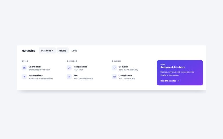
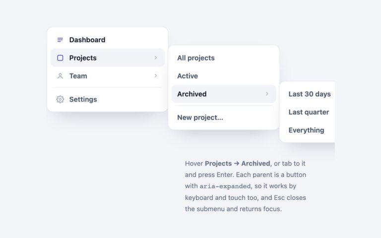
A white top navigation bar with a logo, two dropdowns, two plain links and an indigo Start free button on the right. Products opens a panel with links under Platform and Add-ons headings; Solutions opens a short list of audiences. Pricing is marked as the current page. Use it for marketing sites and product pages where a few sections need a second level. With a mouse the dropdowns open on hover, but hover alone would leave keyboard and touch users out, so every top-level item is also a disclosure button with aria-expanded that opens by click, tap, Enter or Space. Esc closes the open dropdown and returns focus to its button, and it also dismisses a menu that opened on hover. An invisible bridge covers the gap under each button so the pointer can travel into the panel without it closing. Hover effects only apply on devices that can hover, so phones get a clean tap to open and tap to close. Below 780 pixels the links move to a second row and a dropdown opens full width under the bar. The Bootstrap version uses .navbar with the Dropdown plugin.
What’s included
- Dropdowns that open on hover, click, tap or keyboard
- Esc closes a clicked or a hovered menu
- Pointer bridge so the panel stays open on the way down
- Grouped links with small uppercase headings
- Links wrap to a second row below 780px
Accessibility
The bar is a nav labelled Main. Each dropdown opens from a button with aria-expanded and aria-controls, Esc closes it and returns focus to the button, and moving focus out or clicking elsewhere closes it too. Link groups are lists named by their headings and Pricing carries aria-current="page". Everything focusable shows a 2px indigo outline, and transitions are removed under prefers-reduced-motion.
Customise it
Change the link, hover and accent colours in .nvd-top, .nvd-drop and .nvd-cta (plain CSS), the --bs-navbar-* and --bs-dropdown-* variables on .nvd (Bootstrap) or the --color-nvd-* theme colours (Tailwind). The wrap point is the 780px media query.