<svg width="0" height="0" style="position:absolute" aria-hidden="true" focusable="false">
  <symbol id="i-plus" viewBox="0 0 24 24" fill="none" stroke="currentColor" stroke-width="2" stroke-linecap="round"><path d="M12 5v14M5 12h14"/></symbol>
  <symbol id="i-minus" viewBox="0 0 24 24" fill="none" stroke="currentColor" stroke-width="2" stroke-linecap="round"><path d="M5 12h14"/></symbol>
  <symbol id="i-locate" viewBox="0 0 24 24" fill="none" stroke="currentColor" stroke-width="1.9" stroke-linecap="round"><circle cx="12" cy="12" r="6.5"/><circle cx="12" cy="12" r="2"/><path d="M12 2.5v3M12 18.5v3M2.5 12h3M18.5 12h3"/></symbol>
  <symbol id="i-layers" viewBox="0 0 24 24" fill="none" stroke="currentColor" stroke-width="1.9" stroke-linejoin="round"><path d="m12 4 9 5-9 5-9-5z"/><path d="m3 14 9 5 9-5"/></symbol>
</svg>

<div><span class="lbl">Hint popovers on map controls</span>
<div class="stage" style="--stage-h:300px">
  <div class="controls" role="group" aria-label="Map controls">
    <span class="tt" style="--a:--zoom-in"><button class="mc" type="button" aria-labelledby="tip-zin"><svg aria-hidden="true"><use href="#i-plus"/></svg></button><span class="tip left" id="tip-zin" popover="hint" role="tooltip">Zoom in</span></span>
    <span class="tt" style="--a:--zoom-out"><button class="mc" type="button" aria-labelledby="tip-zout"><svg aria-hidden="true"><use href="#i-minus"/></svg></button><span class="tip left" id="tip-zout" popover="hint" role="tooltip">Zoom out</span></span>
    <span class="tt" style="--a:--locate"><button class="mc" type="button" aria-labelledby="tip-loc"><svg aria-hidden="true"><use href="#i-locate"/></svg></button><span class="tip left" id="tip-loc" popover="hint" role="tooltip">Show my location</span></span>
    <span class="tt" style="--a:--layers"><button class="mc" type="button" aria-labelledby="tip-lay"><svg aria-hidden="true"><use href="#i-layers"/></svg></button><span class="tip left" id="tip-lay" popover="hint" role="tooltip">Map layers</span></span>
  </div>
</div></div>

<div><span class="lbl">Toggletip with popover="auto"</span>
<div class="stage" style="--stage-h:300px">
  <div class="plan">
    <span><small>Team plan</small><br><b>12 seats</b> <button class="help" type="button" popovertarget="seat-help" aria-label="How seats are billed" style="anchor-name:--seat-help">?</button></span>
    <span><small>Next invoice</small><br><b>€168</b></span>
  </div>
  <div class="ttip" id="seat-help" popover style="--a:--seat-help" role="dialog" aria-labelledby="seat-help-t">
    <h3 id="seat-help-t">How seats are billed</h3>
    <p>Each person who signs in during the month uses a seat. Guests who only view shared boards are free.</p>
    <a href="#billing-faq">Billing FAQ</a>
  </div>
</div></div>

<div class="full"><span class="lbl">Fallbacks at the window edge</span>
<div class="stage">
  <div class="edges">
    <span class="tt" style="--a:--st-draft"><button class="chip" type="button" aria-describedby="tip-draft">Draft</button><span class="tip" id="tip-draft" popover="hint" role="tooltip">Only you can see it</span></span>
    <span class="tt" style="--a:--st-review"><button class="chip" type="button" aria-describedby="tip-review">In review</button><span class="tip" id="tip-review" popover="hint" role="tooltip">Needs two approvals</span></span>
    <span class="tt" style="--a:--st-publish"><button class="chip" type="button" aria-describedby="tip-publish">Scheduled</button><span class="tip" id="tip-publish" popover="hint" role="tooltip">Goes live Monday at 09:00 CET</span></span>
  </div>
  <p class="note">Each tooltip prefers to sit centred above its button. Near the side of the window it slides to <code>top span-right</code> or <code>top span-left</code>, and at the top of the window it flips below (<code>flip-block</code>).</p>
</div></div>
CSS
/* Tooltips as popover="hint" elements placed with CSS anchor positioning. position-try-fallbacks flips or shifts them when the
   window edge is in the way, and @starting-style fades them in and out. Each .tt wrapper names its anchor in --a. */
.tt>button{anchor-name:var(--a)}
.tip,.ttip{position:fixed;position-anchor:var(--a);inset:auto;margin:0;opacity:0;translate:0 4px;
  transition:opacity .15s,translate .15s,overlay .15s allow-discrete,display .15s allow-discrete}
.tip:popover-open,.ttip:popover-open{opacity:1;translate:0 0}
@starting-style{.tip:popover-open,.ttip:popover-open{opacity:0;translate:0 4px}}

.tip{width:max-content;max-width:220px;padding:6px 10px;border:0;border-radius:8px;background:#1c1917;color:#fafaf9;
  font:500 .8125rem/1.45 ui-sans-serif,system-ui,-apple-system,"Segoe UI",Roboto,sans-serif;box-shadow:0 10px 24px -10px rgba(28,25,23,.6);overflow:visible;
  position-area:top;margin-bottom:8px;position-try-fallbacks:top span-right,top span-left,flip-block}
.tip.left{translate:4px 0;position-area:left;margin:0 8px 0 0;position-try-fallbacks:flip-inline,top,bottom}
@starting-style{.tip.left:popover-open{translate:4px 0}}
.tip.left:popover-open{translate:0 0}

/* Toggletip: popover="auto", so Esc and a click outside close it and it is the next Tab stop after its button */
.ttip{width:min(290px,calc(100vw - 32px));padding:14px 16px;border:1px solid #e4ddd4;border-radius:12px;background:#fff;color:#1c1917;font-size:.875rem;line-height:1.5;
  box-shadow:0 2px 6px rgba(28,25,23,.06),0 20px 40px -14px rgba(28,25,23,.3);position-area:bottom span-right;margin-top:8px;position-try-fallbacks:bottom span-left,bottom,flip-block}
.ttip h3{margin:0 0 4px;font-size:.9rem}
.ttip p{margin:0 0 8px;color:#44403c}
.ttip a{color:#c2410c;font-weight:600;border-radius:3px}

/* Fallback: without anchor positioning the script places tooltips with top/left instead. */
@supports not (anchor-name:--a){.tip,.ttip{margin:0}}

/* Controls */
.mc{display:grid;place-items:center;width:40px;height:40px;padding:0;border:0;background:#fff;color:#292524;cursor:pointer}
.mc:hover{background:#f5f0ea}
.mc svg{width:18px;height:18px}
.controls{position:absolute;top:20px;right:20px;display:flex;flex-direction:column;border:1px solid #d6cdc2;border-radius:12px;background:#fff;overflow:hidden;box-shadow:0 6px 16px -8px rgba(28,25,23,.3)}
.controls .tt+.tt{border-top:1px solid #ebe4dc}
.controls .tt{display:block}
.chip{display:inline-flex;align-items:center;height:36px;padding:0 14px;border:1px solid #d6cdc2;border-radius:999px;background:#fff;color:#1c1917;font:600 .8125rem/1 ui-sans-serif,system-ui,-apple-system,"Segoe UI",Roboto,sans-serif;cursor:pointer}
.chip:hover{background:#f5f0ea}
.edges{display:flex;justify-content:space-between;gap:10px;padding-top:44px}
.help{display:inline-grid;place-items:center;width:22px;height:22px;padding:0;border:1.5px solid #8a7f74;border-radius:50%;background:#fff;color:#44403c;font:700 .75rem/1 ui-sans-serif,system-ui,sans-serif;cursor:pointer;vertical-align:-4px}
.help:hover,.help:popover-open,.help[aria-expanded="true"]{border-color:#c2410c;background:#c2410c;color:#fff}
.plan{display:flex;flex-wrap:wrap;align-items:center;gap:10px 18px;padding:14px 16px;border:1px solid #e4ddd4;border-radius:12px;background:#fff}
.plan b{font-size:1.25rem}
.plan small{color:#5c544c;font-size:.8125rem}
:is(.mc,.chip,.help,.ttip a):focus-visible{outline:2px solid #c2410c;outline-offset:2px}
.controls .mc:focus-visible{outline-offset:-3px}
@media (prefers-reduced-motion:reduce){.tip,.ttip{transition:none}}
JavaScript
// Hint tooltips: shown on hover, keyboard focus and tap, kept open while the pointer is on them, closed by Esc (WCAG 1.4.13).
// popover="hint" does this without closing an open popover="auto"; where "hint" is unsupported it behaves as "manual" and still works.
// Without CSS anchor positioning, place() puts each popover next to its button with top/left.
(() => {
  const anchored = CSS.supports('anchor-name: --a');
  const place = (pop, btn) => {
    if (anchored) return;
    const r = btn.getBoundingClientRect(), w = pop.offsetWidth, h = pop.offsetHeight, vw = document.documentElement.clientWidth;
    let x = r.left + r.width / 2 - w / 2, y = r.top - h - 8;
    if (pop.classList.contains('left')) { x = r.left - w - 8; y = r.top + r.height / 2 - h / 2; }
    if (pop.classList.contains('ttip')) { x = r.left; y = r.bottom + 8; }
    if (y < 8) y = r.bottom + 8;
    pop.style.left = Math.min(Math.max(8, x), vw - w - 8) + 'px'; pop.style.top = y + 'px';
  };
  const tips = [...document.querySelectorAll('.tt > .tip[popover]')];
  tips.forEach(tip => {
    const wrap = tip.parentElement, btn = wrap.querySelector('button');
    let timer;
    const show = () => {
      clearTimeout(timer);
      tips.forEach(o => o !== tip && o.matches(':popover-open') && o.hidePopover());
      if (!tip.matches(':popover-open')) { tip.showPopover(); place(tip, btn); }
    };
    const hide = () => { clearTimeout(timer); timer = setTimeout(() => { if (!wrap.matches(':hover') && document.activeElement !== btn && tip.matches(':popover-open')) tip.hidePopover(); }, 120); };
    wrap.addEventListener('pointerenter', show);
    wrap.addEventListener('pointerleave', hide);
    btn.addEventListener('focus', show);
    btn.addEventListener('blur', hide);
  });
  document.addEventListener('keydown', e => { if (e.key === 'Escape') tips.forEach(t => t.matches(':popover-open') && t.hidePopover()); });
  document.addEventListener('pointerdown', e => { if (!e.target.closest('.tt')) tips.forEach(t => t.matches(':popover-open') && t.hidePopover()); });
  document.querySelectorAll('.ttip[popover]').forEach(p => p.addEventListener('toggle', e => {
    if (e.newState === 'open') place(p, document.querySelector(`[popovertarget="${p.id}"]`));
  }));
})();
Bootstrap 5 code
Requires: Bootstrap 5.3.8 CSS
HTML
<svg width="0" height="0" style="position:absolute" aria-hidden="true" focusable="false">
  <symbol id="i-plus" viewBox="0 0 24 24" fill="none" stroke="currentColor" stroke-width="2" stroke-linecap="round"><path d="M12 5v14M5 12h14"/></symbol>
  <symbol id="i-minus" viewBox="0 0 24 24" fill="none" stroke="currentColor" stroke-width="2" stroke-linecap="round"><path d="M5 12h14"/></symbol>
  <symbol id="i-locate" viewBox="0 0 24 24" fill="none" stroke="currentColor" stroke-width="1.9" stroke-linecap="round"><circle cx="12" cy="12" r="6.5"/><circle cx="12" cy="12" r="2"/><path d="M12 2.5v3M12 18.5v3M2.5 12h3M18.5 12h3"/></symbol>
  <symbol id="i-layers" viewBox="0 0 24 24" fill="none" stroke="currentColor" stroke-width="1.9" stroke-linejoin="round"><path d="m12 4 9 5-9 5-9-5z"/><path d="m3 14 9 5 9-5"/></symbol>
</svg>

<div><span class="lbl">Hint popovers on map controls</span>
<div class="stage" style="--stage-h:300px">
  <div class="controls d-flex flex-column rounded-3 overflow-hidden" role="group" aria-label="Map controls">
    <span class="tt d-block" style="--a:--zoom-in"><button class="btn mc" type="button" aria-labelledby="tip-zin"><svg aria-hidden="true"><use href="#i-plus"/></svg></button><span class="tip tooltip-inner left" id="tip-zin" popover="hint" role="tooltip">Zoom in</span></span>
    <span class="tt d-block" style="--a:--zoom-out"><button class="btn mc" type="button" aria-labelledby="tip-zout"><svg aria-hidden="true"><use href="#i-minus"/></svg></button><span class="tip tooltip-inner left" id="tip-zout" popover="hint" role="tooltip">Zoom out</span></span>
    <span class="tt d-block" style="--a:--locate"><button class="btn mc" type="button" aria-labelledby="tip-loc"><svg aria-hidden="true"><use href="#i-locate"/></svg></button><span class="tip tooltip-inner left" id="tip-loc" popover="hint" role="tooltip">Show my location</span></span>
    <span class="tt d-block" style="--a:--layers"><button class="btn mc" type="button" aria-labelledby="tip-lay"><svg aria-hidden="true"><use href="#i-layers"/></svg></button><span class="tip tooltip-inner left" id="tip-lay" popover="hint" role="tooltip">Map layers</span></span>
  </div>
</div></div>

<div><span class="lbl">Toggletip with popover="auto"</span>
<div class="stage" style="--stage-h:300px">
  <div class="card rounded-3" style="--bs-card-border-color:#e4ddd4"><div class="card-body d-flex flex-wrap align-items-center" style="gap:10px 18px;padding:14px 16px">
    <span><small class="muted">Team plan</small><br><b class="fs-5">12 seats</b> <button class="help rounded-circle" type="button" popovertarget="seat-help" aria-label="How seats are billed" style="anchor-name:--seat-help">?</button></span>
    <span><small class="muted">Next invoice</small><br><b class="fs-5">€168</b></span>
  </div></div>
  <div class="ttip popover" id="seat-help" popover style="--a:--seat-help" role="dialog" aria-labelledby="seat-help-t"><div class="popover-body">
    <h3 id="seat-help-t">How seats are billed</h3>
    <p>Each person who signs in during the month uses a seat. Guests who only view shared boards are free.</p>
    <a href="#billing-faq">Billing FAQ</a>
  </div></div>
</div></div>

<div class="full"><span class="lbl">Fallbacks at the window edge</span>
<div class="stage">
  <div class="d-flex justify-content-between gap-2" style="padding-top:44px">
    <span class="tt" style="--a:--st-draft"><button class="btn chip rounded-pill" type="button" aria-describedby="tip-draft">Draft</button><span class="tip tooltip-inner" id="tip-draft" popover="hint" role="tooltip">Only you can see it</span></span>
    <span class="tt" style="--a:--st-review"><button class="btn chip rounded-pill" type="button" aria-describedby="tip-review">In review</button><span class="tip tooltip-inner" id="tip-review" popover="hint" role="tooltip">Needs two approvals</span></span>
    <span class="tt" style="--a:--st-publish"><button class="btn chip rounded-pill" type="button" aria-describedby="tip-publish">Scheduled</button><span class="tip tooltip-inner" id="tip-publish" popover="hint" role="tooltip">Goes live Monday at 09:00 CET</span></span>
  </div>
  <p class="note">Each tooltip prefers to sit centred above its button. Near the side of the window it slides to <code>top span-right</code> or <code>top span-left</code>, and at the top of the window it flips below (<code>flip-block</code>).</p>
</div></div>
// Hint tooltips: shown on hover, keyboard focus and tap, kept open while the pointer is on them, closed by Esc (WCAG 1.4.13).
// popover="hint" does this without closing an open popover="auto"; where "hint" is unsupported it behaves as "manual" and still works.
// Without CSS anchor positioning, place() puts each popover next to its button with top/left.
(() => {
  const anchored = CSS.supports('anchor-name: --a');
  const place = (pop, btn) => {
    if (anchored) return;
    const r = btn.getBoundingClientRect(), w = pop.offsetWidth, h = pop.offsetHeight, vw = document.documentElement.clientWidth;
    let x = r.left + r.width / 2 - w / 2, y = r.top - h - 8;
    if (pop.classList.contains('left')) { x = r.left - w - 8; y = r.top + r.height / 2 - h / 2; }
    if (pop.classList.contains('ttip')) { x = r.left; y = r.bottom + 8; }
    if (y < 8) y = r.bottom + 8;
    pop.style.left = Math.min(Math.max(8, x), vw - w - 8) + 'px'; pop.style.top = y + 'px';
  };
  const tips = [...document.querySelectorAll('.tt > .tip[popover]')];
  tips.forEach(tip => {
    const wrap = tip.parentElement, btn = wrap.querySelector('button');
    let timer;
    const show = () => {
      clearTimeout(timer);
      tips.forEach(o => o !== tip && o.matches(':popover-open') && o.hidePopover());
      if (!tip.matches(':popover-open')) { tip.showPopover(); place(tip, btn); }
    };
    const hide = () => { clearTimeout(timer); timer = setTimeout(() => { if (!wrap.matches(':hover') && document.activeElement !== btn && tip.matches(':popover-open')) tip.hidePopover(); }, 120); };
    wrap.addEventListener('pointerenter', show);
    wrap.addEventListener('pointerleave', hide);
    btn.addEventListener('focus', show);
    btn.addEventListener('blur', hide);
  });
  document.addEventListener('keydown', e => { if (e.key === 'Escape') tips.forEach(t => t.matches(':popover-open') && t.hidePopover()); });
  document.addEventListener('pointerdown', e => { if (!e.target.closest('.tt')) tips.forEach(t => t.matches(':popover-open') && t.hidePopover()); });
  document.querySelectorAll('.ttip[popover]').forEach(p => p.addEventListener('toggle', e => {
    if (e.newState === 'open') place(p, document.querySelector(`[popovertarget="${p.id}"]`));
  }));
})();
/* Without CSS anchor positioning the script places tooltips with top/left, so drop the anchor offsets. */
@supports not (anchor-name: --a) { .tip, .ttip { margin: 0 } }
JavaScript
// Hint tooltips: shown on hover, keyboard focus and tap, kept open while the pointer is on them, closed by Esc (WCAG 1.4.13).
// popover="hint" does this without closing an open popover="auto"; where "hint" is unsupported it behaves as "manual" and still works.
// Without CSS anchor positioning, place() puts each popover next to its button with top/left.
(() => {
  const anchored = CSS.supports('anchor-name: --a');
  const place = (pop, btn) => {
    if (anchored) return;
    const r = btn.getBoundingClientRect(), w = pop.offsetWidth, h = pop.offsetHeight, vw = document.documentElement.clientWidth;
    let x = r.left + r.width / 2 - w / 2, y = r.top - h - 8;
    if (pop.classList.contains('left')) { x = r.left - w - 8; y = r.top + r.height / 2 - h / 2; }
    if (pop.classList.contains('ttip')) { x = r.left; y = r.bottom + 8; }
    if (y < 8) y = r.bottom + 8;
    pop.style.left = Math.min(Math.max(8, x), vw - w - 8) + 'px'; pop.style.top = y + 'px';
  };
  const tips = [...document.querySelectorAll('.tt > .tip[popover]')];
  tips.forEach(tip => {
    const wrap = tip.parentElement, btn = wrap.querySelector('button');
    let timer;
    const show = () => {
      clearTimeout(timer);
      tips.forEach(o => o !== tip && o.matches(':popover-open') && o.hidePopover());
      if (!tip.matches(':popover-open')) { tip.showPopover(); place(tip, btn); }
    };
    const hide = () => { clearTimeout(timer); timer = setTimeout(() => { if (!wrap.matches(':hover') && document.activeElement !== btn && tip.matches(':popover-open')) tip.hidePopover(); }, 120); };
    wrap.addEventListener('pointerenter', show);
    wrap.addEventListener('pointerleave', hide);
    btn.addEventListener('focus', show);
    btn.addEventListener('blur', hide);
  });
  document.addEventListener('keydown', e => { if (e.key === 'Escape') tips.forEach(t => t.matches(':popover-open') && t.hidePopover()); });
  document.addEventListener('pointerdown', e => { if (!e.target.closest('.tt')) tips.forEach(t => t.matches(':popover-open') && t.hidePopover()); });
  document.querySelectorAll('.ttip[popover]').forEach(p => p.addEventListener('toggle', e => {
    if (e.newState === 'open') place(p, document.querySelector(`[popovertarget="${p.id}"]`));
  }));
})();
About this set
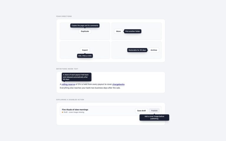
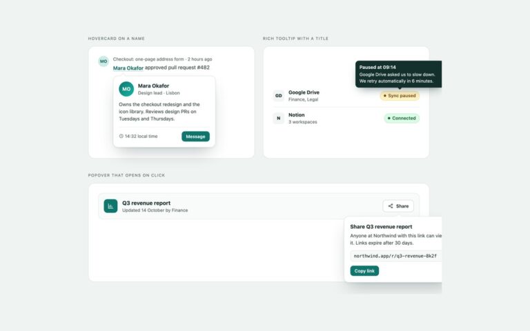
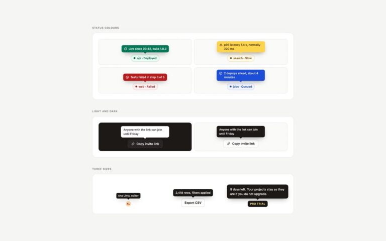
Tooltips built on the newest platform features instead of a positioning library. Hint popovers on map controls labels Zoom in, Zoom out, Show my location and Map layers with popover=”hint” elements, placed to the left of each button with CSS anchor positioning; a hint popover can open without closing a menu or toggletip that is already open. Toggletip with popover=”auto” explains how seats are billed: a question mark button opens it with popovertarget, Esc and a click outside close it, and focus handling comes from the browser. Fallbacks at the window edge shows three status chips whose tooltips prefer to sit centred above, slide to top span-right or top span-left near the sides of the window, and flip below when the button is at the top, all through position-try-fallbacks. Every popover fades and slides in and out with @starting-style and transition-behavior: allow-discrete. A short script opens the hint tooltips on hover and focus, keeps them open under the pointer and closes them with Esc. Where popover=”hint” is not supported it behaves as manual and the same script still works, and without anchor positioning the script places each popover with top and left.
What’s included
popover="hint" tooltips that leave open menus alone
popover="auto" toggletip with built-in Esc and outside click
CSS anchor positioning with position-area
position-try-fallbacks to shift and flip at window edges
@starting-style entrance and exit
Script fallback for browsers without anchor positioning
Accessibility
Hint tooltips have role="tooltip" and name or describe their buttons through aria-labelledby or aria-describedby. They open on keyboard focus and hover, stay open under the pointer, and close with Esc. The toggletip is a labelled dialog opened by popovertarget, so the browser exposes its expanded state and puts it next in the Tab order, and Esc returns focus to the button. Focus outlines are visible, and transitions stop under prefers-reduced-motion.
Customise it
Each .tt wrapper sets --a to a unique anchor name; change position-area to move a tooltip and position-try-fallbacks to change where it goes when there is no room. Colours are plain values on .tip and .ttip. In Bootstrap they are the --bs-tooltip-* and --bs-popover-* variables, and in Tailwind the [position-area:...] utilities and hex values.