
Tooltips – 8 Free CSS, Bootstrap & Tailwind Sets
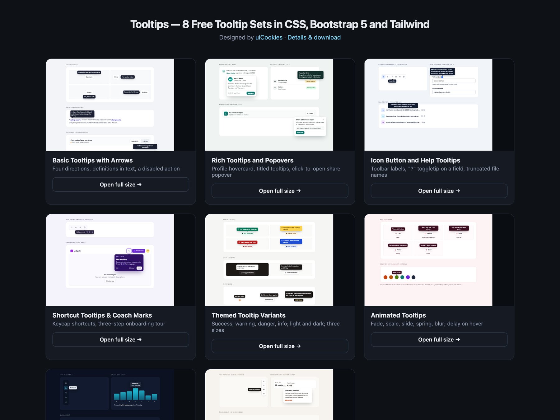
Tooltips is a pack of eight sets of tooltips, hovercards, toggletips and popovers, designed and maintained in-house by uiCookies. Every set comes in three versions that look the same: plain HTML and CSS, Bootstrap 5 using its own Tooltip and Popover plugins where they fit, and Tailwind CSS 4. The sets cover tooltips with arrows in four directions, rich tooltips, hovercards and click popovers, icon button labels, form help and truncated text, keyboard shortcut tooltips and onboarding coach marks, colour and size themes, animated entrances, a dark set and a modern CSS set built on popover="hint", anchor positioning and @starting-style. Each set needs a short script, because closing a tooltip with Esc cannot be done in CSS alone.
A good tooltip appears on keyboard focus as well as on hover, closes with Esc without moving focus, and stays open while the pointer moves onto it, which is what WCAG 1.4.13 asks of content that appears on hover or focus. It is linked to its trigger with aria-describedby, or names an icon-only button through aria-labelledby, so screen readers hear it once. It never holds the only copy of something people need: a password rule or the reason a button is disabled also belongs in visible text. Tooltips cannot hold links or buttons; once content is interactive it becomes a click popover or a toggletip, which also works on touch screens where there is no hover.