Tooltips play a major role in the user experience. If you are an app developer, you have to make sure that the user knows each and every option on your app. Mentioning what the particular option or the function does will help the user know what to do. No matter whether you are using a simple design or a new creative design, using tooltip in your design will always guide your users. In this list, we have collected tooltip design for all types of websites and applications. For your convenience, we have collected both hover tooltip designs and clickable tooltip design. Most of the designs have very subtle animation, so you can even use them in your contact form and other types of form designs.
Simple Tooltip CSS To Create Friendly Designs
Tooltips CSS design examples with code snippets to help you create stunning and friendly designs. Most example codings are shared with you on the CodePen editor so that you can edit and visualize the results on the editor itself.
Buildex

Buildex is a Bootstrap UI kit, and you get a ready-made bootstrap tooltip CSS design in this pack. The creator has given you tooltips that appear on the right, left, bottom, and top. Though it is a UI kit, the creator has kept the code structure as simple as possible to let the developer easily find the element they want.
You can use this bootstrap tooltips CSS on any website or application because of its professional look. You can edit the code and custom effects to make the tooltip even more engaging.
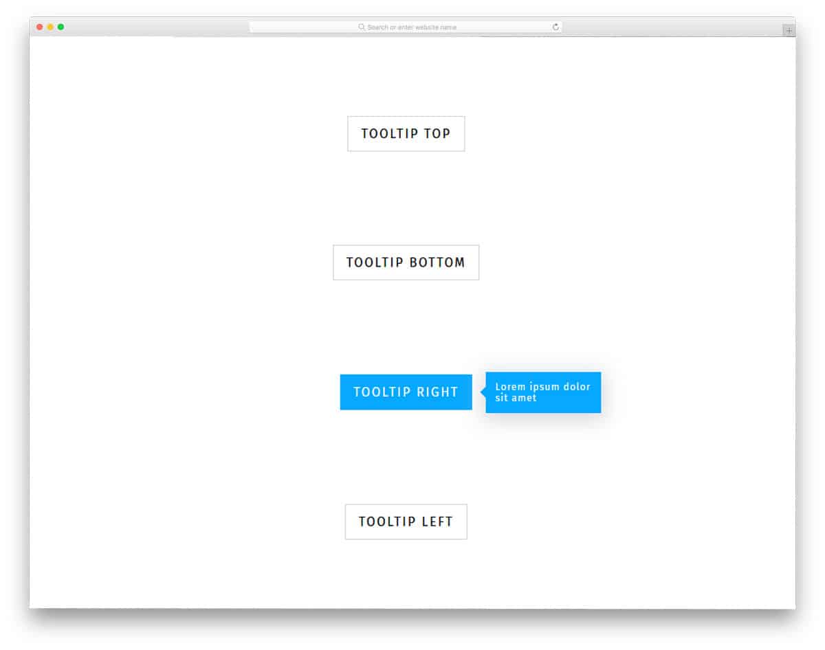
Jellyfish
Jellyfish is also a Bootstrap UI kit. All elements, including the tooltips, are made using the bootstrap4 framework.
If you are looking for a simple bootstrap tooltip HTML design, this one might impress you. The creator has kept the design professional with a contemporary look, making it a good option for all types of websites and applications. The creator has created the Bootstrap tooltips for buttons in the default design, but you can use it for other elements as well. Well-optimized bootstrap UI kits like these are a good asset to a professional developer; make sure you add it to your inventory.
Google Maps Radio Button With Tooltip
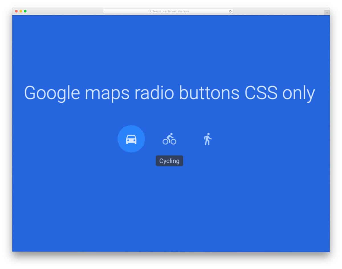
As the name implies, this tooltips CSS uses a Google map concept. As more and more icons are used in the modern web and mobile UI designs, tooltips are used to make interactions easier for first-time users. The hover-activated tooltip in this design is very simple but functional. You have plenty of room for improvement in this design. For example, you can add subtle animations to the icons and a lot more.
You can use it easily on any part of your website. For more interactive radio button designs, take a look at our radio button design collection.
Animated CSS Hover Tooltips

You get animated CSS hover tooltips in this design. The tooltips smoothly slide from the top when you hover the element. Only bottom tooltips are used in this design to maintain a uniform look throughout the design. The default design is for CSS grid layout with gradient flex boxes. Tooltips are used to show the purpose of the flexbox to the audience. Since the whole grid layout concept is made purely using the HTML and CSS script, you can utilize the code easily in your project.
Animated SVG radio buttons With Tooltip

Though this concept is originally designed for radio buttons, the creator has used a tooltip to show what users have to do. The cursor smartly changes into a question mark and shows the tooltip to the user. If you are planning to use a simple yet attractive tooltip for your application, tooltip CSS designs like this will be a good choice. Plus, the whole design is made using the CSS script, so you can use them easily on any part of your website and application. Speaking of radio buttons, take a look at our bootstrap radio button collection for more user-friendly design concepts.
Laser Line Effect Tooltip

For those who want to be a little creative with their tooltip design, this concept might inspire you. As the name implies, this tooltip design uses a laser line animation effect. The default design makes the best option for the tooltips that have to show big messages. To let the user know that there is a tooltip for them to help, the creator has used a blinking effect for the dot. Since the default design is versatile and simple, you can fit this design on any part of your website and web applications.
Tooltips for Letters
The creator has used the first letter CSS property in this tooltip design, which makes it unique. Tooltips are used to show the related information/synonyms of a letter in this example. If you are making an interactive blog design or a landing page with relevant links to your products, tooltip CSS designs like this will come in handy for you. As said before, the whole design is made using the CSS script. Hence, you can easily handle the code and implement it even on your existing website or application.
Fancy & Animated Tooltip

In this design, the developer has given you tooltip for call to action buttons and text links. We have given you examples of how to make a link style design unique without making it look odd. Using tooltip is one of the best practice to let the user know where they will be taken or what the action will be on clicking the link. In this design, the developer has animated the tooltip box a bit to give an interactive experience. Since the given zoom in animation effect is simple, the user will experience the same smooth effect across all devices. By making a few adjustments, you can use this design on your responsive web design.
Custom Tooltip

Custom tooltip also gives you tooltip design for call to action buttons and text links. The unique feature in this call to action button tooltip design is it is a delayed tooltip. Some of the options may be self-explanatory for the users, but still, you need to make the option clear to the users; In cases like that, this delayed tooltip will be a good option. The flexbox for the delayed tooltip is bigger so that you can give a detailed message. Since it is a demo, the looks are very minimal, but you can change the look easily. The CSS3 script used in this design allows you to use all modern colors and attractive animation effects.
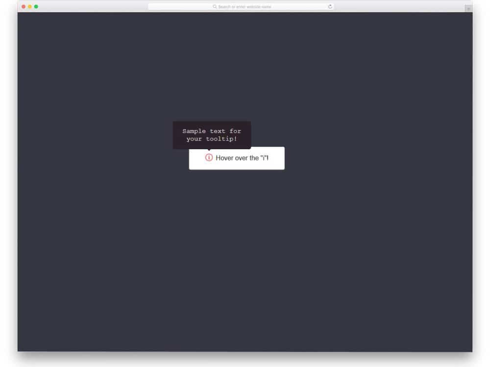
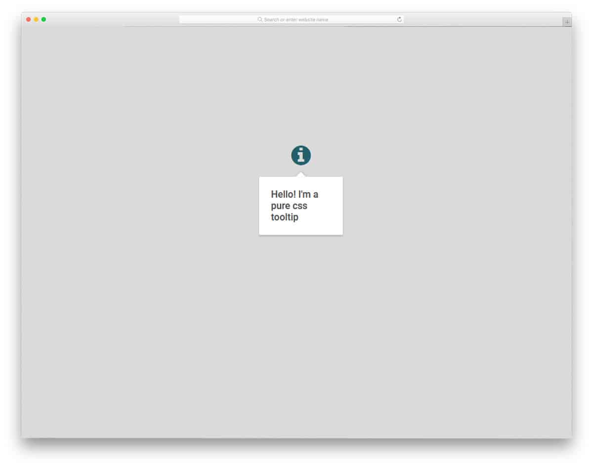
Pure Tooltips CSS

One of the most commonly used Tooltips CSS design is the “i” mark. By default, the users are used to this “i” symbol for finding the information about the tool. In this tooltips CSS example, the creator has used the traditional design wisely to show the information. Though the design is simple, the familiar design will help the user to easily understand the environment. The tooltip message box is made bigger and bolder so that the user can easily read the message in it. Since this design is made using the CSS3 script, it can handle any modern color scheme without any issue. So you can easily make this design fit inside your application or website.
Single Element Tooltip

The tooltip design, in this example, will come in handy for text-rich pages like a blog post or an about page. When you are mentioning a new term or link, you can use this tooltip design to show the link’s meaning or the destination. The creator has written the code carefully so that you can show the tooltip in different directions. Based on your needs, you can pick a direction and use the tooltip in that particular direction. Since the default tooltip design is simple and neat, you can fit this tooltip design easily on any part of your website.
Dead Simple Tooltip

The creator has really given you a dead-simple tooltip design in this example. Just like most other tooltips CSS designs, this one is also a hover activated tooltip design. The creator has used a nice big box for the tooltip, so you get more than enough space to show your message. Letters are made bigger and bolder for a better reading experience. Just like the design, its code script is also dead-simple. You can use this light-weight code script on any part of your website and forms without any hitch.
CSS Tooltip
This is also a simple and neat CSS tooltip design example. Coding-wise, this example is slightly smaller when compared to the Dead-Simple Tooltip design mentioned above. If you are a beginner, tooltips CSS designs like this will help you understand the concept easily. The creator has kept the tooltips animation faster in the default design for easier interaction. But, you can adjust the animation as per your needs and can add a touch of elegance to it. The entire code script is shared with you directly on the CodePen editor to let you easily utilize the code.
Guided Tour Tooltip
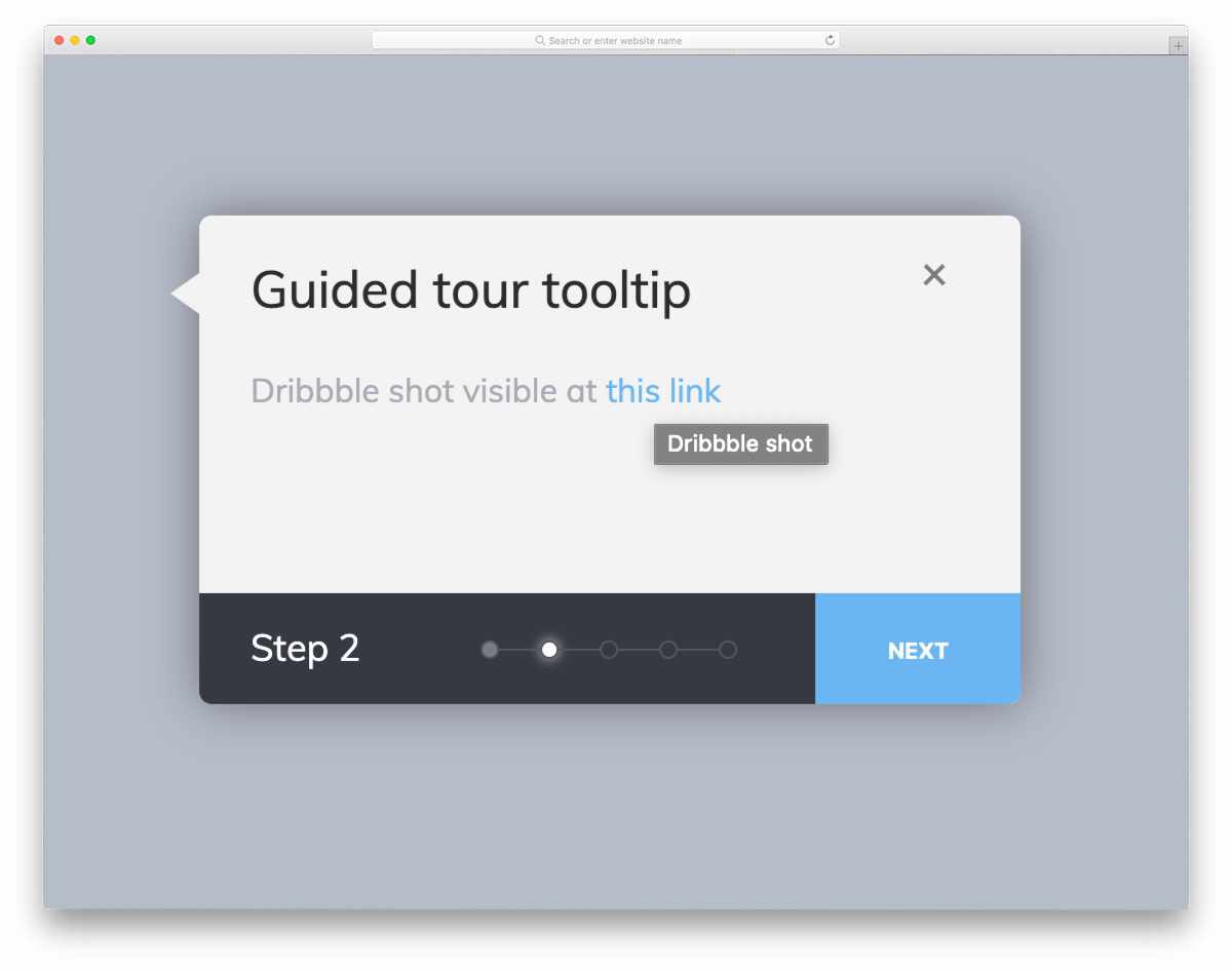
In this example, you can see how tooltips can be used in a wizard. The creator has used the tooltips only for the links. But, you can take this concept and can use it for other purposes as well. Speaking of links, if you like to differentiate the important text links from others, take a look at our link style CSS collection. This example has more than enough space for you to add the features you want and to improvise the design as per your likings. Since the developer has shared the code on the CodePen editor, you can edit and visualize your results on the CodePen editor before using it on your project, plus, you can save some time.
CSS Simple Tooltip

It is another pure CSS tooltip design. The creator has given tooltip designs for both links and call to action buttons. Since the whole design is made using the CSS3 script, you can add some colors and effects to make the tooltip even more impressive. Speaking of colorful buttons, take a look at our CSS gradient button design that can give depth to your design.
Tooltip Pagination
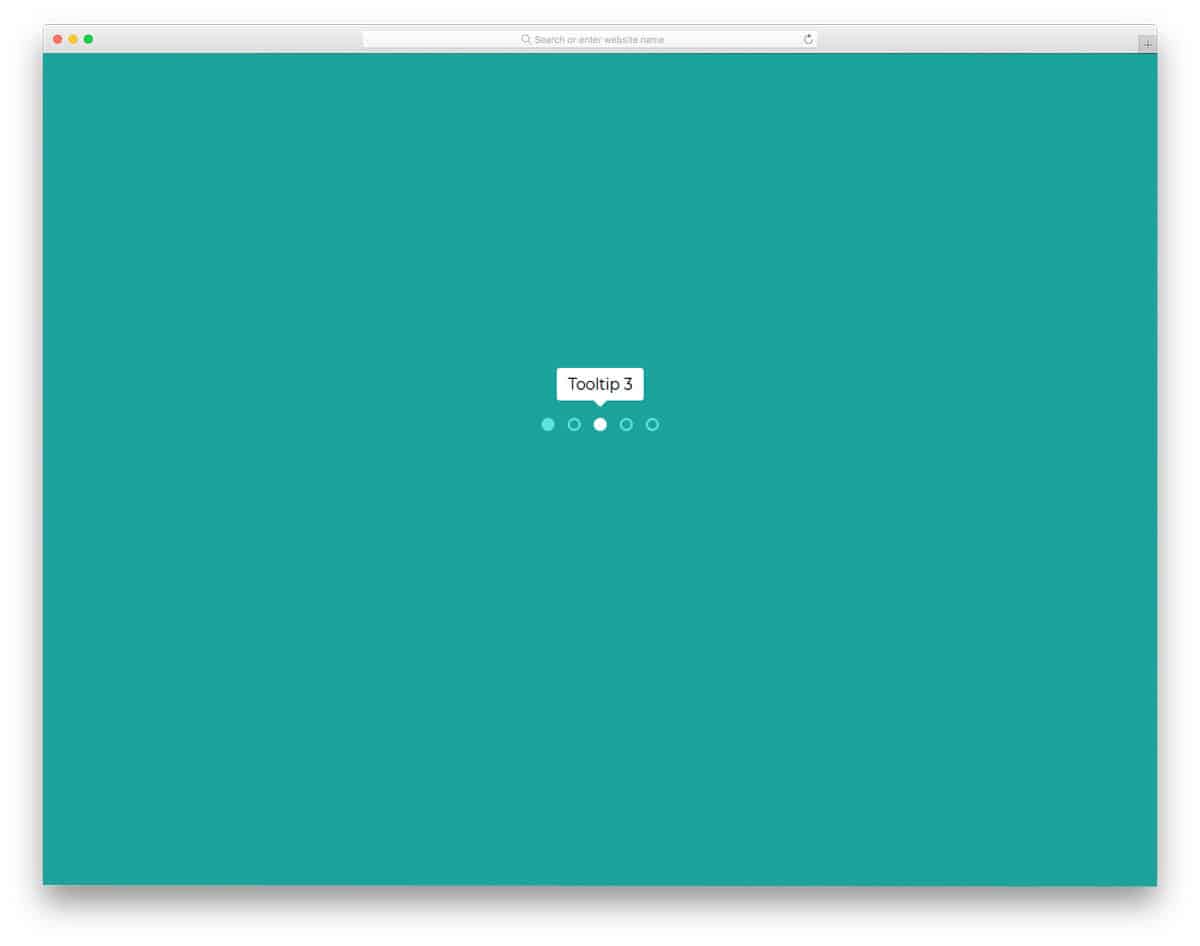
Another most commonly used Tooltips CSS design is in the pagination area and in slider indicators. Showing a gist of the upcoming page or slide content will help the user easily jump to the slide they want. The tooltips CSS design is snappier in this example, as soon as you move the cursor, the tooltips are shown neatly to the user. Since it is a concept model, the creator has kept the tooltip box small and simple. But you can edit the code and make the tooltip box in the design you want. If you are looking for interactive pagination designs, take a look at our CSS Pagination design collection.
Material Tooltip
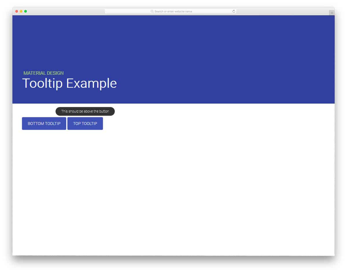
From the name itself you can infer that the creator has used material design in this tooltips CSS example. Bottom tooltips CSS and top tooltips CSS are given in this pack, both of them work perfectly. Small animation effects are used to present the tooltip message. Though the design concept is simple, the creator has used CSS3 and Javascript framework to make this design. You can take this design as an inspiration and can make your own custom tooltip design in the code format you prefer. Because of the material design, you can use this design in any modern websites and applications.
Hint- a Tooltips CSS library
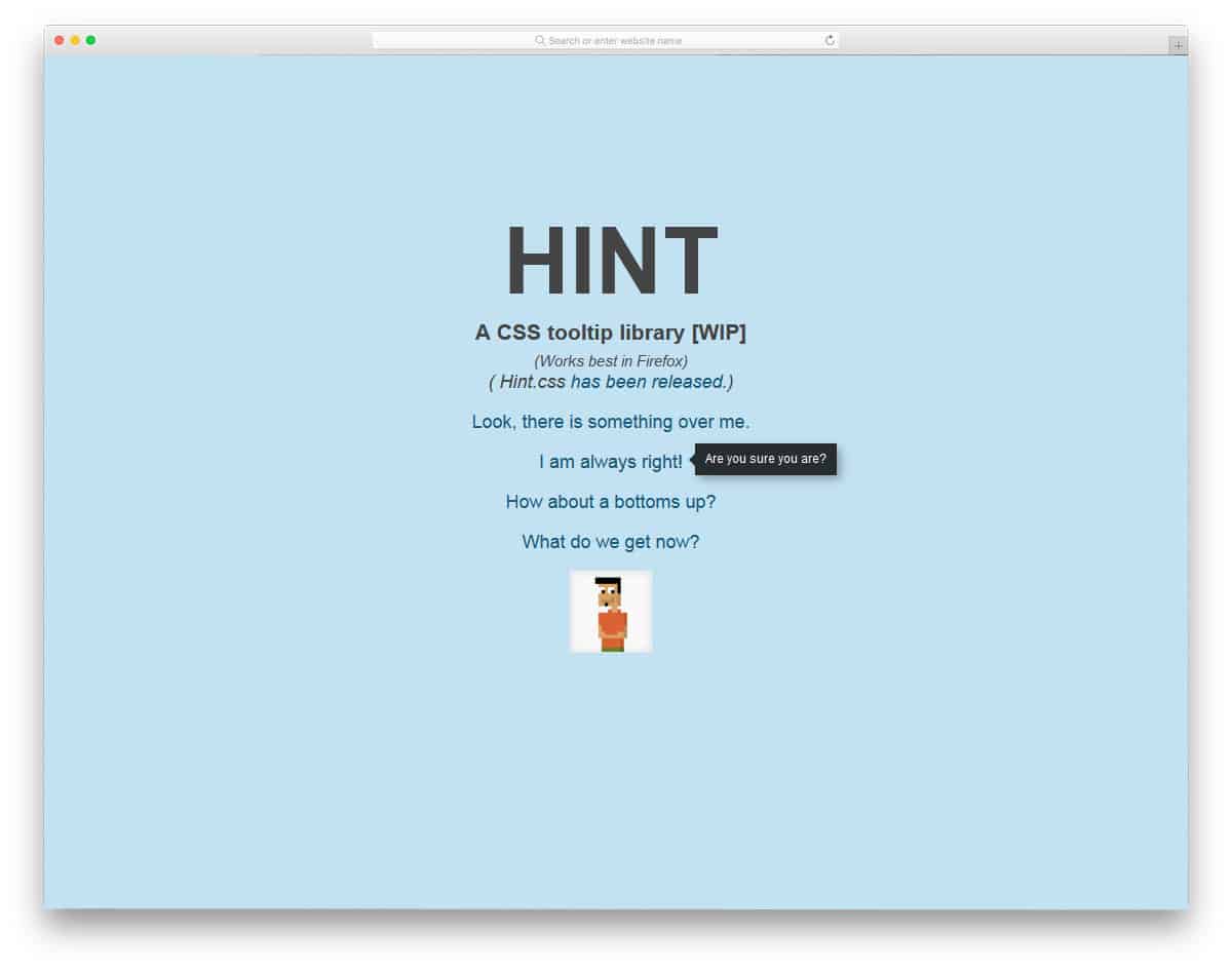
In this example, the creator has shown the tooltip on all four sides. If you are a beginner, this tooltips CSS will help you get a basic idea of positioning the tooltip message. Since it is a concept model, the creator has kept the message simple. If you like to make the tooltip dynamic and automatically show the message left/right based on the available screen space, you might need to work a little bit on the Javascript framework. The code script is shared with you directly, so you can play easily with the design and mess with it to get the desired result you want.
CSS Tooltip Magic
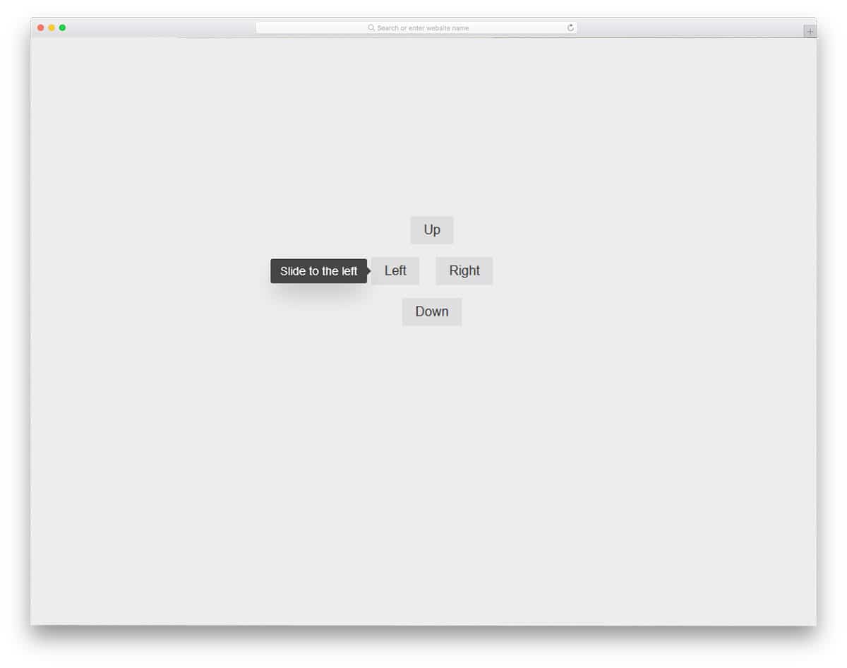
This is another hover action based tooltip design. The developer has used the shadow and depth effect smartly to highlight and show the tooltip message. With neat subtle animation, you can clearly show the message to the user. The tooltip message is shown in all four directions in this design. Based on your requirements and design, you can pick the direction you want. Not only the design but the code structure is also kept simple for easier customization. Though the default tooltip message box is small, you can adjust the code to resize the box.
Bootstrap’s Tooltip Hover Delay

This one is another delayed tooltip effect. Though it is a delayed tooltip, it takes only a few seconds to appear so the user won’t miss the message. In the default demo, the message is kept short, but as usual, you can adjust the message box size. The developer has used CSS3 and Javascript in this design. In the previous Custom Tooltip design, the developer has made the same effect using the CSS3 script alone. Based on the code structure you prefer, you can go for it and trim it as per your requirements. The developer has shared the code in CodePen editor, hence you can visualize your customizations then and there as you make.
Social Icons With Tooltip
As the name implies, the developer has used Social media icons concept for this tooltip design. It is a hover over tooltip design just like in all the websites you have seen. The tooltip box color smartly changes color based on the color of the social media icon color. Design-wise it is a very simple one, which you can use on any website or application. Because of this simple design, this Social Icons With Tooltip design easily fit in any part of the website. By making a few optimizations, you can use this design on your project. Properly handled HTML5 and CSS3 script will make customizations simple for other developers.
Tooltip By Hixann

This one is another social media icon tooltip box design. The developer has used a tooltip box raising animation in this design. Instead of changing the color of the entire tooltip box, the texts are made colorful on a white box. If you prefer a minimal design, this effect might impress you. All the tooltip boxes appear on the top of the icons, so make sure you give enough space at the top and bottom of the icons. The effect is made purely using the CSS3 script, hence you have plenty of customization options. All you have to do is to copy the code and optimize it for your functions and design.
CSS ToolTip Smooth Animation

In this animation, the call to action button is also animated along with the tooltip box. As per the name, the animation effect is smooth and clean. On the clean white background, the smooth animation effect gives a neat floating effect. The only small design flaw in this tooltip example is the tooltip box and the call to action buttons have the same shape and same size. Users on small screen devices may get confused between the buttons and the tooltip box. The shape might be the one thing you must consider redesigning before using it on your website. If you are making mobile responsive websites, take a look at our free mobile responsive website templates collection to finish your project easily and efficiently.
Tooltiper

This is another tooltip design for typography style website designs. With the modern fonts, you can clearly express the content to the users and also can elegantly present the contents. In this design, the developer has used tooltip boxes for the text links. If you are running a magazine or news website, you can use this design to show your related article for a particular word. For example, for the iPhone Xs, you can show the initial impression article and in-depth review article in the suggestion. The developer has used a card flipping style animation for the tooltip box, which looks attractive. Take a look at our CSS card flipping animation list for more creative animations and inspirations.
Bootstrap Carousel Tooltip
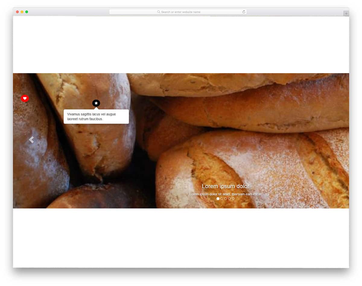
If you are making a website for a product based company, this tooltip design will be a good choice. Though the original design is for the carousels and image sliders, this can be used for other purposes as well. For example, in a car manufacturer website, you can use this tooltip to show the highlights of each and every part. All tooltip designs given in this example are a hover-based effect. To make this dynamic image based tooltip design, the developer has used HTML5, CSS3, and Javascript framework. The entire code structure used to make this design is shared with you for quick and easy usage.
SVG Doughnut Chart With Animation And Tooltip
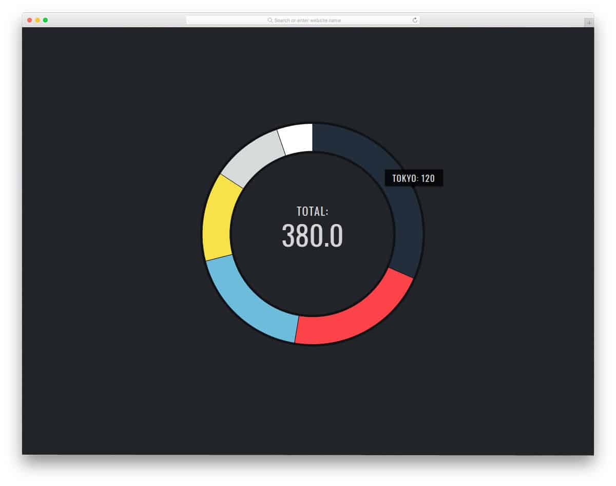
The modern interactive charts help us to visualize the content and get proper value easily. In this design, the developer has used the tooltip to see the value on each part of the chart. Since the tooltip is used for utility purpose, the tooltip is made bigger and bolder. Users can clearly see the contents on the chart. Ample amount of space is given for the elements so that even mobile users can interact with the charts without any issue. To make this dynamic user-friendly chart, the developer has used CSS3 and Javascript. Since it uses the latest web development frameworks, you can make the chart more colorful and interactive.
Google Keep Tooltip Reproduction
Google Keep is one of the widely used free note-taking application. If you are an Android user and uses the web a lot, Google keep is the best app you can use to keep your work synced. The developer Kyle Lavery has tried to reproduce the Google keep environment for this tooltip design. To make the note-taking app easy to use, the tooltip is used effectively to introduce the tools. The tooltip animation in this design is very smooth and clean so that it won’t take much of the user’s time. On the dark tooltip box, the texts are clear and easy to read.
Friendly Little Tooltips

Friendly Little Tooltips is another simple tooltip design for social media icons. In the demo, the developer has shown the tooltip in different directions, but you can stick any one direction that you prefer. More than adequate space is given between each icon in the demo, if you wish to save some space, you can reduce the space between the icons. With rounded edges and small shape, the tooltip box easily fits in the design. By making a few optimizations, you can use this design even on mobile responsive websites. Since it is a CSS3 based design, working on this code and using it on a modern website will be an easy job.
Animated CSS Tooltip

Username is one common area where users constantly need a proper guide. As each website and platform uses different username standards, giving a tooltip will help the user properly use the field. In this design, the developer uses material design, which looks attractive and clean. Clean animation effect is used for the tooltip box and the small shaking effect at the end will get the user attention for sure. This material design tooltip design can be used for both website and mobile application. Take a look at our free login form templates collection for forms with more useful features like this pre-designed for you.
Easy Tooltips

If you are making a digital manual for your product, then this tooltip design will be a good option. Rather than simply showing the icons and highlighting its name, you can use a tooltip to clearly convey the information to the user. In this tooltip design, the developer has made a big white tooltip box to clearly show the message. As always, you can change the effect and color scheme based on your needs. If you are planning for a tooltip design among the regular text contents, this simple design will be a good choice.
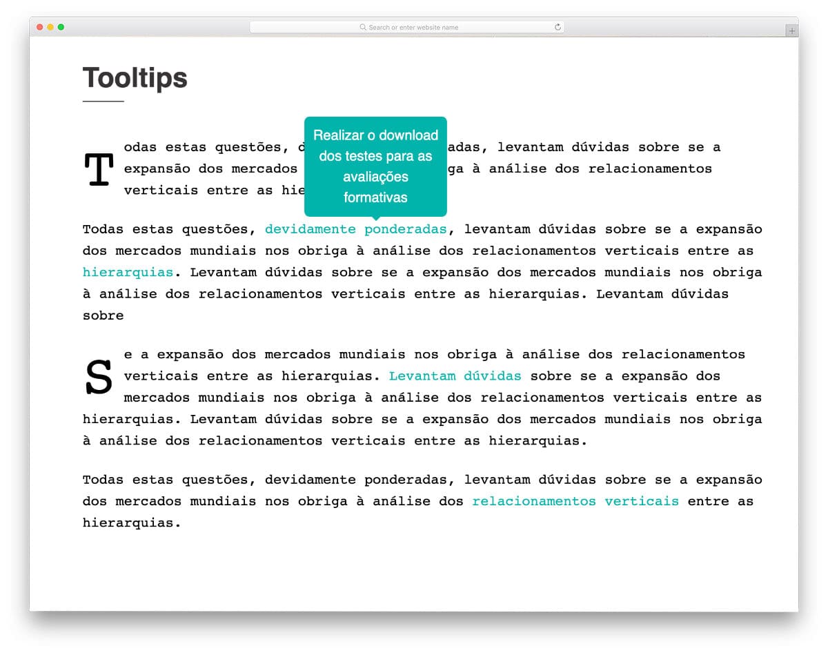
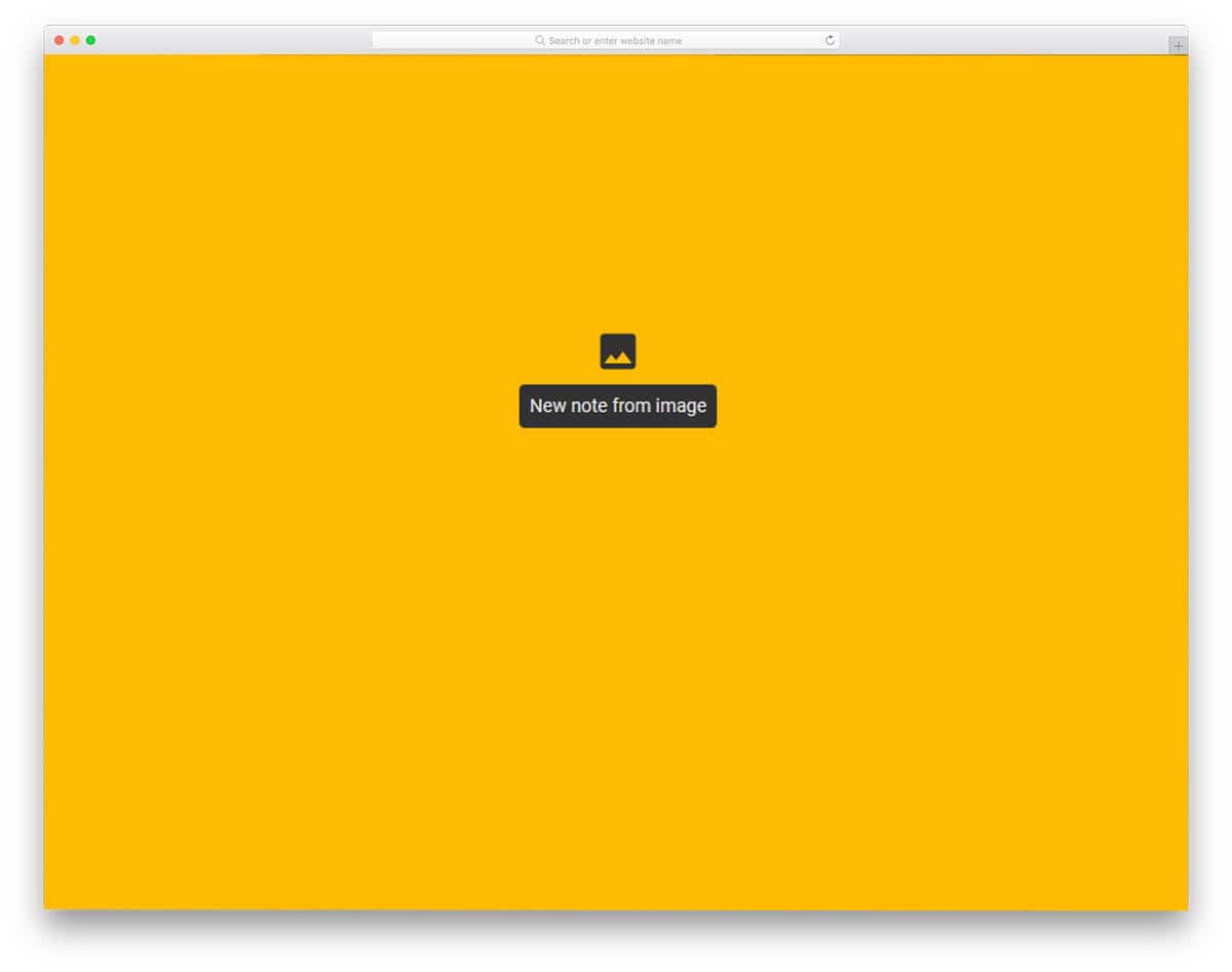
Button With Tooltip
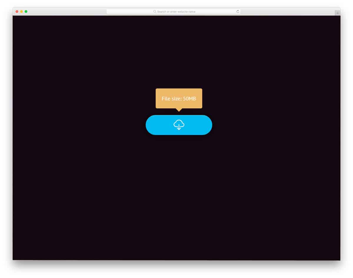
In this design, the developer has used both button animation and tooltip animation. On hovering over the button you will see a download icon and the file size at the top. Rather than simply putting the file size somewhere on the webpage, it is smart to show it in the tooltip. If you are running a directory website for software and free downloads, this design will come in handy for you. The default tooltip box is big enough to accommodate bold texts so that the user can easily read and interact with the element. These sensible animation effects are made using the CSS3 script alone. Hence, customizing and using it will be an easy job for the developers.
Pure CSS Tooltip With Full Shadow Around
This is a typical tooltip design you might have seen in many forms and tools. On hovering over the icon, the details of the particular element will be shown to the user. As the name implies, shadows are used to differentiate the icon from the rest of the element. Because of this simple design, you can easily use this tooltip design on any website or application. All you have to do is to edit the code as per your requirement and use it on your design. Since the code structure is kept simple you can easily add your own features.
Automation Tooltips

Automation Tooltips is another tooltip design for text editors and blogs. You can use this design to show the errors, synonyms of the words, and article suggestions. The tooltip animation is kept simple and swift so that the user doesn’t have to wait for a longer period. Shadows and bright colors are used to highlight the tooltip box. Neat design of the tooltip box makes readability easier, hence these tooltip boxes will give a better user experience. To make this dynamic tooltip box, the developer has used HTML, CSS3, and Javascript frameworks. The entire code structure is shared with you so that you can easily utilize the code for your design.
Tooltips
The developer Elhombretecla has given us a simple tooltip design. Tooltips are shown in all four directions, based on your need you can pick one and start using it. Shadow and depth effects are used to highlight the tooltip box from the rest of the background. The entire code structure is shared with you in the CodePen editor. Hence, you can customize and visualize the design before using it on your project. Therefore it is easy to use and easy to edit design for all types of websites.