
Notifications – 8 Free CSS, Bootstrap & Tailwind Sets
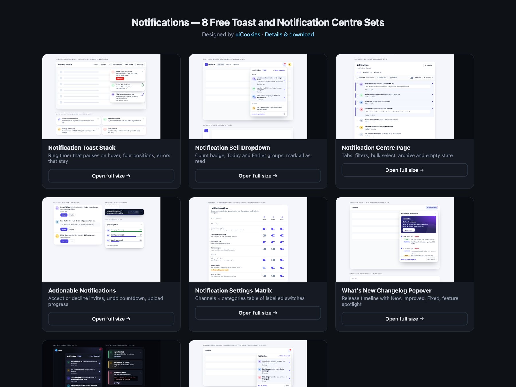
Notifications is a pack of eight sets of toasts and notification centre components, designed and maintained in-house by uiCookies. Every set comes in three versions that look the same: plain HTML and CSS, Bootstrap 5 using .toast, .dropdown, .popover, .list-group, .nav-underline, .form-switch, .table and .progress where they fit, and Tailwind CSS 4. The sets cover a toast stack with a visible timer and four positions, a notification bell with a dropdown panel, a full notification centre page with tabs, filters and bulk actions, actionable notifications such as invitations, an undo toast and an upload toast, a channels by categories settings table, a What's new changelog popover, a dark set and a modern CSS set built on the popover attribute, @starting-style and anchor positioning. Inline banners and form alerts live in the separate Alerts pack.
A good notification tells people what happened without taking over the page. Toasts that disappear on their own need a visible timer that pauses while someone is reading or tabbing through them, and errors should stay until they are closed. Messages need a polite live region so screen readers hear them, with role="alert" kept for the urgent ones. A bell's unread count has to be part of the button's name, not just a red number, and marking things as read should update that count and say so. Panels close with Esc and hand focus back to the bell, and a settings page works best as a real table where every switch is named by its row and column, so Email under Mentions is never just an unlabelled toggle.