
Badges & Avatars – 8 Free CSS, Bootstrap & Tailwind Sets
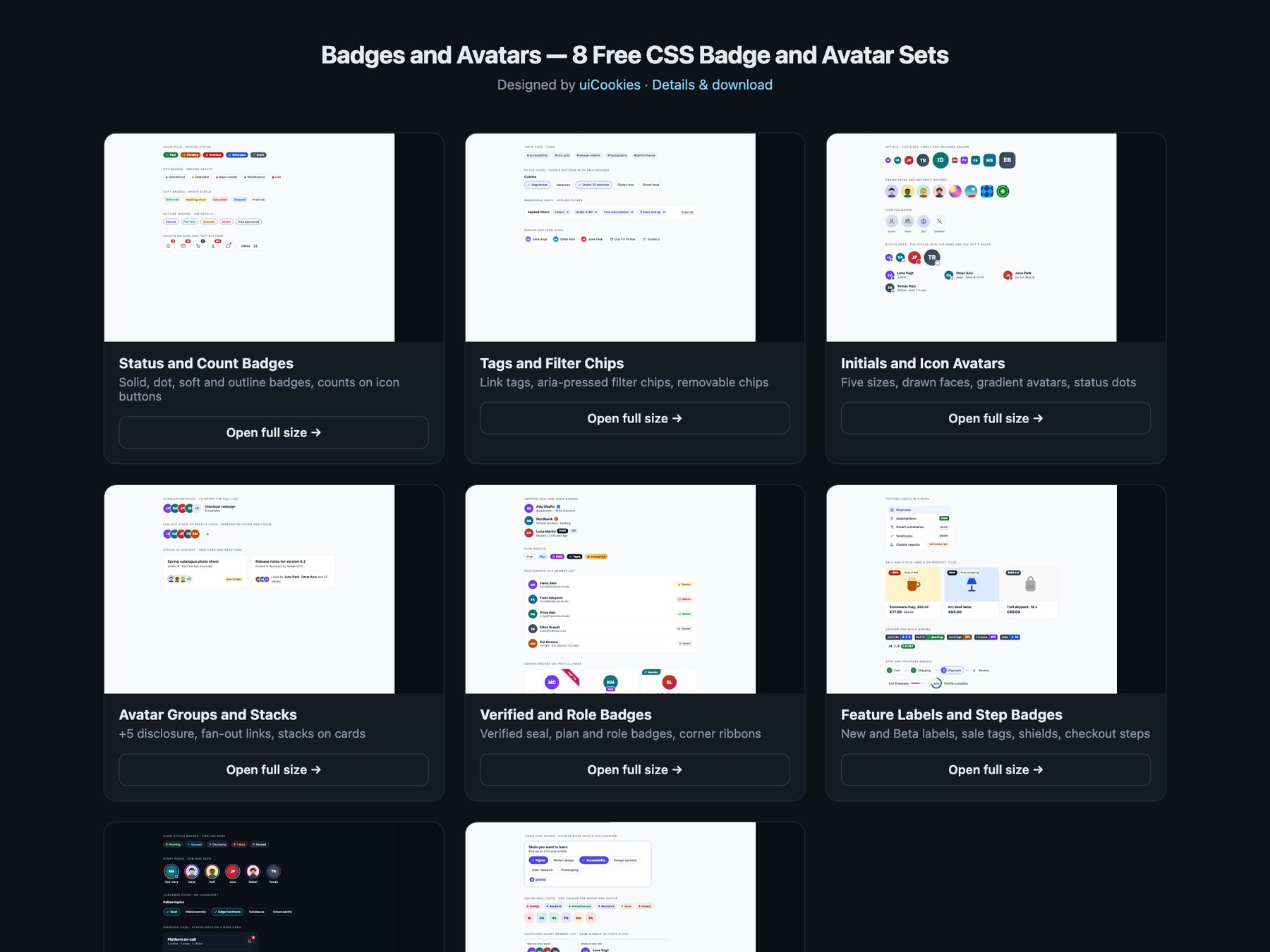
Badges and Avatars is a pack of eight sets of status badges, chips, avatars and labels, designed and maintained in-house by uiCookies. Every set comes in three versions that look the same: plain HTML and CSS, Bootstrap 5 using .badge, .btn, .btn-check, .btn-close, .nav-pills, .list-group, .card, .dropdown-menu and .progress where they fit, and Tailwind CSS 4. The sets cover status and notification count badges, tags and filter chips, initials and icon avatars, avatar groups with an overflow count, verified, plan and role badges, feature, sale, version and step labels, a dark set and a modern CSS set built on :has(), color-mix() and container queries. None of the avatars use photos of people: they are initials, CSS gradients or small faces drawn in SVG. Only the removable and filter chips use JavaScript.
A good badge says its meaning in a word. Green and red mean nothing to a colour-blind reader or a screen reader, so every status here is written out, and status dots on avatars change shape as well as colour. A count on an icon button needs the rest of the sentence, so the button reads Notifications, 3 unread rather than a lone 3. Avatars need a name that does not depend on a hover tooltip, which keyboard and touch users never see, and a +5 overflow should open a list of the people it hides. Filter chips are toggle buttons that report pressed or not pressed, and removing a chip should move keyboard focus somewhere sensible instead of dropping it at the top of the page.