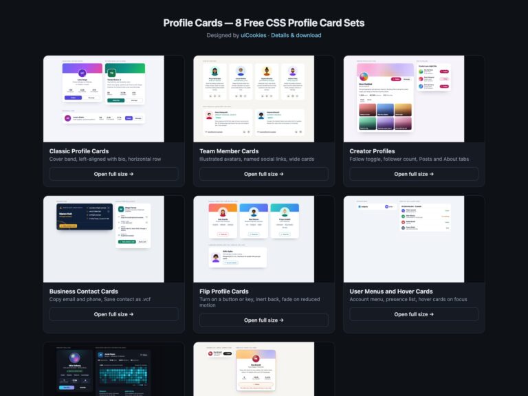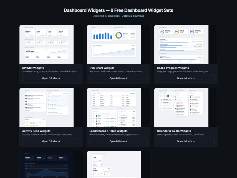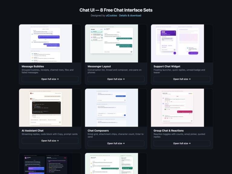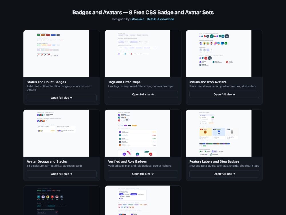
Badges and Avatars is a pack of eight sets of status badges, chips, avatars and labels, designed and maintained in-house by uiCookies. Every set comes in three versions that look the same: plain HTML and CSS, Bootstrap 5 using .badge, .btn, .btn-check, .btn-close, .nav-pills, .list-group, .card, .dropdown-menu and .progress where they fit, and Tailwind CSS 4. The sets cover status and notification count badges, tags and filter chips, initials and icon avatars, avatar groups with an overflow count, verified, plan and role badges, feature, sale, version and step labels, a dark set and a modern CSS set built on :has(), color-mix() and container queries. None of the avatars use photos of people: they are initials, CSS gradients or small faces drawn in SVG. Only the removable and filter chips use JavaScript.
A good badge says its meaning in a word. Green and red mean nothing to a colour-blind reader or a screen reader, so every status here is written out, and status dots on avatars change shape as well as colour. A count on an icon button needs the rest of the sentence, so the button reads Notifications, 3 unread rather than a lone 3. Avatars need a name that does not depend on a hover tooltip, which keyboard and touch users never see, and a +5 overflow should open a list of the people it hides. Filter chips are toggle buttons that report pressed or not pressed, and removing a chip should move keyboard focus somewhere sensible instead of dropping it at the top of the page.
Free download Browse live demos All snippets
The sets
1. Status and Count Badges
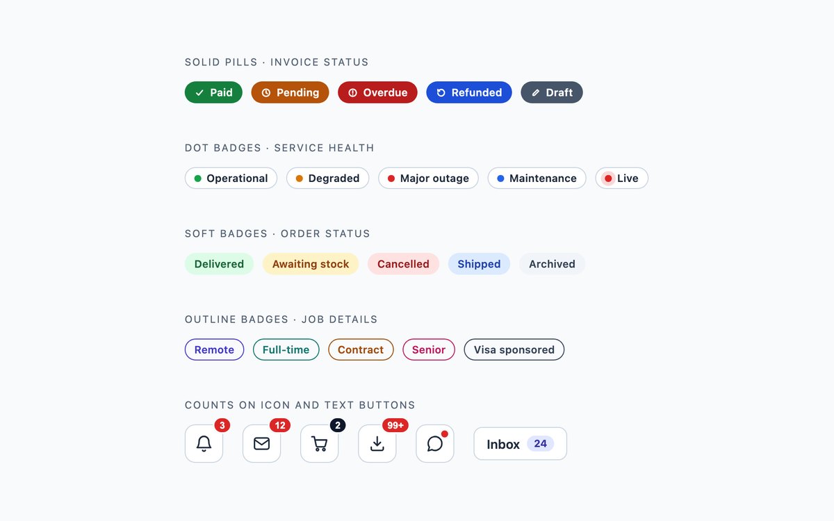
Solid, dot, soft and outline badges for invoices, service health, orders and job details, and notification counts on icon buttons including a 99+ overflow and a dot-only indicator.
Use them wherever a row needs a state. Every badge is a word, and each count carries hidden text such as 12 unread so the button name reads in full.
Live Demo CSS, Bootstrap & Tailwind code
2. Tags and Filter Chips
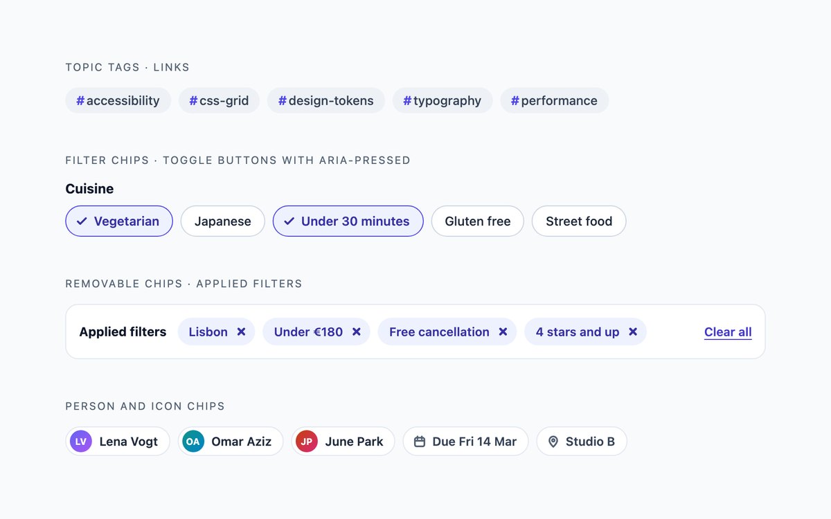
Hashtag link tags, recipe filter chips, the applied filters of a hotel search as removable chips, and person and icon chips.
Filter chips are buttons with aria-pressed and a visible tick. A few lines of JavaScript announce a removed chip and move focus to the next one or to the heading.
Live Demo CSS, Bootstrap & Tailwind code
3. Initials and Icon Avatars
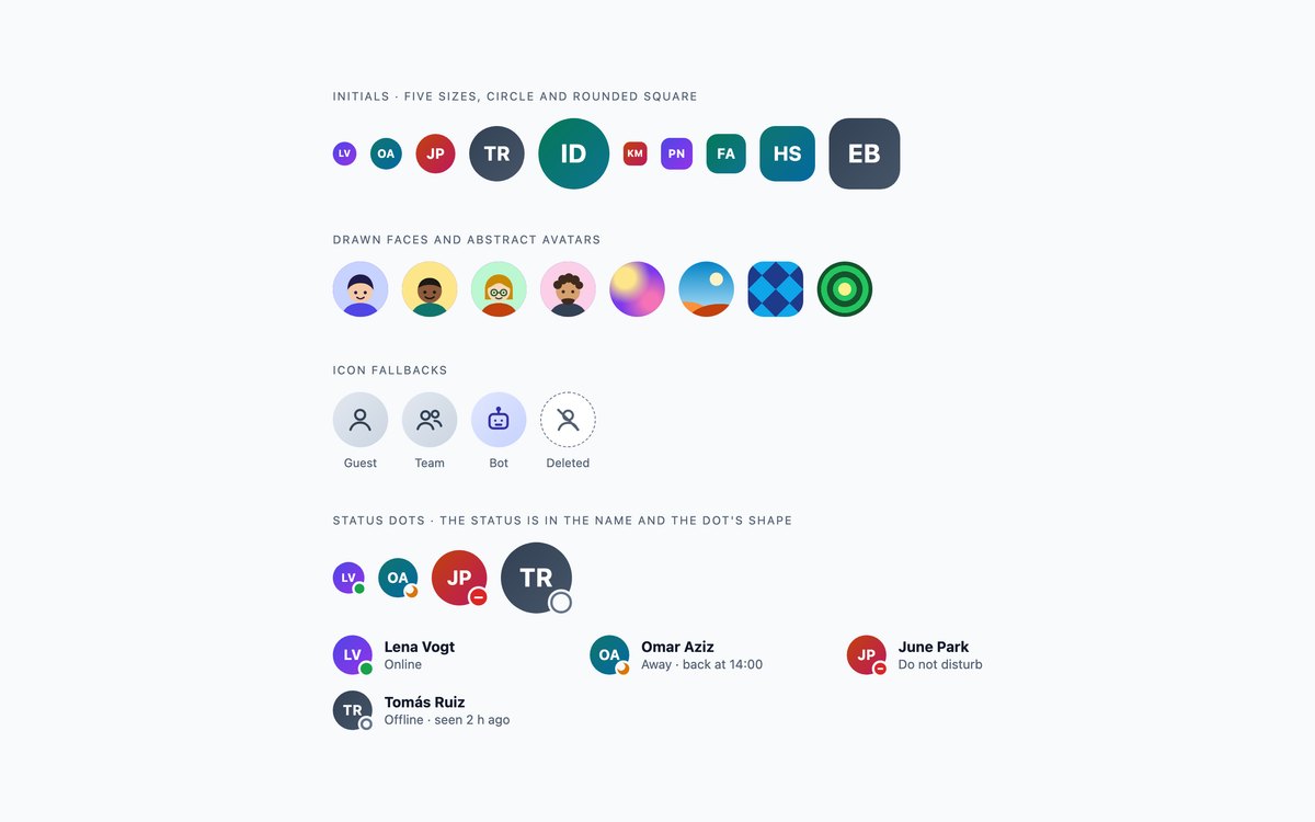
Initials avatars in five sizes as circles and rounded squares, four drawn SVG faces, four gradient avatars, icon fallbacks and presence dots.
Use them when people have not uploaded a picture, or for sample data. Each avatar is role="img" with a name, and status dots differ in shape as well as colour.
Live Demo CSS, Bootstrap & Tailwind code
4. Avatar Groups and Stacks
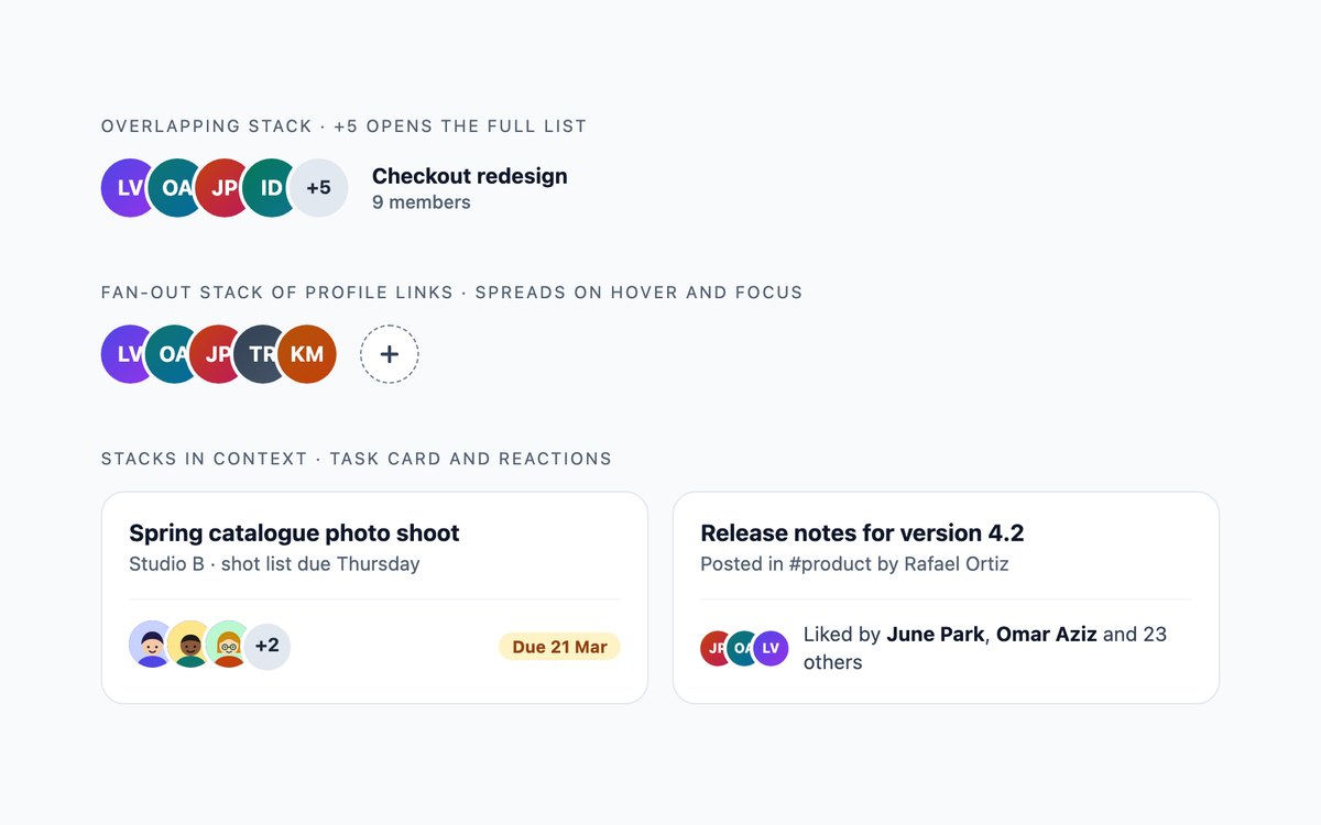
An overlapping stack with a +5 overflow, a fan-out stack of profile links with an add button, and stacks on a task card and a social post.
The +5 is a native details disclosure that lists the hidden members without JavaScript, and no avatar relies on a tooltip for its name.
Live Demo CSS, Bootstrap & Tailwind code
5. Verified and Role Badges
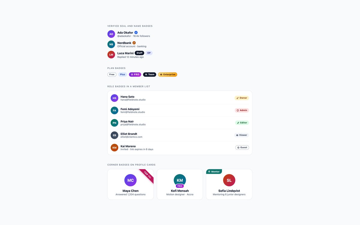
A verified seal, Staff and OP badges, plan badges from Free to Enterprise, role badges in a member list and corner badges on profile cards.
Use them in feeds, account menus and team settings. The seal is an SVG with an aria-label such as Verified account, and every other badge is a visible word.
Live Demo CSS, Bootstrap & Tailwind code
6. Feature Labels and Step Badges
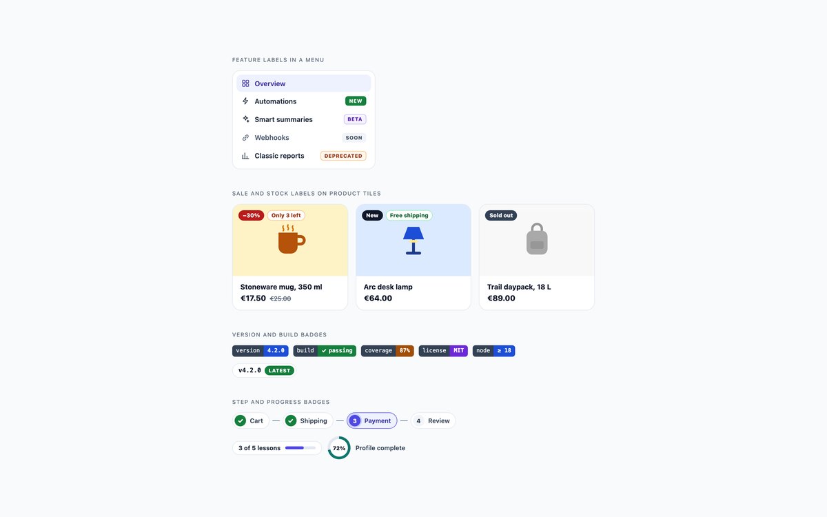
New, Beta, Soon and Deprecated labels in a menu, sale and stock labels on product tiles, shields-style version badges and checkout step and progress badges.
The old price has hidden was text, the current step uses aria-current, and bars and rings always sit next to text with the same value. Bootstrap uses .nav-pills, .card and .progress.
Live Demo CSS, Bootstrap & Tailwind code
7. Dark Badges and Avatars
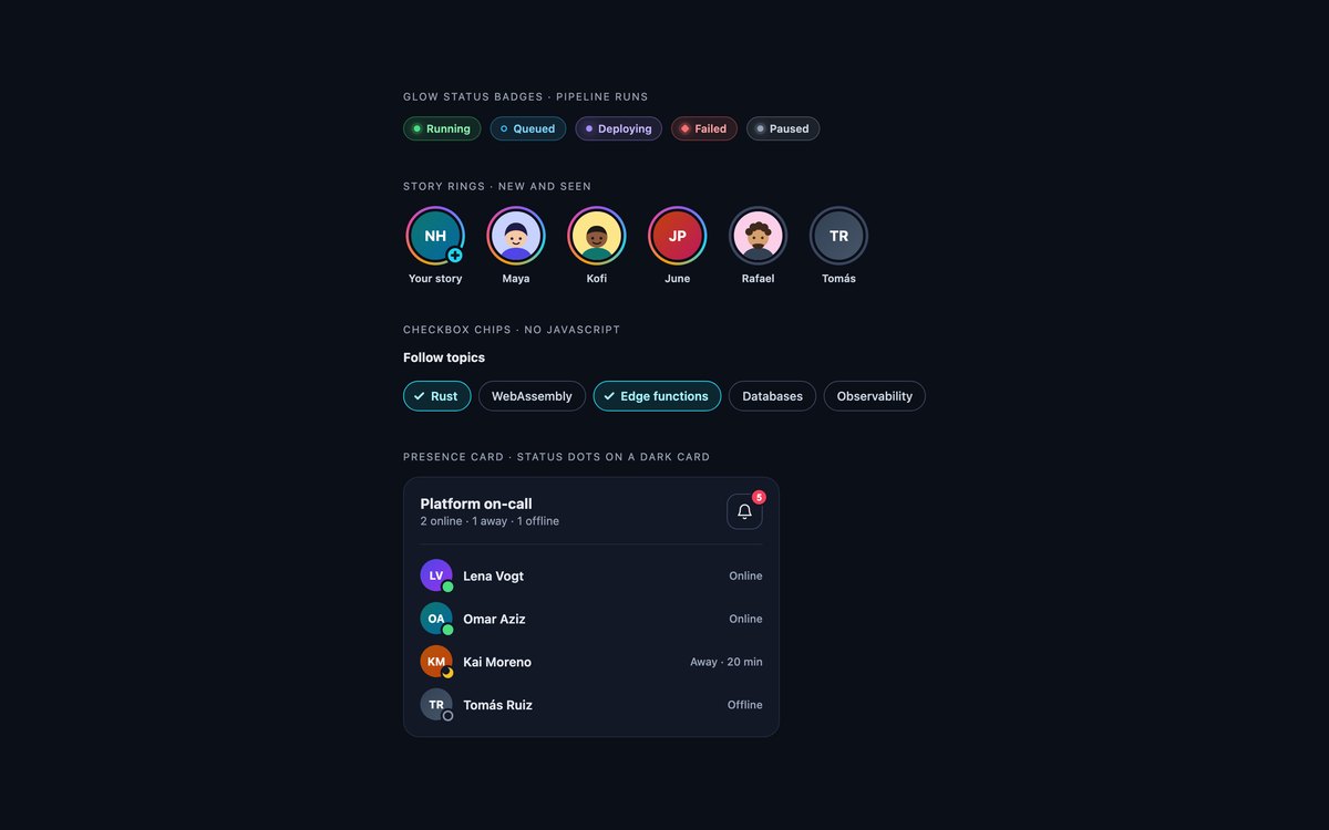
Glow status badges for a pipeline, story rings for new and seen stories, checkbox chips and an on-call presence card with an alerts count.
Colours are lightened for contrast on a near-black ground. The chips are native checkboxes with no JavaScript, and Bootstrap runs in data-bs-theme="dark".
Live Demo CSS, Bootstrap & Tailwind code
8. Modern CSS Badges and Avatars
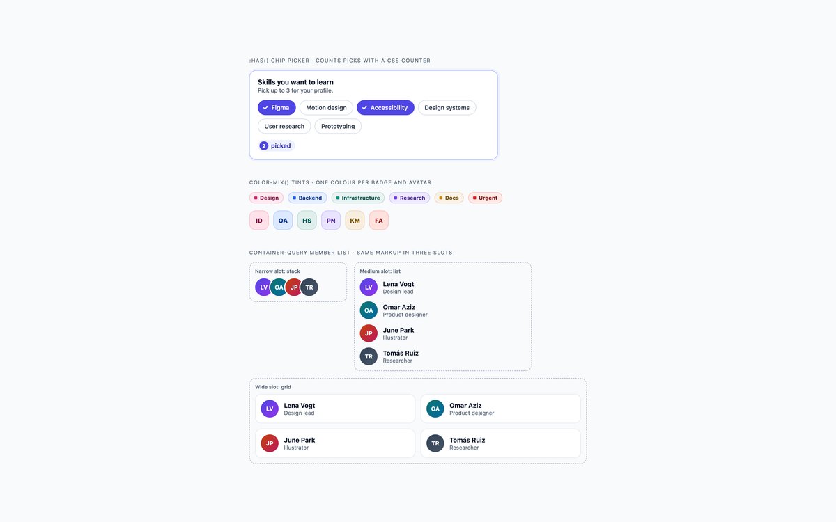
A skills picker that counts and warns past three picks, badges and soft avatars tinted from a single colour, and a member list shown in three slot widths.
:has() and a CSS counter drive the picker, color-mix() derives each tint, and a container query switches the list between a stack, a list and a grid.
Live Demo CSS, Bootstrap & Tailwind code
Frequently asked questions
Are these badges and avatars free for commercial projects?
Yes. Every set is free for personal and commercial projects, including client work and products you sell. Attribution is optional but always welcome. The licence is at uicookies.com/license/.
Do these badges and avatars need JavaScript?
Only set 2 does, with a few lines of vanilla JavaScript and no library that flip aria-pressed on the filter chips and move focus when a chip is removed. The +5 overflow list uses a native details element, the dark chips and the skills picker are native checkboxes, and the picker counts with :has() and a CSS counter. The Bootstrap versions do not load Bootstrap’s JavaScript bundle.
Are the badges and avatars accessible?
Every status is written as a word, and status dots change shape as well as colour. Avatars have names through role="img" and aria-label, hidden link text or visible text, never only a tooltip, and counts on icon buttons read in full, such as Messages, 12 unread. Every control shows a visible focus outline, motion stops under prefers-reduced-motion, and every set passes an automated axe-core WCAG 2.1 AA check.
Which frameworks are included?
Every set has three files that look the same: plain HTML and CSS, Bootstrap 5.3.8 and Tailwind CSS 4. The Bootstrap files use .badge, .btn, .btn-check, .btn-close, .nav-pills, .list-group, .card, .dropdown-menu and .progress where they fit, with a small style block for the rest. The Tailwind files use utility classes in the markup, with a style block only for a keyframe or the CSS counter.
How do I show an avatar when a user has no profile photo?
Show their initials on a coloured background and give the element role="img" with the full name as its aria-label, so screen readers read the name rather than two letters. Pick a background dark enough for white text, or derive a light tint and dark text from one colour with color-mix() as set 8 does. For accounts that are not people, such as a team or a bot, use an icon instead, as in set 3.