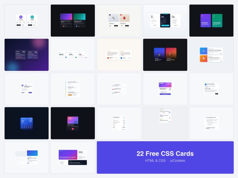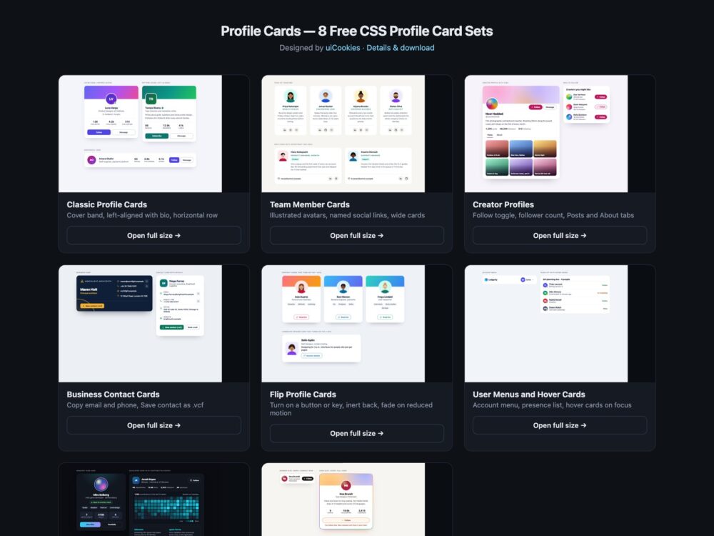
Profile Cards is a pack of eight sets of user profile cards and team member cards, designed and maintained in-house by uiCookies. Every set comes in three versions that look the same: plain HTML and CSS, Bootstrap 5 using .card, .btn, .badge, the grid and, where they fit, its dropdown, tab and button plugins, and Tailwind CSS 4. The sets cover classic cards with a cover and stats, team grids with social links, creator profiles with a Follow toggle and tabs, business cards with copy buttons and a vCard download, flip cards, account menus and hover cards, a dark set and a modern CSS set built on container queries, :has() and @property. No set uses photos of people: the avatars are initials, abstract gradients or illustrations drawn for the pack, and every name is fictional.
A good profile card says who someone is in a glance and lets you act on it without guessing. The name is a real heading, the numbers are labelled so that 4.2k is read as 4.2k followers, and the avatar is decoration rather than the only place the name appears. On a page with twenty cards, every Follow or Message control needs the person’s name in its accessible name, otherwise a screen reader user hears twenty identical buttons. A Follow toggle should announce its state, a flip card should turn on a button rather than on hover alone, and a hover card has to open on keyboard focus too and close with Escape. Contact details work best as real mailto: and tel: links with a way to copy them.
Free download Browse live demos All snippets
The sets
1. Classic Profile Cards
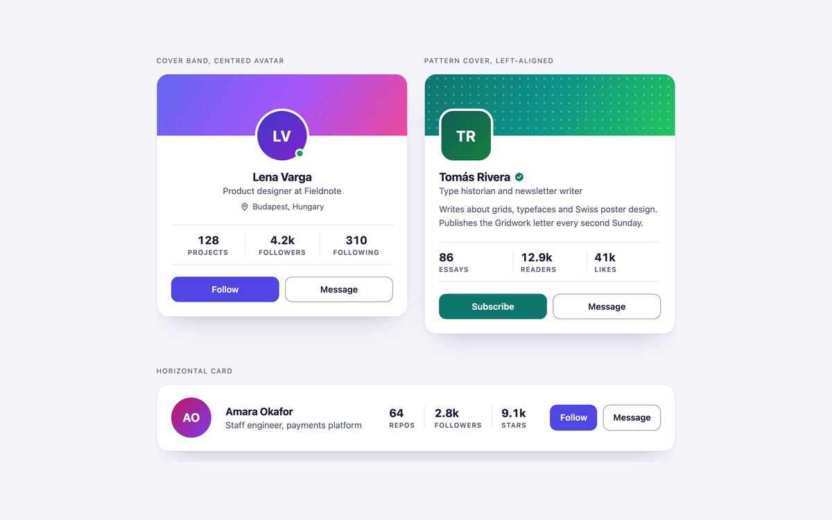
A centred card with a gradient cover, a left-aligned card with a dotted cover, a verified badge and a bio, and a horizontal card for directories.
Use them for author boxes, member directories and account pages. Stats are a description list, and each button includes the person’s name for screen readers.
Live Demo CSS, Bootstrap & Tailwind code
2. Team Member Cards
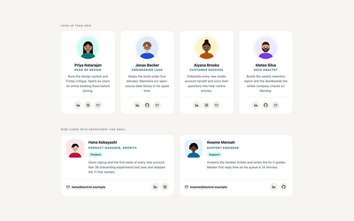
A four-up team grid with illustrated SVG avatars, roles, short bios and social icon links, and wide cards with a department tag and an email address.
Use them on About and Team pages. Every icon link is named, such as Priya Natarajan on LinkedIn, and the grid reflows to one column on phones.
Live Demo CSS, Bootstrap & Tailwind code
3. Creator Profile Cards
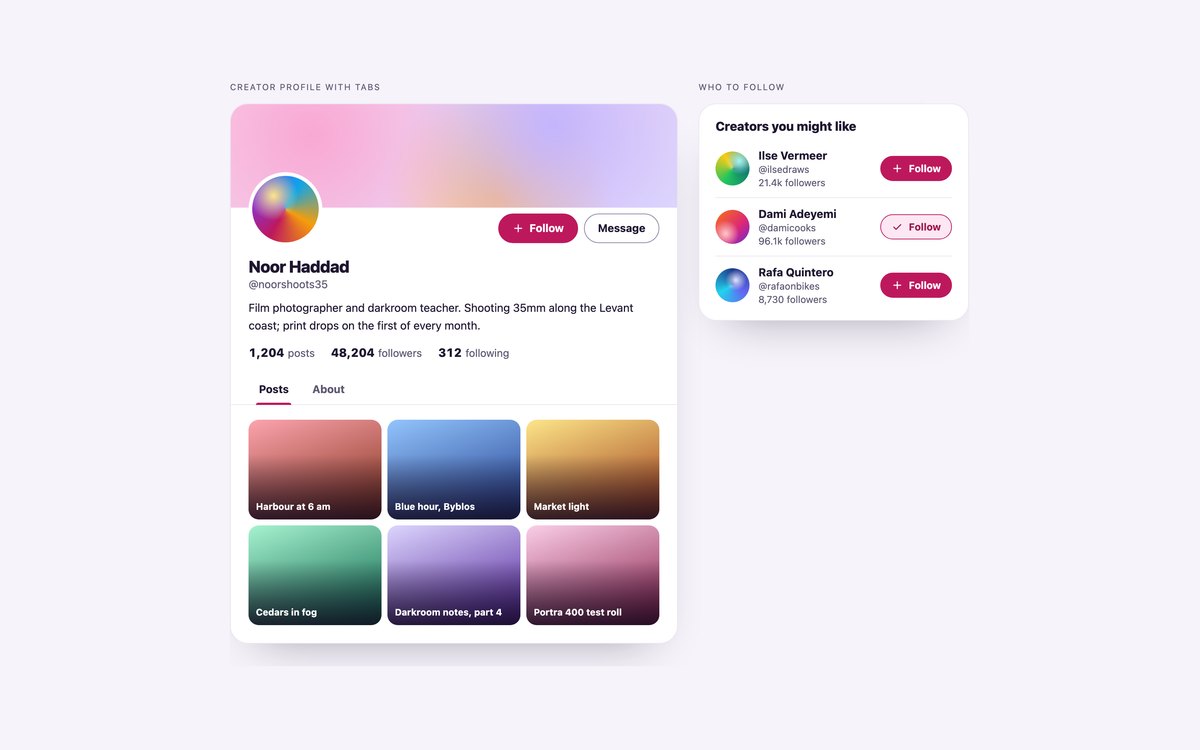
A creator profile with follower counts, a Follow toggle and Posts and About tabs, and a Who to follow list with a toggle per creator.
Follow is a button with aria-pressed that updates the follower count, and the tabs follow the ARIA tabs pattern with arrow keys. About thirty lines of vanilla JavaScript run both.
Live Demo CSS, Bootstrap & Tailwind code
4. Business Contact Cards
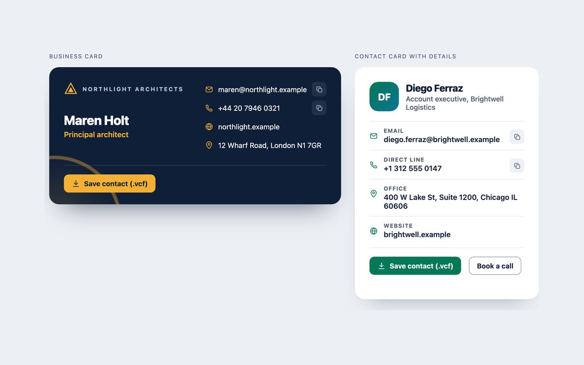
A navy business card and a light contact card, each with mailto: and tel: links, copy buttons and a Save contact button.
Save contact downloads a vCard built in the browser from the card’s own text, and it works without JavaScript too. Copying is announced in a status line.
Live Demo CSS, Bootstrap & Tailwind code
5. Flip Profile Cards
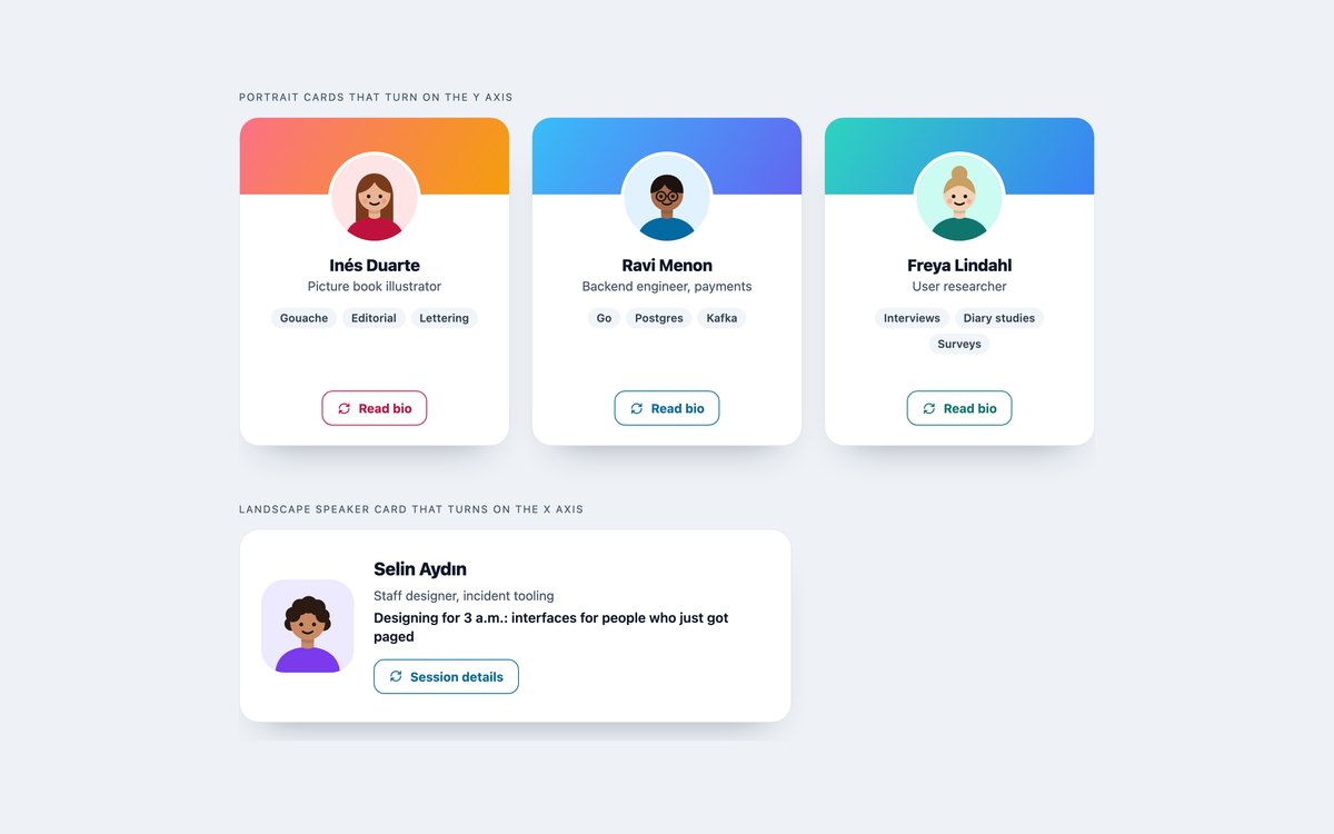
Three portrait cards that turn on the Y axis to show a bio, facts and links, and a landscape speaker card that turns on the X axis to show session details.
They turn on a button press, not hover, so they work with touch and keyboard. The hidden face is inert, Escape turns the card back, and reduced motion swaps the turn for a fade.
Live Demo CSS, Bootstrap & Tailwind code
6. User Menus and Hover Cards
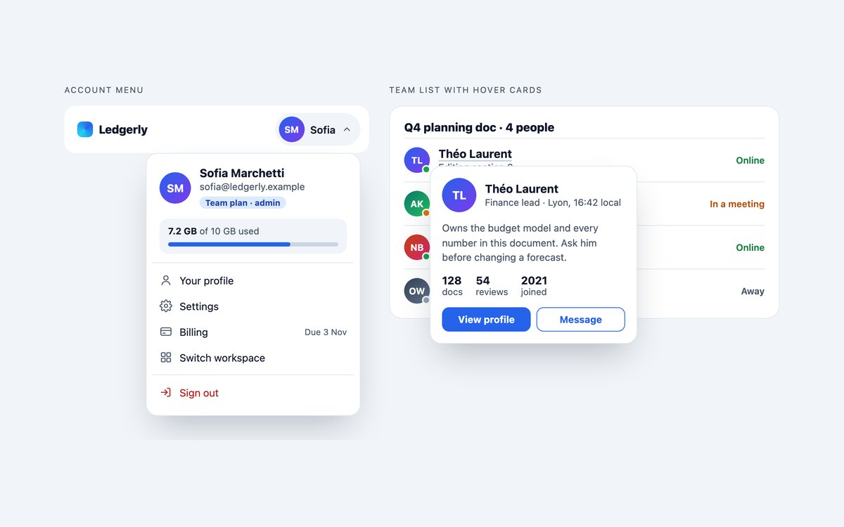
An account menu with a mini profile, storage meter and Sign out, and a team list with presence where each name opens a hover card.
The menu closes with Escape, a click outside or tabbing away. Hover cards open on focus as well as hover, stay open while you move into them and close with Escape.
Live Demo CSS, Bootstrap & Tailwind code
7. Dark Profile Cards
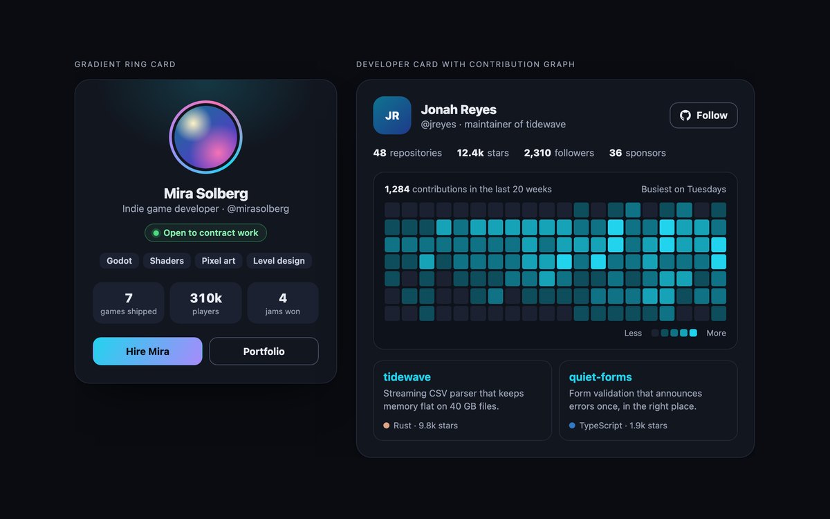
A card with a conic gradient avatar ring, skills and stat tiles, and a developer card with a twenty-week contribution graph and pinned repositories.
Colours are checked for contrast on a near-black ground. The contribution graph is a CSS grid with one text label, and Bootstrap runs it in data-bs-theme="dark".
Live Demo CSS, Bootstrap & Tailwind code
8. Modern CSS Profile Cards
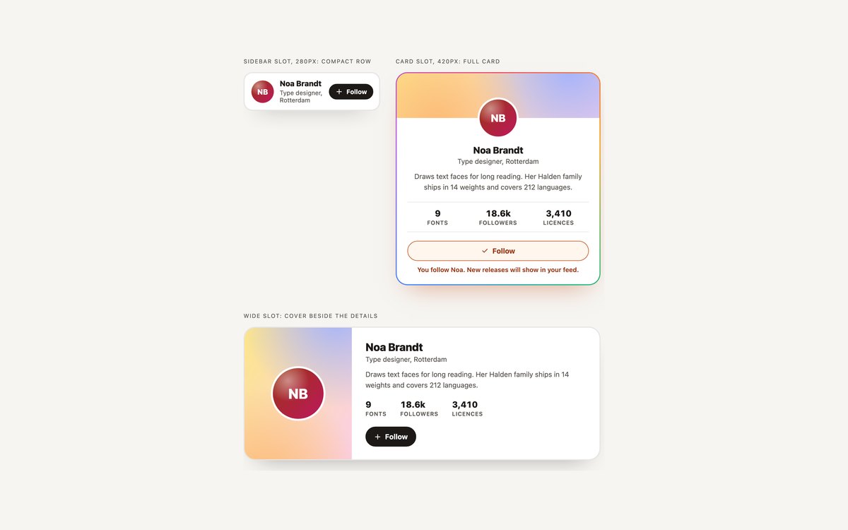
One card shown in three slots: a compact row in a 280 pixel sidebar, a full card from 320 pixels and a wide card with the cover beside the details from 600 pixels.
Container queries pick the layout from the slot width, :has() marks a followed card without JavaScript, and @property lets the gradient border spin on hover.
Live Demo CSS, Bootstrap & Tailwind code
Frequently asked questions
Are these profile cards free for commercial projects?
Yes. Every set is free for personal and commercial projects, including client work and products you sell. Attribution is optional but always welcome. The licence is at uicookies.com/license/.
Do these profile cards need JavaScript?
Sets 01, 02, 07 and 08 need none. The creator profile uses about thirty lines of vanilla JavaScript for the Follow toggle and the tabs, the contact cards use a short script for the copy buttons and to rebuild the vCard, the flip cards use one to turn the card and manage focus, and the account menu uses one to open and close. No set loads a library; the Bootstrap versions of sets 03 and 06 use Bootstrap’s own bundle for tabs, toggle buttons and the dropdown.
Are the profile cards accessible?
Each card is labelled by the person’s name, stats are description lists, and every Follow, Message and social link includes the person’s name in its accessible name. The Follow toggle announces its pressed state, the tabs follow the ARIA tabs pattern, hover cards open on keyboard focus and close with Escape, and flip cards make the hidden face inert. Every control has a visible focus outline, motion stops under prefers-reduced-motion, and every set passes an automated axe-core WCAG 2.1 AA check.
Which frameworks are included?
Every set has three files that look the same: plain HTML and CSS, Bootstrap 5.3.8 and Tailwind CSS 4. The Bootstrap files use .card, .btn, .btn-check, .badge, .list-group, .nav-underline, .dropdown-menu, .progress and the grid where they fit, with a small style block for the rest. The Tailwind files use utility classes, including @container variants, has-checked and aria-pressed variants, with a style block only where a keyframe, @property or the flip mechanics need it.
How do I make a vCard download button for a contact card?
Write the contact as vCard 3.0 text, with lines such as BEGIN:VCARD, FN, EMAIL, TEL and END:VCARD, then put it in a link as a data:text/vcard URL with a download attribute such as download="maren-holt.vcf". That works with no script. Set 04 also rebuilds the link from the fields shown on the card, so the file always matches the visible details.