/* Bootstrap Tooltip for icon buttons and truncated names, Bootstrap Popover for the "?" toggletip, restyled through their CSS variables.
The script triggers them so they open on hover, focus and tap, stay open under the pointer and close with Esc. */
.tooltip.tt{--bs-tooltip-bg:#111b30;--bs-tooltip-color:#f5f8ff;--bs-tooltip-opacity:1;--bs-tooltip-max-width:240px;--bs-tooltip-padding-x:10px;--bs-tooltip-padding-y:6px;
--bs-tooltip-font-size:.8125rem;--bs-tooltip-border-radius:7px;--bs-tooltip-arrow-width:12px;--bs-tooltip-arrow-height:6px;font-family:inherit}
.tooltip.tt .tooltip-inner{font-weight:500;line-height:1.45;box-shadow:0 10px 24px -10px rgba(15,23,42,.55)}
.tooltip.tt-file{--bs-tooltip-max-width:300px}
.tooltip.tt-file .tooltip-inner{overflow-wrap:anywhere}
.popover.tg-pop{--bs-popover-bg:#111b30;--bs-popover-border-color:#111b30;--bs-popover-arrow-border:#111b30;--bs-popover-max-width:250px;--bs-popover-font-size:.8125rem;
--bs-popover-border-radius:7px;--bs-popover-inner-border-radius:7px;--bs-popover-body-padding-x:11px;--bs-popover-body-padding-y:8px;--bs-popover-body-color:#f5f8ff;
--bs-popover-arrow-width:12px;--bs-popover-arrow-height:6px;font-family:inherit;line-height:1.45;box-shadow:0 10px 24px -10px rgba(15,23,42,.55)}
/* Icon toolbar */
.bar{display:inline-flex;flex-wrap:wrap;gap:2px;padding:4px;border:1px solid #d5dce8;border-radius:12px;background:#fff;box-shadow:0 1px 2px rgba(15,23,42,.05)}
.bar .vr{margin:6px 4px;background:#dce2ec;opacity:1}
.ib{--bs-btn-padding-x:0;--bs-btn-padding-y:0;--bs-btn-color:#3b4760;--bs-btn-border-width:0;--bs-btn-border-radius:8px;--bs-btn-hover-bg:#eef2f8;--bs-btn-hover-color:#18233a;
--bs-btn-active-bg:#e3ecff;--bs-btn-active-color:#1d4ed8;display:grid;place-items:center;width:36px;height:36px}
.ib[aria-pressed="true"]{background:#e3ecff;color:#1d4ed8}
.ib svg{width:18px;height:18px}
/* Form */
.form-label{margin:0;font-size:.875rem;font-weight:600}
.form-control{--bs-border-color:#8d99ae;height:42px;border-radius:9px;font-size:.9375rem;color:#18233a}
.form-control:focus{border-color:#2563eb;box-shadow:none}
.form-control:focus-visible{outline:2px solid #2563eb;outline-offset:1px}
.form-text{margin-top:6px;color:#536079;font-size:.8125rem}
.help{display:grid;place-items:center;width:20px;height:20px;padding:0;border:1.5px solid #6b7890;border-radius:50%;background:#fff;color:#3b4760;font-size:.75rem;font-weight:700;line-height:1}
.help:hover,.help[aria-expanded="true"]{border-color:#2563eb;background:#2563eb;color:#fff}
/* Files */
.files{max-width:440px;--bs-list-group-border-color:#e6ebf2;--bs-list-group-item-padding-x:0;--bs-list-group-item-padding-y:10px}
.ft{display:grid;place-items:center;flex:none;width:34px;height:40px;border-radius:7px;background:#e3ecff;color:#1d4ed8;font-size:.625rem;font-weight:800;line-height:1;letter-spacing:.04em}
.ft.doc{background:#dff3ff;color:#075985}.ft.fig{background:#f3e8ff;color:#7e22ce}
.trunc{display:block;flex:1;min-width:0;color:#18233a;font-weight:600;font-size:.9rem;text-decoration:none;border-radius:4px}
.trunc:hover{color:#1d4ed8;text-decoration:underline}
.meta{flex:none;color:#536079;font-size:.8125rem}
@media (hover:none){.trunc.text-truncate{white-space:normal;overflow-wrap:anywhere}}
:is(.ib,.help,.trunc):focus-visible{outline:2px solid #2563eb;outline-offset:2px;box-shadow:none}
/* Bootstrap's fade is off (animation: false avoids a show/hide race when Esc is pressed mid-fade); this fades it in instead. */
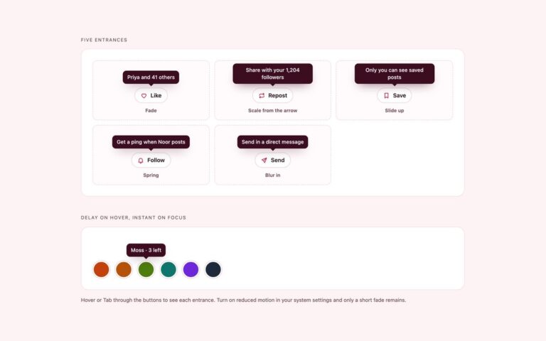
.tooltip.show{animation:tt-in .15s ease-out}
@keyframes tt-in{from{opacity:0}}
@media (prefers-reduced-motion:reduce){.tooltip.show{animation:none}.tooltip,.popover,.ib{transition:none}}
JavaScript
(() => {
// Bootstrap Tooltip, triggered here (WCAG 1.4.13): hover, focus and tap open it, it stays open under the pointer and Esc closes it.
// data-tt-label: the tooltip repeats the button's aria-label, so Bootstrap's aria-describedby is dropped to avoid reading it twice.
// data-tt-clip: only show the tooltip when the text is actually cut off.
const tips = new Map();
const hideTips = keep => tips.forEach(t => t !== keep && t.hide());
document.querySelectorAll('[data-bs-toggle="tooltip"]').forEach(el => {
const tip = new bootstrap.Tooltip(el, { trigger: 'manual', animation: false, offset: [0, 10], customClass: ('tt ' + (el.dataset.bsCustomClass || '')).trim() });
tips.set(el, tip);
let open = false, timer;
el.addEventListener('show.bs.tooltip', e => { if ('ttClip' in el.dataset && el.scrollWidth <= el.clientWidth) e.preventDefault(); else open = true; });
el.addEventListener('hide.bs.tooltip', () => { open = false; });
el.addEventListener('inserted.bs.tooltip', () => {
if ('ttLabel' in el.dataset) el.removeAttribute('aria-describedby');
tip.tip.addEventListener('mouseenter', () => clearTimeout(timer));
tip.tip.addEventListener('mouseleave', leave);
});
const show = () => { clearTimeout(timer); hideTips(tip); if (!open) tip.show(); };
const leave = () => { clearTimeout(timer); timer = setTimeout(() => { if (el !== document.activeElement) tip.hide(); }, 150); };
el.addEventListener('mouseenter', show);
el.addEventListener('focus', () => { clearTimeout(timer); if (!open) tip.show(); });
el.addEventListener('mouseleave', leave);
el.addEventListener('blur', () => { if (!el.matches(':hover')) tip.hide(); });
});
// Toggletips: Bootstrap Popover opened by click; a visually hidden status region reads the text out. Esc or a click elsewhere closes it.
const pops = [];
document.querySelectorAll('[data-bs-toggle="popover"]').forEach(btn => {
const pop = new bootstrap.Popover(btn, { trigger: 'click', offset: [0, 10], customClass: 'tg-pop', container: btn.parentElement });
const live = btn.parentElement.querySelector('[role="status"]');
pops.push([btn, pop]);
btn.addEventListener('shown.bs.popover', () => {
btn.setAttribute('aria-expanded', 'true'); btn.removeAttribute('aria-describedby');
setTimeout(() => { live.textContent = btn.dataset.bsContent; }, 60);
});
btn.addEventListener('hide.bs.popover', () => { btn.setAttribute('aria-expanded', 'false'); live.textContent = ''; });
});
const closePops = () => pops.forEach(([btn, pop]) => btn.getAttribute('aria-expanded') === 'true' && pop.hide());
document.addEventListener('pointerdown', e => {
if (![...tips.keys()].some(el => el.contains(e.target)) && !e.target.closest('.tooltip')) hideTips();
if (!e.target.closest('.popover, [data-bs-toggle="popover"]')) closePops();
});
document.addEventListener('keydown', e => { if (e.key === 'Escape') { hideTips(); closePops(); } });
})();
@theme {
--color-tt: #111b30;
--color-tt-ink: #f5f8ff;
}
/* tt-open: a tooltip inside a .tt wrapper that is hovered, holds focus or was opened by tap, and was not dismissed with Esc. */
@custom-variant tt-open (&:is(:where(.tt):is(:hover, :focus-within, .is-open):not(.is-dismissed) > *));
/* tg-open: the bubble of a toggletip whose "?" button was clicked. */
@custom-variant tg-open (&:is(:where(.tg).is-open > *));
JavaScript
(() => {
  const fit = t => {
    const tip = t.querySelector(':scope > .tt-top, :scope > .tt-bottom'); if (!tip) return;
    tip.style.removeProperty('--tt-nudge');
    requestAnimationFrame(() => {
      const r = tip.getBoundingClientRect(), w = document.documentElement.clientWidth;
      const d = r.left < 8 ? 8 - r.left : r.right > w - 8 ? w - 8 - r.right : 0;
      if (d) tip.style.setProperty('--tt-nudge', d + 'px');
    });
  };
  // Truncated names: mark the ones that are actually cut off, so only those get a tooltip.
  const clip = () => document.querySelectorAll('.tt.tr').forEach(t => { const a = t.firstElementChild; t.toggleAttribute('data-clipped', a.scrollWidth > a.clientWidth); });
  clip(); addEventListener('resize', clip);

  // Tooltips (WCAG 1.4.13): Esc dismisses without moving focus, a tap opens one on touch screens, one open at a time.
  const tts = [...document.querySelectorAll('.tt')];
  const enter = t => { tts.forEach(o => o !== t && o.classList.remove('is-open')); t.classList.remove('is-dismissed'); fit(t); };
  tts.forEach(t => { t.addEventListener('pointerenter', () => enter(t)); t.addEventListener('focusin', () => enter(t)); if (t.classList.contains('is-open')) fit(t); });

  // Toggletips: the "?" button opens its bubble on click and a status region reads the text out; Esc or a click elsewhere closes it.
  const tgs = [...document.querySelectorAll('.tg')];
  const setTip = (tg, open) => {
    const btn = tg.querySelector('[data-toggletip]'), live = tg.querySelector('[role="status"]');
    tg.classList.toggle('is-open', open); btn.setAttribute('aria-expanded', open);
    live.textContent = '';
    if (open) { fit(tg); setTimeout(() => { live.textContent = document.getElementById(btn.getAttribute('aria-controls')).textContent; }, 60); }
  };
  tgs.forEach(tg => tg.querySelector('[data-toggletip]').addEventListener('click', () => setTip(tg, !tg.classList.contains('is-open'))));

  document.addEventListener('pointerdown', e => {
    const t = e.target.closest('.tt');
    if (!t) tts.forEach(o => o.classList.remove('is-open')); else if (e.pointerType === 'touch') t.classList.add('is-open');
    tgs.forEach(tg => !tg.contains(e.target) && tg.classList.contains('is-open') && setTip(tg, false));
  });
  document.addEventListener('keydown', e => {
    if (e.key !== 'Escape') return;
    tgs.forEach(tg => tg.classList.contains('is-open') && setTip(tg, false));
    tts.filter(t => t.matches(':hover, :focus-within, .is-open')).forEach(t => { t.classList.remove('is-open'); t.classList.add('is-dismissed'); });
  });
})();
About this set
Three places where a tooltip does real work. Icon buttons named by their tooltip is a text formatting toolbar, with Bold, Italic, Insert link, Bulleted list, Quote and Add image, where each icon-only button takes its accessible name from its tooltip through aria-labelledby, so the name is written once and read the same way by screen readers. Help toggletip on a form field puts a question mark button next to VAT number: a click opens a bubble explaining why the number is asked for, and a status region reads it out. The rule people must follow, that it starts with the country code, stays visible as hint text under the field instead of hiding in the bubble. Full text of a truncated name lists shared files whose long names are cut off with an ellipsis; the tooltip shows the full name, but only when the name is actually cut, and on touch screens the names wrap instead. The Bootstrap version uses Bootstrap Tooltip for the toolbar and the file names and Bootstrap Popover for the toggletip.
What’s included
Icon buttons labelled by their tooltip with aria-labelledby
A click toggletip whose text is announced through role="status"
Essential help kept as visible hint text
Tooltip only on file names that are really truncated
Names wrap instead on touch screens
Esc closes tooltips and the toggletip
Accessibility
Toolbar buttons are named by their tooltips, so screen readers say Bold, toggle button, pressed, and the tooltip is not read twice; Bootstrap drops its extra aria-describedby for the same reason. The toggletip button has an aria-label and aria-expanded, and its text is announced in a status region when it opens. File links already contain the full name, so their tooltips are hidden from screen readers. Esc dismisses everything, focus outlines are visible and the fades stop under prefers-reduced-motion.
Customise it
Set --tt-bg and --tt-ink on .tt and .tg in plain CSS, the --bs-tooltip-* and --bs-popover-* variables on .tooltip.tt and .popover.tg-pop in Bootstrap, and the --color-tt theme colours in Tailwind. The help button colour is the #2563eb hover and expanded state.