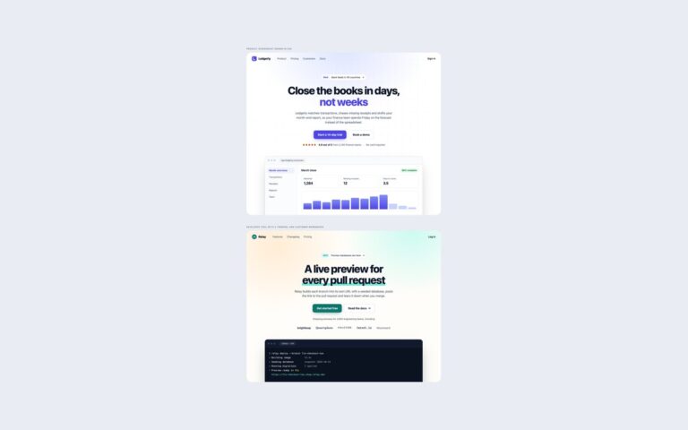
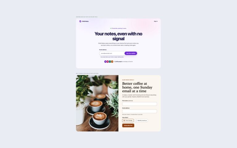
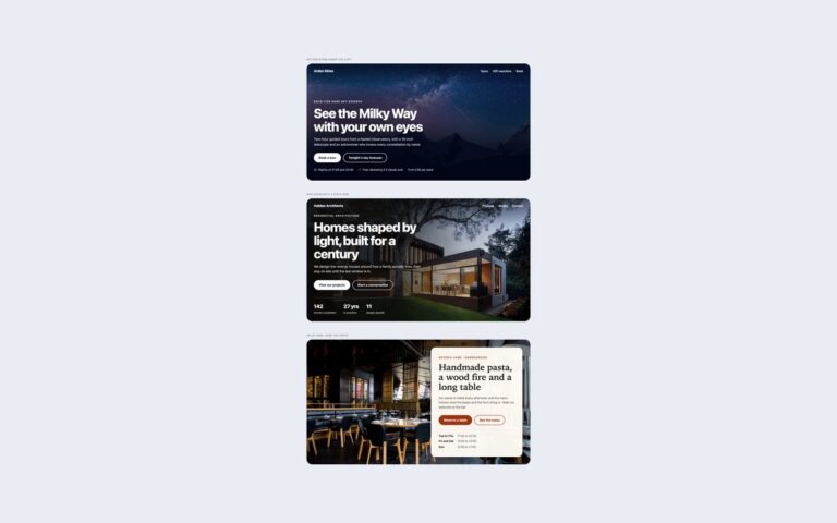
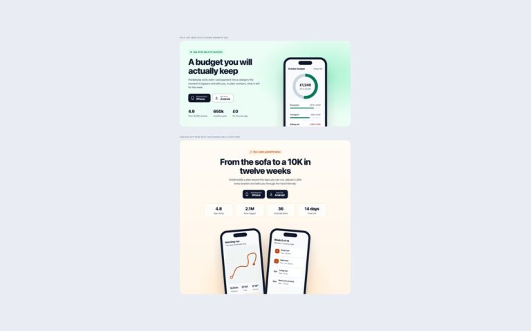
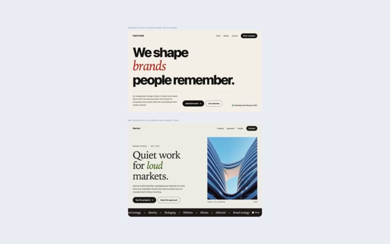
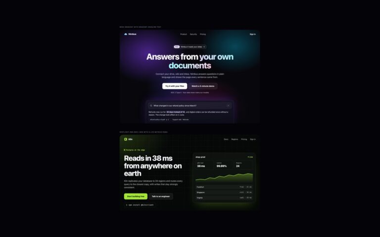
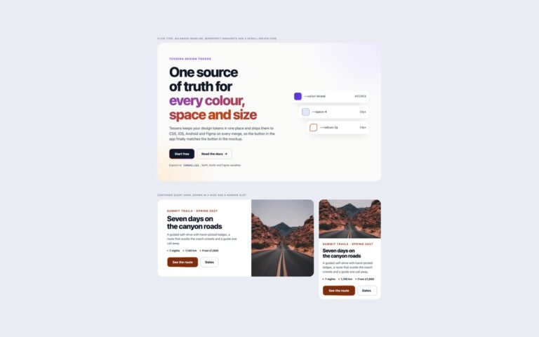
Open demo

CSS code

HTML
<div><span class="lbl">Copy and image with a floating detail card</span>
<section class="sp sp-green" aria-labelledby="sp-green-title">
  <div>
    <p class="sp-kicker">Plant care, delivered</p>
    <h1 class="sp-title" id="sp-green-title">Healthy houseplants without the guesswork</h1>
    <p class="sp-sub">Greenroom picks plants for the light in your home, ships them in peat-free soil and sends a care card for each one, written by our growers in Somerset.</p>
    <div class="sp-ctas"><a class="sp-btn" href="#">Build your plan</a><a class="sp-link" href="#">See how it works <span aria-hidden="true">→</span></a></div>
    <ul class="sp-checks">
      <li><svg width="18" height="18" viewBox="0 0 20 20" fill="none" stroke="currentColor" stroke-width="2.4" stroke-linecap="round" stroke-linejoin="round" aria-hidden="true" focusable="false"><path d="M4.5 10.5l3.5 3.5 7.5-8"/></svg>Matched to your light, space and pets</li>
      <li><svg width="18" height="18" viewBox="0 0 20 20" fill="none" stroke="currentColor" stroke-width="2.4" stroke-linecap="round" stroke-linejoin="round" aria-hidden="true" focusable="false"><path d="M4.5 10.5l3.5 3.5 7.5-8"/></svg>Free replacement in the first 60 days</li>
      <li><svg width="18" height="18" viewBox="0 0 20 20" fill="none" stroke="currentColor" stroke-width="2.4" stroke-linecap="round" stroke-linejoin="round" aria-hidden="true" focusable="false"><path d="M4.5 10.5l3.5 3.5 7.5-8"/></svg>Skip or pause any month</li>
    </ul>
  </div>
  <figure class="sp-media">
    <img src="https://images.unsplash.com/photo-1466692476868-aef1dfb1e735?auto=format&fit=crop&w=1000&q=80" alt="Young seedlings growing in a dark seed tray" width="1000" height="1250">
    <figcaption class="sp-float"><span class="sp-float-icon" aria-hidden="true"><svg width="20" height="20" viewBox="0 0 24 24" fill="none" stroke="currentColor" stroke-width="2" stroke-linecap="round" stroke-linejoin="round"><path d="M3 7h11v9H3zM14 10h4l3 3v3h-7"/><circle cx="7" cy="18" r="2"/><circle cx="17" cy="18" r="2"/></svg></span><span><b>Next box: Thursday 14 November</b>Calathea, Pilea and a Boston fern</span></figcaption>
  </figure>
</section></div>

<div><span class="lbl">Copy and a quote form</span>
<section class="sp sp-quote" aria-labelledby="sp-quote-title">
  <div>
    <p class="sp-kicker">Home removals across the UK</p>
    <h2 class="sp-title" id="sp-quote-title">Know what your move costs before you pack a box</h2>
    <p class="sp-sub">Tidewater Removals gives you a fixed price from a short form, not a vague estimate after a home visit. The crew, van and insurance are all in it.</p>
    <ul class="sp-stats">
      <li><b>4.9 / 5</b>from 3,200 moves</li>
      <li><b>Fixed price</b>no hourly surprises</li>
      <li><b>£50,000</b>goods-in-transit cover</li>
    </ul>
  </div>
  <form class="sp-form" action="#" aria-labelledby="sp-form-title">
    <h3 id="sp-form-title">Get a fixed quote</h3>
    <p>Takes about two minutes.</p>
    <div class="sp-fields">
      <div class="sp-field"><label for="sp-from">Moving from</label><input id="sp-from" name="from" autocomplete="postal-code" placeholder="BS1 4DJ"></div>
      <div class="sp-field"><label for="sp-to">Moving to</label><input id="sp-to" name="to" placeholder="EX4 3LS"></div>
      <div class="sp-field"><label for="sp-date">Moving date</label><input id="sp-date" name="date" type="date"></div>
      <div class="sp-field"><label for="sp-size">Home size</label><select id="sp-size" name="size"><option>Studio</option><option>1 bedroom</option><option selected>2 bedrooms</option><option>3 bedrooms</option><option>4 or more bedrooms</option></select></div>
      <div class="sp-field full"><label for="sp-email">Email</label><input id="sp-email" name="email" type="email" autocomplete="email" required placeholder="[email protected]"></div>
    </div>
    <button class="sp-btn" type="submit">Get my quote</button>
    <p class="sp-note">We reply within one working hour. No calls unless you ask.</p>
  </form>
</section></div>

<div><span class="lbl">Video poster link and copy</span>
<section class="sp sp-film" aria-labelledby="sp-film-title">
  <a class="sp-poster" href="#trailer">
    <img src="https://images.unsplash.com/photo-1493246507139-91e8fad9978e?auto=format&fit=crop&w=1200&q=80" alt="" width="1200" height="825">
    <span class="sp-play" aria-hidden="true"><svg width="28" height="28" viewBox="0 0 24 24" fill="currentColor"><path d="M8 5.5v13l11-6.5z"/></svg></span>
    <span class="sp-cap">Watch the trailer <time datetime="PT2M14S"><span class="sp-sr">, length </span>2:14</time></span>
  </a>
  <div>
    <p class="sp-kicker">A documentary in six parts</p>
    <h2 class="sp-title" id="sp-film-title">The Long Way North</h2>
    <p class="sp-sub">One cargo bike, 3,100 kilometres of coast road and the fishing towns most maps leave out. New episodes every Friday from 7 November.</p>
    <div class="sp-ctas"><a class="sp-btn" href="#">Start watching free</a><a class="sp-link" href="#">Episode guide <span aria-hidden="true">→</span></a></div>
    <ul class="sp-meta" aria-label="Series details"><li>6 episodes</li><li>48 minutes each</li><li>Subtitles in 12 languages</li></ul>
  </div>
</section></div>
CSS
/* Split heroes: copy on one side, and an image, a form or a video poster link on the other.
   Two columns from 992px, stacked below. */
.sp{--sp-ink:#0f172a;--sp-muted:#475569;--sp-bg:#fff;--sp-accent:#1d4ed8;--sp-accent-hover:#1e40af;--sp-line:#cbd5e1;--sp-radius:28px;
  display:grid;grid-template-columns:1fr 1fr;align-items:center;gap:56px;padding:64px 56px;border-radius:var(--sp-radius);
  background:var(--sp-bg);color:var(--sp-ink);font-family:-apple-system,BlinkMacSystemFont,"Segoe UI",Roboto,Helvetica,Arial,sans-serif;line-height:1.5}
.sp :where(h1,h2,h3,p,ul,figure){margin:0;padding:0}
.sp a{color:inherit;text-decoration:none}
.sp :is(a,button,input,select):focus-visible{outline:3px solid var(--sp-accent);outline-offset:3px}
.sp-kicker{font-size:.8rem;font-weight:700;letter-spacing:.12em;text-transform:uppercase;color:var(--sp-accent)}
.sp-title{margin-top:14px;font-size:clamp(2.1rem,4.4vw,3.4rem);line-height:1.06;letter-spacing:-.035em;font-weight:800}
.sp-sub{margin-top:20px;max-width:520px;font-size:1.08rem;color:var(--sp-muted)}
.sp-ctas{display:flex;flex-wrap:wrap;align-items:center;gap:12px 24px;margin-top:32px}
.sp-btn{display:inline-flex;align-items:center;justify-content:center;gap:8px;min-height:50px;padding:0 26px;border:0;border-radius:999px;
  background:var(--sp-accent);color:#fff;font:inherit;font-weight:700;cursor:pointer;transition:background-color .2s}
.sp .sp-btn{color:#fff}
.sp-btn:hover{background:var(--sp-accent-hover)}
.sp-link{display:inline-flex;align-items:center;gap:6px;font-weight:700;border-radius:4px}
.sp .sp-link{text-decoration:underline;text-decoration-thickness:2px;text-underline-offset:5px;text-decoration-color:var(--sp-line)}
.sp .sp-link:hover{text-decoration-color:currentColor}
.sp-checks{display:grid;gap:10px;margin-top:32px;list-style:none;font-size:.95rem;color:var(--sp-muted)}
.sp-checks li{display:flex;gap:10px;align-items:flex-start}
.sp-checks svg{flex:none;margin-top:2px;color:var(--sp-accent)}
/* image */
.sp-media{position:relative}
.sp-media img{display:block;width:100%;height:auto;aspect-ratio:4/5;object-fit:cover;border-radius:22px}
.sp-float{position:absolute;left:-28px;bottom:28px;display:flex;gap:12px;align-items:center;max-width:330px;padding:14px 16px;border-radius:16px;
  background:#fff;box-shadow:0 20px 40px -18px rgba(15,23,42,.4);font-size:.85rem;color:var(--sp-muted)}
.sp-float b{display:block;color:var(--sp-ink);font-size:.92rem}
.sp-float-icon{flex:none;display:grid;place-items:center;width:40px;height:40px;border-radius:12px;background:#ecfccb;color:#3f6212}
.sp-green{--sp-bg:#f3f6ee;--sp-accent:#3f6212;--sp-accent-hover:#365314;--sp-line:#a3b18a}
/* form */
.sp-quote{--sp-accent:#1d4ed8;--sp-accent-hover:#1e40af}
.sp-stats{display:flex;flex-wrap:wrap;gap:18px 32px;margin-top:34px;list-style:none}
.sp-stats li{font-size:.86rem;color:var(--sp-muted)}
.sp-stats b{display:block;font-size:1.3rem;color:var(--sp-ink);letter-spacing:-.02em}
.sp-form{padding:32px;border:1px solid #e2e8f0;border-radius:22px;background:#f8fafc;box-shadow:0 30px 60px -36px rgba(15,23,42,.45)}
.sp-form h3{font-size:1.3rem;letter-spacing:-.02em}
.sp-form > p{margin-top:4px;font-size:.92rem;color:var(--sp-muted)}
.sp-fields{display:grid;grid-template-columns:1fr 1fr;gap:16px;margin-top:22px}
.sp-field{display:grid;gap:6px;min-width:0}
.sp-field.full{grid-column:1/-1}
.sp-field label{font-size:.86rem;font-weight:600}
.sp-field :is(input,select){width:100%;min-height:46px;padding:0 14px;border:1px solid #8a96a8;border-radius:12px;background:#fff;color:var(--sp-ink);font:inherit;font-size:.96rem}
.sp-field input::placeholder{color:#64748b}
.sp-field :is(input,select):focus-visible{outline-offset:1px;border-color:var(--sp-accent)}
.sp-form .sp-btn{width:100%;margin-top:22px;border-radius:12px}
.sp-note{margin-top:12px;font-size:.8rem;color:var(--sp-muted);text-align:center}
/* video poster */
.sp-film{--sp-bg:#f6f0e7;--sp-accent:#9a3412;--sp-accent-hover:#7c2d12;--sp-line:#d6b79c;grid-template-columns:7fr 5fr}
.sp-poster{position:relative;display:block;border-radius:22px;overflow:hidden;box-shadow:0 30px 60px -30px rgba(68,34,12,.55)}
.sp-poster img{display:block;width:100%;height:auto;aspect-ratio:16/11;object-fit:cover;transition:transform .5s}
.sp-poster:hover img{transform:scale(1.03)}
.sp-play{position:absolute;inset:0;margin:auto;display:grid;place-items:center;width:84px;height:84px;border-radius:50%;background:#fff;color:var(--sp-accent);
  box-shadow:0 0 0 10px rgba(255,255,255,.35);transition:transform .2s}
.sp-poster:hover .sp-play{transform:scale(1.06)}
.sp-cap{position:absolute;left:16px;bottom:16px;display:flex;align-items:center;gap:10px;padding:8px 14px;border-radius:999px;background:rgba(15,23,42,.88);color:#fff;font-size:.88rem;font-weight:600}
.sp-cap time{padding-left:10px;border-left:1px solid rgba(255,255,255,.4);font-variant-numeric:tabular-nums}
.sp-sr{position:absolute;width:1px;height:1px;overflow:hidden;clip:rect(0 0 0 0);white-space:nowrap}
.sp-meta{display:flex;flex-wrap:wrap;gap:8px;margin-top:26px;list-style:none}
.sp-meta li{padding:5px 12px;border:1px solid var(--sp-line);border-radius:999px;font-size:.82rem;color:#57534e}
@media (max-width:991px){
  .sp,.sp-film{grid-template-columns:1fr;gap:40px;padding:40px 22px}
  .sp-media img{aspect-ratio:4/3}
  .sp-float{position:relative;left:auto;bottom:auto;margin:-36px 12px 0;max-width:none}
  .sp-fields{grid-template-columns:1fr}
  .sp-form{padding:24px 18px}
}
@media (prefers-reduced-motion:reduce){.sp *{transition:none!important}.sp-poster:hover img,.sp-poster:hover .sp-play{transform:none}}

Bootstrap 5 code

Requires: Bootstrap 5.3.8 CSS

HTML
<div><span class="lbl">Copy and image with a floating detail card</span>
<section class="sp sp-green row align-items-center" aria-labelledby="sp-green-title">
  <div class="col-lg-6">
    <p class="sp-kicker">Plant care, delivered</p>
    <h1 class="sp-title" id="sp-green-title">Healthy houseplants without the guesswork</h1>
    <p class="sp-sub">Greenroom picks plants for the light in your home, ships them in peat-free soil and sends a care card for each one, written by our growers in Somerset.</p>
    <div class="sp-ctas d-flex flex-wrap align-items-center"><a class="btn sp-btn d-inline-flex align-items-center" href="#">Build your plan</a><a class="sp-link" href="#">See how it works <span aria-hidden="true">→</span></a></div>
    <ul class="sp-checks list-unstyled d-grid">
      <li class="d-flex gap-2"><svg width="18" height="18" viewBox="0 0 20 20" fill="none" stroke="currentColor" stroke-width="2.4" stroke-linecap="round" stroke-linejoin="round" aria-hidden="true" focusable="false"><path d="M4.5 10.5l3.5 3.5 7.5-8"/></svg>Matched to your light, space and pets</li>
      <li class="d-flex gap-2"><svg width="18" height="18" viewBox="0 0 20 20" fill="none" stroke="currentColor" stroke-width="2.4" stroke-linecap="round" stroke-linejoin="round" aria-hidden="true" focusable="false"><path d="M4.5 10.5l3.5 3.5 7.5-8"/></svg>Free replacement in the first 60 days</li>
      <li class="d-flex gap-2"><svg width="18" height="18" viewBox="0 0 20 20" fill="none" stroke="currentColor" stroke-width="2.4" stroke-linecap="round" stroke-linejoin="round" aria-hidden="true" focusable="false"><path d="M4.5 10.5l3.5 3.5 7.5-8"/></svg>Skip or pause any month</li>
    </ul>
  </div>
  <div class="col-lg-6">
    <figure class="sp-media position-relative m-0">
      <img src="https://images.unsplash.com/photo-1466692476868-aef1dfb1e735?auto=format&fit=crop&w=1000&q=80" alt="Young seedlings growing in a dark seed tray" width="1000" height="1250">
      <figcaption class="sp-float position-absolute d-flex align-items-center gap-3"><span class="sp-float-icon d-grid flex-shrink-0" aria-hidden="true"><svg width="20" height="20" viewBox="0 0 24 24" fill="none" stroke="currentColor" stroke-width="2" stroke-linecap="round" stroke-linejoin="round"><path d="M3 7h11v9H3zM14 10h4l3 3v3h-7"/><circle cx="7" cy="18" r="2"/><circle cx="17" cy="18" r="2"/></svg></span><span><b>Next box: Thursday 14 November</b>Calathea, Pilea and a Boston fern</span></figcaption>
    </figure>
  </div>
</section></div>

<div><span class="lbl">Copy and a quote form</span>
<section class="sp row align-items-center" aria-labelledby="sp-quote-title">
  <div class="col-lg-6">
    <p class="sp-kicker">Home removals across the UK</p>
    <h2 class="sp-title" id="sp-quote-title">Know what your move costs before you pack a box</h2>
    <p class="sp-sub">Tidewater Removals gives you a fixed price from a short form, not a vague estimate after a home visit. The crew, van and insurance are all in it.</p>
    <ul class="sp-stats list-unstyled d-flex flex-wrap">
      <li><b>4.9 / 5</b>from 3,200 moves</li>
      <li><b>Fixed price</b>no hourly surprises</li>
      <li><b>£50,000</b>goods-in-transit cover</li>
    </ul>
  </div>
  <div class="col-lg-6">
    <form class="sp-form" action="#" aria-labelledby="sp-form-title">
      <h3 id="sp-form-title">Get a fixed quote</h3>
      <p class="sp-form-sub">Takes about two minutes.</p>
      <div class="row g-3 mt-2">
        <div class="col-lg-6"><label class="form-label" for="spb-from">Moving from</label><input class="form-control" id="spb-from" name="from" autocomplete="postal-code" placeholder="BS1 4DJ"></div>
        <div class="col-lg-6"><label class="form-label" for="spb-to">Moving to</label><input class="form-control" id="spb-to" name="to" placeholder="EX4 3LS"></div>
        <div class="col-lg-6"><label class="form-label" for="spb-date">Moving date</label><input class="form-control" id="spb-date" name="date" type="date"></div>
        <div class="col-lg-6"><label class="form-label" for="spb-size">Home size</label><select class="form-select" id="spb-size" name="size"><option>Studio</option><option>1 bedroom</option><option selected>2 bedrooms</option><option>3 bedrooms</option><option>4 or more bedrooms</option></select></div>
        <div class="col-12"><label class="form-label" for="spb-email">Email</label><input class="form-control" id="spb-email" name="email" type="email" autocomplete="email" required placeholder="[email protected]"></div>
      </div>
      <button class="btn sp-btn w-100" type="submit">Get my quote</button>
      <p class="sp-note text-center">We reply within one working hour. No calls unless you ask.</p>
    </form>
  </div>
</section></div>

<div><span class="lbl">Video poster link and copy</span>
<section class="sp sp-film row align-items-center" aria-labelledby="sp-film-title">
  <div class="col-lg-7">
    <a class="sp-poster position-relative d-block" href="#trailer">
      <img src="https://images.unsplash.com/photo-1493246507139-91e8fad9978e?auto=format&fit=crop&w=1200&q=80" alt="" width="1200" height="825">
      <span class="sp-play position-absolute d-grid" aria-hidden="true"><svg width="28" height="28" viewBox="0 0 24 24" fill="currentColor"><path d="M8 5.5v13l11-6.5z"/></svg></span>
      <span class="sp-cap position-absolute d-flex align-items-center rounded-pill">Watch the trailer <time datetime="PT2M14S"><span class="visually-hidden">, length </span>2:14</time></span>
    </a>
  </div>
  <div class="col-lg-5">
    <p class="sp-kicker">A documentary in six parts</p>
    <h2 class="sp-title" id="sp-film-title">The Long Way North</h2>
    <p class="sp-sub">One cargo bike, 3,100 kilometres of coast road and the fishing towns most maps leave out. New episodes every Friday from 7 November.</p>
    <div class="sp-ctas d-flex flex-wrap align-items-center"><a class="btn sp-btn d-inline-flex align-items-center" href="#">Start watching free</a><a class="sp-link" href="#">Episode guide <span aria-hidden="true">→</span></a></div>
    <ul class="sp-meta list-unstyled d-flex flex-wrap" aria-label="Series details"><li>6 episodes</li><li>48 minutes each</li><li>Subtitles in 12 languages</li></ul>
  </div>
</section></div>
CSS
/* Split heroes in Bootstrap 5: the grid (.row, .col-lg-*), .btn, .form-label, .form-control, .form-select and .visually-hidden,
   restyled through Bootstrap CSS variables. Two columns from the lg breakpoint (992px). */
.sp{--sp-ink:#0f172a;--sp-muted:#475569;--sp-bg:#fff;--sp-accent:#1d4ed8;--sp-accent-hover:#1e40af;--sp-line:#cbd5e1;--sp-radius:28px;
  --bs-gutter-x:56px;--bs-gutter-y:0;row-gap:40px;margin:0;padding:64px 28px;border-radius:var(--sp-radius);background:var(--sp-bg);color:var(--sp-ink)}
.sp a{text-decoration:none}
.sp a:not(.btn){color:inherit}
.sp :is(a,.btn,.form-control,.form-select):focus-visible{outline:3px solid var(--sp-accent);outline-offset:3px;box-shadow:none}
.sp-kicker{margin:0;font-size:.8rem;font-weight:700;letter-spacing:.12em;text-transform:uppercase;color:var(--sp-accent)}
.sp-title{margin:14px 0 0;font-size:clamp(2.1rem,4.4vw,3.4rem);line-height:1.06;letter-spacing:-.035em;font-weight:800}
.sp-sub{margin:20px 0 0;max-width:520px;font-size:1.08rem;color:var(--sp-muted)}
.sp-ctas{gap:12px 24px;margin-top:32px}
.sp-btn{--bs-btn-padding-x:26px;--bs-btn-padding-y:12px;--bs-btn-font-weight:700;--bs-btn-border-radius:999px;--bs-btn-border-width:0;
  --bs-btn-color:#fff;--bs-btn-bg:var(--sp-accent);--bs-btn-hover-color:#fff;--bs-btn-hover-bg:var(--sp-accent-hover);--bs-btn-active-color:#fff;--bs-btn-active-bg:var(--sp-accent-hover);
  min-height:50px;transition:background-color .2s}
.sp .sp-link{font-weight:700;border-radius:4px;text-decoration:underline;text-decoration-thickness:2px;text-underline-offset:5px;text-decoration-color:var(--sp-line)}
.sp .sp-link:hover{text-decoration-color:currentColor}
.sp-checks{gap:10px;margin:32px 0 0;font-size:.95rem;color:var(--sp-muted)}
.sp-checks svg{flex:none;margin-top:2px;color:var(--sp-accent)}
.sp-media img{display:block;width:100%;height:auto;aspect-ratio:4/5;object-fit:cover;border-radius:22px}
.sp-float{left:-28px;bottom:28px;max-width:330px;padding:14px 16px;border-radius:16px;background:#fff;box-shadow:0 20px 40px -18px rgba(15,23,42,.4);font-size:.85rem;color:var(--sp-muted)}
.sp-float b{display:block;color:var(--sp-ink);font-size:.92rem}
.sp-float-icon{place-items:center;width:40px;height:40px;border-radius:12px;background:#ecfccb;color:#3f6212}
.sp-green{--sp-bg:#f3f6ee;--sp-accent:#3f6212;--sp-accent-hover:#365314;--sp-line:#a3b18a}
.sp-stats{gap:18px 32px;margin:34px 0 0}
.sp-stats li{font-size:.86rem;color:var(--sp-muted)}
.sp-stats b{display:block;font-size:1.3rem;color:var(--sp-ink);letter-spacing:-.02em}
.sp-form{padding:32px;border:1px solid #e2e8f0;border-radius:22px;background:#f8fafc;box-shadow:0 30px 60px -36px rgba(15,23,42,.45)}
.sp-form h3{margin:0;font-size:1.3rem;font-weight:700;letter-spacing:-.02em}
.sp-form-sub{margin:4px 0 0;font-size:.92rem;color:var(--sp-muted)}
.sp-form .form-label{margin-bottom:6px;font-size:.86rem;font-weight:600}
.sp-form :is(.form-control,.form-select){--bs-border-color:#8a96a8;min-height:46px;padding-left:14px;border-radius:12px;font-size:.96rem;color:var(--sp-ink)}
.sp-form :is(.form-control,.form-select):focus{border-color:var(--sp-accent);box-shadow:none}
.sp-form :is(.form-control,.form-select):focus-visible{outline-offset:1px}
.sp-form .form-control::placeholder{color:#64748b}
.sp-form .sp-btn{--bs-btn-border-radius:12px;margin-top:22px}
.sp-note{margin:12px 0 0;font-size:.8rem;color:var(--sp-muted)}
.sp-film{--sp-bg:#f6f0e7;--sp-accent:#9a3412;--sp-accent-hover:#7c2d12;--sp-line:#d6b79c}
.sp-poster{border-radius:22px;overflow:hidden;box-shadow:0 30px 60px -30px rgba(68,34,12,.55)}
.sp-poster img{display:block;width:100%;height:auto;aspect-ratio:16/11;object-fit:cover;transition:transform .5s}
.sp-poster:hover img{transform:scale(1.03)}
.sp-play{place-items:center;inset:0;margin:auto;width:84px;height:84px;border-radius:50%;background:#fff;color:var(--sp-accent);box-shadow:0 0 0 10px rgba(255,255,255,.35);transition:transform .2s}
.sp-poster:hover .sp-play{transform:scale(1.06)}
.sp-cap{left:16px;bottom:16px;gap:10px;padding:8px 14px;background:rgba(15,23,42,.88);color:#fff;font-size:.88rem;font-weight:600}
.sp-cap time{padding-left:10px;border-left:1px solid rgba(255,255,255,.4);font-variant-numeric:tabular-nums}
.sp-meta{gap:8px;margin:26px 0 0}
.sp-meta li{padding:5px 12px;border:1px solid var(--sp-line);border-radius:999px;font-size:.82rem;color:#57534e}
@media (max-width:991.98px){
  .sp{--bs-gutter-x:0;padding:40px 22px}
  .sp-media img{aspect-ratio:4/3}
  .sp-float{position:relative!important;left:auto;bottom:auto;margin:-36px 12px 0;max-width:none}
  .sp-form{padding:24px 18px}
}
@media (prefers-reduced-motion:reduce){.sp *{transition:none!important}.sp-poster:hover img,.sp-poster:hover .sp-play{transform:none}}

Tailwind 4 code

Requires: Tailwind CSS 4

HTML
<div><span class="mb-4 block text-[.72rem] tracking-[.12em] text-[#4b5567] uppercase">Copy and image with a floating detail card</span>
<section class="grid grid-cols-1 items-center gap-10 rounded-[28px] bg-[#f3f6ee] px-[22px] py-10 leading-normal text-[#0f172a] min-[992px]:grid-cols-2 min-[992px]:gap-14 min-[992px]:px-14 min-[992px]:py-16" aria-labelledby="sp-green-title">
  <div>
    <p class="text-[.8rem] font-bold tracking-[.12em] text-[#3f6212] uppercase">Plant care, delivered</p>
    <h1 class="mt-3.5 text-[clamp(2.1rem,4.4vw,3.4rem)] leading-[1.06] font-extrabold tracking-[-.035em]" id="sp-green-title">Healthy houseplants without the guesswork</h1>
    <p class="mt-5 max-w-[520px] text-[1.08rem] text-[#475569]">Greenroom picks plants for the light in your home, ships them in peat-free soil and sends a care card for each one, written by our growers in Somerset.</p>
    <div class="mt-8 flex flex-wrap items-center gap-x-6 gap-y-3"><a class="inline-flex min-h-[50px] items-center justify-center rounded-full bg-[#3f6212] px-[26px] font-bold text-white transition-[color,background-color,border-color,text-decoration-color] duration-200 hover:bg-[#365314] focus-visible:outline-3 focus-visible:outline-offset-3 focus-visible:outline-[#3f6212] motion-reduce:transition-none" href="#">Build your plan</a><a class="inline-flex items-center gap-1.5 rounded font-bold underline decoration-[#a3b18a] decoration-2 underline-offset-[5px] hover:decoration-current focus-visible:outline-3 focus-visible:outline-offset-3 focus-visible:outline-[#3f6212]" href="#">See how it works <span aria-hidden="true">→</span></a></div>
    <ul class="mt-8 grid gap-2.5 text-[.95rem] text-[#475569]">
      <li class="flex items-start gap-2.5"><svg class="mt-0.5 flex-none text-[#3f6212]" width="18" height="18" viewBox="0 0 20 20" fill="none" stroke="currentColor" stroke-width="2.4" stroke-linecap="round" stroke-linejoin="round" aria-hidden="true" focusable="false"><path d="M4.5 10.5l3.5 3.5 7.5-8"/></svg>Matched to your light, space and pets</li>
      <li class="flex items-start gap-2.5"><svg class="mt-0.5 flex-none text-[#3f6212]" width="18" height="18" viewBox="0 0 20 20" fill="none" stroke="currentColor" stroke-width="2.4" stroke-linecap="round" stroke-linejoin="round" aria-hidden="true" focusable="false"><path d="M4.5 10.5l3.5 3.5 7.5-8"/></svg>Free replacement in the first 60 days</li>
      <li class="flex items-start gap-2.5"><svg class="mt-0.5 flex-none text-[#3f6212]" width="18" height="18" viewBox="0 0 20 20" fill="none" stroke="currentColor" stroke-width="2.4" stroke-linecap="round" stroke-linejoin="round" aria-hidden="true" focusable="false"><path d="M4.5 10.5l3.5 3.5 7.5-8"/></svg>Skip or pause any month</li>
    </ul>
  </div>
  <figure class="relative">
    <img class="block aspect-[4/3] h-auto w-full rounded-[22px] object-cover min-[992px]:aspect-[4/5]" src="https://images.unsplash.com/photo-1466692476868-aef1dfb1e735?auto=format&fit=crop&w=1000&q=80" alt="Young seedlings growing in a dark seed tray" width="1000" height="1250">
    <figcaption class="relative mx-3 -mt-9 flex items-center gap-3 rounded-2xl bg-white px-4 py-3.5 text-[.85rem] text-[#475569] shadow-[0_20px_40px_-18px_rgba(15,23,42,.4)] min-[992px]:absolute min-[992px]:bottom-7 min-[992px]:-left-7 min-[992px]:m-0 min-[992px]:max-w-[330px]"><span class="grid size-10 flex-none place-items-center rounded-xl bg-[#ecfccb] text-[#3f6212]" aria-hidden="true"><svg width="20" height="20" viewBox="0 0 24 24" fill="none" stroke="currentColor" stroke-width="2" stroke-linecap="round" stroke-linejoin="round"><path d="M3 7h11v9H3zM14 10h4l3 3v3h-7"/><circle cx="7" cy="18" r="2"/><circle cx="17" cy="18" r="2"/></svg></span><span><b class="block text-[.92rem] text-[#0f172a]">Next box: Thursday 14 November</b>Calathea, Pilea and a Boston fern</span></figcaption>
  </figure>
</section></div>

<div><span class="mb-4 block text-[.72rem] tracking-[.12em] text-[#4b5567] uppercase">Copy and a quote form</span>
<section class="grid grid-cols-1 items-center gap-10 rounded-[28px] bg-white px-[22px] py-10 leading-normal text-[#0f172a] min-[992px]:grid-cols-2 min-[992px]:gap-14 min-[992px]:px-14 min-[992px]:py-16" aria-labelledby="sp-quote-title">
  <div>
    <p class="text-[.8rem] font-bold tracking-[.12em] text-[#1d4ed8] uppercase">Home removals across the UK</p>
    <h2 class="mt-3.5 text-[clamp(2.1rem,4.4vw,3.4rem)] leading-[1.06] font-extrabold tracking-[-.035em]" id="sp-quote-title">Know what your move costs before you pack a box</h2>
    <p class="mt-5 max-w-[520px] text-[1.08rem] text-[#475569]">Tidewater Removals gives you a fixed price from a short form, not a vague estimate after a home visit. The crew, van and insurance are all in it.</p>
    <ul class="mt-[34px] flex flex-wrap gap-x-8 gap-y-[18px] text-[.86rem] text-[#475569]">
      <li><b class="block text-[1.3rem] tracking-[-.02em] text-[#0f172a]">4.9 / 5</b>from 3,200 moves</li>
      <li><b class="block text-[1.3rem] tracking-[-.02em] text-[#0f172a]">Fixed price</b>no hourly surprises</li>
      <li><b class="block text-[1.3rem] tracking-[-.02em] text-[#0f172a]">£50,000</b>goods-in-transit cover</li>
    </ul>
  </div>
  <form class="rounded-[22px] border border-[#e2e8f0] bg-[#f8fafc] px-[18px] py-6 shadow-[0_30px_60px_-36px_rgba(15,23,42,.45)] min-[992px]:p-8" action="#" aria-labelledby="spt-form-title">
    <h3 class="text-[1.3rem] font-bold tracking-[-.02em]" id="spt-form-title">Get a fixed quote</h3>
    <p class="mt-1 text-[.92rem] text-[#475569]">Takes about two minutes.</p>
    <div class="mt-[22px] grid grid-cols-1 gap-4 min-[992px]:grid-cols-2">
      <div class="grid min-w-0 gap-1.5"><label class="text-[.86rem] font-semibold" for="spt-from">Moving from</label><input class="min-h-[46px] w-full rounded-xl border border-[#8a96a8] bg-white px-3.5 text-[.96rem] placeholder:text-[#64748b] focus-visible:border-[#1d4ed8] focus-visible:outline-3 focus-visible:outline-offset-1 focus-visible:outline-[#1d4ed8]" id="spt-from" name="from" autocomplete="postal-code" placeholder="BS1 4DJ"></div>
      <div class="grid min-w-0 gap-1.5"><label class="text-[.86rem] font-semibold" for="spt-to">Moving to</label><input class="min-h-[46px] w-full rounded-xl border border-[#8a96a8] bg-white px-3.5 text-[.96rem] placeholder:text-[#64748b] focus-visible:border-[#1d4ed8] focus-visible:outline-3 focus-visible:outline-offset-1 focus-visible:outline-[#1d4ed8]" id="spt-to" name="to" placeholder="EX4 3LS"></div>
      <div class="grid min-w-0 gap-1.5"><label class="text-[.86rem] font-semibold" for="spt-date">Moving date</label><input class="min-h-[46px] w-full rounded-xl border border-[#8a96a8] bg-white px-3.5 text-[.96rem] focus-visible:border-[#1d4ed8] focus-visible:outline-3 focus-visible:outline-offset-1 focus-visible:outline-[#1d4ed8]" id="spt-date" name="date" type="date"></div>
      <div class="grid min-w-0 gap-1.5"><label class="text-[.86rem] font-semibold" for="spt-size">Home size</label><select class="min-h-[46px] w-full rounded-xl border border-[#8a96a8] bg-white px-3.5 text-[.96rem] focus-visible:border-[#1d4ed8] focus-visible:outline-3 focus-visible:outline-offset-1 focus-visible:outline-[#1d4ed8]" id="spt-size" name="size"><option>Studio</option><option>1 bedroom</option><option selected>2 bedrooms</option><option>3 bedrooms</option><option>4 or more bedrooms</option></select></div>
      <div class="col-span-full grid min-w-0 gap-1.5"><label class="text-[.86rem] font-semibold" for="spt-email">Email</label><input class="min-h-[46px] w-full rounded-xl border border-[#8a96a8] bg-white px-3.5 text-[.96rem] placeholder:text-[#64748b] focus-visible:border-[#1d4ed8] focus-visible:outline-3 focus-visible:outline-offset-1 focus-visible:outline-[#1d4ed8]" id="spt-email" name="email" type="email" autocomplete="email" required placeholder="[email protected]"></div>
    </div>
    <button class="mt-[22px] inline-flex min-h-[50px] w-full cursor-pointer items-center justify-center rounded-xl bg-[#1d4ed8] px-[26px] font-bold text-white transition-[color,background-color,border-color,text-decoration-color] duration-200 hover:bg-[#1e40af] focus-visible:outline-3 focus-visible:outline-offset-3 focus-visible:outline-[#1d4ed8] motion-reduce:transition-none" type="submit">Get my quote</button>
    <p class="mt-3 text-center text-[.8rem] text-[#475569]">We reply within one working hour. No calls unless you ask.</p>
  </form>
</section></div>

<div><span class="mb-4 block text-[.72rem] tracking-[.12em] text-[#4b5567] uppercase">Video poster link and copy</span>
<section class="grid grid-cols-1 items-center gap-10 rounded-[28px] bg-[#f6f0e7] px-[22px] py-10 leading-normal text-[#0f172a] min-[992px]:grid-cols-[7fr_5fr] min-[992px]:gap-14 min-[992px]:px-14 min-[992px]:py-16" aria-labelledby="sp-film-title">
  <a class="group relative block overflow-hidden rounded-[22px] shadow-[0_30px_60px_-30px_rgba(68,34,12,.55)] focus-visible:outline-3 focus-visible:outline-offset-3 focus-visible:outline-[#9a3412]" href="#trailer">
    <img class="block aspect-[16/11] h-auto w-full object-cover transition-transform duration-500 group-hover:scale-[1.03] motion-reduce:transition-none motion-reduce:group-hover:scale-100" src="https://images.unsplash.com/photo-1493246507139-91e8fad9978e?auto=format&fit=crop&w=1200&q=80" alt="" width="1200" height="825">
    <span class="absolute inset-0 m-auto grid size-[84px] place-items-center rounded-full bg-white text-[#9a3412] shadow-[0_0_0_10px_rgba(255,255,255,.35)] transition-transform duration-200 group-hover:scale-[1.06] motion-reduce:transition-none motion-reduce:group-hover:scale-100" aria-hidden="true"><svg width="28" height="28" viewBox="0 0 24 24" fill="currentColor"><path d="M8 5.5v13l11-6.5z"/></svg></span>
    <span class="absolute bottom-4 left-4 flex items-center gap-2.5 rounded-full bg-[rgba(15,23,42,.88)] px-3.5 py-2 text-[.88rem] font-semibold text-white">Watch the trailer <time class="border-l border-white/40 pl-2.5 tabular-nums" datetime="PT2M14S"><span class="sr-only">, length </span>2:14</time></span>
  </a>
  <div>
    <p class="text-[.8rem] font-bold tracking-[.12em] text-[#9a3412] uppercase">A documentary in six parts</p>
    <h2 class="mt-3.5 text-[clamp(2.1rem,4.4vw,3.4rem)] leading-[1.06] font-extrabold tracking-[-.035em]" id="sp-film-title">The Long Way North</h2>
    <p class="mt-5 max-w-[520px] text-[1.08rem] text-[#475569]">One cargo bike, 3,100 kilometres of coast road and the fishing towns most maps leave out. New episodes every Friday from 7 November.</p>
    <div class="mt-8 flex flex-wrap items-center gap-x-6 gap-y-3"><a class="inline-flex min-h-[50px] items-center justify-center rounded-full bg-[#9a3412] px-[26px] font-bold text-white transition-[color,background-color,border-color,text-decoration-color] duration-200 hover:bg-[#7c2d12] focus-visible:outline-3 focus-visible:outline-offset-3 focus-visible:outline-[#9a3412] motion-reduce:transition-none" href="#">Start watching free</a><a class="inline-flex items-center gap-1.5 rounded font-bold underline decoration-[#d6b79c] decoration-2 underline-offset-[5px] hover:decoration-current focus-visible:outline-3 focus-visible:outline-offset-3 focus-visible:outline-[#9a3412]" href="#">Episode guide <span aria-hidden="true">→</span></a></div>
    <ul class="mt-[26px] flex flex-wrap gap-2 text-[.82rem] text-[#57534e]" aria-label="Series details"><li class="rounded-full border border-[#d6b79c] px-3 py-[5px]">6 episodes</li><li class="rounded-full border border-[#d6b79c] px-3 py-[5px]">48 minutes each</li><li class="rounded-full border border-[#d6b79c] px-3 py-[5px]">Subtitles in 12 languages</li></ul>
  </div>
</section></div>

About this set

Three two-column heroes that pair the copy with something on the other side. Copy and image is a plant subscription hero with a kicker, headline, a filled and an underlined call to action and three ticked benefits, next to a tall photo with a floating card announcing the next delivery. Copy and a quote form is a removals company hero with three short stats beside a quote form: two postcode fields, a date, a home size select and a required email field, each with a visible label. Video poster link and copy puts a large landscape photo first, with a round play button and a duration chip; the whole poster is one link to the trailer, so it works without a video player until you add one. Use them for the most common landing page pattern, where the right column carries the proof. Below 992px each hero stacks, the floating card tucks under the photo instead of covering it and the form fields go to one column. Colours come from four custom properties, so the same layout takes on a new palette with a modifier class.

What’s included

  • Image, form and video poster variants of the same split layout
  • Floating detail card that tucks under the photo on phones
  • Quote form with visible labels, autocomplete hints and a required email
  • Video poster link with a play button and a duration chip
  • Stacks to one column below 992px

Accessibility

Every form field has a visible label tied to it with for and id, the email field is required and typed, and the submit is a real button. The video poster is one link whose name reads Watch the trailer, length 2:14, with the play icon hidden from screen readers. All links, buttons and fields show a 3px focus outline, and the image zoom and colour transitions stop under prefers-reduced-motion.

Customise it

Change --sp-accent, --sp-accent-hover, --sp-bg and --sp-line on .sp, as the .sp-green and .sp-film modifiers do. In Bootstrap the button colours are --bs-btn-* variables on .sp-btn; in Tailwind swap the #3f6212, #1d4ed8 and #9a3412 values.