Open demo

CSS code

HTML
<div class="two">
<div><span class="lbl">clip-path: shape()</span>
<div class="shapes"><span class="curved" aria-hidden="true"></span><span class="curved" style="--w:96px" aria-hidden="true"></span><span class="curved" style="--w:56px" aria-hidden="true"></span></div></div>
<div><span class="lbl">@property arrows</span>
<div class="links">
<a class="grow" href="#">Explore the API reference<i aria-hidden="true"></i></a>
<a class="spin-ring" href="#">See the 2027 roadmap<svg viewBox="0 0 24 24" aria-hidden="true"><path d="M5 12h14M13 6l6 6-6 6"/></svg></a>
</div></div>
</div>
<div><span class="lbl">Scroll-driven cue and back-to-top</span>
<div class="reader" tabindex="0" role="region" aria-label="Article preview, scrollable">
<header id="reader-top"><h3>The quiet return of the night train</h3><p>Eleven sleeper routes reopened across Europe this year. We rode four of them.</p>
<span class="cue" aria-hidden="true"><b></b><b></b></span></header>
<article>
<p>The 21:04 from Vienna to Hamburg leaves from platform 9 with a dining car that closes at ten and a conductor who learns every passenger's name. Fares start at 39 euros for a seat and 89 for a couchette.</p>
<p>Brussels to Prague took fourteen hours, longer than a flight and a train combined, but nobody on board seemed to mind. The cabins are new, the beds are wider than they look, and breakfast arrives somewhere near Dresden.</p>
<p>The Stockholm to Berlin service is the busiest of the four. Book two months ahead in summer; in winter the train runs half empty and the northern lights sometimes follow it past Malmo.</p>
<p>Our least favourite was the Zurich to Rome line, where the air conditioning fought the passengers all night. It is still the only way to fall asleep in the Alps and wake up beside the Tiber.</p>
<p>Every operator now sells through the same booking site, which is the real change. Two years ago this trip needed four accounts and a spreadsheet.</p>
</article>
<a class="up" href="#reader-top"><svg viewBox="0 0 24 24" aria-hidden="true"><path d="M12 19V5M6 11l6-6 6 6"/></svg>Back to top</a>
</div></div>
CSS
/* Modern CSS arrows: clip-path shape(), @property and scroll-driven animation, each with a fallback. */
.curved,.grow,.spin-ring,.reader{--ink:#17142b;--accent:#4232d8;--sky:#0ea5e9;--line:#e4e2ef;--muted:#4a4660}
/* 1. A curved arrow cut with clip-path: shape(); browsers without shape() get the polygon */
.curved{display:block;width:var(--w,160px);min-width:0;aspect-ratio:8/5;background:linear-gradient(120deg,var(--accent),var(--sky));
  clip-path:polygon(0 100%,58% 36%,56% 14%,100% 46%,60% 76%,59% 56%,14% 100%)}
@supports (clip-path:shape(from 0 0,line to 1px 1px)){
  .curved{clip-path:shape(from 0% 100%,curve to 58% 36% with 22% 44%,line to 56% 14%,line to 100% 46%,line to 60% 76%,
    line to 59% 56%,curve to 14% 100% with 32% 60%,close)}
}
.shapes{display:flex;align-items:flex-end;gap:22px;padding:22px;border:1px solid var(--line);border-radius:14px;background:#fff}
/* 2. @property: one registered length drives the shaft and the head together */
@property --shaft{syntax:"<length>";inherits:true;initial-value:14px}
@property --angle{syntax:"<angle>";inherits:false;initial-value:0deg}
.grow{--shaft:14px;display:inline-flex;align-items:center;gap:10px;border-radius:6px;color:var(--accent);font-size:1rem;font-weight:650;text-decoration:none;
  transition:--shaft .35s cubic-bezier(.3,.7,.4,1)}
.grow i{position:relative;display:block;width:calc(var(--shaft) + 4px);height:12px}
.grow i::before{content:"";position:absolute;left:0;top:5px;width:var(--shaft);height:2px;border-radius:2px;background:currentColor}
.grow i::after{content:"";position:absolute;top:2px;left:calc(var(--shaft) - 7px);width:8px;height:8px;border-top:2px solid currentColor;border-right:2px solid currentColor;rotate:45deg}
.grow:hover,.grow:focus-visible{--shaft:34px}
.grow:focus-visible{outline:2px solid var(--accent);outline-offset:4px}
.spin-ring{display:inline-flex;align-items:center;gap:10px;padding:12px 20px;border:2px solid transparent;border-radius:999px;color:var(--ink);font:inherit;
  font-size:.92rem;font-weight:650;text-decoration:none;
  background:linear-gradient(#fff,#fff) padding-box,conic-gradient(from var(--angle),var(--accent),var(--sky),#f472b6,var(--accent)) border-box}
.spin-ring svg{width:18px;height:18px;fill:none;stroke:currentColor;stroke-width:2.2;stroke-linecap:round;stroke-linejoin:round;transition:transform .3s}
.spin-ring:hover,.spin-ring:focus-visible{animation:ring-spin 2.4s linear infinite}
.spin-ring:hover svg,.spin-ring:focus-visible svg{transform:translateX(4px)}
.spin-ring:focus-visible{outline:2px solid var(--accent);outline-offset:3px}
@keyframes ring-spin{to{--angle:360deg}}
.links{display:flex;flex-direction:column;align-items:flex-start;gap:26px;padding:26px 22px;border:1px solid var(--line);border-radius:14px;background:#fff}
/* 3. Scroll-driven: the cue fades out as the reader scrolls, the back-to-top link fades in */
.reader{position:relative;height:320px;overflow-y:auto;border:1px solid var(--line);border-radius:16px;background:#fff;overscroll-behavior:contain}
.reader:focus-visible{outline:2px solid var(--accent);outline-offset:3px}
.reader header{display:flex;flex-direction:column;align-items:center;gap:8px;padding:34px 24px 18px;text-align:center;
  background:linear-gradient(180deg,#efedfd,#fff)}
.reader h3{font-size:1.35rem;letter-spacing:-.01em}
.reader header p{font-size:.88rem;color:var(--muted)}
.reader .cue{display:grid;justify-items:center;margin-top:14px;color:var(--accent)}
.reader .cue b{width:14px;height:14px;margin-top:-6px;border-right:2.5px solid currentColor;border-bottom:2.5px solid currentColor;rotate:45deg}
.reader article{padding:8px 26px 10px;max-width:62ch;margin:0 auto}
.reader article p{margin-bottom:14px;font-size:.92rem;line-height:1.65;color:#2c2942}
.reader .up{position:sticky;bottom:14px;display:flex;align-items:center;gap:8px;width:max-content;margin:0 14px 14px auto;padding:8px 14px 8px 10px;
  border-radius:999px;background:var(--ink);color:#fff;font-size:.82rem;font-weight:600;text-decoration:none;box-shadow:0 8px 20px -8px rgba(23,20,43,.5)}
.reader .up svg{width:16px;height:16px;fill:none;stroke:currentColor;stroke-width:2.4;stroke-linecap:round;stroke-linejoin:round}
.reader .up:focus-visible{outline:2px solid var(--accent);outline-offset:3px}
@supports (animation-timeline:scroll()){
  .reader .cue{animation:cue-out linear both;animation-timeline:scroll(nearest block);animation-range:0 120px}
  .reader .up{animation:up-in linear both;animation-timeline:scroll(nearest block);animation-range:180px 260px}
}
@keyframes cue-out{to{opacity:0;translate:0 12px}}
@keyframes up-in{from{opacity:0;visibility:hidden;translate:0 10px}to{opacity:1;visibility:visible;translate:0 0}}
@media (prefers-reduced-motion:reduce){
  .grow{transition:none}.spin-ring:hover,.spin-ring:focus-visible{animation:none}.spin-ring svg{transition:none}
  @keyframes cue-out{to{opacity:0}}
  @keyframes up-in{from{opacity:0;visibility:hidden}to{opacity:1;visibility:visible}}
}

Bootstrap 5 code

Requires: Bootstrap 5.3.8 CSS

HTML
<div class="row gx-4 gy-5">
<div class="col-md-6"><span class="lbl">clip-path: shape()</span>
<div class="shapes card flex-row align-items-end p-4"><span class="curved" aria-hidden="true"></span><span class="curved" style="--w:96px" aria-hidden="true"></span><span class="curved" style="--w:56px" aria-hidden="true"></span></div></div>
<div class="col-md-6"><span class="lbl">@property arrows</span>
<div class="links card align-items-start gap-4 px-4 py-4">
<a class="grow text-decoration-none" href="#">Explore the API reference<i aria-hidden="true"></i></a>
<a class="spin-ring btn rounded-pill d-inline-flex align-items-center gap-2" href="#">See the 2027 roadmap<svg viewBox="0 0 24 24" aria-hidden="true"><path d="M5 12h14M13 6l6 6-6 6"/></svg></a>
</div></div>
</div>
<div><span class="lbl">Scroll-driven cue and back-to-top</span>
<div class="reader card d-block overflow-y-auto" tabindex="0" role="region" aria-label="Article preview, scrollable">
<header id="reader-top" class="d-flex flex-column align-items-center gap-2 text-center"><h3 class="fw-bold mb-0">The quiet return of the night train</h3><p class="mb-0">Eleven sleeper routes reopened across Europe this year. We rode four of them.</p>
<span class="cue" aria-hidden="true"><b></b><b></b></span></header>
<article>
<p>The 21:04 from Vienna to Hamburg leaves from platform 9 with a dining car that closes at ten and a conductor who learns every passenger's name. Fares start at 39 euros for a seat and 89 for a couchette.</p>
<p>Brussels to Prague took fourteen hours, longer than a flight and a train combined, but nobody on board seemed to mind. The cabins are new, the beds are wider than they look, and breakfast arrives somewhere near Dresden.</p>
<p>The Stockholm to Berlin service is the busiest of the four. Book two months ahead in summer; in winter the train runs half empty and the northern lights sometimes follow it past Malmo.</p>
<p>Our least favourite was the Zurich to Rome line, where the air conditioning fought the passengers all night. It is still the only way to fall asleep in the Alps and wake up beside the Tiber.</p>
<p>Every operator now sells through the same booking site, which is the real change. Two years ago this trip needed four accounts and a spreadsheet.</p>
</article>
<a class="up d-flex align-items-center gap-2 rounded-pill text-decoration-none" href="#reader-top"><svg viewBox="0 0 24 24" aria-hidden="true"><path d="M12 19V5M6 11l6-6 6 6"/></svg>Back to top</a>
</div></div>
CSS
/* Bootstrap .row, .card and .btn around the same modern CSS.
   Modern CSS arrows: clip-path shape(), @property and scroll-driven animation, each with a fallback. */
.curved,.grow,.spin-ring,.reader{--ink:#17142b;--accent:#4232d8;--sky:#0ea5e9;--line:#e4e2ef;--muted:#4a4660}
/* 1. A curved arrow cut with clip-path: shape(); browsers without shape() get the polygon */
.curved{display:block;width:var(--w,160px);min-width:0;aspect-ratio:8/5;background:linear-gradient(120deg,var(--accent),var(--sky));
  clip-path:polygon(0 100%,58% 36%,56% 14%,100% 46%,60% 76%,59% 56%,14% 100%)}
@supports (clip-path:shape(from 0 0,line to 1px 1px)){
  .curved{clip-path:shape(from 0% 100%,curve to 58% 36% with 22% 44%,line to 56% 14%,line to 100% 46%,line to 60% 76%,
    line to 59% 56%,curve to 14% 100% with 32% 60%,close)}
}
.shapes{gap:22px}
.shapes,.links,.reader{--bs-card-border-color:var(--line);--bs-card-border-radius:14px}
/* 2. @property: one registered length drives the shaft and the head together */
@property --shaft{syntax:"<length>";inherits:true;initial-value:14px}
@property --angle{syntax:"<angle>";inherits:false;initial-value:0deg}
.grow{--shaft:14px;display:inline-flex;align-items:center;gap:10px;border-radius:6px;color:var(--accent);font-size:1rem;font-weight:650;text-decoration:none;
  transition:--shaft .35s cubic-bezier(.3,.7,.4,1)}
.grow i{position:relative;display:block;width:calc(var(--shaft) + 4px);height:12px}
.grow i::before{content:"";position:absolute;left:0;top:5px;width:var(--shaft);height:2px;border-radius:2px;background:currentColor}
.grow i::after{content:"";position:absolute;top:2px;left:calc(var(--shaft) - 7px);width:8px;height:8px;border-top:2px solid currentColor;border-right:2px solid currentColor;rotate:45deg}
.grow:hover,.grow:focus-visible{--shaft:34px}
.grow:focus-visible{outline:2px solid var(--accent);outline-offset:4px}
.spin-ring{--bs-btn-color:var(--ink);--bs-btn-hover-color:var(--ink);--bs-btn-active-color:var(--ink);--bs-btn-font-size:.92rem;--bs-btn-font-weight:650;
  --bs-btn-padding-x:20px;--bs-btn-padding-y:12px;--bs-btn-border-width:2px;border-color:transparent!important;
  background:linear-gradient(#fff,#fff) padding-box,conic-gradient(from var(--angle),var(--accent),var(--sky),#f472b6,var(--accent)) border-box!important}
.spin-ring svg{width:18px;height:18px;fill:none;stroke:currentColor;stroke-width:2.2;stroke-linecap:round;stroke-linejoin:round;transition:transform .3s}
.spin-ring:hover,.spin-ring:focus-visible{animation:ring-spin 2.4s linear infinite}
.spin-ring:hover svg,.spin-ring:focus-visible svg{transform:translateX(4px)}
.spin-ring:focus-visible{outline:2px solid var(--accent);outline-offset:3px;box-shadow:none}
@keyframes ring-spin{to{--angle:360deg}}
/* 3. Scroll-driven: the cue fades out as the reader scrolls, the back-to-top link fades in */
.reader{--bs-card-border-radius:16px;height:320px;overscroll-behavior:contain}
.reader:focus-visible{outline:2px solid var(--accent);outline-offset:3px}
.reader header{display:flex;flex-direction:column;align-items:center;gap:8px;padding:34px 24px 18px;text-align:center;
  background:linear-gradient(180deg,#efedfd,#fff)}
.reader h3{font-size:1.35rem;letter-spacing:-.01em}
.reader header p{font-size:.88rem;color:var(--muted)}
.reader .cue{display:grid;justify-items:center;margin-top:14px;color:var(--accent)}
.reader .cue b{width:14px;height:14px;margin-top:-6px;border-right:2.5px solid currentColor;border-bottom:2.5px solid currentColor;rotate:45deg}
.reader article{padding:8px 26px 10px;max-width:62ch;margin:0 auto}
.reader article p{margin-bottom:14px;font-size:.92rem;line-height:1.65;color:#2c2942}
.reader .up{position:sticky;bottom:14px;display:flex;align-items:center;gap:8px;width:max-content;margin:0 14px 14px auto;padding:8px 14px 8px 10px;
  border-radius:999px;background:var(--ink);color:#fff;font-size:.82rem;font-weight:600;text-decoration:none;box-shadow:0 8px 20px -8px rgba(23,20,43,.5)}
.reader .up svg{width:16px;height:16px;fill:none;stroke:currentColor;stroke-width:2.4;stroke-linecap:round;stroke-linejoin:round}
.reader .up:focus-visible{outline:2px solid var(--accent);outline-offset:3px}
@supports (animation-timeline:scroll()){
  .reader .cue{animation:cue-out linear both;animation-timeline:scroll(nearest block);animation-range:0 120px}
  .reader .up{animation:up-in linear both;animation-timeline:scroll(nearest block);animation-range:180px 260px}
}
@keyframes cue-out{to{opacity:0;translate:0 12px}}
@keyframes up-in{from{opacity:0;visibility:hidden;translate:0 10px}to{opacity:1;visibility:visible;translate:0 0}}
@media (prefers-reduced-motion:reduce){
  .grow{transition:none}.spin-ring:hover,.spin-ring:focus-visible{animation:none}.spin-ring svg{transition:none}
  @keyframes cue-out{to{opacity:0}}
  @keyframes up-in{from{opacity:0;visibility:hidden}to{opacity:1;visibility:visible}}
}

Tailwind 4 code

Requires: Tailwind CSS 4

HTML
<div class="grid grid-cols-1 gap-x-7 gap-y-10 md:grid-cols-2">
<div><span class="mb-4 block text-[.72rem] tracking-[.12em] text-[#5d5a72] uppercase">clip-path: shape()</span>
<div class="flex items-end gap-[22px] rounded-[14px] border border-line bg-white p-[22px]"><span class="curved block min-w-0 w-40" aria-hidden="true"></span><span class="curved block min-w-0 w-24" aria-hidden="true"></span><span class="curved block min-w-0 w-14" aria-hidden="true"></span></div></div>
<div><span class="mb-4 block text-[.72rem] tracking-[.12em] text-[#5d5a72] uppercase">@property arrows</span>
<div class="flex flex-col items-start gap-[26px] rounded-[14px] border border-line bg-white px-[22px] py-[26px]">
<a class="grow-arrow inline-flex items-center gap-2.5 rounded-md text-base font-[650] text-accent focus-visible:outline-2 focus-visible:outline-offset-4 focus-visible:outline-accent" href="#">Explore the API reference<i aria-hidden="true"></i></a>
<a class="spin-ring group inline-flex items-center gap-2.5 rounded-full border-2 border-transparent px-5 py-3 text-[.92rem] font-[650] text-ink focus-visible:outline-2 focus-visible:outline-offset-3 focus-visible:outline-accent" href="#">See the 2027 roadmap<svg class="size-[18px] fill-none stroke-current stroke-[2.2] transition-transform duration-300 group-hover:translate-x-1 group-focus-visible:translate-x-1 motion-reduce:transition-none" stroke-linecap="round" stroke-linejoin="round" viewBox="0 0 24 24" aria-hidden="true"><path d="M5 12h14M13 6l6 6-6 6"/></svg></a>
</div></div>
</div>
<div><span class="mb-4 block text-[.72rem] tracking-[.12em] text-[#5d5a72] uppercase">Scroll-driven cue and back-to-top</span>
<div class="relative h-80 overflow-y-auto overscroll-contain rounded-2xl border border-line bg-white focus-visible:outline-2 focus-visible:outline-offset-3 focus-visible:outline-accent" tabindex="0" role="region" aria-label="Article preview, scrollable">
<header id="reader-top" class="flex flex-col items-center gap-2 bg-linear-to-b from-[#efedfd] to-white px-6 pt-[34px] pb-[18px] text-center"><h3 class="text-[1.35rem] font-bold tracking-[-.01em]">The quiet return of the night train</h3><p class="text-[.88rem] text-muted">Eleven sleeper routes reopened across Europe this year. We rode four of them.</p>
<span class="scroll-cue mt-3.5 grid justify-items-center text-accent" aria-hidden="true"><b class="-mt-1.5 size-3.5 rotate-45 border-r-[2.5px] border-b-[2.5px] border-current"></b><b class="-mt-1.5 size-3.5 rotate-45 border-r-[2.5px] border-b-[2.5px] border-current"></b></span></header>
<article class="mx-auto max-w-[62ch] px-[26px] pt-2 pb-2.5">
<p class="mb-3.5 text-[.92rem] leading-[1.65] text-[#2c2942]">The 21:04 from Vienna to Hamburg leaves from platform 9 with a dining car that closes at ten and a conductor who learns every passenger's name. Fares start at 39 euros for a seat and 89 for a couchette.</p>
<p class="mb-3.5 text-[.92rem] leading-[1.65] text-[#2c2942]">Brussels to Prague took fourteen hours, longer than a flight and a train combined, but nobody on board seemed to mind. The cabins are new, the beds are wider than they look, and breakfast arrives somewhere near Dresden.</p>
<p class="mb-3.5 text-[.92rem] leading-[1.65] text-[#2c2942]">The Stockholm to Berlin service is the busiest of the four. Book two months ahead in summer; in winter the train runs half empty and the northern lights sometimes follow it past Malmo.</p>
<p class="mb-3.5 text-[.92rem] leading-[1.65] text-[#2c2942]">Our least favourite was the Zurich to Rome line, where the air conditioning fought the passengers all night. It is still the only way to fall asleep in the Alps and wake up beside the Tiber.</p>
<p class="mb-3.5 text-[.92rem] leading-[1.65] text-[#2c2942]">Every operator now sells through the same booking site, which is the real change. Two years ago this trip needed four accounts and a spreadsheet.</p>
</article>
<a class="scroll-up sticky bottom-3.5 mr-3.5 mb-3.5 ml-auto flex w-max items-center gap-2 rounded-full bg-ink py-2 pr-3.5 pl-2.5 text-[.82rem] font-semibold text-white shadow-[0_8px_20px_-8px_rgba(23,20,43,.5)] focus-visible:outline-2 focus-visible:outline-offset-3 focus-visible:outline-accent" href="#reader-top"><svg class="size-4 fill-none stroke-current stroke-[2.4]" stroke-linecap="round" stroke-linejoin="round" viewBox="0 0 24 24" aria-hidden="true"><path d="M12 19V5M6 11l6-6 6 6"/></svg>Back to top</a>
</div></div>
CSS
/* The modern features live in small utilities: shape() with a polygon fallback, two @property values,
   and scroll-driven fades behind @supports. Layout and colour are utility classes in the markup. */
@theme {
  --color-ink: #17142b;
  --color-accent: #4232d8;
  --color-sky: #0ea5e9;
  --color-line: #e4e2ef;
  --color-muted: #4a4660;
}
@property --shaft{syntax:"<length>";inherits:true;initial-value:14px}
@property --angle{syntax:"<angle>";inherits:false;initial-value:0deg}
@keyframes ring-spin{to{--angle:360deg}}
@keyframes cue-out{to{opacity:0;translate:0 12px}}
@keyframes up-in{from{opacity:0;visibility:hidden;translate:0 10px}to{opacity:1;visibility:visible;translate:0 0}}
@utility curved{aspect-ratio:8/5;background:linear-gradient(120deg,var(--color-accent),var(--color-sky));
  clip-path:polygon(0 100%,58% 36%,56% 14%,100% 46%,60% 76%,59% 56%,14% 100%);
  @supports (clip-path:shape(from 0 0,line to 1px 1px)){clip-path:shape(from 0% 100%,curve to 58% 36% with 22% 44%,line to 56% 14%,line to 100% 46%,line to 60% 76%,line to 59% 56%,curve to 14% 100% with 32% 60%,close)}}
@utility grow-arrow{--shaft:14px;transition:--shaft .35s cubic-bezier(.3,.7,.4,1);
  &:hover,&:focus-visible{--shaft:34px}
  & i{position:relative;display:block;width:calc(var(--shaft) + 4px);height:12px}
  & i::before{content:"";position:absolute;left:0;top:5px;width:var(--shaft);height:2px;border-radius:2px;background:currentColor}
  & i::after{content:"";position:absolute;top:2px;left:calc(var(--shaft) - 7px);width:8px;height:8px;border-top:2px solid currentColor;border-right:2px solid currentColor;rotate:45deg}
  @media (prefers-reduced-motion:reduce){transition:none}}
@utility spin-ring{background:linear-gradient(#fff,#fff) padding-box,conic-gradient(from var(--angle),var(--color-accent),var(--color-sky),#f472b6,var(--color-accent)) border-box;
  &:hover,&:focus-visible{animation:ring-spin 2.4s linear infinite}
  @media (prefers-reduced-motion:reduce){&:hover,&:focus-visible{animation:none}}}
@utility scroll-cue{@supports (animation-timeline:scroll()){animation:cue-out linear both;animation-timeline:scroll(nearest block);animation-range:0 120px}
  @media (prefers-reduced-motion:reduce){translate:none!important}}
@utility scroll-up{@supports (animation-timeline:scroll()){animation:up-in linear both;animation-timeline:scroll(nearest block);animation-range:180px 260px}
  @media (prefers-reduced-motion:reduce){translate:none!important}}

About this set

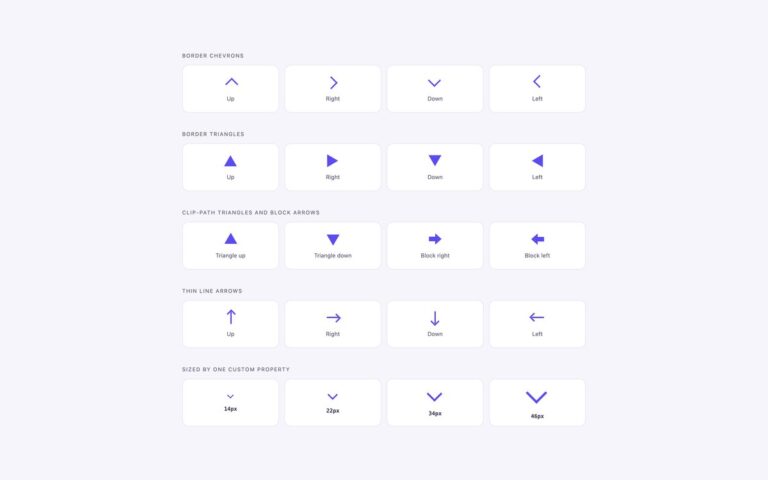
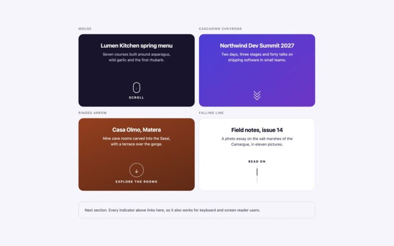
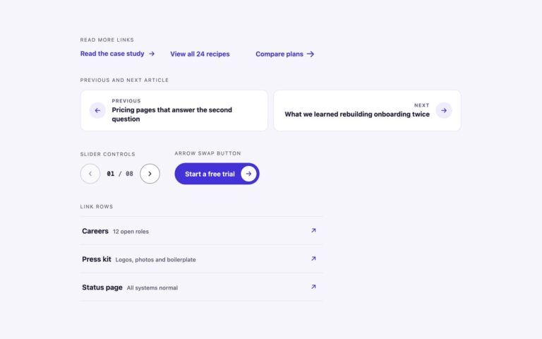
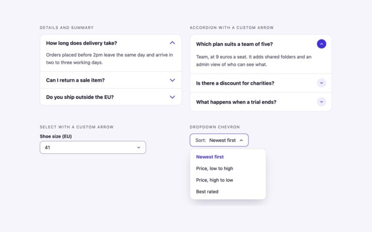
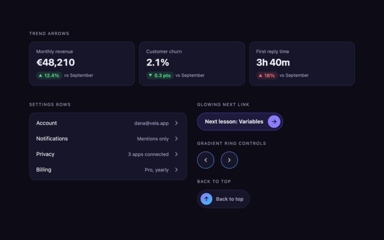
Three arrows built with newer CSS that used to need SVG or JavaScript, each with a fallback. The curved arrow is cut from a gradient box with clip-path: shape(), which accepts curves, so the tail bends smoothly; browsers without shape() get a straight-edged polygon of the same outline through @supports. The @property links register two custom properties. –shaft is a length that grows on hover or focus and drives both the shaft and the head of a line arrow at once, which an unregistered property cannot animate. –angle rotates a conic gradient border around a roadmap link while it is hovered or focused. The scroll-driven reader is a scrollable article preview with a chevron cue that fades out over the first 120 pixels of scrolling and a back-to-top link that fades in further down, using animation-timeline: scroll(nearest block). That replaces the usual scroll listener. Where scroll-driven animation is not supported, the cue and the back-to-top link simply stay visible. The scroll box can be focused and scrolled with the keyboard, and the back-to-top link is hidden with visibility while it is transparent, so it is never focusable unseen.

What’s included

  • Curved arrow cut with clip-path: shape(), polygon fallback
  • Registered --shaft length drives the shaft and head together
  • Conic gradient ring rotated through a registered --angle
  • Scroll-driven cue that fades out and back-to-top link that fades in
  • Every modern feature sits behind @supports or degrades to a static arrow

Accessibility

The scroll region is focusable with tabindex="0", named by aria-label and shows a focus outline. The back-to-top link uses visibility as well as opacity, so it cannot receive focus while invisible. Arrows are aria-hidden and links are named by their text. Under prefers-reduced-motion the hover animations are off and the scroll-driven fades no longer move, only change opacity.

Customise it

Change --accent and --sky for the gradients, the hover value of --shaft for how far the arrow grows, and animation-range on .cue and .up for when they fade. In Tailwind these live in the curved, grow-arrow, spin-ring, scroll-cue and scroll-up utilities.