About this set
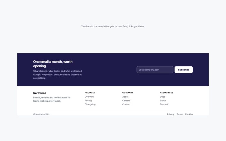
A newsletter-first footer in warm paper tones. The top band pairs a serif headline, One good email, every Sunday., and a short description with an email field joined to an amber Subscribe button, plus a small line of reassurance underneath. A dashed divider separates it from a slim bottom row with the publication name and three links. On screens under 768px the pitch and the form stack, and the field shrinks rather than pushing the button off screen. The form uses a real email input with a visually hidden label, autocomplete set to email and native required validation, so browsers can autofill it and reject malformed addresses before anything runs. A few lines of JavaScript stop the demo from submitting, change the button to Subscribed and announce the result through a status region; nothing is sent, so point the form action at your mailing-list provider or post it with fetch. Use it on blogs, publications and studio sites where the newsletter is the main call to action. The Bootstrap version uses a .row, an .input-group with .form-control and .btn, and a .nav.
What’s included
- Email field and button joined into one control
- Visually hidden label, autocomplete="email" and native validation
- Polite status message after signing up
- Stacks into one column below 768px
- Front end only, ready to point at any mailing-list provider
Accessibility
The email field has a visually hidden label, Email address, and autocomplete="email"; the confirmation is announced through a role="status" region. The field draws an amber border and ring on focus, and the button and links show a dark 2px outline. The field border was darkened to reach 3:1, all small text reaches 4.5:1, and the button hover transition is off under prefers-reduced-motion.
Customise it
Change --fnl-accent, --fnl-field, --fnl-muted and --fnl-soft on .fnl in the plain CSS and Bootstrap versions; Bootstrap also reads --bs-btn-bg there. In Tailwind edit bg-[#b45309], border-[#a08c70] and the grey text utilities.