Open demo

CSS code

HTML
<footer class="fcol">
  <div class="cols">
    <div class="brand">
      <div class="logo"><i aria-hidden="true"></i>Northwind</div>
      <p>Dashboards, docs, and conversations in one calm place. Built by a small team that answers its own support email.</p>
    </div>
    <nav aria-labelledby="fcol-product">
      <h2 id="fcol-product">Product</h2>
      <ul><li><a href="#">Features</a></li><li><a href="#">Pricing</a></li><li><a href="#">Changelog</a></li><li><a href="#">Roadmap</a></li></ul>
    </nav>
    <nav aria-labelledby="fcol-company">
      <h2 id="fcol-company">Company</h2>
      <ul><li><a href="#">About</a></li><li><a href="#">Blog</a></li><li><a href="#">Careers</a></li><li><a href="#">Press kit</a></li></ul>
    </nav>
    <nav aria-labelledby="fcol-support">
      <h2 id="fcol-support">Support</h2>
      <ul><li><a href="#">Help center</a></li><li><a href="#">API docs</a></li><li><a href="#">Status</a></li><li><a href="#">Contact</a></li></ul>
    </nav>
  </div>
  <div class="base">
    <p>© Northwind Labs. All rights reserved.</p>
    <ul class="soc">
      <li><a href="#" aria-label="Northwind on X"><svg viewBox="0 0 24 24" aria-hidden="true"><path d="M4 4l16 16M20 4L4 20"/></svg></a></li>
      <li><a href="#" aria-label="Northwind on GitHub"><svg viewBox="0 0 24 24" aria-hidden="true"><path d="M9 19c-4 1.3-4-2.2-6-2.7m12 5.4v-3.4c0-1 .1-1.4-.5-2 2.8-.3 5.5-1.4 5.5-6a4.6 4.6 0 00-1.3-3.2 4.3 4.3 0 00-.1-3.2s-1-.3-3.4 1.3a11.7 11.7 0 00-6 0C6.7 3.6 5.7 3.9 5.7 3.9a4.3 4.3 0 00-.1 3.2A4.6 4.6 0 004.3 10.3c0 4.6 2.7 5.7 5.5 6-.4.4-.5.9-.5 1.5V21"/></svg></a></li>
      <li><a href="#" aria-label="Northwind on YouTube"><svg viewBox="0 0 24 24" aria-hidden="true"><rect x="2.5" y="5" width="19" height="14" rx="4"/><path d="M10 9.5l4.5 2.5-4.5 2.5z"/></svg></a></li>
    </ul>
  </div>
</footer>
CSS
/* Four-column footer: a brand blurb and three labelled link groups, then a copyright and social bar.
   Below 768px the groups fall into two columns under the brand. */
.fcol{--fcol-text:#1b2433;--fcol-link:#4b5871;--fcol-muted:#6b7488;--fcol-line:#e8ebf1;--fcol-accent:#2563eb;
  background:#fff;border-top:1px solid var(--fcol-line);color:var(--fcol-text);line-height:normal}
.fcol,.fcol *{box-sizing:border-box}
.fcol h2,.fcol p,.fcol ul{margin:0;padding:0}
.fcol ul{list-style:none}
.fcol a{color:var(--fcol-link);text-decoration:none;border-radius:4px}
.fcol a:hover{color:var(--fcol-accent)}
.fcol a:focus-visible{outline:2px solid var(--fcol-accent);outline-offset:2px}
.fcol .cols{display:grid;grid-template-columns:2fr 1fr 1fr 1fr;gap:36px;max-width:1040px;margin:0 auto;padding:52px 32px 40px}
.fcol .logo{display:flex;align-items:center;gap:9px;font-size:1.05rem;font-weight:700;margin-bottom:12px}
.fcol .logo i{width:26px;height:26px;border-radius:8px;background:linear-gradient(135deg,#2563eb,#7c3aed)}
.fcol .brand p{font-size:.85rem;line-height:1.65;color:#67748f;max-width:30ch}
.fcol h2{font-size:.74rem;font-weight:800;letter-spacing:.09em;text-transform:uppercase;color:var(--fcol-muted);margin-bottom:14px}
.fcol nav a{display:block;font-size:.87rem;font-weight:500;padding:5px 0}
.fcol .base{display:flex;align-items:center;justify-content:space-between;flex-wrap:wrap;gap:10px;max-width:1040px;margin:0 auto;padding:18px 32px;
  border-top:1px solid #eef1f6;font-size:.8rem;color:var(--fcol-muted)}
.fcol .soc{display:flex;gap:8px}
.fcol .soc a{width:32px;height:32px;display:flex;align-items:center;justify-content:center;border:1px solid #e2e6ee;border-radius:9px;
  transition:border-color .15s,color .15s,transform .15s}
.fcol .soc a:hover{border-color:var(--fcol-accent);transform:translateY(-2px)}
.fcol .soc svg{width:15px;height:15px;fill:none;stroke:currentColor;stroke-width:2;stroke-linecap:round;stroke-linejoin:round}
@media (max-width:767.98px){
  .fcol .cols{grid-template-columns:1fr 1fr;padding:44px 20px 32px}
  .fcol .brand{grid-column:1 / -1}
  .fcol .base{padding:18px 20px}
}
@media (prefers-reduced-motion:reduce){.fcol *{transition:none!important}.fcol .soc a:hover{transform:none}}

Bootstrap 5 code

Requires: Bootstrap 5.3.8 CSS

HTML
<footer class="fcol">
  <div class="cols">
    <div class="row">
      <div class="brand col-12 col-md-5">
        <div class="logo"><i aria-hidden="true"></i>Northwind</div>
        <p>Dashboards, docs, and conversations in one calm place. Built by a small team that answers its own support email.</p>
      </div>
      <nav class="col-6 col-md" aria-labelledby="fcol-product">
        <h2 id="fcol-product">Product</h2>
        <ul class="nav flex-column"><li class="nav-item"><a class="nav-link" href="#">Features</a></li><li class="nav-item"><a class="nav-link" href="#">Pricing</a></li><li class="nav-item"><a class="nav-link" href="#">Changelog</a></li><li class="nav-item"><a class="nav-link" href="#">Roadmap</a></li></ul>
      </nav>
      <nav class="col-6 col-md" aria-labelledby="fcol-company">
        <h2 id="fcol-company">Company</h2>
        <ul class="nav flex-column"><li class="nav-item"><a class="nav-link" href="#">About</a></li><li class="nav-item"><a class="nav-link" href="#">Blog</a></li><li class="nav-item"><a class="nav-link" href="#">Careers</a></li><li class="nav-item"><a class="nav-link" href="#">Press kit</a></li></ul>
      </nav>
      <nav class="col-6 col-md" aria-labelledby="fcol-support">
        <h2 id="fcol-support">Support</h2>
        <ul class="nav flex-column"><li class="nav-item"><a class="nav-link" href="#">Help center</a></li><li class="nav-item"><a class="nav-link" href="#">API docs</a></li><li class="nav-item"><a class="nav-link" href="#">Status</a></li><li class="nav-item"><a class="nav-link" href="#">Contact</a></li></ul>
      </nav>
    </div>
  </div>
  <div class="base d-flex flex-wrap align-items-center justify-content-between">
    <p class="mb-0">© Northwind Labs. All rights reserved.</p>
    <ul class="soc list-unstyled d-flex gap-2 mb-0">
      <li><a class="btn" href="#" aria-label="Northwind on X"><svg viewBox="0 0 24 24" aria-hidden="true"><path d="M4 4l16 16M20 4L4 20"/></svg></a></li>
      <li><a class="btn" href="#" aria-label="Northwind on GitHub"><svg viewBox="0 0 24 24" aria-hidden="true"><path d="M9 19c-4 1.3-4-2.2-6-2.7m12 5.4v-3.4c0-1 .1-1.4-.5-2 2.8-.3 5.5-1.4 5.5-6a4.6 4.6 0 00-1.3-3.2 4.3 4.3 0 00-.1-3.2s-1-.3-3.4 1.3a11.7 11.7 0 00-6 0C6.7 3.6 5.7 3.9 5.7 3.9a4.3 4.3 0 00-.1 3.2A4.6 4.6 0 004.3 10.3c0 4.6 2.7 5.7 5.5 6-.4.4-.5.9-.5 1.5V21"/></svg></a></li>
      <li><a class="btn" href="#" aria-label="Northwind on YouTube"><svg viewBox="0 0 24 24" aria-hidden="true"><rect x="2.5" y="5" width="19" height="14" rx="4"/><path d="M10 9.5l4.5 2.5-4.5 2.5z"/></svg></a></li>
    </ul>
  </div>
</footer>
CSS
/* Bootstrap grid (.row, .col-*) with .nav.flex-column link groups and .btn social icons. */
.fcol{--fcol-text:#1b2433;--fcol-link:#4b5871;--fcol-muted:#6b7488;--fcol-line:#e8ebf1;--fcol-accent:#2563eb;
  background:#fff;border-top:1px solid var(--fcol-line);color:var(--fcol-text);line-height:normal}
.fcol .cols{max-width:1040px;margin:0 auto;padding:52px 32px 40px}
.fcol .row{--bs-gutter-x:36px;--bs-gutter-y:36px}
.fcol .logo{display:flex;align-items:center;gap:9px;font-size:1.05rem;font-weight:700;margin-bottom:12px}
.fcol .logo i{width:26px;height:26px;border-radius:8px;background:linear-gradient(135deg,#2563eb,#7c3aed)}
.fcol .brand p{font-size:.85rem;line-height:1.65;color:#67748f;max-width:30ch;margin:0}
.fcol h2{font-size:.74rem;font-weight:800;letter-spacing:.09em;text-transform:uppercase;line-height:normal;color:var(--fcol-muted);margin-bottom:14px}
.fcol .nav{--bs-nav-link-padding-x:0;--bs-nav-link-padding-y:5px;--bs-nav-link-font-size:.87rem;--bs-nav-link-font-weight:500;
  --bs-nav-link-color:var(--fcol-link);--bs-nav-link-hover-color:var(--fcol-accent)}
.fcol .nav-link{align-self:flex-start;border-radius:4px}
.fcol .base{max-width:1040px;margin:0 auto;padding:18px 32px;gap:10px;border-top:1px solid #eef1f6;font-size:.8rem;color:var(--fcol-muted)}
.fcol .soc .btn{--bs-btn-padding-x:0;--bs-btn-padding-y:0;--bs-btn-color:var(--fcol-link);--bs-btn-border-color:#e2e6ee;--bs-btn-border-radius:9px;
  --bs-btn-hover-color:var(--fcol-link);--bs-btn-hover-bg:transparent;--bs-btn-hover-border-color:var(--fcol-accent);
  --bs-btn-active-color:var(--fcol-link);--bs-btn-active-border-color:var(--fcol-accent);
  width:32px;height:32px;display:flex;align-items:center;justify-content:center;transition:border-color .15s,transform .15s}
.fcol .soc .btn:hover{transform:translateY(-2px)}
.fcol .soc svg{width:15px;height:15px;fill:none;stroke:currentColor;stroke-width:2;stroke-linecap:round;stroke-linejoin:round}
.fcol a:focus-visible{outline:2px solid var(--fcol-accent);outline-offset:2px;box-shadow:none}
@media (max-width:767.98px){.fcol .cols{padding:44px 20px 32px}.fcol .base{padding:18px 20px}}
@media (prefers-reduced-motion:reduce){.fcol *{transition:none!important}.fcol .soc .btn:hover{transform:none}}

Tailwind 4 code

Requires: Tailwind CSS 4

HTML
<footer class="border-t border-[#e8ebf1] bg-white leading-[normal] text-[#1b2433]">
  <div class="mx-auto grid max-w-[1040px] grid-cols-2 gap-9 px-5 pt-11 pb-8 md:grid-cols-[2fr_1fr_1fr_1fr] md:px-8 md:pt-[52px] md:pb-10">
    <div class="col-span-2 md:col-span-1">
      <div class="mb-3 flex items-center gap-[9px] text-[1.05rem] font-bold"><i class="size-[26px] rounded-lg bg-linear-135 from-[#2563eb] to-[#7c3aed]" aria-hidden="true"></i>Northwind</div>
      <p class="max-w-[30ch] text-[.85rem] leading-[1.65] text-[#67748f]">Dashboards, docs, and conversations in one calm place. Built by a small team that answers its own support email.</p>
    </div>
    <nav aria-labelledby="fcol-product">
      <h2 id="fcol-product" class="mb-3.5 text-[.74rem] font-extrabold tracking-[.09em] text-[#6b7488] uppercase">Product</h2>
      <ul class="text-[.87rem] font-medium [&_a]:block [&_a]:rounded [&_a]:py-[5px] [&_a]:text-[#4b5871] [&_a:hover]:text-[#2563eb] [&_a:focus-visible]:outline-2 [&_a:focus-visible]:outline-offset-2 [&_a:focus-visible]:outline-[#2563eb]"><li><a href="#">Features</a></li><li><a href="#">Pricing</a></li><li><a href="#">Changelog</a></li><li><a href="#">Roadmap</a></li></ul>
    </nav>
    <nav aria-labelledby="fcol-company">
      <h2 id="fcol-company" class="mb-3.5 text-[.74rem] font-extrabold tracking-[.09em] text-[#6b7488] uppercase">Company</h2>
      <ul class="text-[.87rem] font-medium [&_a]:block [&_a]:rounded [&_a]:py-[5px] [&_a]:text-[#4b5871] [&_a:hover]:text-[#2563eb] [&_a:focus-visible]:outline-2 [&_a:focus-visible]:outline-offset-2 [&_a:focus-visible]:outline-[#2563eb]"><li><a href="#">About</a></li><li><a href="#">Blog</a></li><li><a href="#">Careers</a></li><li><a href="#">Press kit</a></li></ul>
    </nav>
    <nav aria-labelledby="fcol-support">
      <h2 id="fcol-support" class="mb-3.5 text-[.74rem] font-extrabold tracking-[.09em] text-[#6b7488] uppercase">Support</h2>
      <ul class="text-[.87rem] font-medium [&_a]:block [&_a]:rounded [&_a]:py-[5px] [&_a]:text-[#4b5871] [&_a:hover]:text-[#2563eb] [&_a:focus-visible]:outline-2 [&_a:focus-visible]:outline-offset-2 [&_a:focus-visible]:outline-[#2563eb]"><li><a href="#">Help center</a></li><li><a href="#">API docs</a></li><li><a href="#">Status</a></li><li><a href="#">Contact</a></li></ul>
    </nav>
  </div>
  <div class="mx-auto flex max-w-[1040px] flex-wrap items-center justify-between gap-2.5 border-t border-[#eef1f6] px-5 py-[18px] text-[.8rem] text-[#6b7488] md:px-8">
    <p>© Northwind Labs. All rights reserved.</p>
    <ul class="flex gap-2 [&_a]:flex [&_a]:size-8 [&_a]:items-center [&_a]:justify-center [&_a]:rounded-[9px] [&_a]:border [&_a]:border-[#e2e6ee] [&_a]:text-[#4b5871] [&_a]:transition [&_a]:duration-150 [&_a:hover]:-translate-y-0.5 [&_a:hover]:border-[#2563eb] [&_a:focus-visible]:outline-2 [&_a:focus-visible]:outline-offset-2 [&_a:focus-visible]:outline-[#2563eb] motion-reduce:[&_a]:transition-none motion-reduce:[&_a:hover]:translate-y-0 [&_svg]:size-[15px] [&_svg]:fill-none [&_svg]:stroke-current [&_svg]:stroke-2 [&_svg]:[stroke-linecap:round] [&_svg]:[stroke-linejoin:round]">
      <li><a href="#" aria-label="Northwind on X"><svg viewBox="0 0 24 24" aria-hidden="true"><path d="M4 4l16 16M20 4L4 20"/></svg></a></li>
      <li><a href="#" aria-label="Northwind on GitHub"><svg viewBox="0 0 24 24" aria-hidden="true"><path d="M9 19c-4 1.3-4-2.2-6-2.7m12 5.4v-3.4c0-1 .1-1.4-.5-2 2.8-.3 5.5-1.4 5.5-6a4.6 4.6 0 00-1.3-3.2 4.3 4.3 0 00-.1-3.2s-1-.3-3.4 1.3a11.7 11.7 0 00-6 0C6.7 3.6 5.7 3.9 5.7 3.9a4.3 4.3 0 00-.1 3.2A4.6 4.6 0 004.3 10.3c0 4.6 2.7 5.7 5.5 6-.4.4-.5.9-.5 1.5V21"/></svg></a></li>
      <li><a href="#" aria-label="Northwind on YouTube"><svg viewBox="0 0 24 24" aria-hidden="true"><rect x="2.5" y="5" width="19" height="14" rx="4"/><path d="M10 9.5l4.5 2.5-4.5 2.5z"/></svg></a></li>
    </ul>
  </div>
</footer>

About this set

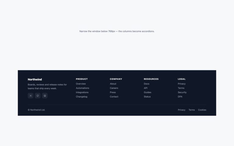
A classic white site footer in two rows. The top row holds the brand, a gradient logo mark with a two-line blurb, followed by three link groups: Product, Company and Support, four links each. The bottom row carries the copyright line on the left and three square social buttons for X, GitHub and YouTube on the right, drawn as inline SVG so they stay sharp and take the link colour. On wide screens the brand column is twice as wide as each link column; below 768px the brand spans the full width and the three groups fall into two columns, so nothing is squeezed on a phone. Each group is a nav labelled by its own heading, which gives screen reader users a named landmark per group instead of one long list of links. Use it for SaaS products, agencies and small company sites that need a tidy sitemap at the bottom of every page. The Bootstrap version builds the columns with .row and .col-md, the links with .nav.flex-column and the social icons with .btn.

What’s included

  • Brand column with logo mark and short blurb
  • Three link groups, each a nav labelled by its heading
  • Inline SVG social buttons for X, GitHub and YouTube
  • Two-column layout below 768px with the brand on top
  • Subtle lift on social hover, switched off for reduced motion

Accessibility

Each link group is a nav element labelled by its h2 heading, and the social links have names such as Northwind on X while their icons are hidden from assistive technology. Every link shows a 2px blue focus outline. The small grey headings and copyright text use #6b7488, which passes 4.5:1 on white, and the hover lift is removed under prefers-reduced-motion.

Customise it

Change --fcol-accent, --fcol-link and --fcol-muted on .fcol in the plain CSS and Bootstrap versions; Bootstrap also reads the --bs-nav-link-* and --bs-btn-* variables set there. In Tailwind edit the hex colour utilities such as text-[#4b5871] and hover:text-[#2563eb].