About this set
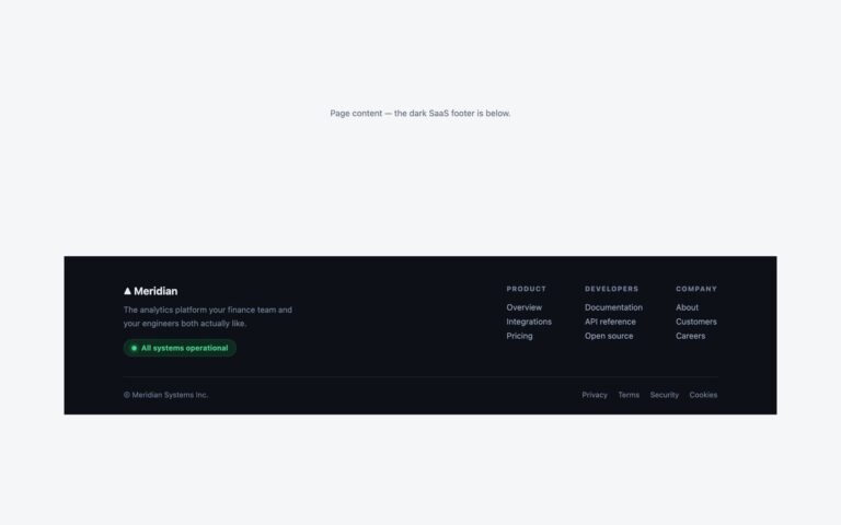
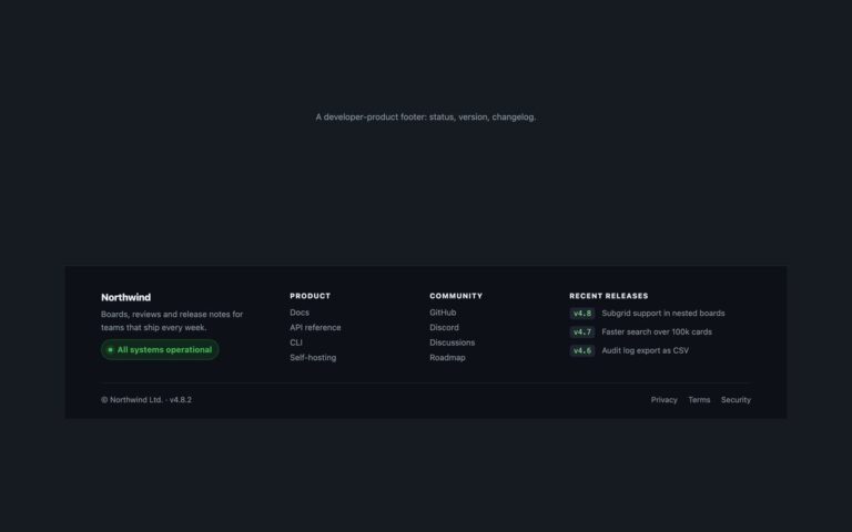
A dark footer for a product sold in several countries. The top row pairs the brand and a one-line description with three link columns (Product, Company, Resources). Under a hairline divider sits a preferences row: a language picker with a globe icon and a currency picker with a currency icon, both real select elements dressed as rounded pills, followed by a short note that prices and delivery depend on the region. A legal bar with the copyright line and Privacy, Terms and Cookies links finishes it. Use it on a shop, SaaS or travel site where visitors expect to change language or currency from any page. Because the pickers are native selects they work with the keyboard, submit with a form and show the platform’s own option list on phones. Language options carry a lang attribute, so a screen reader pronounces Deutsch, Français and 日本語 correctly. The pill takes the focus outline when the select inside it is focused. The Bootstrap version sets data-bs-theme=”dark” so .form-select draws a light chevron.
What’s included
- Language and currency pickers built on native select elements
- lang attributes on each language option for correct pronunciation
- Pill outline drawn with :focus-within when the select has focus
- Pill border lightened to meet 3:1 against the dark background
- Bootstrap version uses .form-select under data-bs-theme="dark"
Accessibility
Each select is named by visually hidden text inside its label (Language, Currency). Link columns sit in a nav labelled Footer and the legal links in one labelled Legal. Keyboard focus shows a 2px lavender outline on links and around the whole pill for the selects, and the grey note text meets 4.5:1 on #12151c.
Customise it
Change #12151c (background), #5d6576 (pill border) and #a5b4fc (focus) in the .fl rules. In Bootstrap the link colours are --bs-nav-link-* on .fl .nav; in Tailwind edit the bg-[#12151c], border-[#5d6576] and outline-[#a5b4fc] utilities. Add or remove option elements for your locales.