Open demo

CSS code

HTML
<div><span class="lbl">Icon on the left</span>
<form class="sb" role="search" aria-label="Articles">
  <label class="sr-only" for="sb-articles">Search articles</label>
  <div class="sb-box">
    <svg class="sb-ico" viewBox="0 0 24 24" fill="none" stroke="currentColor" stroke-width="2" stroke-linecap="round" aria-hidden="true" focusable="false"><circle cx="11" cy="11" r="7"/><path d="m20 20-3.5-3.5"/></svg>
    <input class="sb-input" id="sb-articles" type="search" name="q" placeholder="Search articles">
  </div>
</form></div>

<div><span class="lbl">Icon button on the right</span>
<form class="sb sb-right" role="search" aria-label="Recipes">
  <label class="sr-only" for="sb-recipes">Search recipes</label>
  <div class="sb-box">
    <input class="sb-input" id="sb-recipes" type="search" name="q" placeholder="Search 2,400 recipes">
    <button class="sb-btn sb-icon-btn" type="submit" aria-label="Search"><svg viewBox="0 0 24 24" fill="none" stroke="currentColor" stroke-width="2" stroke-linecap="round" aria-hidden="true" focusable="false"><circle cx="11" cy="11" r="7"/><path d="m20 20-3.5-3.5"/></svg></button>
  </div>
</form></div>

<div><span class="lbl">Button attached</span>
<form class="sb sb-join" role="search" aria-label="Products">
  <label class="sr-only" for="sb-products">Search products</label>
  <div class="sb-box">
    <svg class="sb-ico" viewBox="0 0 24 24" fill="none" stroke="currentColor" stroke-width="2" stroke-linecap="round" aria-hidden="true" focusable="false"><circle cx="11" cy="11" r="7"/><path d="m20 20-3.5-3.5"/></svg>
    <input class="sb-input" id="sb-products" type="search" name="q" placeholder="Products, brands and more">
    <button class="sb-btn" type="submit">Search</button>
  </div>
</form></div>

<div><span class="lbl">Pill with the button inside</span>
<form class="sb sb-pill" role="search" aria-label="Help centre">
  <label class="sr-only" for="sb-help">Search the help centre</label>
  <div class="sb-box">
    <svg class="sb-ico" viewBox="0 0 24 24" fill="none" stroke="currentColor" stroke-width="2" stroke-linecap="round" aria-hidden="true" focusable="false"><circle cx="11" cy="11" r="7"/><path d="m20 20-3.5-3.5"/></svg>
    <input class="sb-input" id="sb-help" type="search" name="q" placeholder="Search the help centre">
    <button class="sb-btn" type="submit">Search</button>
  </div>
</form></div>

<div><span class="lbl">Underline</span>
<form class="sb sb-line" role="search" aria-label="Archive">
  <label class="sr-only" for="sb-archive">Search the archive</label>
  <div class="sb-box">
    <svg class="sb-ico" viewBox="0 0 24 24" fill="none" stroke="currentColor" stroke-width="2" stroke-linecap="round" aria-hidden="true" focusable="false"><circle cx="11" cy="11" r="7"/><path d="m20 20-3.5-3.5"/></svg>
    <input class="sb-input" id="sb-archive" type="search" name="q" placeholder="Search 18 years of the archive">
  </div>
</form></div>
CSS
/* Classic search inputs. Each is a <form role="search"> with a type="search" input, a visually hidden <label>
   and an SVG icon laid over the field. Colours live in the custom properties on .sb. */
.sb{--sb-ink:#0f172a;--sb-muted:#64748b;--sb-line:#7c889c;--sb-bg:#fff;--sb-accent:#4f46e5;--sb-accent-dark:#4338ca;
  --sb-ring:rgba(79,70,229,.22);position:relative;max-width:560px;color:var(--sb-ink)}
.sb *{box-sizing:border-box}
.sr-only{position:absolute;width:1px;height:1px;padding:0;margin:-1px;overflow:hidden;clip:rect(0,0,0,0);white-space:nowrap;border:0}
.sb-box{position:relative;display:flex;align-items:center}
.sb-ico{position:absolute;left:15px;top:50%;z-index:2;width:18px;height:18px;margin-top:-9px;color:var(--sb-muted);pointer-events:none}
.sb-input{width:100%;min-width:0;height:48px;margin:0;padding:0 16px 0 44px;font:inherit;font-size:1rem;color:inherit;
  background:var(--sb-bg);border:1px solid var(--sb-line);border-radius:10px;-webkit-appearance:none;appearance:none;
  transition:border-color .15s,box-shadow .15s}
.sb-input::placeholder{color:var(--sb-muted);opacity:1}
.sb-input:hover{border-color:#5b6477}
.sb-input:focus{outline:none;border-color:var(--sb-accent);box-shadow:0 0 0 1px var(--sb-accent),0 0 0 5px var(--sb-ring)}
.sb-btn{display:inline-flex;align-items:center;justify-content:center;gap:8px;flex:none;height:48px;margin:0;padding:0 22px;
  font:inherit;font-size:.95rem;font-weight:600;color:#fff;background:var(--sb-accent);border:0;border-radius:10px;cursor:pointer;
  transition:background-color .15s}
.sb-btn:hover{background:var(--sb-accent-dark)}
.sb-btn:focus-visible{outline:2px solid var(--sb-accent);outline-offset:2px}
/* icon button on the right */
.sb-right .sb-input{padding:0 56px 0 16px}
.sb-icon-btn{position:absolute;right:4px;top:4px;width:40px;height:40px;padding:0;background:transparent;color:var(--sb-muted);border-radius:8px}
.sb-icon-btn:hover{background:#eef2ff;color:var(--sb-accent)}
.sb-icon-btn svg{width:18px;height:18px}
/* button attached */
.sb-join .sb-input{border-radius:10px 0 0 10px;border-right:0}
.sb-join .sb-input:focus{position:relative;z-index:1}
.sb-join .sb-btn{border-radius:0 10px 10px 0}
/* pill with the button inside */
.sb-pill .sb-input{height:56px;padding:0 128px 0 48px;border-radius:999px;box-shadow:0 6px 18px rgba(15,23,42,.07)}
.sb-pill .sb-input:focus{box-shadow:0 0 0 1px var(--sb-accent),0 0 0 5px var(--sb-ring)}
.sb-pill .sb-ico{left:19px}
.sb-pill .sb-btn{position:absolute;right:6px;top:6px;height:44px;border-radius:999px}
/* underline */
.sb-line .sb-input{height:46px;padding-left:30px;background:transparent;border:0;border-bottom:2px solid var(--sb-line);border-radius:0}
.sb-line .sb-input:focus{border-bottom-color:var(--sb-accent);box-shadow:0 2px 0 var(--sb-accent)}
.sb-line .sb-ico{left:2px}
@media (prefers-reduced-motion:reduce){.sb-input,.sb-btn{transition:none}}

Bootstrap 5 code

Requires: Bootstrap 5.3.8 CSS

HTML
<div><span class="lbl">Icon on the left</span>
<form class="sb" role="search" aria-label="Articles">
  <label class="visually-hidden" for="sb-articles">Search articles</label>
  <div class="position-relative">
    <svg class="sb-ico" viewBox="0 0 24 24" fill="none" stroke="currentColor" stroke-width="2" stroke-linecap="round" aria-hidden="true" focusable="false"><circle cx="11" cy="11" r="7"/><path d="m20 20-3.5-3.5"/></svg>
    <input class="form-control" id="sb-articles" type="search" name="q" placeholder="Search articles">
  </div>
</form></div>

<div><span class="lbl">Icon button on the right</span>
<form class="sb sb-right" role="search" aria-label="Recipes">
  <label class="visually-hidden" for="sb-recipes">Search recipes</label>
  <div class="position-relative">
    <input class="form-control" id="sb-recipes" type="search" name="q" placeholder="Search 2,400 recipes">
    <button class="btn sb-icon-btn" type="submit" aria-label="Search"><svg viewBox="0 0 24 24" fill="none" stroke="currentColor" stroke-width="2" stroke-linecap="round" aria-hidden="true" focusable="false"><circle cx="11" cy="11" r="7"/><path d="m20 20-3.5-3.5"/></svg></button>
  </div>
</form></div>

<div><span class="lbl">Button attached</span>
<form class="sb" role="search" aria-label="Products">
  <label class="visually-hidden" for="sb-products">Search products</label>
  <div class="input-group">
    <input class="form-control" id="sb-products" type="search" name="q" placeholder="Products, brands and more">
    <svg class="sb-ico" viewBox="0 0 24 24" fill="none" stroke="currentColor" stroke-width="2" stroke-linecap="round" aria-hidden="true" focusable="false"><circle cx="11" cy="11" r="7"/><path d="m20 20-3.5-3.5"/></svg>
    <button class="btn" type="submit">Search</button>
  </div>
</form></div>

<div><span class="lbl">Pill with the button inside</span>
<form class="sb sb-pill" role="search" aria-label="Help centre">
  <label class="visually-hidden" for="sb-help">Search the help centre</label>
  <div class="position-relative">
    <svg class="sb-ico" viewBox="0 0 24 24" fill="none" stroke="currentColor" stroke-width="2" stroke-linecap="round" aria-hidden="true" focusable="false"><circle cx="11" cy="11" r="7"/><path d="m20 20-3.5-3.5"/></svg>
    <input class="form-control rounded-pill" id="sb-help" type="search" name="q" placeholder="Search the help centre">
    <button class="btn rounded-pill" type="submit">Search</button>
  </div>
</form></div>

<div><span class="lbl">Underline</span>
<form class="sb sb-line" role="search" aria-label="Archive">
  <label class="visually-hidden" for="sb-archive">Search the archive</label>
  <div class="position-relative">
    <svg class="sb-ico" viewBox="0 0 24 24" fill="none" stroke="currentColor" stroke-width="2" stroke-linecap="round" aria-hidden="true" focusable="false"><circle cx="11" cy="11" r="7"/><path d="m20 20-3.5-3.5"/></svg>
    <input class="form-control" id="sb-archive" type="search" name="q" placeholder="Search 18 years of the archive">
  </div>
</form></div>
CSS
/* Bootstrap .form-control, .input-group and .btn, recoloured through the --sb-* properties and Bootstrap's --bs-btn-* variables. */
.sb{--sb-ink:#0f172a;--sb-muted:#64748b;--sb-line:#7c889c;--sb-accent:#4f46e5;--sb-accent-dark:#4338ca;--sb-ring:rgba(79,70,229,.22);
  max-width:560px;color:var(--sb-ink)}
.sb .form-control{height:48px;padding:0 16px 0 44px;font-size:1rem;color:var(--sb-ink);border-color:var(--sb-line);border-radius:10px;
  -webkit-appearance:none;appearance:none}
.sb .form-control::placeholder{color:var(--sb-muted);opacity:1}
.sb .form-control:hover{border-color:#5b6477}
.sb .form-control:focus{border-color:var(--sb-accent);box-shadow:0 0 0 1px var(--sb-accent),0 0 0 5px var(--sb-ring)}
.sb-ico{position:absolute;left:15px;top:50%;z-index:6;width:18px;height:18px;margin-top:-9px;color:var(--sb-muted);pointer-events:none}
.sb .btn{--bs-btn-padding-x:22px;--bs-btn-font-weight:600;--bs-btn-font-size:.95rem;--bs-btn-border-radius:10px;
  --bs-btn-bg:var(--sb-accent);--bs-btn-border-color:var(--sb-accent);--bs-btn-color:#fff;--bs-btn-hover-color:#fff;
  --bs-btn-hover-bg:var(--sb-accent-dark);--bs-btn-hover-border-color:var(--sb-accent-dark);
  --bs-btn-active-bg:var(--sb-accent-dark);--bs-btn-active-border-color:var(--sb-accent-dark);--bs-btn-active-color:#fff;
  display:inline-flex;align-items:center;justify-content:center;height:48px}
.sb .btn:focus-visible{outline:2px solid var(--sb-accent);outline-offset:2px;box-shadow:none}
/* icon button on the right */
.sb-right .form-control{padding:0 56px 0 16px}
.sb .sb-icon-btn{--bs-btn-bg:transparent;--bs-btn-border-color:transparent;--bs-btn-color:var(--sb-muted);--bs-btn-hover-bg:#eef2ff;
  --bs-btn-hover-border-color:#eef2ff;--bs-btn-hover-color:var(--sb-accent);--bs-btn-active-bg:#e0e7ff;--bs-btn-active-color:var(--sb-accent);
  --bs-btn-border-radius:8px;position:absolute;right:4px;top:4px;width:40px;height:40px;padding:0}
.sb-icon-btn svg{width:18px;height:18px}
/* pill with the button inside */
.sb-pill .form-control{height:56px;padding:0 128px 0 48px;box-shadow:0 6px 18px rgba(15,23,42,.07)}
.sb-pill .sb-ico{left:19px}
.sb-pill .btn{position:absolute;right:6px;top:6px;height:44px}
/* underline */
.sb-line .form-control{height:46px;padding-left:30px;background:transparent;border:0;border-bottom:2px solid var(--sb-line);border-radius:0}
.sb-line .form-control:focus{background:transparent;border-bottom-color:var(--sb-accent);box-shadow:0 2px 0 var(--sb-accent)}
.sb-line .sb-ico{left:2px}

Tailwind 4 code

Requires: Tailwind CSS 4

HTML
<div><span class="mb-3.5 block text-[.72rem] tracking-[.12em] text-[#5b6477] uppercase">Icon on the left</span>
<form class="relative max-w-[560px] text-sb-ink" role="search" aria-label="Articles">
  <label class="sr-only" for="sb-articles">Search articles</label>
  <div class="relative flex items-center">
    <svg class="pointer-events-none absolute top-1/2 left-[15px] size-[18px] -translate-y-1/2 text-sb-muted" viewBox="0 0 24 24" fill="none" stroke="currentColor" stroke-width="2" stroke-linecap="round" aria-hidden="true" focusable="false"><circle cx="11" cy="11" r="7"/><path d="m20 20-3.5-3.5"/></svg>
    <input class="h-12 w-full min-w-0 appearance-none rounded-[10px] border border-sb-line bg-white pr-4 pl-11 text-base text-sb-ink transition-[border-color,box-shadow] duration-150 placeholder:text-sb-muted hover:border-[#5b6477] focus:border-sb-accent focus:shadow-[0_0_0_1px_var(--color-sb-accent),0_0_0_5px_rgba(79,70,229,.22)] focus:outline-none motion-reduce:transition-none" id="sb-articles" type="search" name="q" placeholder="Search articles">
  </div>
</form></div>

<div><span class="mb-3.5 block text-[.72rem] tracking-[.12em] text-[#5b6477] uppercase">Icon button on the right</span>
<form class="relative max-w-[560px] text-sb-ink" role="search" aria-label="Recipes">
  <label class="sr-only" for="sb-recipes">Search recipes</label>
  <div class="relative flex items-center">
    <input class="h-12 w-full min-w-0 appearance-none rounded-[10px] border border-sb-line bg-white pr-14 pl-4 text-base text-sb-ink transition-[border-color,box-shadow] duration-150 placeholder:text-sb-muted hover:border-[#5b6477] focus:border-sb-accent focus:shadow-[0_0_0_1px_var(--color-sb-accent),0_0_0_5px_rgba(79,70,229,.22)] focus:outline-none motion-reduce:transition-none" id="sb-recipes" type="search" name="q" placeholder="Search 2,400 recipes">
    <button class="absolute top-1 right-1 inline-flex size-10 cursor-pointer items-center justify-center rounded-lg text-sb-muted transition-colors duration-150 hover:bg-[#eef2ff] hover:text-sb-accent focus-visible:outline-2 focus-visible:outline-offset-2 focus-visible:outline-sb-accent motion-reduce:transition-none" type="submit" aria-label="Search"><svg class="size-[18px]" viewBox="0 0 24 24" fill="none" stroke="currentColor" stroke-width="2" stroke-linecap="round" aria-hidden="true" focusable="false"><circle cx="11" cy="11" r="7"/><path d="m20 20-3.5-3.5"/></svg></button>
  </div>
</form></div>

<div><span class="mb-3.5 block text-[.72rem] tracking-[.12em] text-[#5b6477] uppercase">Button attached</span>
<form class="relative max-w-[560px] text-sb-ink" role="search" aria-label="Products">
  <label class="sr-only" for="sb-products">Search products</label>
  <div class="relative flex items-center">
    <svg class="pointer-events-none absolute top-1/2 left-[15px] z-10 size-[18px] -translate-y-1/2 text-sb-muted" viewBox="0 0 24 24" fill="none" stroke="currentColor" stroke-width="2" stroke-linecap="round" aria-hidden="true" focusable="false"><circle cx="11" cy="11" r="7"/><path d="m20 20-3.5-3.5"/></svg>
    <input class="relative h-12 w-full min-w-0 appearance-none rounded-l-[10px] border border-r-0 border-sb-line bg-white pr-4 pl-11 text-base text-sb-ink transition-[border-color,box-shadow] duration-150 placeholder:text-sb-muted hover:border-[#5b6477] focus:border-sb-accent focus:shadow-[0_0_0_1px_var(--color-sb-accent),0_0_0_5px_rgba(79,70,229,.22)] focus:outline-none motion-reduce:transition-none" id="sb-products" type="search" name="q" placeholder="Products, brands and more">
    <button class="inline-flex h-12 flex-none cursor-pointer items-center justify-center rounded-r-[10px] bg-sb-accent px-[22px] text-[.95rem] font-semibold text-white transition-colors duration-150 hover:bg-sb-accent-dark focus-visible:outline-2 focus-visible:outline-offset-2 focus-visible:outline-sb-accent motion-reduce:transition-none" type="submit">Search</button>
  </div>
</form></div>

<div><span class="mb-3.5 block text-[.72rem] tracking-[.12em] text-[#5b6477] uppercase">Pill with the button inside</span>
<form class="relative max-w-[560px] text-sb-ink" role="search" aria-label="Help centre">
  <label class="sr-only" for="sb-help">Search the help centre</label>
  <div class="relative flex items-center">
    <svg class="pointer-events-none absolute top-1/2 left-[19px] size-[18px] -translate-y-1/2 text-sb-muted" viewBox="0 0 24 24" fill="none" stroke="currentColor" stroke-width="2" stroke-linecap="round" aria-hidden="true" focusable="false"><circle cx="11" cy="11" r="7"/><path d="m20 20-3.5-3.5"/></svg>
    <input class="h-14 w-full min-w-0 appearance-none rounded-full border border-sb-line bg-white pr-32 pl-12 text-base text-sb-ink shadow-[0_6px_18px_rgba(15,23,42,.07)] transition-[border-color,box-shadow] duration-150 placeholder:text-sb-muted hover:border-[#5b6477] focus:border-sb-accent focus:shadow-[0_0_0_1px_var(--color-sb-accent),0_0_0_5px_rgba(79,70,229,.22)] focus:outline-none motion-reduce:transition-none" id="sb-help" type="search" name="q" placeholder="Search the help centre">
    <button class="absolute top-1.5 right-1.5 inline-flex h-11 cursor-pointer items-center justify-center rounded-full bg-sb-accent px-[22px] text-[.95rem] font-semibold text-white transition-colors duration-150 hover:bg-sb-accent-dark focus-visible:outline-2 focus-visible:outline-offset-2 focus-visible:outline-sb-accent motion-reduce:transition-none" type="submit">Search</button>
  </div>
</form></div>

<div><span class="mb-3.5 block text-[.72rem] tracking-[.12em] text-[#5b6477] uppercase">Underline</span>
<form class="relative max-w-[560px] text-sb-ink" role="search" aria-label="Archive">
  <label class="sr-only" for="sb-archive">Search the archive</label>
  <div class="relative flex items-center">
    <svg class="pointer-events-none absolute top-1/2 left-0.5 size-[18px] -translate-y-1/2 text-sb-muted" viewBox="0 0 24 24" fill="none" stroke="currentColor" stroke-width="2" stroke-linecap="round" aria-hidden="true" focusable="false"><circle cx="11" cy="11" r="7"/><path d="m20 20-3.5-3.5"/></svg>
    <input class="h-[46px] w-full min-w-0 appearance-none rounded-none border-0 border-b-2 border-sb-line bg-transparent pr-4 pl-[30px] text-base text-sb-ink transition-[border-color,box-shadow] duration-150 placeholder:text-sb-muted focus:border-sb-accent focus:shadow-[0_2px_0_var(--color-sb-accent)] focus:outline-none motion-reduce:transition-none" id="sb-archive" type="search" name="q" placeholder="Search 18 years of the archive">
  </div>
</form></div>
CSS
@theme {
  --color-sb-ink: #0f172a;
  --color-sb-muted: #64748b;
  --color-sb-line: #7c889c;
  --color-sb-accent: #4f46e5;
  --color-sb-accent-dark: #4338ca;
}

About this set

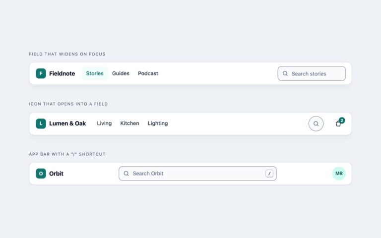
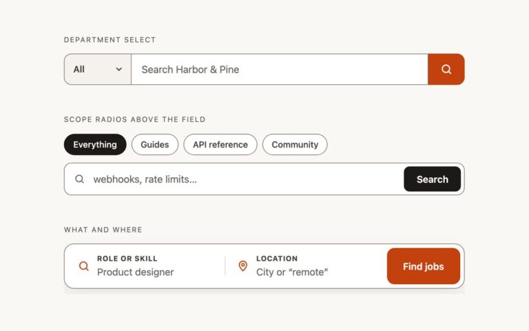
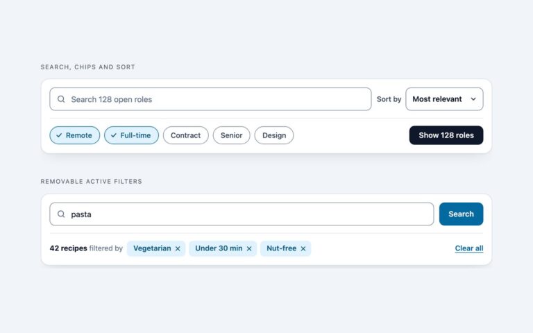
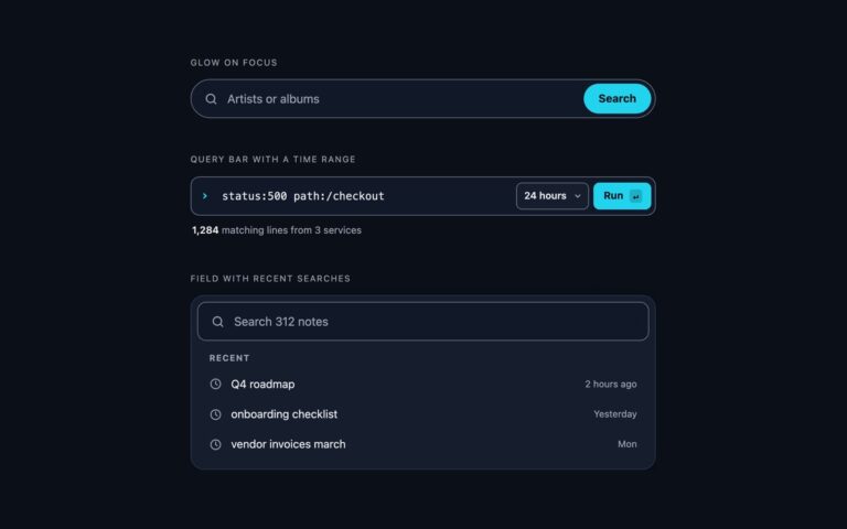
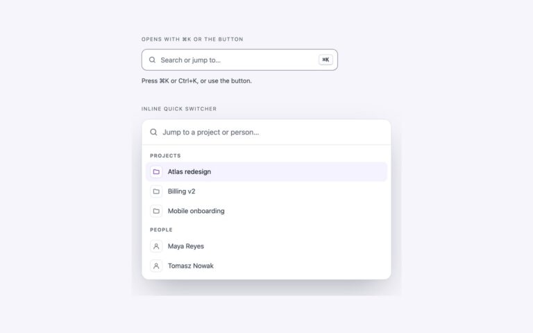
Five search inputs that cover most sites: a field with the magnifier on the left, a field with an icon submit button on the right, a field with a Search button attached, a tall pill with the button inside it, and a minimal underline field for editorial pages. Use the icon-left field as the default in sidebars and lists, the icon button when space is tight, the attached button when the search is the main action of a page section, the pill for landing pages, and the underline where the design has no boxes. Each one is a form with role=”search” and a descriptive aria-label, so screen reader users can jump straight to it as a landmark. The input is type=”search”, which brings the right mobile keyboard and a native clear control, and it is named by a visually hidden label rather than by its placeholder. The icon is an inline SVG laid over the field with pointer-events turned off, so clicking it still focuses the input. The Bootstrap version uses .form-control and .input-group, and the Tailwind version uses the same measurements as utilities.

What’s included

  • Five layouts: icon left, icon button, attached button, pill, underline
  • form role="search" with a visually hidden label on every input
  • type="search" inputs, so phones show a search keyboard
  • Borders darkened to 3:1 against the page, placeholders at 4.5:1
  • Focus ring drawn with box-shadow on the field itself

Accessibility

Every form has role="search" and an aria-label, and every input has a real label that is visually hidden, so the name does not disappear when someone starts typing. The icon-only submit button has aria-label="Search" and the decorative icons are aria-hidden. Focus moves the border to the accent colour and adds a ring, buttons get a 2px outline on :focus-visible, and all transitions are removed under prefers-reduced-motion.

Customise it

Change --sb-accent, --sb-line and --sb-muted on .sb for colour, and the height and border-radius on .sb-input for size. In Bootstrap the same --sb-* properties feed .form-control and the --bs-btn-* variables; in Tailwind edit the --color-sb-* theme colours and the h-, rounded- and px- utilities.