Open demo

CSS code

HTML
<div><span class="lbl">Layered radial meshes</span><div class="bp-grid bp-3">
<div class="bp bp-mesh bp-tile"><span class="bp-tag">Sunrise mesh</span></div>
<div class="bp bp-mesh bp-tile" style="--bp-bg:#ecfeff;--bp-c1:#22d3ee;--bp-c2:#34d399;--bp-c3:#3b82f6;--bp-c4:#a5f3fc"><span class="bp-tag">Lagoon mesh</span></div>
<div class="bp bp-mesh bp-tile" style="--bp-bg:#faf5ff;--bp-c1:#c084fc;--bp-c2:#f0abfc;--bp-c3:#818cf8;--bp-c4:#fda4af"><span class="bp-tag">Orchid mesh</span></div>
</div></div>
<div><span class="lbl">Soft and blurred</span><div class="bp-grid bp-3">
<div class="bp bp-orbs bp-tile"><span class="bp-tag">Blurred orbs</span></div>
<div class="bp bp-spotlight bp-tile"><span class="bp-tag">Top spotlight</span></div>
<div class="bp bp-conic-blur bp-tile"><span class="bp-tag">Blurred conic</span></div>
</div></div>
CSS
/* Mesh and blurred gradient backgrounds from layered radial and conic gradients. Colours are --bp-c1 to --bp-c4. */
/* Base: the pattern is painted on ::before, under the content (isolation:isolate), so --bp-opacity
   fades only the pattern, never the text on top of it. */
.bp{--bp-opacity:1;position:relative;isolation:isolate;overflow:hidden;background:var(--bp-bg)}
.bp::before{content:"";position:absolute;inset:0;z-index:-1;border-radius:inherit;pointer-events:none;opacity:var(--bp-opacity)}
/* Mesh: four radial gradients, one from each corner. --bp-size is how far each colour spreads */
.bp-mesh{--bp-bg:#fff7ed;--bp-c1:#fb923c;--bp-c2:#f472b6;--bp-c3:#facc15;--bp-c4:#a78bfa;--bp-size:70%;--bp-opacity:.85}
.bp-mesh::before{background-image:radial-gradient(var(--bp-size) var(--bp-size) at 0% 0%,var(--bp-c1),transparent 70%),radial-gradient(var(--bp-size) var(--bp-size) at 100% 0%,var(--bp-c2),transparent 70%),radial-gradient(var(--bp-size) var(--bp-size) at 100% 100%,var(--bp-c3),transparent 70%),radial-gradient(var(--bp-size) var(--bp-size) at 0% 100%,var(--bp-c4),transparent 70%)}
/* Blurred orbs: three hard circles softened by one static blur */
.bp-orbs{--bp-bg:#f8fafc;--bp-c1:#60a5fa;--bp-c2:#f472b6;--bp-c3:#fbbf24;--bp-blur:32px;--bp-opacity:.8}
.bp-orbs::before{inset:-15%;background-image:radial-gradient(circle at 28% 34%,var(--bp-c1) 0 16%,transparent 17%),radial-gradient(circle at 70% 30%,var(--bp-c2) 0 13%,transparent 14%),radial-gradient(circle at 56% 74%,var(--bp-c3) 0 15%,transparent 16%);filter:blur(var(--bp-blur))}
/* Top spotlight: a wide glow from above and a faint one from below */
.bp-spotlight{--bp-bg:#f8fafc;--bp-c1:#c7d2fe;--bp-c2:#e0f2fe;--bp-size:75%;--bp-opacity:1}
.bp-spotlight::before{background-image:radial-gradient(var(--bp-size) 60% at 50% -10%,var(--bp-c1),transparent 70%),radial-gradient(50% 40% at 50% 115%,var(--bp-c2),transparent 70%)}
/* Blurred conic: a colour wheel melted by a blur */
.bp-conic-blur{--bp-bg:#fff;--bp-c1:#a78bfa;--bp-c2:#f9a8d4;--bp-c3:#fde68a;--bp-c4:#93c5fd;--bp-blur:40px;--bp-opacity:.75}
.bp-conic-blur::before{inset:-25%;background-image:conic-gradient(from 200deg at 50% 50%,var(--bp-c1),var(--bp-c2),var(--bp-c3),var(--bp-c4),var(--bp-c1));filter:blur(var(--bp-blur))}
/* Demo tile and name chip */
.bp-tile{min-height:var(--bp-tile-h,180px);border-radius:16px;border:1px solid #dee2e6}
/* The name chip is an opaque scrim, so its text keeps 4.5:1 whatever pattern is underneath. */
.bp-tag{position:absolute;left:16px;bottom:16px;padding:4px 8px;border-radius:6px;background:#fff;color:#0f172a;font-size:.875rem;font-weight:600;line-height:1.5;box-shadow:0 2px 4px rgb(0 0 0 / .075)}

Bootstrap 5 code

Requires: Bootstrap 5.3.8 CSS

HTML
<div><span class="lbl">Layered radial meshes</span><div class="row row-cols-1 row-cols-sm-2 row-cols-lg-3 g-3">
<div class="col"><div class="bp bp-mesh bp-tile rounded-4 border"><span class="position-absolute start-0 bottom-0 m-3 px-2 py-1 rounded-2 bg-white text-dark small fw-semibold shadow-sm lh-base">Sunrise mesh</span></div></div>
<div class="col"><div class="bp bp-mesh bp-tile rounded-4 border" style="--bp-bg:#ecfeff;--bp-c1:#22d3ee;--bp-c2:#34d399;--bp-c3:#3b82f6;--bp-c4:#a5f3fc"><span class="position-absolute start-0 bottom-0 m-3 px-2 py-1 rounded-2 bg-white text-dark small fw-semibold shadow-sm lh-base">Lagoon mesh</span></div></div>
<div class="col"><div class="bp bp-mesh bp-tile rounded-4 border" style="--bp-bg:#faf5ff;--bp-c1:#c084fc;--bp-c2:#f0abfc;--bp-c3:#818cf8;--bp-c4:#fda4af"><span class="position-absolute start-0 bottom-0 m-3 px-2 py-1 rounded-2 bg-white text-dark small fw-semibold shadow-sm lh-base">Orchid mesh</span></div></div>
</div></div>
<div><span class="lbl">Soft and blurred</span><div class="row row-cols-1 row-cols-sm-2 row-cols-lg-3 g-3">
<div class="col"><div class="bp bp-orbs bp-tile rounded-4 border"><span class="position-absolute start-0 bottom-0 m-3 px-2 py-1 rounded-2 bg-white text-dark small fw-semibold shadow-sm lh-base">Blurred orbs</span></div></div>
<div class="col"><div class="bp bp-spotlight bp-tile rounded-4 border"><span class="position-absolute start-0 bottom-0 m-3 px-2 py-1 rounded-2 bg-white text-dark small fw-semibold shadow-sm lh-base">Top spotlight</span></div></div>
<div class="col"><div class="bp bp-conic-blur bp-tile rounded-4 border"><span class="position-absolute start-0 bottom-0 m-3 px-2 py-1 rounded-2 bg-white text-dark small fw-semibold shadow-sm lh-base">Blurred conic</span></div></div>
</div></div>
CSS
/* Mesh and blurred gradient backgrounds from layered radial and conic gradients. Colours are --bp-c1 to --bp-c4. */
/* Base: the pattern is painted on ::before, under the content (isolation:isolate), so --bp-opacity
   fades only the pattern, never the text on top of it. */
.bp{--bp-opacity:1;position:relative;isolation:isolate;overflow:hidden;background:var(--bp-bg)}
.bp::before{content:"";position:absolute;inset:0;z-index:-1;border-radius:inherit;pointer-events:none;opacity:var(--bp-opacity)}
/* Mesh: four radial gradients, one from each corner. --bp-size is how far each colour spreads */
.bp-mesh{--bp-bg:#fff7ed;--bp-c1:#fb923c;--bp-c2:#f472b6;--bp-c3:#facc15;--bp-c4:#a78bfa;--bp-size:70%;--bp-opacity:.85}
.bp-mesh::before{background-image:radial-gradient(var(--bp-size) var(--bp-size) at 0% 0%,var(--bp-c1),transparent 70%),radial-gradient(var(--bp-size) var(--bp-size) at 100% 0%,var(--bp-c2),transparent 70%),radial-gradient(var(--bp-size) var(--bp-size) at 100% 100%,var(--bp-c3),transparent 70%),radial-gradient(var(--bp-size) var(--bp-size) at 0% 100%,var(--bp-c4),transparent 70%)}
/* Blurred orbs: three hard circles softened by one static blur */
.bp-orbs{--bp-bg:#f8fafc;--bp-c1:#60a5fa;--bp-c2:#f472b6;--bp-c3:#fbbf24;--bp-blur:32px;--bp-opacity:.8}
.bp-orbs::before{inset:-15%;background-image:radial-gradient(circle at 28% 34%,var(--bp-c1) 0 16%,transparent 17%),radial-gradient(circle at 70% 30%,var(--bp-c2) 0 13%,transparent 14%),radial-gradient(circle at 56% 74%,var(--bp-c3) 0 15%,transparent 16%);filter:blur(var(--bp-blur))}
/* Top spotlight: a wide glow from above and a faint one from below */
.bp-spotlight{--bp-bg:#f8fafc;--bp-c1:#c7d2fe;--bp-c2:#e0f2fe;--bp-size:75%;--bp-opacity:1}
.bp-spotlight::before{background-image:radial-gradient(var(--bp-size) 60% at 50% -10%,var(--bp-c1),transparent 70%),radial-gradient(50% 40% at 50% 115%,var(--bp-c2),transparent 70%)}
/* Blurred conic: a colour wheel melted by a blur */
.bp-conic-blur{--bp-bg:#fff;--bp-c1:#a78bfa;--bp-c2:#f9a8d4;--bp-c3:#fde68a;--bp-c4:#93c5fd;--bp-blur:40px;--bp-opacity:.75}
.bp-conic-blur::before{inset:-25%;background-image:conic-gradient(from 200deg at 50% 50%,var(--bp-c1),var(--bp-c2),var(--bp-c3),var(--bp-c4),var(--bp-c1));filter:blur(var(--bp-blur))}
/* Demo tile height; corners, border and the name chip use Bootstrap utilities */
.bp-tile{min-height:var(--bp-tile-h,180px)}

Tailwind 4 code

Requires: Tailwind CSS 4

HTML
<div><span class="mb-4 block text-[.72rem] tracking-[.12em] text-[#5b6477] uppercase">Layered radial meshes</span><div class="grid grid-cols-1 gap-4 min-[576px]:grid-cols-2 min-[992px]:grid-cols-3">
<div class="bp-mesh relative min-h-[180px] overflow-hidden rounded-2xl border border-[#dee2e6]"><span class="absolute bottom-4 left-4 rounded-md bg-white px-2 py-1 text-sm leading-normal font-semibold text-[#0f172a] shadow-[0_2px_4px_rgb(0_0_0/.075)]">Sunrise mesh</span></div>
<div class="bp-mesh [--bp-bg:#ecfeff] [--bp-c1:#22d3ee] [--bp-c2:#34d399] [--bp-c3:#3b82f6] [--bp-c4:#a5f3fc] relative min-h-[180px] overflow-hidden rounded-2xl border border-[#dee2e6]"><span class="absolute bottom-4 left-4 rounded-md bg-white px-2 py-1 text-sm leading-normal font-semibold text-[#0f172a] shadow-[0_2px_4px_rgb(0_0_0/.075)]">Lagoon mesh</span></div>
<div class="bp-mesh [--bp-bg:#faf5ff] [--bp-c1:#c084fc] [--bp-c2:#f0abfc] [--bp-c3:#818cf8] [--bp-c4:#fda4af] relative min-h-[180px] overflow-hidden rounded-2xl border border-[#dee2e6]"><span class="absolute bottom-4 left-4 rounded-md bg-white px-2 py-1 text-sm leading-normal font-semibold text-[#0f172a] shadow-[0_2px_4px_rgb(0_0_0/.075)]">Orchid mesh</span></div>
</div></div>
<div><span class="mb-4 block text-[.72rem] tracking-[.12em] text-[#5b6477] uppercase">Soft and blurred</span><div class="grid grid-cols-1 gap-4 min-[576px]:grid-cols-2 min-[992px]:grid-cols-3">
<div class="bp-orbs relative min-h-[180px] overflow-hidden rounded-2xl border border-[#dee2e6]"><span class="absolute bottom-4 left-4 rounded-md bg-white px-2 py-1 text-sm leading-normal font-semibold text-[#0f172a] shadow-[0_2px_4px_rgb(0_0_0/.075)]">Blurred orbs</span></div>
<div class="bp-spotlight relative min-h-[180px] overflow-hidden rounded-2xl border border-[#dee2e6]"><span class="absolute bottom-4 left-4 rounded-md bg-white px-2 py-1 text-sm leading-normal font-semibold text-[#0f172a] shadow-[0_2px_4px_rgb(0_0_0/.075)]">Top spotlight</span></div>
<div class="bp-conic-blur relative min-h-[180px] overflow-hidden rounded-2xl border border-[#dee2e6]"><span class="absolute bottom-4 left-4 rounded-md bg-white px-2 py-1 text-sm leading-normal font-semibold text-[#0f172a] shadow-[0_2px_4px_rgb(0_0_0/.075)]">Blurred conic</span></div>
</div></div>
CSS
/* Mesh and blurred gradient backgrounds from layered radial and conic gradients. Colours are --bp-c1 to --bp-c4. Each pattern is a utility; pass colours and sizes as arbitrary properties, e.g. [--bp-color:#0d9488]. */
/* Mesh: four radial gradients, one from each corner. --bp-size is how far each colour spreads */
@utility bp-mesh{
  position:relative;isolation:isolate;overflow:hidden;background:var(--bp-bg,#fff7ed);
  &::before{content:"";position:absolute;inset:0;z-index:-1;border-radius:inherit;pointer-events:none;opacity:var(--bp-opacity,.85);background-image:radial-gradient(var(--bp-size,70%) var(--bp-size,70%) at 0% 0%,var(--bp-c1,#fb923c),transparent 70%),radial-gradient(var(--bp-size,70%) var(--bp-size,70%) at 100% 0%,var(--bp-c2,#f472b6),transparent 70%),radial-gradient(var(--bp-size,70%) var(--bp-size,70%) at 100% 100%,var(--bp-c3,#facc15),transparent 70%),radial-gradient(var(--bp-size,70%) var(--bp-size,70%) at 0% 100%,var(--bp-c4,#a78bfa),transparent 70%)}
}
/* Blurred orbs: three hard circles softened by one static blur */
@utility bp-orbs{
  position:relative;isolation:isolate;overflow:hidden;background:var(--bp-bg,#f8fafc);
  &::before{content:"";position:absolute;inset:0;z-index:-1;border-radius:inherit;pointer-events:none;opacity:var(--bp-opacity,.8);inset:-15%;background-image:radial-gradient(circle at 28% 34%,var(--bp-c1,#60a5fa) 0 16%,transparent 17%),radial-gradient(circle at 70% 30%,var(--bp-c2,#f472b6) 0 13%,transparent 14%),radial-gradient(circle at 56% 74%,var(--bp-c3,#fbbf24) 0 15%,transparent 16%);filter:blur(var(--bp-blur,32px))}
}
/* Top spotlight: a wide glow from above and a faint one from below */
@utility bp-spotlight{
  position:relative;isolation:isolate;overflow:hidden;background:var(--bp-bg,#f8fafc);
  &::before{content:"";position:absolute;inset:0;z-index:-1;border-radius:inherit;pointer-events:none;opacity:var(--bp-opacity,1);background-image:radial-gradient(var(--bp-size,75%) 60% at 50% -10%,var(--bp-c1,#c7d2fe),transparent 70%),radial-gradient(50% 40% at 50% 115%,var(--bp-c2,#e0f2fe),transparent 70%)}
}
/* Blurred conic: a colour wheel melted by a blur */
@utility bp-conic-blur{
  position:relative;isolation:isolate;overflow:hidden;background:var(--bp-bg,#fff);
  &::before{content:"";position:absolute;inset:0;z-index:-1;border-radius:inherit;pointer-events:none;opacity:var(--bp-opacity,.75);inset:-25%;background-image:conic-gradient(from 200deg at 50% 50%,var(--bp-c1,#a78bfa),var(--bp-c2,#f9a8d4),var(--bp-c3,#fde68a),var(--bp-c4,#93c5fd),var(--bp-c1,#a78bfa));filter:blur(var(--bp-blur,40px))}
}

About this set

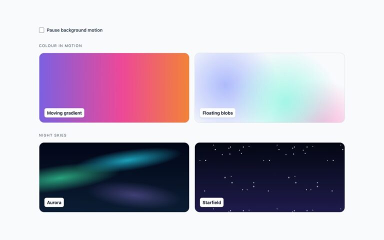
Six soft gradient backgrounds of the kind design tools call mesh gradients, built with layered CSS gradients. Sunrise, Lagoon and Orchid are the same class with three palettes: four radial gradients, one from each corner, each fading to transparent at 70 percent so the colours blend in the middle. Blurred orbs draws three hard-edged circles and softens them with one static blur filter on an oversized layer, so the blur never shows a hard edge at the sides. Top spotlight is a single wide glow from above with a faint one from below, a good choice behind a centred hero headline. Blurred conic melts a conic colour wheel into a smooth multi-colour wash. Use the corner meshes for hero and pricing sections, the spotlight behind headings, and the orbs or conic wash for sign-in screens and empty states. Each mesh is painted on ::before under the content, the four colours are –bp-c1 to –bp-c4, and –bp-size controls how far each corner colour spreads. Nothing animates, so the blur is drawn once rather than every frame.

What’s included

  • Three four-corner meshes from one class with swappable palettes
  • Blurred orbs and blurred conic using a single static blur
  • Top spotlight for centred hero headlines
  • Colours set with --bp-c1 to --bp-c4, spread with --bp-size
  • Plain CSS, Bootstrap 5 and Tailwind CSS 4 versions of the same design

Accessibility

The meshes are decorative backgrounds and need no alt text. Name labels are opaque chips, so their text stays above 4.5:1 over the brightest colour. If you put text straight on a mesh, check it against the lightest and darkest colour, not the average. Nothing animates.

Customise it

Set --bp-bg and --bp-c1 to --bp-c4 for the palette, --bp-size for the spread of each corner, --bp-blur for the orbs and conic wash, and --bp-opacity for strength. In Tailwind pass them as arbitrary properties, as the Lagoon and Orchid tiles do with bp-mesh [--bp-c1:#22d3ee].