About this set
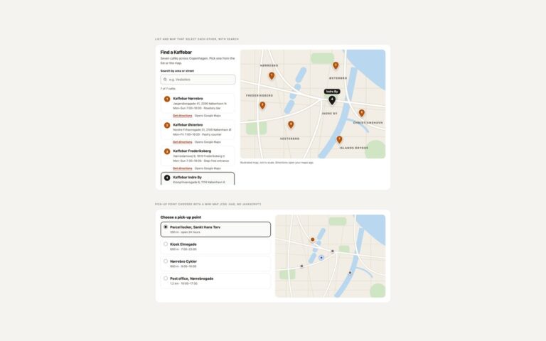
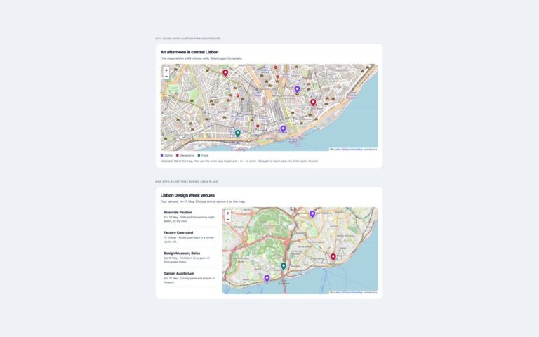
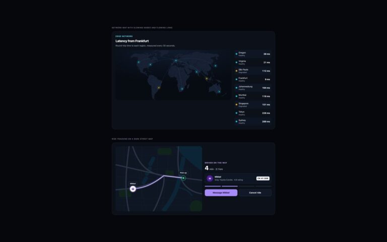
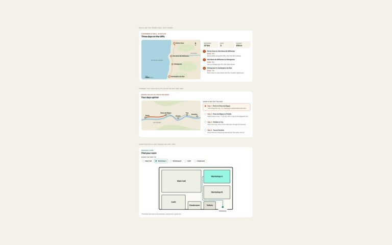
A set of map markers drawn with CSS and small inline SVGs, shown over an illustrated city map so you can see them in context. Pulsing status markers show five couriers, with a double ripple for moving couriers, an amber colour for one running late and no pulse for one on a break; each marker has a name tag and a text description of its status. Cluster count badges group nearby venues and scale between four sizes with the count, with soft rings around each badge. Popup pins are buttons that open a card docked at the bottom of the map with the restaurant’s cuisine, hours, rating and a booking link; only one card is open at a time, the close button and Escape return focus to the pin, and the card works at phone width because it never has to fit above the pin. A gallery shows six more shapes to choose from: teardrop pin, dot with halo, numbered marker, icon pin, price tag and label pill. The same markers work as Leaflet divIcons, which set 06 uses.
What’s included
- Pulsing markers that stop for idle items and for reduced motion
- Cluster badges in four sizes with the count in text
- Popup cards opened by pin buttons, closed with Escape
- Docked popup card that fits at phone width
- Gallery of six marker shapes made with CSS
Accessibility
Status markers and clusters are list items with visually hidden text, such as "Mette, running 6 minutes late", so colour is never the only signal. Popup pins are buttons with an accessible name, aria-expanded and aria-controls; each card is a labelled group, and closing it returns focus to its pin. Pins and buttons show a focus outline, and the pulse animation and pin scaling are switched off under prefers-reduced-motion.
Customise it
Change --c on .mk-pulse for status colours, the background of .mk-cluster for clusters, and the pin colour through the color of .mk-btn. Marker sizes are plain width and height values in each rule.