Open demo

CSS code

HTML
<div><span class="lbl">Bordered</span>
<div class="f">
<label for="t1">Full name</label>
<input id="t1" name="name" type="text" autocomplete="name" placeholder="Ada Lovelace">
</div>
</div>
<div><span class="lbl">Filled</span>
<div class="f f-filled">
<label for="t2">Email address</label>
<input id="t2" name="email" type="email" autocomplete="email" placeholder="[email protected]">
</div>
</div>
<div><span class="lbl">Underline</span>
<div class="f f-under">
<label for="t3">Company</label>
<input id="t3" name="company" type="text" autocomplete="organization" placeholder="Analytical Engines Ltd">
</div>
</div>
<div><span class="lbl">Pill</span>
<div class="f f-pill">
<label for="t4">Postcode</label>
<input id="t4" name="postcode" type="text" autocomplete="postal-code" placeholder="SW1A 1AA">
</div>
</div>
CSS
/* Text fields: a visible <label> above every input, a 3:1 border and a focus ring. */
.f{--f-text:#0f172a;--f-label:#334155;--f-hint:#64748b;--f-bg:#fff;--f-fill:#f1f5f9;--f-border:#8492a6;
  --f-focus:#2563eb;--f-ring:#dbeafe;--f-radius:9px;display:flex;flex-direction:column;gap:7px;max-width:360px}
.f label{font-size:.82rem;font-weight:600;color:var(--f-label)}
.f input{box-sizing:border-box;width:100%;font:inherit;font-size:.92rem;padding:11px 14px;color:var(--f-text);
  background:var(--f-bg);border:1px solid var(--f-border);border-radius:var(--f-radius);
  transition:border-color .16s,box-shadow .16s,background-color .16s}
.f input::placeholder{color:var(--f-hint)}
.f input:focus{outline:0;border-color:var(--f-focus);box-shadow:0 0 0 3px var(--f-ring)}
/* filled: a tinted ground; the bottom rule keeps a 3:1 edge against the page */
.f-filled input{background:var(--f-fill);border-color:transparent transparent var(--f-border);
  border-radius:var(--f-radius) var(--f-radius) 0 0}
.f-filled input:focus{background:var(--f-bg);border-color:var(--f-focus)}
.f-filled input::placeholder{color:#5b6b82} /* 4.5:1 on the tint */
/* underline only: the rule thickens to 3px on focus */
.f-under input{border:0;border-bottom:2px solid var(--f-border);border-radius:0;padding-left:0;padding-right:0;background:transparent}
.f-under input:focus{border-bottom-color:var(--f-focus);box-shadow:0 1px 0 var(--f-focus)}
/* pill */
.f-pill input{border-radius:999px;padding-left:18px;padding-right:18px}
@media (prefers-reduced-motion:reduce){.f input{transition:none}}

Bootstrap 5 code

Requires: Bootstrap 5.3.8 CSS

HTML
<div><span class="lbl">Bordered</span>
<div class="fx">
<label for="t1" class="form-label">Full name</label>
<input id="t1" name="name" class="form-control" type="text" autocomplete="name" placeholder="Ada Lovelace">
</div>
</div>
<div><span class="lbl">Filled</span>
<div class="fx">
<label for="t2" class="form-label">Email address</label>
<input id="t2" name="email" class="form-control form-control-filled" type="email" autocomplete="email" placeholder="[email protected]">
</div>
</div>
<div><span class="lbl">Underline</span>
<div class="fx">
<label for="t3" class="form-label">Company</label>
<input id="t3" name="company" class="form-control form-control-under" type="text" autocomplete="organization" placeholder="Analytical Engines Ltd">
</div>
</div>
<div><span class="lbl">Pill</span>
<div class="fx">
<label for="t4" class="form-label">Postcode</label>
<input id="t4" name="postcode" class="form-control rounded-pill" type="text" autocomplete="postal-code" placeholder="SW1A 1AA">
</div>
</div>
CSS
/* Bootstrap .form-label + .form-control, restyled through --bs-* variables on .fx. */
.fx{--bs-body-color:#0f172a;--bs-body-bg:#fff;--bs-border-color:#8492a6;--bs-border-radius:9px;
  --bs-secondary-color:#64748b;--f-label:#334155;--f-fill:#f1f5f9;--f-focus:#2563eb;--f-ring:#dbeafe;max-width:360px}
.fx .form-label{display:block;margin-bottom:7px;font-size:.82rem;font-weight:600;color:var(--f-label)}
.fx .form-control{padding:11px 14px;font-size:.92rem;line-height:normal;
  transition:border-color .16s,box-shadow .16s,background-color .16s}
.fx .form-control:focus{border-color:var(--f-focus);box-shadow:0 0 0 3px var(--f-ring)}
/* filled: a tinted ground; the bottom rule keeps a 3:1 edge against the page */
.fx .form-control-filled{background-color:var(--f-fill);border-color:transparent transparent var(--bs-border-color);
  border-radius:var(--bs-border-radius) var(--bs-border-radius) 0 0}
.fx .form-control-filled:focus{background-color:var(--bs-body-bg)}
.fx .form-control-filled::placeholder{color:#5b6b82} /* 4.5:1 on the tint */
/* underline only: the rule thickens to 3px on focus */
.fx .form-control-under{border-width:0 0 2px;border-radius:0;padding-left:0;padding-right:0;background-color:transparent}
.fx .form-control-under:focus{box-shadow:0 1px 0 var(--f-focus)}
/* pill: Bootstrap's .rounded-pill utility plus wider side padding */
.fx .form-control.rounded-pill{padding-left:18px;padding-right:18px}
@media (prefers-reduced-motion:reduce){.fx .form-control{transition:none}}

Tailwind 4 code

Requires: Tailwind CSS 4

HTML
<div><span class="mb-4 block text-[.72rem] tracking-[.12em] text-[#64748b] uppercase">Bordered</span>
<div class="flex max-w-[360px] flex-col gap-[7px]">
<label for="t1" class="text-[.82rem] font-semibold text-[#334155]">Full name</label>
<input id="t1" name="name" type="text" autocomplete="name" placeholder="Ada Lovelace" class="w-full rounded-[9px] border border-[#8492a6] bg-white px-[14px] py-[11px] text-[.92rem] text-[#0f172a] placeholder:text-[#64748b] transition-[border-color,box-shadow,background-color] duration-[160ms] focus:border-[#2563eb] focus:shadow-[0_0_0_3px_#dbeafe] focus:outline-none motion-reduce:transition-none">
</div>
</div>
<div><span class="mb-4 block text-[.72rem] tracking-[.12em] text-[#64748b] uppercase">Filled</span>
<div class="flex max-w-[360px] flex-col gap-[7px]">
<label for="t2" class="text-[.82rem] font-semibold text-[#334155]">Email address</label>
<input id="t2" name="email" type="email" autocomplete="email" placeholder="[email protected]" class="w-full rounded-t-[9px] border border-transparent border-b-[#8492a6] bg-[#f1f5f9] px-[14px] py-[11px] text-[.92rem] text-[#0f172a] placeholder:text-[#5b6b82] transition-[border-color,box-shadow,background-color] duration-[160ms] focus:border-[#2563eb] focus:bg-white focus:shadow-[0_0_0_3px_#dbeafe] focus:outline-none motion-reduce:transition-none">
</div>
</div>
<div><span class="mb-4 block text-[.72rem] tracking-[.12em] text-[#64748b] uppercase">Underline</span>
<div class="flex max-w-[360px] flex-col gap-[7px]">
<label for="t3" class="text-[.82rem] font-semibold text-[#334155]">Company</label>
<input id="t3" name="company" type="text" autocomplete="organization" placeholder="Analytical Engines Ltd" class="w-full border-b-2 border-[#8492a6] bg-transparent py-[11px] text-[.92rem] text-[#0f172a] placeholder:text-[#64748b] transition-[border-color,box-shadow] duration-[160ms] focus:border-[#2563eb] focus:shadow-[0_1px_0_#2563eb] focus:outline-none motion-reduce:transition-none">
</div>
</div>
<div><span class="mb-4 block text-[.72rem] tracking-[.12em] text-[#64748b] uppercase">Pill</span>
<div class="flex max-w-[360px] flex-col gap-[7px]">
<label for="t4" class="text-[.82rem] font-semibold text-[#334155]">Postcode</label>
<input id="t4" name="postcode" type="text" autocomplete="postal-code" placeholder="SW1A 1AA" class="w-full rounded-full border border-[#8492a6] bg-white px-[18px] py-[11px] text-[.92rem] text-[#0f172a] placeholder:text-[#64748b] transition-[border-color,box-shadow] duration-[160ms] focus:border-[#2563eb] focus:shadow-[0_0_0_3px_#dbeafe] focus:outline-none motion-reduce:transition-none">
</div>
</div>

About this set

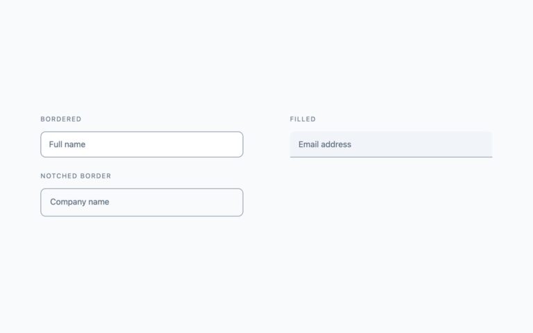
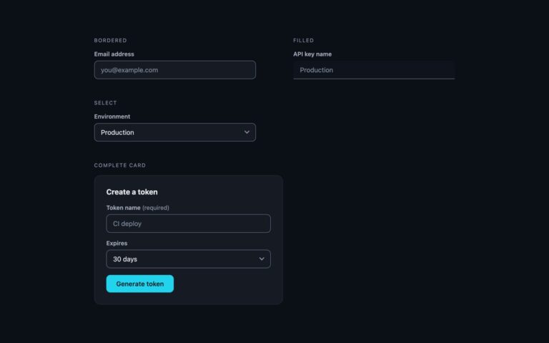
Four treatments for a single-line text field, each with a visible label above the input. Bordered is the default: a white field with a 1px slate border and a 9px radius, for most forms. Filled sits on a light slate tint with square bottom corners and a bottom rule, which suits dense settings screens where full borders get busy. Underline drops everything but a 2px rule under the text, for minimal or editorial layouts; on focus the rule turns blue and thickens to 3px. Pill rounds the field fully, which pairs with pill buttons in signup or search bars. Every field gets the same focus treatment: the border turns blue and a soft 3px ring appears around it. The demo fields use the matching input types and autocomplete tokens (name, email, organization, postal-code), so browsers can offer saved values and phones show the right keyboard. The Bootstrap version is the stock .form-label and .form-control restyled through –bs-* variables, with .rounded-pill for the pill; the Tailwind version is utility classes only.

What’s included

  • Four treatments: bordered, filled, underline and pill
  • Visible label on every field, no placeholder-as-label
  • Borders darkened to 3:1 against the page, including the filled field's bottom rule
  • Correct input types and autocomplete tokens in the demo
  • Bootstrap version uses .form-control and .rounded-pill

Accessibility

Each input has a visible label joined to it with for and id, so clicking the label focuses the field and screen readers announce its name. Borders and the filled field's bottom rule reach 3:1 against the page and placeholder text reaches 4.5:1. Keyboard and mouse focus turn the border blue and add a 3px ring; the underline field thickens its rule instead. Colour transitions are removed under prefers-reduced-motion.

Customise it

In plain CSS change --f-border, --f-focus, --f-ring, --f-fill and --f-radius on .f. In Bootstrap set --bs-border-color, --bs-border-radius and --f-focus on .fx; in Tailwind edit the border-, bg- and focus: colour classes on each input.