Open demo

CSS code

HTML
<div><span class="lbl">Contact form</span>
<div class="card form-ui">
<h2>Start a project</h2>
<p class="sub">We reply to everything within one working day.</p>
<form class="stack">
<div class="two">
<div class="f"><label for="l1">First name <span class="req">(required)</span></label><input id="l1" name="given-name" type="text" autocomplete="given-name" required></div>
<div class="f"><label for="l2">Last name</label><input id="l2" name="family-name" type="text" autocomplete="family-name"></div>
</div>
<div class="f"><label for="l3">Email address <span class="req">(required)</span></label><input id="l3" name="email" type="email" autocomplete="email" required></div>
<div class="f"><label for="l4">What do you need? <span class="req">(required)</span></label>
<textarea id="l4" name="message" placeholder="A sentence or two is plenty." required></textarea></div>
<button class="btn" type="submit">Send enquiry</button>
</form>
</div>
</div>
<div><span class="lbl">Inline signup</span>
<form class="form-ui">
<label for="l7">Email address <span class="req">(required)</span></label>
<div class="inline"><input id="l7" name="email" type="email" autocomplete="email" placeholder="[email protected]" required>
<button class="btn" type="submit">Subscribe</button></div>
</form>
</div>
<div><span class="lbl">Settings rows</span>
<div class="card form-ui">
<div class="rowset"><div><label for="l5">Display name</label><span class="help" id="l5-help">Shown on your public profile.</span></div>
<input id="l5" name="nickname" type="text" autocomplete="nickname" value="Ada L." aria-describedby="l5-help"></div>
<div class="rowset"><div><label for="l6">Reply-to address</label><span class="help" id="l6-help">Where responses are sent.</span></div>
<input id="l6" name="reply-to" type="email" autocomplete="email" value="[email protected]" aria-describedby="l6-help"></div>
</div>
</div>
CSS
/* Whole forms: a contact card with a two-column row, an inline signup and settings rows. */
.form-ui{--f-text:#0f172a;--f-label:#334155;--f-hint:#64748b;--f-bg:#fff;--f-border:#8492a6;--f-focus:#2563eb;
  --f-ring:#dbeafe;--f-radius:9px;--f-btn:#0f172a}
.form-ui .f{display:flex;flex-direction:column;gap:7px}
.form-ui label{display:block;font-size:.82rem;font-weight:600;color:var(--f-label)}
.form-ui .req{font-weight:400;color:var(--f-hint)}
.form-ui input,.form-ui textarea{box-sizing:border-box;width:100%;font:inherit;font-size:.92rem;padding:11px 14px;
  color:var(--f-text);background:var(--f-bg);border:1px solid var(--f-border);border-radius:var(--f-radius);
  transition:border-color .16s,box-shadow .16s}
.form-ui input::placeholder,.form-ui textarea::placeholder{color:var(--f-hint)}
.form-ui input:focus,.form-ui textarea:focus{outline:0;border-color:var(--f-focus);box-shadow:0 0 0 3px var(--f-ring)}
.form-ui textarea{resize:vertical}
.form-ui .btn{font:inherit;font-size:.9rem;font-weight:600;padding:11px 24px;border:0;border-radius:var(--f-radius);
  background:var(--f-btn);color:#fff;cursor:pointer;align-self:flex-start;transition:opacity .16s}
.form-ui .btn:hover{opacity:.88}
.form-ui .btn:focus-visible{outline:2px solid var(--f-focus);outline-offset:2px}
/* card */
.card{background:#fff;border-radius:14px;padding:26px;box-shadow:0 2px 12px rgba(15,23,42,.09);max-width:520px}
.card h2{font-size:1.05rem;margin:0 0 5px}
.card .sub{font-size:.83rem;color:var(--f-hint);margin:0 0 20px}
.stack{display:flex;flex-direction:column;gap:16px}
/* two columns that fall to one below ~420px of width */
.two{display:grid;grid-template-columns:repeat(auto-fit,minmax(190px,1fr));gap:16px}
/* inline signup */
.inline{display:flex;gap:9px;max-width:460px;margin-top:7px}
.inline input{flex:1;min-width:0;padding:12px 15px}
.inline .btn{align-self:stretch}
/* settings rows: label and help text on the left, the field on the right; wraps when narrow */
.rowset{display:flex;flex-wrap:wrap;justify-content:space-between;align-items:center;gap:12px 20px;padding:15px 0;
  border-bottom:1px solid #f1f5f9}
.rowset:last-child{border-bottom:0}
.rowset label{display:block;font-size:.9rem;font-weight:700;color:var(--f-text);cursor:pointer}
.rowset .help{font-size:.79rem;color:var(--f-hint)}
.rowset input{max-width:170px;font-size:.88rem;padding:8px 11px;border-radius:8px}
@media (prefers-reduced-motion:reduce){.form-ui input,.form-ui textarea,.form-ui .btn{transition:none}}

Bootstrap 5 code

Requires: Bootstrap 5.3.8 CSS

HTML
<div><span class="lbl">Contact form</span>
<div class="card form-ui"><div class="card-body">
<h2 class="card-title">Start a project</h2>
<p class="sub">We reply to everything within one working day.</p>
<form class="d-flex flex-column gap-3">
<div class="row g-3">
<div class="col-sm-6"><label for="l1" class="form-label">First name <span class="req">(required)</span></label><input id="l1" name="given-name" class="form-control" type="text" autocomplete="given-name" required></div>
<div class="col-sm-6"><label for="l2" class="form-label">Last name</label><input id="l2" name="family-name" class="form-control" type="text" autocomplete="family-name"></div>
</div>
<div><label for="l3" class="form-label">Email address <span class="req">(required)</span></label><input id="l3" name="email" class="form-control" type="email" autocomplete="email" required></div>
<div><label for="l4" class="form-label">What do you need? <span class="req">(required)</span></label>
<textarea id="l4" name="message" class="form-control" placeholder="A sentence or two is plenty." required></textarea></div>
<button class="btn align-self-start" type="submit">Send enquiry</button>
</form>
</div></div>
</div>
<div><span class="lbl">Inline signup</span>
<form class="form-ui">
<label for="l7" class="form-label">Email address <span class="req">(required)</span></label>
<div class="inline d-flex gap-2"><input id="l7" name="email" class="form-control" type="email" autocomplete="email" placeholder="[email protected]" required>
<button class="btn flex-none" type="submit">Subscribe</button></div>
</form>
</div>
<div><span class="lbl">Settings rows</span>
<div class="card form-ui"><div class="card-body">
<div class="rowset d-flex flex-wrap justify-content-between align-items-center"><div><label for="l5" class="form-label">Display name</label><span class="help" id="l5-help">Shown on your public profile.</span></div>
<input id="l5" name="nickname" class="form-control" type="text" autocomplete="nickname" value="Ada L." aria-describedby="l5-help"></div>
<div class="rowset d-flex flex-wrap justify-content-between align-items-center"><div><label for="l6" class="form-label">Reply-to address</label><span class="help" id="l6-help">Where responses are sent.</span></div>
<input id="l6" name="reply-to" class="form-control" type="email" autocomplete="email" value="[email protected]" aria-describedby="l6-help"></div>
</div></div>
</div>
CSS
/* Bootstrap .card, .row/.col grid, .form-control and .btn, restyled through --bs-* variables on .form-ui. */
.form-ui{--bs-body-color:#0f172a;--bs-body-bg:#fff;--bs-border-color:#8492a6;--bs-border-radius:9px;
  --bs-secondary-color:#64748b;--f-label:#334155;--f-focus:#2563eb;--f-ring:#dbeafe}
.form-ui .form-label{display:block;margin-bottom:7px;font-size:.82rem;font-weight:600;color:var(--f-label)}
.form-ui .req{font-weight:400;color:var(--bs-secondary-color)}
.form-ui .form-control{padding:11px 14px;font-size:.92rem;line-height:normal;transition:border-color .16s,box-shadow .16s}
.form-ui .form-control:focus{border-color:var(--f-focus);box-shadow:0 0 0 3px var(--f-ring)}
.form-ui textarea.form-control{min-height:0;resize:vertical}
.form-ui .btn{--bs-btn-padding-x:24px;--bs-btn-padding-y:11px;--bs-btn-font-size:.9rem;--bs-btn-font-weight:600;
  --bs-btn-line-height:normal;--bs-btn-border-width:0;--bs-btn-border-radius:9px;--bs-btn-bg:#0f172a;--bs-btn-color:#fff;
  --bs-btn-hover-bg:#27303f;--bs-btn-hover-color:#fff;--bs-btn-active-bg:#0f172a;--bs-btn-active-color:#fff;--bs-btn-focus-box-shadow:none}
.form-ui .btn:focus-visible{background-color:var(--bs-btn-bg);outline:2px solid var(--f-focus);outline-offset:2px}
/* card */
.form-ui.card{--bs-card-bg:#fff;--bs-card-border-width:0;--bs-card-border-radius:14px;--bs-card-spacer-x:26px;
  --bs-card-spacer-y:26px;--bs-card-title-spacer-y:5px;max-width:520px;box-shadow:0 2px 12px rgba(15,23,42,.09)}
.form-ui .card-title{font-size:1.05rem;font-weight:700;line-height:normal}
.form-ui .sub{font-size:.83rem;color:var(--bs-secondary-color);margin-bottom:20px}
/* inline signup */
.form-ui .inline{max-width:460px}
.form-ui .inline .form-control{padding:12px 15px}
/* settings rows */
.form-ui .rowset{gap:12px 20px;padding:15px 0;border-bottom:1px solid #f1f5f9}
.form-ui .rowset:last-child{border-bottom:0}
.form-ui .rowset .form-label{margin:0;font-size:.9rem;font-weight:700;color:var(--bs-body-color);cursor:pointer}
.form-ui .rowset .help{font-size:.79rem;color:var(--bs-secondary-color)}
.form-ui .rowset .form-control{max-width:170px;font-size:.88rem;padding:8px 11px;border-radius:8px}
@media (prefers-reduced-motion:reduce){.form-ui .form-control,.form-ui .btn{transition:none}}

Tailwind 4 code

Requires: Tailwind CSS 4

HTML
<div><span class="mb-4 block text-[.72rem] tracking-[.12em] text-[#64748b] uppercase">Contact form</span>
<div class="max-w-[520px] rounded-[14px] bg-white p-[26px] shadow-[0_2px_12px_rgba(15,23,42,.09)]">
<h2 class="mb-[5px] text-[1.05rem] font-bold">Start a project</h2>
<p class="mb-5 text-[.83rem] text-[#64748b]">We reply to everything within one working day.</p>
<form class="flex flex-col gap-4">
<div class="grid grid-cols-[repeat(auto-fit,minmax(190px,1fr))] gap-4">
<div class="flex flex-col gap-[7px]"><label for="l1" class="text-[.82rem] font-semibold text-[#334155]">First name <span class="font-normal text-[#64748b]">(required)</span></label><input id="l1" name="given-name" type="text" autocomplete="given-name" required class="w-full rounded-[9px] border border-[#8492a6] bg-white px-[14px] py-[11px] text-[.92rem] text-[#0f172a] transition-[border-color,box-shadow] duration-[160ms] focus:border-[#2563eb] focus:shadow-[0_0_0_3px_#dbeafe] focus:outline-none motion-reduce:transition-none"></div>
<div class="flex flex-col gap-[7px]"><label for="l2" class="text-[.82rem] font-semibold text-[#334155]">Last name</label><input id="l2" name="family-name" type="text" autocomplete="family-name" class="w-full rounded-[9px] border border-[#8492a6] bg-white px-[14px] py-[11px] text-[.92rem] text-[#0f172a] transition-[border-color,box-shadow] duration-[160ms] focus:border-[#2563eb] focus:shadow-[0_0_0_3px_#dbeafe] focus:outline-none motion-reduce:transition-none"></div>
</div>
<div class="flex flex-col gap-[7px]"><label for="l3" class="text-[.82rem] font-semibold text-[#334155]">Email address <span class="font-normal text-[#64748b]">(required)</span></label><input id="l3" name="email" type="email" autocomplete="email" required class="w-full rounded-[9px] border border-[#8492a6] bg-white px-[14px] py-[11px] text-[.92rem] text-[#0f172a] transition-[border-color,box-shadow] duration-[160ms] focus:border-[#2563eb] focus:shadow-[0_0_0_3px_#dbeafe] focus:outline-none motion-reduce:transition-none"></div>
<div class="flex flex-col gap-[7px]"><label for="l4" class="text-[.82rem] font-semibold text-[#334155]">What do you need? <span class="font-normal text-[#64748b]">(required)</span></label>
<textarea id="l4" name="message" placeholder="A sentence or two is plenty." required class="w-full resize-y rounded-[9px] border border-[#8492a6] bg-white px-[14px] py-[11px] text-[.92rem] text-[#0f172a] placeholder:text-[#64748b] transition-[border-color,box-shadow] duration-[160ms] focus:border-[#2563eb] focus:shadow-[0_0_0_3px_#dbeafe] focus:outline-none motion-reduce:transition-none"></textarea></div>
<button type="submit" class="cursor-pointer self-start rounded-[9px] bg-[#0f172a] px-6 py-[11px] text-[.9rem] font-semibold text-white transition-opacity duration-[160ms] hover:opacity-[.88] focus-visible:outline-2 focus-visible:outline-offset-2 focus-visible:outline-[#2563eb] motion-reduce:transition-none">Send enquiry</button>
</form>
</div>
</div>
<div><span class="mb-4 block text-[.72rem] tracking-[.12em] text-[#64748b] uppercase">Inline signup</span>
<form>
<label for="l7" class="block text-[.82rem] font-semibold text-[#334155]">Email address <span class="font-normal text-[#64748b]">(required)</span></label>
<div class="mt-[7px] flex max-w-[460px] gap-[9px]"><input id="l7" name="email" type="email" autocomplete="email" placeholder="[email protected]" required class="min-w-0 flex-1 rounded-[9px] border border-[#8492a6] bg-white px-[15px] py-3 text-[.92rem] text-[#0f172a] placeholder:text-[#64748b] transition-[border-color,box-shadow] duration-[160ms] focus:border-[#2563eb] focus:shadow-[0_0_0_3px_#dbeafe] focus:outline-none motion-reduce:transition-none">
<button type="submit" class="cursor-pointer rounded-[9px] bg-[#0f172a] px-6 py-[11px] text-[.9rem] font-semibold text-white transition-opacity duration-[160ms] hover:opacity-[.88] focus-visible:outline-2 focus-visible:outline-offset-2 focus-visible:outline-[#2563eb] motion-reduce:transition-none">Subscribe</button></div>
</form>
</div>
<div><span class="mb-4 block text-[.72rem] tracking-[.12em] text-[#64748b] uppercase">Settings rows</span>
<div class="max-w-[520px] rounded-[14px] bg-white p-[26px] shadow-[0_2px_12px_rgba(15,23,42,.09)]">
<div class="flex flex-wrap items-center justify-between gap-x-5 gap-y-3 border-b border-[#f1f5f9] py-[15px] last:border-b-0"><div><label for="l5" class="block cursor-pointer text-[.9rem] font-bold text-[#0f172a]">Display name</label><span id="l5-help" class="text-[.79rem] text-[#64748b]">Shown on your public profile.</span></div>
<input id="l5" name="nickname" type="text" autocomplete="nickname" value="Ada L." aria-describedby="l5-help" class="w-full max-w-[170px] rounded-[8px] border border-[#8492a6] bg-white px-[11px] py-2 text-[.88rem] text-[#0f172a] transition-[border-color,box-shadow] duration-[160ms] focus:border-[#2563eb] focus:shadow-[0_0_0_3px_#dbeafe] focus:outline-none motion-reduce:transition-none"></div>
<div class="flex flex-wrap items-center justify-between gap-x-5 gap-y-3 border-b border-[#f1f5f9] py-[15px] last:border-b-0"><div><label for="l6" class="block cursor-pointer text-[.9rem] font-bold text-[#0f172a]">Reply-to address</label><span id="l6-help" class="text-[.79rem] text-[#64748b]">Where responses are sent.</span></div>
<input id="l6" name="reply-to" type="email" autocomplete="email" value="[email protected]" aria-describedby="l6-help" class="w-full max-w-[170px] rounded-[8px] border border-[#8492a6] bg-white px-[11px] py-2 text-[.88rem] text-[#0f172a] transition-[border-color,box-shadow] duration-[160ms] focus:border-[#2563eb] focus:shadow-[0_0_0_3px_#dbeafe] focus:outline-none motion-reduce:transition-none"></div>
</div>
</div>

About this set

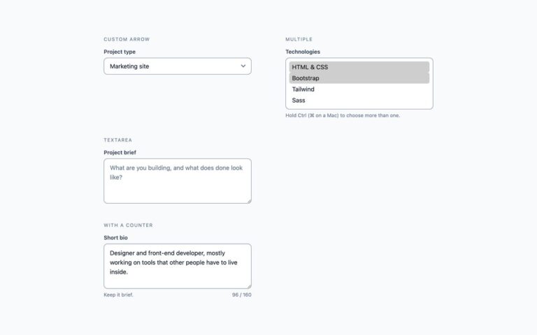
Three complete forms rather than single fields. The contact form sits in a white card with a heading and a response-time note; first and last name share a row that falls to one column on narrow screens, followed by email, a message field and a submit button. Required fields say (required) in their labels and carry the required attribute, so the browser blocks an empty submission and points at the first missing field. The inline signup puts an email field and a Subscribe button side by side under a visible label, for footers and article ends. Settings rows lay out a label and a line of help text on the left with a compact field on the right, and wrap the field underneath on small screens; the help text is linked to its field with aria-describedby rather than being part of the label. The demo fields use given-name, family-name, email and nickname autocomplete tokens. The Bootstrap version uses .card, a .row with .col-sm-6 columns, .form-control and .btn; the Tailwind version uses a grid with repeat(auto-fit, minmax(190px, 1fr)).

What’s included

  • Contact card, inline signup and settings rows
  • Two-column name row that collapses on narrow screens
  • Required fields marked in text and with the required attribute
  • Settings rows wrap the field below the label on mobile
  • Bootstrap version uses .card, .row, .col-sm-6 and .btn

Accessibility

Every field has a visible label; required ones add the word required and the required attribute, and settings help text is linked with aria-describedby. Buttons are real submit buttons with a 2px blue outline on keyboard focus, and fields show a blue border and 3px ring. Field borders reach 3:1 and secondary text 4.5:1 on white. Transitions are removed under prefers-reduced-motion.

Customise it

In plain CSS change --f-border, --f-focus, --f-btn and --f-radius on .form-ui, and the card's background and shadow on .card. In Bootstrap set --bs-card-* and --bs-btn-* variables on .form-ui; in Tailwind edit the bg-, border- and shadow- classes on the card and fields.