Open demo

CSS code

HTML
<div><span class="lbl">Bordered</span>
<div class="fl"><input id="f1" name="name" type="text" autocomplete="name" placeholder=" "><label for="f1">Full name</label></div>
</div>
<div><span class="lbl">Filled</span>
<div class="fl fl-filled"><input id="f2" name="email" type="email" autocomplete="email" placeholder=" "><label for="f2">Email address</label></div>
</div>
<div><span class="lbl">Notched border</span>
<div class="fl fl-notch"><input id="f3" name="company" type="text" autocomplete="organization" placeholder=" "><label for="f3">Company name</label></div>
</div>
CSS
/* Floating label: a real <label> placed after the input, moved by :focus and :not(:placeholder-shown).
   The input needs placeholder=" " (a single space) so :placeholder-shown means "empty". */
.fl{--fl-text:#0f172a;--fl-label:#5b6b82;--fl-bg:#fff;--fl-fill:#f1f5f9;--fl-border:#8492a6;--fl-focus:#2563eb;
  --fl-ring:#dbeafe;--fl-surface:#f8fafc;--fl-radius:9px;position:relative;max-width:360px}
.fl input{box-sizing:border-box;width:100%;font:inherit;font-size:.95rem;padding:19px 14px 7px;color:var(--fl-text);
  background:var(--fl-bg);border:1px solid var(--fl-border);border-radius:var(--fl-radius);
  transition:border-color .16s,box-shadow .16s}
.fl label{position:absolute;left:15px;top:14px;font-size:.92rem;color:var(--fl-label);pointer-events:none;
  transform-origin:0 0;transition:transform .16s,color .16s}
.fl input:focus{outline:0;border-color:var(--fl-focus);box-shadow:0 0 0 3px var(--fl-ring)}
.fl input:focus+label,.fl input:not(:placeholder-shown)+label{transform:translateY(-9px) scale(.78);color:var(--fl-focus)}
/* filled: tinted ground, bottom rule keeps a 3:1 edge */
.fl-filled input{background:var(--fl-fill);border-color:transparent transparent var(--fl-border);
  border-radius:var(--fl-radius) var(--fl-radius) 0 0}
/* notched: the label cuts the border; set --fl-surface to the colour behind the field */
.fl-notch input{padding-top:15px;padding-bottom:15px;background:var(--fl-surface)}
.fl-notch label{top:15px;left:11px;padding:0 6px;background:var(--fl-surface)}
.fl-notch input:focus+label,.fl-notch input:not(:placeholder-shown)+label{transform:translateY(-24px) scale(.8)}
@media (prefers-reduced-motion:reduce){.fl input,.fl label{transition:none}}

Bootstrap 5 code

Requires: Bootstrap 5.3.8 CSS

HTML
<div><span class="lbl">Bordered</span>
<div class="form-floating flx"><input id="f1" name="name" class="form-control" type="text" autocomplete="name" placeholder=" "><label for="f1">Full name</label></div>
</div>
<div><span class="lbl">Filled</span>
<div class="form-floating flx"><input id="f2" name="email" class="form-control form-control-filled" type="email" autocomplete="email" placeholder=" "><label for="f2">Email address</label></div>
</div>
<div><span class="lbl">Notched border</span>
<div class="form-floating flx flx-notch"><input id="f3" name="company" class="form-control" type="text" autocomplete="organization" placeholder=" "><label for="f3">Company name</label></div>
</div>
CSS
/* Bootstrap .form-floating, resized and recoloured. Bootstrap needs a placeholder on the input;
   " " (a single space) is enough, because .form-floating hides it. */
.flx{--bs-body-color:#0f172a;--bs-body-bg:#fff;--bs-border-color:#8492a6;--bs-border-radius:9px;
  --fl-label:#5b6b82;--fl-fill:#f1f5f9;--fl-focus:#2563eb;--fl-ring:#dbeafe;--fl-surface:#f8fafc;max-width:360px}
.flx>.form-control,.flx>.form-control:focus,.flx>.form-control:not(:placeholder-shown){height:auto;min-height:0;
  padding:19px 14px 7px;font-size:.95rem;line-height:normal;transition:border-color .16s,box-shadow .16s}
.flx>.form-control:focus{border-color:var(--fl-focus);box-shadow:0 0 0 3px var(--fl-ring)}
.flx>label{top:14px;left:15px;height:auto;padding:0;border:0;font-size:.92rem;line-height:normal;color:var(--fl-label);
  transition:transform .16s,color .16s}
.flx>label::after{display:none}
.flx>.form-control:focus~label,.flx>.form-control:not(:placeholder-shown)~label{
  transform:translateY(-9px) scale(.78);color:var(--fl-focus)}
/* filled: tinted ground, bottom rule keeps a 3:1 edge */
.flx>.form-control-filled{background-color:var(--fl-fill);border-color:transparent transparent var(--bs-border-color);
  border-radius:var(--bs-border-radius) var(--bs-border-radius) 0 0}
/* notched: the label cuts the border; set --fl-surface to the colour behind the field */
.flx-notch>.form-control,.flx-notch>.form-control:focus,.flx-notch>.form-control:not(:placeholder-shown){
  padding-top:15px;padding-bottom:15px;background-color:var(--fl-surface)}
.flx-notch>label{top:15px;left:11px;padding:0 6px;background:var(--fl-surface)}
.flx-notch>.form-control:focus~label,.flx-notch>.form-control:not(:placeholder-shown)~label{transform:translateY(-24px) scale(.8)}
@media (prefers-reduced-motion:reduce){.flx>.form-control,.flx>label{transition:none}}

Tailwind 4 code

Requires: Tailwind CSS 4

HTML
<div><span class="mb-4 block text-[.72rem] tracking-[.12em] text-[#64748b] uppercase">Bordered</span>
<div class="relative max-w-[360px]">
<input id="f1" name="name" type="text" autocomplete="name" placeholder=" " class="peer w-full rounded-[9px] border border-[#8492a6] bg-white px-[14px] pt-[19px] pb-[7px] text-[.95rem] text-[#0f172a] transition-[border-color,box-shadow] duration-[160ms] focus:border-[#2563eb] focus:shadow-[0_0_0_3px_#dbeafe] focus:outline-none motion-reduce:transition-none">
<label for="f1" class="pointer-events-none absolute top-[14px] left-[15px] origin-top-left -translate-y-[9px] scale-[.78] text-[.92rem] text-[#2563eb] transition-[translate,scale,color] duration-[160ms] peer-placeholder-shown:translate-y-0 peer-placeholder-shown:scale-100 peer-placeholder-shown:text-[#5b6b82] peer-focus:-translate-y-[9px] peer-focus:scale-[.78] peer-focus:text-[#2563eb] motion-reduce:transition-none">Full name</label>
</div>
</div>
<div><span class="mb-4 block text-[.72rem] tracking-[.12em] text-[#64748b] uppercase">Filled</span>
<div class="relative max-w-[360px]">
<input id="f2" name="email" type="email" autocomplete="email" placeholder=" " class="peer w-full rounded-t-[9px] border border-transparent border-b-[#8492a6] bg-[#f1f5f9] px-[14px] pt-[19px] pb-[7px] text-[.95rem] text-[#0f172a] transition-[border-color,box-shadow] duration-[160ms] focus:border-[#2563eb] focus:shadow-[0_0_0_3px_#dbeafe] focus:outline-none motion-reduce:transition-none">
<label for="f2" class="pointer-events-none absolute top-[14px] left-[15px] origin-top-left -translate-y-[9px] scale-[.78] text-[.92rem] text-[#2563eb] transition-[translate,scale,color] duration-[160ms] peer-placeholder-shown:translate-y-0 peer-placeholder-shown:scale-100 peer-placeholder-shown:text-[#5b6b82] peer-focus:-translate-y-[9px] peer-focus:scale-[.78] peer-focus:text-[#2563eb] motion-reduce:transition-none">Email address</label>
</div>
</div>
<div><span class="mb-4 block text-[.72rem] tracking-[.12em] text-[#64748b] uppercase">Notched border</span>
<div class="relative max-w-[360px]">
<input id="f3" name="company" type="text" autocomplete="organization" placeholder=" " class="peer w-full rounded-[9px] border border-[#8492a6] bg-[#f8fafc] px-[14px] py-[15px] text-[.95rem] text-[#0f172a] transition-[border-color,box-shadow] duration-[160ms] focus:border-[#2563eb] focus:shadow-[0_0_0_3px_#dbeafe] focus:outline-none motion-reduce:transition-none">
<label for="f3" class="pointer-events-none absolute top-[15px] left-[11px] origin-top-left -translate-y-[24px] scale-[.8] bg-[#f8fafc] px-[6px] text-[.92rem] text-[#2563eb] transition-[translate,scale,color] duration-[160ms] peer-placeholder-shown:translate-y-0 peer-placeholder-shown:scale-100 peer-placeholder-shown:text-[#5b6b82] peer-focus:-translate-y-[24px] peer-focus:scale-[.8] peer-focus:text-[#2563eb] motion-reduce:transition-none">Company name</label>
</div>
</div>

About this set

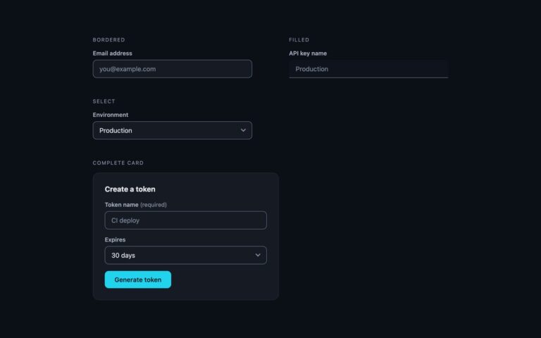
Three fields where the label starts inside the input, like a placeholder, and rises to the top edge when the field is focused or has a value. Bordered is a white field with a slate border; the label shrinks to 78% and sits above the typed text. Filled uses a light slate ground with a bottom rule, a common look in Material-style forms. Notched border lifts the label onto the border itself so it cuts a gap in the outline, which needs the label background to match whatever the field sits on. Unlike placeholder-only designs, the label is a real label element that stays visible after typing and stays clickable. The technique is CSS only: the input comes before its label, carries placeholder=” ” (a single space), and the label moves with :focus and :not(:placeholder-shown), which also catches browser autofill. The Bootstrap version is the stock .form-floating component resized and recoloured, with the notched variant added in a few lines; the Tailwind version uses peer, peer-focus and peer-placeholder-shown.

What’s included

  • Three variants: bordered, filled and notched border
  • Real label elements that stay visible and clickable after typing
  • CSS only: :focus and :not(:placeholder-shown), no JavaScript
  • Floats for browser autofill as well as typing
  • Bootstrap version built on .form-floating

Accessibility

Each input is named by a real label element, so screen readers read the field name whether the label is resting or raised. Resting label text reaches 4.5:1 on both the white and tinted grounds, and the raised label is blue at 4.5:1 or better. Focus turns the border blue and adds a 3px ring. The label movement and colour change are removed under prefers-reduced-motion.

Customise it

In plain CSS change --fl-border, --fl-focus, --fl-label, --fl-fill and --fl-surface on .fl; set --fl-surface to the colour behind a notched field. In Bootstrap the same custom properties live on .flx next to --bs-border-color; in Tailwind edit the colour classes on the input and label.