.sr-only{position:absolute;width:1px;height:1px;padding:0;margin:-1px;overflow:hidden;clip:rect(0,0,0,0);white-space:nowrap;border:0}

/* 1. The layout grid reacts to the checkbox inside it (:has), and the sidebar is a size container,
      so its own width decides whether labels show (@container). No JavaScript. */
.mx-app{display:grid;grid-template-columns:244px minmax(0,1fr);height:520px;background:#fff;border:1px solid #d6dce5;border-radius:16px;overflow:hidden;
  box-shadow:0 1px 2px rgba(15,23,42,.05),0 18px 40px -22px rgba(15,23,42,.28);transition:grid-template-columns .3s cubic-bezier(.4,0,.2,1)}
.mx-app:has(.mx-check:checked){grid-template-columns:72px minmax(0,1fr)}
.mx{--mx-accent:#a21caf;--mx-active-bg:#fbeaff;--mx-active-ink:#86198f;--mx-ink:#52525b;--mx-strong:#18181b;--mx-muted:#63636d;--mx-line:#e7e5eb;--mx-hover:#f4f4f5;
  container-type:inline-size;display:flex;flex-direction:column;min-width:0;padding:16px 12px;background:#fcfbfd;border-right:1px solid var(--mx-line);
  overflow:hidden;font-size:.875rem}
.mx ul{list-style:none;margin:0;padding:0;display:flex;flex-direction:column;gap:2px}
.mx-top{display:flex;align-items:center;justify-content:space-between;gap:8px;padding:0 0 14px 6px}
.mx-brand{display:flex;align-items:center;gap:10px;border-radius:8px;color:var(--mx-strong);font-size:1rem;font-weight:700;text-decoration:none;white-space:nowrap}
.mx-logo{flex:none;display:grid;place-items:center;width:32px;height:32px;border-radius:10px;background:conic-gradient(from 200deg,#a21caf,#db2777,#f59e0b,#a21caf);color:#fff;font-size:.85rem;font-weight:800}
.mx-toggle{position:relative;flex:none;display:grid;place-items:center;width:32px;height:32px;border:1px solid #d4d4d8;border-radius:8px;background:#fff;color:var(--mx-ink);cursor:pointer;
  transition:background-color .15s}
.mx-toggle:hover{background:var(--mx-hover)}
.mx-toggle input{position:absolute;inset:0;margin:0;opacity:0;cursor:pointer}
.mx-toggle svg{width:16px;height:16px}
.mx-toggle:has(:focus-visible){outline:2px solid var(--mx-accent);outline-offset:2px}
.mx-heading{margin:16px 0 6px;padding:0 10px;font-size:.6875rem;font-weight:700;letter-spacing:.08em;text-transform:uppercase;color:var(--mx-muted);white-space:nowrap}
.mx-link{position:relative;display:flex;align-items:center;gap:12px;padding:9px 12px;border-radius:9px;color:var(--mx-ink);font-weight:500;text-decoration:none;white-space:nowrap;
  transition:background-color .15s,color .15s}
.mx-link svg{width:20px;height:20px;flex:none}
.mx-link:hover{background:var(--mx-hover);color:var(--mx-strong)}
.mx-link[aria-current="page"]{background:var(--mx-active-bg);color:var(--mx-active-ink);font-weight:600}
.mx-count{margin-left:auto;padding:0 7px;border-radius:999px;background:var(--mx-accent);color:#fff;font-size:.7rem;font-weight:700;line-height:1.6}
.mx a:focus-visible{outline:2px solid var(--mx-accent);outline-offset:2px}
.mx .mx-foot{margin-top:auto}
@container (max-width:140px){
  .mx-top{flex-direction:column;padding:0 0 10px;gap:12px}
  .mx-label{position:absolute;width:1px;height:1px;overflow:hidden;clip:rect(0,0,0,0);white-space:nowrap}
  .mx-heading{height:1px;margin:12px 10px;padding:0;background:var(--mx-line);overflow:hidden;color:transparent}
  .mx-link{justify-content:center;padding:10px}
  .mx-count{position:absolute;top:2px;right:2px;padding:0 5px;font-size:.625rem}
  .mx-toggle svg{transform:scaleX(-1)}
}

/* 2. Drawer: a modal <dialog>. command="show-modal" opens it with no script, closedby="any" closes it on a backdrop click,
      @starting-style animates both ways. */
.mx-shell{display:flex;flex-direction:column;height:460px;background:#fff;border:1px solid #d6dce5;border-radius:16px;overflow:hidden;
  box-shadow:0 1px 2px rgba(15,23,42,.05),0 18px 40px -22px rgba(15,23,42,.28)}
.mx-bar{display:flex;align-items:center;gap:12px;padding:12px 18px;border-bottom:1px solid #e7e5eb}
.mx-bar b{color:#18181b}
.mx-bar span{margin-left:auto;font-size:.8rem;color:#63636d}
.mx-btn{display:grid;place-items:center;width:36px;height:36px;padding:0;border:1px solid #d4d4d8;border-radius:10px;background:#fff;color:#18181b;cursor:pointer;transition:background-color .15s}
.mx-btn:hover{background:#f4f4f5}
.mx-btn svg{width:18px;height:18px}
.mx-btn:focus-visible{outline:2px solid #a21caf;outline-offset:2px}
.mx-drawer{position:fixed;inset:10px auto 10px 10px;width:min(300px,calc(100vw - 20px));height:auto;max-width:none;max-height:none;margin:0;
  flex-direction:column;border:0;border-radius:18px;box-shadow:0 30px 60px -20px rgba(24,24,27,.45);
  translate:calc(-100% - 20px) 0;transition:translate .32s cubic-bezier(.3,0,.2,1),display .32s allow-discrete,overlay .32s allow-discrete}
.mx-drawer:not([open]){display:none}
.mx-drawer[open]{display:flex;translate:0 0}
@starting-style{.mx-drawer[open]{translate:calc(-100% - 20px) 0}}
.mx-drawer::backdrop{background:rgba(24,24,27,0);backdrop-filter:blur(0);
  transition:background-color .32s,backdrop-filter .32s,display .32s allow-discrete,overlay .32s allow-discrete}
.mx-drawer[open]::backdrop{background:rgba(24,24,27,.4);backdrop-filter:blur(3px)}
@starting-style{.mx-drawer[open]::backdrop{background:rgba(24,24,27,0);backdrop-filter:blur(0)}}
.mx-drawer .mx-top{padding:0 0 14px 6px}

@media (max-width:640px){
  .mx-app{grid-template-columns:minmax(0,1fr);height:auto}
  .mx-app>.mx{border-right:0;border-bottom:1px solid var(--mx-line)}
  .mx-app:has(.mx-check:checked){grid-template-columns:72px minmax(0,1fr)}
  .mx-app:has(.mx-check:checked)>.mx{border-right:1px solid var(--mx-line);border-bottom:0}
}
@media (prefers-reduced-motion:reduce){.mx-app,.mx-drawer,.mx-drawer::backdrop,.mx-link,.mx-toggle,.mx-btn{transition:none}}
JavaScript
// Only for browsers without invoker commands (command / commandfor): wire the same buttons to the dialog API.
if (!('command' in HTMLButtonElement.prototype)) {
  document.querySelectorAll('button[commandfor]').forEach(function (btn) {
    btn.addEventListener('click', function () {
      var dialog = document.getElementById(btn.getAttribute('commandfor'));
      if (!dialog) return;
      if (btn.getAttribute('command') === 'show-modal') dialog.showModal(); else dialog.close();
    });
  });
}
/* Bootstrap version: .btn-check + .btn for the collapse toggle, .nav/.nav-link lists, .badge, .btn for the drawer buttons. */

/* 1. The layout grid reacts to the checkbox inside it (:has), and the sidebar is a size container,
      so its own width decides whether labels show (@container). No JavaScript. */
.mx-app{display:grid;grid-template-columns:244px minmax(0,1fr);height:520px;background:#fff;border:1px solid #d6dce5;border-radius:16px;overflow:hidden;
  box-shadow:0 1px 2px rgba(15,23,42,.05),0 18px 40px -22px rgba(15,23,42,.28);transition:grid-template-columns .3s cubic-bezier(.4,0,.2,1)}
.mx-app:has(.mx-check:checked){grid-template-columns:72px minmax(0,1fr)}
.mx{--mx-accent:#a21caf;--mx-active-bg:#fbeaff;--mx-active-ink:#86198f;--mx-ink:#52525b;--mx-strong:#18181b;--mx-muted:#63636d;--mx-line:#e7e5eb;--mx-hover:#f4f4f5;
  container-type:inline-size;display:flex;flex-direction:column;min-width:0;padding:16px 12px;background:#fcfbfd;border-right:1px solid var(--mx-line);
  overflow:hidden;font-size:.875rem}
.mx .nav{gap:2px}
.mx-top{display:flex;align-items:center;justify-content:space-between;gap:8px;padding:0 0 14px 6px}
.mx-brand{display:flex;align-items:center;gap:10px;border-radius:8px;color:var(--mx-strong);font-size:1rem;font-weight:700;text-decoration:none;white-space:nowrap}
.mx-logo{flex:none;display:grid;place-items:center;width:32px;height:32px;border-radius:10px;background:conic-gradient(from 200deg,#a21caf,#db2777,#f59e0b,#a21caf);color:#fff;font-size:.85rem;font-weight:800}
.mx-toggle{--bs-btn-padding-x:0;--bs-btn-padding-y:0;display:grid;place-items:center;width:32px;height:32px;border:1px solid #d4d4d8;border-radius:8px;background:#fff;color:var(--mx-ink);cursor:pointer;
  transition:background-color .15s}
.mx-toggle:hover{background:var(--mx-hover)}
.btn-check:checked+.mx-toggle{background:#fff;color:var(--mx-ink);border-color:#d4d4d8}
.mx-toggle svg{width:16px;height:16px}
.btn-check:focus-visible+.mx-toggle{box-shadow:none;outline:2px solid var(--mx-accent);outline-offset:2px}
.mx-heading{margin:16px 0 6px;line-height:1.5;padding:0 10px;font-size:.6875rem;font-weight:700;letter-spacing:.08em;text-transform:uppercase;color:var(--mx-muted);white-space:nowrap}
.mx .nav-link{position:relative;display:flex;font-size:.875rem;line-height:1.5;align-items:center;gap:12px;padding:9px 12px;border-radius:9px;color:var(--mx-ink);font-weight:500;text-decoration:none;white-space:nowrap;
  transition:background-color .15s,color .15s}
.mx .nav-link svg{width:20px;height:20px;flex:none}
.mx .nav-link:hover{background:var(--mx-hover);color:var(--mx-strong)}
.mx .nav-link[aria-current="page"]{background:var(--mx-active-bg);color:var(--mx-active-ink);font-weight:600}
.mx .badge{margin-left:auto;padding:0 7px;border-radius:999px;background:var(--mx-accent);color:#fff;font-size:.7rem;font-weight:700;line-height:1.6}
.mx a:focus-visible,.mx-btn:focus-visible{box-shadow:none}
.mx a:focus-visible{outline:2px solid var(--mx-accent);outline-offset:2px}
.mx .mx-foot{margin-top:auto}
@container (max-width:140px){
  .mx-top{flex-direction:column;padding:0 0 10px;gap:12px}
  .mx-label{position:absolute;width:1px;height:1px;overflow:hidden;clip:rect(0,0,0,0);white-space:nowrap}
  .mx-heading{height:1px;margin:12px 10px;padding:0;background:var(--mx-line);overflow:hidden;color:transparent}
  .mx .nav-link{justify-content:center;padding:10px}
  .mx .badge{position:absolute;top:2px;right:2px;padding:0 5px;font-size:.625rem}
  .mx-toggle svg{transform:scaleX(-1)}
}

/* 2. Drawer: a modal <dialog>. command="show-modal" opens it with no script, closedby="any" closes it on a backdrop click,
      @starting-style animates both ways. */
.mx-shell{display:flex;flex-direction:column;height:460px;background:#fff;border:1px solid #d6dce5;border-radius:16px;overflow:hidden;
  box-shadow:0 1px 2px rgba(15,23,42,.05),0 18px 40px -22px rgba(15,23,42,.28)}
.mx-bar{display:flex;align-items:center;gap:12px;padding:12px 18px;border-bottom:1px solid #e7e5eb}
.mx-bar b{color:#18181b}
.mx-bar span{margin-left:auto;font-size:.8rem;color:#63636d}
.mx-btn{--bs-btn-padding-x:0;--bs-btn-padding-y:0;display:grid;place-items:center;width:36px;height:36px;padding:0;border:1px solid #d4d4d8;border-radius:10px;background:#fff;color:#18181b;cursor:pointer;transition:background-color .15s}
.mx-btn:hover{background:#f4f4f5}
.mx-btn svg{width:18px;height:18px}
.mx-btn:focus-visible{outline:2px solid #a21caf;outline-offset:2px}
.mx-drawer{position:fixed;inset:10px auto 10px 10px;width:min(300px,calc(100vw - 20px));height:auto;max-width:none;max-height:none;margin:0;
  flex-direction:column;border:0;border-radius:18px;box-shadow:0 30px 60px -20px rgba(24,24,27,.45);
  translate:calc(-100% - 20px) 0;transition:translate .32s cubic-bezier(.3,0,.2,1),display .32s allow-discrete,overlay .32s allow-discrete}
.mx-drawer:not([open]){display:none}
.mx-drawer[open]{display:flex;translate:0 0}
@starting-style{.mx-drawer[open]{translate:calc(-100% - 20px) 0}}
.mx-drawer::backdrop{background:rgba(24,24,27,0);backdrop-filter:blur(0);
  transition:background-color .32s,backdrop-filter .32s,display .32s allow-discrete,overlay .32s allow-discrete}
.mx-drawer[open]::backdrop{background:rgba(24,24,27,.4);backdrop-filter:blur(3px)}
@starting-style{.mx-drawer[open]::backdrop{background:rgba(24,24,27,0);backdrop-filter:blur(0)}}
.mx-drawer .mx-top{padding:0 0 14px 6px}

@media (max-width:640px){
  .mx-app{grid-template-columns:minmax(0,1fr);height:auto}
  .mx-app>.mx{border-right:0;border-bottom:1px solid var(--mx-line)}
  .mx-app:has(.mx-check:checked){grid-template-columns:72px minmax(0,1fr)}
  .mx-app:has(.mx-check:checked)>.mx{border-right:1px solid var(--mx-line);border-bottom:0}
}
@media (prefers-reduced-motion:reduce){.mx-app,.mx-drawer,.mx-drawer::backdrop,.mx .nav-link,.mx-toggle,.mx-btn{transition:none}}
JavaScript
// Only for browsers without invoker commands (command / commandfor): wire the same buttons to the dialog API.
if (!('command' in HTMLButtonElement.prototype)) {
  document.querySelectorAll('button[commandfor]').forEach(function (btn) {
    btn.addEventListener('click', function () {
      var dialog = document.getElementById(btn.getAttribute('commandfor'));
      if (!dialog) return;
      if (btn.getAttribute('command') === 'show-modal') dialog.showModal(); else dialog.close();
    });
  });
}
// Only for browsers without invoker commands (command / commandfor): wire the same buttons to the dialog API.
if (!('command' in HTMLButtonElement.prototype)) {
  document.querySelectorAll('button[commandfor]').forEach(function (btn) {
    btn.addEventListener('click', function () {
      var dialog = document.getElementById(btn.getAttribute('commandfor'));
      if (!dialog) return;
      if (btn.getAttribute('command') === 'show-modal') dialog.showModal(); else dialog.close();
    });
  });
}
About this set
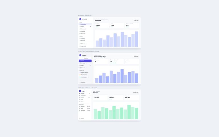
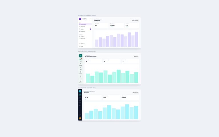
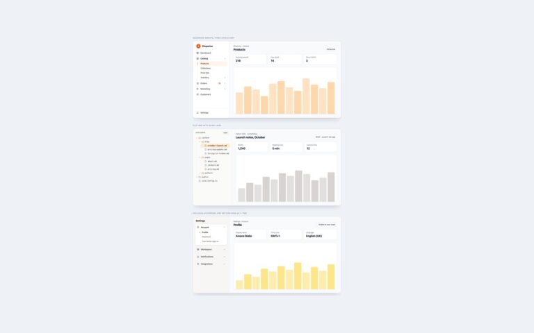
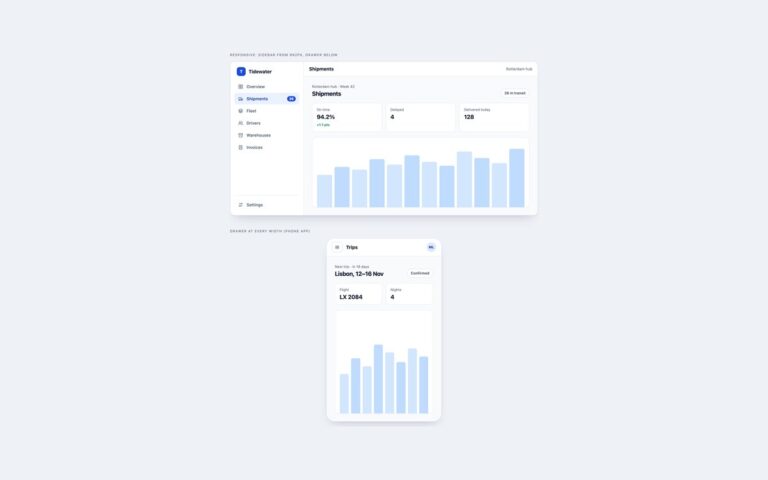
Two sidebars that use current CSS and HTML for behaviour that usually needs JavaScript. The first is a support inbox whose collapse toggle is a checkbox inside the sidebar. The layout grid watches it with :has() and changes its first column from 244px to 72px, and the change animates because grid-template-columns can transition. The sidebar is also a size container, so a container query hides the labels, turns the Channels heading into a divider and moves the count onto the icon whenever the sidebar is narrower than 140px. That means the same markup compacts itself in any narrow column, not only when toggled. The second is a help-centre drawer built on a modal dialog element. The menu button opens it with command=”show-modal” and commandfor, the close button uses command=”close”, Esc closes it, and closedby=”any” closes it on a backdrop click. @starting-style animates the slide in both directions and the backdrop blurs the page behind. Because the dialog is modal, focus stays inside it and the page behind cannot be reached. A short script is included only for browsers that do not support invoker commands yet.
What’s included
Collapse driven by :has() on the layout grid, no JavaScript
Container query compacts the sidebar whenever it is narrow
Animated grid-template-columns change
Modal dialog drawer opened with invoker commands
Enter and exit animation with @starting-style and a blurred backdrop
Accessibility
The collapse toggle is a real checkbox labelled Collapse sidebar, and its visible square shows a focus outline when the checkbox has focus. Collapsed labels are visually hidden but still name every link. The drawer is a modal dialog with an aria-label, so it traps focus, makes the page inert and closes with Esc; its buttons have aria-labels. All transitions stop under prefers-reduced-motion.
Customise it
Change the --mx-* custom properties on .mx for colours, the 244px and 72px values in .mx-app for widths, and the 140px container query for the point where labels hide. Bootstrap uses a .btn-check toggle with the same CSS; Tailwind uses has-checked:, @container and @max-[140px]: utilities.