About this set
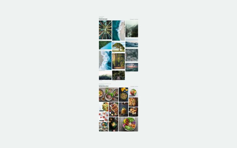
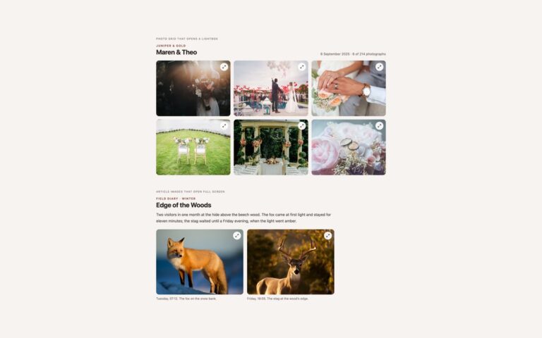
Two gallery features that usually need JavaScript, done in CSS. Filter by category with radio buttons and :has() shows twelve photographs from four categories with a row of pill filters (All, Landscape, City, Food and Wildlife, each with a count); the filters are real radio buttons, and rules such as .fl:has([value=city]:checked) .fl-item:not([data-cat=city]) hide every other category. Photos that come back fade and grow in through @starting-style. Popover lightbox with no script is a print shop of four editions: each thumbnail is a button with popovertarget, which opens a dark popover with the large photo, the title, edition, size and price, and a close button. The browser handles light dismiss, so Esc or a click outside closes it, autofocus puts focus on the close button and focus goes back to the thumbnail. Use the filter for portfolios and the popover where a full modal dialog is more than you need. The Bootstrap version styles the filters as .btn-check pills, and the Tailwind version uses has-, peer-checked:, starting: and open: variants.
What’s included
- Category filter built from radio buttons and :has(), with no JavaScript
- Filtered photos fade back in with @starting-style
- Lightbox built on the native Popover API with light dismiss
- Close button gets focus on open and focus returns to the thumbnail
- Bootstrap version uses .btn-check pills and .row-cols-* grids
Accessibility
The filters are a fieldset of native radio buttons with a hidden legend, so they are announced as a group and change with the arrow keys; hidden photos use display: none and leave the reading order. The print buttons are named Enlarge and the title, each popover has role="dialog" and is named by its heading, and the close button is labelled. Every control shows a visible focus outline, and the fades and zoom are switched off under prefers-reduced-motion.
Customise it
Change the pill colours in .fl-filters span (Bootstrap: the --bs-btn-* variables on .fl-filters .btn), the categories in the data-cat values and :has() rules, and the popover colours in .pv-pop and .pv-pop::backdrop. In Tailwind edit the group-has-[[value=…]:checked]/fl:hidden classes and the open: and backdrop: utilities.