<div><span class="lbl">Slide up</span>
<a href="#" class="cap cap-slide">
  <img src="https://images.unsplash.com/photo-1487958449943-2429e8be8625?auto=format&fit=crop&w=900&h=675&q=70" alt="Angular white building with a glass base against a pale sky" width="900" height="675">
  <span class="cap-panel"><span class="cap-kicker">Cultural · 2023</span><span class="cap-title">Kite Pavilion</span>
    <span class="cap-text">A folded aluminium roof over a riverside gallery, built in fourteen months.</span>
    <span class="cap-more">View project <svg viewBox="0 0 24 24" fill="none" stroke="currentColor" stroke-width="2" aria-hidden="true"><path d="M5 12h14M13 6l6 6-6 6"/></svg></span></span>
</a></div>
<div><span class="lbl">Fade overlay</span>
<a href="#" class="cap cap-fade">
  <img src="https://images.unsplash.com/photo-1511818966892-d7d671e672a2?auto=format&fit=crop&w=900&h=675&q=70" alt="Looking up between dark glass office towers under a grey sky" width="900" height="675">
  <span class="cap-panel"><span class="cap-kicker">Commercial · 2022</span><span class="cap-title">Meridian Towers</span>
    <span class="cap-text">Twin offices wrapped in fritted glass to cut summer glare.</span></span>
</a></div>
<div><span class="lbl">Curtain</span>
<a href="#" class="cap cap-curtain">
  <img src="https://images.unsplash.com/photo-1480714378408-67cf0d13bc1b?auto=format&fit=crop&w=900&h=675&q=70" alt="Low sun shining between Manhattan towers onto a long avenue" width="900" height="675">
  <span class="cap-panel"><span class="cap-kicker">Residential · 2024</span><span class="cap-title">Harbour Street Lofts</span>
    <span class="cap-text">Ninety apartments above a restored 1910 warehouse.</span></span>
</a></div>
<div><span class="lbl">Corner reveal</span>
<a href="#" class="cap cap-corner">
  <img src="https://images.unsplash.com/photo-1600566753190-17f0baa2a6c3?auto=format&fit=crop&w=900&h=675&q=70" alt="Modern two-storey house with timber cladding and black window frames" width="900" height="675">
  <span class="cap-panel"><span class="cap-kicker">Private home · 2025</span><span class="cap-title">Kestrel House</span>
    <span class="cap-text">Timber, steel and a courtyard pool on a narrow suburban plot.</span>
    <svg class="cap-plus" viewBox="0 0 24 24" fill="none" stroke="currentColor" stroke-width="2.4" stroke-linecap="round" aria-hidden="true"><path d="M12 5v14M5 12h14"/></svg></span>
</a></div>
CSS
/* Caption reveal overlays. The caption is real text inside the link, so it is part of the link's name.
   It appears on :hover and :focus-visible; on touch screens (hover: none) it is always shown as a bottom bar. */
.cap{--cap-panel:rgba(17,17,17,.86);--cap-ink:#fff;--cap-soft:#e4e4e0;--cap-accent:#f0b429;--cap-curtain:#17273a;
  --cap-radius:16px;--cap-ease:cubic-bezier(.22,.8,.24,1);
  position:relative;display:block;aspect-ratio:4/3;overflow:hidden;border-radius:var(--cap-radius);
  background:#2a2a2a;color:var(--cap-ink);text-decoration:none;isolation:isolate}
.cap:focus-visible{outline:3px solid #141414;outline-offset:4px}
.cap img{position:absolute;inset:0;width:100%;height:100%;object-fit:cover;transition:transform .7s var(--cap-ease)}
.cap-panel{position:absolute;z-index:2;display:flex;flex-direction:column;gap:6px;padding:22px 24px;line-height:1.4}
.cap-kicker{font-size:.7rem;font-weight:700;letter-spacing:.14em;text-transform:uppercase;color:var(--cap-accent)}
.cap-title{font-size:1.35rem;font-weight:700;letter-spacing:-.01em;line-height:1.2}
.cap-text{font-size:.92rem;color:var(--cap-soft);max-width:36ch}
.cap-more{margin-top:6px;font-size:.85rem;font-weight:600;display:inline-flex;align-items:center;gap:6px}
.cap-more svg{width:16px;height:16px}

/* 1. Slide up from the bottom edge */
.cap-slide .cap-panel{inset:auto 0 0 0;background:var(--cap-panel);transform:translateY(101%);transition:transform .45s var(--cap-ease)}
.cap-slide:is(:hover,:focus-visible) .cap-panel{transform:none}
.cap-slide:is(:hover,:focus-visible) img{transform:translateY(-6%) scale(1.06)}

/* 2. Fade a full overlay in, text rising slightly */
.cap-fade .cap-panel{inset:0;justify-content:center;align-items:center;text-align:center;background:var(--cap-panel);
  opacity:0;transition:opacity .4s}
.cap-fade .cap-panel>*{transform:translateY(12px);transition:transform .45s var(--cap-ease)}
.cap-fade:is(:hover,:focus-visible) .cap-panel{opacity:1}
.cap-fade:is(:hover,:focus-visible) .cap-panel>*{transform:none}

/* 3. Curtain: two halves close from the sides, then the text fades in */
.cap-curtain::before,.cap-curtain::after{content:"";position:absolute;z-index:1;top:0;bottom:0;width:50.5%;
  background:var(--cap-curtain);transform:scaleX(0);transition:transform .5s var(--cap-ease)}
.cap-curtain::before{left:0;transform-origin:left}
.cap-curtain::after{right:0;transform-origin:right}
.cap-curtain .cap-panel{inset:0;justify-content:center;align-items:center;text-align:center;opacity:0;transition:opacity .25s}
.cap-curtain:is(:hover,:focus-visible)::before,.cap-curtain:is(:hover,:focus-visible)::after{transform:scaleX(1)}
.cap-curtain:is(:hover,:focus-visible) .cap-panel{opacity:1;transition-delay:.28s}

/* 4. Corner: a round + button in the corner grows into the whole panel */
.cap-corner .cap-panel{inset:0;justify-content:flex-end;background:#9a3412;
  clip-path:circle(26px at calc(100% - 38px) calc(100% - 38px));transition:clip-path .55s var(--cap-ease)}
.cap-corner .cap-panel>:not(.cap-plus){opacity:0;transition:opacity .25s}
.cap-plus{position:absolute;right:24px;bottom:24px;width:28px;height:28px;transition:transform .45s var(--cap-ease)}
.cap-corner:is(:hover,:focus-visible) .cap-panel{clip-path:circle(150% at calc(100% - 38px) calc(100% - 38px))}
.cap-corner:is(:hover,:focus-visible) .cap-panel>:not(.cap-plus){opacity:1;transition-delay:.18s}
.cap-corner:is(:hover,:focus-visible) .cap-plus{transform:rotate(45deg)}
.cap-corner .cap-kicker{color:#fed7aa}
.cap-corner .cap-text{color:#ffedd5}

/* Touch screens have no hover: show every caption as a bar along the bottom */
@media (hover:none){
  .cap .cap-panel{inset:auto 0 0 0;justify-content:flex-end;align-items:flex-start;text-align:left;opacity:1;transform:none;
    clip-path:none;background:linear-gradient(to top,rgba(17,17,17,.92),rgba(17,17,17,.78) 70%,rgba(17,17,17,0));padding-top:48px}
  .cap .cap-panel>*{opacity:1!important;transform:none!important}
  .cap-plus,.cap-curtain::before,.cap-curtain::after{display:none}
}
/* Reduced motion: no sliding, scaling or wiping — captions switch on with a fade instead */
@media (prefers-reduced-motion:reduce){
  .cap img,.cap-panel>*,.cap-plus{transform:none!important;transition:none}
  .cap-slide .cap-panel{transform:none;opacity:0;transition:opacity .3s}
  .cap-slide:is(:hover,:focus-visible) .cap-panel{opacity:1}
  .cap-curtain::before,.cap-curtain::after{transform:none;opacity:0;transition:opacity .3s}
  .cap-curtain:is(:hover,:focus-visible)::before,.cap-curtain:is(:hover,:focus-visible)::after{opacity:1}
  .cap-curtain:is(:hover,:focus-visible) .cap-panel{transition-delay:0s}
  .cap-corner .cap-panel{transition:none}
  @media (hover:none){.cap-slide .cap-panel{opacity:1}}
}
Bootstrap 5 code
Requires: Bootstrap 5.3.8 CSS
HTML
<div class="row gx-4 gy-5">
<div class="col-md-6"><span class="lbl">Slide up</span>
<a href="#" class="card text-bg-dark cap cap-slide">
  <img class="card-img object-fit-cover" src="https://images.unsplash.com/photo-1487958449943-2429e8be8625?auto=format&fit=crop&w=900&h=675&q=70" alt="Angular white building with a glass base against a pale sky" width="900" height="675">
  <span class="card-img-overlay cap-panel"><span class="cap-kicker">Cultural · 2023</span><span class="cap-title">Kite Pavilion</span>
    <span class="cap-text">A folded aluminium roof over a riverside gallery, built in fourteen months.</span>
    <span class="cap-more">View project <svg viewBox="0 0 24 24" fill="none" stroke="currentColor" stroke-width="2" aria-hidden="true"><path d="M5 12h14M13 6l6 6-6 6"/></svg></span></span>
</a></div>
<div class="col-md-6"><span class="lbl">Fade overlay</span>
<a href="#" class="card text-bg-dark cap cap-fade">
  <img class="card-img object-fit-cover" src="https://images.unsplash.com/photo-1511818966892-d7d671e672a2?auto=format&fit=crop&w=900&h=675&q=70" alt="Looking up between dark glass office towers under a grey sky" width="900" height="675">
  <span class="card-img-overlay cap-panel"><span class="cap-kicker">Commercial · 2022</span><span class="cap-title">Meridian Towers</span>
    <span class="cap-text">Twin offices wrapped in fritted glass to cut summer glare.</span></span>
</a></div>
<div class="col-md-6"><span class="lbl">Curtain</span>
<a href="#" class="card text-bg-dark cap cap-curtain">
  <img class="card-img object-fit-cover" src="https://images.unsplash.com/photo-1480714378408-67cf0d13bc1b?auto=format&fit=crop&w=900&h=675&q=70" alt="Low sun shining between Manhattan towers onto a long avenue" width="900" height="675">
  <span class="card-img-overlay cap-panel"><span class="cap-kicker">Residential · 2024</span><span class="cap-title">Harbour Street Lofts</span>
    <span class="cap-text">Ninety apartments above a restored 1910 warehouse.</span></span>
</a></div>
<div class="col-md-6"><span class="lbl">Corner reveal</span>
<a href="#" class="card text-bg-dark cap cap-corner">
  <img class="card-img object-fit-cover" src="https://images.unsplash.com/photo-1600566753190-17f0baa2a6c3?auto=format&fit=crop&w=900&h=675&q=70" alt="Modern two-storey house with timber cladding and black window frames" width="900" height="675">
  <span class="card-img-overlay cap-panel"><span class="cap-kicker">Private home · 2025</span><span class="cap-title">Kestrel House</span>
    <span class="cap-text">Timber, steel and a courtyard pool on a narrow suburban plot.</span>
    <svg class="cap-plus" viewBox="0 0 24 24" fill="none" stroke="currentColor" stroke-width="2.4" stroke-linecap="round" aria-hidden="true"><path d="M12 5v14M5 12h14"/></svg></span>
</a></div>
</div>
CSS
/* Bootstrap .card with .card-img and .card-img-overlay. Caption reveal overlays. The caption is real text inside the link, so it is part of the link's name.
   It appears on :hover and :focus-visible; on touch screens (hover: none) it is always shown as a bottom bar. */
.cap{--cap-panel:rgba(17,17,17,.86);--cap-ink:#fff;--cap-soft:#e4e4e0;--cap-accent:#f0b429;--cap-curtain:#17273a;
  --cap-radius:16px;--cap-ease:cubic-bezier(.22,.8,.24,1);
  --bs-card-border-width:0;--bs-card-border-radius:var(--cap-radius);--bs-card-inner-border-radius:var(--cap-radius);
  aspect-ratio:4/3;overflow:hidden;text-decoration:none;isolation:isolate}
.cap:focus-visible{outline:3px solid #141414;outline-offset:4px}
.cap .card-img{position:absolute;inset:0;width:100%;height:100%;transition:transform .7s var(--cap-ease)}
.cap-panel{z-index:2;display:flex;flex-direction:column;gap:6px;padding:22px 24px;line-height:1.4;border-radius:0}
.cap-kicker{font-size:.7rem;font-weight:700;letter-spacing:.14em;text-transform:uppercase;color:var(--cap-accent)}
.cap-title{font-size:1.35rem;font-weight:700;letter-spacing:-.01em;line-height:1.2}
.cap-text{font-size:.92rem;color:var(--cap-soft);max-width:36ch}
.cap-more{margin-top:6px;font-size:.85rem;font-weight:600;display:inline-flex;align-items:center;gap:6px}
.cap-more svg{width:16px;height:16px}

/* 1. Slide up from the bottom edge */
.cap-slide .cap-panel{inset:auto 0 0 0;background:var(--cap-panel);transform:translateY(101%);transition:transform .45s var(--cap-ease)}
.cap-slide:is(:hover,:focus-visible) .cap-panel{transform:none}
.cap-slide:is(:hover,:focus-visible) .card-img{transform:translateY(-6%) scale(1.06)}

/* 2. Fade a full overlay in, text rising slightly */
.cap-fade .cap-panel{inset:0;justify-content:center;align-items:center;text-align:center;background:var(--cap-panel);
  opacity:0;transition:opacity .4s}
.cap-fade .cap-panel>*{transform:translateY(12px);transition:transform .45s var(--cap-ease)}
.cap-fade:is(:hover,:focus-visible) .cap-panel{opacity:1}
.cap-fade:is(:hover,:focus-visible) .cap-panel>*{transform:none}

/* 3. Curtain: two halves close from the sides, then the text fades in */
.cap-curtain::before,.cap-curtain::after{content:"";position:absolute;z-index:1;top:0;bottom:0;width:50.5%;
  background:var(--cap-curtain);transform:scaleX(0);transition:transform .5s var(--cap-ease)}
.cap-curtain::before{left:0;transform-origin:left}
.cap-curtain::after{right:0;transform-origin:right}
.cap-curtain .cap-panel{inset:0;justify-content:center;align-items:center;text-align:center;opacity:0;transition:opacity .25s}
.cap-curtain:is(:hover,:focus-visible)::before,.cap-curtain:is(:hover,:focus-visible)::after{transform:scaleX(1)}
.cap-curtain:is(:hover,:focus-visible) .cap-panel{opacity:1;transition-delay:.28s}

/* 4. Corner: a round + button in the corner grows into the whole panel */
.cap-corner .cap-panel{inset:0;justify-content:flex-end;background:#9a3412;
  clip-path:circle(26px at calc(100% - 38px) calc(100% - 38px));transition:clip-path .55s var(--cap-ease)}
.cap-corner .cap-panel>:not(.cap-plus){opacity:0;transition:opacity .25s}
.cap-plus{position:absolute;right:24px;bottom:24px;width:28px;height:28px;transition:transform .45s var(--cap-ease)}
.cap-corner:is(:hover,:focus-visible) .cap-panel{clip-path:circle(150% at calc(100% - 38px) calc(100% - 38px))}
.cap-corner:is(:hover,:focus-visible) .cap-panel>:not(.cap-plus){opacity:1;transition-delay:.18s}
.cap-corner:is(:hover,:focus-visible) .cap-plus{transform:rotate(45deg)}
.cap-corner .cap-kicker{color:#fed7aa}
.cap-corner .cap-text{color:#ffedd5}

/* Touch screens have no hover: show every caption as a bar along the bottom */
@media (hover:none){
  .cap .cap-panel{inset:auto 0 0 0;justify-content:flex-end;align-items:flex-start;text-align:left;opacity:1;transform:none;
    clip-path:none;background:linear-gradient(to top,rgba(17,17,17,.92),rgba(17,17,17,.78) 70%,rgba(17,17,17,0));padding-top:48px}
  .cap .cap-panel>*{opacity:1!important;transform:none!important}
  .cap-plus,.cap-curtain::before,.cap-curtain::after{display:none}
}
/* Reduced motion: no sliding, scaling or wiping — captions switch on with a fade instead */
@media (prefers-reduced-motion:reduce){
  .cap .card-img,.cap-panel>*,.cap-plus{transform:none!important;transition:none}
  .cap-slide .cap-panel{transform:none;opacity:0;transition:opacity .3s}
  .cap-slide:is(:hover,:focus-visible) .cap-panel{opacity:1}
  .cap-curtain::before,.cap-curtain::after{transform:none;opacity:0;transition:opacity .3s}
  .cap-curtain:is(:hover,:focus-visible)::before,.cap-curtain:is(:hover,:focus-visible)::after{opacity:1}
  .cap-curtain:is(:hover,:focus-visible) .cap-panel{transition-delay:0s}
  .cap-corner .cap-panel{transition:none}
  @media (hover:none){.cap-slide .cap-panel{opacity:1}}
}
/* touch: matches screens without hover, where every caption is shown as a bottom bar */
@custom-variant touch (@media (hover: none));
@theme {
  --color-gold: #f0b429;
  --color-curtain: #17273a;
}
About this set
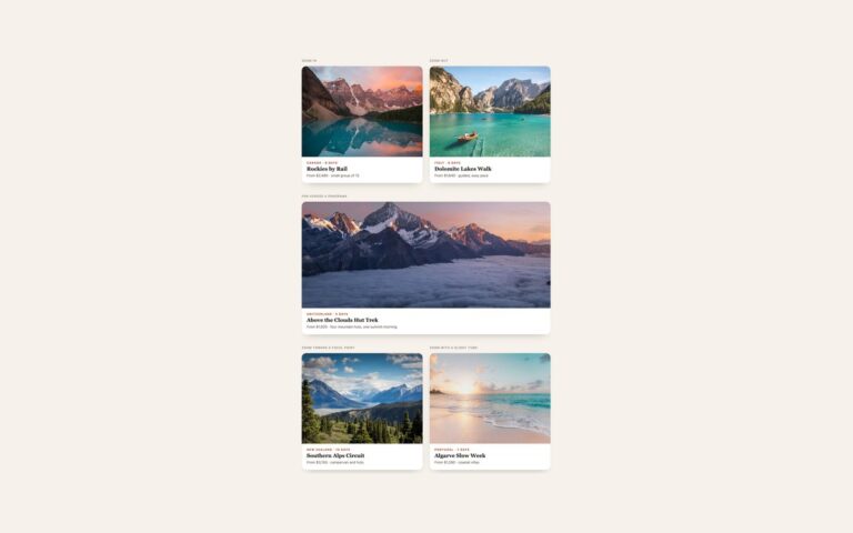
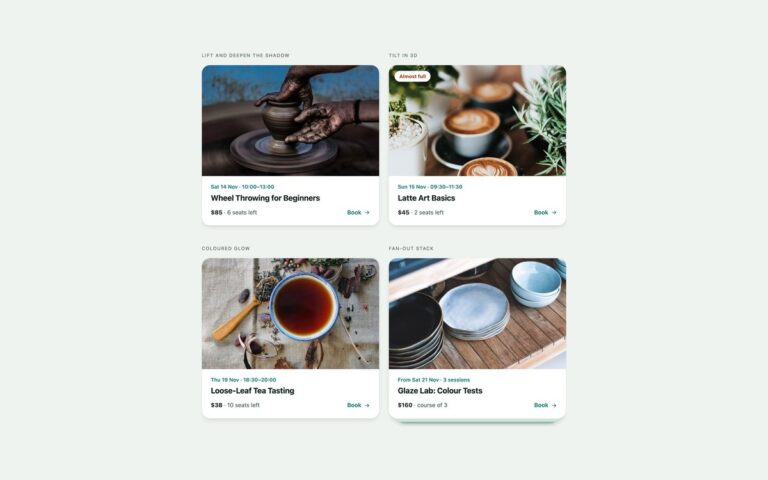
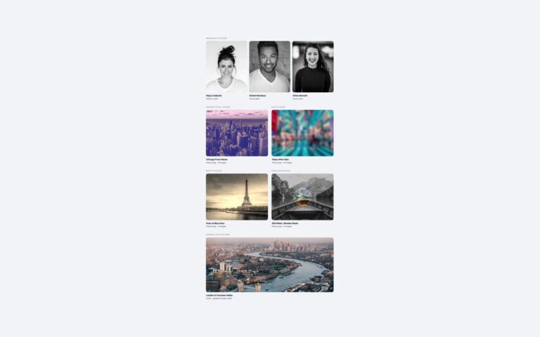
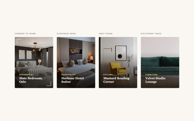
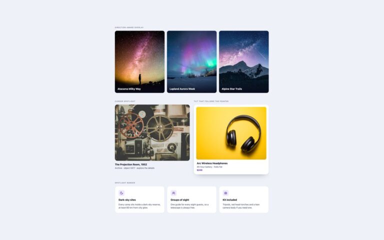
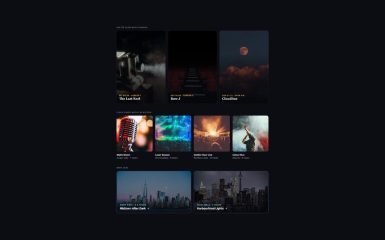
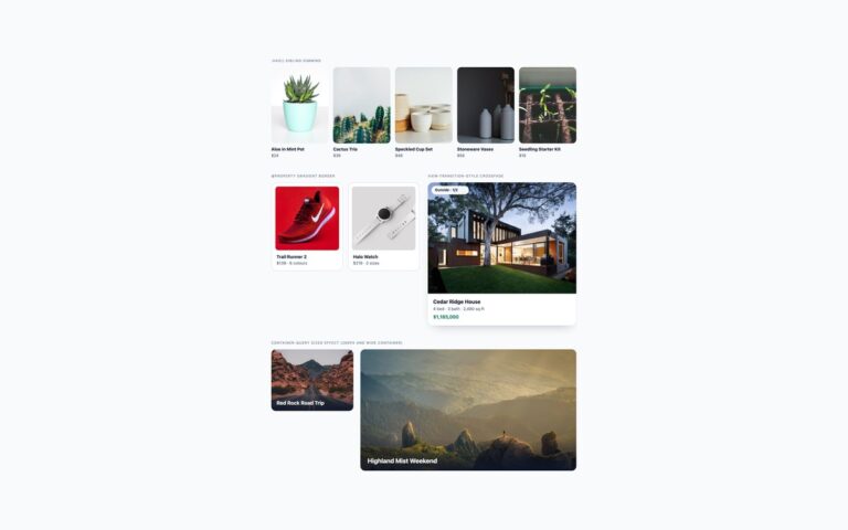
Four caption reveals for photo grids, shown on an architecture portfolio. Slide up raises a dark panel with a kicker, the project name, a sentence of detail and a View project cue from the bottom edge while the photo drifts up slightly. Fade overlay fades in a full charcoal layer with centred text that rises a few pixels. Curtain closes two navy halves from the sides and then fades the caption in. Corner reveal starts as a round plus button in the bottom corner and grows into a full orange panel through an animated clip-path circle, turning the plus into a cross. The caption is real text inside the link, so it is part of the link’s name whether it is showing or not. On touch screens, detected with the hover: none media query, every caption is shown as a bar along the bottom of the photo, because nobody can hover there. Use slide up or fade for most portfolios, the curtain when the photo can disappear entirely, and the corner when you want a visible hint that there is more.
What’s included
Four reveals: slide up, fade overlay, curtain, corner clip-path
Captions always shown as a bottom bar on touch screens
Same reveal on :hover and :focus-visible
Reduced motion fades captions in instead of sliding or wiping
Bootstrap version built on .card-img-overlay
Accessibility
Each tile is one link; its name is the photo's alt text plus the caption, which stays in the markup when hidden. Keyboard focus shows a 3px outline and reveals the caption exactly as hover does. Under prefers-reduced-motion nothing slides or wipes: the captions and curtains fade in, and the corner panel switches without animating.
Customise it
Colours are custom properties on .cap: --cap-panel, --cap-accent, --cap-curtain and --cap-radius; the corner panel colour is set in .cap-corner .cap-panel. In Tailwind change the gold and curtain theme colours and the bg- utilities on each panel.