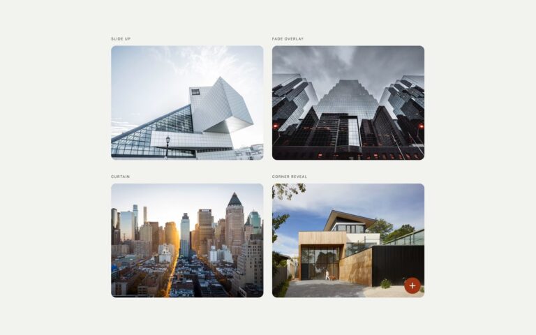
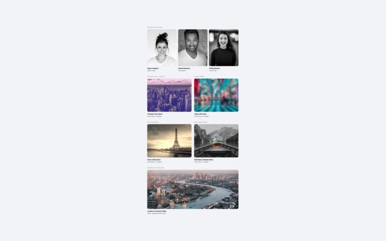
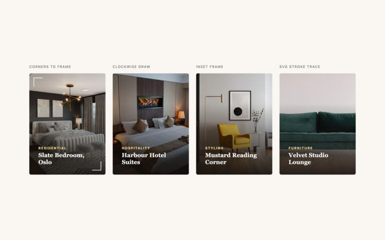
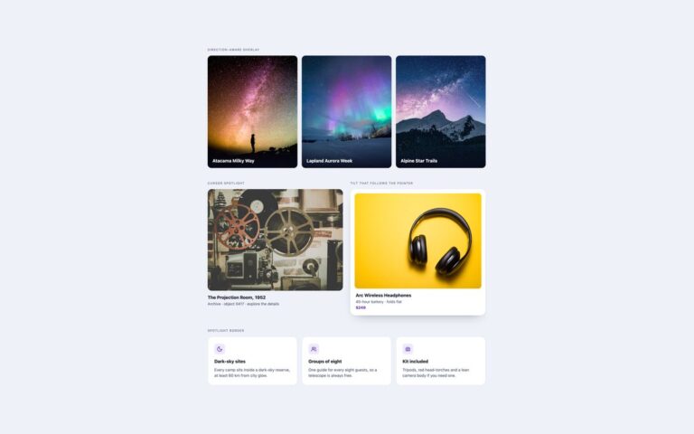
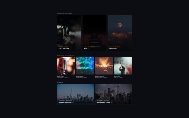
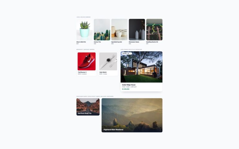
Open demo

CSS code

HTML
<div><span class="lbl">Lift and deepen the shadow</span>
<a href="#" class="lc lc-lift">
  <span class="lc-media"><img src="https://images.unsplash.com/photo-1493106641515-6b5631de4bb9?auto=format&fit=crop&w=800&h=500&q=70" alt="Clay-covered hands shaping a pot on a potter's wheel" width="800" height="500"></span>
  <span class="lc-body"><span class="lc-date">Sat 14 Nov · 10:00–13:00</span><span class="lc-title">Wheel Throwing for Beginners</span>
    <span class="lc-meta"><span><b>$85</b> · 6 seats left</span><span class="lc-cta">Book <svg viewBox="0 0 24 24" fill="none" stroke="currentColor" stroke-width="2" aria-hidden="true"><path d="M5 12h14M13 6l6 6-6 6"/></svg></span></span></span>
</a></div>
<div><span class="lbl">Tilt in 3D</span>
<a href="#" class="lc lc-tilt">
  <span class="lc-media"><img src="https://images.unsplash.com/photo-1509042239860-f550ce710b93?auto=format&fit=crop&w=800&h=500&q=70" alt="Cups of latte with leaf patterns in the foam on a café table" width="800" height="500"></span>
  <span class="lc-badge">Almost full</span>
  <span class="lc-body"><span class="lc-date">Sun 15 Nov · 09:30–11:30</span><span class="lc-title">Latte Art Basics</span>
    <span class="lc-meta"><span><b>$45</b> · 2 seats left</span><span class="lc-cta">Book <svg viewBox="0 0 24 24" fill="none" stroke="currentColor" stroke-width="2" aria-hidden="true"><path d="M5 12h14M13 6l6 6-6 6"/></svg></span></span></span>
</a></div>
<div><span class="lbl">Coloured glow</span>
<a href="#" class="lc lc-glow">
  <span class="lc-media"><img src="https://images.unsplash.com/photo-1571934811356-5cc061b6821f?auto=format&fit=crop&w=800&h=500&q=70" alt="A cup of black tea surrounded by dried herbs and spices on linen" width="800" height="500"></span>
  <span class="lc-body"><span class="lc-date">Thu 19 Nov · 18:30–20:00</span><span class="lc-title">Loose-Leaf Tea Tasting</span>
    <span class="lc-meta"><span><b>$38</b> · 10 seats left</span><span class="lc-cta">Book <svg viewBox="0 0 24 24" fill="none" stroke="currentColor" stroke-width="2" aria-hidden="true"><path d="M5 12h14M13 6l6 6-6 6"/></svg></span></span></span>
</a></div>
<div><span class="lbl">Fan-out stack</span>
<a href="#" class="lc lc-stack">
  <span class="lc-media"><img src="https://images.unsplash.com/photo-1578749556568-bc2c40e68b61?auto=format&fit=crop&w=800&h=500&q=70" alt="Stacks of handmade plates and bowls in pale blue and charcoal glazes" width="800" height="500"></span>
  <span class="lc-body"><span class="lc-date">From Sat 21 Nov · 3 sessions</span><span class="lc-title">Glaze Lab: Colour Tests</span>
    <span class="lc-meta"><span><b>$160</b> · course of 3</span><span class="lc-cta">Book <svg viewBox="0 0 24 24" fill="none" stroke="currentColor" stroke-width="2" aria-hidden="true"><path d="M5 12h14M13 6l6 6-6 6"/></svg></span></span></span>
</a></div>
CSS
/* Card hover effects. The whole card is one link; every effect runs on :hover and :focus-visible.
   The card itself has no background: the photo and the body paint the surface, so the glow and the
   stacked sheets (z-index:-1 pseudo-elements) can sit behind it. */
.lc{--lc-accent:#0f766e;--lc-ink:#15231d;--lc-muted:#4b5d55;--lc-card:#fff;--lc-radius:20px;--lc-ease:cubic-bezier(.2,.8,.2,1);
  position:relative;display:flex;flex-direction:column;border-radius:var(--lc-radius);color:var(--lc-ink);text-decoration:none;
  box-shadow:0 1px 2px rgba(21,35,29,.08),0 6px 16px -8px rgba(21,35,29,.25);
  transition:transform .4s var(--lc-ease),box-shadow .4s var(--lc-ease)}
.lc:focus-visible{outline:3px solid var(--lc-accent);outline-offset:5px}
.lc-media{position:relative;display:block;aspect-ratio:16/10;overflow:hidden;border-radius:var(--lc-radius) var(--lc-radius) 0 0;background:#cfdcd5}
.lc-media img{display:block;width:100%;height:100%;object-fit:cover;transition:transform .6s var(--lc-ease)}
.lc-body{display:grid;gap:6px;padding:18px 22px 22px;background:var(--lc-card);border-radius:0 0 var(--lc-radius) var(--lc-radius);line-height:1.4}
.lc-date{font-size:.8rem;font-weight:600;color:var(--lc-accent)}
.lc-title{font-size:1.2rem;font-weight:700;letter-spacing:-.01em;line-height:1.25;transition:color .3s}
.lc-meta{display:flex;justify-content:space-between;align-items:center;gap:12px;margin-top:8px;font-size:.9rem;color:var(--lc-muted)}
.lc-meta b{color:var(--lc-ink)}
.lc-cta{display:inline-flex;align-items:center;gap:6px;font-weight:600;color:var(--lc-accent)}
.lc-cta svg{width:16px;height:16px;transition:transform .3s var(--lc-ease)}
.lc:is(:hover,:focus-visible) .lc-title{color:var(--lc-accent)}
.lc:is(:hover,:focus-visible) .lc-cta svg{transform:translateX(4px)}

/* 1. Lift with a deeper shadow */
.lc-lift:is(:hover,:focus-visible){transform:translateY(-8px);
  box-shadow:0 2px 4px rgba(21,35,29,.06),0 30px 50px -20px rgba(21,35,29,.45)}
.lc-lift:is(:hover,:focus-visible) .lc-media img{transform:scale(1.05)}

/* 2. Tilt in 3D: the card leans back and the badge lifts off it */
.lc-tilt{transform-style:preserve-3d}
.lc-tilt:is(:hover,:focus-visible){transform:perspective(900px) rotateX(7deg) translateY(-6px);
  box-shadow:0 34px 40px -26px rgba(21,35,29,.5)}
.lc-badge{position:absolute;top:14px;left:14px;padding:6px 12px;border-radius:999px;background:#fff;color:#9a3412;
  font-size:.75rem;font-weight:700;box-shadow:0 4px 12px rgba(21,35,29,.18);transition:transform .4s var(--lc-ease)}
.lc-tilt:is(:hover,:focus-visible) .lc-badge{transform:translateZ(40px)}
.lc-tilt .lc-media::after{content:"";position:absolute;inset:0;background:linear-gradient(165deg,rgba(255,255,255,.4),rgba(255,255,255,0) 45%);
  opacity:0;transition:opacity .4s}
.lc-tilt:is(:hover,:focus-visible) .lc-media::after{opacity:1}

/* 3. Coloured glow: a blurred gradient halo and a gradient ring fade in behind the card */
.lc-glow{--lc-glow:linear-gradient(135deg,#10b981,#0ea5e9 50%,#8b5cf6);isolation:isolate}
.lc-glow::before,.lc-glow::after{content:"";position:absolute;z-index:-1;background:var(--lc-glow);opacity:0;transition:opacity .4s}
.lc-glow::before{inset:14px -4px -12px;border-radius:inherit;filter:blur(26px)}
.lc-glow::after{inset:-2px;border-radius:calc(var(--lc-radius) + 2px)}
.lc-glow:is(:hover,:focus-visible){transform:translateY(-4px);box-shadow:none}
.lc-glow:is(:hover,:focus-visible)::before{opacity:.9}
.lc-glow:is(:hover,:focus-visible)::after{opacity:1}

/* 4. Fan-out stack: two sheets behind the card swing out */
.lc-stack{isolation:isolate}
.lc-stack::before,.lc-stack::after{content:"";position:absolute;inset:0;z-index:-1;border-radius:inherit;
  box-shadow:0 6px 16px -8px rgba(21,35,29,.3);transition:transform .45s var(--lc-ease),background-color .3s}
.lc-stack::before{background:#9fc7b6;transform:translateY(32px) scale(.9)}
.lc-stack::after{background:#cfe3da;transform:translateY(18px) scale(.95)}
.lc-stack:is(:hover,:focus-visible){transform:translateY(-4px)}
.lc-stack:is(:hover,:focus-visible)::before{transform:translate(18px,10px) rotate(5deg)}
.lc-stack:is(:hover,:focus-visible)::after{transform:translate(-14px,6px) rotate(-4deg)}

/* Reduced motion: nothing moves. Shadows, glow, sheen, colours and the title colour still change. */
@media (prefers-reduced-motion:reduce){
  .lc,.lc *,.lc::before,.lc::after,.lc .lc-media::after{transition-property:opacity,box-shadow,color,background-color!important}
  .lc:is(:hover,:focus-visible),.lc:is(:hover,:focus-visible) *{transform:none!important}
  .lc-stack:is(:hover,:focus-visible)::before{transform:translateY(32px) scale(.9)!important;background:#7fb5a0}
  .lc-stack:is(:hover,:focus-visible)::after{transform:translateY(18px) scale(.95)!important;background:#b2d4c6}
}

Bootstrap 5 code

Requires: Bootstrap 5.3.8 CSS

HTML
<div class="row gx-4 gy-5">
<div class="col-md-6"><span class="lbl">Lift and deepen the shadow</span>
<a href="#" class="card text-decoration-none lc lc-lift">
  <span class="lc-media"><img class="card-img-top object-fit-cover" src="https://images.unsplash.com/photo-1493106641515-6b5631de4bb9?auto=format&fit=crop&w=800&h=500&q=70" alt="Clay-covered hands shaping a pot on a potter's wheel" width="800" height="500"></span>
  <span class="card-body lc-body"><span class="lc-date">Sat 14 Nov · 10:00–13:00</span><span class="card-title lc-title">Wheel Throwing for Beginners</span>
    <span class="lc-meta"><span><b>$85</b> · 6 seats left</span><span class="lc-cta">Book <svg viewBox="0 0 24 24" fill="none" stroke="currentColor" stroke-width="2" aria-hidden="true"><path d="M5 12h14M13 6l6 6-6 6"/></svg></span></span></span>
</a></div>
<div class="col-md-6"><span class="lbl">Tilt in 3D</span>
<a href="#" class="card text-decoration-none lc lc-tilt">
  <span class="lc-media"><img class="card-img-top object-fit-cover" src="https://images.unsplash.com/photo-1509042239860-f550ce710b93?auto=format&fit=crop&w=800&h=500&q=70" alt="Cups of latte with leaf patterns in the foam on a café table" width="800" height="500"></span>
  <span class="badge rounded-pill lc-badge">Almost full</span>
  <span class="card-body lc-body"><span class="lc-date">Sun 15 Nov · 09:30–11:30</span><span class="card-title lc-title">Latte Art Basics</span>
    <span class="lc-meta"><span><b>$45</b> · 2 seats left</span><span class="lc-cta">Book <svg viewBox="0 0 24 24" fill="none" stroke="currentColor" stroke-width="2" aria-hidden="true"><path d="M5 12h14M13 6l6 6-6 6"/></svg></span></span></span>
</a></div>
<div class="col-md-6"><span class="lbl">Coloured glow</span>
<a href="#" class="card text-decoration-none lc lc-glow">
  <span class="lc-media"><img class="card-img-top object-fit-cover" src="https://images.unsplash.com/photo-1571934811356-5cc061b6821f?auto=format&fit=crop&w=800&h=500&q=70" alt="A cup of black tea surrounded by dried herbs and spices on linen" width="800" height="500"></span>
  <span class="card-body lc-body"><span class="lc-date">Thu 19 Nov · 18:30–20:00</span><span class="card-title lc-title">Loose-Leaf Tea Tasting</span>
    <span class="lc-meta"><span><b>$38</b> · 10 seats left</span><span class="lc-cta">Book <svg viewBox="0 0 24 24" fill="none" stroke="currentColor" stroke-width="2" aria-hidden="true"><path d="M5 12h14M13 6l6 6-6 6"/></svg></span></span></span>
</a></div>
<div class="col-md-6"><span class="lbl">Fan-out stack</span>
<a href="#" class="card text-decoration-none lc lc-stack">
  <span class="lc-media"><img class="card-img-top object-fit-cover" src="https://images.unsplash.com/photo-1578749556568-bc2c40e68b61?auto=format&fit=crop&w=800&h=500&q=70" alt="Stacks of handmade plates and bowls in pale blue and charcoal glazes" width="800" height="500"></span>
  <span class="card-body lc-body"><span class="lc-date">From Sat 21 Nov · 3 sessions</span><span class="card-title lc-title">Glaze Lab: Colour Tests</span>
    <span class="lc-meta"><span><b>$160</b> · course of 3</span><span class="lc-cta">Book <svg viewBox="0 0 24 24" fill="none" stroke="currentColor" stroke-width="2" aria-hidden="true"><path d="M5 12h14M13 6l6 6-6 6"/></svg></span></span></span>
</a></div>
</div>
CSS
/* Bootstrap .card as a link, with .card-img-top, .card-body and a .badge. Card hover effects. The whole card is one link; every effect runs on :hover and :focus-visible.
   The card itself has no background: the photo and the body paint the surface, so the glow and the
   stacked sheets (z-index:-1 pseudo-elements) can sit behind it. */
.lc{--lc-accent:#0f766e;--lc-ink:#15231d;--lc-muted:#4b5d55;--lc-card:#fff;--lc-radius:20px;--lc-ease:cubic-bezier(.2,.8,.2,1);
  --bs-card-bg:transparent;--bs-card-border-width:0;--bs-card-border-radius:var(--lc-radius);--bs-card-spacer-x:22px;--bs-card-spacer-y:18px;
  color:var(--lc-ink);
  box-shadow:0 1px 2px rgba(21,35,29,.08),0 6px 16px -8px rgba(21,35,29,.25);
  transition:transform .4s var(--lc-ease),box-shadow .4s var(--lc-ease)}
.lc:focus-visible{outline:3px solid var(--lc-accent);outline-offset:5px}
.lc-media{position:relative;display:block;aspect-ratio:16/10;overflow:hidden;border-radius:var(--lc-radius) var(--lc-radius) 0 0;background:#cfdcd5}
.lc-media img{display:block;width:100%;height:100%;border-radius:0;transition:transform .6s var(--lc-ease)}
.lc-body{display:grid;gap:6px;padding-bottom:22px;background:var(--lc-card);border-radius:0 0 var(--lc-radius) var(--lc-radius);line-height:1.4}
.lc-date{font-size:.8rem;font-weight:600;color:var(--lc-accent)}
.lc-title{margin:0;font-size:1.2rem;font-weight:700;letter-spacing:-.01em;line-height:1.25;transition:color .3s}
.lc-meta{display:flex;justify-content:space-between;align-items:center;gap:12px;margin-top:8px;font-size:.9rem;color:var(--lc-muted)}
.lc-meta b{color:var(--lc-ink)}
.lc-cta{display:inline-flex;align-items:center;gap:6px;font-weight:600;color:var(--lc-accent)}
.lc-cta svg{width:16px;height:16px;transition:transform .3s var(--lc-ease)}
.lc:is(:hover,:focus-visible) .lc-title{color:var(--lc-accent)}
.lc:is(:hover,:focus-visible) .lc-cta svg{transform:translateX(4px)}

/* 1. Lift with a deeper shadow */
.lc-lift:is(:hover,:focus-visible){transform:translateY(-8px);
  box-shadow:0 2px 4px rgba(21,35,29,.06),0 30px 50px -20px rgba(21,35,29,.45)}
.lc-lift:is(:hover,:focus-visible) .lc-media img{transform:scale(1.05)}

/* 2. Tilt in 3D: the card leans back and the badge lifts off it */
.lc-tilt{transform-style:preserve-3d}
.lc-tilt:is(:hover,:focus-visible){transform:perspective(900px) rotateX(7deg) translateY(-6px);
  box-shadow:0 34px 40px -26px rgba(21,35,29,.5)}
.lc-badge{position:absolute;top:14px;left:14px;padding:6px 12px;--bs-badge-color:#9a3412;background:#fff;
  font-size:.75rem;font-weight:700;box-shadow:0 4px 12px rgba(21,35,29,.18);transition:transform .4s var(--lc-ease)}
.lc-tilt:is(:hover,:focus-visible) .lc-badge{transform:translateZ(40px)}
.lc-tilt .lc-media::after{content:"";position:absolute;inset:0;background:linear-gradient(165deg,rgba(255,255,255,.4),rgba(255,255,255,0) 45%);
  opacity:0;transition:opacity .4s}
.lc-tilt:is(:hover,:focus-visible) .lc-media::after{opacity:1}

/* 3. Coloured glow: a blurred gradient halo and a gradient ring fade in behind the card */
.lc-glow{--lc-glow:linear-gradient(135deg,#10b981,#0ea5e9 50%,#8b5cf6);isolation:isolate}
.lc-glow::before,.lc-glow::after{content:"";position:absolute;z-index:-1;background:var(--lc-glow);opacity:0;transition:opacity .4s}
.lc-glow::before{inset:14px -4px -12px;border-radius:inherit;filter:blur(26px)}
.lc-glow::after{inset:-2px;border-radius:calc(var(--lc-radius) + 2px)}
.lc-glow:is(:hover,:focus-visible){transform:translateY(-4px);box-shadow:none}
.lc-glow:is(:hover,:focus-visible)::before{opacity:.9}
.lc-glow:is(:hover,:focus-visible)::after{opacity:1}

/* 4. Fan-out stack: two sheets behind the card swing out */
.lc-stack{isolation:isolate}
.lc-stack::before,.lc-stack::after{content:"";position:absolute;inset:0;z-index:-1;border-radius:inherit;
  box-shadow:0 6px 16px -8px rgba(21,35,29,.3);transition:transform .45s var(--lc-ease),background-color .3s}
.lc-stack::before{background:#9fc7b6;transform:translateY(32px) scale(.9)}
.lc-stack::after{background:#cfe3da;transform:translateY(18px) scale(.95)}
.lc-stack:is(:hover,:focus-visible){transform:translateY(-4px)}
.lc-stack:is(:hover,:focus-visible)::before{transform:translate(18px,10px) rotate(5deg)}
.lc-stack:is(:hover,:focus-visible)::after{transform:translate(-14px,6px) rotate(-4deg)}

/* Reduced motion: nothing moves. Shadows, glow, sheen, colours and the title colour still change. */
@media (prefers-reduced-motion:reduce){
  .lc,.lc *,.lc::before,.lc::after,.lc .lc-media::after{transition-property:opacity,box-shadow,color,background-color!important}
  .lc:is(:hover,:focus-visible),.lc:is(:hover,:focus-visible) *{transform:none!important}
  .lc-stack:is(:hover,:focus-visible)::before{transform:translateY(32px) scale(.9)!important;background:#7fb5a0}
  .lc-stack:is(:hover,:focus-visible)::after{transform:translateY(18px) scale(.95)!important;background:#b2d4c6}
}

Tailwind 4 code

Requires: Tailwind CSS 4

HTML
<div class="grid grid-cols-1 gap-x-6 gap-y-[50px] md:grid-cols-2">
<div><span class="mb-[18px] block text-[.72rem] tracking-[.12em] text-[#4f6158] uppercase">Lift and deepen the shadow</span>
<a href="#" class="group relative flex flex-col rounded-[20px] text-ink no-underline shadow-[0_1px_2px_rgba(21,35,29,.08),0_6px_16px_-8px_rgba(21,35,29,.25)] transition-[translate,transform,box-shadow] duration-400 ease-[cubic-bezier(.2,.8,.2,1)] focus-visible:outline-3 focus-visible:outline-offset-5 focus-visible:outline-teal motion-safe:hover:-translate-y-2 motion-safe:focus-visible:-translate-y-2 hover:shadow-[0_2px_4px_rgba(21,35,29,.06),0_30px_50px_-20px_rgba(21,35,29,.45)] focus-visible:shadow-[0_2px_4px_rgba(21,35,29,.06),0_30px_50px_-20px_rgba(21,35,29,.45)]">
  <span class="relative block aspect-[16/10] overflow-hidden rounded-t-[20px] bg-[#cfdcd5] "><img class="block size-full object-cover transition-[scale] duration-600 ease-[cubic-bezier(.2,.8,.2,1)] motion-safe:group-hover:scale-105 motion-safe:group-focus-visible:scale-105" src="https://images.unsplash.com/photo-1493106641515-6b5631de4bb9?auto=format&fit=crop&w=800&h=500&q=70" alt="Clay-covered hands shaping a pot on a potter's wheel" width="800" height="500"></span>
  <span class="grid gap-1.5 rounded-b-[20px] bg-white px-[22px] pt-[18px] pb-[22px] leading-[1.4]"><span class="text-[.8rem] font-semibold text-teal">Sat 14 Nov · 10:00–13:00</span><span class="text-[1.2rem] leading-[1.25] font-bold tracking-[-.01em] transition-colors duration-300 group-hover:text-teal group-focus-visible:text-teal">Wheel Throwing for Beginners</span>
    <span class="mt-2 flex items-center justify-between gap-3 text-[.9rem] text-muted"><span><b class="text-ink">$85</b> · 6 seats left</span><span class="inline-flex items-center gap-1.5 font-semibold text-teal">Book <svg class="size-4 transition-[translate] duration-300 ease-[cubic-bezier(.2,.8,.2,1)] motion-safe:group-hover:translate-x-1 motion-safe:group-focus-visible:translate-x-1" viewBox="0 0 24 24" fill="none" stroke="currentColor" stroke-width="2" aria-hidden="true"><path d="M5 12h14M13 6l6 6-6 6"/></svg></span></span></span>
</a></div>
<div><span class="mb-[18px] block text-[.72rem] tracking-[.12em] text-[#4f6158] uppercase">Tilt in 3D</span>
<a href="#" class="group relative flex flex-col rounded-[20px] text-ink no-underline shadow-[0_1px_2px_rgba(21,35,29,.08),0_6px_16px_-8px_rgba(21,35,29,.25)] transition-[translate,transform,box-shadow] duration-400 ease-[cubic-bezier(.2,.8,.2,1)] focus-visible:outline-3 focus-visible:outline-offset-5 focus-visible:outline-teal transform-3d motion-safe:hover:[transform:perspective(900px)_rotateX(7deg)_translateY(-6px)] motion-safe:focus-visible:[transform:perspective(900px)_rotateX(7deg)_translateY(-6px)] hover:shadow-[0_34px_40px_-26px_rgba(21,35,29,.5)] focus-visible:shadow-[0_34px_40px_-26px_rgba(21,35,29,.5)]">
  <span class="relative block aspect-[16/10] overflow-hidden rounded-t-[20px] bg-[#cfdcd5] after:absolute after:inset-0 after:bg-[linear-gradient(165deg,rgba(255,255,255,.4),rgba(255,255,255,0)_45%)] after:opacity-0 after:transition-opacity after:duration-400 group-hover:after:opacity-100 group-focus-visible:after:opacity-100"><img class="block size-full object-cover transition-[scale] duration-600 ease-[cubic-bezier(.2,.8,.2,1)] " src="https://images.unsplash.com/photo-1509042239860-f550ce710b93?auto=format&fit=crop&w=800&h=500&q=70" alt="Cups of latte with leaf patterns in the foam on a café table" width="800" height="500"></span>
  <span class="absolute top-3.5 left-3.5 rounded-full bg-white px-3 py-1.5 text-[.75rem] leading-none font-bold text-[#9a3412] shadow-[0_4px_12px_rgba(21,35,29,.18)] transition-transform duration-400 ease-[cubic-bezier(.2,.8,.2,1)] motion-safe:group-hover:[transform:translateZ(40px)] motion-safe:group-focus-visible:[transform:translateZ(40px)]">Almost full</span>
  <span class="grid gap-1.5 rounded-b-[20px] bg-white px-[22px] pt-[18px] pb-[22px] leading-[1.4]"><span class="text-[.8rem] font-semibold text-teal">Sun 15 Nov · 09:30–11:30</span><span class="text-[1.2rem] leading-[1.25] font-bold tracking-[-.01em] transition-colors duration-300 group-hover:text-teal group-focus-visible:text-teal">Latte Art Basics</span>
    <span class="mt-2 flex items-center justify-between gap-3 text-[.9rem] text-muted"><span><b class="text-ink">$45</b> · 2 seats left</span><span class="inline-flex items-center gap-1.5 font-semibold text-teal">Book <svg class="size-4 transition-[translate] duration-300 ease-[cubic-bezier(.2,.8,.2,1)] motion-safe:group-hover:translate-x-1 motion-safe:group-focus-visible:translate-x-1" viewBox="0 0 24 24" fill="none" stroke="currentColor" stroke-width="2" aria-hidden="true"><path d="M5 12h14M13 6l6 6-6 6"/></svg></span></span></span>
</a></div>
<div><span class="mb-[18px] block text-[.72rem] tracking-[.12em] text-[#4f6158] uppercase">Coloured glow</span>
<a href="#" class="group relative flex flex-col rounded-[20px] text-ink no-underline shadow-[0_1px_2px_rgba(21,35,29,.08),0_6px_16px_-8px_rgba(21,35,29,.25)] transition-[translate,transform,box-shadow] duration-400 ease-[cubic-bezier(.2,.8,.2,1)] focus-visible:outline-3 focus-visible:outline-offset-5 focus-visible:outline-teal isolate before:absolute before:inset-x-[-4px] before:top-3.5 before:bottom-[-12px] before:-z-1 before:rounded-[inherit] before:bg-[linear-gradient(135deg,#10b981,#0ea5e9_50%,#8b5cf6)] before:opacity-0 before:blur-[26px] before:transition-opacity before:duration-400 after:absolute after:-inset-0.5 after:-z-1 after:rounded-[22px] after:bg-[linear-gradient(135deg,#10b981,#0ea5e9_50%,#8b5cf6)] after:opacity-0 after:transition-opacity after:duration-400 hover:before:opacity-90 focus-visible:before:opacity-90 hover:after:opacity-100 focus-visible:after:opacity-100 hover:shadow-none focus-visible:shadow-none motion-safe:hover:-translate-y-1 motion-safe:focus-visible:-translate-y-1">
  <span class="relative block aspect-[16/10] overflow-hidden rounded-t-[20px] bg-[#cfdcd5] "><img class="block size-full object-cover transition-[scale] duration-600 ease-[cubic-bezier(.2,.8,.2,1)] " src="https://images.unsplash.com/photo-1571934811356-5cc061b6821f?auto=format&fit=crop&w=800&h=500&q=70" alt="A cup of black tea surrounded by dried herbs and spices on linen" width="800" height="500"></span>
  <span class="grid gap-1.5 rounded-b-[20px] bg-white px-[22px] pt-[18px] pb-[22px] leading-[1.4]"><span class="text-[.8rem] font-semibold text-teal">Thu 19 Nov · 18:30–20:00</span><span class="text-[1.2rem] leading-[1.25] font-bold tracking-[-.01em] transition-colors duration-300 group-hover:text-teal group-focus-visible:text-teal">Loose-Leaf Tea Tasting</span>
    <span class="mt-2 flex items-center justify-between gap-3 text-[.9rem] text-muted"><span><b class="text-ink">$38</b> · 10 seats left</span><span class="inline-flex items-center gap-1.5 font-semibold text-teal">Book <svg class="size-4 transition-[translate] duration-300 ease-[cubic-bezier(.2,.8,.2,1)] motion-safe:group-hover:translate-x-1 motion-safe:group-focus-visible:translate-x-1" viewBox="0 0 24 24" fill="none" stroke="currentColor" stroke-width="2" aria-hidden="true"><path d="M5 12h14M13 6l6 6-6 6"/></svg></span></span></span>
</a></div>
<div><span class="mb-[18px] block text-[.72rem] tracking-[.12em] text-[#4f6158] uppercase">Fan-out stack</span>
<a href="#" class="group relative flex flex-col rounded-[20px] text-ink no-underline shadow-[0_1px_2px_rgba(21,35,29,.08),0_6px_16px_-8px_rgba(21,35,29,.25)] transition-[translate,transform,box-shadow] duration-400 ease-[cubic-bezier(.2,.8,.2,1)] focus-visible:outline-3 focus-visible:outline-offset-5 focus-visible:outline-teal isolate before:absolute before:inset-0 before:-z-1 before:rounded-[inherit] before:bg-[#9fc7b6] before:shadow-[0_6px_16px_-8px_rgba(21,35,29,.3)] before:translate-y-8 before:scale-90 before:transition-[translate,rotate,scale,background-color] before:duration-450 after:absolute after:inset-0 after:-z-1 after:rounded-[inherit] after:bg-[#cfe3da] after:shadow-[0_6px_16px_-8px_rgba(21,35,29,.3)] after:translate-y-[18px] after:scale-95 after:transition-[translate,rotate,scale,background-color] after:duration-450 motion-safe:hover:-translate-y-1 motion-safe:focus-visible:-translate-y-1 motion-safe:hover:before:translate-x-[18px] motion-safe:focus-visible:before:translate-x-[18px] motion-safe:hover:before:translate-y-2.5 motion-safe:focus-visible:before:translate-y-2.5 motion-safe:hover:before:rotate-5 motion-safe:focus-visible:before:rotate-5 motion-safe:hover:before:scale-100 motion-safe:focus-visible:before:scale-100 motion-safe:hover:after:-translate-x-3.5 motion-safe:focus-visible:after:-translate-x-3.5 motion-safe:hover:after:translate-y-1.5 motion-safe:focus-visible:after:translate-y-1.5 motion-safe:hover:after:-rotate-4 motion-safe:focus-visible:after:-rotate-4 motion-safe:hover:after:scale-100 motion-safe:focus-visible:after:scale-100 motion-reduce:hover:before:bg-[#7fb5a0] motion-reduce:focus-visible:before:bg-[#7fb5a0] motion-reduce:hover:after:bg-[#b2d4c6] motion-reduce:focus-visible:after:bg-[#b2d4c6]">
  <span class="relative block aspect-[16/10] overflow-hidden rounded-t-[20px] bg-[#cfdcd5] "><img class="block size-full object-cover transition-[scale] duration-600 ease-[cubic-bezier(.2,.8,.2,1)] " src="https://images.unsplash.com/photo-1578749556568-bc2c40e68b61?auto=format&fit=crop&w=800&h=500&q=70" alt="Stacks of handmade plates and bowls in pale blue and charcoal glazes" width="800" height="500"></span>
  <span class="grid gap-1.5 rounded-b-[20px] bg-white px-[22px] pt-[18px] pb-[22px] leading-[1.4]"><span class="text-[.8rem] font-semibold text-teal">From Sat 21 Nov · 3 sessions</span><span class="text-[1.2rem] leading-[1.25] font-bold tracking-[-.01em] transition-colors duration-300 group-hover:text-teal group-focus-visible:text-teal">Glaze Lab: Colour Tests</span>
    <span class="mt-2 flex items-center justify-between gap-3 text-[.9rem] text-muted"><span><b class="text-ink">$160</b> · course of 3</span><span class="inline-flex items-center gap-1.5 font-semibold text-teal">Book <svg class="size-4 transition-[translate] duration-300 ease-[cubic-bezier(.2,.8,.2,1)] motion-safe:group-hover:translate-x-1 motion-safe:group-focus-visible:translate-x-1" viewBox="0 0 24 24" fill="none" stroke="currentColor" stroke-width="2" aria-hidden="true"><path d="M5 12h14M13 6l6 6-6 6"/></svg></span></span></span>
</a></div>
</div>
CSS
@theme {
  --color-teal: #0f766e;
  --color-ink: #15231d;
  --color-muted: #4b5d55;
}

About this set

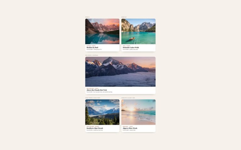
Four hover effects for content cards, shown on a set of workshop listings with a photo, date, title, price and a Book cue. Lift raises the card by eight pixels, deepens its shadow and zooms the photo slightly. Tilt in 3D leans the card back with a perspective rotation, slides a light sheen across the photo and lifts the Almost full badge toward the viewer with translateZ. Coloured glow fades in a blurred emerald, cyan and violet halo behind the card and a two-pixel gradient ring around it. Fan-out stack shows two sheets peeking below the card, which swing out to either side on hover, a good fit for courses, collections and multi-part items. The card itself has no background: the photo and the body paint the surface, so the halo and the sheets can be pseudo-elements with a negative z-index behind it. Every card is a single link, and the effect runs on keyboard focus as well as hover. Under reduced motion nothing moves, but the shadow, glow, sheen and title colour still change.

What’s included

  • Four effects: lift, 3D tilt with a floating badge, gradient glow, fan-out stack
  • Glow and stacked sheets drawn with pseudo-elements, no extra markup
  • Arrow nudge and title colour change on every card
  • Same effect on :hover and :focus-visible
  • Reduced motion keeps colour, shadow and glow changes without movement

Accessibility

Each card is one link named by the photo's alt text and the visible date, title and price. Keyboard focus draws a 3px teal outline and applies the same hover state. Under prefers-reduced-motion all transforms are removed; the shadow, glow, sheen and title colour still change, and the stacked sheets darken instead of fanning out.

Customise it

Set --lc-accent, --lc-ink, --lc-card and --lc-radius on .lc, and --lc-glow on .lc-glow for the halo gradient. In Bootstrap the same variables sit on the .card. In Tailwind edit the teal, ink and muted theme colours and the gradient in the before: and after: utilities.