About this set
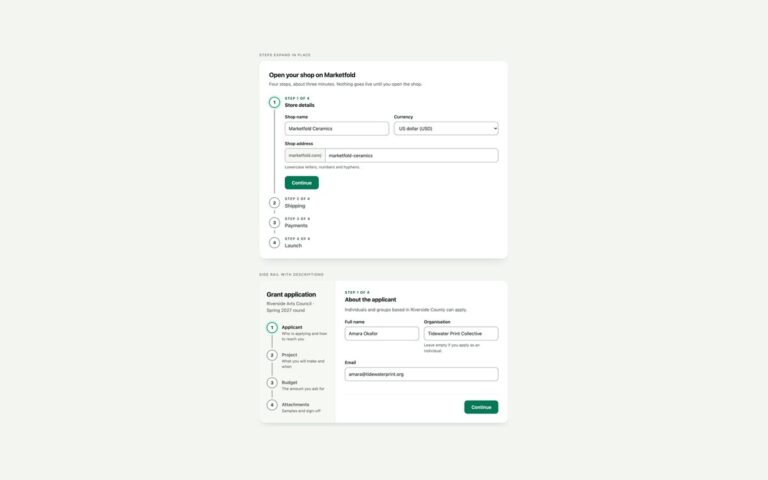
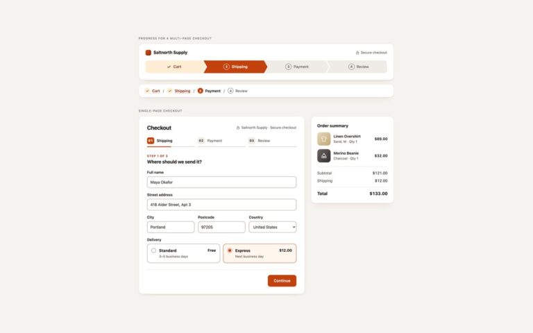
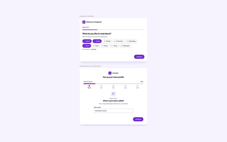
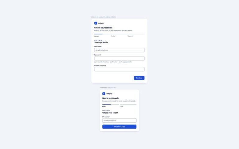
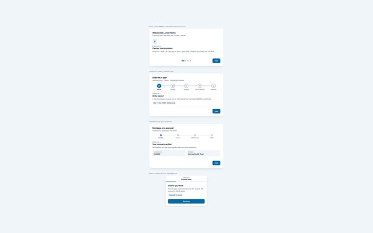
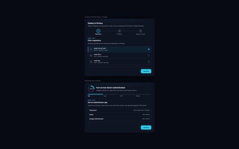
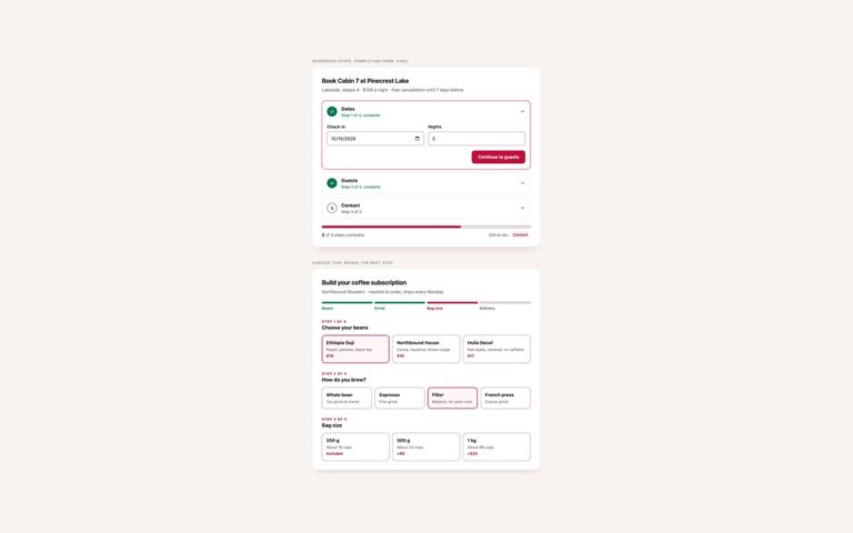
Two multi-step forms with the stepper across the top, the pattern most wizards start from. Numbered stepper, labels below, is a four-step workspace setup: name and address, team invites, a plan picked from radio tiles and a review list that repeats what was entered. Numbered dots sit on a line that fills in the accent colour as steps are completed, and finished steps swap their number for a tick. Compact bar, labels beside numbers, is a three-step job posting form where the stepper is a segmented bar and the current step is a raised white pill; below 520 pixels the other steps shrink to their number so the bar never overflows. Each step is a section with its own heading, and one Back and Continue bar serves the whole form. About forty lines of vanilla JavaScript show one step at a time, check the current step’s fields with the browser’s own constraint validation before moving on, set aria-current=”step” and a data-state on the stepper, move focus to the new step’s heading, fill the review slots and show a done panel. Without JavaScript every step shows in order and the form submits normally.
What’s included
- Numbered stepper with a connector line that fills as you go
- Compact segmented bar that keeps only the current label on phones
- Per-step validation with the browser's constraint validation
- Review step filled from the form through data-out slots
- Focus moves to each new step heading, which starts with Step 2 of 4
- Every step visible and submittable without JavaScript
Accessibility
The stepper is an ordered list labelled Progress; the current item has aria-current="step" and finished items gain a visually hidden ", completed". Each step is a section named by its heading, and focus moves to that heading on Back and Continue so screen readers announce "Step 2 of 4, Invite your team". Fields, radio tiles and buttons show visible focus rings, field borders reach 3:1, and the step animation and colour transitions stop under prefers-reduced-motion.
Customise it
Change --wz-accent, --wz-accent-dark, --wz-soft and --wz-line on .wz in the plain CSS and Bootstrap versions; Bootstrap buttons and fields read them through --bs-btn-* and --bs-border-color. In Tailwind edit the --color-wz-* theme colours.