About this set
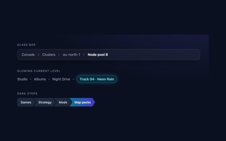
Three breadcrumbs where every level is a shape rather than a word between separators. Filled arrows are indigo chevron blocks that nest into each other, with the current page in solid indigo. Graduated tint uses teal blocks that darken one step per level, so depth reads at a glance, with compact uppercase labels. The bordered path bar is a single outlined bar split by tall chevron lines, with the current level on a pale indigo tint, the look of file managers and cloud consoles. Use the arrows for course or catalogue hierarchies that deserve visual weight, and the path bar in admin screens where it should blend with toolbars. Each arrow is painted on li::before with clip-path, behind the text, so focus outlines on the links are never clipped, and the link is stretched over the whole arrow to make the full shape clickable. Below 420px the arrows tighten so four levels still fit on one line. The Bootstrap version replaces the .breadcrumb divider with the same shapes and uses .stretched-link.
What’s included
- Filled arrows, graduated tint and bordered path bar variants
- Arrows drawn with clip-path on a pseudo-element, so focus rings stay visible
- Whole arrow is clickable through a stretched link
- Narrow-screen sizing keeps four levels on one row at 375px
- Hover state darkens the arrow; current page has its own fill
Accessibility
Each variant is a nav with aria-label="Breadcrumb" and an ordered list, with aria-current="page" on the last level. The arrows and chevron lines are pseudo-elements with no text, so they are not announced. Links show a 2px outline in the text colour when focused by keyboard, and background transitions are removed under prefers-reduced-motion. White text on the current step is at least 5.4:1.
Customise it
Change --st-bg, --st-fg, --st-hover, --st-cur-bg and --st-tip (arrow depth) on .steps, or the --pb-* variables on .pathbar; the Bootstrap version uses the same variables. In Tailwind set [--tip:12px] on the nav and change the before:bg- colour classes per level.