Open demo

CSS code

HTML
<div><span class="lbl">Collapsed middle, native details menu</span><div class="stage">
<nav class="bcx" aria-label="Breadcrumb">
  <ol>
    <li><a href="#">Home</a></li>
    <li>
      <details>
        <summary aria-label="Show 3 more levels">…</summary>
        <ul>
          <li><a href="#">Knowledge base</a></li>
          <li><a href="#">Engineering</a></li>
          <li><a href="#">Handbook</a></li>
        </ul>
      </details>
    </li>
    <li><a href="#">Deployments</a></li>
    <li aria-current="page">Rollback checklist</li>
  </ol>
</nav>
</div></div>

<div><span class="lbl">Responsive, back link in narrow containers</span>
<div class="frames">
<div class="stage"><span class="frame-note">Wide container</span>
<nav class="bcx bcx-resp" aria-label="Breadcrumb">
  <ol>
    <li><a href="#">Home</a></li>
    <li><a href="#">Account</a></li>
    <li><a href="#">Orders</a></li>
    <li aria-current="page">Order #10482</li>
  </ol>
</nav></div>
<div class="stage narrow"><span class="frame-note">Narrow container</span>
<nav class="bcx bcx-resp" aria-label="Breadcrumb">
  <ol>
    <li><a href="#">Home</a></li>
    <li><a href="#">Account</a></li>
    <li><a href="#">Orders</a></li>
    <li aria-current="page">Order #10482</li>
  </ol>
</nav></div>
</div></div>

<div><span class="lbl">Truncated long labels</span><div class="stage">
<nav class="bcx bcx-trunc" aria-label="Breadcrumb">
  <ol>
    <li><a href="#">Home</a></li>
    <li><a href="#">Customer Success Playbooks</a></li>
    <li><a href="#">Enterprise Onboarding Programme</a></li>
    <li aria-current="page"><span>Week One Kickoff Agenda and Stakeholder Map</span></li>
  </ol>
</nav>
</div></div>
CSS
/* Collapsed and responsive breadcrumbs. Separators are li + li::before painted through a mask. */
.bcx{--bx-link:#475569;--bx-hover:#be123c;--bx-current:#0f172a;--bx-sep:#94a3b8;--bx-gap:.5rem;
  --bx-chevron:url("data:image/svg+xml,<svg xmlns='http://www.w3.org/2000/svg' viewBox='0 0 16 16' fill='none' stroke='%23000' stroke-width='1.8' stroke-linecap='round' stroke-linejoin='round'><path d='M6 3.5 10.5 8 6 12.5'/></svg>");
  --bx-back:url("data:image/svg+xml,<svg xmlns='http://www.w3.org/2000/svg' viewBox='0 0 16 16' fill='none' stroke='%23000' stroke-width='1.8' stroke-linecap='round' stroke-linejoin='round'><path d='M10 3.5 5.5 8l4.5 4.5'/></svg>");
  font-size:.9rem;line-height:1.5}
.bcx ol{display:flex;flex-wrap:wrap;align-items:center;gap:.25rem var(--bx-gap);margin:0;padding:0;list-style:none}
.bcx ol>li{display:inline-flex;align-items:center;gap:var(--bx-gap);min-width:0;color:var(--bx-link)}
.bcx ol>li+li::before{content:"";flex:none;width:14px;height:14px;background:var(--bx-sep);mask:var(--bx-chevron) center/contain no-repeat}
.bcx a{color:var(--bx-link);text-decoration:none;border-radius:4px;transition:color .15s}
.bcx a:hover{color:var(--bx-hover);text-decoration:underline;text-underline-offset:3px}
.bcx a:focus-visible,.bcx summary:focus-visible{outline:2px solid var(--bx-hover);outline-offset:2px}
.bcx [aria-current="page"]{color:var(--bx-current);font-weight:600}

/* 1. Collapsed middle: a native <details> holds the hidden levels */
.bcx details{position:relative}
.bcx summary{display:grid;place-items:center;width:32px;height:24px;border-radius:6px;background:#f1f5f9;color:#334155;
  cursor:pointer;list-style:none;font-weight:700;letter-spacing:.05em;transition:background-color .15s}
.bcx summary::-webkit-details-marker{display:none}
.bcx summary:hover,.bcx details[open] summary{background:#ffe4e6;color:var(--bx-hover)}
.bcx details ul{position:absolute;z-index:10;top:calc(100% + 8px);left:-6px;min-width:210px;margin:0;padding:6px;list-style:none;
  background:#fff;border:1px solid #e2e8f0;border-radius:10px;box-shadow:0 12px 32px -8px rgba(15,23,42,.22)}
.bcx details ul a{display:block;padding:.45rem .7rem;border-radius:6px;white-space:nowrap}
.bcx details ul a:hover{background:#fff1f2;text-decoration:none}

/* 2. Responsive: the nav is a size container. Under 26rem only the parent level shows, as a back link. */
.bcx-resp{container-type:inline-size}
@container (max-width:26rem){
  .bcx-resp ol>li:not(:nth-last-child(2)){display:none}
  .bcx-resp ol>li:nth-last-child(2)::before{content:"";flex:none;width:14px;height:14px;background:currentColor;mask:var(--bx-back) center/contain no-repeat}
  .bcx-resp ol>li:nth-last-child(2){gap:.3rem}
  .bcx-resp ol>li:nth-last-child(2) a{color:var(--bx-hover);font-weight:600}
}

/* 3. Truncated labels: long names cut with an ellipsis, shown in full on hover or focus */
.bcx-trunc a,.bcx-trunc [aria-current="page"] span{display:inline-block;vertical-align:bottom;overflow:hidden;white-space:nowrap;text-overflow:ellipsis;max-width:16ch}
.bcx-trunc [aria-current="page"] span{max-width:26ch}
.bcx-trunc a:hover,.bcx-trunc a:focus-visible{max-width:none}
@media (prefers-reduced-motion:reduce){.bcx a,.bcx summary{transition:none}}

Bootstrap 5 code

Requires: Bootstrap 5.3.8 CSS

HTML
<div><span class="lbl">Collapsed middle, native details menu</span><div class="stage">
<nav class="bcx" aria-label="Breadcrumb">
  <ol class="breadcrumb">
    <li class="breadcrumb-item"><a href="#">Home</a></li>
    <li class="breadcrumb-item">
      <details>
        <summary aria-label="Show 3 more levels">…</summary>
        <ul class="dropdown-menu show">
          <li><a class="dropdown-item" href="#">Knowledge base</a></li>
          <li><a class="dropdown-item" href="#">Engineering</a></li>
          <li><a class="dropdown-item" href="#">Handbook</a></li>
        </ul>
      </details>
    </li>
    <li class="breadcrumb-item"><a href="#">Deployments</a></li>
    <li class="breadcrumb-item active" aria-current="page">Rollback checklist</li>
  </ol>
</nav>
</div></div>

<div><span class="lbl">Responsive, back link in narrow containers</span>
<div class="frames">
<div class="stage"><span class="frame-note">Wide container</span>
<nav class="bcx bcx-resp" aria-label="Breadcrumb">
  <ol class="breadcrumb">
    <li class="breadcrumb-item"><a href="#">Home</a></li>
    <li class="breadcrumb-item"><a href="#">Account</a></li>
    <li class="breadcrumb-item"><a href="#">Orders</a></li>
    <li class="breadcrumb-item active" aria-current="page">Order #10482</li>
  </ol>
</nav></div>
<div class="stage narrow"><span class="frame-note">Narrow container</span>
<nav class="bcx bcx-resp" aria-label="Breadcrumb">
  <ol class="breadcrumb">
    <li class="breadcrumb-item"><a href="#">Home</a></li>
    <li class="breadcrumb-item"><a href="#">Account</a></li>
    <li class="breadcrumb-item"><a href="#">Orders</a></li>
    <li class="breadcrumb-item active" aria-current="page">Order #10482</li>
  </ol>
</nav></div>
</div></div>

<div><span class="lbl">Truncated long labels</span><div class="stage">
<nav class="bcx bcx-trunc" aria-label="Breadcrumb">
  <ol class="breadcrumb">
    <li class="breadcrumb-item"><a class="text-truncate" href="#">Home</a></li>
    <li class="breadcrumb-item"><a class="text-truncate" href="#">Customer Success Playbooks</a></li>
    <li class="breadcrumb-item"><a class="text-truncate" href="#">Enterprise Onboarding Programme</a></li>
    <li class="breadcrumb-item active" aria-current="page"><span class="text-truncate">Week One Kickoff Agenda and Stakeholder Map</span></li>
  </ol>
</nav>
</div></div>
CSS
/* Bootstrap .breadcrumb, collapsed and responsive. The chevron is --bs-breadcrumb-divider (inline SVG) and gets
   empty alt text where supported. The hidden levels use Bootstrap's .dropdown-menu look inside a native <details>. */
.bcx{--bs-breadcrumb-divider:url("data:image/svg+xml,<svg xmlns='http://www.w3.org/2000/svg' width='14' height='14' viewBox='0 0 16 16' fill='none' stroke='%2394a3b8' stroke-width='1.8' stroke-linecap='round' stroke-linejoin='round'><path d='M6 3.5 10.5 8 6 12.5'/></svg>");
  --bx-link:#475569;--bx-hover:#be123c;--bx-current:#0f172a;
  --bx-back:url("data:image/svg+xml,<svg xmlns='http://www.w3.org/2000/svg' viewBox='0 0 16 16' fill='none' stroke='%23000' stroke-width='1.8' stroke-linecap='round' stroke-linejoin='round'><path d='M10 3.5 5.5 8l4.5 4.5'/></svg>")}
.bcx .breadcrumb{--bs-breadcrumb-margin-bottom:0;--bs-breadcrumb-font-size:.9rem;--bs-breadcrumb-item-padding-x:.5rem;
  --bs-breadcrumb-item-active-color:var(--bx-current);align-items:center;row-gap:.25rem;line-height:1.5}
.bcx .breadcrumb-item{display:flex;align-items:center;min-width:0;color:var(--bx-link)}
.bcx .breadcrumb-item+.breadcrumb-item::before{display:block;line-height:0}
@supports (content:"x" / ""){.bcx .breadcrumb-item+.breadcrumb-item::before{content:var(--bs-breadcrumb-divider,"/") / ""}}
.bcx .breadcrumb-item.active{color:var(--bx-current);font-weight:600}
.bcx a{color:var(--bx-link);text-decoration:none;border-radius:4px;transition:color .15s}
.bcx a:hover{color:var(--bx-hover);text-decoration:underline;text-underline-offset:3px}
.bcx a:focus-visible,.bcx summary:focus-visible{outline:2px solid var(--bx-hover);outline-offset:2px}

/* 1. Collapsed middle: native <details>, menu styled with .dropdown-menu variables */
.bcx details{position:relative}
.bcx summary{display:grid;place-items:center;width:32px;height:24px;border-radius:6px;background:#f1f5f9;color:#334155;
  cursor:pointer;list-style:none;font-weight:700;letter-spacing:.05em;transition:background-color .15s}
.bcx summary::-webkit-details-marker{display:none}
.bcx summary:hover,.bcx details[open] summary{background:#ffe4e6;color:var(--bx-hover)}
.bcx details .dropdown-menu{--bs-dropdown-min-width:210px;--bs-dropdown-padding-x:6px;--bs-dropdown-padding-y:6px;
  --bs-dropdown-font-size:.9rem;--bs-dropdown-border-color:#e2e8f0;--bs-dropdown-border-radius:10px;
  --bs-dropdown-link-color:var(--bx-link);--bs-dropdown-link-hover-color:var(--bx-hover);--bs-dropdown-link-hover-bg:#fff1f2;
  --bs-dropdown-link-active-color:var(--bx-hover);--bs-dropdown-link-active-bg:#fff1f2;
  --bs-dropdown-item-padding-x:.7rem;--bs-dropdown-item-padding-y:.45rem;--bs-dropdown-item-border-radius:6px;
  top:calc(100% + 8px);left:-6px;z-index:10;box-shadow:0 12px 32px -8px rgba(15,23,42,.22)}
.bcx details .dropdown-item:hover{text-decoration:none}

/* 2. Responsive: the nav is a size container. Under 26rem only the parent level shows, as a back link. */
.bcx-resp{container-type:inline-size}
@container (max-width:26rem){
  .bcx-resp .breadcrumb-item:not(:nth-last-child(2)){display:none}
  .bcx-resp .breadcrumb-item:nth-last-child(2){padding-left:0}
  .bcx-resp .breadcrumb-item:nth-last-child(2)::before{content:"";float:none;width:14px;height:14px;margin-right:.3rem;padding:0;
    background:currentColor;mask:var(--bx-back) center/contain no-repeat}
  .bcx-resp .breadcrumb-item:nth-last-child(2) a{color:var(--bx-hover);font-weight:600}
}

/* 3. Truncated labels: Bootstrap's .text-truncate plus a max-width; full text on hover or focus */
.bcx-trunc .text-truncate{display:inline-block;vertical-align:bottom;max-width:16ch}
.bcx-trunc .active .text-truncate{max-width:26ch}
.bcx-trunc a.text-truncate:hover,.bcx-trunc a.text-truncate:focus-visible{max-width:none}
@media (prefers-reduced-motion:reduce){.bcx a,.bcx summary{transition:none}}

Tailwind 4 code

Requires: Tailwind CSS 4

HTML
<div><span class="mb-3 block text-[.72rem] tracking-[.12em] text-[#5b6477] uppercase">Collapsed middle, native details menu</span><div class="rounded-[14px] border border-[#e2e7f0] bg-white px-[22px] py-[18px] shadow-[0_1px_2px_rgba(15,23,42,.04)]">
<nav aria-label="Breadcrumb" class="text-[.9rem] leading-normal">
  <ol class="flex flex-wrap items-center gap-x-2 gap-y-1 *:inline-flex *:min-w-0 *:items-center *:gap-2 [&>li+li]:before:size-3.5 [&>li+li]:before:flex-none [&>li+li]:before:bg-slate-400 [&>li+li]:before:sep-chevron">
    <li><a href="#" class="rounded text-[#475569] no-underline transition-[color,background-color,border-color] hover:text-[#be123c] hover:underline hover:underline-offset-3 focus-visible:outline-2 focus-visible:outline-offset-2 focus-visible:outline-[#be123c] motion-reduce:transition-none">Home</a></li>
    <li>
      <details class="group relative">
        <summary aria-label="Show 3 more levels" class="grid h-6 w-8 cursor-pointer list-none place-items-center rounded-md bg-slate-100 font-bold tracking-[.05em] text-slate-700 transition-[color,background-color,border-color] hover:bg-[#ffe4e6] hover:text-[#be123c] group-open:bg-[#ffe4e6] group-open:text-[#be123c] focus-visible:outline-2 focus-visible:outline-offset-2 focus-visible:outline-[#be123c] motion-reduce:transition-none [&::-webkit-details-marker]:hidden">…</summary>
        <ul class="absolute top-[calc(100%+8px)] -left-1.5 z-10 min-w-[210px] rounded-[10px] border border-slate-200 bg-white p-1.5 shadow-[0_12px_32px_-8px_rgba(15,23,42,.22)]">
          <li><a href="#" class="block rounded-md px-[.7rem] py-[.45rem] whitespace-nowrap text-[#475569] no-underline transition-[color,background-color,border-color] hover:bg-[#fff1f2] hover:text-[#be123c] focus-visible:outline-2 focus-visible:outline-offset-2 focus-visible:outline-[#be123c] motion-reduce:transition-none">Knowledge base</a></li>
          <li><a href="#" class="block rounded-md px-[.7rem] py-[.45rem] whitespace-nowrap text-[#475569] no-underline transition-[color,background-color,border-color] hover:bg-[#fff1f2] hover:text-[#be123c] focus-visible:outline-2 focus-visible:outline-offset-2 focus-visible:outline-[#be123c] motion-reduce:transition-none">Engineering</a></li>
          <li><a href="#" class="block rounded-md px-[.7rem] py-[.45rem] whitespace-nowrap text-[#475569] no-underline transition-[color,background-color,border-color] hover:bg-[#fff1f2] hover:text-[#be123c] focus-visible:outline-2 focus-visible:outline-offset-2 focus-visible:outline-[#be123c] motion-reduce:transition-none">Handbook</a></li>
        </ul>
      </details>
    </li>
    <li><a href="#" class="rounded text-[#475569] no-underline transition-[color,background-color,border-color] hover:text-[#be123c] hover:underline hover:underline-offset-3 focus-visible:outline-2 focus-visible:outline-offset-2 focus-visible:outline-[#be123c] motion-reduce:transition-none">Deployments</a></li>
    <li aria-current="page" class="font-semibold text-slate-900">Rollback checklist</li>
  </ol>
</nav>
</div></div>

<div><span class="mb-3 block text-[.72rem] tracking-[.12em] text-[#5b6477] uppercase">Responsive, back link in narrow containers</span>
<div class="flex flex-col gap-3.5">
<div class="rounded-[14px] border border-[#e2e7f0] bg-white px-[22px] py-[18px] shadow-[0_1px_2px_rgba(15,23,42,.04)]"><span class="mb-2.5 block text-xs text-[#5b6477]">Wide container</span>
<nav aria-label="Breadcrumb" class="@container text-[.9rem] leading-normal">
  <ol class="flex flex-wrap items-center gap-x-2 gap-y-1 *:inline-flex *:min-w-0 *:items-center *:gap-2">
    <li class="@max-[26rem]:hidden"><a href="#" class="rounded text-[#475569] no-underline transition-[color,background-color,border-color] hover:text-[#be123c] hover:underline hover:underline-offset-3 focus-visible:outline-2 focus-visible:outline-offset-2 focus-visible:outline-[#be123c] motion-reduce:transition-none">Home</a></li>
    <li class="not-first:before:size-3.5 not-first:before:flex-none not-first:before:bg-slate-400 not-first:before:sep-chevron @max-[26rem]:hidden"><a href="#" class="rounded text-[#475569] no-underline transition-[color,background-color,border-color] hover:text-[#be123c] hover:underline hover:underline-offset-3 focus-visible:outline-2 focus-visible:outline-offset-2 focus-visible:outline-[#be123c] motion-reduce:transition-none">Account</a></li>
    <li class="not-first:before:size-3.5 not-first:before:flex-none not-first:before:bg-slate-400 not-first:before:sep-chevron @max-[26rem]:gap-[.3rem]! @max-[26rem]:before:bg-current! @max-[26rem]:before:sep-back!"><a href="#" class="rounded text-[#475569] no-underline transition-[color,background-color,border-color] hover:text-[#be123c] hover:underline hover:underline-offset-3 focus-visible:outline-2 focus-visible:outline-offset-2 focus-visible:outline-[#be123c] motion-reduce:transition-none @max-[26rem]:font-semibold @max-[26rem]:text-[#be123c]">Orders</a></li>
    <li aria-current="page" class="not-first:before:size-3.5 not-first:before:flex-none not-first:before:bg-slate-400 not-first:before:sep-chevron font-semibold text-slate-900 @max-[26rem]:hidden">Order #10482</li>
  </ol>
</nav></div>
<div class="rounded-[14px] border border-[#e2e7f0] bg-white px-[22px] py-[18px] shadow-[0_1px_2px_rgba(15,23,42,.04)] w-[320px] max-w-full"><span class="mb-2.5 block text-xs text-[#5b6477]">Narrow container</span>
<nav aria-label="Breadcrumb" class="@container text-[.9rem] leading-normal">
  <ol class="flex flex-wrap items-center gap-x-2 gap-y-1 *:inline-flex *:min-w-0 *:items-center *:gap-2">
    <li class="@max-[26rem]:hidden"><a href="#" class="rounded text-[#475569] no-underline transition-[color,background-color,border-color] hover:text-[#be123c] hover:underline hover:underline-offset-3 focus-visible:outline-2 focus-visible:outline-offset-2 focus-visible:outline-[#be123c] motion-reduce:transition-none">Home</a></li>
    <li class="not-first:before:size-3.5 not-first:before:flex-none not-first:before:bg-slate-400 not-first:before:sep-chevron @max-[26rem]:hidden"><a href="#" class="rounded text-[#475569] no-underline transition-[color,background-color,border-color] hover:text-[#be123c] hover:underline hover:underline-offset-3 focus-visible:outline-2 focus-visible:outline-offset-2 focus-visible:outline-[#be123c] motion-reduce:transition-none">Account</a></li>
    <li class="not-first:before:size-3.5 not-first:before:flex-none not-first:before:bg-slate-400 not-first:before:sep-chevron @max-[26rem]:gap-[.3rem]! @max-[26rem]:before:bg-current! @max-[26rem]:before:sep-back!"><a href="#" class="rounded text-[#475569] no-underline transition-[color,background-color,border-color] hover:text-[#be123c] hover:underline hover:underline-offset-3 focus-visible:outline-2 focus-visible:outline-offset-2 focus-visible:outline-[#be123c] motion-reduce:transition-none @max-[26rem]:font-semibold @max-[26rem]:text-[#be123c]">Orders</a></li>
    <li aria-current="page" class="not-first:before:size-3.5 not-first:before:flex-none not-first:before:bg-slate-400 not-first:before:sep-chevron font-semibold text-slate-900 @max-[26rem]:hidden">Order #10482</li>
  </ol>
</nav></div>
</div></div>

<div><span class="mb-3 block text-[.72rem] tracking-[.12em] text-[#5b6477] uppercase">Truncated long labels</span><div class="rounded-[14px] border border-[#e2e7f0] bg-white px-[22px] py-[18px] shadow-[0_1px_2px_rgba(15,23,42,.04)]">
<nav aria-label="Breadcrumb" class="text-[.9rem] leading-normal">
  <ol class="flex flex-wrap items-center gap-x-2 gap-y-1 *:inline-flex *:min-w-0 *:items-center *:gap-2 [&>li+li]:before:size-3.5 [&>li+li]:before:flex-none [&>li+li]:before:bg-slate-400 [&>li+li]:before:sep-chevron">
    <li><a href="#" class="rounded text-[#475569] no-underline transition-[color,background-color,border-color] hover:text-[#be123c] hover:underline hover:underline-offset-3 focus-visible:outline-2 focus-visible:outline-offset-2 focus-visible:outline-[#be123c] motion-reduce:transition-none inline-block max-w-[16ch] truncate align-bottom hover:max-w-none focus-visible:max-w-none">Home</a></li>
    <li><a href="#" class="rounded text-[#475569] no-underline transition-[color,background-color,border-color] hover:text-[#be123c] hover:underline hover:underline-offset-3 focus-visible:outline-2 focus-visible:outline-offset-2 focus-visible:outline-[#be123c] motion-reduce:transition-none inline-block max-w-[16ch] truncate align-bottom hover:max-w-none focus-visible:max-w-none">Customer Success Playbooks</a></li>
    <li><a href="#" class="rounded text-[#475569] no-underline transition-[color,background-color,border-color] hover:text-[#be123c] hover:underline hover:underline-offset-3 focus-visible:outline-2 focus-visible:outline-offset-2 focus-visible:outline-[#be123c] motion-reduce:transition-none inline-block max-w-[16ch] truncate align-bottom hover:max-w-none focus-visible:max-w-none">Enterprise Onboarding Programme</a></li>
    <li aria-current="page" class="font-semibold text-slate-900"><span class="inline-block max-w-[26ch] truncate align-bottom">Week One Kickoff Agenda and Stakeholder Map</span></li>
  </ol>
</nav>
</div></div>
CSS
/* Separator and back-arrow shapes for li::before, painted through a mask so nothing is read aloud. */
@utility sep-chevron { mask: url("data:image/svg+xml,<svg xmlns='http://www.w3.org/2000/svg' viewBox='0 0 16 16' fill='none' stroke='%23000' stroke-width='1.8' stroke-linecap='round' stroke-linejoin='round'><path d='M6 3.5 10.5 8 6 12.5'/></svg>") center / contain no-repeat; }
@utility sep-back { mask: url("data:image/svg+xml,<svg xmlns='http://www.w3.org/2000/svg' viewBox='0 0 16 16' fill='none' stroke='%23000' stroke-width='1.8' stroke-linecap='round' stroke-linejoin='round'><path d='M10 3.5 5.5 8l4.5 4.5'/></svg>") center / contain no-repeat; }

About this set

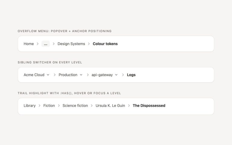
Three answers to the long path problem. Collapsed middle keeps the first level, the parent and the current page, and folds the levels in between into a button marked with an ellipsis. It is a native details element, so clicking or pressing Enter opens a small menu of the hidden levels with no script. The responsive variant makes the nav a size container: in a wide container it shows the full path, and once the container is narrower than 26rem it hides everything except the parent level and turns it into a back link with a left chevron, the pattern many mobile apps use. The demo shows the same markup in a wide and a narrow box. Truncated labels keeps every level but cuts long names with an ellipsis at 16 characters and the current page at 26, and a label expands to its full length on hover or keyboard focus. Screen readers always get the full text. The Bootstrap version styles the menu with .dropdown-menu and .dropdown-item and truncates with .text-truncate.

What’s included

  • Middle levels collapsed into a native details menu, no JavaScript
  • Container query turns the path into a back link below 26rem
  • Long labels truncated with an ellipsis and expanded on hover or focus
  • Bootstrap .dropdown-menu, .dropdown-item and .text-truncate
  • Same markup works in a sidebar, a card or full width

Accessibility

The nav is labelled Breadcrumb, and the summary has aria-label="Show 3 more levels" so the ellipsis is announced as a disclosure button with its expanded state. Truncated labels keep their full text for screen readers. In a narrow container only the parent link remains in the accessibility tree, which is intentional for the back-link pattern. All links and the summary show a 2px focus outline; transitions stop under prefers-reduced-motion. The details menu closes when the summary is activated again, not on Escape.

Customise it

Colours are --bx-link, --bx-hover and --bx-current on .bcx. Change the 26rem in the @container rule to move the breakpoint, and the 16ch and 26ch max-widths for truncation. In Tailwind edit @max-[26rem]: and max-w-[16ch].