/* Dark notifications: the bell panel and toasts from the light sets, retuned for a near-black UI. Every text colour
   was checked for 4.5:1 on its surface; glows are box-shadows, so they add no contrast the text depends on. */
.dk-frame,.dk-stack{--dk-bg:#0b0d14;--dk-surface:#131722;--dk-raised:#1a1f2e;--dk-line:#262c3d;--dk-ink:#f1f5f9;--dk-text:#c3c9d9;--dk-muted:#8b93a7;--dk-brand:#818cf8;--dk-focus:#a5b4fc}
.sr-only{position:absolute;width:1px;height:1px;padding:0;margin:-1px;overflow:hidden;clip:rect(0,0,0,0);white-space:nowrap;border:0}
.dk-frame [hidden],.dk-stack [hidden]{display:none!important}
.dk-frame{position:relative;height:600px;border:1px solid var(--dk-line);border-radius:18px;background:radial-gradient(80% 60% at 85% 0%,rgba(129,140,248,.14),transparent 60%),var(--dk-bg)}
.dk-bar{position:relative;display:flex;align-items:center;justify-content:space-between;height:62px;padding:0 18px;border-bottom:1px solid var(--dk-line)}
.dk-logo{display:flex;align-items:center;gap:9px;color:var(--dk-ink);font-weight:750}
.dk-logo i{width:24px;height:24px;border-radius:50%;background:conic-gradient(from 200deg,#818cf8,#22d3ee,#818cf8);box-shadow:0 0 16px rgba(129,140,248,.6)}
.nf{position:relative}
.dk-bell{position:relative;display:grid;place-items:center;width:40px;height:40px;padding:0;border:1px solid var(--dk-line);border-radius:12px;background:var(--dk-surface);color:var(--dk-text);cursor:pointer}
.dk-bell:hover,.dk-bell[aria-expanded="true"]{color:var(--dk-ink);border-color:#3b4258;background:var(--dk-raised)}
.dk-bell svg{width:20px;height:20px}
.dk-count{position:absolute;top:-6px;right:-6px;min-width:20px;height:20px;padding:0 5px;border:2px solid var(--dk-bg);border-radius:999px;background:#e11d48;color:#fff;
  font-size:.6875rem;font-weight:700;line-height:16px;text-align:center;box-shadow:0 0 12px rgba(225,29,72,.7)}
.dk-panel{position:absolute;top:calc(100% + 12px);right:-6px;z-index:20;width:400px;max-width:calc(100vw - 32px);border:1px solid var(--dk-line);border-radius:16px;background:var(--dk-surface);color:var(--dk-text);
  font-size:.875rem;line-height:1.45;box-shadow:0 30px 60px -20px rgba(0,0,0,.7),0 0 0 1px rgba(129,140,248,.06);animation:dk-in .18s ease-out}
.dk-head{display:flex;flex-wrap:wrap;align-items:center;gap:10px;padding:16px 16px 12px 18px;border-bottom:1px solid var(--dk-line)}
.dk-head h2{margin:0;font-size:1rem;color:var(--dk-ink)}
.dk-new{padding:2px 8px;border-radius:999px;background:rgba(129,140,248,.16);color:#c7d2fe;font-size:.75rem;font-weight:650;white-space:nowrap}
.dk-markall{display:inline-flex;align-items:center;gap:6px;margin-left:auto;padding:5px 8px;border:0;border-radius:8px;background:transparent;color:#c7d2fe;font:inherit;font-size:.8125rem;font-weight:600;white-space:nowrap;cursor:pointer}
.dk-markall:hover{background:rgba(129,140,248,.12)}
.dk-markall:disabled{color:var(--dk-muted);background:transparent;cursor:default}
.dk-markall svg{width:16px;height:16px}
.dk-list{margin:0;padding:8px;list-style:none;max-height:390px;overflow-y:auto}
.dk-list li+li{margin-top:2px}
.nf-item{position:relative;display:flex;gap:12px;padding:11px 30px 11px 10px;border-radius:12px;color:var(--dk-text);text-decoration:none}
.nf-item:hover{background:var(--dk-raised)}
.nf-item.is-unread{background:rgba(129,140,248,.08)}
.nf-item b{color:var(--dk-ink);font-weight:650}
.dk-time{display:block;margin-top:4px;font-size:.75rem;color:var(--dk-muted)}
.dk-unread{position:absolute;top:50%;right:12px;width:8px;height:8px;margin-top:-4px;border-radius:50%;background:#a5b4fc;box-shadow:0 0 0 3px rgba(129,140,248,.2),0 0 12px rgba(165,180,252,.9)}
.nf-item:not(.is-unread) .dk-unread{display:none}
.dk-av{flex:none;display:grid;place-items:center;width:36px;height:36px;border-radius:50%;font-size:.75rem;font-weight:700}
.dk-av svg{width:18px;height:18px}
.dk-av.ok{background:rgba(74,222,128,.12);color:#4ade80}.dk-av.warn{background:rgba(251,191,36,.12);color:#fbbf24}
.dk-av.c1{background:#312e81;color:#c7d2fe}.dk-av.c2{background:#164e63;color:#a5f3fc}
.dk-foot{display:flex;justify-content:space-between;align-items:center;padding:10px 12px 12px 18px;border-top:1px solid var(--dk-line);font-size:.75rem;color:var(--dk-muted)}
.dk-link{padding:4px 0;color:#c7d2fe;font-size:.875rem;font-weight:600;text-decoration:none}
.dk-link:hover{text-decoration:underline}
/* Toasts */
.dk-stack{display:flex;flex-direction:column;gap:12px;max-width:420px;padding:22px;border:1px solid var(--dk-line);border-radius:18px;background:var(--dk-bg)}
.dk-toast{--dk-tone:#4ade80;position:relative;display:flex;align-items:flex-start;gap:12px;padding:14px 10px 14px 14px;overflow:hidden;border:1px solid var(--dk-line);border-radius:14px;
  background:linear-gradient(90deg,color-mix(in srgb,var(--dk-tone) 10%,transparent),transparent 45%),var(--dk-surface);color:var(--dk-text);font-size:.875rem;line-height:1.45;
  box-shadow:0 16px 36px -16px rgba(0,0,0,.8);animation:dk-in .3s cubic-bezier(.2,.8,.2,1)}
.dk-toast::before{content:"";position:absolute;left:0;top:12px;bottom:12px;width:3px;border-radius:0 3px 3px 0;background:var(--dk-tone);box-shadow:0 0 12px var(--dk-tone)}
.dk-toast.warn{--dk-tone:#fbbf24}
.dk-toast.err{--dk-tone:#fb7185}
.dk-ticon{flex:none;display:grid;place-items:center;width:30px;height:30px;border-radius:50%;background:color-mix(in srgb,var(--dk-tone) 14%,transparent);color:var(--dk-tone)}
.dk-ticon svg{width:16px;height:16px}
.dk-tbody{flex:1;min-width:0}
.dk-ttitle{margin:0;font-size:.9375rem;font-weight:650;color:var(--dk-ink)}
.dk-ttext{margin:2px 0 0}
.dk-code{display:block;margin-top:8px;padding:8px 10px;border-radius:8px;background:#05070c;border:1px solid var(--dk-line);color:#fda4af;font:500 .75rem/1.5 ui-monospace,SFMono-Regular,Menlo,Consolas,monospace;white-space:pre-wrap;overflow-wrap:anywhere}
.dk-act{display:inline-block;margin-top:8px;color:#c7d2fe;font-weight:650;text-decoration:none}
.dk-act:hover{text-decoration:underline}
.dk-x{flex:none;display:grid;place-items:center;width:30px;height:30px;padding:0;border:0;border-radius:8px;background:transparent;color:var(--dk-muted);cursor:pointer}
.dk-x:hover{background:var(--dk-raised);color:var(--dk-ink)}
.dk-x svg{width:14px;height:14px}
.dk-bell:focus-visible,.dk-markall:focus-visible,.nf-item:focus-visible,.dk-link:focus-visible,.dk-act:focus-visible,.dk-x:focus-visible{outline:2px solid var(--dk-focus);outline-offset:2px}
.nf-item:focus-visible{outline-offset:-2px}
@keyframes dk-in{from{opacity:0;transform:translateY(-6px)}}
@media (max-width:520px){.dk-frame{height:680px}.nf{position:static}.dk-panel{left:8px;right:8px;width:auto;max-width:none}.dk-stack{padding:14px}}
@media (prefers-reduced-motion:reduce){.dk-panel,.dk-toast{animation:none}}
JavaScript
(function () {
  // Bell panel: same pattern as a light dropdown. Open/close, Esc, outside click, mark read.
    document.querySelectorAll('[data-nf]').forEach(function (nf) {
      var bell = nf.querySelector('[data-nf-bell]');
      var panel = nf.querySelector('[data-nf-panel]');
      if (!bell || !panel) return;
      var count = nf.querySelector('[data-nf-count]');
      var badge = nf.querySelector('[data-nf-new]');
      var markAll = nf.querySelector('[data-nf-markall]');
      var status = nf.querySelector('[data-nf-status]');

      function setOpen(open) {
        bell.setAttribute('aria-expanded', open);
        panel.hidden = !open;
      }
      function refresh() {
        var n = panel.querySelectorAll('.is-unread').length;
        if (count) {
          count.hidden = n === 0;
          if (count.firstChild && count.firstChild.nodeType === 3) count.firstChild.nodeValue = n;
        }
        if (badge) { badge.hidden = n === 0; badge.textContent = n + ' new'; }
        if (markAll) markAll.disabled = n === 0;
      }
      function read(item) {
        item.classList.remove('is-unread');
        var sr = item.querySelector('.sr-only');
        if (sr) sr.remove();
      }

      bell.addEventListener('click', function () { setOpen(panel.hidden); });
      markAll && markAll.addEventListener('click', function () {
        panel.querySelectorAll('.is-unread').forEach(read);
        refresh();
        if (status) status.textContent = 'All notifications marked as read';
      });
      panel.addEventListener('click', function (e) {
        var item = e.target.closest('.nf-item');
        if (!item) return;
        e.preventDefault(); // demo links; remove when they point somewhere
        read(item); refresh();
      });
      // Esc closes and returns focus to the bell; a click outside closes.
      nf.addEventListener('keydown', function (e) {
        if (e.key === 'Escape' && !panel.hidden) { setOpen(false); bell.focus(); }
      });
      document.addEventListener('click', function (e) {
        if (!panel.hidden && !nf.contains(e.target)) setOpen(false);
      });
      refresh();
    });

  // Toasts: the close button removes the toast and moves focus to the next one.
  document.querySelectorAll('[data-dt-stack]').forEach(function (stack) {
    stack.addEventListener('click', function (e) {
      var btn = e.target.closest('[data-dt-close]');
      if (!btn) return;
      var toast = btn.closest('[data-dt]');
      var next = toast.nextElementSibling || toast.previousElementSibling;
      toast.remove();
      var target = next && next.querySelector('[data-dt-close]');
      if (target) target.focus();
    });
  });
})();
(function () {
  // Bell: Bootstrap's dropdown plugin opens and closes the panel; this marks notifications as read.
    document.querySelectorAll('[data-nf]').forEach(function (nf) {
      var count = nf.querySelector('[data-nf-count]');
      var badge = nf.querySelector('[data-nf-new]');
      var markAll = nf.querySelector('[data-nf-markall]');
      var status = nf.querySelector('[data-nf-status]');
      var toggle = nf.querySelector('[data-bs-toggle="dropdown"]');
      if (toggle) bootstrap.Dropdown.getOrCreateInstance(toggle); // so a dropdown that starts open closes on outside click

      function refresh() {
        var n = nf.querySelectorAll('.nf-item.is-unread').length;
        if (count) {
          count.classList.toggle('d-none', n === 0);
          if (count.firstChild && count.firstChild.nodeType === 3) count.firstChild.nodeValue = n;
        }
        if (badge) { badge.classList.toggle('d-none', n === 0); badge.textContent = n + ' new'; }
        if (markAll) markAll.disabled = n === 0;
      }
      function read(item) {
        item.classList.remove('is-unread');
        var sr = item.querySelector('.visually-hidden');
        if (sr) sr.remove();
      }
      markAll && markAll.addEventListener('click', function () {
        nf.querySelectorAll('.nf-item.is-unread').forEach(read);
        refresh();
        if (status) status.textContent = 'All notifications marked as read';
      });
      nf.addEventListener('click', function (e) {
        var item = e.target.closest('.nf-item');
        if (!item) return;
        e.preventDefault(); // demo links; remove when they point somewhere
        read(item); refresh();
      });
      refresh();
    });

  // Toasts: Bootstrap's Toast plugin hides them (data-bs-dismiss); remove the element and move focus on.
  document.querySelectorAll('[data-dt-stack] .toast').forEach(function (toast) {
    var hadFocus = false, next = null;
    toast.addEventListener('hide.bs.toast', function () {
      hadFocus = toast.contains(document.activeElement);
      next = toast.nextElementSibling || toast.previousElementSibling;
    });
    toast.addEventListener('hidden.bs.toast', function () {
      toast.remove();
      var target = hadFocus && next && next.querySelector('.btn-close');
      if (target) target.focus();
    });
  });
})();
(function () {
  // Bell panel: same pattern as a light dropdown. Open/close, Esc, outside click, mark read.
    document.querySelectorAll('[data-nf]').forEach(function (nf) {
      var bell = nf.querySelector('[data-nf-bell]');
      var panel = nf.querySelector('[data-nf-panel]');
      if (!bell || !panel) return;
      var count = nf.querySelector('[data-nf-count]');
      var badge = nf.querySelector('[data-nf-new]');
      var markAll = nf.querySelector('[data-nf-markall]');
      var status = nf.querySelector('[data-nf-status]');

      function setOpen(open) {
        bell.setAttribute('aria-expanded', open);
        panel.hidden = !open;
      }
      function refresh() {
        var n = panel.querySelectorAll('.is-unread').length;
        if (count) {
          count.hidden = n === 0;
          if (count.firstChild && count.firstChild.nodeType === 3) count.firstChild.nodeValue = n;
        }
        if (badge) { badge.hidden = n === 0; badge.textContent = n + ' new'; }
        if (markAll) markAll.disabled = n === 0;
      }
      function read(item) {
        item.classList.remove('is-unread');
        var sr = item.querySelector('.sr-only');
        if (sr) sr.remove();
      }

      bell.addEventListener('click', function () { setOpen(panel.hidden); });
      markAll && markAll.addEventListener('click', function () {
        panel.querySelectorAll('.is-unread').forEach(read);
        refresh();
        if (status) status.textContent = 'All notifications marked as read';
      });
      panel.addEventListener('click', function (e) {
        var item = e.target.closest('.nf-item');
        if (!item) return;
        e.preventDefault(); // demo links; remove when they point somewhere
        read(item); refresh();
      });
      // Esc closes and returns focus to the bell; a click outside closes.
      nf.addEventListener('keydown', function (e) {
        if (e.key === 'Escape' && !panel.hidden) { setOpen(false); bell.focus(); }
      });
      document.addEventListener('click', function (e) {
        if (!panel.hidden && !nf.contains(e.target)) setOpen(false);
      });
      refresh();
    });

  // Toasts: the close button removes the toast and moves focus to the next one.
  document.querySelectorAll('[data-dt-stack]').forEach(function (stack) {
    stack.addEventListener('click', function (e) {
      var btn = e.target.closest('[data-dt-close]');
      if (!btn) return;
      var toast = btn.closest('[data-dt]');
      var next = toast.nextElementSibling || toast.previousElementSibling;
      toast.remove();
      var target = next && next.querySelector('[data-dt-close]');
      if (target) target.focus();
    });
  });
})();
About this set
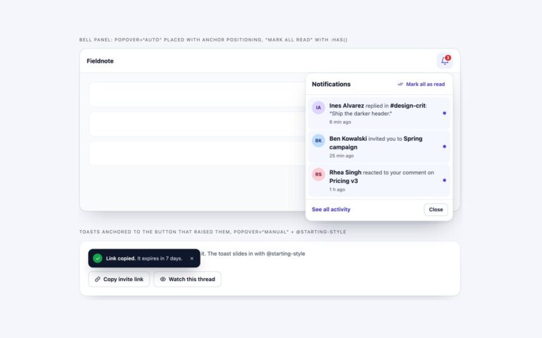
Notification UI for dark dashboards and developer tools. A bell on a near-black app bar has a red count with a soft glow and opens a panel of five events from a deployment platform: a production deploy, a CPU alert, a review request, a merged pull request and a finished backup, with unread items tinted and marked by a glowing dot, a Mark all as read button and an Open inbox link. Beside it, a stack of three toasts shows a finished deploy with a View deploy link, a memory warning and a failed build with the failing test in a monospace log line and an Open logs link. Each toast has a coloured stripe with a glow and a faint wash of its status colour mixed in with color-mix(), so the status reads at a glance without lowering text contrast. Every text colour was checked for 4.5:1 against its surface. Closing a toast moves focus to the next one. Use it for monitoring, CI and admin interfaces with a dark theme. The Bootstrap version runs under data-bs-theme=”dark” with the Dropdown and Toast plugins.
What’s included
Near-black palette with every text colour checked for 4.5:1
Status stripes and glows from one --dk-tone custom property
Failed build toast with a wrapped log line
Bell panel with count glow, unread dots and mark all as read
Bootstrap in data-bs-theme="dark" with .dropdown and .toast
Accessibility
The bell's name includes the unread count and it has aria-expanded and aria-controls; Esc closes the panel and returns focus. Unread items carry visually hidden (unread) text and Mark all as read is announced. The toast stack is a polite live region and the failed build uses role="alert"; each close button is named after its toast and closing moves focus to the next toast. Focus outlines use a light indigo that stands out on the dark surfaces, and animations are off under prefers-reduced-motion.
Customise it
In plain CSS change --dk-bg, --dk-surface, --dk-line, --dk-ink, --dk-text and --dk-focus on .dk-frame and .dk-stack, and --dk-tone on each toast status. In Bootstrap the same variables feed the --bs-dropdown-* and --bs-toast-* variables; in Tailwind edit the hex values and the [--dk-tone:…] utility.