Open demo

CSS code

HTML
<svg width="0" height="0" style="position:absolute" aria-hidden="true" focusable="false">
  <symbol id="i-bell" viewBox="0 0 24 24" fill="none" stroke="currentColor" stroke-width="1.9" stroke-linecap="round" stroke-linejoin="round"><path d="M6 8a6 6 0 0 1 12 0c0 7 3 9 3 9H3s3-2 3-9"/><path d="M10.3 21a1.9 1.9 0 0 0 3.4 0"/></symbol>
  <symbol id="i-checks" viewBox="0 0 24 24" fill="none" stroke="currentColor" stroke-width="2" stroke-linecap="round" stroke-linejoin="round"><path d="m2 12.5 4 4 8-9M12 16l1 1 8-9"/></symbol>
  <symbol id="i-ok" viewBox="0 0 24 24" fill="none" stroke="currentColor" stroke-width="2.4" stroke-linecap="round" stroke-linejoin="round"><path d="m5 12.5 4.5 4.5L19 7.5"/></symbol>
  <symbol id="i-link" viewBox="0 0 24 24" fill="none" stroke="currentColor" stroke-width="2" stroke-linecap="round" stroke-linejoin="round"><path d="M10 14a4.5 4.5 0 0 0 6.4 0l3-3a4.5 4.5 0 0 0-6.4-6.4l-1 1"/><path d="M14 10a4.5 4.5 0 0 0-6.4 0l-3 3a4.5 4.5 0 0 0 6.4 6.4l1-1"/></symbol>
  <symbol id="i-eye" viewBox="0 0 24 24" fill="none" stroke="currentColor" stroke-width="2" stroke-linecap="round" stroke-linejoin="round"><path d="M2 12s3.6-7 10-7 10 7 10 7-3.6 7-10 7S2 12 2 12z"/><circle cx="12" cy="12" r="3"/></symbol>
  <symbol id="i-x" viewBox="0 0 24 24" fill="none" stroke="currentColor" stroke-width="2.2" stroke-linecap="round"><path d="M6.5 6.5l11 11M17.5 6.5l-11 11"/></symbol>
</svg>

<div><span class="lbl">Bell panel: popover=“auto” placed with anchor positioning, “mark all read” with :has()</span>
<div class="mc-frame">
  <header class="mc mc-bar">
    <b>Fieldnote</b>
    <button class="mc-bell" type="button" popovertarget="mc-panel"><svg aria-hidden="true"><use href="#i-bell"/></svg><span class="mc-sr">Notifications</span><span class="mc-count">3<span class="mc-sr"> unread</span></span></button>
    <section class="mc-panel" id="mc-panel" popover aria-labelledby="mc-title">
      <div class="mc-head"><h2 id="mc-title">Notifications</h2>
        <label class="mc-markall"><input type="checkbox" id="mc-readall"><svg aria-hidden="true"><use href="#i-checks"/></svg>Mark all as read</label></div>
      <ul class="mc-list">
          <li class="mc-item"><span class="mc-av c1" aria-hidden="true">IA</span><span><b>Ines Alvarez</b> replied in <b>#design-crit</b>: “Ship the darker header.”<span class="mc-time">6 min ago</span></span><span class="mc-dot"></span></li>
          <li class="mc-item"><span class="mc-av c2" aria-hidden="true">BK</span><span><b>Ben Kowalski</b> invited you to <b>Spring campaign</b><span class="mc-time">25 min ago</span></span><span class="mc-dot"></span></li>
          <li class="mc-item"><span class="mc-av c3" aria-hidden="true">RS</span><span><b>Rhea Singh</b> reacted to your comment on <b>Pricing v3</b><span class="mc-time">1 h ago</span></span><span class="mc-dot"></span></li>
      </ul>
      <p class="mc-empty">You’re all caught up.</p>
      <div class="mc-foot"><a href="#">See all activity</a><button class="mc-close" type="button" popovertarget="mc-panel" popovertargetaction="hide">Close</button></div>
    </section>
  </header>
  <div class="mc-rows" aria-hidden="true"><i></i><i></i><i></i></div>
</div></div>

<div><span class="lbl">Toasts anchored to the button that raised them, popover=“manual” + @starting-style</span>
<div class="mc mc-card">
  <p class="mc-note">Each button opens a toast pinned just above it. The toast slides in with @starting-style and closes with its own button.</p>
  <div class="mc-actions">
    <button class="mc-btn mc-a-copy" type="button" popovertarget="mc-t-copy" popovertargetaction="show"><svg aria-hidden="true"><use href="#i-link"/></svg>Copy invite link</button>
    <div class="mc-toast mc-t-copy" id="mc-t-copy" popover="manual" role="status">
      <span class="mc-ticon" aria-hidden="true"><svg><use href="#i-ok"/></svg></span><p><b>Link copied.</b> It expires in 7 days.</p>
      <button class="mc-x" type="button" popovertarget="mc-t-copy" popovertargetaction="hide" aria-label="Dismiss: Link copied"><svg aria-hidden="true"><use href="#i-x"/></svg></button>
    </div>
    <button class="mc-btn mc-a-watch" type="button" popovertarget="mc-t-watch" popovertargetaction="show"><svg aria-hidden="true"><use href="#i-eye"/></svg>Watch this thread</button>
    <div class="mc-toast mc-t-watch" id="mc-t-watch" popover="manual" role="status">
      <span class="mc-ticon" aria-hidden="true"><svg><use href="#i-ok"/></svg></span><p><b>Watching.</b> You’ll get a notification for each reply.</p>
      <button class="mc-x" type="button" popovertarget="mc-t-watch" popovertargetaction="hide" aria-label="Dismiss: Watching"><svg aria-hidden="true"><use href="#i-x"/></svg></button>
    </div>
  </div>
</div></div>
CSS
/* Modern CSS notifications, no component JavaScript.
   1. The panel is popover="auto": the bell opens it, Esc and outside clicks close it, and the browser sets
      aria-expanded on the bell. Anchor positioning pins it under the bell; without it, the panel sits top-right.
   2. "Mark all as read" is a checkbox; :has(:checked) hides the count and the unread dots.
   3. Toasts are popover="manual", pinned above their trigger with anchor positioning and animated in with
      @starting-style; display and overlay transition with allow-discrete so they animate out too. */
.mc{--mc-brand:#4f46e5;--mc-ink:#0f172a;--mc-text:#475569;--mc-muted:#5b6474;--mc-line:#e2e8f0;color:var(--mc-text);font-size:.875rem;line-height:1.45}
.mc-sr{position:absolute;width:1px;height:1px;padding:0;margin:-1px;overflow:hidden;clip:rect(0,0,0,0);white-space:nowrap;border:0}
.mc-bar{display:flex;align-items:center;justify-content:space-between;height:62px;padding:0 18px;border-bottom:1px solid var(--mc-line);background:#fff;border-radius:18px 18px 0 0}
.mc-bar b{color:var(--mc-ink);font-size:.95rem}
.mc-bell{anchor-name:--mc-bell;position:relative;display:grid;place-items:center;width:42px;height:42px;padding:0;border:1px solid transparent;border-radius:12px;background:transparent;color:#334155;cursor:pointer}
.mc-bell:hover,.mc-bell:has(+ :popover-open){background:#eef2ff;color:var(--mc-brand)}
.mc-bell svg{width:22px;height:22px}
.mc-count{position:absolute;top:3px;right:2px;min-width:19px;height:19px;padding:0 5px;border:2px solid #fff;border-radius:999px;background:#dc2626;color:#fff;font-size:.6875rem;font-weight:700;line-height:15px;text-align:center}
.mc-bar:has(#mc-readall:checked) .mc-count{display:none}
/* Panel */
.mc-panel{position:fixed;inset:auto;margin:0;padding:0;width:min(380px,calc(100vw - 24px));max-height:min(480px,calc(100vh - 100px));overflow:auto;
  border:1px solid var(--mc-line);border-radius:16px;background:#fff;color:var(--mc-text);box-shadow:0 28px 56px -24px rgba(15,23,42,.35),0 4px 12px rgba(15,23,42,.06);
  position-anchor:--mc-bell;top:anchor(bottom);right:anchor(right);margin-top:10px;position-try-fallbacks:flip-inline;
  opacity:0;translate:0 -8px;transition:opacity .2s,translate .2s,display .2s allow-discrete,overlay .2s allow-discrete}
.mc-panel:popover-open{opacity:1;translate:0 0}
@starting-style{.mc-panel:popover-open{opacity:0;translate:0 -8px}}
@supports not (anchor-name:--a){.mc-panel{top:72px;right:16px}}
.mc-head{display:flex;flex-wrap:wrap;align-items:center;gap:8px;padding:14px 12px 12px 16px;border-bottom:1px solid var(--mc-line)}
.mc-head h2{flex:1;margin:0;font-size:1rem;color:var(--mc-ink)}
.mc-markall{position:relative;display:inline-flex;align-items:center;gap:6px;padding:5px 8px;border-radius:8px;color:#4338ca;font-size:.8125rem;font-weight:600;cursor:pointer}
.mc-markall:hover{background:#eef2ff}
.mc-markall input{position:absolute;opacity:0;width:1px;height:1px;margin:0}
.mc-markall svg{width:16px;height:16px}
.mc-markall:has(:focus-visible){outline:2px solid var(--mc-brand);outline-offset:2px}
.mc-markall:has(:checked){color:#166534;background:#f0fdf4}
.mc-list{margin:0;padding:6px;list-style:none}
.mc-item{position:relative;display:flex;gap:11px;padding:10px 28px 10px 10px;border-radius:12px;background:#f5f7ff}
.mc-item+.mc-item{margin-top:2px}
.mc-item b{color:var(--mc-ink);font-weight:650}
.mc-time{display:block;margin-top:3px;font-size:.75rem;color:var(--mc-muted)}
.mc-av{flex:none;display:grid;place-items:center;width:34px;height:34px;border-radius:50%;font-size:.75rem;font-weight:700}
.mc-av.c1{background:#ddd6fe;color:#4c1d95}.mc-av.c2{background:#bfdbfe;color:#1e3a8a}.mc-av.c3{background:#fecdd3;color:#881337}
.mc-dot{position:absolute;top:50%;right:11px;width:8px;height:8px;margin-top:-4px;border-radius:50%;background:var(--mc-brand)}
.mc-panel:has(#mc-readall:checked) .mc-item{background:transparent}
.mc-panel:has(#mc-readall:checked) .mc-dot{display:none}
.mc-empty{display:none;margin:0;padding:0 16px 10px;font-size:.8125rem;color:#166534}
.mc-panel:has(#mc-readall:checked) .mc-empty{display:block}
.mc-foot{display:flex;justify-content:space-between;align-items:center;padding:10px 12px 12px 16px;border-top:1px solid var(--mc-line)}
.mc-foot a{color:#4338ca;font-weight:650;text-decoration:none}
.mc-foot a:hover{text-decoration:underline}
.mc-close{height:32px;padding:0 12px;border:1px solid #cbd5e1;border-radius:9px;background:#fff;color:var(--mc-ink);font:inherit;font-size:.8125rem;font-weight:600;cursor:pointer}
.mc-close:hover{background:#f1f5f9}
/* Anchored toasts */
.mc-card{padding:22px;border:1px solid var(--mc-line);border-radius:18px;background:#fff;box-shadow:0 1px 2px rgba(15,23,42,.05),0 20px 40px -30px rgba(15,23,42,.3)}
.mc-note{margin:0 0 16px;max-width:560px}
.mc-actions{display:flex;flex-wrap:wrap;gap:10px}
.mc-btn{display:inline-flex;align-items:center;gap:7px;height:40px;padding:0 15px;border:1px solid #cbd5e1;border-radius:10px;background:#fff;color:var(--mc-ink);font:inherit;font-size:.875rem;font-weight:600;cursor:pointer}
.mc-btn:hover{background:#f1f5f9}
.mc-btn svg{width:16px;height:16px}
.mc-a-copy{anchor-name:--mc-copy}
.mc-a-watch{anchor-name:--mc-watch}
.mc-toast{position:fixed;inset:auto;margin:0;padding:10px 8px 10px 12px;width:max-content;max-width:min(320px,calc(100vw - 24px));display:flex;align-items:center;gap:10px;
  border:0;border-radius:12px;background:#0f172a;color:#cbd5e1;font-size:.8125rem;line-height:1.4;box-shadow:0 18px 36px -14px rgba(15,23,42,.55);
  bottom:anchor(top);left:anchor(left);margin-bottom:10px;position-try-fallbacks:flip-block,flip-inline;
  opacity:0;translate:0 8px;transition:opacity .25s,translate .25s,display .25s allow-discrete,overlay .25s allow-discrete}
.mc-toast:not(:popover-open){display:none}
.mc-toast:popover-open{opacity:1;translate:0 0}
@starting-style{.mc-toast:popover-open{opacity:0;translate:0 8px}}
.mc-t-copy{position-anchor:--mc-copy}
.mc-t-watch{position-anchor:--mc-watch}
@supports not (anchor-name:--a){.mc-toast{bottom:16px;left:50%;transform:translateX(-50%)}}
.mc-toast p{margin:0}
.mc-toast b{color:#fff;font-weight:600}
.mc-ticon{flex:none;display:grid;place-items:center;width:24px;height:24px;border-radius:50%;background:#16a34a;color:#fff}
.mc-ticon svg{width:13px;height:13px}
.mc-x{flex:none;display:grid;place-items:center;width:28px;height:28px;padding:0;border:0;border-radius:7px;background:transparent;color:#cbd5e1;cursor:pointer}
.mc-x:hover{background:rgba(255,255,255,.1);color:#fff}
.mc-x svg{width:13px;height:13px}
.mc-bell:focus-visible,.mc-btn:focus-visible,.mc-close:focus-visible,.mc-foot a:focus-visible{outline:2px solid var(--mc-brand);outline-offset:2px}
.mc-x:focus-visible{outline:2px solid #a5b4fc;outline-offset:1px}
@media (max-width:520px){.mc-panel{left:12px;right:12px;width:auto}}
@media (prefers-reduced-motion:reduce){.mc-panel,.mc-toast{transition:none}}

Bootstrap 5 code

Requires: Bootstrap 5.3.8 CSS

HTML
<svg width="0" height="0" style="position:absolute" aria-hidden="true" focusable="false">
  <symbol id="i-bell" viewBox="0 0 24 24" fill="none" stroke="currentColor" stroke-width="1.9" stroke-linecap="round" stroke-linejoin="round"><path d="M6 8a6 6 0 0 1 12 0c0 7 3 9 3 9H3s3-2 3-9"/><path d="M10.3 21a1.9 1.9 0 0 0 3.4 0"/></symbol>
  <symbol id="i-checks" viewBox="0 0 24 24" fill="none" stroke="currentColor" stroke-width="2" stroke-linecap="round" stroke-linejoin="round"><path d="m2 12.5 4 4 8-9M12 16l1 1 8-9"/></symbol>
  <symbol id="i-ok" viewBox="0 0 24 24" fill="none" stroke="currentColor" stroke-width="2.4" stroke-linecap="round" stroke-linejoin="round"><path d="m5 12.5 4.5 4.5L19 7.5"/></symbol>
  <symbol id="i-link" viewBox="0 0 24 24" fill="none" stroke="currentColor" stroke-width="2" stroke-linecap="round" stroke-linejoin="round"><path d="M10 14a4.5 4.5 0 0 0 6.4 0l3-3a4.5 4.5 0 0 0-6.4-6.4l-1 1"/><path d="M14 10a4.5 4.5 0 0 0-6.4 0l-3 3a4.5 4.5 0 0 0 6.4 6.4l1-1"/></symbol>
  <symbol id="i-eye" viewBox="0 0 24 24" fill="none" stroke="currentColor" stroke-width="2" stroke-linecap="round" stroke-linejoin="round"><path d="M2 12s3.6-7 10-7 10 7 10 7-3.6 7-10 7S2 12 2 12z"/><circle cx="12" cy="12" r="3"/></symbol>
  <symbol id="i-x" viewBox="0 0 24 24" fill="none" stroke="currentColor" stroke-width="2.2" stroke-linecap="round"><path d="M6.5 6.5l11 11M17.5 6.5l-11 11"/></symbol>
</svg>

<div><span class="lbl">Bell panel: popover=“auto” placed with anchor positioning, “mark all read” with :has()</span>
<div class="mc-frame">
  <header class="mc mc-bar d-flex align-items-center justify-content-between">
    <b>Fieldnote</b>
    <button class="btn mc-bell" type="button" popovertarget="mc-panel"><svg aria-hidden="true"><use href="#i-bell"/></svg><span class="visually-hidden">Notifications</span><span class="badge rounded-pill text-bg-danger mc-count">3<span class="visually-hidden"> unread</span></span></button>
    <section class="card mc-panel" id="mc-panel" popover aria-labelledby="mc-title">
      <div class="card-header mc-head d-flex flex-wrap align-items-center gap-2"><h2 class="flex-grow-1" id="mc-title">Notifications</h2>
        <input type="checkbox" class="btn-check" id="mc-readall" autocomplete="off"><label class="btn mc-markall d-inline-flex align-items-center gap-1" for="mc-readall"><svg aria-hidden="true"><use href="#i-checks"/></svg>Mark all as read</label></div>
      <ul class="list-group list-group-flush mc-list">
          <li class="list-group-item mc-item d-flex gap-2"><span class="mc-av c1" aria-hidden="true">IA</span><span><b>Ines Alvarez</b> replied in <b>#design-crit</b>: “Ship the darker header.”<span class="mc-time">6 min ago</span></span><span class="mc-dot"></span></li>
          <li class="list-group-item mc-item d-flex gap-2"><span class="mc-av c2" aria-hidden="true">BK</span><span><b>Ben Kowalski</b> invited you to <b>Spring campaign</b><span class="mc-time">25 min ago</span></span><span class="mc-dot"></span></li>
          <li class="list-group-item mc-item d-flex gap-2"><span class="mc-av c3" aria-hidden="true">RS</span><span><b>Rhea Singh</b> reacted to your comment on <b>Pricing v3</b><span class="mc-time">1 h ago</span></span><span class="mc-dot"></span></li>
      </ul>
      <p class="mc-empty">You’re all caught up.</p>
      <div class="card-footer mc-foot d-flex justify-content-between align-items-center"><a href="#">See all activity</a><button class="btn btn-outline-secondary mc-close" type="button" popovertarget="mc-panel" popovertargetaction="hide">Close</button></div>
    </section>
  </header>
  <div class="mc-rows" aria-hidden="true"><i></i><i></i><i></i></div>
</div></div>

<div><span class="lbl">Toasts anchored to the button that raised them, popover=“manual” + @starting-style</span>
<div class="card mc mc-card">
  <p class="mc-note">Each button opens a toast pinned just above it. The toast slides in with @starting-style and closes with its own button.</p>
  <div class="d-flex flex-wrap gap-2">
    <button class="btn btn-outline-secondary mc-btn mc-a-copy" type="button" popovertarget="mc-t-copy" popovertargetaction="show"><svg aria-hidden="true"><use href="#i-link"/></svg>Copy invite link</button>
    <div class="toast show mc-toast mc-t-copy" id="mc-t-copy" popover="manual" role="status">
      <span class="mc-ticon" aria-hidden="true"><svg><use href="#i-ok"/></svg></span><p><b>Link copied.</b> It expires in 7 days.</p>
      <button class="btn-close btn-close-white" type="button" popovertarget="mc-t-copy" popovertargetaction="hide" aria-label="Dismiss: Link copied"></button>
    </div>
    <button class="btn btn-outline-secondary mc-btn mc-a-watch" type="button" popovertarget="mc-t-watch" popovertargetaction="show"><svg aria-hidden="true"><use href="#i-eye"/></svg>Watch this thread</button>
    <div class="toast show mc-toast mc-t-watch" id="mc-t-watch" popover="manual" role="status">
      <span class="mc-ticon" aria-hidden="true"><svg><use href="#i-ok"/></svg></span><p><b>Watching.</b> You’ll get a notification for each reply.</p>
      <button class="btn-close btn-close-white" type="button" popovertarget="mc-t-watch" popovertargetaction="hide" aria-label="Dismiss: Watching"></button>
    </div>
  </div>
</div></div>
CSS
/* Modern CSS notifications on Bootstrap, no component JavaScript: a .card panel that is popover="auto" (Esc and
   outside clicks close it, the browser sets aria-expanded on the bell), pinned under the bell with anchor positioning;
   a .btn-check "Mark all as read" toggle read by :has(); and .toast elements that are popover="manual", pinned above
   their trigger and animated with @starting-style. The Bootstrap JS bundle is not loaded. */
.mc{--mc-brand:#4f46e5;--mc-ink:#0f172a;--mc-text:#475569;--mc-muted:#5b6474;--mc-line:#e2e8f0;color:var(--mc-text);font-size:.875rem;line-height:1.45}
.mc-bar{height:62px;padding:0 18px;border-bottom:1px solid var(--mc-line);background:#fff;border-radius:18px 18px 0 0}
.mc-bar b{color:var(--mc-ink);font-size:.95rem}
.mc-bell{--bs-btn-padding-x:0;--bs-btn-padding-y:0;--bs-btn-color:#334155;--bs-btn-hover-color:var(--mc-brand);--bs-btn-hover-bg:#eef2ff;--bs-btn-border-color:transparent;--bs-btn-hover-border-color:transparent;
  --bs-btn-active-bg:#eef2ff;--bs-btn-active-color:var(--mc-brand);--bs-btn-active-border-color:transparent;--bs-btn-border-radius:12px;--bs-btn-focus-box-shadow:0 0 0 2px var(--mc-brand);
  anchor-name:--mc-bell;position:relative;display:grid;place-items:center;width:42px;height:42px}
.mc-bell:has(+ :popover-open){background:#eef2ff;color:var(--mc-brand)}
.mc-bell svg{width:22px;height:22px}
.mc-bell .mc-count{--bs-badge-padding-x:5px;--bs-badge-padding-y:0;--bs-badge-font-size:.6875rem;position:absolute;top:3px;right:2px;min-width:19px;height:19px;line-height:15px;border:2px solid #fff}
.mc-bar:has(#mc-readall:checked) .mc-count{display:none}
.mc-panel{--bs-card-border-color:var(--mc-line);--bs-card-border-radius:16px;--bs-card-inner-border-radius:15px;--bs-card-cap-bg:#fff;--bs-card-cap-padding-y:12px;--bs-card-cap-padding-x:16px;--bs-card-color:var(--mc-text);
  position:fixed;inset:auto;margin:0;padding:0;width:min(380px,calc(100vw - 24px));max-height:min(480px,calc(100vh - 100px));overflow:auto;
  box-shadow:0 28px 56px -24px rgba(15,23,42,.35),0 4px 12px rgba(15,23,42,.06);
  position-anchor:--mc-bell;top:anchor(bottom);right:anchor(right);margin-top:10px;position-try-fallbacks:flip-inline;
  opacity:0;translate:0 -8px;transition:opacity .2s,translate .2s,display .2s allow-discrete,overlay .2s allow-discrete}
.mc-panel:not(:popover-open){display:none}
.mc-panel:popover-open{opacity:1;translate:0 0}
@starting-style{.mc-panel:popover-open{opacity:0;translate:0 -8px}}
@supports not (anchor-name:--a){.mc-panel{top:72px;right:16px}}
.mc-head{padding:14px 12px 12px 16px}
.mc-head h2{margin:0;font-size:1rem;font-weight:700;color:var(--mc-ink)}
.mc-markall{--bs-btn-padding-x:8px;--bs-btn-padding-y:5px;--bs-btn-font-size:.8125rem;--bs-btn-font-weight:600;--bs-btn-color:#4338ca;--bs-btn-hover-color:#4338ca;--bs-btn-hover-bg:#eef2ff;--bs-btn-border-width:0;--bs-btn-border-radius:8px;
  --bs-btn-active-color:#166534;--bs-btn-active-bg:#f0fdf4;--bs-btn-focus-box-shadow:0 0 0 2px var(--mc-brand)}
.mc-markall svg{width:16px;height:16px}
.mc-list{--bs-list-group-border-width:0;--bs-list-group-bg:transparent;--bs-list-group-color:var(--mc-text);padding:6px}
.mc-item{position:relative;gap:11px!important;padding:10px 28px 10px 10px;border-radius:12px!important;background:#f5f7ff}
.mc-item+.mc-item{margin-top:2px}
.mc-item b{color:var(--mc-ink);font-weight:650}
.mc-time{display:block;margin-top:3px;font-size:.75rem;color:var(--mc-muted)}
.mc-av{flex:none;display:grid;place-items:center;width:34px;height:34px;border-radius:50%;font-size:.75rem;font-weight:700}
.mc-av.c1{background:#ddd6fe;color:#4c1d95}.mc-av.c2{background:#bfdbfe;color:#1e3a8a}.mc-av.c3{background:#fecdd3;color:#881337}
.mc-dot{position:absolute;top:50%;right:11px;width:8px;height:8px;margin-top:-4px;border-radius:50%;background:var(--mc-brand)}
.mc-panel:has(#mc-readall:checked) .mc-item{background:transparent}
.mc-panel:has(#mc-readall:checked) .mc-dot{display:none}
.mc-empty{display:none;margin:0;padding:0 16px 10px;font-size:.8125rem;color:#166534}
.mc-panel:has(#mc-readall:checked) .mc-empty{display:block}
.mc-foot{padding:10px 12px 12px 16px}
.mc-foot a{color:#4338ca;font-weight:650;text-decoration:none}
.mc-foot a:hover{text-decoration:underline}
.mc-foot a:focus-visible{outline:2px solid var(--mc-brand);outline-offset:2px}
.mc .btn-outline-secondary,.mc-close{--bs-btn-color:var(--mc-ink);--bs-btn-border-color:#cbd5e1;--bs-btn-hover-color:var(--mc-ink);--bs-btn-hover-bg:#f1f5f9;--bs-btn-hover-border-color:#cbd5e1;--bs-btn-active-color:var(--mc-ink);
  --bs-btn-active-bg:#e2e8f0;--bs-btn-active-border-color:#cbd5e1;--bs-btn-font-weight:600;--bs-btn-focus-box-shadow:0 0 0 2px #fff,0 0 0 4px var(--mc-brand);background:#fff}
.mc-close{--bs-btn-padding-x:12px;--bs-btn-padding-y:0;--bs-btn-font-size:.8125rem;--bs-btn-border-radius:9px;height:32px}
.mc-card{--bs-card-border-color:var(--mc-line);--bs-card-border-radius:18px;padding:22px;box-shadow:0 1px 2px rgba(15,23,42,.05),0 20px 40px -30px rgba(15,23,42,.3)}
.mc-note{margin:0 0 16px;max-width:560px}
.mc-btn{--bs-btn-padding-x:15px;--bs-btn-font-size:.875rem;--bs-btn-border-radius:10px;display:inline-flex;align-items:center;gap:7px;height:40px}
.mc-btn svg{width:16px;height:16px}
.mc-a-copy{anchor-name:--mc-copy}
.mc-a-watch{anchor-name:--mc-watch}
.mc-toast{--bs-toast-bg:#0f172a;--bs-toast-color:#cbd5e1;--bs-toast-border-width:0;--bs-toast-border-radius:12px;--bs-toast-font-size:.8125rem;--bs-toast-box-shadow:0 18px 36px -14px rgba(15,23,42,.55);
  position:fixed;inset:auto;margin:0;padding:10px 8px 10px 12px;width:max-content;max-width:min(320px,calc(100vw - 24px));display:flex;align-items:center;gap:10px;line-height:1.4;
  bottom:anchor(top);left:anchor(left);margin-bottom:10px;position-try-fallbacks:flip-block,flip-inline;
  opacity:0;translate:0 8px;transition:opacity .25s,translate .25s,display .25s allow-discrete,overlay .25s allow-discrete}
.mc-toast:not(:popover-open){display:none}
.mc-toast:popover-open{opacity:1;translate:0 0}
@starting-style{.mc-toast:popover-open{opacity:0;translate:0 8px}}
.mc-t-copy{position-anchor:--mc-copy}
.mc-t-watch{position-anchor:--mc-watch}
@supports not (anchor-name:--a){.mc-toast{bottom:16px;left:50%;transform:translateX(-50%)}}
.mc-toast p{margin:0}
.mc-toast b{color:#fff;font-weight:600}
.mc-ticon{flex:none;display:grid;place-items:center;width:24px;height:24px;border-radius:50%;background:#16a34a;color:#fff}
.mc-ticon svg{width:13px;height:13px}
.mc-toast .btn-close{--bs-btn-close-focus-shadow:0 0 0 2px #a5b4fc;flex:none;width:28px;height:28px;padding:0;border-radius:7px;background-size:9px}
@media (max-width:520px){.mc-panel{left:12px;right:12px;width:auto}}
@media (prefers-reduced-motion:reduce){.mc-panel,.mc-toast{transition:none}}

Tailwind 4 code

Requires: Tailwind CSS 4

HTML
<svg width="0" height="0" style="position:absolute" aria-hidden="true" focusable="false">
  <symbol id="i-bell" viewBox="0 0 24 24" fill="none" stroke="currentColor" stroke-width="1.9" stroke-linecap="round" stroke-linejoin="round"><path d="M6 8a6 6 0 0 1 12 0c0 7 3 9 3 9H3s3-2 3-9"/><path d="M10.3 21a1.9 1.9 0 0 0 3.4 0"/></symbol>
  <symbol id="i-checks" viewBox="0 0 24 24" fill="none" stroke="currentColor" stroke-width="2" stroke-linecap="round" stroke-linejoin="round"><path d="m2 12.5 4 4 8-9M12 16l1 1 8-9"/></symbol>
  <symbol id="i-ok" viewBox="0 0 24 24" fill="none" stroke="currentColor" stroke-width="2.4" stroke-linecap="round" stroke-linejoin="round"><path d="m5 12.5 4.5 4.5L19 7.5"/></symbol>
  <symbol id="i-link" viewBox="0 0 24 24" fill="none" stroke="currentColor" stroke-width="2" stroke-linecap="round" stroke-linejoin="round"><path d="M10 14a4.5 4.5 0 0 0 6.4 0l3-3a4.5 4.5 0 0 0-6.4-6.4l-1 1"/><path d="M14 10a4.5 4.5 0 0 0-6.4 0l-3 3a4.5 4.5 0 0 0 6.4 6.4l1-1"/></symbol>
  <symbol id="i-eye" viewBox="0 0 24 24" fill="none" stroke="currentColor" stroke-width="2" stroke-linecap="round" stroke-linejoin="round"><path d="M2 12s3.6-7 10-7 10 7 10 7-3.6 7-10 7S2 12 2 12z"/><circle cx="12" cy="12" r="3"/></symbol>
  <symbol id="i-x" viewBox="0 0 24 24" fill="none" stroke="currentColor" stroke-width="2.2" stroke-linecap="round"><path d="M6.5 6.5l11 11M17.5 6.5l-11 11"/></symbol>
</svg>

<div><span class="mb-3.5 block text-[.72rem] tracking-[.12em] text-[#5b6474] uppercase">Bell panel: popover=“auto” placed with anchor positioning, “mark all read” with :has()</span>
<div class="h-[420px] rounded-[18px] border border-[#d6dce5] bg-[#f8fafc] shadow-[0_1px_2px_rgba(15,23,42,.05),0_24px_48px_-28px_rgba(15,23,42,.3)]">
  <header class="group/bar flex h-[62px] items-center justify-between rounded-t-[18px] border-b border-[#e2e8f0] bg-white px-[18px] text-sm leading-[1.45] text-[#475569]">
    <b class="text-[.95rem] text-[#0f172a]">Fieldnote</b>
    <button class="peer relative grid size-[42px] cursor-pointer place-items-center rounded-xl border border-transparent bg-transparent p-0 text-[#334155] [anchor-name:--mc-bell] hover:bg-[#eef2ff] hover:text-[#4f46e5] has-[+:popover-open]:bg-[#eef2ff] has-[+:popover-open]:text-[#4f46e5] focus-visible:outline-2 focus-visible:outline-offset-2 focus-visible:outline-[#4f46e5]" type="button" popovertarget="mc-panel"><svg class="size-[22px]" aria-hidden="true"><use href="#i-bell"/></svg><span class="sr-only">Notifications</span><span class="absolute top-[3px] right-0.5 h-[19px] min-w-[19px] rounded-full border-2 border-white bg-[#dc2626] px-[5px] text-center text-[.6875rem] leading-[15px] font-bold text-white group-has-[#mc-readall:checked]/bar:hidden">3<span class="sr-only"> unread</span></span></button>
    <section class="mc-panel group/panel fixed m-0 max-h-[min(480px,calc(100vh-100px))] w-[min(380px,calc(100vw-24px))] overflow-auto rounded-2xl border border-[#e2e8f0] bg-white p-0 text-[#475569] shadow-[0_28px_56px_-24px_rgba(15,23,42,.35),0_4px_12px_rgba(15,23,42,.06)] [inset:auto] mt-2.5 [position-anchor:--mc-bell] [top:anchor(bottom)] [right:anchor(right)] [position-try-fallbacks:flip-inline] -translate-y-2 opacity-0 transition-[opacity,translate,display,overlay] duration-200 transition-discrete motion-reduce:transition-none open:translate-y-0 open:opacity-100 starting:open:-translate-y-2 starting:open:opacity-0 max-[520px]:right-3 max-[520px]:left-3 max-[520px]:w-auto" id="mc-panel" popover aria-labelledby="mc-title">
      <div class="flex flex-wrap items-center gap-2 border-b border-[#e2e8f0] pt-3.5 pr-3 pb-3 pl-4"><h2 class="m-0 flex-1 text-base font-bold text-[#0f172a]" id="mc-title">Notifications</h2>
        <label class="relative inline-flex cursor-pointer items-center gap-1.5 rounded-lg px-2 py-[5px] text-[.8125rem] font-semibold text-[#4338ca] hover:bg-[#eef2ff] has-checked:bg-[#f0fdf4] has-checked:text-[#166534] has-focus-visible:outline-2 has-focus-visible:outline-offset-2 has-focus-visible:outline-[#4f46e5]"><input class="sr-only" type="checkbox" id="mc-readall"><svg class="size-4" aria-hidden="true"><use href="#i-checks"/></svg>Mark all as read</label></div>
      <ul class="m-0 list-none space-y-0.5 p-1.5">
          <li class="relative flex gap-[11px] rounded-xl bg-[#f5f7ff] py-2.5 pr-7 pl-2.5 group-has-[#mc-readall:checked]/panel:bg-transparent [&_b]:font-[650] [&_b]:text-[#0f172a]"><span class="grid size-[34px] flex-none place-items-center rounded-full text-xs font-bold bg-[#ddd6fe] text-[#4c1d95]" aria-hidden="true">IA</span><span><b>Ines Alvarez</b> replied in <b>#design-crit</b>: “Ship the darker header.”<span class="mt-[3px] block text-xs text-[#5b6474]">6 min ago</span></span><span class="absolute top-1/2 right-[11px] -mt-1 size-2 rounded-full bg-[#4f46e5] group-has-[#mc-readall:checked]/panel:hidden"></span></li>
          <li class="relative flex gap-[11px] rounded-xl bg-[#f5f7ff] py-2.5 pr-7 pl-2.5 group-has-[#mc-readall:checked]/panel:bg-transparent [&_b]:font-[650] [&_b]:text-[#0f172a]"><span class="grid size-[34px] flex-none place-items-center rounded-full text-xs font-bold bg-[#bfdbfe] text-[#1e3a8a]" aria-hidden="true">BK</span><span><b>Ben Kowalski</b> invited you to <b>Spring campaign</b><span class="mt-[3px] block text-xs text-[#5b6474]">25 min ago</span></span><span class="absolute top-1/2 right-[11px] -mt-1 size-2 rounded-full bg-[#4f46e5] group-has-[#mc-readall:checked]/panel:hidden"></span></li>
          <li class="relative flex gap-[11px] rounded-xl bg-[#f5f7ff] py-2.5 pr-7 pl-2.5 group-has-[#mc-readall:checked]/panel:bg-transparent [&_b]:font-[650] [&_b]:text-[#0f172a]"><span class="grid size-[34px] flex-none place-items-center rounded-full text-xs font-bold bg-[#fecdd3] text-[#881337]" aria-hidden="true">RS</span><span><b>Rhea Singh</b> reacted to your comment on <b>Pricing v3</b><span class="mt-[3px] block text-xs text-[#5b6474]">1 h ago</span></span><span class="absolute top-1/2 right-[11px] -mt-1 size-2 rounded-full bg-[#4f46e5] group-has-[#mc-readall:checked]/panel:hidden"></span></li>
      </ul>
      <p class="m-0 hidden px-4 pb-2.5 text-[.8125rem] text-[#166534] group-has-[#mc-readall:checked]/panel:block">You’re all caught up.</p>
      <div class="flex items-center justify-between border-t border-[#e2e8f0] pt-2.5 pr-3 pb-3 pl-4"><a class="font-[650] text-[#4338ca] no-underline hover:underline focus-visible:outline-2 focus-visible:outline-offset-2 focus-visible:outline-[#4f46e5]" href="#">See all activity</a><button class="h-8 cursor-pointer rounded-[9px] border border-[#cbd5e1] bg-white px-3 text-[.8125rem] font-semibold text-[#0f172a] hover:bg-[#f1f5f9] focus-visible:outline-2 focus-visible:outline-offset-2 focus-visible:outline-[#4f46e5]" type="button" popovertarget="mc-panel" popovertargetaction="hide">Close</button></div>
    </section>
  </header>
  <div class="grid gap-3 p-6" aria-hidden="true"><i class="h-16 rounded-xl border border-[#edf0f5] bg-white"></i><i class="h-16 rounded-xl border border-[#edf0f5] bg-white"></i><i class="h-16 rounded-xl border border-[#edf0f5] bg-white"></i></div>
</div></div>

<div><span class="mb-3.5 block text-[.72rem] tracking-[.12em] text-[#5b6474] uppercase">Toasts anchored to the button that raised them, popover=“manual” + @starting-style</span>
<div class="rounded-[18px] border border-[#e2e8f0] bg-white p-[22px] text-sm leading-[1.45] text-[#475569] shadow-[0_1px_2px_rgba(15,23,42,.05),0_20px_40px_-30px_rgba(15,23,42,.3)]">
  <p class="mt-0 mb-4 max-w-[560px]">Each button opens a toast pinned just above it. The toast slides in with @starting-style and closes with its own button.</p>
  <div class="flex flex-wrap gap-2.5">
    <button class="inline-flex h-10 cursor-pointer items-center gap-[7px] rounded-[10px] border border-[#cbd5e1] bg-white px-[15px] text-sm font-semibold text-[#0f172a] hover:bg-[#f1f5f9] focus-visible:outline-2 focus-visible:outline-offset-2 focus-visible:outline-[#4f46e5] [anchor-name:--mc-copy]" type="button" popovertarget="mc-t-copy" popovertargetaction="show"><svg class="size-4" aria-hidden="true"><use href="#i-link"/></svg>Copy invite link</button>
    <div class="mc-toast fixed m-0 hidden w-max max-w-[min(320px,calc(100vw-24px))] items-center gap-2.5 rounded-xl border-0 bg-[#0f172a] py-2.5 pr-2 pl-3 text-[.8125rem] leading-[1.4] text-[#cbd5e1] shadow-[0_18px_36px_-14px_rgba(15,23,42,.55)] [inset:auto] mb-2.5 [bottom:anchor(top)] [left:anchor(left)] [position-try-fallbacks:flip-block,flip-inline] translate-y-2 opacity-0 transition-[opacity,translate,display,overlay] duration-200 transition-discrete motion-reduce:transition-none duration-250 open:flex open:translate-y-0 open:opacity-100 starting:open:translate-y-2 starting:open:opacity-0 [position-anchor:--mc-copy]" id="mc-t-copy" popover="manual" role="status">
      <span class="grid size-6 flex-none place-items-center rounded-full bg-[#16a34a] text-white" aria-hidden="true"><svg class="size-[13px]"><use href="#i-ok"/></svg></span><p class="m-0"><b class="font-semibold text-white">Link copied.</b> It expires in 7 days.</p>
      <button class="grid size-7 flex-none cursor-pointer place-items-center rounded-[7px] border-0 bg-transparent p-0 text-[#cbd5e1] hover:bg-white/10 hover:text-white focus-visible:outline-2 focus-visible:outline-offset-1 focus-visible:outline-[#a5b4fc]" type="button" popovertarget="mc-t-copy" popovertargetaction="hide" aria-label="Dismiss: Link copied"><svg class="size-[13px]" aria-hidden="true"><use href="#i-x"/></svg></button>
    </div>
    <button class="inline-flex h-10 cursor-pointer items-center gap-[7px] rounded-[10px] border border-[#cbd5e1] bg-white px-[15px] text-sm font-semibold text-[#0f172a] hover:bg-[#f1f5f9] focus-visible:outline-2 focus-visible:outline-offset-2 focus-visible:outline-[#4f46e5] [anchor-name:--mc-watch]" type="button" popovertarget="mc-t-watch" popovertargetaction="show"><svg class="size-4" aria-hidden="true"><use href="#i-eye"/></svg>Watch this thread</button>
    <div class="mc-toast fixed m-0 hidden w-max max-w-[min(320px,calc(100vw-24px))] items-center gap-2.5 rounded-xl border-0 bg-[#0f172a] py-2.5 pr-2 pl-3 text-[.8125rem] leading-[1.4] text-[#cbd5e1] shadow-[0_18px_36px_-14px_rgba(15,23,42,.55)] [inset:auto] mb-2.5 [bottom:anchor(top)] [left:anchor(left)] [position-try-fallbacks:flip-block,flip-inline] translate-y-2 opacity-0 transition-[opacity,translate,display,overlay] duration-200 transition-discrete motion-reduce:transition-none duration-250 open:flex open:translate-y-0 open:opacity-100 starting:open:translate-y-2 starting:open:opacity-0 [position-anchor:--mc-watch]" id="mc-t-watch" popover="manual" role="status">
      <span class="grid size-6 flex-none place-items-center rounded-full bg-[#16a34a] text-white" aria-hidden="true"><svg class="size-[13px]"><use href="#i-ok"/></svg></span><p class="m-0"><b class="font-semibold text-white">Watching.</b> You’ll get a notification for each reply.</p>
      <button class="grid size-7 flex-none cursor-pointer place-items-center rounded-[7px] border-0 bg-transparent p-0 text-[#cbd5e1] hover:bg-white/10 hover:text-white focus-visible:outline-2 focus-visible:outline-offset-1 focus-visible:outline-[#a5b4fc]" type="button" popovertarget="mc-t-watch" popovertargetaction="hide" aria-label="Dismiss: Watching"><svg class="size-[13px]" aria-hidden="true"><use href="#i-x"/></svg></button>
    </div>
  </div>
</div></div>
CSS
/* Fallback placement for browsers without anchor positioning (the utilities above use anchor()). */
@supports not (anchor-name: --a) {
  .mc-panel { top: 72px; right: 16px; }
  .mc-toast { bottom: 16px; left: 50%; translate: -50% 0; }
}

About this set

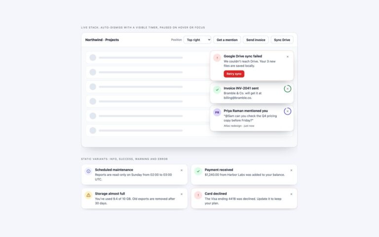
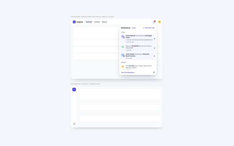
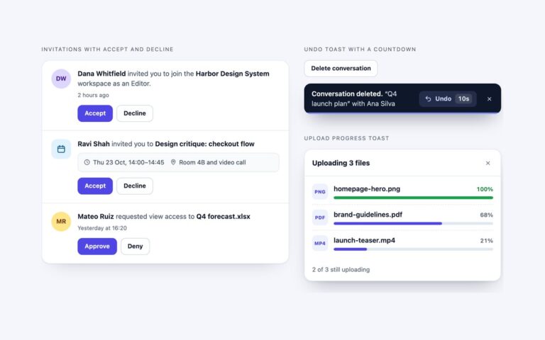
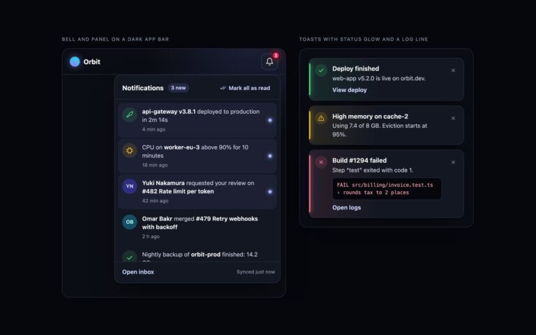
A bell panel and two toasts that work without any component JavaScript. The panel is an element with the popover attribute, opened by a bell with popovertarget, so the browser handles Esc, clicks outside and the bell’s expanded state. CSS anchor positioning pins it under the bell with anchor() and position-try-fallbacks; browsers without anchor positioning place it at the top right through an @supports rule, and on phones it spans the screen width. It fades and slides in with @starting-style, and display and overlay transition with allow-discrete so it animates out as well. Mark all as read is a checkbox styled as a button: :has() on the panel and header reads its state to hide the count badge and unread dots and show a You’re all caught up line. The toasts are popover=”manual” elements opened by Copy invite link and Watch this thread, each anchored just above the button that raised it and closed by its own button. The demo page runs one demo-only line to open the panel and a toast for the preview; the component needs none.

What’s included

  • popover="auto" panel with built-in Esc, light dismiss and expanded state
  • Anchor positioning with a fallback position for other browsers
  • @starting-style entry and allow-discrete exit animations
  • Mark all as read through a checkbox and :has()
  • Toasts anchored to the buttons that raised them

Accessibility

The bell is a button with popovertarget, which gives it an expanded state for assistive technology, and its name includes the unread count until everything is marked read. The panel is a region named by its heading, Esc closes it, and it follows the bell in the DOM so Tab moves straight into it. Toasts have role="status" and named close buttons; a screen reader may not announce a popover as it opens, so keep important messages in a live region too. Transitions are off under prefers-reduced-motion.

Customise it

Change --mc-brand, --mc-ink, --mc-text and --mc-line on .mc, the anchor names on .mc-bell, .mc-a-copy and .mc-a-watch, and the fallback position in the @supports not (anchor-name: --a) rule. Bootstrap restyles .card, .list-group and .toast through their variables; Tailwind uses arbitrary properties such as [anchor-name:--mc-bell] and the open: and starting: variants.