Open demo

CSS code

HTML
<div class="media-tl" tabindex="0" role="region" aria-label="Studio history, scrollable">
  <ol class="rail">
    <li class="item"><time class="yr" datetime="2014">2014</time><div class="card">
      <div class="img" style="background:linear-gradient(140deg,#6366f1,#a855f7)"></div>
      <div class="pad"><h2>Two people, one room</h2><p>Started above a bakery with a borrowed plotter.</p></div></div></li>
    <li class="item"><time class="yr" datetime="2017">2017</time><div class="card">
      <div class="img" style="background:linear-gradient(140deg,#0ea5e9,#22d3ee)"></div>
      <div class="pad"><h2>First national client</h2><p>A rebrand that ran on 400 billboards.</p></div></div></li>
    <li class="item"><time class="yr" datetime="2020">2020</time><div class="card">
      <div class="img" style="background:linear-gradient(140deg,#f43f5e,#f59e0b)"></div>
      <div class="pad"><h2>Everything remote</h2><p>Twelve people across five time zones, permanently.</p></div></div></li>
    <li class="item"><time class="yr" datetime="2023">2023</time><div class="card">
      <div class="img" style="background:linear-gradient(140deg,#16a34a,#84cc16)"></div>
      <div class="pad"><h2>The studio buys itself</h2><p>Employee ownership, finalised in March.</p></div></div></li>
    <li class="item"><time class="yr" datetime="2026">2026</time><div class="card">
      <div class="img" style="background:linear-gradient(140deg,#7c3aed,#db2777)"></div>
      <div class="pad"><h2>Forty and steady</h2><p>Still no billboards in the office.</p></div></div></li>
  </ol>
</div>
CSS
/* Horizontal media timeline: a focusable, scroll-snapping region around an <ol> of cards on a date rail. */
.media-tl{--mt-accent:#4f46e5;--mt-rail:#dde3f0;--mt-border:#e3e8f2;--mt-muted:#5f6a86;
  width:100%;max-width:980px;overflow-x:auto;scroll-snap-type:x mandatory;padding-bottom:14px;border-radius:6px}
.media-tl,.media-tl *{box-sizing:border-box}
.media-tl :where(ol,li,h2,p){margin:0;padding:0;list-style:none}
.media-tl:focus-visible{outline:2px solid var(--mt-accent);outline-offset:4px}
.media-tl::-webkit-scrollbar{height:8px}
.media-tl::-webkit-scrollbar-track{background:#e7ebf5;border-radius:99px}
.media-tl::-webkit-scrollbar-thumb{background:#b9c2d8;border-radius:99px}
.media-tl:hover::-webkit-scrollbar-thumb{background:#96a1bd}
.media-tl .rail{display:flex;position:relative;padding-top:74px;min-width:min-content}
.media-tl .rail::before{content:"";position:absolute;top:58px;left:0;right:0;height:3px;background:var(--mt-rail);border-radius:99px}
.media-tl .item{scroll-snap-align:center;flex:0 0 236px;position:relative;padding:0 12px}
.media-tl .item::before{content:"";position:absolute;top:-24px;left:50%;transform:translateX(-50%);
  width:15px;height:15px;border-radius:50%;background:#fff;border:3px solid var(--mt-accent);z-index:1}
.media-tl .yr{position:absolute;top:-58px;left:50%;transform:translateX(-50%);font-size:.95rem;
  font-weight:900;color:var(--mt-accent);letter-spacing:-.01em}
.media-tl .card{background:#fff;border:1px solid var(--mt-border);border-radius:13px;overflow:hidden}
.media-tl .img{height:118px}
.media-tl .pad{padding:13px 14px 15px}
.media-tl h2{font-size:.9rem;margin-bottom:5px;letter-spacing:-.01em}
.media-tl p{font-size:.79rem;color:var(--mt-muted);line-height:1.55}

Bootstrap 5 code

Requires: Bootstrap 5.3.8 CSS

HTML
<div class="media-tl w-100" tabindex="0" role="region" aria-label="Studio history, scrollable">
  <ol class="rail list-unstyled d-flex position-relative m-0">
    <li class="item position-relative"><time class="yr position-absolute start-50 translate-middle-x" datetime="2014">2014</time><div class="card overflow-hidden">
      <div style="height:118px;background:linear-gradient(140deg,#6366f1,#a855f7)"></div>
      <div class="card-body"><h2 class="card-title">Two people, one room</h2><p class="card-text">Started above a bakery with a borrowed plotter.</p></div></div></li>
    <li class="item position-relative"><time class="yr position-absolute start-50 translate-middle-x" datetime="2017">2017</time><div class="card overflow-hidden">
      <div style="height:118px;background:linear-gradient(140deg,#0ea5e9,#22d3ee)"></div>
      <div class="card-body"><h2 class="card-title">First national client</h2><p class="card-text">A rebrand that ran on 400 billboards.</p></div></div></li>
    <li class="item position-relative"><time class="yr position-absolute start-50 translate-middle-x" datetime="2020">2020</time><div class="card overflow-hidden">
      <div style="height:118px;background:linear-gradient(140deg,#f43f5e,#f59e0b)"></div>
      <div class="card-body"><h2 class="card-title">Everything remote</h2><p class="card-text">Twelve people across five time zones, permanently.</p></div></div></li>
    <li class="item position-relative"><time class="yr position-absolute start-50 translate-middle-x" datetime="2023">2023</time><div class="card overflow-hidden">
      <div style="height:118px;background:linear-gradient(140deg,#16a34a,#84cc16)"></div>
      <div class="card-body"><h2 class="card-title">The studio buys itself</h2><p class="card-text">Employee ownership, finalised in March.</p></div></div></li>
    <li class="item position-relative"><time class="yr position-absolute start-50 translate-middle-x" datetime="2026">2026</time><div class="card overflow-hidden">
      <div style="height:118px;background:linear-gradient(140deg,#7c3aed,#db2777)"></div>
      <div class="card-body"><h2 class="card-title">Forty and steady</h2><p class="card-text">Still no billboards in the office.</p></div></div></li>
  </ol>
</div>
CSS
/* Bootstrap cards on a scroll-snapping date rail; the scroll region is focusable for keyboard users. */
.media-tl{--mt-accent:#4f46e5;--mt-rail:#dde3f0;--mt-muted:#5f6a86;
  max-width:980px;overflow-x:auto;scroll-snap-type:x mandatory;padding-bottom:14px;border-radius:6px}
.media-tl:focus-visible{outline:2px solid var(--mt-accent);outline-offset:4px}
.media-tl::-webkit-scrollbar{height:8px}
.media-tl::-webkit-scrollbar-track{background:#e7ebf5;border-radius:99px}
.media-tl::-webkit-scrollbar-thumb{background:#b9c2d8;border-radius:99px}
.media-tl:hover::-webkit-scrollbar-thumb{background:#96a1bd}
.media-tl .rail{padding-top:74px;min-width:min-content}
.media-tl .rail::before{content:"";position:absolute;top:58px;left:0;right:0;height:3px;background:var(--mt-rail);border-radius:99px}
.media-tl .item{scroll-snap-align:center;flex:0 0 236px;padding:0 12px}
.media-tl .item::before{content:"";position:absolute;top:-24px;left:50%;transform:translateX(-50%);
  width:21px;height:21px;border-radius:50%;background:#fff;border:3px solid var(--mt-accent);z-index:1}
.media-tl .yr{top:-58px;font-size:.95rem;font-weight:900;color:var(--mt-accent);letter-spacing:-.01em}
.media-tl .card{--bs-card-border-color:#e3e8f2;--bs-card-border-radius:13px;--bs-card-spacer-y:13px;--bs-card-spacer-x:14px;
  --bs-card-title-spacer-y:5px}
.media-tl .card-body{padding-bottom:15px}
.media-tl .card-title{font-size:.9rem;font-weight:700;letter-spacing:-.01em;line-height:normal}
.media-tl .card-text{font-size:.79rem;color:var(--mt-muted);line-height:1.55}

Tailwind 4 code

Requires: Tailwind CSS 4

HTML
<div class="w-full max-w-[980px] snap-x snap-mandatory overflow-x-auto rounded-md pb-3.5 focus-visible:outline-2 focus-visible:outline-offset-4 focus-visible:outline-mt-accent [&::-webkit-scrollbar]:h-2 [&::-webkit-scrollbar-thumb]:rounded-full [&::-webkit-scrollbar-thumb]:bg-[#b9c2d8] hover:[&::-webkit-scrollbar-thumb]:bg-[#96a1bd] [&::-webkit-scrollbar-track]:rounded-full [&::-webkit-scrollbar-track]:bg-[#e7ebf5]" tabindex="0" role="region" aria-label="Studio history, scrollable">
  <ol class="relative flex min-w-min pt-[74px] before:absolute before:top-[58px] before:right-0 before:left-0 before:h-[3px] before:rounded-full before:bg-mt-rail">
    <li class="relative flex-[0_0_236px] snap-center px-3 before:absolute before:-top-6 before:left-1/2 before:z-[1] before:size-[21px] before:-translate-x-1/2 before:rounded-full before:border-3 before:border-mt-accent before:bg-white"><time class="absolute -top-[58px] left-1/2 -translate-x-1/2 text-[.95rem] font-black tracking-[-.01em] text-mt-accent" datetime="2014">2014</time><div class="overflow-hidden rounded-[13px] border border-mt-border bg-white">
      <div class="h-[118px] bg-[linear-gradient(140deg,#6366f1,#a855f7)]"></div>
      <div class="px-3.5 pt-[13px] pb-[15px]"><h2 class="mb-[5px] text-[.9rem] font-bold tracking-[-.01em]">Two people, one room</h2><p class="text-[.79rem] leading-[1.55] text-mt-muted">Started above a bakery with a borrowed plotter.</p></div></div></li>
    <li class="relative flex-[0_0_236px] snap-center px-3 before:absolute before:-top-6 before:left-1/2 before:z-[1] before:size-[21px] before:-translate-x-1/2 before:rounded-full before:border-3 before:border-mt-accent before:bg-white"><time class="absolute -top-[58px] left-1/2 -translate-x-1/2 text-[.95rem] font-black tracking-[-.01em] text-mt-accent" datetime="2017">2017</time><div class="overflow-hidden rounded-[13px] border border-mt-border bg-white">
      <div class="h-[118px] bg-[linear-gradient(140deg,#0ea5e9,#22d3ee)]"></div>
      <div class="px-3.5 pt-[13px] pb-[15px]"><h2 class="mb-[5px] text-[.9rem] font-bold tracking-[-.01em]">First national client</h2><p class="text-[.79rem] leading-[1.55] text-mt-muted">A rebrand that ran on 400 billboards.</p></div></div></li>
    <li class="relative flex-[0_0_236px] snap-center px-3 before:absolute before:-top-6 before:left-1/2 before:z-[1] before:size-[21px] before:-translate-x-1/2 before:rounded-full before:border-3 before:border-mt-accent before:bg-white"><time class="absolute -top-[58px] left-1/2 -translate-x-1/2 text-[.95rem] font-black tracking-[-.01em] text-mt-accent" datetime="2020">2020</time><div class="overflow-hidden rounded-[13px] border border-mt-border bg-white">
      <div class="h-[118px] bg-[linear-gradient(140deg,#f43f5e,#f59e0b)]"></div>
      <div class="px-3.5 pt-[13px] pb-[15px]"><h2 class="mb-[5px] text-[.9rem] font-bold tracking-[-.01em]">Everything remote</h2><p class="text-[.79rem] leading-[1.55] text-mt-muted">Twelve people across five time zones, permanently.</p></div></div></li>
    <li class="relative flex-[0_0_236px] snap-center px-3 before:absolute before:-top-6 before:left-1/2 before:z-[1] before:size-[21px] before:-translate-x-1/2 before:rounded-full before:border-3 before:border-mt-accent before:bg-white"><time class="absolute -top-[58px] left-1/2 -translate-x-1/2 text-[.95rem] font-black tracking-[-.01em] text-mt-accent" datetime="2023">2023</time><div class="overflow-hidden rounded-[13px] border border-mt-border bg-white">
      <div class="h-[118px] bg-[linear-gradient(140deg,#16a34a,#84cc16)]"></div>
      <div class="px-3.5 pt-[13px] pb-[15px]"><h2 class="mb-[5px] text-[.9rem] font-bold tracking-[-.01em]">The studio buys itself</h2><p class="text-[.79rem] leading-[1.55] text-mt-muted">Employee ownership, finalised in March.</p></div></div></li>
    <li class="relative flex-[0_0_236px] snap-center px-3 before:absolute before:-top-6 before:left-1/2 before:z-[1] before:size-[21px] before:-translate-x-1/2 before:rounded-full before:border-3 before:border-mt-accent before:bg-white"><time class="absolute -top-[58px] left-1/2 -translate-x-1/2 text-[.95rem] font-black tracking-[-.01em] text-mt-accent" datetime="2026">2026</time><div class="overflow-hidden rounded-[13px] border border-mt-border bg-white">
      <div class="h-[118px] bg-[linear-gradient(140deg,#7c3aed,#db2777)]"></div>
      <div class="px-3.5 pt-[13px] pb-[15px]"><h2 class="mb-[5px] text-[.9rem] font-bold tracking-[-.01em]">Forty and steady</h2><p class="text-[.79rem] leading-[1.55] text-mt-muted">Still no billboards in the office.</p></div></div></li>
  </ol>
</div>
CSS
@theme {
  --color-mt-accent: #4f46e5;
  --color-mt-rail: #dde3f0;
  --color-mt-border: #e3e8f2;
  --color-mt-muted: #5f6a86;
}

About this set

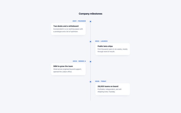
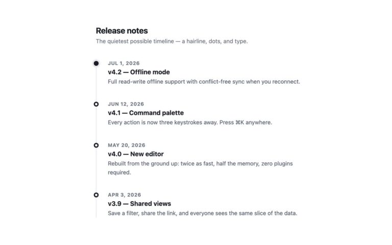
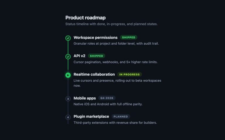
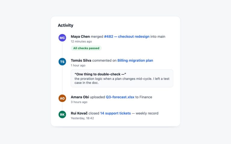
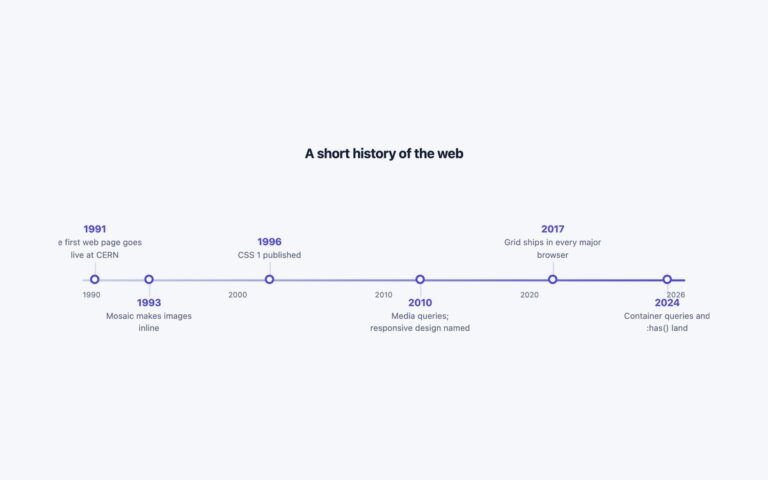
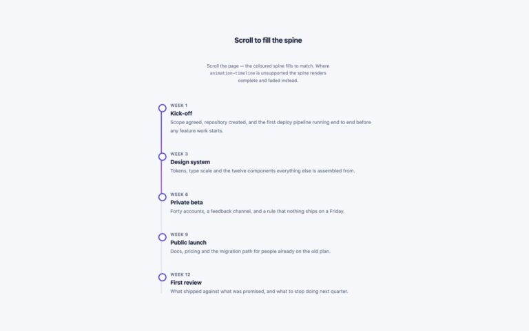
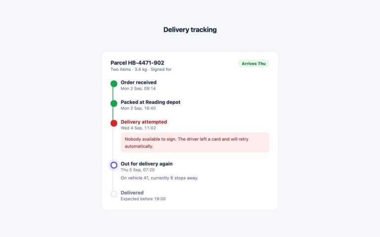
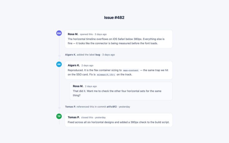
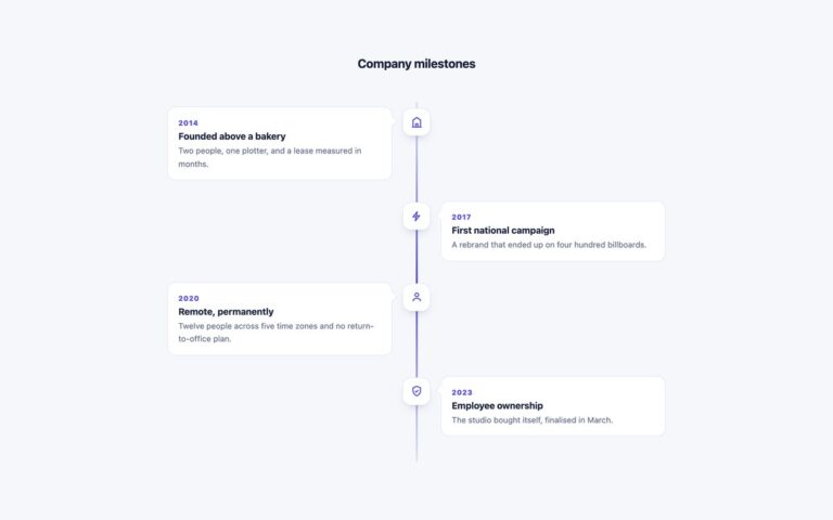
A horizontal timeline of image cards that scrolls sideways along a dated rail, built for a company history, a studio story or a product’s milestones where each moment deserves a picture. Every entry is a fixed 236 pixel column with the year above a ring on the rail and a card underneath holding an image area, a heading and one line of text. The demo uses gradients in place of photos so it loads without assets; swap the gradient for a background image or an img element. The entries are an ordered list inside a scroll container that uses CSS scroll snap, so a flick or a trackpad swipe settles each card in the centre. Because the container scrolls, it is a focusable region with a label, which means keyboard users can Tab to it and move through the years with the arrow keys, and the page itself never scrolls sideways on a phone. The scrollbar is restyled in WebKit and Chromium and falls back to the system one elsewhere. The Bootstrap version builds the cards from the .card component, and the Tailwind version uses snap-x, snap-center and before: utilities for the rail and the rings.

What’s included

  • Ordered list of image cards on a dated rail with a ring per entry
  • Scroll snap centres each card after a swipe
  • Focusable, labelled scroll region that works with the arrow keys
  • No page overflow at 375px: only the timeline scrolls
  • Years marked up with time elements

Accessibility

The scroll container has tabindex="0", role="region" and an aria-label, so it is reachable with Tab, announced by name and scrollable with the arrow keys; it shows a 2px indigo outline on keyboard focus. Entries are an ordered list with real headings, and the rail and rings are CSS decoration that screen readers ignore. Nothing animates.

Customise it

Change --mt-accent, --mt-rail and --mt-muted on .media-tl (plain CSS and Bootstrap) or the --color-mt-* theme colours (Tailwind). Card width is the 236px flex basis on each item and image height is the 118px block.