About this set
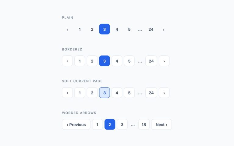
Fully rounded pagination for softer, friendlier interfaces. Filled pills gives every page a light grey circle and marks the current page with a solid near-black fill, which works well on white cards and marketing pages. Ring on the current page uses white bordered circles and shows the active page as a blue outline with a pale halo instead of a fill, a lighter option when the page already has several solid buttons. Compact for a card footer shrinks the same filled pills to 32px with a tighter gap so the control fits under a card, a comment list or a small table. All three are real links inside a nav labelled Pagination, with aria-current on the active page, aria-labels on the chevron arrows and an ellipsis for skipped pages. The rounded shape comes from a 999px radius, so single digits render as circles and two-digit numbers stretch into pills without extra markup. Rows wrap on narrow screens. The Bootstrap version sets –bs-pagination-border-radius on the native .pagination component; the Tailwind version uses rounded-full.
What’s included
- Filled, ring and compact pill variants
- Circles for single digits that stretch into pills for longer numbers
- Ring variant marks the current page without a solid fill
- Compact 32px size for card footers
- Bootstrap version restyles .pagination through its CSS variables
Accessibility
Each row is a nav labelled Pagination with aria-current="page" on the active link and Previous page / Next page names on the arrows. Links show a 2px blue focus outline that sits outside the pill, separate from the ring used for the current page. Text and captions meet 4.5:1 contrast, and hover transitions are disabled under prefers-reduced-motion.
Customise it
In plain CSS change the #f1f5f9 pill background and #0f172a current fill in .pill, or the #2563eb ring colour in .ring. In Bootstrap edit --bs-pagination-bg and --bs-pagination-active-bg on .pagination-pill or .pagination-ring. In Tailwind swap bg-slate-100, bg-slate-900 and border-brand.