About this set
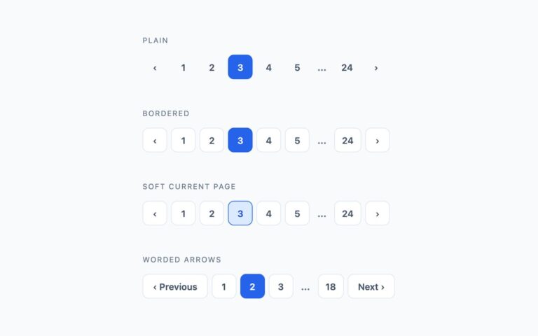
Pagination that reads as one joined object rather than a row of separate buttons. Bordered segments places every page in a single outlined bar with thin dividers and a solid blue current segment, the familiar look of admin panels and data tools. Floating bar removes the outline and lifts the same bar on a soft shadow, suited to controls that sit over content or on a tinted surface. Arrows at the ends is a split layout: Previous is pushed to the left, Next to the right, and the page numbers stay centred between them, which suits article lists and search results that span the full content width. Below 520px the segmented bars tighten their padding so all nine segments still fit a phone screen, and the split layout moves the numbers onto their own centred row above the two arrows. Focus outlines on the joined bars are drawn inside each segment so the bar’s rounded clipping cannot hide them. Bootstrap’s own .pagination already joins its items, so the Bootstrap version keeps that behaviour and only restyles it with –bs-pagination variables.
What’s included
- Joined bar with dividers and a solid current segment
- Shadowed floating variant without an outline
- Split layout with arrows pushed to the ends
- Responsive tightening and re-flow below 520px
- Focus outline drawn inside segments so it is never clipped
Accessibility
Every bar is a nav labelled Pagination; the active page has aria-current="page" and the chevrons are named Previous page and Next page. Keyboard focus shows a 2px blue outline, inset on the joined bars so the rounded container does not clip it. Captions and the ellipsis meet 4.5:1 contrast, and hover transitions stop under prefers-reduced-motion.
Customise it
In plain CSS change the #e2e8f0 divider and #2563eb current colour on .seg, and the shadow on .float2. In Bootstrap edit --bs-pagination-border-color and --bs-pagination-active-bg on .pagination-seg. In Tailwind swap border-slate-200, bg-brand and the shadow-[…] class.