


Collection of the best HTML and CSS mobile menu examples that you can use for mobile and responsive websites.
Since more than 50% of internet traffic comes from mobile devices, making your websites and applications compatible with mobile devices is necessary. A Fortune study found that 75% of users open an app once and never return. There are several reasons, but one of the main ones is complex navigation and the cognitive process. Cognition is good, but people use applications to finish the job easily. So we must keep the process and the navigation as simple as possible. We are in the era of a complete changeover of hardware designs. Both computers and mobile devices have begun adopting breakthrough hardware designs. We have collected interesting CSS mobile menu concepts that you can work flawlessly on modern devices.
An application or a website performs better when optimized for modern devices and user needs. In this list, we have collected some intriguing mobile menu concepts that you can use for your website and application navigation menus.
Creative CSS Mobile Menu Concepts
Unique and creative CSS mobile menu concepts. Both animated and simple concepts are on this list, so take your time and find the best option for your design.
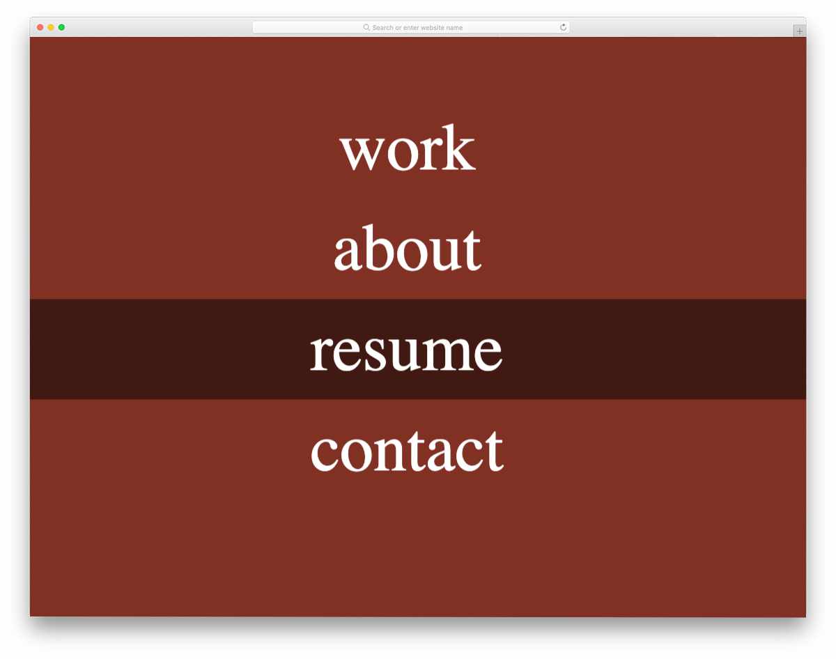
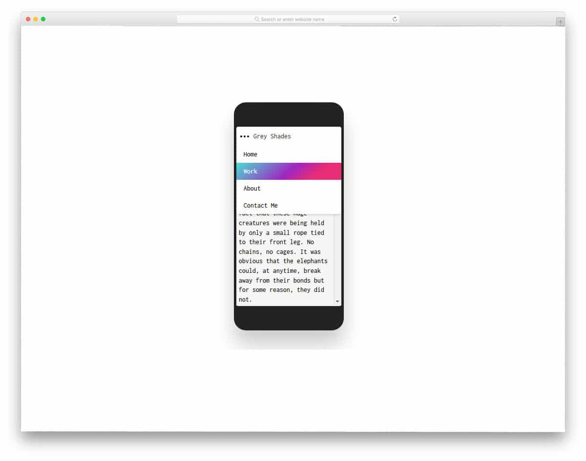
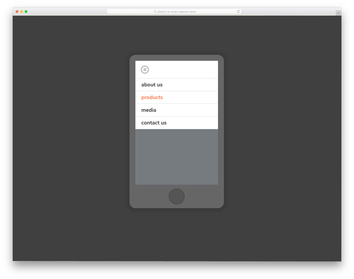
Hamburger Menu V20

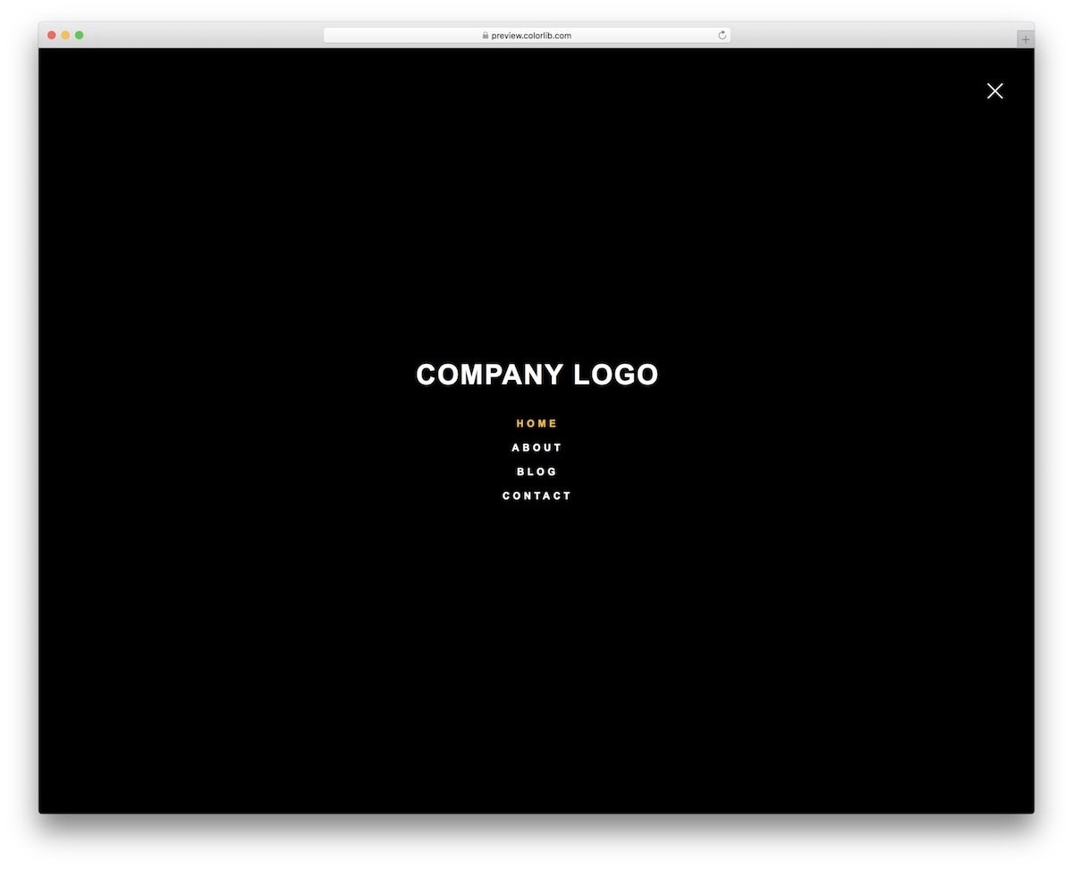
In this CSS mobile menu concept, you get a CSS-only hamburger menu design. The overall design is simple so you can easily implement this design on any website and application. Since this template uses a full-page menu design, you can use this concept on website and mobile UI designs. You have space to add your website or app logo at the top of the mobile menu, which is a thoughtful addition. The creator has given you a basic concept; you can add your custom design and personalize the menu per your requirements.
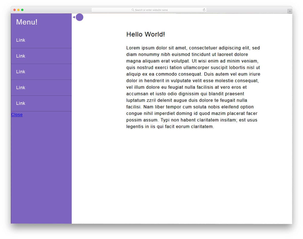
Right Hamburger Menu V05
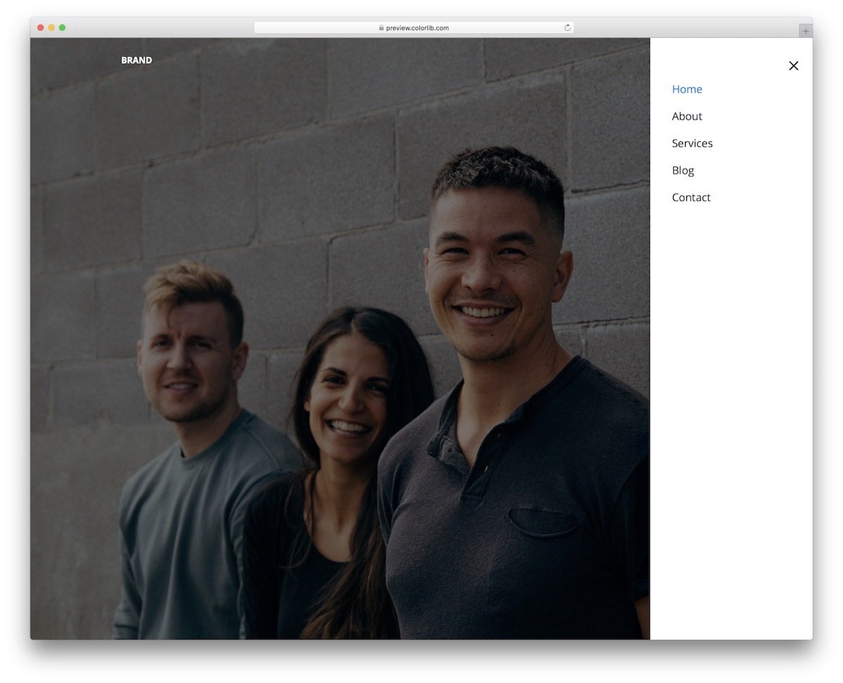
Those specifically looking for a left hamburger CSS mobile menu might love this design. The menu options slide in from the right side of the screen; therefore, most right-hand users can access the menu easily without stretching their thumb across the screen. There is more than ample space between each element, which makes interaction easier. You can use haptic feedback to make the website feel even more connected. This template has plenty of code space, so you can easily add custom features to the website.
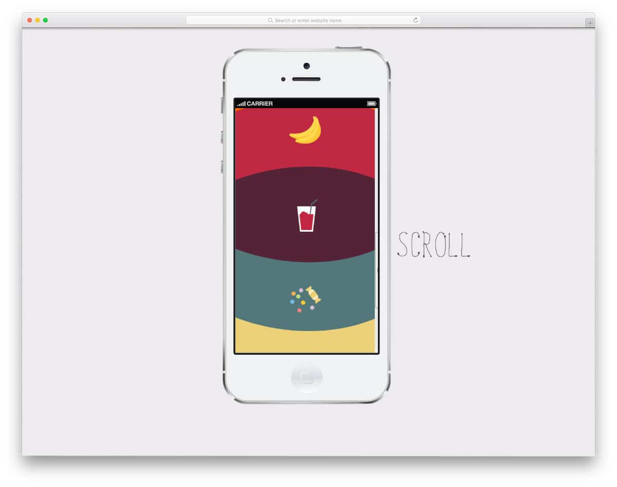
Tabbar Mobile Menu
Tab bar navigation is becoming increasingly popular among mobile UI designers. Especially, the browsers are utilizing the bottom tab bar menu design effectively nowadays. If you want to make your tab navigation stand out from others, this concept might help.
This mobile menu animation uses the water droplet concept to elegantly transition to the audience. The transition and color-filling effects are timed perfectly, making them look natural. Unless you have any special requirements, you can use this code script as is on your website or application.
Tabbar Pure CSS Mobile Menu

If you are looking for a tab bar CSS mobile menu designed entirely with CSS, this code snippet might impress you.
The highlighter smoothly transitions between options and neatly highlights the menu icon. Color effects are also added in this template to make the tab navigation animation even more engaging for the audience. The entire code for this design is available in the CodePen editor. You can edit the code and visualize the results on CodePen before taking the code to your project.
Fancy Tab Bar Active Animation

People love big-screen mobile devices now. As a UI designer, you might need to rethink how your app works on big-screen devices. Pushing the menu option near the bottom of the screen is the obvious solution, and it works well on all types of devices. This example will inspire animation for your menu bar near the bottom of the screen. The animation is really attractive and fun to use. Since it is a concept model, the animation timing is a tad longer than normal, so you might need to change it before implementing this concept in your interface.
Mobile Menu

This CSS mobile menu design gives you an idea for interactive animation. Though it is a mobile menu concept, the creator still uses hover effects. You can replace hover-activated animations with touch/click-activated animations for a more natural experience. A dark highlighter indicates which option the user has selected, and slight animations are added to enhance the interactions. This example is just a raw concept; you can keep it as a base and create your own custom mobile menu design.
Mobile Menu Design 3

The Mobile Menu Design 3 gives you a zippy toggle effect concept for your hamburger menu. Since the creator has concentrated only on the animation part, you don’t get other gimmicks or dropdown menu ideas in this example. The whole design is made using the HTML & CSS script, and a few lines of JavaScript are also used to make the transition animation effect even smoother and engaging. This design’s whole code snippet is shared with you on the CodePen editor; therefore, you can edit the code as per your requirements and can see if it fits in your design.
Mobile Menu – CSS

When moving elements and animations from a big screen to a mobile screen, we have to make many compromises. To avoid compromises in features and design, the designers aim to use a universal design that works easily across all screen sizes. A full-screen mobile menu is one such design that works perfectly on computers, phones, and tablets. In this design, the developer has used a hamburger-style menu that opens in a colorful window. The default design still lags in fluid transitions; you might need to work on this design. Since it is a pure CSS3 design, you can easily customize it.
Mobile Menu Animation

As the latest smartphones are becoming taller and taller, reaching options at the top is becoming difficult for users. UI designers use different approaches to keep options easily accessible. In this design, the developer has placed the menu option at the bottom. When the user clicks the icon, the navigation menu opens in full-screen. As we have seen in the previous design, making a full-screen navigation menu let the user easily pick the option they like. To make this mobile menu concept, the developer has used CSS3 and a JavaScript framework. Since the animation effect used in this design is simple, you can make it using the CSS3 script itself. Based on your preferred code structure, you can trim the code.
Mobile Menu Animation CSS
In this mobile menu design, the developer has used attractive animation effect to make this design unique. Wise designers always prefer to stick to the functional design and only change how the elements appear. This developer also designed a wise design by keeping the hamburger menu icon at the top. With an eye-catching animation, the menu appears in full-screen. The developer has also given you animation effect for closing the menu. By making a few changes to the animation effect, you can use this menu design in your professional websites. Since it is a CSS3 script based design, you can try other animation effects.
Mobile Navigation Animation

As smartphones are becoming powerful nowadays, they can handle animations and interactions more easily than before. As developers, these powerful devices allow us to be even more creative. In this CSS mobile menu example, the creator has used the familiar hamburger-style menu with a swift animation effect. The effects add life to the design and keep the user engaged. The animation effect is kept simple and fast so the user won’t get annoyed by seeing it every time. To create this animated CSS mobile menu design, the creator used HTML5, CSS3, and a few lines of JavaScript.
Pull Menu – Menu Interaction Concept

One of the biggest problems we face in mobile interface design is screen size and real estate. Within the given space, we have to deliver a better user experience. Tech giants like Apple use hardware and software to deliver a better experience; for example, 3D Touch on iPhones (it will be removed in future devices). In this CSS mobile menu concept, the creator has used the pull-down gesture to easily navigate through the menu options. As you pull down the menu from the top, the options change. Though it is a nice concept, it needs a little fine-tuning for a better experience. The entire code script used to make this CSS mobile menu design is shared with you directly. By keeping this design as a base you can create your own mobile menu design.
Touch Device Jelly Menu Concept
In this CSS mobile menu example, the creator hasn’t tried a totally new concept, as you have seen in the Pull menu concept mentioned above; But the creator has played with menu interactions. If you are using a full-screen navigation menu with icons, this menu concept might help you make the design interactive. As the user scrolls down the menu options, the menu options bend and wiggle according to the direction you scroll. To make this jelly menu concept, the creator has used both CSS3 and JavaScript frameworks. By making a few adjustments to the code, you can use this design on your responsive website design or mobile application.
Menu 1

This is another example of a mobile menu toggle effect. The creator of this CSS mobile menu concept has made the regular design a little different by using animation effects. Since it is a concept model, the creator has concentrated only on the transformation effect. You can either use this menu effect or keep this design as a base to create your own custom menu. The animation effect is smooth and quick so the user doesn’t have to wait long for the menu option to appear. The code used to make this design is shared with you in the CodePen editor, so you can edit and visualize the results there.
Colorful Flower Popup Menu
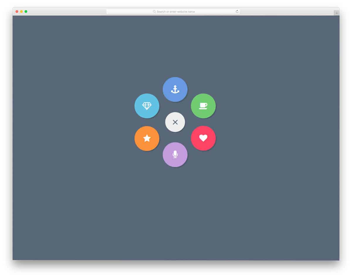
If you want a circular style menu arrangement, this CSS mobile menu concept will impress you. As the name implies, the menu options appear from the hamburger menu icon. The creator has used the icons wisely to save space in the menu and to denote the menu options to the user. The entire design is built with CSS3, so you can easily work with this CSS mobile menu concept. Shadow effects effectively differentiate the menu option from the main screen.
Mobile Menu Design 3
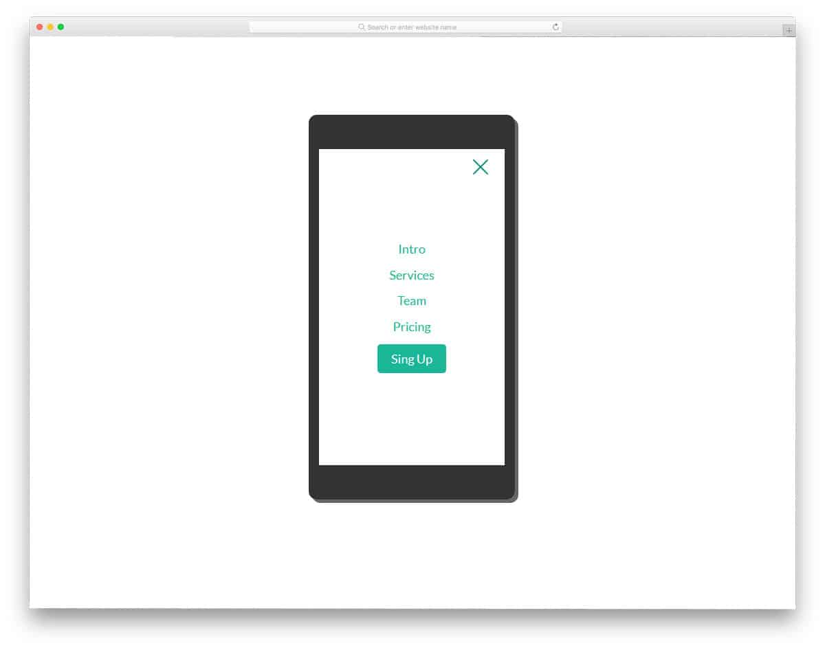
Mobile Menu Design 3 also uses appealing animation to make the mobile menu user-friendly. In this design, the animation effects are sleek and quick so that the user doesn’t have to wait long. Along with the navigation menu, you also get the option to add a call-to-action button. Experts advise making important links as buttons so that you can highlight the link, plus you also get the option to do more customizations. Ample amount of space is given between each option for easier interaction. Look at our CSS button design to make a creative button that expresses its purpose clearly.
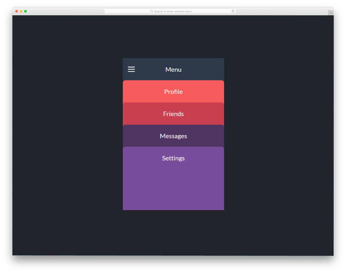
Mobile Menu 2

Mobile menu 2 is also from the same creator of Mobile menu 3 mentioned above. You can expect the same developer-friendly code structure and neat design in this also. The previous menu design was very professional, so you can use it for all types of websites, but this example shows a funky design. The developer has made this menu very colorful and added pleasing animation effects to give the design life. In the default demo, the developer has shown you a tablet device. But you can use this design for all responsive web designs.
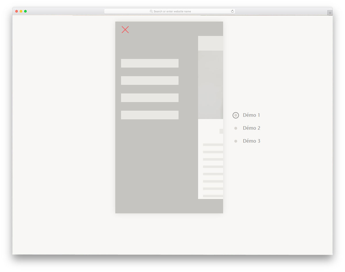
Responsive Navigation Mobile Menu Toggle

This type of navigation menu is becoming extremely popular among modern mobile applications. If you have to show more than one menu options to the user, the developer uses this design along with the regular hamburger menu design. For examples, on an eCommerce website, you have to show the main navigation menu and also the sub menu related to the category; For cases like this, the pull-down menu is the good option. To indicate the menu option to the user, a small arrow is used. Take a look at our CSS arrow design to make the arrow even more attractive and user-friendly.
Mobile Menu Concept

Mobile Menu Concept is an interesting and feasible mobile menu design. Instead of putting all the navigation menu at one place, you can put the frequently used options at the bottom. In this menu, design the developer has added the quick menus with a scrollable option. Apart from the navigation menu option, you also get a search icon at the top. As you noted, in recent Pixel devices, Google has moved the search bar to the bottom for better accessibility. Similarly, this developer has added a search option to the quick menu for quick access. The entire code structure used to create this sensible concept is shared with you directly so you can easily use the design.
Mobile Menu Widget 4

Mobile Menu Widget 4 is another practically applicable mobile menu design. In this design, the developer has used a different animation effect. Instead of moving the menu bar, the developer has moved to the entire page to bring in the menu option. Nothing looks odd in this animation effect, so you can use this effect for your mobile-responsive website without any worries. In the default design, the developer has also provided space for menu icons. Mostly font awesome icons are used in the design, so you get plenty of well-optimized icons to choose from. The developer has used both CSS3 and Javascript in this design, based on the code structure you follow, you can trim the code.
Mob Menu Only CSS

The developer has provided us with a versatile menu design that you can use for both the desktop and mobile versions. Clean hover effects are also applied to the menu icon to give it an interactive feel. The only minor flaw in the design is the timing; menu options take a bit longer than usual to appear. Apart from the timing, everything about this design is perfect. As the title implies, the developer has used only CSS to make this design. Hence, you can easily customize and use this design without any issue.
Distorted Link Effects on Menus

Brutalist designs are in the rise again. As modern fonts are clearer and expressive, brutalist designs are taken to the next level. If you are using a modern brutalist design on your website or mobile application, these CSS mobile concepts will be helpful. As the name suggests, distorted effects are given in this pack. Six types of distorted menu effects are given in this pack. Each effect is different and will give your website or application a unique feel. The entire code script is available as a downloadable file; you can use it easily in your project.
Swanky Pure CSS Drop Down Menu

You can easily use this design on your existing website or application because of its flexibility and practical applicability. Smooth folding and unfolding effects make the dropdown action easy and comfortable for the user. The default colors and icons in the design are crisp and neat, but the only issue is that the dropdown menu doesn’t fold as expected; you’ll need to fix this before using it on your project. Since the entire design is built with CSS3, you can easily manage the code and add the custom features you want.
Simple Radial Menu

This one is another radial mobile menu concept design. Designing a mobile menu that is easy to access is a challenging job because of the new smartphone form factor. If you like to try something different from the hamburger menu design, the radial design is a good alternative. The creator has only given a skeleton design in this example. By keeping this design concept as a base, you can create your own custom mobile menu concept.
Filter Menu
In this example, we get a menu concept for filter menus. Filter menus also play an equal role in modern mobile UI design. Whether you need to narrow down blog post or product search results on a shopping page, filter menus are what we use. In this design, the creator has also followed a radial design concept. The filter option works smoothly in the design. Plus, you get more than enough space to list all the secondary menu options neatly in one place without disturbing the main navigation.
Animated Menu
The creator of this design has provided a toggle animation concept for the mobile hamburger menu. Though the animation is neat, it looks way too simple. You can tweak the design and hover effects a bit to make it even more engaging for mobile users. The code script is shared with you in the CodePen editor so you can easily edit and visualize the results before using it in your project. The creator has kept the code script as simple as possible so that you can add your custom features easily in your mobile menu design.
Slide Out Mobile Menu Experiment
A slide-out mobile menu is a standard mobile menu design you can use on any website or application. In the default design, a small bubble indicates the hidden menu. Hover effects are used effectively to create an interactive experience. The menu’s sliding-in and sliding-out animation is smooth and sleek. CSS and JavaScript frameworks are mainly used to make this front-end design. Since the latest frameworks are used in this design, you can easily integrate with other tools and software.
Mobile Menu

The developer Kirsten Humphreys has given us an interesting mobile menu design. In the Mobile Menu Widget 4, we have seen that the entire page moves to the side. In this design, the web page or app screen slides down to reveal the menu options. As the body ratio increases, the screens are moved to the edges of the phone. Keeping the mobile menu at the top is still not an easy-to-access option. Anyway, you can use this animation or design and move the menu to any other part of the screen. The entire design is built with CSS3, so working with the code will be easy for developers.
Mobile Nav
Mobile Nav is a very basic menu navigation design that we have seen for several years by now. If you are a beginner looking for a well-designed, simple menu, this is the best example for you. In the demo, you can see that the developer used a modern smartphone with thin bezels. The menu icon smoothly toggles into a cross mark and the menu options slide in quickly. Animation effects are timed perfectly in this design so that it won’t annoy the user and deliver the options perfectly to the users. Just like the design, the code is kept simple so new developers can handle it easily.
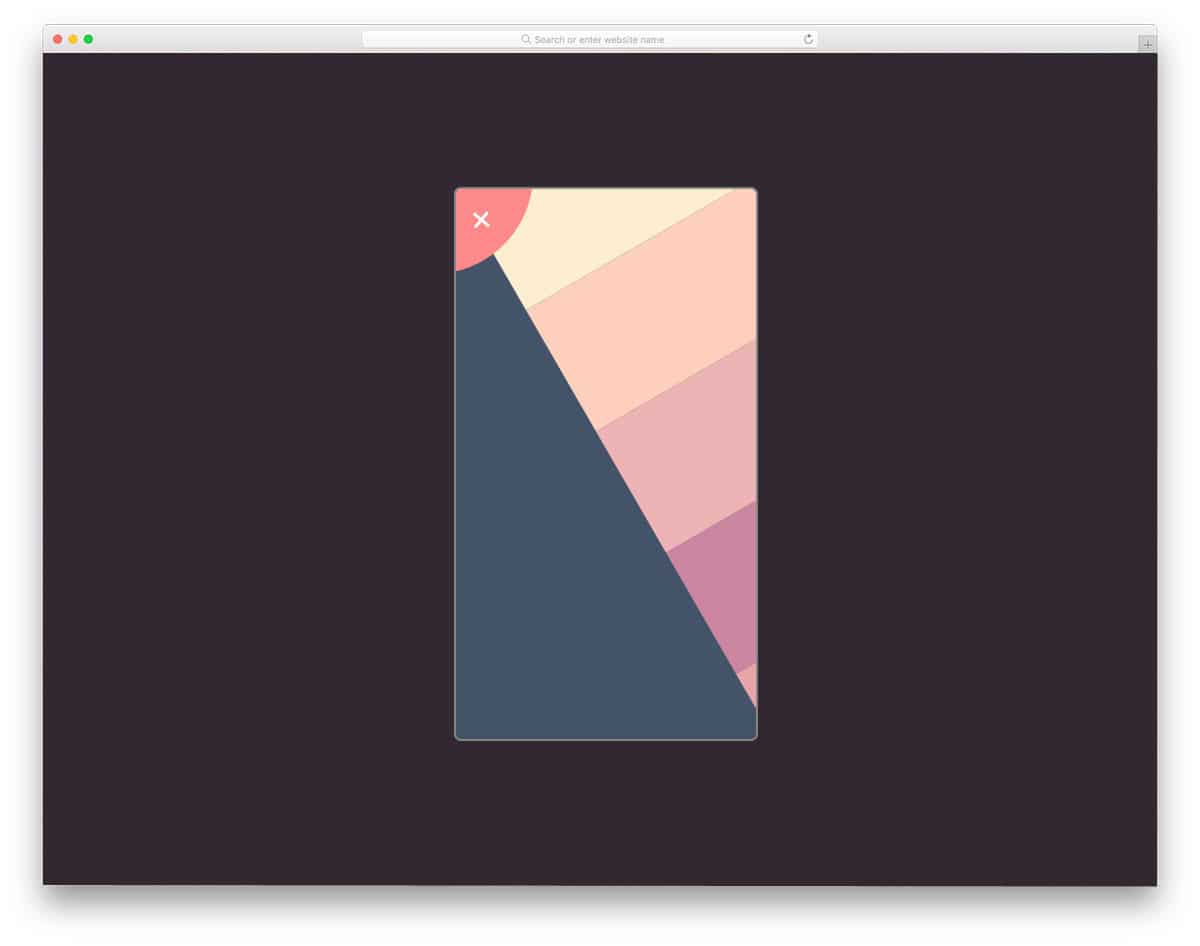
Step By Step Animated Mobile Menu

This developer has given us a colorful concept for a mobile menu design. To let you enjoy the full design and animation, the developer has included a slow-motion option. With slow motion, you can clearly see how the icons and other elements are transforming. For better results and easy interaction, the developer has used a full-page menu design. The default yellow color gives the menu design an attractive look. Letters are made bolder and larger so the user can click and interact with the options more easily. Since the developer has used a slanting menu holder, the menu options are not in line. There are a few tweaks you have to make to shape this as a pixel-perfect design.
Mobile Menu Style
In the Mobile Menu Style design, the developer has given menu toggle and menu animation effects. It is always better to use the design that the user is familiar with. In the link style design list itself, we have seen that the experts recommend using the traditional design with a modern look and animation effects. This developer has done the same thing with this design. The menu placement and icons remain the same, the only thing that differs is the animation effect. Two types of menu animation effects are shown in this design and both of them are sleek and neat. You can use this design on any website and applications.
Animated Accessible Navigation

In this animation, the menu icon has a quick loading animation before the menu options appear. The menu appears from a circular expanding animation, but when it closes, the menu simply moves up and disappears. For design consistency, you can use the circular effect for both the menu appearing and disappearing effect. To make this design, the developer has used HTML, CSS, and a JavaScript framework. As all the frameworks are the latest and greatest, you get plenty of modern customization options with this design. The default design itself looks great, by making a few adjustments, you can use this design in your project.
Pure CSS Navigation Simple & Easy
If you are creating a navigation menu for a blog template, this design is a good option. Blogs usually get most of the traffic from desktops. But if your blog is growing and has started to get momentum, then you will get traffic from all types of devices. Especially if you are a food blog, the chances of getting traffic from smart home devices will increase in the near future. So, making your blog responsive and easy to navigate will be a good move. In this design, the designer has used the three-dot style for the menu icon, which is slowly becoming popular in mobile applications. Gradient colors are used for hover effects, but you can easily customize the colors.
App Navigation
App Navigation is an intriguing navigation menu design concept. Each option is treated as a card. When the user clicks the menu icon, colorful menu options appear in full-screen. After clicking a menu option, the card fully expands and shows the corresponding page. If you are running a magazine website, this menu design will be a good option. As many magazine websites use color codes to organize the categories, this colorful navigation menu concept will fit perfectly for news and magazine websites. To make this beautiful menu design, the developer has used SCSS and a JavaScript framework.
Pure CSS Mobile Nav Animation
The developer has given you three types of mobile navigation animation in this example. All three menu designs are smooth and clean, suitable for any type of website or application. In the demo, the developer has used only lines to show the space for the menu options. But the skeleton structure itself clearly shows how clean the menu will be. The entire code structure used to make all three menu designs is shared with you. All you have to do is pick the design you like and start working on it to fit it to your needs.
Mobile Menu Slider Prototype
Mobile menu slider prototype is an interesting menu design concept. Instead of animating the menu options, the designer moves the entire screen to reveal the menu options. The sliding option is smooth and clean, and gives you an ample amount of space to add menu options. Since it is a pivoted sliding animation, you have only limited space at the top. So make sure you arrange the menu option accordingly to fit within the space. To make this prototype, the developer has used CSS3 and JavaScript. Codes are handled properly so that other developers can use this code easily in their designs.
Mobile Nav – Only Checkbox & CSS
Mobile Nav is a simple menu navigation design with animation. Because of its straightforward design, you can use this design in any website and application. You can implement this menu design for both desktop and mobile versions. Each menu option is treated as a row and neatly unfolds when you click the menu icon. Hover effects indicate which option the user will choose. This entire design is built using the HTML5 and CSS3 frameworks. Since it uses the latest framework, you can easily use other effects on this design.