

User-friendly experience and SEO, both are directly proportional. Making a design that users love to use will ultimately have a better engagement rate. Navigation menus are vital in directing the users to the correct page and helping the search engine crawlers easily find the pages to index. So your menu design should not only be user-friendly but also be search engine friendly. In this list, we have collected some unique bootstrap navigation menu examples that can help you make a cool-looking SEO friendly navigation menu.
There are several criteria to be considered when you decide to make your menu design SEO friendly. To get started, try using the Google Analytics tool to understand the flow of your website traffic and make a priority list based on the pages most visited by your users. Search Engine Journal’s SEO minded navigation menu design article SEO minded navigation menu design article gives you more useful tips to start planning your menu design strategy.
When you are making an SEO friendly navigation menu, it doesn’t mean you have to keep it dumb. Once you have strategized your page links and the pages to be added to the main menu, you can concentrate on the design of your navigation menu. Luckily, the latest web development frameworks are lightweight and easily indexed by the search engine crawlers. So you needn’t worry about having a creative navigation menu on your website.
In this bootstrap menu example list, we collected some user-friendly menu with creative designs. Once you have planned your SEO link hierarchy, you can implement any of these designs and make a strong navigation menu for your website and mobile application.
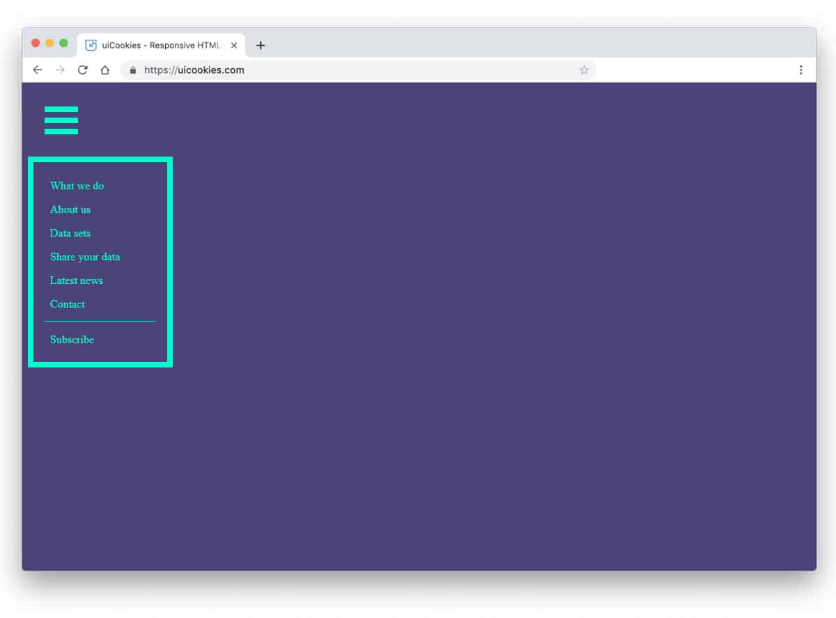
Website Menu V12
The V12 Bootstrap menu has a huge header section to easily accommodate a logo and social media links.
A nice dark horizontal line is used to highlight the navigation menu options. More than ample space is given between each menu option, and you also get a search bar at the right end, which is a smart design and lets the audience quickly search the information they want. A sleek hover effect elegantly indicates which option the user is interacting with. This one will be a great choice if you want a colorful and attention-grabbing menu bar with a traditional look.
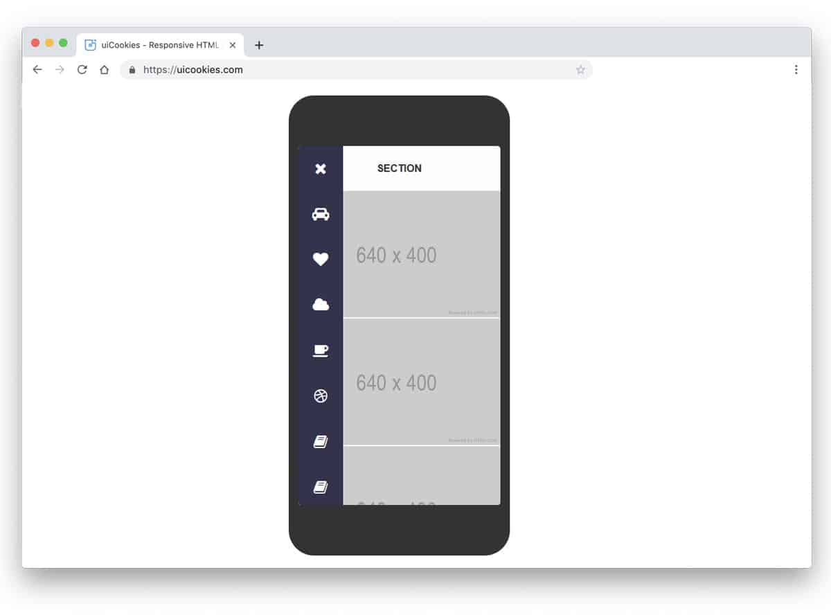
Website Menu V20
The V20 bootstrap menu has a full-page navigation menu design. Since the menu options open on a full page, you can deliver a similar navigation experience on both computer and mobile devices. Another advantage of this full-page design is adding links as your website pages grow. Plus, you can add other widgets like a social media widget, newsletter signup widget, and a lot more. Like most other bootstrap menu examples in this list, this one also has a flexible code structure; Which means you can add custom elements easily in this menu template.
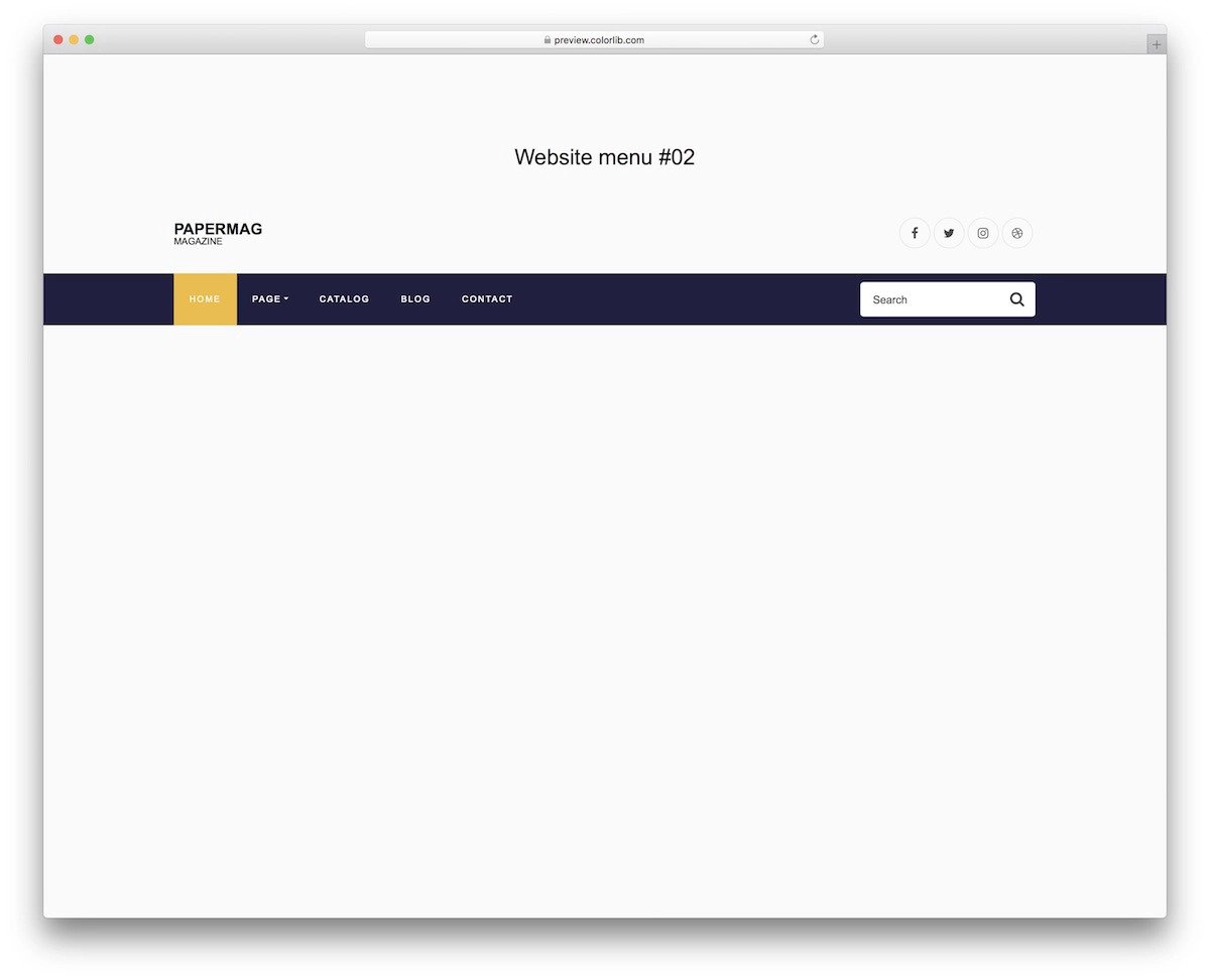
Website Menu V18

The V18 bootstrap menu template provides a smart-looking and functional navigation menu bar. A rounded edge horizontal menu holder is used for the menu, which improves the visual aesthetics of the menu bar. You have space to add a logo at the left-most corner and the navigation options at the right-most corner. Apart from regular drop-down menu options, this one has a mega-menu option. Therefore, you can organize the information neatly and provide all related links in one place. If you are making a menu for a big website with many categories, this bootstrap menu will be a good choice.
Website Menu V08

A transparent bootstrap menu with a call to action button is used in the menu template. The default doesn’t have a sticky navbar, so the transparent design doesn’t affect the readability of the menu options. If you are planning to use a sticky navbar, make sure you add a white/dark background to improve the readability as the user scrolls down the pages. Hover animations and drop-down animations are sleek so that users won’t get annoyed when they happen to use the menu options frequently.
Bootstrap Toggle Menu

This bootstrap toggle menu example uses hover effects smartly to show more related information. For example, when you hover over the office address, you can see the phone number related to that address. A same color scheme is maintained throughout the menu template to improve the branding. Since this template uses the latest CSS script, you can use any modern color on this template. The entire code script is shared with you on the CodePen editor; you can edit and see the results on the editor before taking it to your website or application.
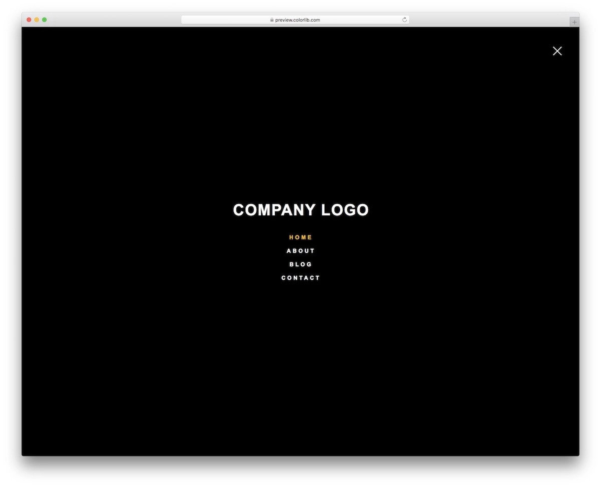
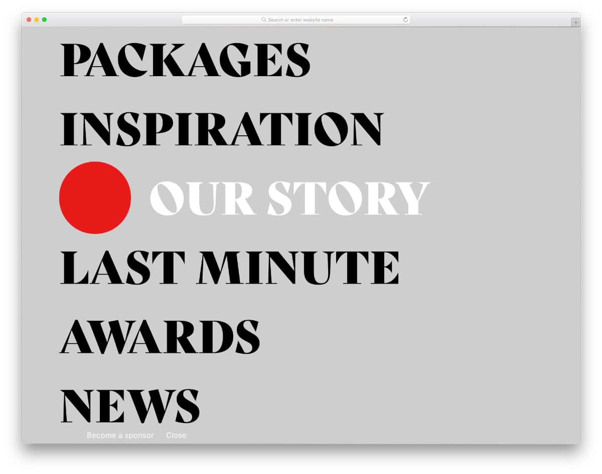
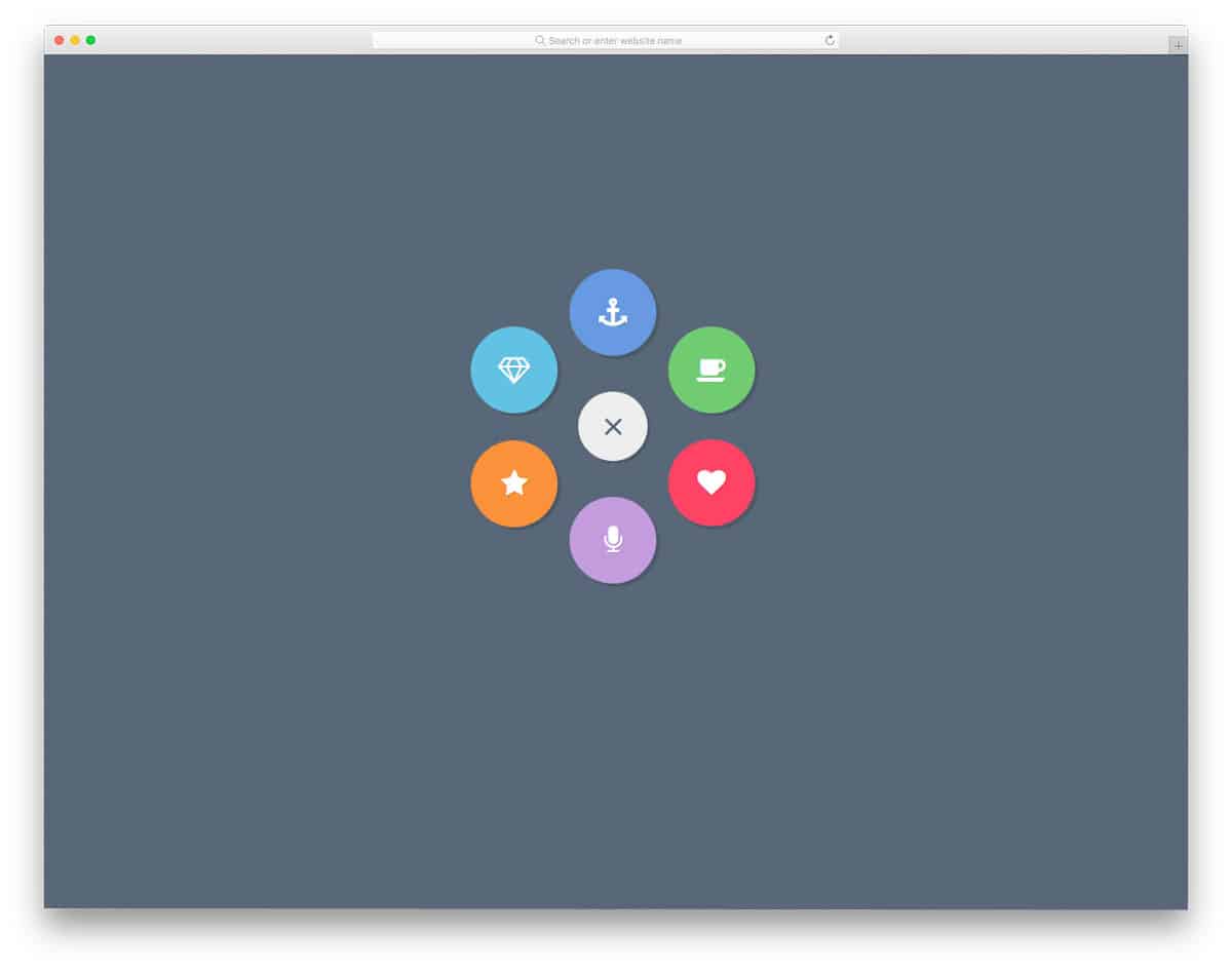
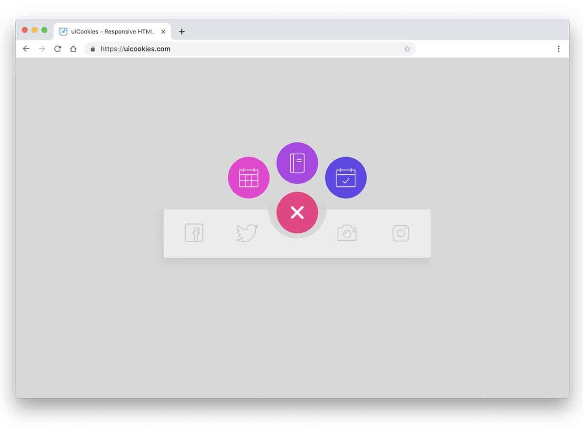
Blobby Nav

The Blobby Nav is a full-page bootstrap menu example. Animated circular elements are used to show the menu options. If you want, add a bubble-like effect to the circular elements to make it even more realistic and engaging to the audience. Both entry and exit animations are given in this pack, which is useful. You can use only limited menu options in this design because of this design’s big circular elements. You can use this menu design on your website by making a few changes to the code and fixing the mobile responsive glitches.
Bootstrap Menu With Awesome Hover

For those who are looking for unique bootstrap menu design examples, this one might intrigue you. The creator used hexagon menu holders in this design and bold hover animations to grab user attention. Though the default design looks more powerful than the normal bootstrap menu design, you can use this concept for any creative business website. Both icons and labels are used in each menu option so that the audience can easily interact with the menu options and click the menu links without issues.
Expanding Menu
Expanding menu is a swift and clean looking bootstrap menu design example. This design helps you utilize the space wisely for other contents. If you wish to give a distraction-free environment for the contents on your website, this menu design will be a good choice. Most hamburger menus design open on the side, but this one opens at the top. A quick expanding animation is used for the menu unfolding and folding actions. Navigation menus like this can be accessed easily from any part of the website. Apart from the hamburger menu animation, the developer has also used hover animations to highlight the menu options selected.
Multibox Menu

Multibox Menu is a creative full-page menu design which utilizes the space with boxes. Main navigation menu options are made bigger and the secondary options are listed in a separate box. Background images are used in some boxes to give a visual break. Hover effects are kept minimal and give a professional touch to the menu design. Since the default menu design uses a black theme, the colors and the effects are visible. The source file of this design is downloadable, hence you can have a better hands-on experience with this design.
Distorted Link Effects on Menus
You don’t have to reimagine the entire menu design. Instead, you can try a few new effects to make it different from the others. In this example, the creator has given different distorted link effects for the menus. This menu design pack has six unique effects that can give your website or application a fresh look. Since most effects are hover activated designs, you might need to change the effects a little for mobile users. The creator has given the entire code script as a downloadable file; hence, you can utilize the code easily on your project.
Inspiration for Menu Hover Effects

This one is also a hover-activated menu design. Some of the designs in this example are intuitive — they allow you to add links and a few words about the page. If you are making any creative or agency website, you can use this menu design on your project. This example has eight demo variations. Each demo is unique and professional; hence, you can use this menu design concept for all websites and applications. The whole design looks crisp, and the animations are very fluid, which makes this menu design a go-to option for many developers.
Mobile Navigation Animation
Mobile-first design is the terminology developers have received from their clients nowadays. Planning your design entirely from the mobile and then moving towards the big screen will reduce the number of elements you must redesign. The creator has given a mobile navigation menu concept in this bootstrap menu design example. Both menu transition effects and menu hover effects are given in this concept to let you fully understand the design. Since everything is working smoothly in this design, you can take this menu design to your project by making a few changes to the code.
Animated Border Menus
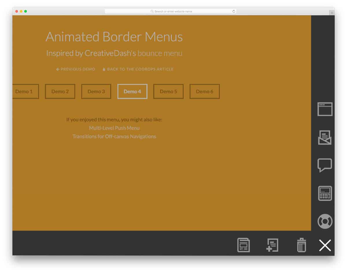
Since screens are becoming bigger and bigger nowadays, UI designers are trying several new designs to make interactions easier. Border menu designs are one of the new UI designs tested by developers to deliver an impeccable user experience on mobile and computer screens. The six demo variations in this example will give you some fresh ideas if you also try new border menu designs. Since this is just a concept design, few elements and links are used. You can take the concept and tweak it per your design needs. All six demo variations are given in the same link — take your time and pick the design that fits you.
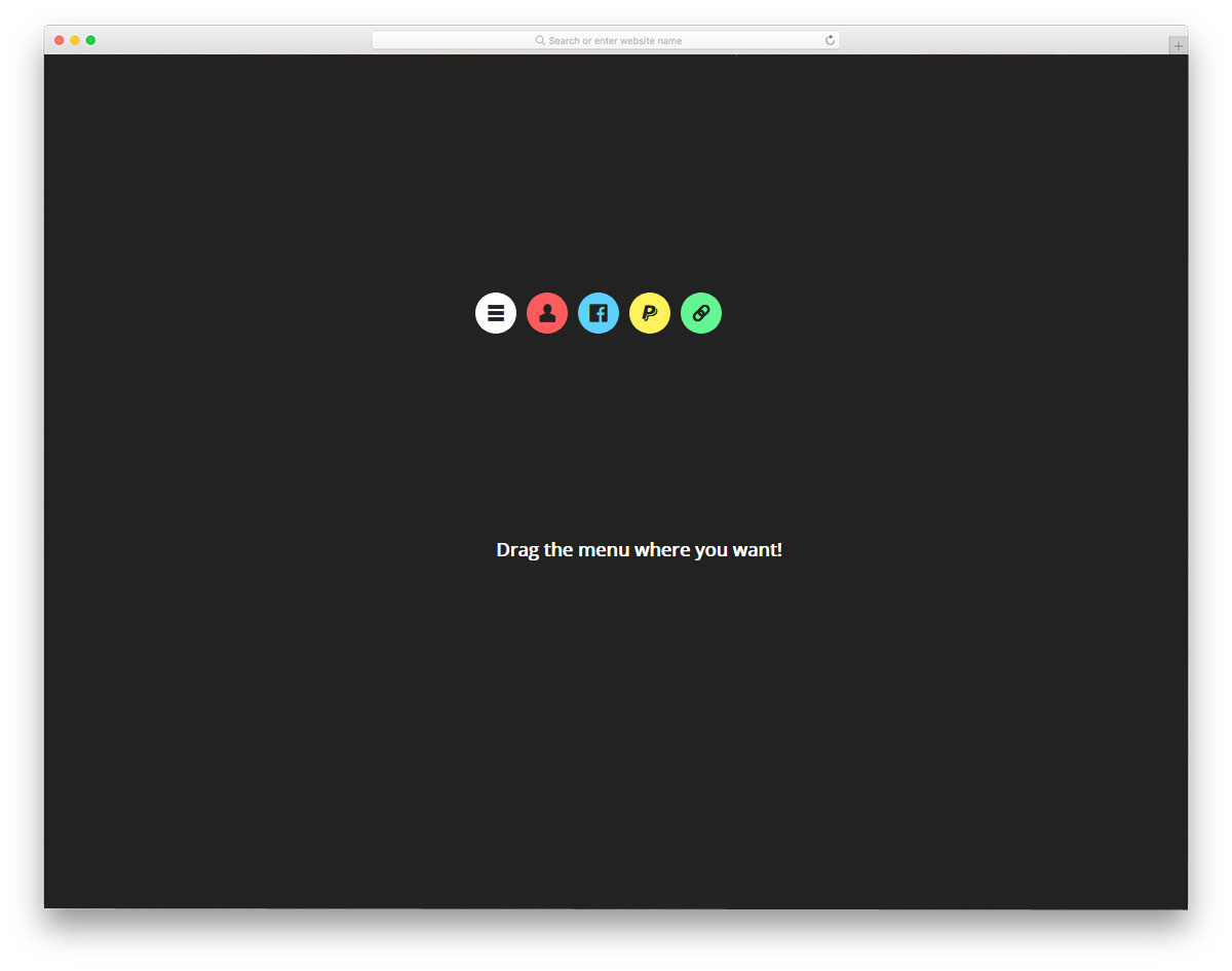
Draggable Menu
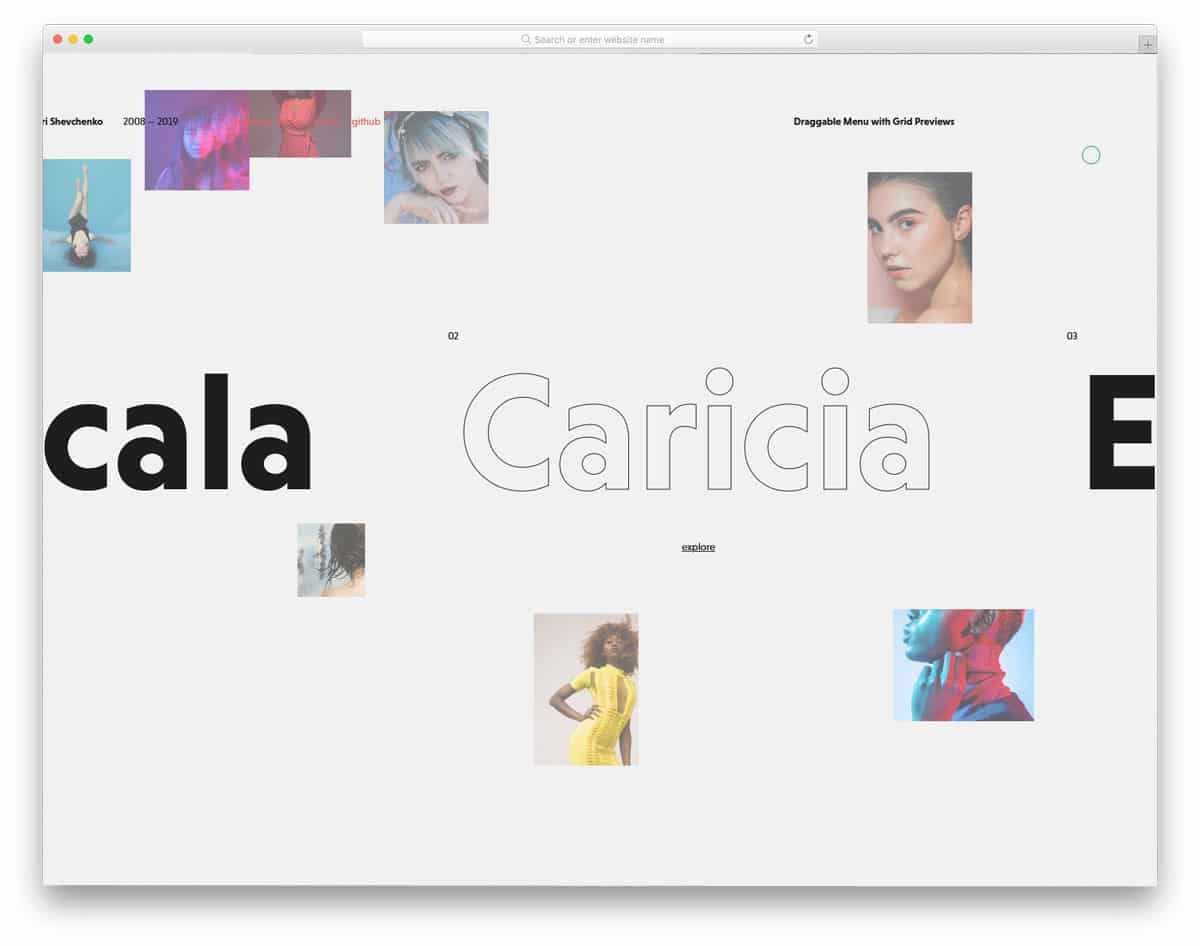
This is another fancy menu design concept. The creator used images and text links in this menu design to make it interactive. As the name suggests, you can interact with the links by dragging them, making it better for both computer and mobile users. Though it is a concept model, the creator has given us a pixel-perfect design. Transitions and animations of each element are designed with care so that you get a professional-looking menu design. This menu design will work perfectly with your website design if you make an interactive agency or photography website.
CSS Navigation Menu
The creator of this navigation menu has given us a hamburger menu design example. In the default design, the menu opens on the left side with chunky borders. The blueish green color scheme gives a fluorescent look to the design. This default design would look good if you make a dark theme template. The chunky borders clearly define the menu area and will work perfectly on desktop and mobile devices. To make this navigation menu the developer has used the HTML5, CSS3, and JavaScript. Since it is a bootstrap menu, you can easily use this design for responsive websites.
PureCSS Menu

PureCSS Menu is a neat and elegant looking navigation menu design. The simple nature of this design makes it a perfect fit for all types of websites. The menu opens in a full window so users can easily select their option. This versatile design can be applied to both desktop and mobile version. A hover animation to indicate the interaction with menu options would be a welcome addition; but, you don’t get it in the default design. Since it is a CSS3 based design, you can easily add the desired effects. By making a few adjustments to the code, you can use this simple bootstrap menu design can be easily used even in an existing website.
Expanding Grid Menu

The above mentioned PureCSS menu is a simple one. If you like the same design with few colors and creative flavor, this Expanding Grid Menu design will impress you. The creator of this design has handled the CSS grids elegantly to give you a colorful menu. Just like in the Windows 10 start menu, the menu grids open from the bottom left corner. The developer of this design has given us two variations; one with solid colors and the other with image background. If you are making a creative photography website, the image background menu design will add richness to your design.
Slide Out Box Menu

In this bootstrap menu example, you get menu design for both main menu and secondary menu. Websites that provide filter options, product details, and page specific options would need a secondary menu. The creator of this menu has handled the menu smartly. At the top left corner, you have the main navigation option and the secondary menu corresponding to the product on the page. The menus are designed smartly to blend with the other element on the page. With the trendy elements, smooth visual effects this menu provides a user-friendly design. If you are into modern design and want a practically applicable design, this menu will impress you.
Line Menu Styles

The creator of this design has given you a bunch of line animation for the menu. Though the hamburger menu is a better option for mobile UI, many users prefer the traditional navigation bar in the desktop version. You can add a little bit of visual effect to make the design interesting to the users. As the name implies, the developer has mostly used the line effect in this menu. Both full element animations and border animations are given in this example. The code script for this entire collection is shared with you. All you have to do is to pick the one you like and start editing the code as per your needs.
Side Menu Staggered Animation
This bootstrap menu example is for the mobile navigation menu. As the name implies, the developer has used staggered animation for the menu folding and unfolding action. The menu concept is good, but using it for menus with many options will be annoying. By taking this design as a base you can create your own custom design with different animation effects. The developer has shared the entire code with you so you can easily utilize the code to make your custom design. For more animation inspirations, take a look at our CSS animation examples.
Triangular Sidebar Menu

Triangular Sidebar Menu is an interesting mobile menu concept. Each menu option is shown in a separate triangular element. If you follow geometric shapes in your design, this menu concept might impress you. The toggle animations are quick and simple so the users can easily access the menu options. Just like the design, the code script of this example is also a bit sophisticated. The creator has used HTML5, CSS3, and javascript frameworks to make this design. The entire code script is shared with you on the CodePen editor, hence, you can easily edit and visualize your customizations before using it on your website.
Floatting Draggable Menu
Floating menus are becoming popular among app creators. This example is more or less similar to Facebook’s messenger app and the Samsung Galaxy Note’s quick app. The menu design in this example is quick and smooth so the users will enjoy using this menu design. You can easily use this design on your website or application by making a few adjustments to the design and tweaks to the code. From the code itself you can see that the creator has mostly used CSS and Javascript frameworks for this design. If you are looking for some unique menu design for your application, this code snippet might be useful.
Hamburger Menu Lines Animation
This is another animated menu design concept. As the name implies, the creator has used animated lines in this design. Though it is an animated menu concept, the creator has maintained the familiar look of the hamburger menu, so the users will find it easy to interact with this menu design. This design is originally designed for the mobile view, by making a few changes to the design you can use this concept for desktop version as well. To make this animation smooth and fluid, the creator has used a few lines of javascript in this bootstrap menu example.
Colourful Flower Popup Menu
Colourful Flower Popup Menu is a simplified concept of the Draggable bootstrap menu example mentioned above. In this example, the menu options simply pop out from the hamburger menu icon. A little bit of bouncy character is added to this menu option when thy pop out from the hamburger menu, which gives a smooth and fluid feel to the interface. If you don’t want the draggable character and want only the compact menu design, this code snippet will come in handy for you. The code script of this design is simple and light-weight, it is made purely using the HTML5 and CSS3 script.
Pull Menu
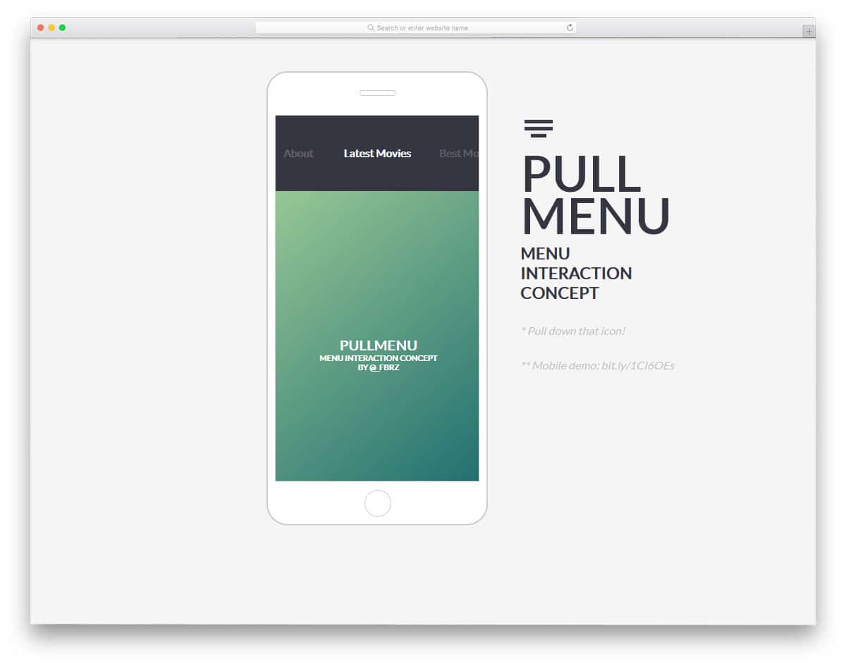
Pull Menu is another interesting menu concept. Instead of the regular tap and swipe gestures, this example uses a pull gesture to change the menu options. Since mobile screens are becoming longer and longer, reaching the top of the screen is not easy for the users. If you like to make the menu design even more interesting and accessible for your users, this mobile concept is worth a try. Since this design includes different gestures and dynamic options, it uses Javascript and the CSS3 script. The creator has organized the code neatly so you can easily understand the code.
Off Canvas Pop Out Menu

This one is also an interesting menu design concept. As the name implies, the menu appears as a popout menu. This popout menu design might intrigue you if you are not into full-page menu design. To give a natural flow to the animation the developer has used a little bit of bounciness to the animation. In the default design, you get only get a wireframe. Based on your needs you can add the elements you need. For example, you can add your social media profile links and the navigation menu. Look at our social media icon design collection for new trendy designs.
MainMenu
MainMenu is a colorful bootstrap navigation menu design. If you design a school website template for children, this navigation menu design will fit perfectly. The developer has used both texts and icons for the navigation menu labels. Each navigation menu option is treated as a card and is animated neatly to for easier interaction. Animation effects are kept swift and clean so that the user doesn’t have to wait long for the option to appear. In the default design, the developer has also given you drop-down options, which will be useful if you have more pages to list in the menu.
CSS Grid Menu Panels

If you plan to use a Windows like design for your menu, this design might help you. The developer has used the CSS grid smartly to give you this unique looking menu design. Since this menu uses tiles, you have more than enough space to show images and texts in the menu option. To make the design lively, you can add animations to the tiles just like in the Windows 10. Grids of all sizes and orientations are given in this design so you have enough space for all contents. Plus, the user can easily interact with the tiles.
CSS – Folding Menu
In this bootstrap menu example, the creator has used hover action to trigger the action. The developer has used the menu to show social media profile links in the demo, but you can add the links you want. The folding and unfolding animations are made neat and clean in this design. This smooth animation will help the user to easily feel the effect. Another advantage with this design is it is made mostly using the HTML5 and CSS3 script. Hence, developers can easily work with this design. The minimal design of this menu makes it easy to fit on any part of the website.
Off-Canvas Menu On Pure CSS
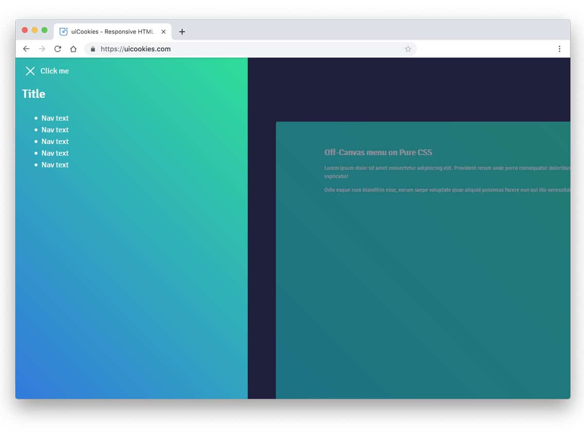
The off-canvas effect gives a cool look and dimension to your navigation menu design. The developer of this design has used the off-canvas effect and gradient color scheme to elegantly show the menu. In the navigation menu, you have space to add other elements like copyright details. Apart from the animation effect, the navigation menu is almost the same. So your users won’t feel any trouble using the menu and accessing its options. As the name implies, this one is made purely using the CSS3 script, hence this design won’t make you page heavy or slow to load.
Off-Canvas Menu Effects
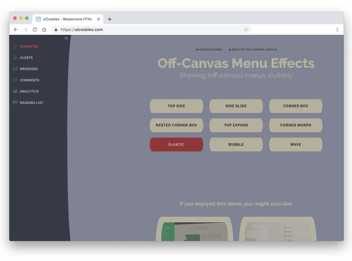
If you love the previous off-canvas menu effect, then this design will be a curious one for you. The developer gave us various off-canvas menu effects in this design example. Nearly nine types of off-canvas menu design effects are given in this set. All the effects are smooth and clean which you can use in all types of professional websites. Some of the effects are unique, for example, the wave and bubble effects are really interesting one which will make your user’s eyebrow raise. A detailed tutorial and code snippets are shared with you by the developer, hence you can work easily with this design.
Transitions For Off-Canvas Navigation
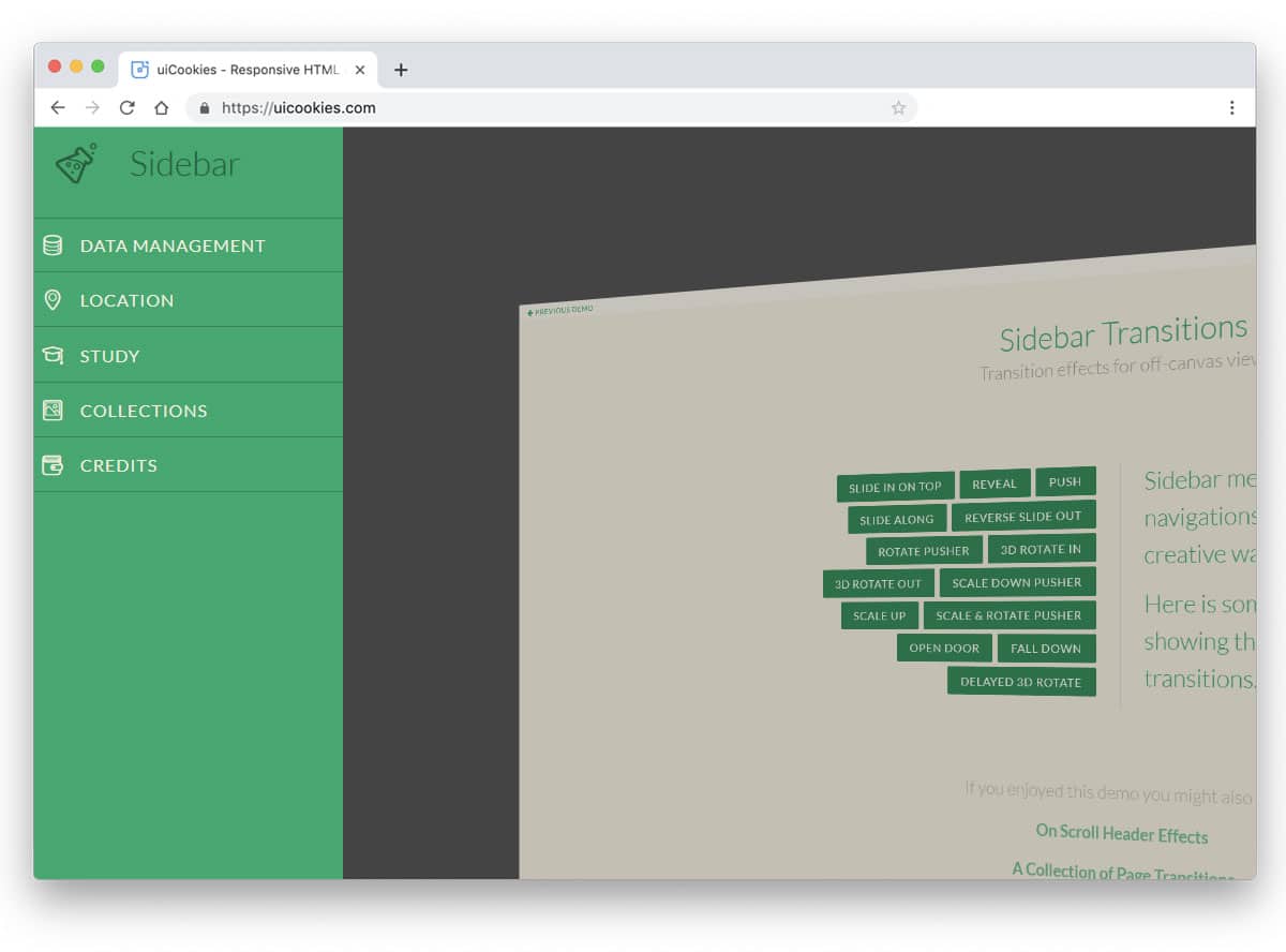
In this example also you get different transition effects for your hamburger menu design. From the simple slide in animation to complex 3D animation, the developer has given you different transition effects. Fourteen types of transition effects are given in this design. Since most of them are made using the CSS3 and Bootstrap 4 framework, you can easily utilize this code in your design. The developer has shared the complete tutorial and code snippet file for this bootstrap menu design to let you easily work with this design. All you have to do is to pick the transition effect you like and start editing the code to fit your needs.
Perspective Page View Navigation
Natural and fluid animations are not only used in the mobile interface, but they are also used effectively in desktop versions. For example, Microsoft’s fluent interface aims to give uniform natural interactions for all its devices like mobiles, surface devices, and Xbox. The developer has given you different animation examples for the navigation menu in this design. Making a unique navigation menu design might confuse the user some time. To make the design unique, we can use smart animation effects like this. All six menu effects in this example are smooth and can be easily applied in professional websites.
Jelly Menu
Jelly Menu is a concept design for mobile navigations. Because of the edge to edge screen trend popularity, the designers are constantly trying new ways to make the options easily accessible. In this design, the developer has used an expanding many from the circular button. Since the menu bar is long, important options can be given at the main bar and the secondary options can be added to the circular menu. Animation effects are smooth and the developer has used colors to present the options engagingly to the users. You can use it in your design by making a few adjustments to this bootstrap menu example.
Another Bootstrap Menu Concept

Another Bootstrap Menu Concept is a simple and practically applicable menu design. The menu opens in a full-page with smooth animation effects. To indicate the menu options that the users are interacting, hover effects are used. Since the design is very simple you can easily use this one on any type of website. Both the folding and unfolding animations are smooth in this design. This full-page menu design has plenty of space, which you can use to add other elements like social media profile links. The design and code structure of this example are kept simple for easier customizations.
CSS3 Side Panel With Menu

In this design, the hamburger menu unfolds from the left side. The default menu design has enough space to add the elements you need. The only thing you need to change in this menu design is to make the texts slightly bigger and bolder. Of course, the hover effect highlights the text, but it is not that legible. Since the developer has used the CSS3 script, you can use any modern fonts in this design.