
If you keep up with the latest additions to the developers and designers, then you might have heard of CSS Image galleries. It is a more advanced version of a gallery template or layout, achieved with CSS effects, animations, and transitions. While most people prefer staying low-profile and opting for traditional gallery-based templates, we have noticed that many users are now choosing CSS Image gallery designs over others. But what exactly is the number surging over the years? To keep it plain and simple, using CSS as the base makes everything more appealing to look at. Whether by implementing design structures, adding effects, or even animations, these are probably more engaging and enticing for viewers.
Thus, today we wanted to list the best options for you to try. These examples are a great way to get a head start rather than starting entirely from scratch. Elevate your simple portfolios and galleries with epic scroll, transitions, animations, effects, and more! Get inspirations and implement them on your site today to radically improve performance.

CSS Grid Gallery

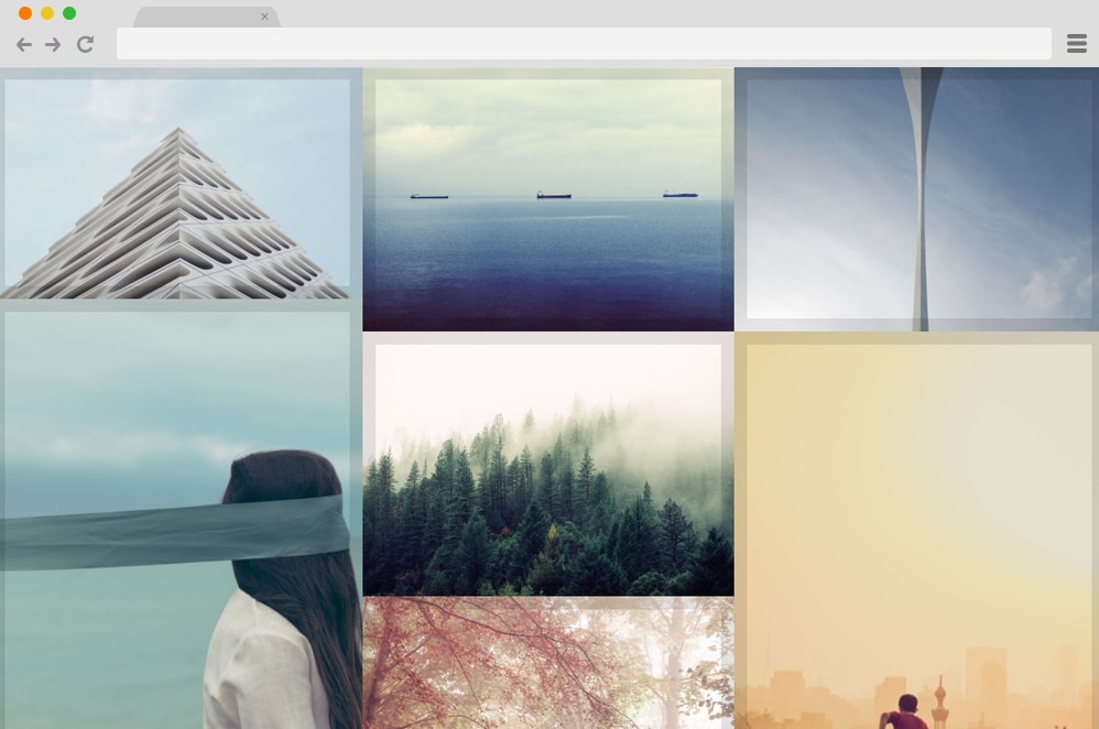
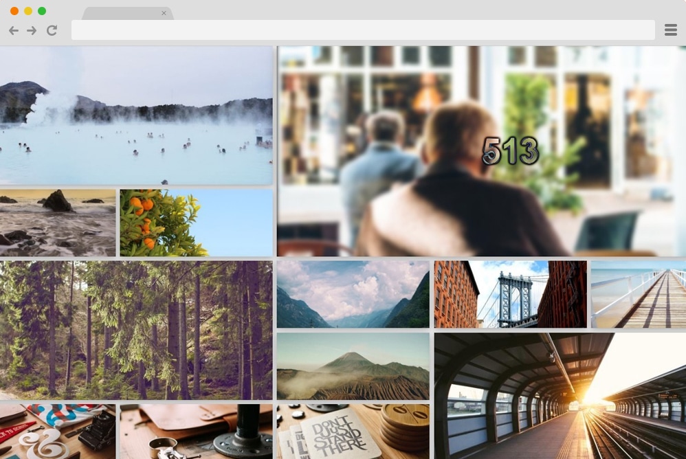
Our list of the best CSS galleries today is a great start: we have this minimalist, simple gallery design. When showcasing your images and media files, it’s best if they’re the first things to appear on your site. Hence, this design is the right way to display all your portfolios in a huge yet elegant grid. Each of these sections is customizable, and you can choose which media to display and how much of each.
The great thing here is that this layout also offers smooth, engaging animations on hover. When your users hover over any image, the image specifications are displayed as they zoom in on the picture. Pretty cool right? This can be a great start for your future projects, and you can get a jump-start with access to the overall code structure below.
CSS Gallery by Ana Travas

Now, if you want something out of the box, unique, and visually appealing, this CSS gallery animation is definitely up your alley. Here, instead of the traditional way of showcasing your media, it displays them in a full-width, smooth-running slideshow. When your users click your link, they see a creative, engaging slideshow of your work portfolio, sure to impress. Each of these images is animated to transition from one to another, with unique movement each time.
The creator has also included text or image descriptions that go hand in hand with the images. A great thing here is that while it looks pretty complicated, you can see the full code structure here. Check out the link below, and thank us later!
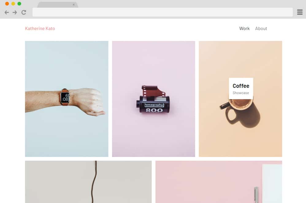
Simple HTML CSS Gallery

Another simple, minimal option ideal for those looking to get a head start on their website creation is this CSS gallery. The design is straightforward and ideal for adding that extra creative flair to your already awesome site. The images are aligned in a single line here for your users to see. However, when hovered over, it also displays the image description if you wish to add one. Playful with the images here, the creators have also chosen a bold, eye-catching background color. But since it is pretty open to what you are looking for, you can change and play around with the design as much as you like.
CSS Gallery
This is a simple way to add an interesting touch to any portfolio or gallery-based website. A grid-based layout is created using a simple framework that showcases all your designs and products. Each image also smoothly expands its frame when hovered over, highlighting it further. Another creative element is the tags that appear along the hover effect, displaying further details about that specific image. You can easily add additional information for the users to see before they decide to dive into the content. It is organized in a modern, irregular manner, giving it an edgy touch. Engaging, enthralling, and responsive in all ways, using this example on your site will surely improve your users’ interaction rate.
Hexagon Gallery

A very fascinating CSS image gallery by Gabriela Johnson, this visually pleasing design uses various CSS and HTML animations and elements. Like the name pretty much explains, the gallery is depicted in strategically placed hexagon image holders. The creators have paid extra attention to small details with the lighting and shadows. The great thing is that the gallery also features engaging hover and click animations. It creates a glowing effect through the play of lighting.
Another effect implemented is expansion on click/hover, where the image is displayed in a larger size. An awesome, unique take on gallery designs, the entire structure is secure and reliable. And the best part is that it is highly customizable, so you can make it as custom as you want. Each element can be replaced with whatever you want. Check out the link below to get the full code snippet to view and replicate a similar result.
Masonry Gallery
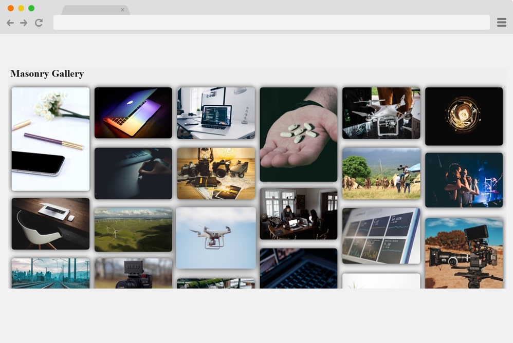
Another way to elevate your gallery is to add subtle CSS effects that effectively leave a great first impression on your users. And this example is one of the simpler yet equally engaging designs on our list. The name itself pretty much explains the overalls. It relies on a masonry grid design, and each image holder is designed to execute specific actions on hover and click. When any image is hovered over, it scales to a simple size. And if you click on any of the images you want to have a closer look at, you can click, and that image comes to full view while the rest fades into the background.
For a more creative appeal, the images also make use of a simple rotating motion before coming to a stop in a zoomed-in view. Various aspects are kept in mind to achieve this awesome result, and we can pretty much say it surely deserves a mention here on our list today. Although the majority of elements rely on HTML and CSS, it also uses JS throughout the gallery.
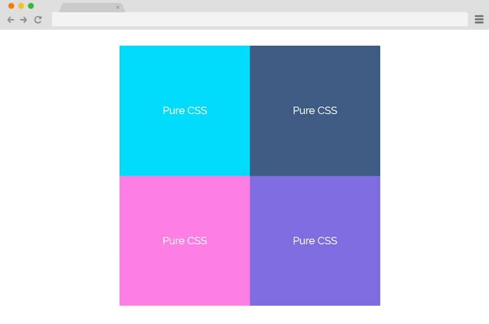
Pure CSS Responsive Gallery

Now, if you are looking for something simpler and minimal with the design and animations, this will get your attention. As the name suggests, this is a pure CSS image gallery design meant to showcase your work creatively. It starts as a simple grid gallery that displays all your images. Hovering over each animation highlights the selection with a border box appearing. However, for a closer look, you can click an image to expand it to the whole gallery, overlaying all the other contents.
Simpler with the codes and easy to customize, this sure takes the cake on every requirement for a CSS gallery. It is also fully responsive, and the creator has ensured that it looks awesome on all devices. Follow the link below to access the whole structure and a live preview.
Guided
Now, this is a more sophisticated, super-engaging CSS image gallery design—one-of-a-kind and impactful in its visuals. With an animated gallery to keep your users entertained while effectively leaving a great first impression, this is one that you should try out. Whether you are a professional or a personal photographer, this is a great way to present your work to the audience. The creative use of animation as the image is revealed is pretty unique. Revealing each element on scroll, the remaining images fade into the background. Another small detail—the transition from random hexagons to squares and rectangles — adds a touch of creativity.
It is fully responsive and adjusts according to the device screen sizes. Not only this, but the whole structure is pretty pliable to further customization. You can access the full code snippet and a live preview via the link below. Awesome end result to increase productivity while leaving a lasting impression. Why not draw inspiration from this design itself?
Responsive Photo Gallery Grid With Lightbox
One with a visually appealing layout and professional-looking elements, this is another great CSS image gallery for you. It is designed by Majed and features a simple yet elegant, clean interface. The photo gallery uses a grid-based layout for a uniform overall feel. Each image box is also animated to apply the lightbox effect on click. For reference, it simply means that when clicked, the specific image expands to full view while the rest fade into the background.
A minimal, image or content-focused approach is another way to get users interested in your works and projects. This style is also responsive, meaning the entire structure adjusts and resizes based on the devices your users are using. There’s no JS code used, which means the overall gallery is pretty customizable and easy to replicate.
Simplicity

The name ‘simplicity’ in itself conveys the overall description of what this CSS image gallery represents. Clean, simple, and minimal, this is a great way to add in that creative touch to your website. Thanks to its visually impressive impact, we are sure this implementation of animation and effects takes this concept to a whole new level. It features an interface similar to that of a slideshow-based layout. The gallery is represented by the images lined up below the display space.
When clicked on any image, it slides into an expanded version of itself above the images lined up. For a touch of a realistic feel, the images are designed to cast a shadow that gives it that almost 3D feel. Although it seems pretty minimal and clean, the result relies on CSS, HTML, and even JavaScript. This is also responsive, meaning the entire gallery design resizes to fit the screen it is displayed on.
3d CSS Gallery

This is a more creative and advanced take on the basic gallery templates and layouts normally used. The design is based on both CSS, JS, and HTML to get this mesmerizing result. It starts out with the images placed in a manner that resembles a bookshelf on the wall. Proper use of shadows and lighting adds that extra 3D appeal. The images are placed on separate blocks to make them easier to view. Furthermore, it uses the Zoom-in and Zoom-out effect when navigating the different sections.
For navigation, a menu with the shelves is placed at the top. Surely, anyone who lands on the site will be impressed by the amount of effort this CSS Image gallery showcases. Follow the link below to get a closer look at the structure the creators have used.
CSS Gallery Hover Effect

This CSS image Gallery is the ideal design to add a creative touch to any portfolio, photography site, gallery, and more. Various Images are placed horizontally atop each other for a cleaner, more organized interface. What’s more, atop each image is an animated card that further showcases the details. When hovering over the images, the animated transparent card appears with a simple flex effect. The CSS-based transition reverses itself when exiting. Based entirely on CSS and HTML coding structure, it is easy to implement this design onto your site. Since the entire infrastructure is flexible, you can easily change the fonts used, adjust the sizes, and more with a few code changes.
Flip Image Gallery With Content

Flip Image Gallery is a variation that leans more towards the creative side. Unique, stylish, and visually stunning, this example executes an amazing card-based design. All of the image holders are placed horizontally, creating an almost slideshow-like layout. When hovering over each image, it smoothly flips to reveal the rest of the content. For demo purposes, the creators have added fictional characters and their traits effectively.
\And in a similar way, you can use this for almost any type of portfolio and gallery-based websites. When scrolled over, the images slide to reveal the next in line. To add a more authentic feel, the images also include a professional-looking loader. Using JS and CSS alongside HTML coding, this template ensures optimal performance.
Split CSS Gallery
Now, this gallery is the perfect way to execute simplicity but with style. Several Image holders are stacked on top of one another, each displaying just enough to give users a glimpse of what it holds. When hovered over one image, the rest disperses and slides to reveal the content inside. The creators here have achieved a monochrome effect with a black-and-white palette. But you can add any images and replace the demo image. The entire structure relies solely on HTML and CSS, making it easy to implement on your site. Because it is minimal and clean, it does not affect your site’s speed or performance. Greatly pleasing, take your gallery to a new level with this split screen gallery.
Lightbox CSS Gallery

Using the advanced CSS effect on the image holders, this is yet another amazing way to add a creative touch to any of your future projects, websites, or portfolios. The grid-based layout pleasingly showcases all of your works. And to add that extra flair, it uses the classic lightbox effect, dimming the rest of the content when an image expands on the screen. The design is also responsive, meaning it adjusts to every device screen size with ease.
Pure CSS Gallery Hover Effect

Modern and edgy, this amazing CSS picture gallery is a unique way to add that innovative touch to any website, whether you own a blog, portfolio, product pages, or more. Each image is strategically placed to create an organized, clean interface. And these sections are further elevated with a touch of CSS coding. When hovered over, the image flexes into monochrome mode, revealing a webkit structure. It even has the classic click effect it executes when the users decide to reveal the rest of the content. Access the entire structure purely in CSS and HTML by following the link below.
Open & Close
This is a simpler example of CSS image gallery design that is minimal yet effective. The creator used colorful cards to execute the gallery for demo purposes. However, you can easily replace them with images you wish. The cards are placed in an orderly manner, giving the interface a cohesive feel. Each image also executes a smooth hover effect, and upon a click, it displays the full content below the gallery section. Unlike most other examples, this CSS design is also perfect for blogs, product pages, and more. It is also responsive, meaning all elements automatically adjust to any device screen size.
Fancy CSS Gallery

Just like the name suggests, this CSS photo gallery is a fancier, rugged version compared to simpler, minimal ones. Several cards are scattered across the interface to give the interface an edgy look. However, when hovered over, each of those cards comes into place, expanding and revealing the contents more clearly. The design is also based on the material style, with the play of shadows and light. All of it is based on the CSS and HTML coding structure so that it is simple and clean. Even the color palette is bright and appealing. However, you can easily change those with a few tweaks here and there.
Simple Gallery

Designed with an organized and grid-based layout structure, this CSS picture gallery design is great for any type of blog, portfolio, gallery, and any similar niche of websites. All of the images are aligned in an equally proportionate grid. And each of these sections also executes a stunning hover effect. When the cursor is placed atop them, it reveals the contents and further details on the image. You can add in details, descriptions, credits, or more according to your need.
And making any changes to the fonts, styling, images, and their sizes is a breeze. With a simple adjustment here and there, you can easily get a head start instead of starting from scratch. Get access to all the coding the creators used by following the link below.
CSS Gallery
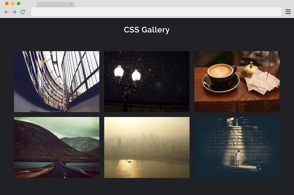
Another classic CSS image gallery example is this simple animated inspiration, perfect for anyone looking to get creative. Based entirely on the CSS and HTML structure, this entire interface is responsive and easily adjusts to every device screen size. The image holders are elevated further using simple transitions and opacity changes when hovered over. In addition, it reveals the text sections alongside a smooth hover effect. The flexible and versatile interface is easily adjustable as well.
CSS Photo Gallery With Popin

Creative and uncomplicated in its design and effects, this CSS Photo gallery is another great source of inspiration. The creator of this gallery design has added great detail to every transition and effect, ensuring a brilliant performance. When clicking any image, it pops in smoothly, focusing on the image while the rest of the background dims in a lightbox-like effect. To add another creative touch, text or details of the images appear when hovered over, so users have a clearer idea of what they are looking at.
CSS Gallery with Before & After Images

Created using combined CSS, HTML, and JS, this Gallery with before-and-after image depictions is a more complex framework than the rest. But it’s still creative and innovative. Ideal for showcasing changes or timelines that differ, this design is perfect for product pages, promotional content, and even business- or personal-gallery sites. It starts out as a normal gallery, but instead of a single image, several placeholders show two comparative images. When hovered over any one side of the image, it slides into a full view while the other side slides into a more constricted view. The remaining ones with only one image also execute a pan in effect when hovered over.
HTML CSS Photo Gallery
Now, for those looking for a captivating way to engage users on their gallery websites, this HTML CSS Photo Gallery is the perfect choice. Why? Well, to start, it is based on a simple framework of just CSS and HTML. Another reason is surely its striking design. Unlike a simple masonry grid-based layout, this gallery uses multiple random cards scattered across the screen, as if they were scattered on a table or a floor. Whichever image you view, it adjusts itself to make it more viewable for the users.
And this is ideal for anyone to share their photo collection in a unique and striking way. The font styles, sizes, and color schemes are flexible so that you can make further changes. Follow the link below to better examine the code the creators used to achieve this result.
Tumblr Photogrid

Inspired by the popular image grid on the website Pinterest, this is a stunning CSS image gallery design on our list. It includes various images stacked in a clean and organized grid with different sized images. If you are familiar with the Polaroid images, the white bordering frame around each image resembles a similar approach. The creator has used a basic square grid, but if you want, you can easily use portrait or another prefix to display the pictures. The codes used are easy to understand and implement on your site. Get full access to the infrastructure from the link below.
Magnific Gallery
Magnific Gallery uses CSS, HTML, and JS to deliver this flawless, smooth-running photo gallery. While a bit complex for first-time users, professional developers can get a great, inspiring idea with this particular variation. The images are placed in a borderless and randomly organized grid. However, with the help of JS and CSS, the images execute a stunning animation that takes it to a whole other level. When the users hover over the images, various animated shapes slide in to display the title or description you add.
But the interesting thing is that when clicked, the image switches to a full view with options to navigate the gallery. This is an advanced and engaging example for you to try out. If you want to look at the infrastructure it is based on, follow the link below.
Gmail Image Gallery Animation

Taking inspiration from another popular website, Google, the creator of this CSS image gallery has added a hint of their own creativity as well. Using a combination of JS, CSS, and HTML, the gallery starts out with a simple image placed against another. In material design, shadows and lighting also play a vital role in adding an appealing factor. When clicked on, the images pop up for a closer look at the image and its details. However, unlike the old-school effect, the popped-up images remain visible even when you click the next image. Only when you click on the image again does it return to its default position. A great way to showcase your artwork and skyrocket the performance of any gallery site with ease.
Scrolling & Looping Gallery

Just as the name suggests, this amazing gallery design is based on the classic image scroll or slider style. It works like a presentation or slideshow: when users click a specific image, it appears on the screen for a full view. But the twist here is that the creators have used different CSS effects and transitions for each image. Which means that whenever an image is clicked on, it either slides up, slides down, pans in, pans out, or more. Definitely a great way to keep users engaged, add in this stunning gallery design, and execute your work of art in style.
Amur Leopard Image Gallery With CSS VARS

Just like the name suggests, this CSS Image Gallery design is one of a kind and surely ranks among the best on our list. The creators used only CSS and HTML, but the end result is amazing. A simple, rounded-edged square box is filled with another circle frame inside. Both of these shapes hold images that users wish to display. While the circle gives the user a full view of one, the frame’s outer edge holds the rest of the gallery. The circle depicts a monochrome black-and-white effect, but when hovered over, it changes to match the original picture. There is also an animated button that displays the description about each image when the cursor is placed on top.
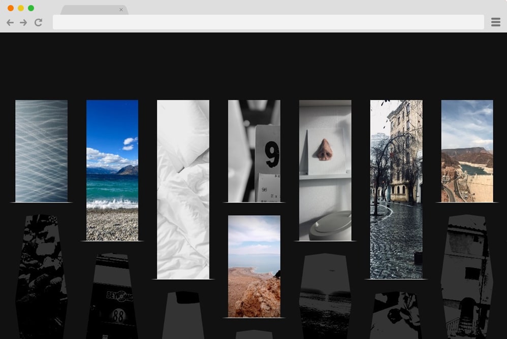
Portfolio Gallery

Subtle and minimal, the creator of this CSS gallery used a black-and-white aesthetic to achieve this stunning result. The grids and the placement of each image are irregular but appealing. And because of this minimalist design, users can focus fully on the images displayed without getting too sidetracked. Elegant and sophisticated, the entire framework is built with CSS, making it easier for users to replicate.
CSS 3D Transform Gallery

This is a more advanced option for those looking to implement a 3D effect on their site. Following a material design and effect, various images and descriptions on cards depict a smooth movement as they settle into full view. And it’s quite hard to believe that the creator used only HTML and CSS. Engaging and sure to entice users, add this amazing image gallery design to make the most of your next project.
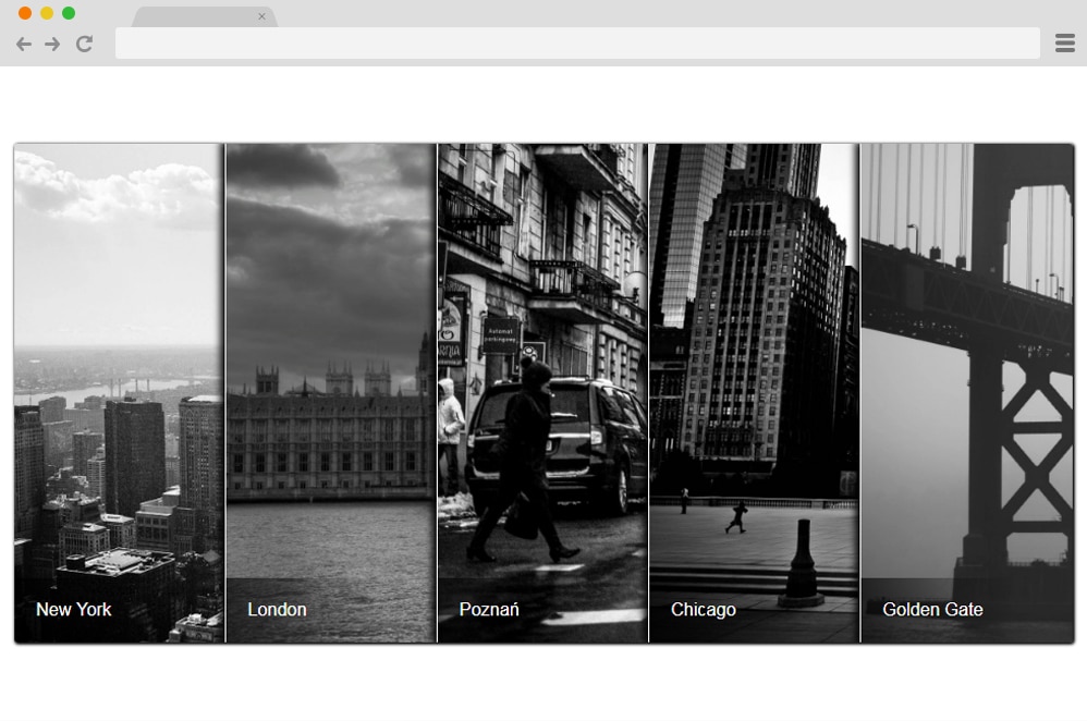
Travel Gallery

Just as the name suggests, this CSS gallery design is perfect for showcasing various locations and places on any site, creating a more modern, edgy feel. It is ideal for blogs, photo galleries, and any creative site. Created using CSS, JS, and HTML, it ensures users a smooth experience. Each image is placed horizontally side by side, each depicting a different location. When hovering over the title or the description, it slides into the display.
Slide-out Scrolling Gallery

The name itself pretty much explains the whole structure this CSS gallery is based on. Relying fully on the slide and scroll effect, with each scroll or slide, the contents on the site is displayed. Three equally divided sections are revealed when scrolled downwards. The one in the middle stays intact, while the ones on either side use the slide to make it more interesting for users to see. Although minimal and simple, it uses CSS, HTML, and even JS to animate some elements. Perfect for any creative gallery site, follow the link below to view the full coding structure that the creator has provided.
Reflective Photo Gallery Wall
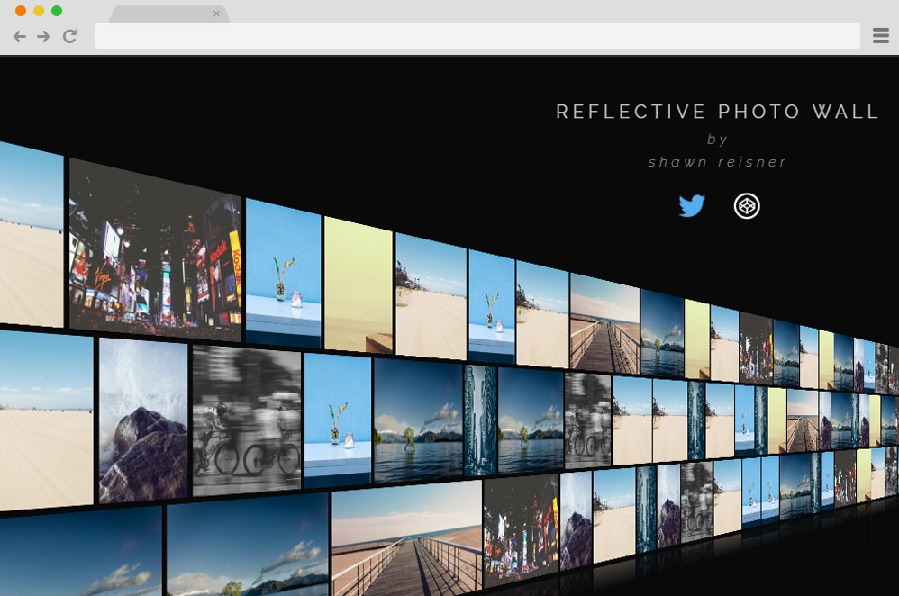
This is a more advanced take on a simple CSS gallery design achieved with JS, CSS, and HTML. All images are placed in a 3D wall-like structure placed edge to edge, leaving minimal gaps. It’s like walking into a TV store where all of the screens display different channels for the shoppers to see. Perfectly summing up what great things you can do with CSS and JS, this example takes an online gallery to a whole new level.
Quad Image Gallery

From the name alone, you can guess that this CSS picture gallery is designed with professional portfolios and galleries in mind. But with a more flexible and versatile design, it is also suited for blogs, online shops, product pages, and more. The interface is clean and modern, with all image sections organized. When clicked, it expands and slides in to fully display the image. It is built with CSS, HTML, and JS to deliver this minimal yet effective page transition and grid-based gallery layout.
very goog and thank you
Amazing