
A radio button or option is an element that allows users to choose one option from a predefined set. It is like a checkbox. The only difference is that checkboxes allow users to choose more than one option. However, with a radio button, when a person tries to select more than one option, the previously selected option is deselected. And the term itself was derived from the real radio buttons. If you reminisce about older radios and how their buttons worked, you can see the resemblance. When one button was pressed, the previously pressed button would automatically pop out.
Although previously buttons were not considered a vital element for styling, more and more sites have adopted custom CSS radio buttons. When the default styling is too plain and the design is poor, using CSS radio buttons adds a creative touch to your website. So while the rest of the world is getting increasingly into, today we decided why not join in? Thus, here at uiCookies, we have compiled a list of the best options for you to try and copy for your site. Keep things fresh, modern and stylish with these variations throughout your site.

CSS Radio Buttons
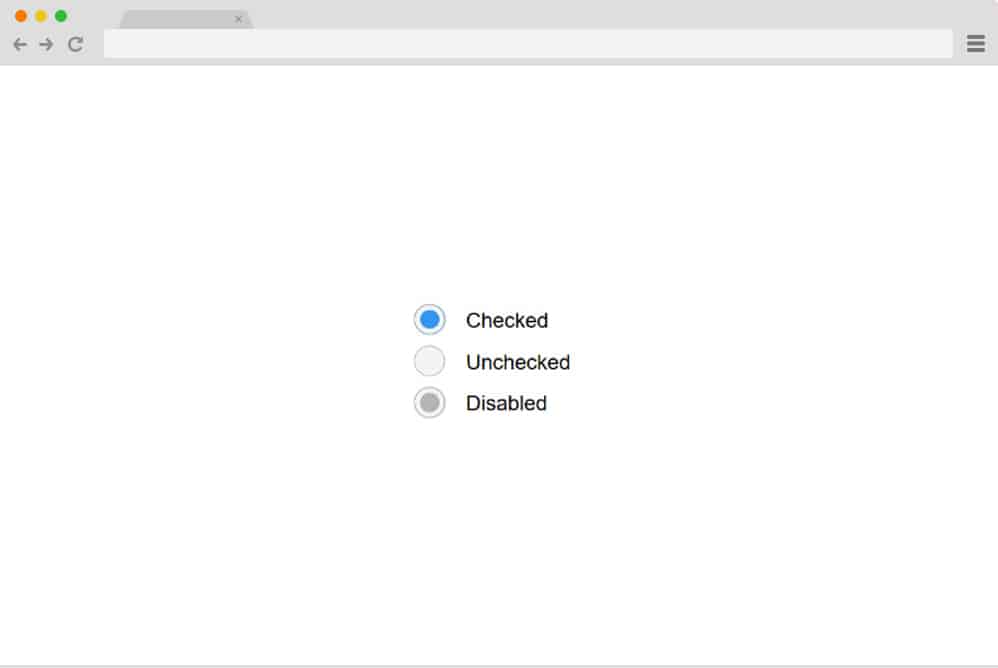
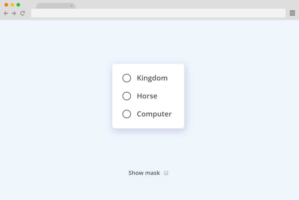
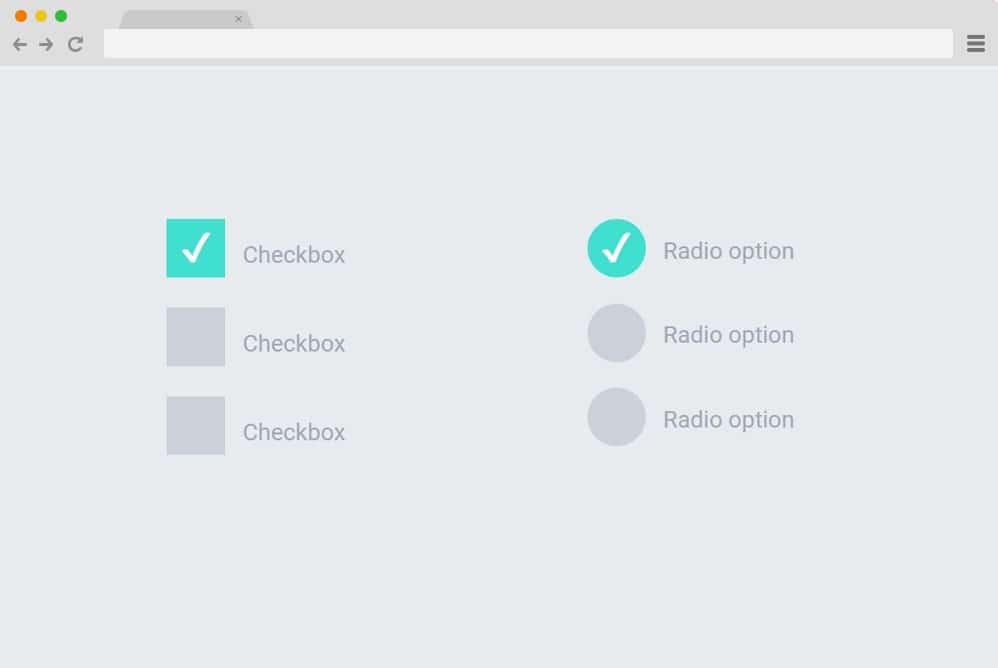
On the top of our pick today, we have the classic and straightforward design that covers all the basics of what is required. The clean codes used here are completely based on CSS and HTML; and no JS. It features three radio button variants. Fonts and styling are kept to a minimum, with a simple color background. These buttons, when clicked, highlight the selection with a simple color fill. An additional disabled button is also presented here if one needs to add to the site. It is responsive and is ideal for all screen sizes, whether laptops, desktops, or hand-held devices.
Radio Color Picker
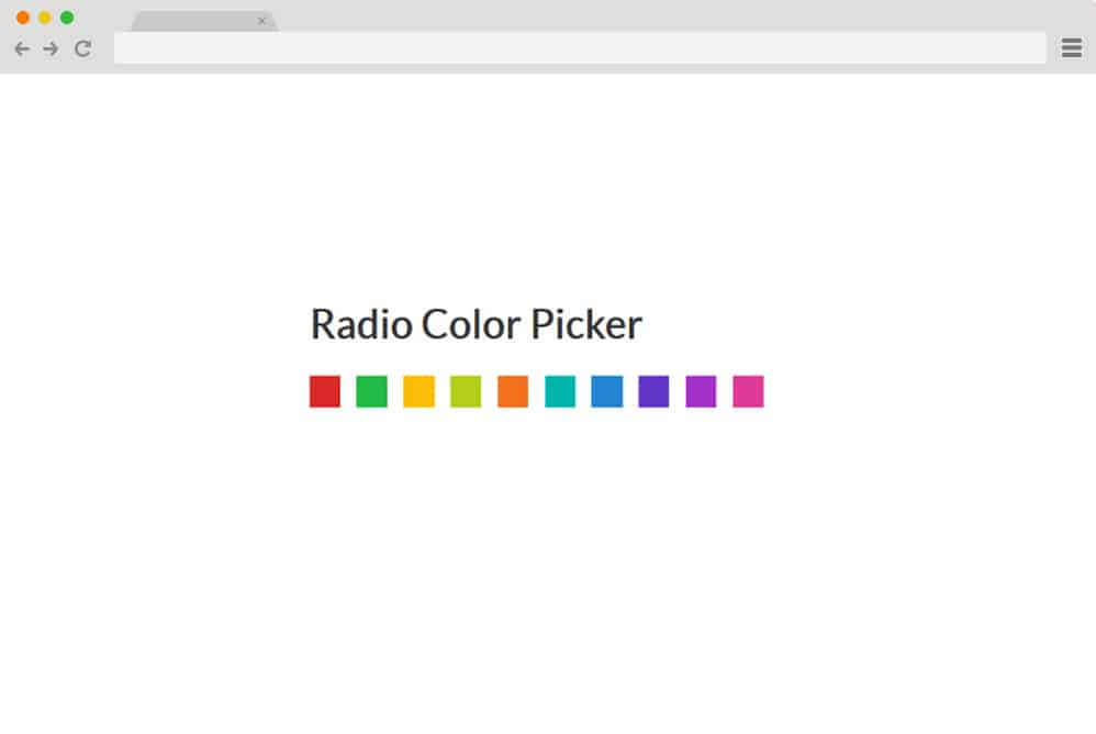
So this one stands out from a traditional multipurpose CSS radio button as this is designed with specific purposes in mind. While most of the other variations provide a written description and or an icon to represent the choices, this offers a color block as a selection. Basically, if you are offering users variations of color schemes for any of your future projects, then this radio button is super handy. And this, too, relies entirely on CSS and HTML, with no JS. Responsive, easy to read, and easy to replicate, this will save you time and effort next time you want to create this from scratch. Simply follow the link below to get an in-depth look at the structure by the creator themselves.
CSS Radio-Button
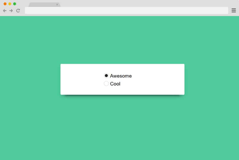
This is another simple enhancement to the regular CSS radio button design that stands out. With a clean and eye-pleasing color background, the creator has used a material-based card to place the buttons on. The buttons, however, use a simple mechanism that lets you select only one option at a time, just as with the regular ones. Fonts are kept simple to ensure the primary focus here is on the animated buttons. All of these are based on the advanced CSS and HTML structure with no reliance on JS. This makes this template easier to understand and replicate on your site. Follow the link below for a more in-depth view of the structure.
Responsive Toggle Switch

One of the simplest yet most creative ways to keep your site fresh is this CSS radio button with a toggle switch. As the name suggests, this design is responsive, meaning it adjusts to whatever device your users are on. The radio button appears as a switch, displaying the options users can choose. It is full-width and once one answer is clicked, the other option deselects itself automatically.
Smile Toggle
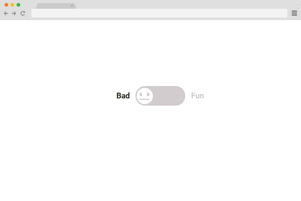
Another variation of the toggle effect, implemented in a unique and visually pleasing way, is this CSS radio button. Unlike the previous one, which displayed the answer for each switch, this toggle option provides an animated mood meter. A smiley is used as a mood switcher, with one side bad and the other fun. When on the bad side, the emoticon is neutral and colorless. Once the user chooses the fun option, the animated emoji smiles as the toggle switch changes color to match the mood. It is a great idea to use radio buttons to keep things interesting for your users when collecting feedback or asking about their experience using your site or products.
Slap Toggle
Another variation of the toggle switch-based CSS radio button is the slap toggle. It is similar to the one we mentioned before; however, unlike a simple toggle between options, it offers a more complex and creative alternative. When clicked, the two answers immediately switch color to showcase their selection. And the color doesn’t just switch; using the classic old slap-and-jump effect makes things more interesting. Not only is it mesmerizing to look at, but adding this to any section of your site can surely entertain your users for a while.
Toggle Radio Input

What if you are looking to add more than one CSS radio button for your users to see? Well, the solution is right here! This CSS radio button has options for users to add two similar looking boxes side by side. It is simple and will keep users from becoming too distracted or disengaged when filling out their requirements. It features two boxes, each with options for users to choose from. And just like a checkbox, users can fill out and choose two options, one from each, for a change.
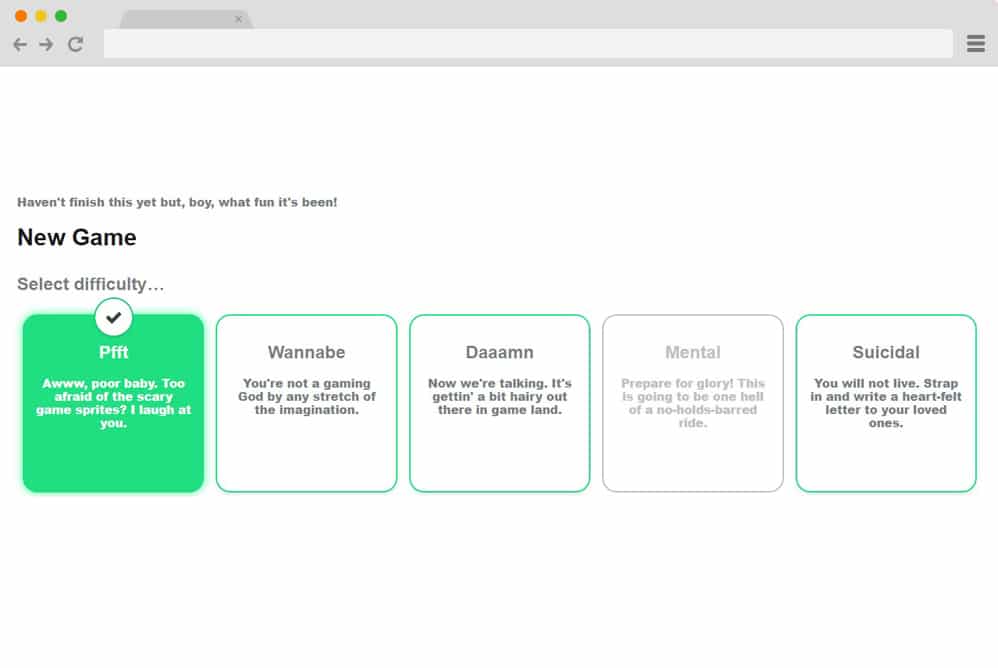
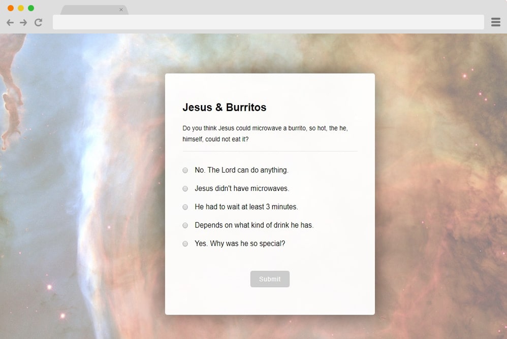
Custom Radio Button Survey

If a simple and clean survey form does not satisfy your creative and innovative influence, then this CSS radio button is for you. Created with the ideology of a unique and visually appealing survey page, use it for any of your next projects to impress. Showcase multiple questions with multiple answers, all with a mandatory radio button feature. Perfect when taking polls, reviews, and surveys, the design and style are advanced and responsive as well.
Liquid Radio Button
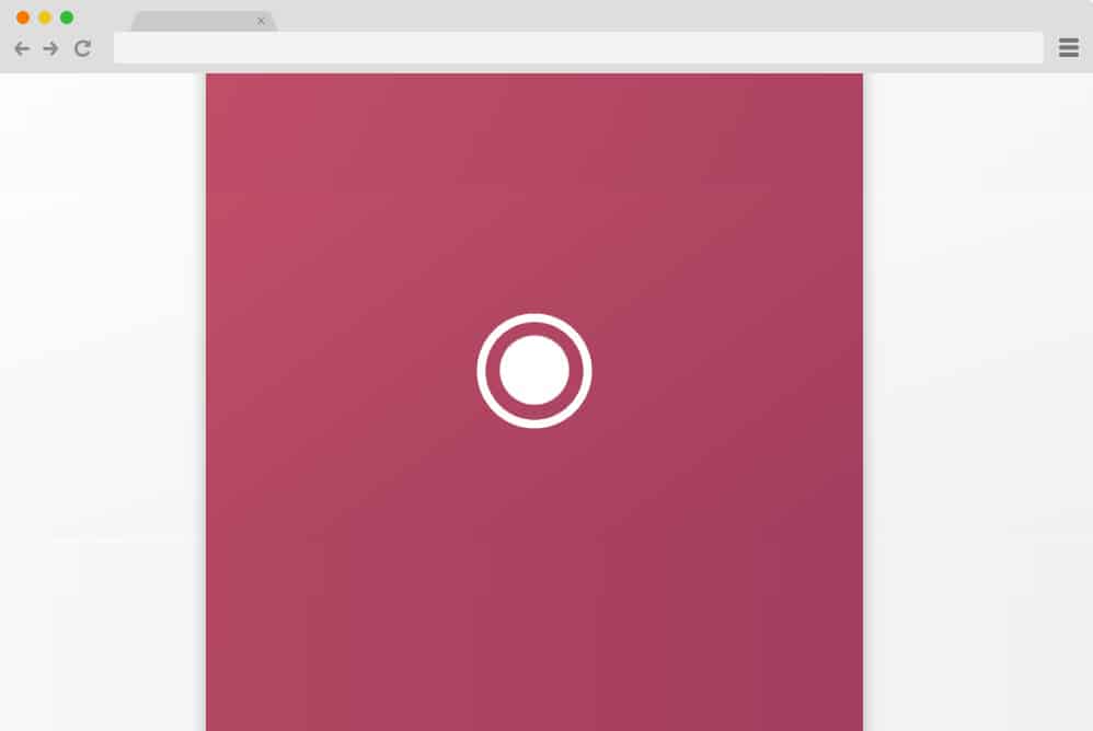
This is a fancy, elegant CSS radio button example that cleverly uses the SVG animation effect. It executes a flawless custom liquid effect that displays the status of an option. When the option is selected, it shows a liquid-dripping effect to highlight the selected display section. When a different option is clicked, it disperses to a random location, resembling a liquid splattering and then disappearing. Perfect for those who like to keep it simple yet eye-catching, add a hint of attraction for your users to enjoy!
Jelly Radio Button
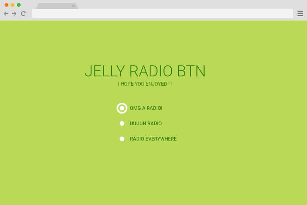
Another creative addition to our list of best CSS radio buttons is this Jelly Radio Button. Created with the powerful CSS structure, it showcases a flawless Jelly effect alongside the radio buttons. When selected, the buttons display something like a bulls-eye targeting the options that users choose. And just like a normal radio button, one is deselected when another option is clicked. The fonts are based on Google CSS fonts and look stunning.
Radio Button Big Square

Remember the toggle switch we were talking about earlier? Well, this is yet another CSS radio button that is a variation of a similar stimulation and effect. Although this time, it displays the button as two large squares and features a mesmerizing effect. Each square showcases an answer and an icon. When clicking any option, the icon slides down to align with the text, while the unselected option hides the icon. Another way to know which answer you have selected is the clever use of the color switch. Creative yet subtle and simple, this is a great option for you!
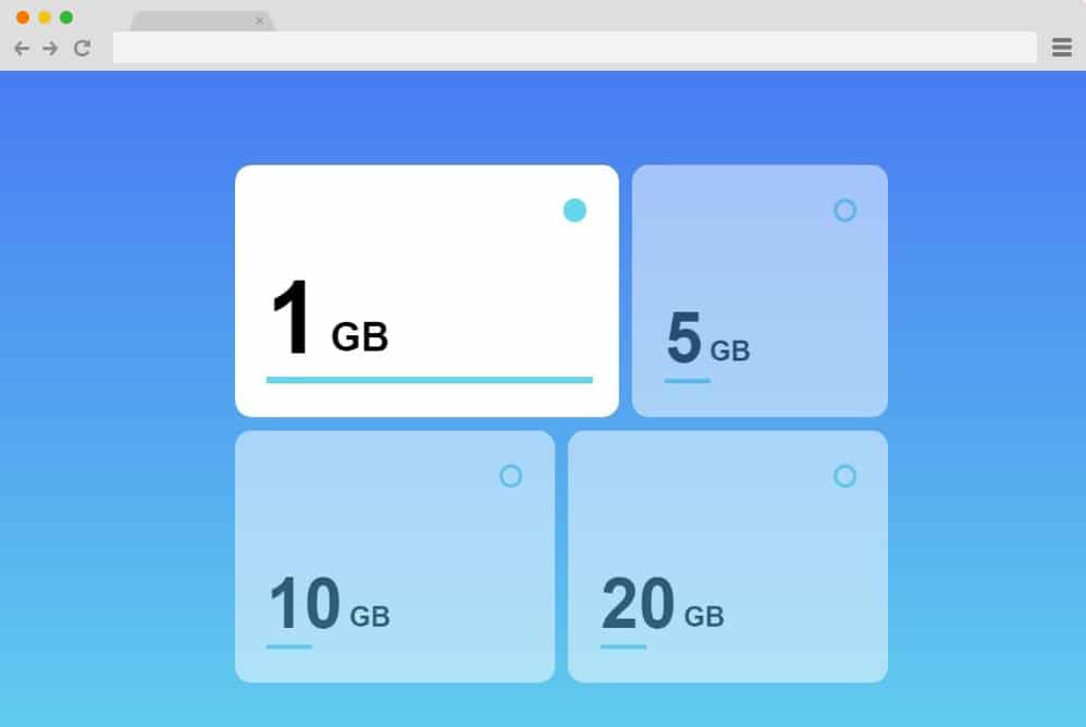
Radio Selects
If you are familiar with the interface of many games, then you might be familiar with this type of CSS Radio button. That’s right, this example is perfect for users developing apps and games! However, the versatile radio buttons can also be seen on various corporate sites when users choose the types of plans or services they want. Four or five levels or boxes are marked as radio buttons, displaying options. When clicked on, the answer you choose will change color, and the selection icon appears atop the box. You can easily change other details while leaving the codes intact, and add this to your site.
Input Radio CSS
Created only with CSS, this example showcases perfectly what a simple animation and effect can do. The checkboxes are placed side by side and animated to highlight the selected answer. The input radio features an animated slide button that appears on whichever option you choose.
Just a Very Simple Radio Button
Simplest and the exact definition of a radio button, this example is the most basic yet effective of the lot. The signature buttons are displayed all unselected to start with. And when the users click on one option, the animated slide button appears, changing its location whenever a new option is clicked on. Created using the simplest and cleanest HTML and CSS structure, get started with the basics by copying the code for yourself right away.
Google Dots Radio Button
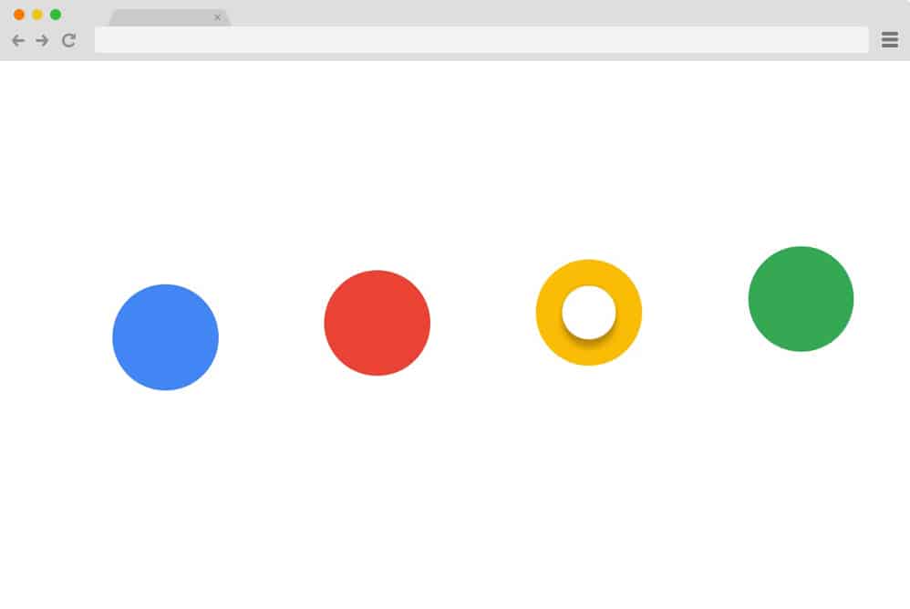
A simple and standard CSS radio button, this example showcases the purpose exactly as the name suggests. It displays four different options using the signature color schemes that are blue, red, yellow and green. Each option, when selected, showcases its status with the basic white sphere in between. However, the unique feature is the animations. The options bounce in a rhythmic pattern, almost hypnotically, stopping only when clicked. But that’s not all: the sphere in between also produces a stunning effect before coming to a halt to indicate that it is selected. And the best part is, each option displays different action when selected. Creative and unique in every way, this is surely one of the best options.
Animated Switch for Radio Button

Another visually pleasing CSS only radio button is this Animated switch variation. A simple switch with various options is placed for the users to choose from. One of the options is selected by default, which is differentiated by the animated sphere. When any other option is selected, the sphere moves to the selected answer while changing color. Using the simple slide-left-and-right effect, this animated CSS radio button adds a creative touch to any site.
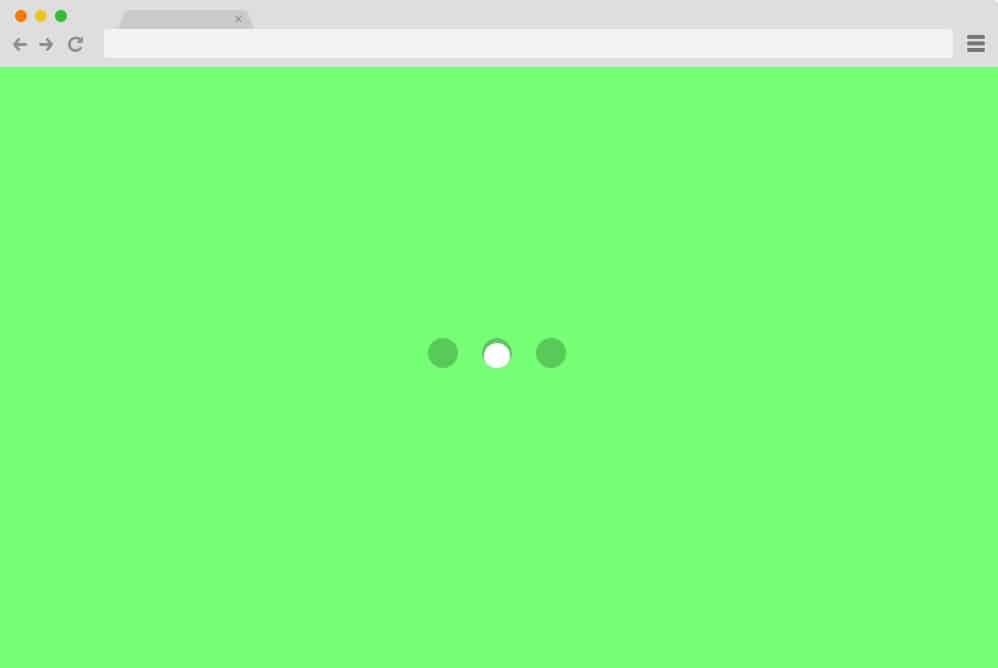
Material Radio Button
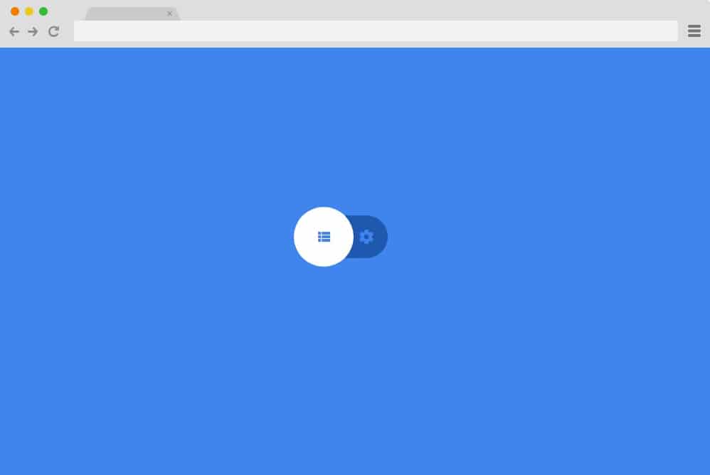
Built with Material Design, this CSS radio button uses both CSS and jQuery to make a maximum impact. It displays a settings switch that toggles between options with a flawless liquid animation. Just like the previous example, it too showcases the selected option with an animated sphere. But the difference is that instead of covering the option as a whole, the sphere in this button highlights the icons used on the menus.
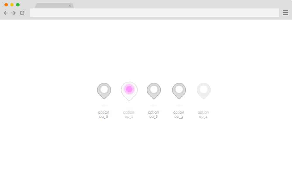
Google Maps Radio Button
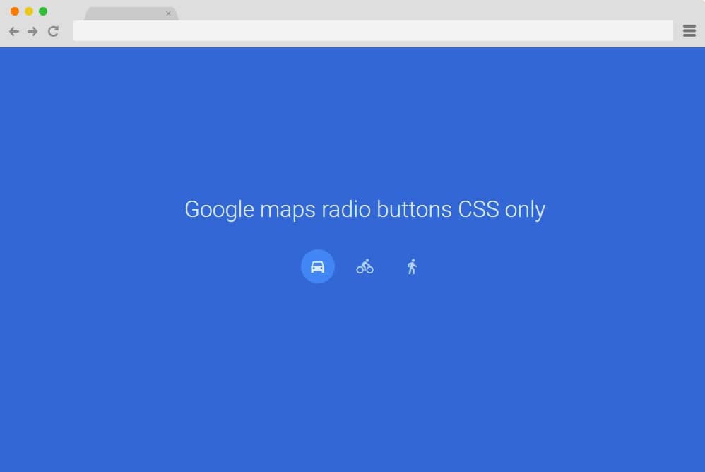
Using only simple CSS, this radio button style is based on the icons used by Google Maps. Perfect for any custom maps or location tracker, there are three different icons representing drive, cycling, and walking. When hovering over the icons, their details are displayed, making it clearer what they represent. However, the icons can easily be replaced with others. The simple effect of highlighting the selection with a sphere is used using HTML and CSS. Thus, it is easy to load and does not significantly affect the site’s load time.
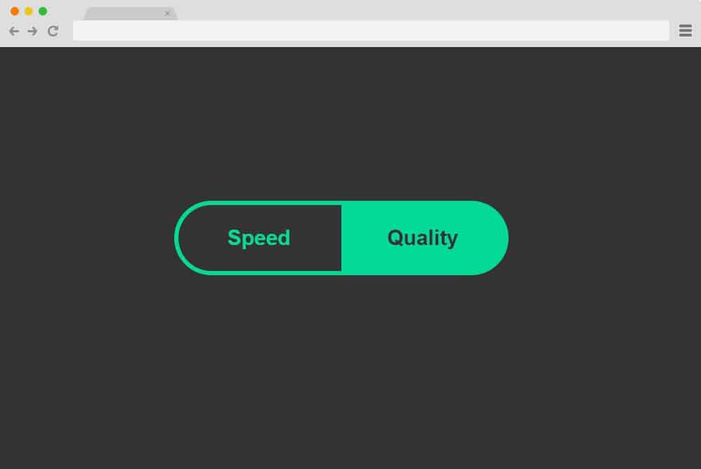
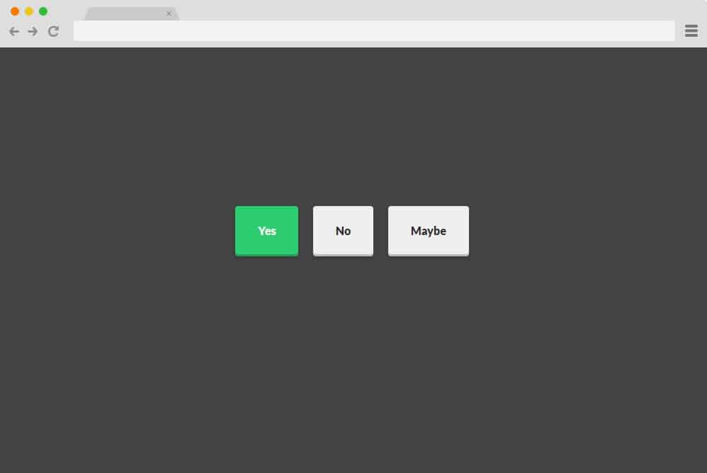
Simple Toggle
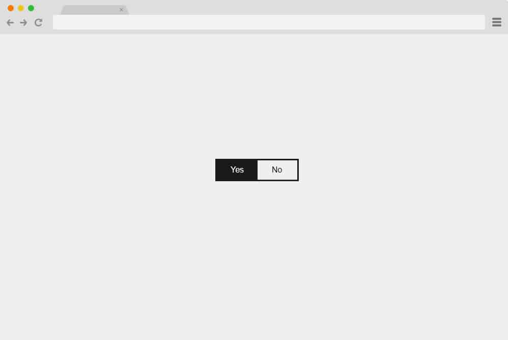
Another minimal and simplistic option for you to try out is the Simple Toggle CSS radio button. With an animated slide button, it offers two options: yes or no. An answer is already selected by default, and if users wish to change it, the animated shapeshifts to the opposite side to highlight the selection. You can use it for any type of contact forms, feedback, or place it throughout the site if you want to create radio buttons for multiple queries. This too uses only CSS, ensuring smooth, clean performance.
Fancy Radio Button
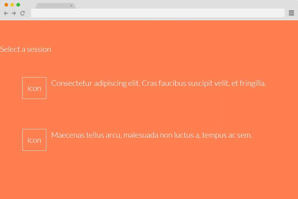
This is a much fancier version of the basic CSS radio button. With a checkbox-like structure, each option has a placement for description and icons to represent it. Alongside these are square checkboxes where users can select their answers. When you select any option, whether the checkbox itself, the description, or the icon, a check icon will appear in the empty boxes. If you switch the answer, the check icon will automatically change its position. Making use of only CSS and HTML, this will surely add the extra elevating factor.
Radio Button Input Scale
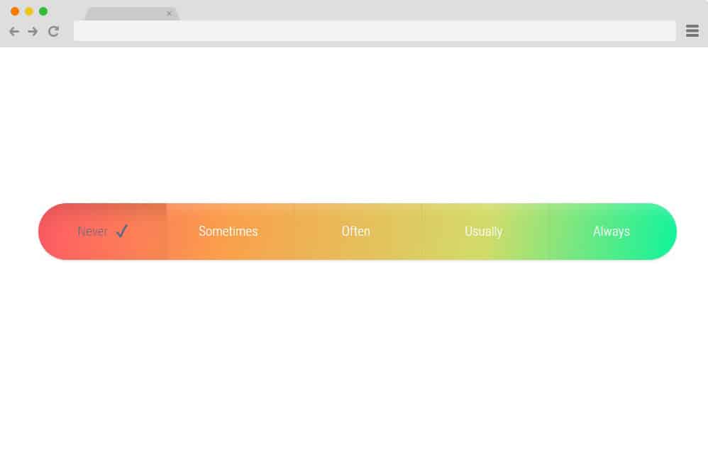
Featuring a full CSS framework, this is yet another stunning example of a radio button you can use on your website. It includes a gradient scale, with each option more likely to represent certain levels. When you click a specific option, it highlights it by changing the gradient level. Additionally, a check mark also appears on the right side of the chosen answer. Simple yet innovative, get an interesting appeal on your site with ease.
Stylish Radio Button

If you are one to keep up with the latest trends, fresh ideas, and stylish designs, here is a CSS radio button variation for you. Like the timeline effect, the various sections are displayed for users to choose from. Just like a normal timeline, it shifts the placement when clicked. The timeline icons also change color and broaden in size to highlight the selection. Visually pleasing, color-matched schemes are used to fit any niche and add an appealing factor.
Radio Button Styling

Now, this is yet another variation of the classic switcheroo CSS radio button. It features two icons representing the two sexes, male and female, which you can easily change to your custom icons. It is displayed with a simple background and the icons using an almost opaque feature. With the simple CSS, when selected, the icons take on a 3D effect. To make the selection even clearer, the icons also change to a lighter shade. Surely a unique option, this custom CSS radio button is worth a try.
Strike Through Radio
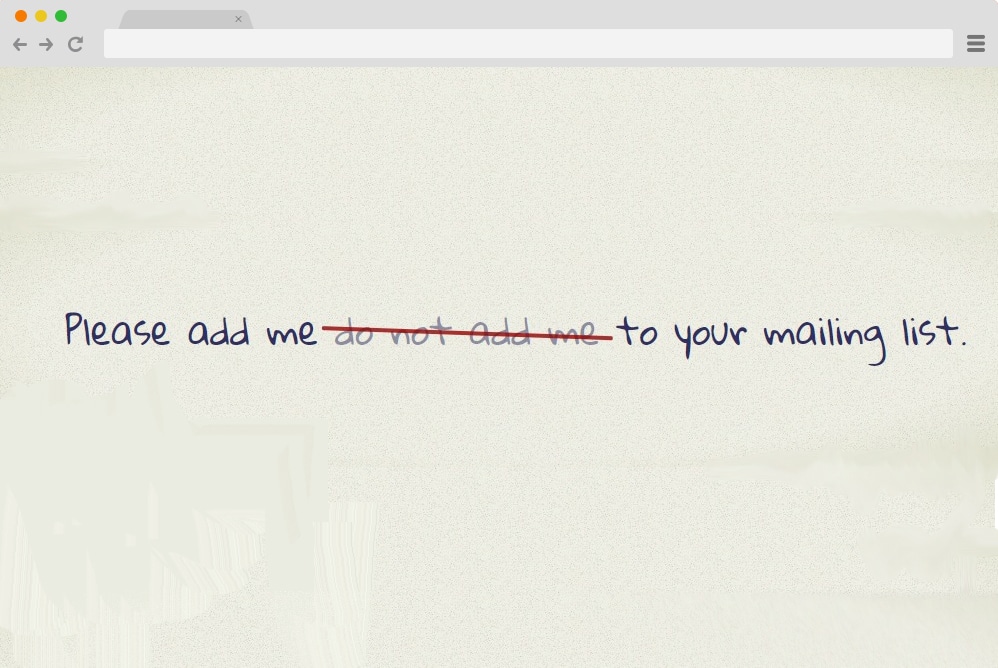
Taking an innovative, unique idea to action, this example uses the classic strikethrough effect on the text areas. Taking inspiration from real forms and certificates that offer options to choose from, this is a unique way to add a CSS radio button to your site. Unlike most other options on our list, it does not provide descriptions or icons for each choice. However, it works as a sentence where all the choices are written side by side. And once you select one, unlike the other radio buttons, where the selected option is highlighted, this works the other way around. The unselected items are crossed out with a single red line giving out an edgy feel.
Balloon Radio Button
The name of this example is based on the shapes of the radio buttons used to derive the choices. Various balloon-shaped buttons are placed side by side, each denoting an option. When hovering over the icons, the animated shapes change position, making it interesting for your users. Once clicked on, the circle inside the balloon changes color and highlights itself as the selected option.
Flat Radio Button
Featuring a flat, modern look, this is one of the simpler versions of attractive CSS radio buttons. There are three 3D icons, each denoting a choice. When clicked, each one applies a simple CSS effect and changes its status. Each box also changes color when selected, making it simple for users to use and understand. Simple, effective, and built entirely with HTML and CSS, with no additional JavaScript or coding, for a smooth user experience.
Radio Checked Style
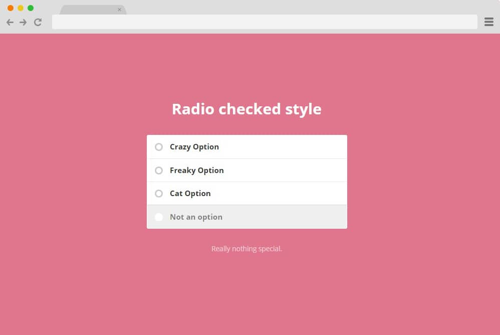
Resembling a simple checkbox, this is another great example of a CSS radio button. Definitely suited for even professional use, you can easily make the best out of CSS-based buttons. It features a clean form style option for users to choose. Basically, it works like a regular radio button, which enables you to choose only one answer at a time. When multiple options are clicked, the previously selected answer deselects itself automatically.
Underground radio button
This is another great example of an animated radio button that works effortlessly and gets the result. As with any radio button, only one option can be selected. However, a simple addition the creator made is a liquid-drop-like effect when any of the options is selected. Effective and unique, this adds a touch of creativity, making it an appealing radio button option for your site. Since the whole structure is built only with HTML and CSS, replicating and making additional changes is also pretty easy.
Alignment Radio Button
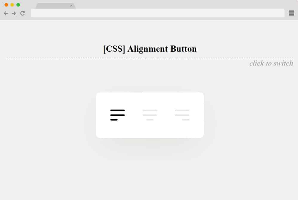
Getting more into the creative, more distinct, and unique options for CSS radio buttons, this is a great choice. Now, instead of the traditional checkboxes or buttons, the creators of this particular option have used icons for page alignment. And instead of the usual list-like positions of the choices, this is more horizontal, allowing the animated lines to move smoothly from left to right depending on the choice. That is exactly what seems to be the inspiration here. From the animated lines to the icons used to the overall movement, this is a pretty different variation you can use. Follow the link below, and you will get access to the whole structure for a closer look.
Transform toggles
Another one that follows the toggle-based design is this CSS radio button we have in line for you. It features multiple choices represented by toggle switches. Each represents a different data work, like a radio button, as only one can be selected at a time. To show the selection, the toggle switch expands and turns into a more opaque version of itself. While the remaining options showcase a fading effect. A small addition of the animated line that expands along with the selection also adds that extra touch of creativity. The entire structure relies solely on CSS and HTML, making it easy for you to adjust any details associated with this radio button. The font, font size, as well as the color palette and the animations are adjustable. Just follow the link below to get a closer look and understand the structure used.
Hidden Radio Messages/Tooltips
Now, this is a more efficient and practical style of radio button, more likely aimed at quizzes and questionnaires. It follows all the simple practices of a traditional and simple CSS radio button with multiple options, where you can only select one at a time. The form-based radio button design, however, differs slightly with the addition of a tooltip or hidden message that appears only after selection. One can use this to show instant results of whether the choice is right or wrong. Or one can also add in additional information and tips to make it interesting for their users on their site.
Each of these messages is also represented with a different color scheme, which makes for a pretty vibrant appearance on a simple and plain form. There is also a submit button at the bottom, like with any other form, that uses the slide effect on hover. While it is based on CSS and HTML, you can adjust any aspect you like with ease as well.
Ripple Animation Input Type Radio and Checkbox
If keeping it simple is what you are looking for, then check out this awesome addition by Wilder Taype. The name pretty much sums it up: ripple animation, radio input type, and checkbox. Do we even need to explain it further? The buttons or boxes use the classic CSS animation to showcase the selection on click. In addition, a simple check mark appears as the button changes color to mark the choice. Pretty easy to understand and replicate, why not check this out for yourself?
SVG Splat Radio Button
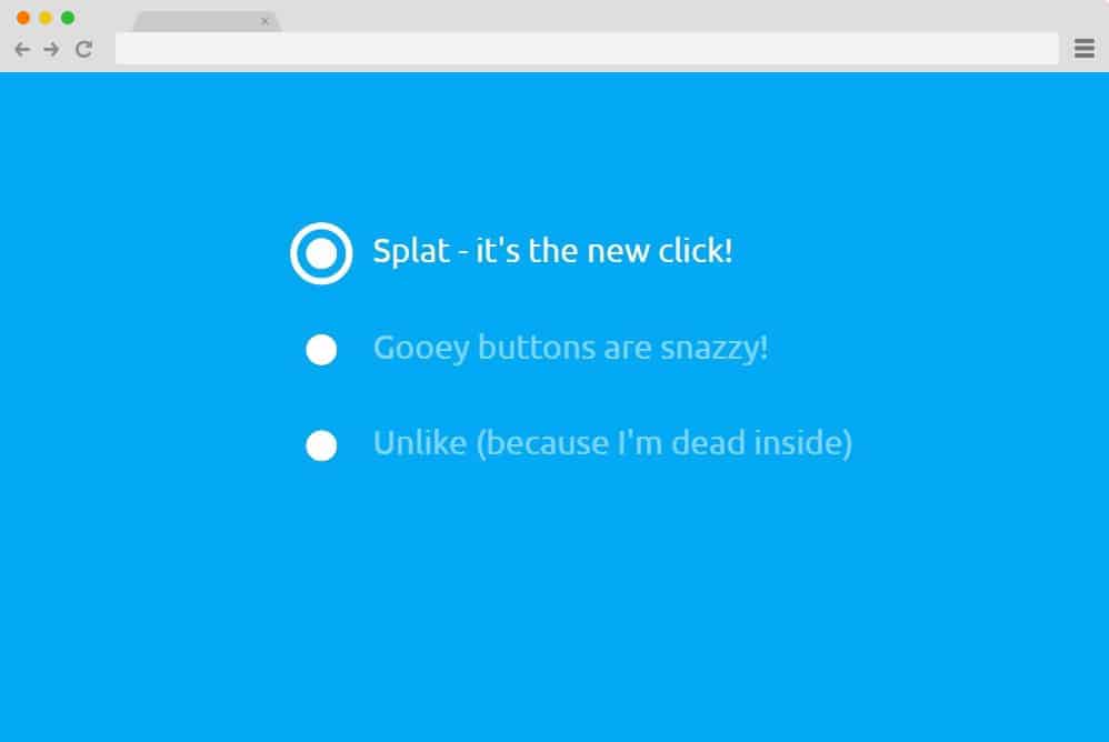
This is a more sophisticated version of the animations and effects used with the radio button. This specific example makes use of CSS, HTML, and JS to get that classic SVG going on the buttons. The interface is simple enough, with multiple choices; one can only select one at a time. However, the part where it shows the selection is where the water splat-like effect comes into play. Even the initial button changes its form to highlight what you chose. And if something more creative is what you are looking for, then this definitely takes the cake. Follow the link below to see exactly how the creators managed this result. And if you want, you can perfectly replicate while personalizing the sections per your requirements.
Radio Buttons
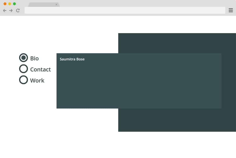
Now, this is a radio button design that serves more as a navigation or projection tool. That’s right, it follows a simple structure: after one clicks the option, the card displaying the content changes based on the selection. The buttons also feature a color change effect on hover. The background is a classic split-screen, and the projection card containing the contents is placed above it. Based solely on the powerful CSS and HTML code, it is pretty easy to understand and replicate similar results.
Radio Hopping

Next in line is this incredibly animated CSS radio button by Jon Kantner. A professional-looking, pretty pleasing-to-the-eye design that takes a simple radio button animation to the next level. Basically, here it features simple buttons that are simple at first glance. But the creator has used the hopping value when clicking any of the available options. Basically, it switches between the selections with a snake or worm-like movement, going from one point to the other. The final touch here is the color change when highlighting the specific option from black to blue. All in all, a simple and smooth mechanism but an impactful and engaging result. Why not take a full glimpse at the code structure with the code down below?
Radio Button with Marble & Wood
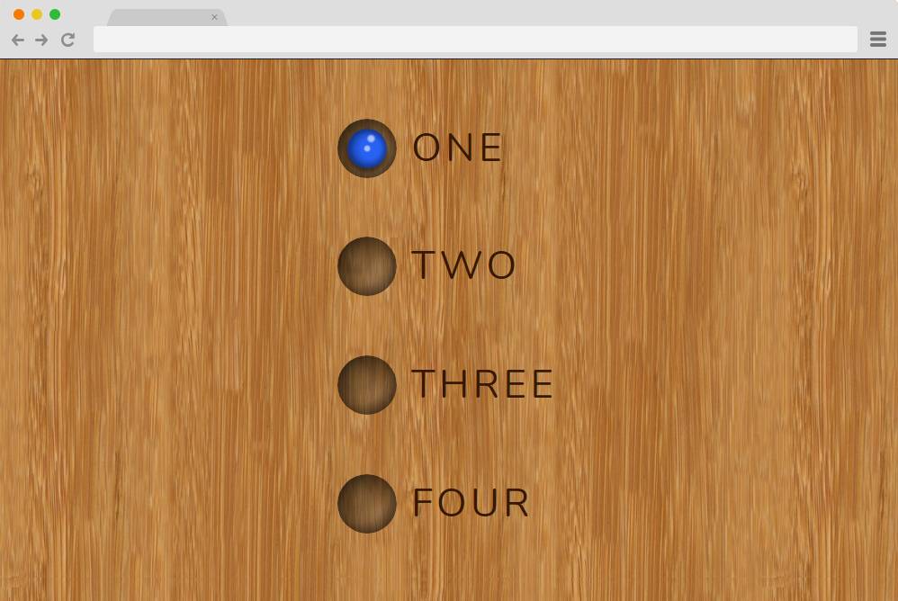
Now this is a more attractive-looking CSS radio button, inspired by pool balls and tables, as it pretty much shows. The options are represented by the shadowed buttons that look like the hole where the ball goes. And when clicking on any of them, the selection is basically the ball-like button sliding up and down. The background is another great take on a simple approach with stunning results. Here, you can see the wooden, marble-like background, which adds to the appeal. Pretty simple and easy, it is engaging enough for your users and is a great start to learning the basics of how the animations work. Take a closer look at the end result and the whole structure used to achieve the result from the link down below.
Neuromorphic Radio

This example by the creator Halvves is another stunning option you can take a look at. While the overall design looks pretty simple and minimal, there are multiple elements here that are quite impressive. The morphing movement and the 3D design are used to point out some major ones. Neumorphic, as the name suggests, this radio button features a smooth transition when selecting a specific option. Almost as if you were literally pressing each of the buttons. Using various elements, classes, and actions, the creator has managed to achieve a pretty realistic feel.