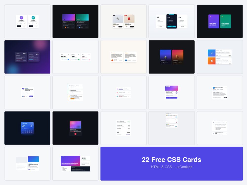
Every card on this page was designed and coded in-house by uiCookies — this is our own pack, not a roundup of CodePen embeds. Each design is a single self-contained HTML file with the CSS inline: no framework, no build step, no icon library.
The first ten are the generic shapes every card collection has: profile, blog, product, pricing, flip, glass, stats, testimonial, hover reveal and horizontal. The other twelve are the cards a real product actually ships — an event, a notification, a file upload, a course, a job listing, an invoice, a board task — plus three worth knowing for their behaviour rather than their looks: a card that expands with no JavaScript, a loading skeleton, and a bento grid.
Download all 22 (free) Browse live demos
Which card do you need?
A card is a container for one thing. Pick by what that thing is:
| What you are showing | Start with |
|---|---|
| A person — team page, author box | Profile (1) |
| An article or post in a list | Blog Post (2) or Hover Reveal (9) |
| Something for sale | Product (3) or Pricing (4) |
| A number that changed | Stat Cards (7) |
| Something happening on a date | Event (11) |
| A message that needs acknowledging | Notification (12) |
| A file, upload or attachment | File Upload (13) |
| Progress through something long | Course Progress (14) |
| A listing people apply or respond to | Job Listing (15) |
| A row on a board | Task / Kanban (19) |
| Detail that should not always be visible | Expanding Card (20) |
| A marketing section of mixed weights | Bento Grid (22) |
The classic card shapes
Ten takes on the card layouts that turn up in nearly every project.
1. Profile Card
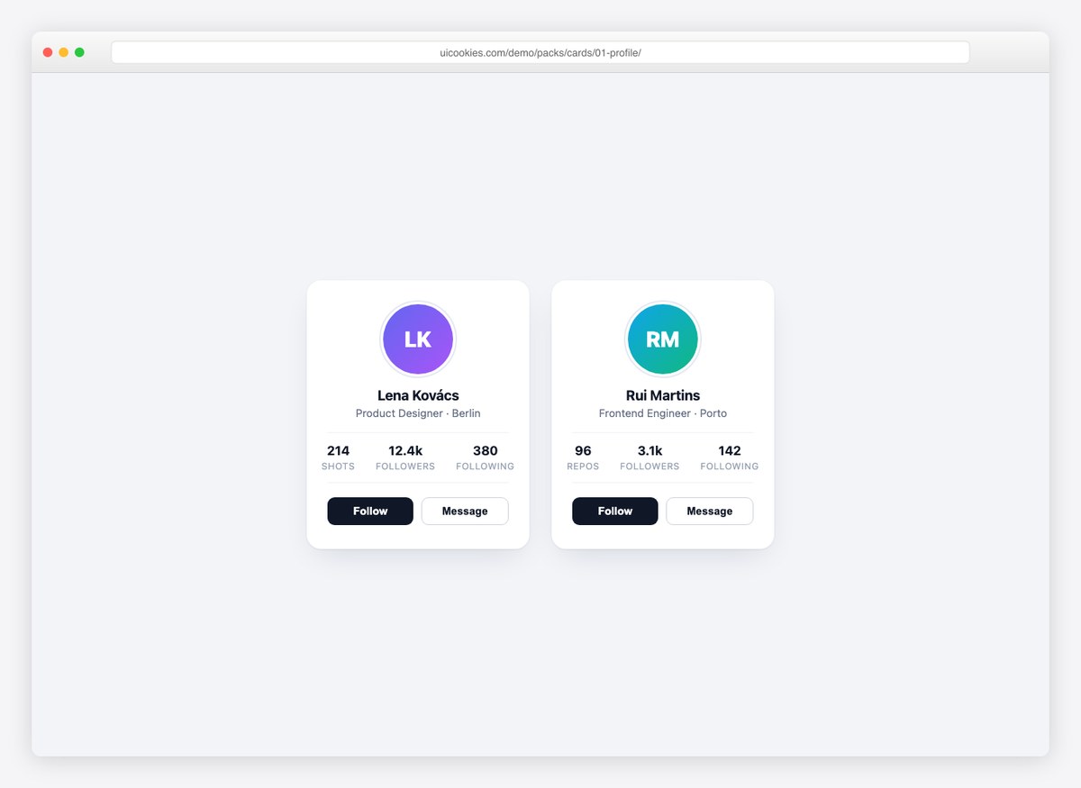
A team-member or social profile card with avatar, role, follower stats, and follow/message actions. The whole card lifts on hover — a small touch that makes grids of these feel alive.
Live Demo CSS, Bootstrap & Tailwind code
2. Blog Post Card
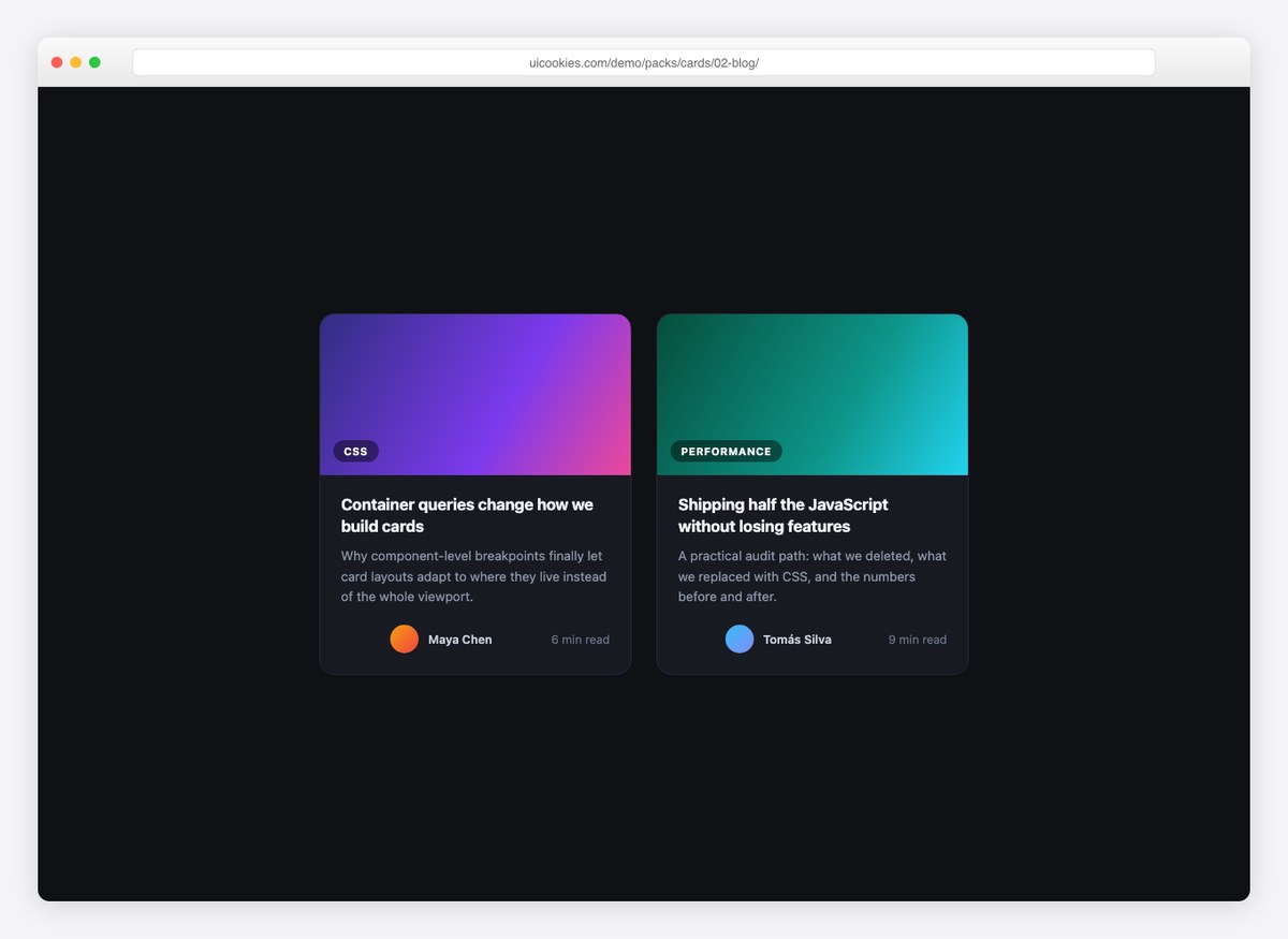
Dark-theme article card with a gradient cover, category chip, excerpt, and author meta. Built for post grids where covers are generated rather than photographic.
Live Demo CSS, Bootstrap & Tailwind code
3. Product Card
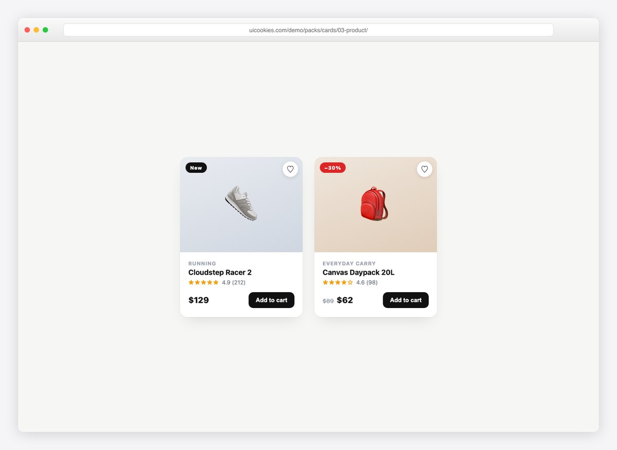
An e-commerce card with everything a listing needs: sale badge, wishlist heart that toggles, star rating with review count, price (including strike-through sale pricing), and an add-to-cart button.
Live Demo CSS, Bootstrap & Tailwind code
4. Pricing Cards
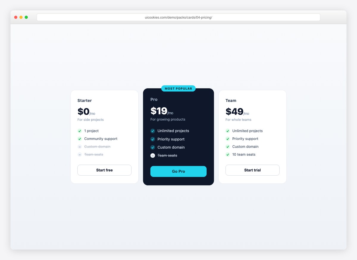
A three-tier pricing row with a scaled-up, dark “most popular” plan. Included and excluded features use checked and struck list items, so plans compare at a glance.
Live Demo CSS, Bootstrap & Tailwind code
5. Flip Card
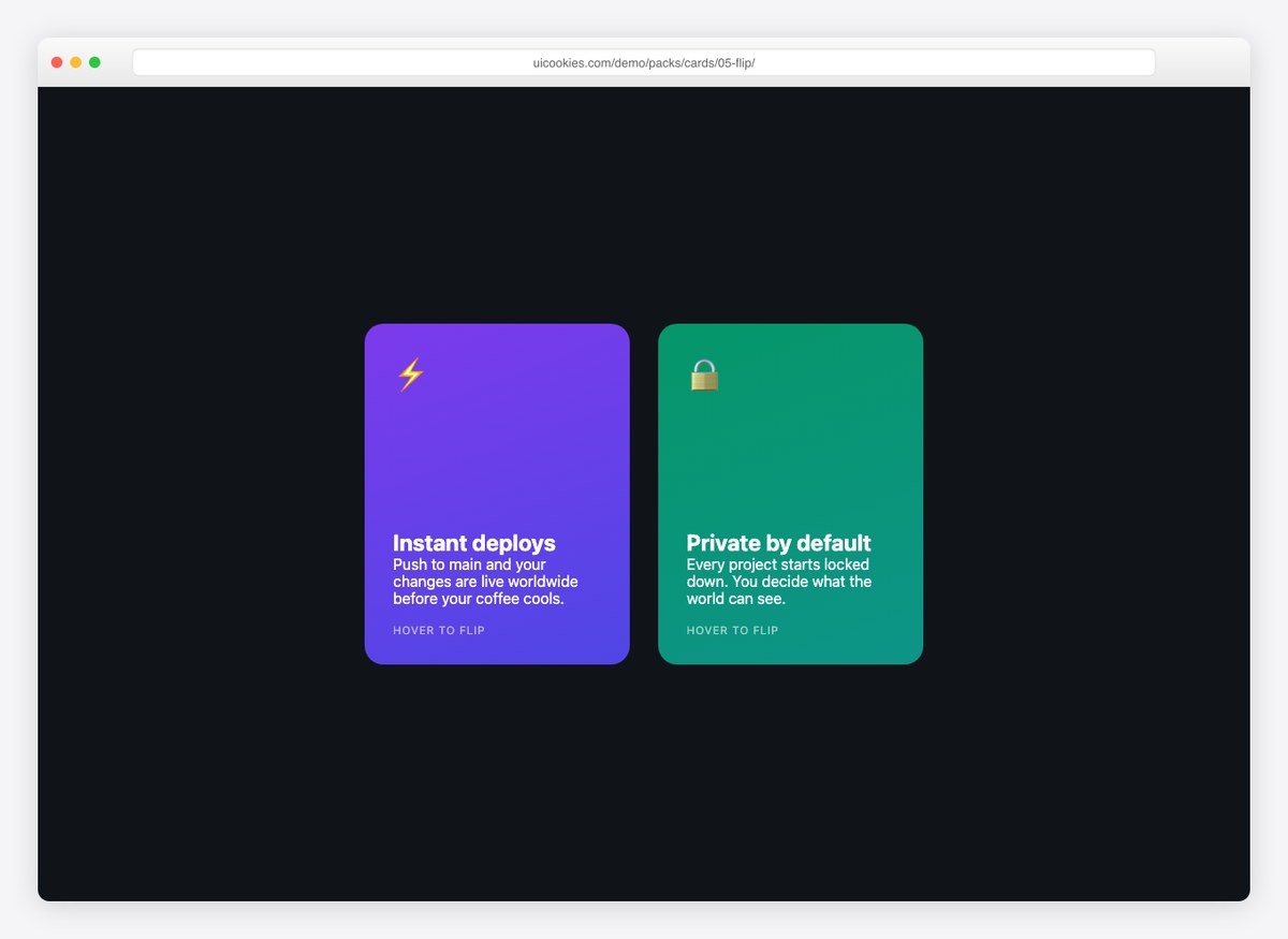
The classic CSS 3D card flip, done accessibly: it flips on hover and on keyboard focus. Gradient front for the pitch, dark back for the feature list and call-to-action.
Live Demo CSS, Bootstrap & Tailwind code
6. Glass Card
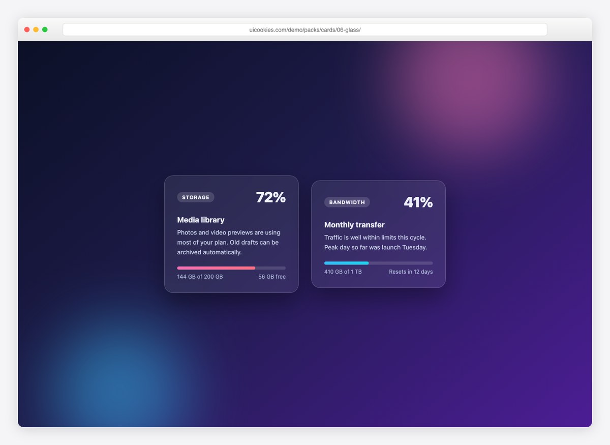
A frosted-glass usage card with progress bars, floating over color orbs. Pure CSS backdrop filters — a design that looks expensive and costs nothing.
Live Demo CSS, Bootstrap & Tailwind code
7. Stat Cards
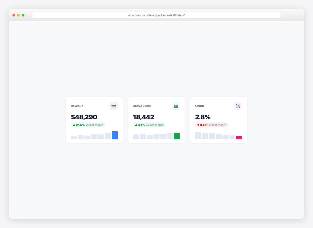
Dashboard KPI cards with the number, a delta chip (up/down), and a pure-CSS sparkline. Drop a row of these above any admin table and the page reads like a product.
Live Demo CSS, Bootstrap & Tailwind code
8. Testimonial Card
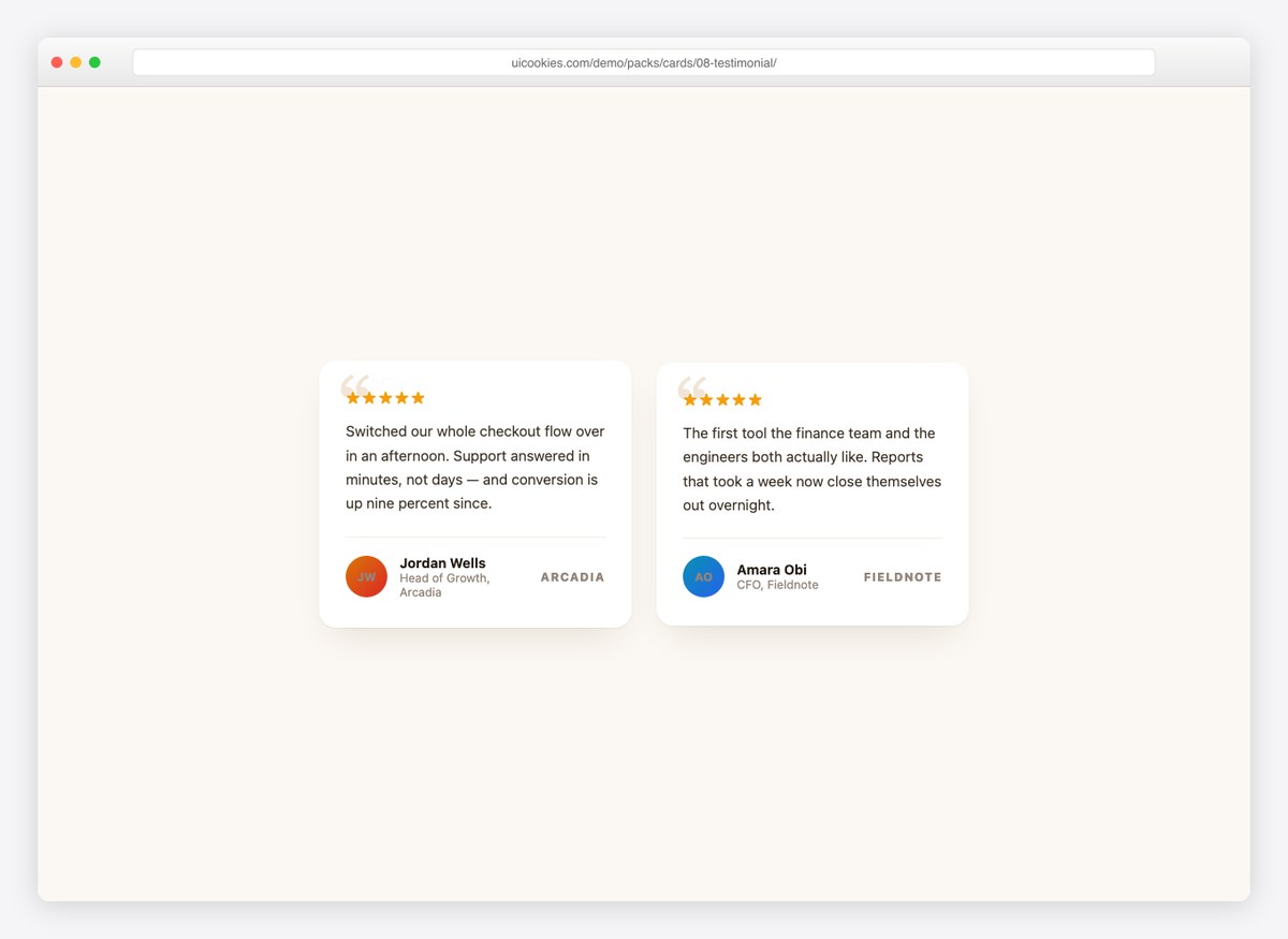
A review card with an oversized serif quote mark, star row, and attribution footer with avatar and company. Warm palette that fits marketing pages.
Live Demo CSS, Bootstrap & Tailwind code
9. Hover Reveal Card
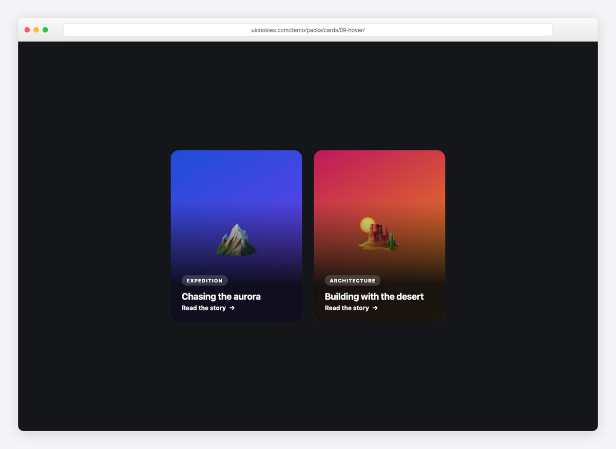
A full-image card whose description slides up from the bottom on hover, while the background photo gently zooms. The whole card is a link — right for editorial and portfolio grids.
Live Demo CSS, Bootstrap & Tailwind code
10. Horizontal Card
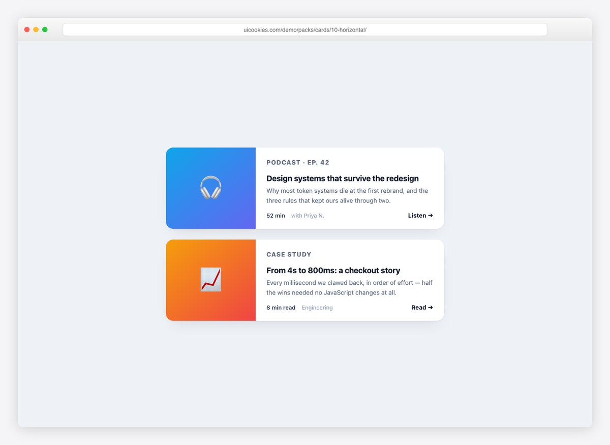
Media-left, content-right — the layout lists and search results want. Stacks vertically below 560px, so it stays readable on phones without extra work.
Live Demo CSS, Bootstrap & Tailwind code
Cards for real product screens
These nine are the card types that get built by hand on every project because no collection includes them.
11. Event Card

The date as a block rather than a line of text, which is what lets an events list be scanned rather than read. Venue, time and seats remaining sit underneath, with an attendee stack and the action in the footer.
Live Demo CSS, Bootstrap & Tailwind code
12. Notification Cards

One card in three severities — informational, success and warning — differing by a left rule, an icon wash and nothing else. The dismiss control is a real <button> with a name, not a bare × glyph, so it survives a keyboard and a screen reader.
Live Demo CSS, Bootstrap & Tailwind code
13. File Upload Cards

A file list is never all one state, so this is all three: uploading with a progress bar and time remaining, complete, and failed with the reason and a retry. The file-type flag is drawn in CSS, so there are no icon assets to ship.
Live Demo CSS, Bootstrap & Tailwind code
14. Course Progress Card

The progress ring is a single conic-gradient driven by one custom property — no SVG, no canvas, no library. Change --p and the ring follows. Lesson count, duration and the next lesson are named rather than implied.
Live Demo CSS, Bootstrap & Tailwind code
15. Job Listing Card

Salary band and location type promoted above the description, because those are the two things a candidate filters on and most job cards bury them. The save control is a button, not a link, since it changes state rather than navigating.
Live Demo CSS, Bootstrap & Tailwind code
16. Weather Card

Current conditions and a five-day strip, drawn entirely in CSS and inline SVG — the sky is a gradient, the sun and cloud marks are paths. Nothing is fetched, so the card works offline in a prototype.
Live Demo CSS, Bootstrap & Tailwind code
17. Media Player Card

A now-playing card whose scrubber is a real <input type="range">, so it is operable with arrow keys for free. Album art is a gradient rather than an image, and every transport control carries an accessible name.
Live Demo CSS, Bootstrap & Tailwind code
18. Invoice and Receipt Card

Line items, a totals block and a paid stamp. The amounts use font-variant-numeric: tabular-nums, which is the difference between a totals column that lines up and one that wobbles as the digits change.
Live Demo CSS, Bootstrap & Tailwind code
19. Task and Kanban Cards

Board cards with label chips, a checklist counter, assignee avatars and a due date that turns red once it is past. That last state change is small and does most of the work in making a board readable at a glance.
Live Demo CSS, Bootstrap & Tailwind code
Three cards worth knowing for how they behave
The last three are here for a technique rather than a look — each one solves a problem that comes up long after the visual design is settled.
20. Expanding Card

A card that expands in place with no JavaScript at all: a native <details> wrapped in the grid-template-rows: 0fr → 1fr trick. It animates to automatic height, which is the one thing the old max-height hack never managed.
Live Demo CSS, Bootstrap & Tailwind code
21. Skeleton Loading Card

The loading placeholder shown next to the card it stands in for, so the two can be checked against each other. Under prefers-reduced-motion the shimmer slows rather than stopping — a frozen skeleton reads as a hung page, which is worse than the motion was.
Live Demo CSS, Bootstrap & Tailwind code
22. Bento Grid Cards

The bento layout: cards of deliberately unequal size in one grid. Using grid-template-areas rather than span counts means the arrangement is legible in the CSS and the mobile stack is a three-line override.
Live Demo CSS, Bootstrap & Tailwind code
The anatomy of a card
Strip away the styling and almost every card in this pack is the same four parts, in the same order:
- A media or identity slot — image, avatar, icon, date block or nothing at all. It is what makes the card recognisable before it is read.
- A heading that names the one thing this card is about. If a card needs two headings, it is two cards.
- Supporting detail — an excerpt, a set of metadata rows, a price. Two or three lines. A card that needs a paragraph is a page.
- A footer holding the action and the low-priority metadata, separated from the body by a rule or a change of background so the eye can skip it.
The failure mode is always the same: a card that tries to carry everything. If you cannot say in one sentence what a card is of, the design will not save it.
Bootstrap cards, and what changed in Bootstrap 5
Bootstrap’s card is deliberately thin — .card gives you a bordered, rounded box and .card-body gives it padding. Everything else is yours. That is why these designs drop in cleanly: keep Bootstrap’s outer shell and paste the inner markup and rules inside it.
Three things that catch people out moving from Bootstrap 4:
.card-deckis gone. Bootstrap 5 removed it in favour of the grid. Use<div class="row row-cols-1 row-cols-md-3 g-4">with each card in a<div class="col">, and addh-100to the card so a row keeps equal heights..card-columnsis gone too. The masonry effect is now a documented CSS-columns snippet rather than a component.- The utility names moved.
ml-*andmr-*becamems-*andme-*, andtext-leftandtext-rightbecametext-startandtext-end— the change that makes right-to-left layouts work.
If you are not on Bootstrap at all, none of this applies: every design here stands on its own class names.
Card grids that keep their shape
Most broken card layouts are the grid’s fault rather than the card’s. Two rules cover nearly all of it.
Let the grid do the columns. One line handles every breakpoint without a media query:
.cards {
  display: grid;
  grid-template-columns: repeat(auto-fit, minmax(260px, 1fr));
  gap: 20px;
}
Cards in a row then share the tallest height automatically, which is the whole reason .card-deck stopped being necessary.
Push the footer down. If the card body varies in length, the actions drift. Make the card a column flex container and give the footer margin-top: auto — the footers then line up across the row no matter how the text falls.
Making a whole card clickable, properly
The obvious approach — wrapping the entire card in an <a> — creates one link whose accessible name is every word in the card read aloud, and it makes the text impossible to select. The standard fix keeps the link on the heading and stretches it:
.card { position: relative; }
.card h3 a::after {
  content: "";
  position: absolute;
  inset: 0;
}
The link’s name stays the heading, the whole card is still the hit area, and any other control inside the card keeps working if you give it position: relative; z-index: 1. Add :focus-within styling to the card so keyboard users see the same highlight a mouse hover gives.
Performance and hover effects
Card grids are where hover effects get expensive, because there are twenty of them on screen. Two habits keep it cheap:
- Animate
transformandopacity, nothing else. Every card here lifts withtranslateYrather than by changingtopormargin, which would force a layout pass on each frame. - Do not leave
will-changeon. Setting it permanently on every card hands the compositor twenty layers to hold whether or not anyone hovers. Leave it off; the transform is already cheap.
If a grid is long, content-visibility: auto with a contain-intrinsic-size hint lets the browser skip rendering the cards below the fold. On a hundred-card page that is a measurable difference; on a dozen it is not worth the complexity.
Using the cards in your project
Download the pack, open the folder for the design you want, and copy its markup along with the rules from the <style> block. Each design is self-contained — nothing depends on the other 21 or on a shared stylesheet. Rename the classes if they collide with something you already load, and the card is yours.
Frequently asked questions
Are these card templates free?
Yes. All 22 are free for personal and commercial projects, including client work. No attribution is required.
Do the cards work with Bootstrap?
Yes. They are plain HTML and CSS on their own class names, so they sit alongside Bootstrap without fighting it. If you would rather use Bootstrap’s own card, keep the outer .card and .card-body and copy in the inner markup and rules — the section on Bootstrap 5 below explains what changed.
Do I need JavaScript for these cards?
Twenty-one of the 22 are pure CSS, the expanding card included — it uses a native <details> element. Nothing in the pack loads a library.
Is there a CSS card flip example included?
Yes, design 5. It uses transform-style: preserve-3d with a rotation on hover and focus, so it also flips for keyboard users rather than only for a mouse.
How do I make all the cards in a row the same height?
Use a grid — display: grid; grid-template-columns: repeat(auto-fit, minmax(260px, 1fr)) — and every card in a row matches the tallest automatically. Bootstrap 5 removed .card-deck precisely because the grid does this better.
Should the whole card be a link?
Not by wrapping everything in an <a>. That produces one enormous link with an unreadable accessible name, and it makes the text unselectable. Put the link on the heading and stretch it over the card with a pseudo-element — the section on this below has the four lines.
Can I use these in a template I sell?
You can use them in client work and in products you sell. What you cannot do is repackage the pack itself as a template pack for redistribution.
Do the cards work in dark mode?
Four of them are designed dark (weather, media player, and the dark panels in the blog and bento sets). For the rest, the fastest route is to move the colours into custom properties on :root and redefine them under prefers-color-scheme, which is how design 22 in the login pack is built.
Download all 22 card templates (free) Browse live demos