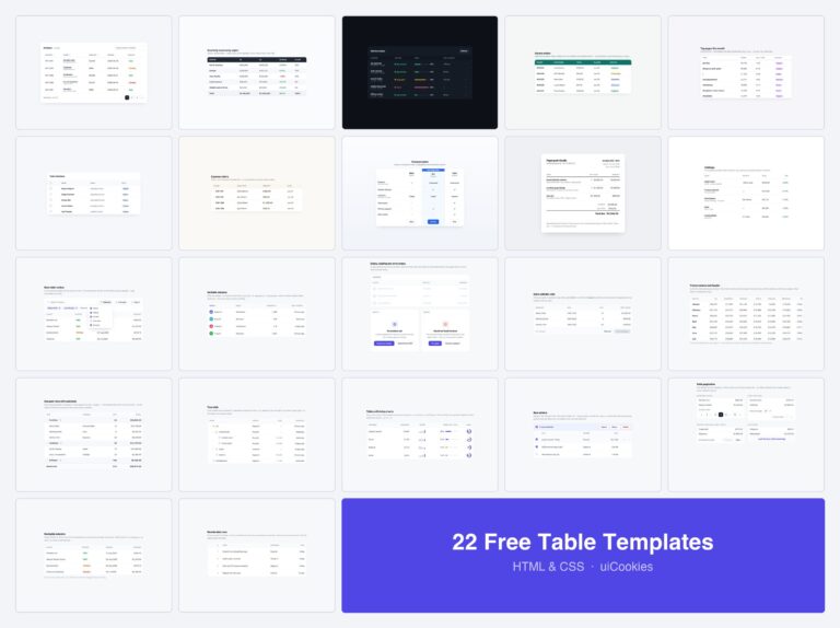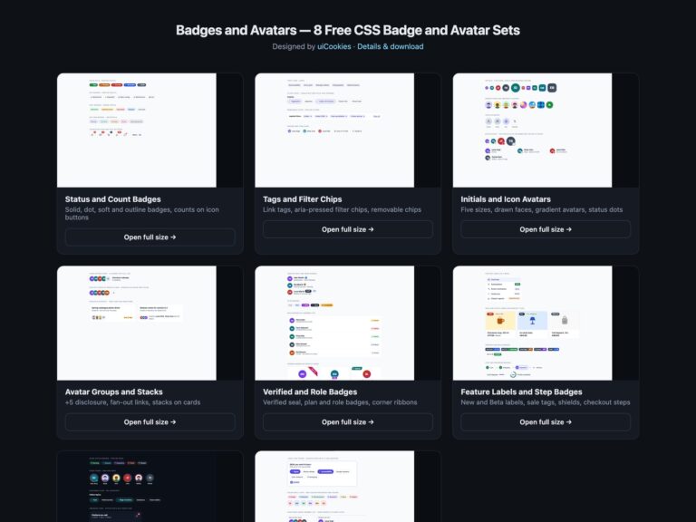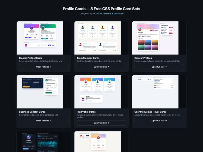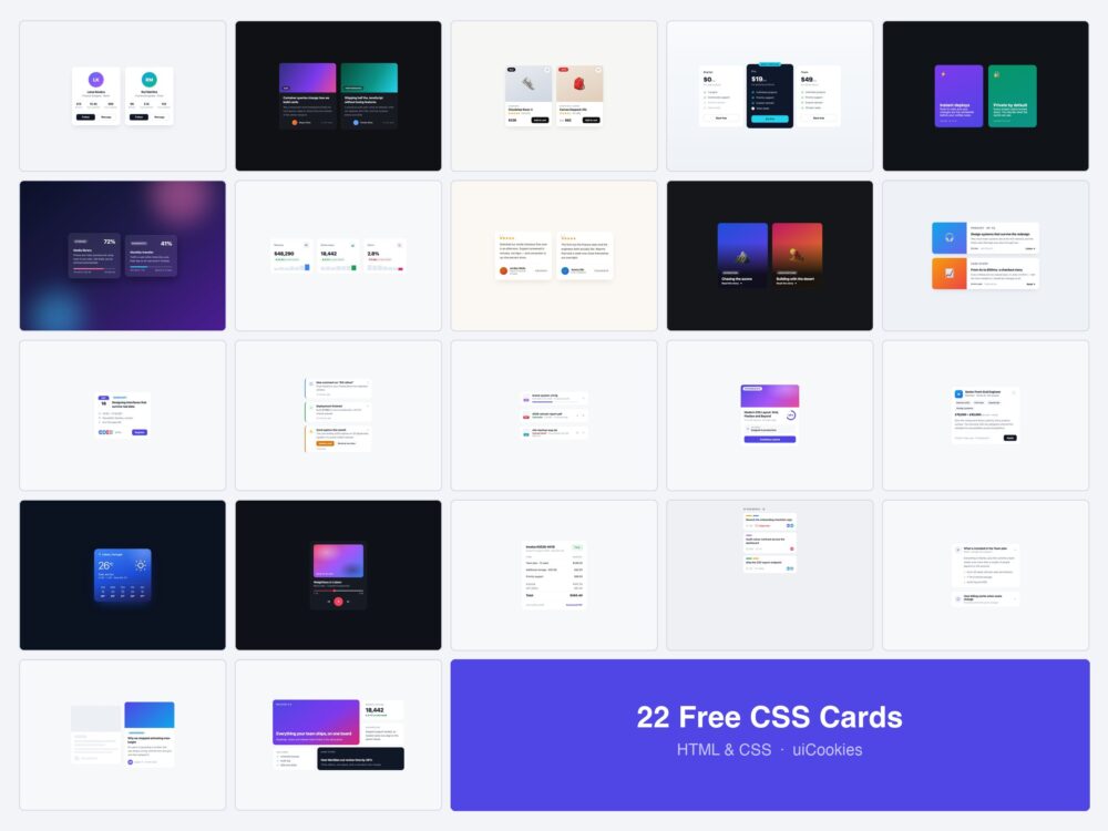
These 22 Bootstrap cards and CSS card examples cover people, articles, products, pricing and application tasks. Choose by the content and actions a card needs, then compare the live example before copying its source.
Each set includes plain CSS, Bootstrap 5 and Tailwind variants; selected examples also include React. A Bootstrap version uses Bootstrap classes plus its listed custom styles. The plain CSS version is a separate self-contained starting point, so you can choose a framework without rebuilding the design yourself.
Copy individual component code without an email. Confirm your email for a complete ZIP; newsletter signup is optional. Original code is free for personal and commercial projects under the uiCookies license.
Which card layout should you choose?
| Example | Use it for | Design consideration |
|---|---|---|
| Profile Cards with Stats | A team member, author or account | Name, role and separate profile actions |
| Dark Blog Post Cards | An article or resource listing | One clear destination for the story |
| Product Cards with Wishlist | A product preview | Keep wishlist and cart actions separate from the product link |
| Three-Tier Pricing Cards | A plan comparison | Readable inclusions and exclusions; demo buttons do not take payments |
| Kanban Task Cards | A task or work item | Labels, due dates and checklist progress |
| Skeleton Loading Card | Content waiting on a request | Reserve space, then replace the skeleton with real content |
All 22 card examples
Profile Cards with Stats
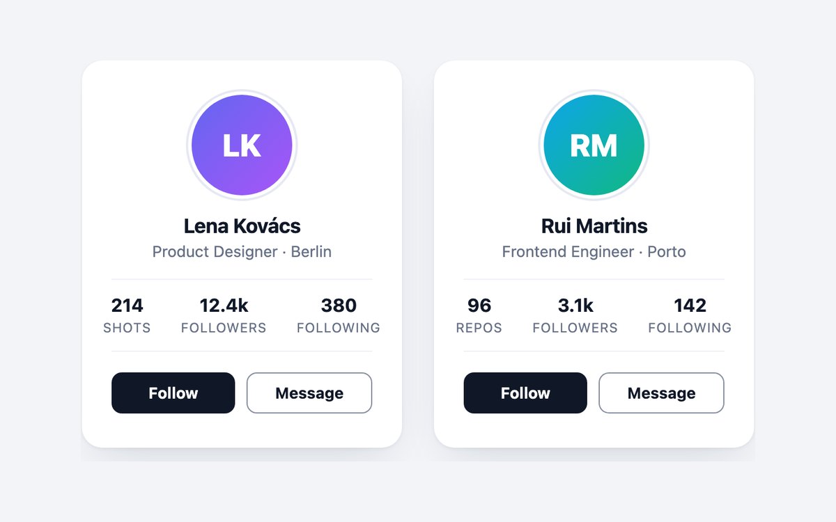
- Gradient initials avatar with an outer ring drawn by ::after
- Three stats in a bordered row, marked up as a list
- Follow and Message buttons named per person with visually hidden text
Code and setup · Live CSS demo CSS, Bootstrap & Tailwind code · Bootstrap code · Tailwind code · React code
Dark Blog Post Cards
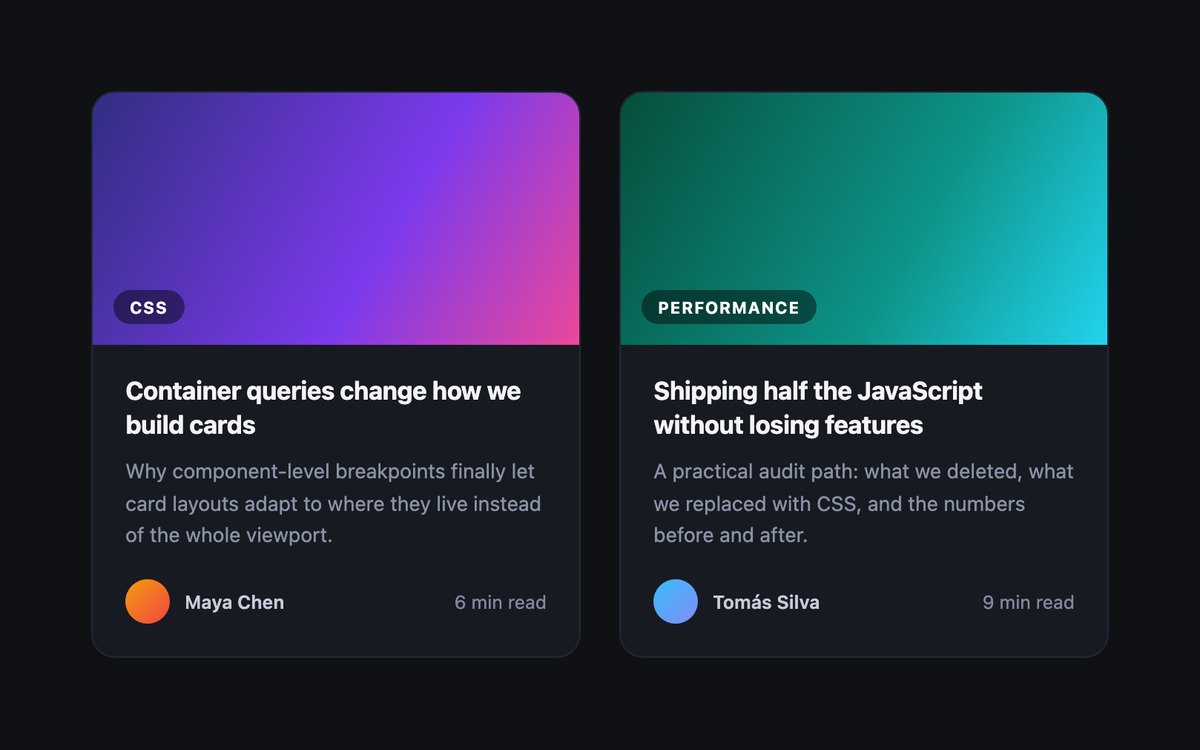
- Stretched title link makes the whole card clickable with one link target
- Focus ring drawn around the whole card while the link is focused
- Frosted category chip over a gradient cover
Code and setup · Live CSS demo CSS, Bootstrap & Tailwind code · Bootstrap code · Tailwind code · React code
Product Cards with Wishlist
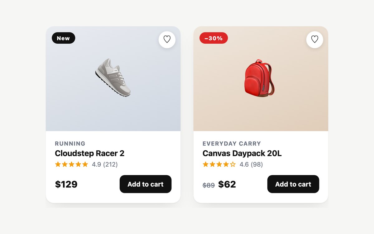
- Product name as a stretched link with the buttons layered above it
- Wishlist heart toggle that uses aria-pressed
- New and sale badges, struck-through old price read out as Was and now
Code and setup · Live CSS demo CSS, Bootstrap & Tailwind code · Bootstrap code · Tailwind code · React code
Three-Tier Pricing Cards
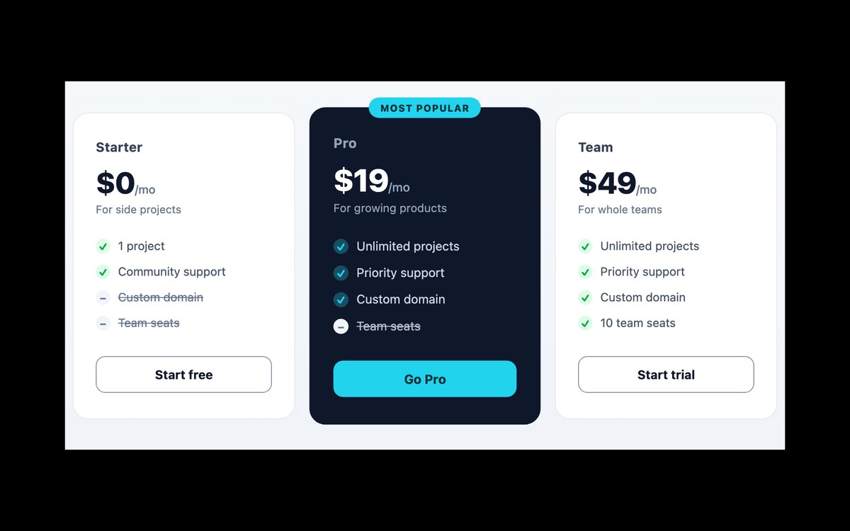
- Three plans with a dark, enlarged featured plan and a Most popular pill
- Tick and dash markers as CSS glyphs with empty alt text
- Excluded features announced with hidden Not included text
Code and setup · Live CSS demo CSS, Bootstrap & Tailwind code · Bootstrap code · Tailwind code · React code
3D Flip Cards
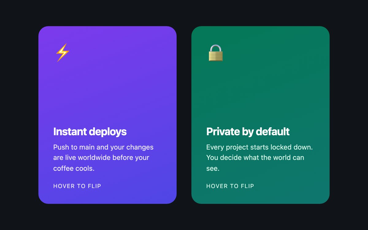
- CSS-only 3D flip with perspective, preserve-3d and backface-visibility
- Flips on hover and when keyboard focus reaches the link on the back
- Both faces readable by screen readers in source order
Code and setup · Live CSS demo CSS, Bootstrap & Tailwind code · Bootstrap code · Tailwind code · React code
Glassmorphism Usage Cards
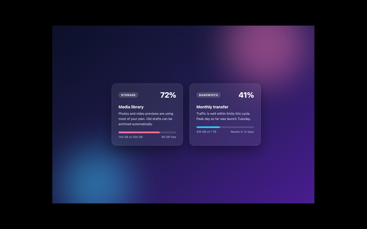
- Frosted glass panel using backdrop-filter blur
- Usage bar exposed as a meter with label and value text
- Category pill, large percentage and used and remaining figures
Code and setup · Live CSS demo CSS, Bootstrap & Tailwind code · Bootstrap code · Tailwind code · React code
KPI Stat Cards with Sparklines
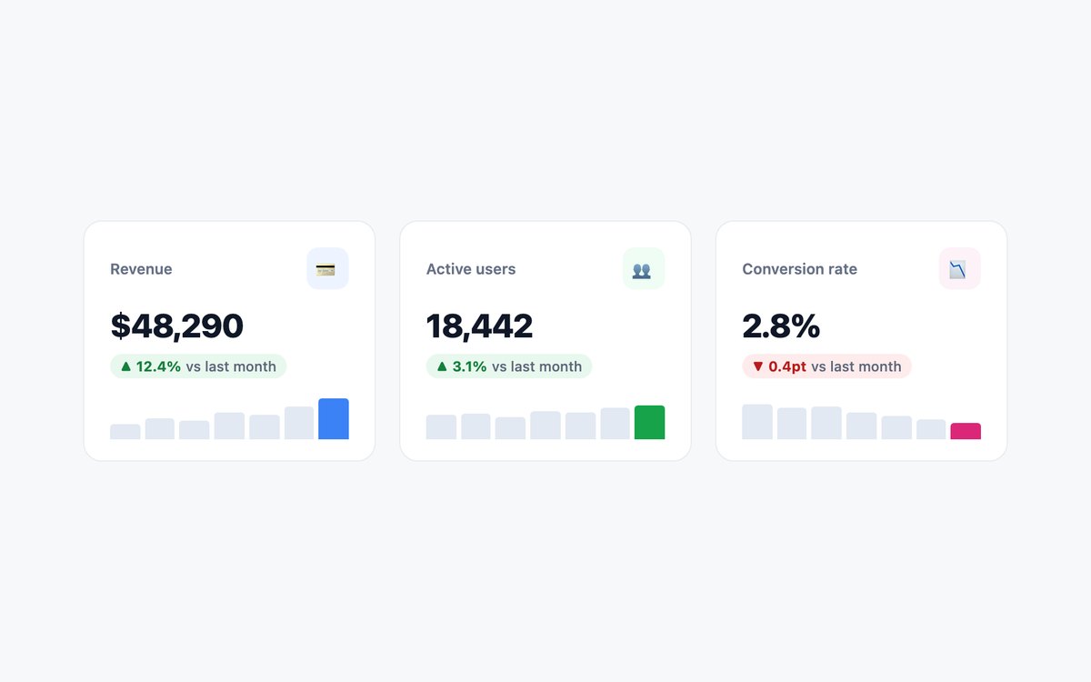
- Sparkline built from plain elements with percentage heights
- Accent colour set once through currentColor
- Up and down change pills with screen-reader words in place of arrows
Code and setup · Live CSS demo CSS, Bootstrap & Tailwind code · Bootstrap code · Tailwind code · React code
Testimonial Cards with Ratings
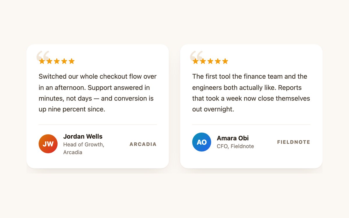
- figure, blockquote and figcaption markup for the quote and attribution
- Star rating announced as Rated 5 out of 5
- Decorative quote mark with empty alt text
Code and setup · Live CSS demo CSS, Bootstrap & Tailwind code · Bootstrap code · Tailwind code · React code
Hover Reveal Overlay Cards
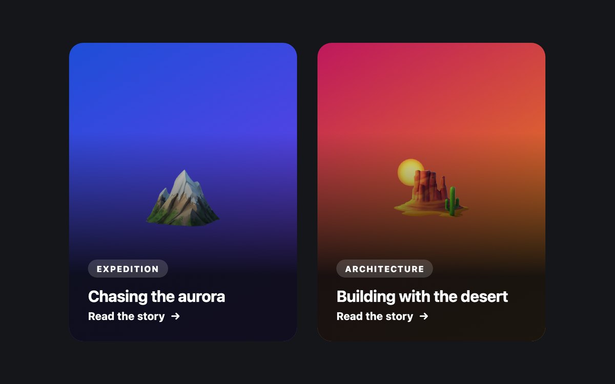
- Stretched title link with the whole card clickable
- Description revealed on hover and on keyboard focus
- Description always visible on touch screens without hover
Code and setup · Live CSS demo CSS, Bootstrap & Tailwind code · Bootstrap code · Tailwind code
Horizontal Media Cards
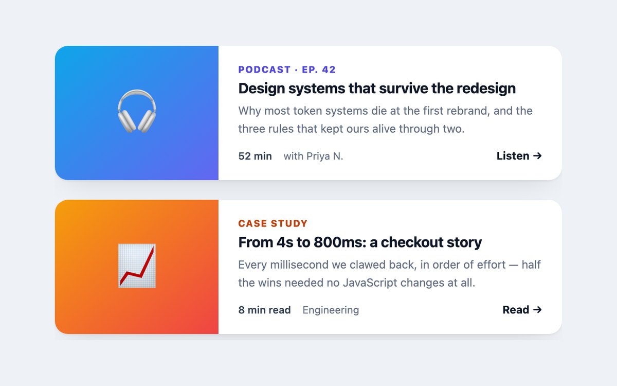
- Side-by-side media and text that stack on narrow screens
- Footer link stretched over the card as its single link target
- Link text completed with the item title for screen readers
Code and setup · Live CSS demo CSS, Bootstrap & Tailwind code · Bootstrap code · Tailwind code
Event Card with Date Block
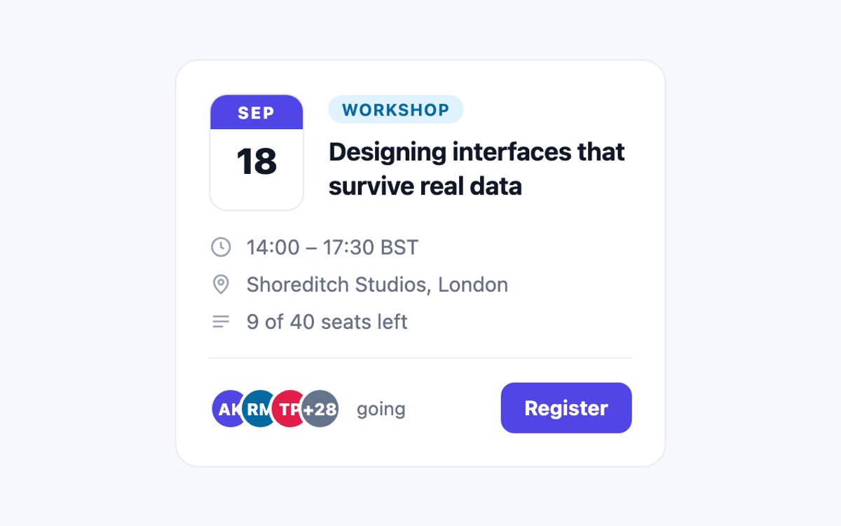
- Calendar date block marked up as a time element
- Time, venue and seats rows with inline SVG icons
- Overlapping attendee avatars with an overflow count
Code and setup · Live CSS demo CSS, Bootstrap & Tailwind code · Bootstrap code · Tailwind code
Notification Cards
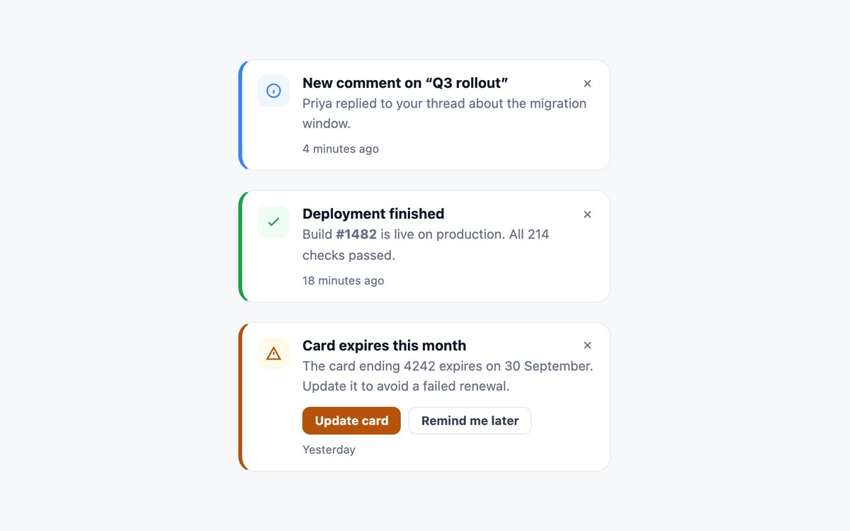
- Info, success and warning variants driven by one –tone variable
- Stretched-link titles on the cards that open something
- Dismiss and action buttons layered above the link
Code and setup · Live CSS demo CSS, Bootstrap & Tailwind code · Bootstrap code · Tailwind code
File Upload Status Cards
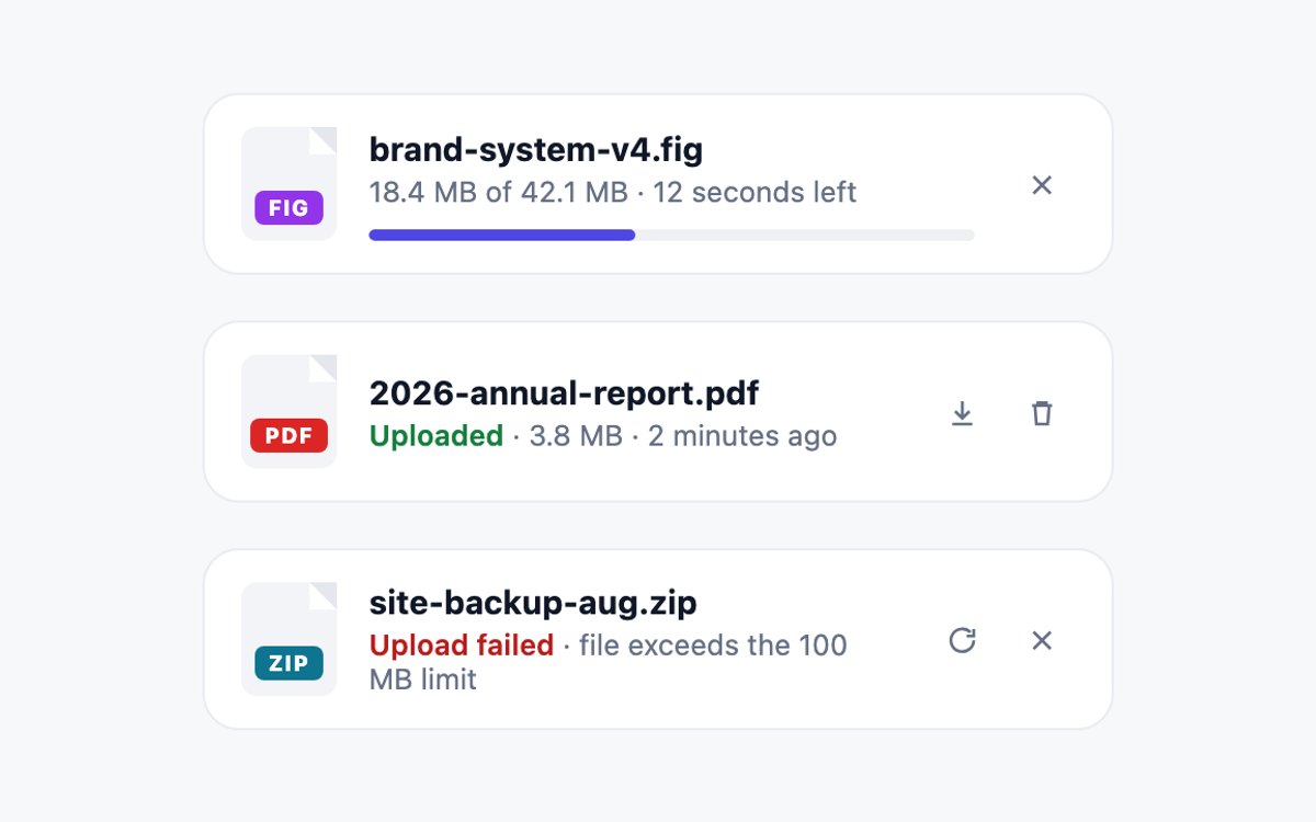
- Uploading, uploaded and failed states in one layout
- File-type badge with a folded corner drawn in CSS
- Progress bar exposed as role="progressbar" with a value
Code and setup · Live CSS demo CSS, Bootstrap & Tailwind code · Bootstrap code · Tailwind code
Course Progress Card
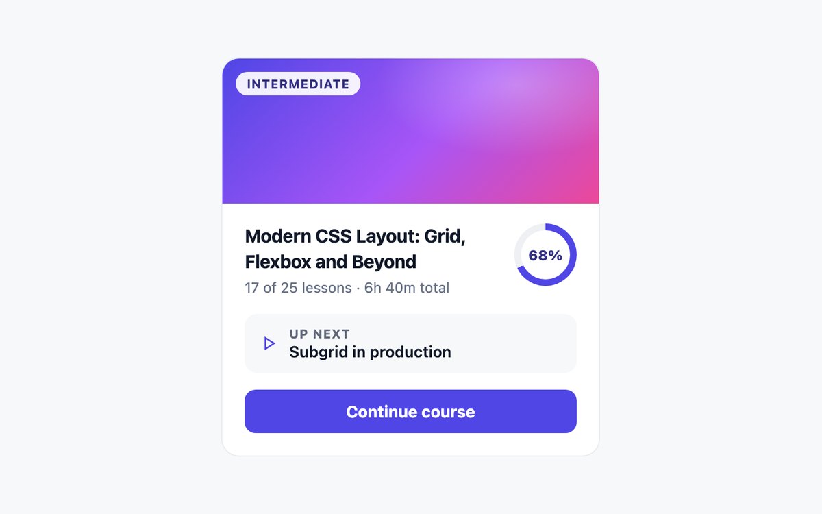
- Conic-gradient progress ring set by one –p variable
- Ring exposed as role="progressbar" with its value
- Whole card clickable through one stretched link
Code and setup · Live CSS demo CSS, Bootstrap & Tailwind code · Bootstrap code · Tailwind code
Job Listing Card
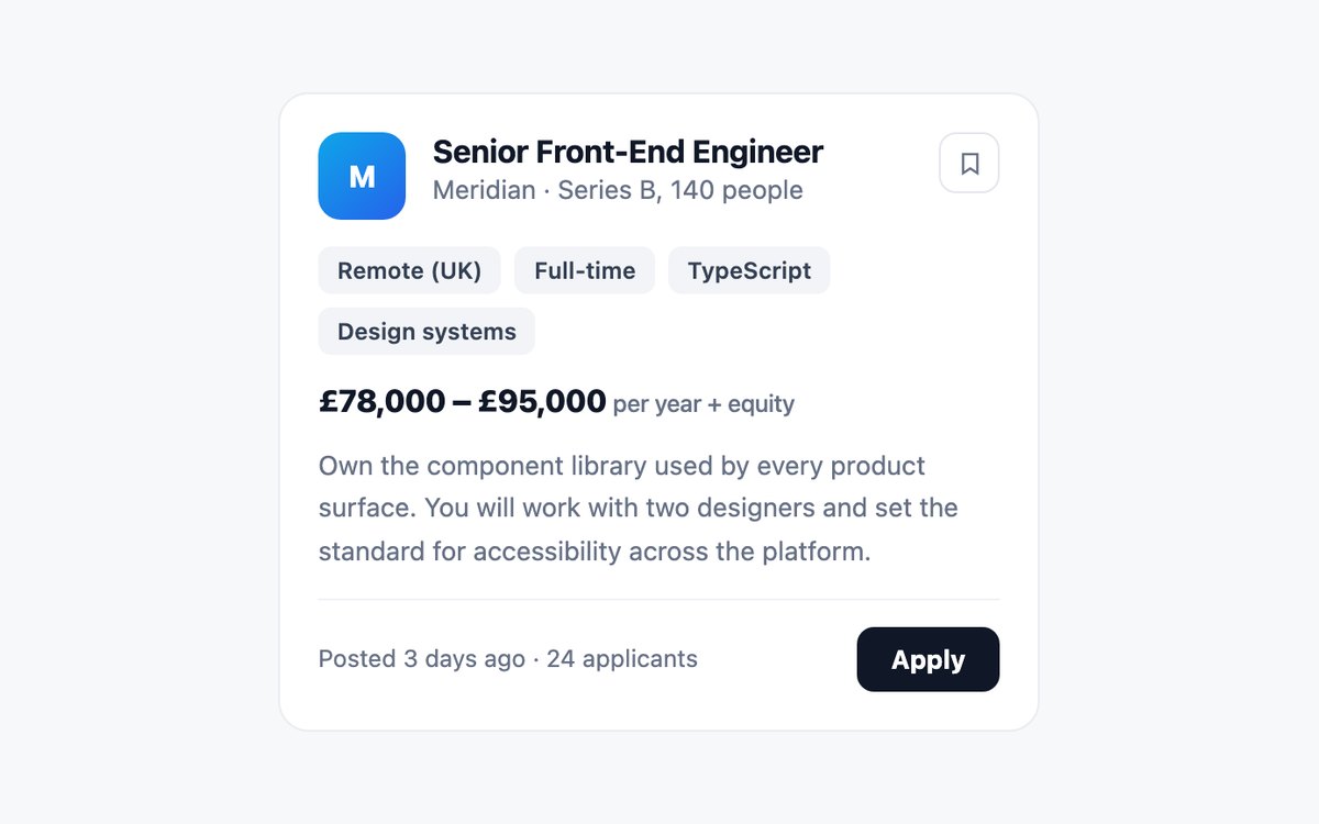
- Whole card opens the posting through a stretched title link
- Save and Apply stay separate targets above the link
- Button names include the job title
Code and setup · Live CSS demo CSS, Bootstrap & Tailwind code · Bootstrap code · Tailwind code
Weather Forecast Card
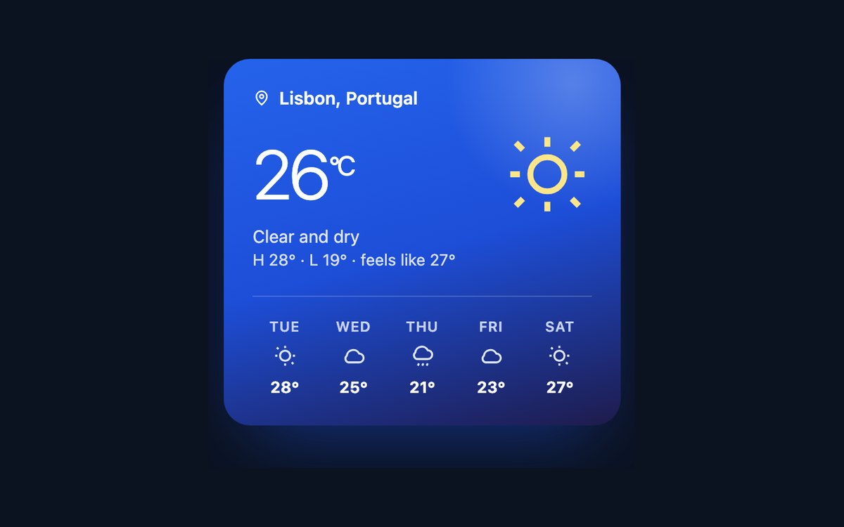
- Current reading, conditions and a five-day strip
- Inline SVG icons and a CSS-only gradient background
- Hidden condition text for each forecast day
Code and setup · Live CSS demo CSS, Bootstrap & Tailwind code · Bootstrap code · Tailwind code
Music Player Card
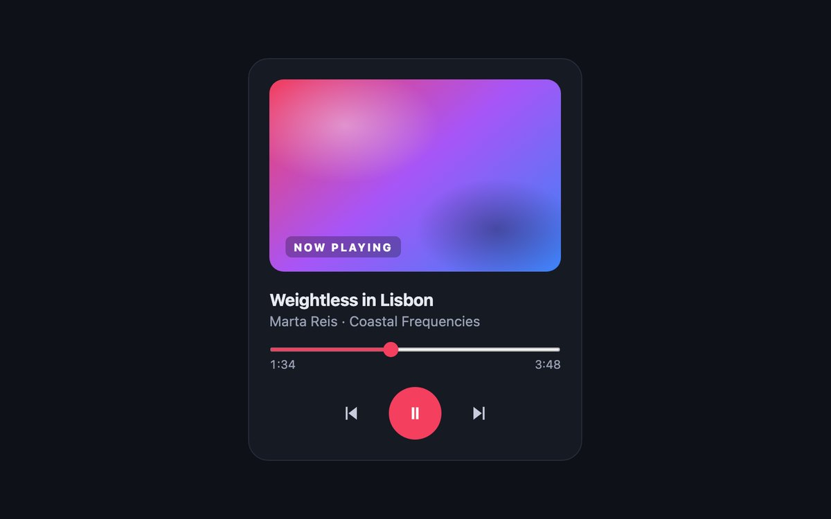
- Seek bar is a native range input with keyboard support
- Elapsed time and aria-valuetext kept in sync by script
- Labelled previous, pause and next buttons
Code and setup · Live CSS demo CSS, Bootstrap & Tailwind code · Bootstrap code · Tailwind code
Invoice Receipt Card
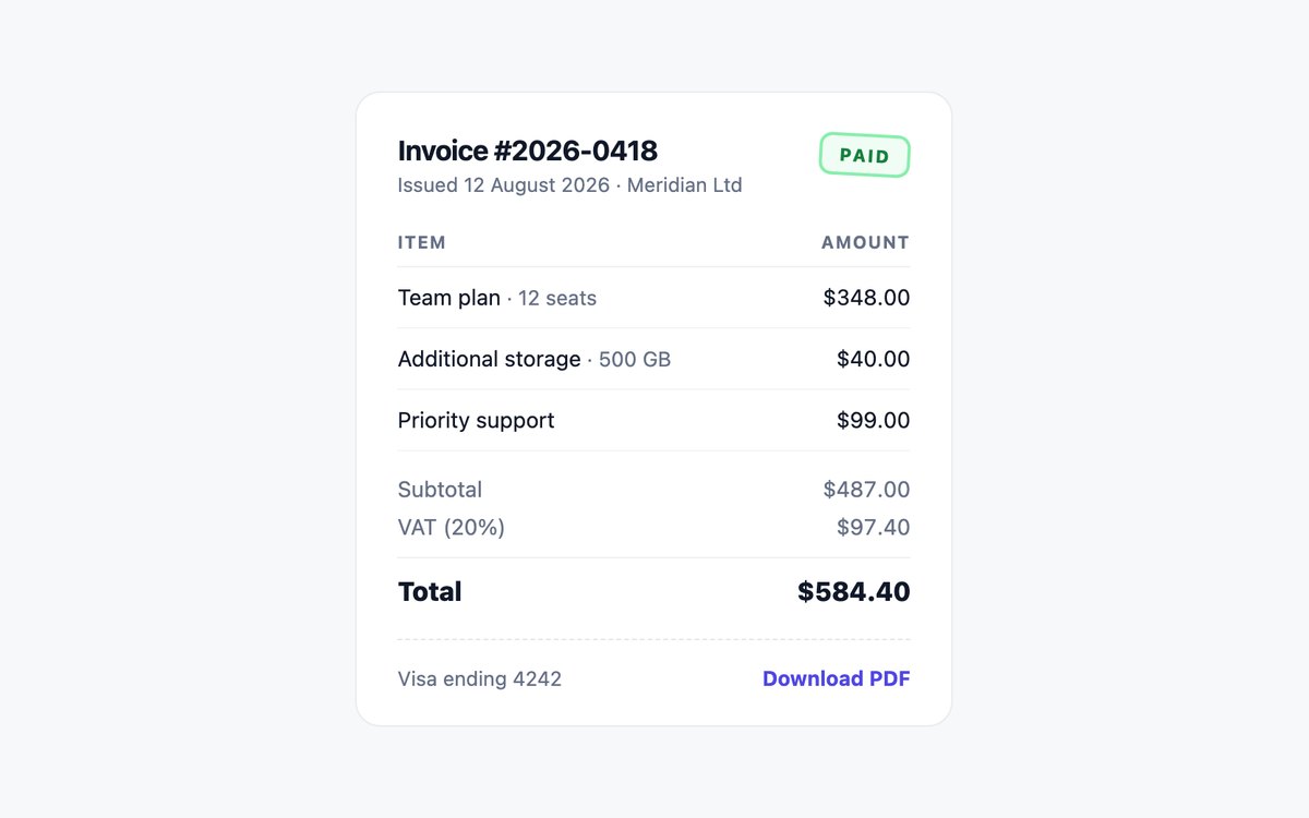
- Line items in a real table with caption and headers
- Totals marked up as a description list
- Tabular figures so amounts align
Code and setup · Live CSS demo CSS, Bootstrap & Tailwind code · Bootstrap code · Tailwind code
Kanban Task Cards
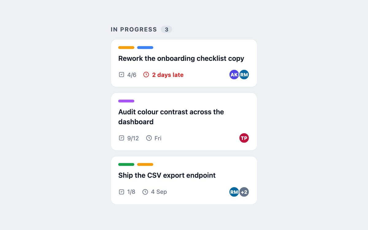
- Label chips, checklist count, due date and assignees
- Overdue state in bold red with a hidden Overdue prefix
- Whole card opens the task through a stretched link
Code and setup · Live CSS demo CSS, Bootstrap & Tailwind code · Bootstrap code · Tailwind code
Expandable Details Cards
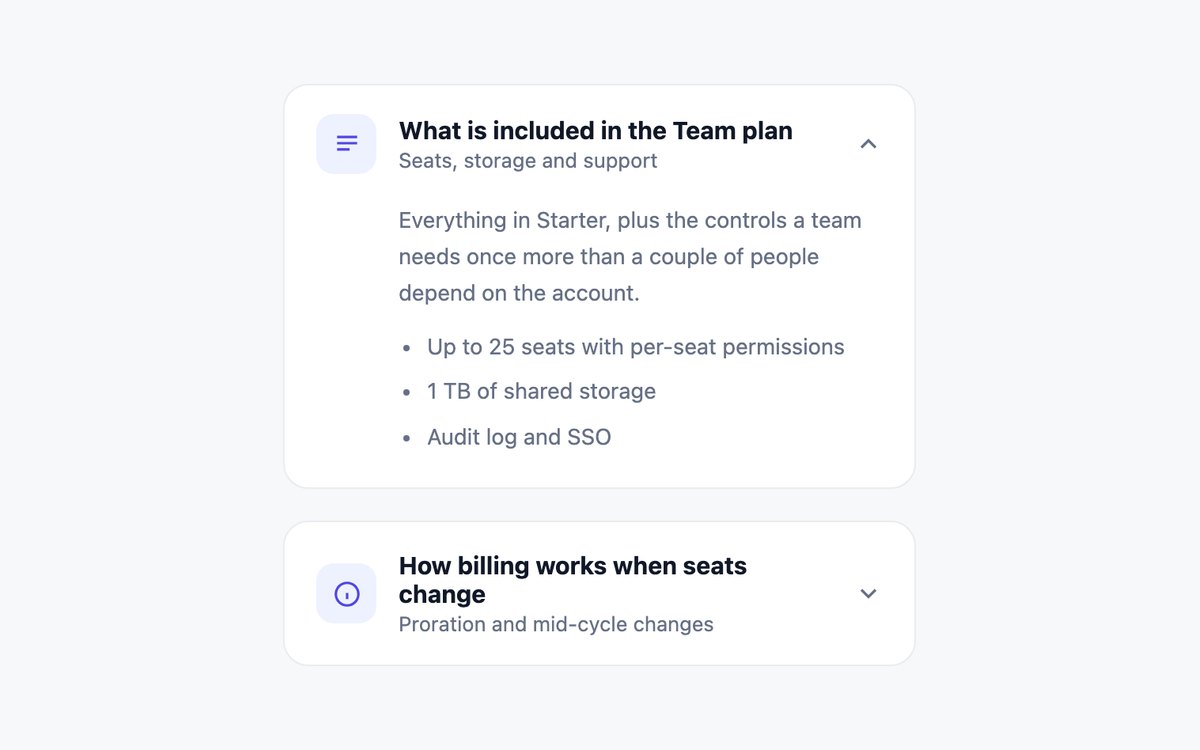
- Native details and summary, no JavaScript
- Grid-rows animation on ::details-content
- Chevron rotates with the open state
Code and setup · Live CSS demo CSS, Bootstrap & Tailwind code · Bootstrap code · Tailwind code
Skeleton Loading Card
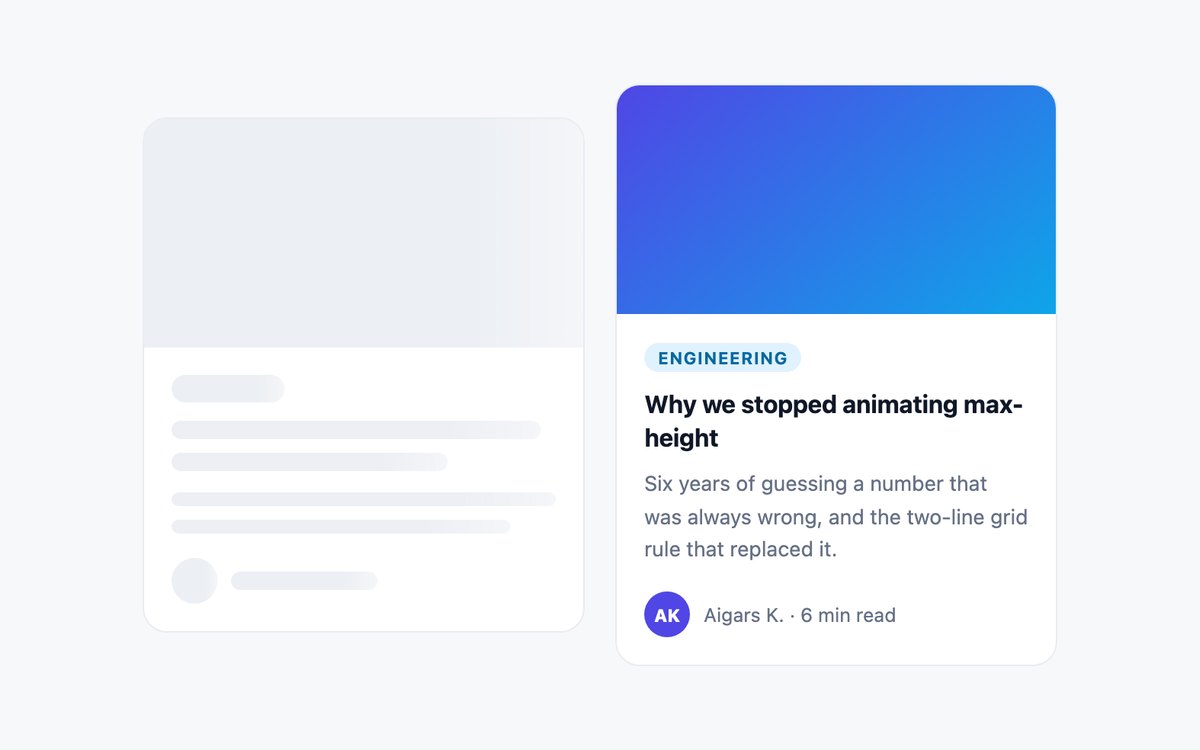
- Skeleton mirrors the loaded card so nothing shifts
- Shimmer removed under prefers-reduced-motion
- aria-busy plus one hidden Loading article status
Code and setup · Live CSS demo CSS, Bootstrap & Tailwind code · Bootstrap code · Tailwind code
Bento Grid Cards
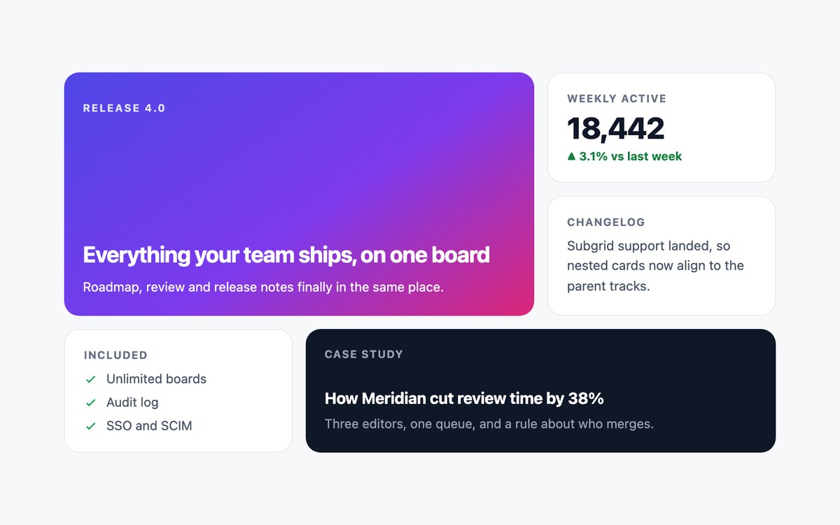
- Named grid areas that rearrange with one property
- Single-column layout on narrow screens
- Bootstrap version built with .row and .col-md-*
Code and setup · Live CSS demo CSS, Bootstrap & Tailwind code · Bootstrap code · Tailwind code
Make card links and actions predictable
A card with one destination can use a title link stretched across the card. Keep additional buttons above that link so saving a product does not also open it. Avoid wrapping interactive controls inside another link. Use a descriptive title, keep keyboard focus visible and give repeated controls names that identify their item.
Hover-revealed content needs a keyboard and touch equivalent. Test the example with a pointer, Tab and Enter, and a phone. Treat decorative transforms as optional; essential prices, labels and actions should remain understandable when motion is reduced.
Handle real application states
- Skeletons should be temporary request states. Replace them after success and provide an error or empty state when content is unavailable.
- A progress card should reflect real progress and expose its value in text or an accessible control. These demos use sample values.
- Wishlist, follow, message, payment and upload controls illustrate frontend behavior. A backend is needed to persist changes, deliver messages or process a transaction.
- Use fictional reviews and ratings only in demos. Replace sample claims with truthful content before deploying a client site.
Build a card grid that survives real content
Test short and long titles, missing images, translated labels and several price lengths. Keep image aspect ratios deliberate and include intrinsic dimensions to reduce layout shifts. A one-column phone layout is often clearer than squeezing two action-heavy cards onto a narrow screen.
Use CSS Grid or the framework’s responsive columns for layout. Equal-height cards should not hide text: place the action area at the end while allowing the content to grow. The bento example is useful for mixed visual weight, while horizontal media cards suit compact lists.
Download all 22 card sets · Compare data table patterns · See complete school portal templates