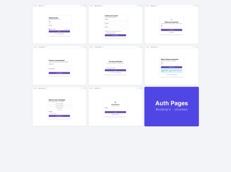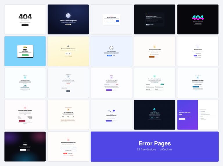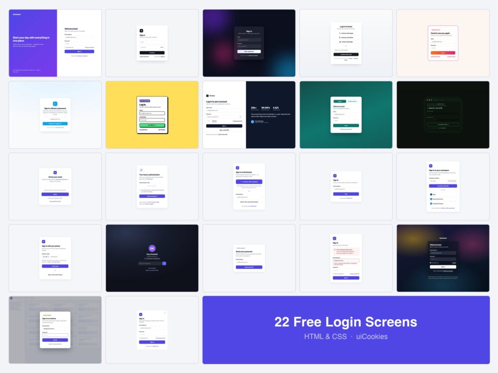
Every login screen on this page was designed and coded in-house by uiCookies — this is our own pack, not a roundup of CodePen embeds. Each design is a single self-contained HTML file: the CSS and any vanilla JavaScript are inline, there are no external libraries or fonts, and nothing needs a build step.
Most login-form collections show you ten versions of the same email-and-password card. The first ten here are exactly that, and they are good ones. The other twelve are the rest of the flow — the one-time code screen, the two-factor step, the passkey prompt, the SSO field, the lock screen, the reset request, and the error states — because those are the screens you end up building by hand at 11pm after the pretty one is finished.
Download all 22 (free) Browse live demos
Which screen do you need?
Pick by the situation rather than by the look — the skin is the easy part to change later.
| If this is you | Start with |
|---|---|
| You are building a normal product login | Split Screen (1) or Minimal Card (2) |
| Most people sign in with Google or GitHub | Social-First (4) |
| You do not want to store passwords at all | Magic Link (6) plus One-Time Code (11) |
| You sell to companies with their own IdP | Enterprise SSO (15) |
| You are rolling out passkeys | Passkey Sign-In (13) with Identifier-First (14) |
| You have 2FA switched on | Two-Factor (12) |
| Sessions expire while people are working | Session Lock (17) or Modal (21) |
| Your signups come from a phone, not a laptop | Phone Number (16) |
| You need the error and reset states too | Error States (19) and Password Reset (18) |
Email and password screens
Ten takes on the form everybody still needs. All of them are responsive, label every field, and carry the autocomplete attributes that make password managers behave.
1. Split Screen Login
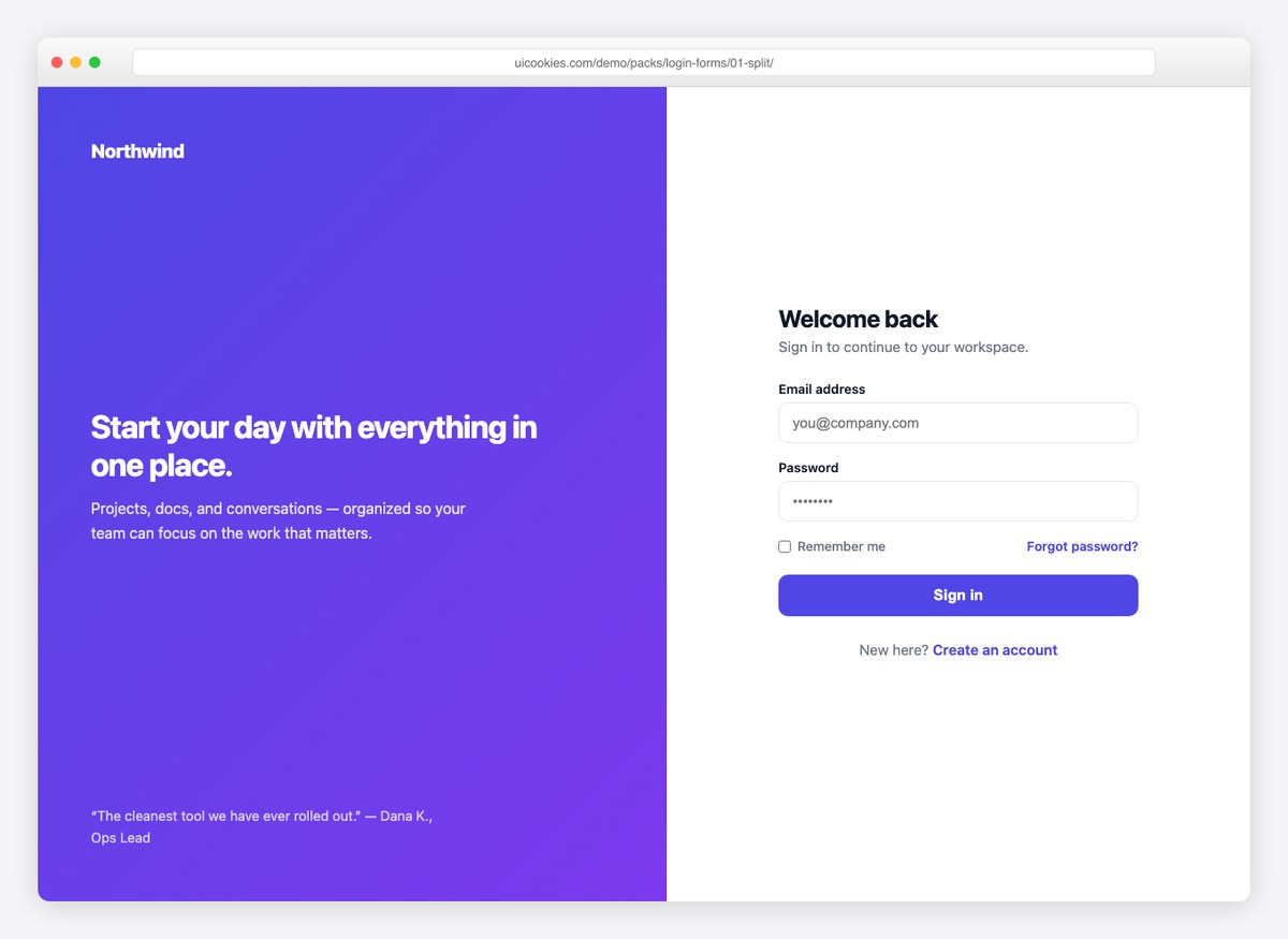
The classic SaaS pattern: a gradient brand panel with product messaging on the left, a focused sign-in form on the right. The panel collapses away on mobile so the form always comes first. A safe, professional default for any product login.
Live Demo CSS, Bootstrap & Tailwind code
2. Minimal Card with Floating Labels
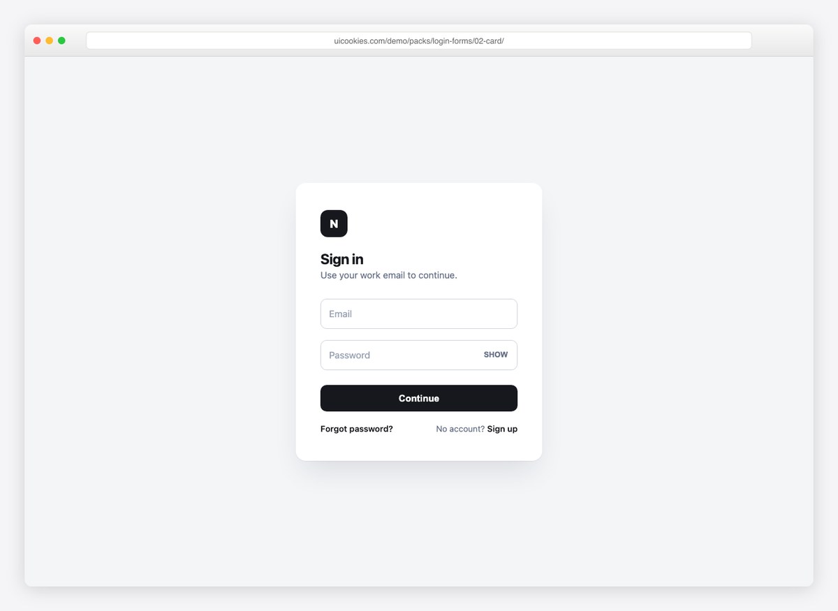
A single white card with floating labels that lift as you type, plus a show/hide password toggle. This is the design to reach for when the login should disappear into the product rather than make a statement.
Live Demo CSS, Bootstrap & Tailwind code
3. Glassmorphism Login
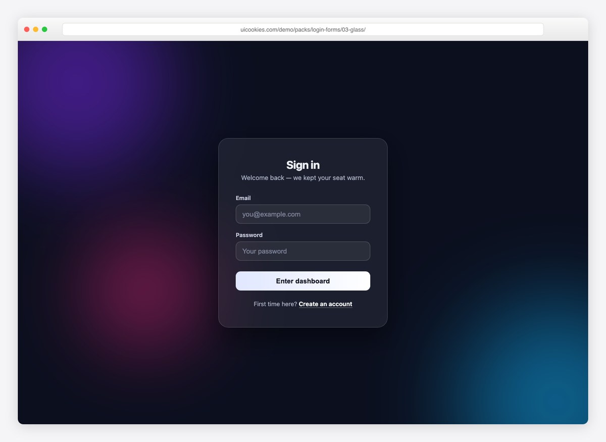
A frosted-glass card floating over slowly drifting gradient blobs. The blur and translucency come from plain CSS backdrop filters — no images, no canvas — so the whole effect costs a few kilobytes.
Live Demo CSS, Bootstrap & Tailwind code
4. Social-First Login
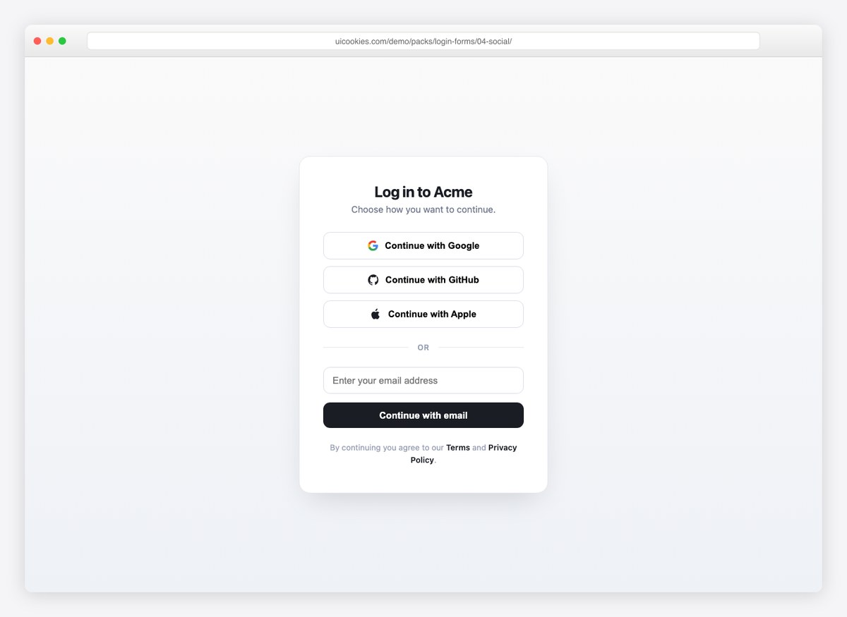
Google, GitHub, and Apple buttons lead, with an email fallback below the divider. Use it when most of your signups come through OAuth and the email path is the exception, not the rule.
Live Demo CSS, Bootstrap & Tailwind code
5. Animated Gradient Border
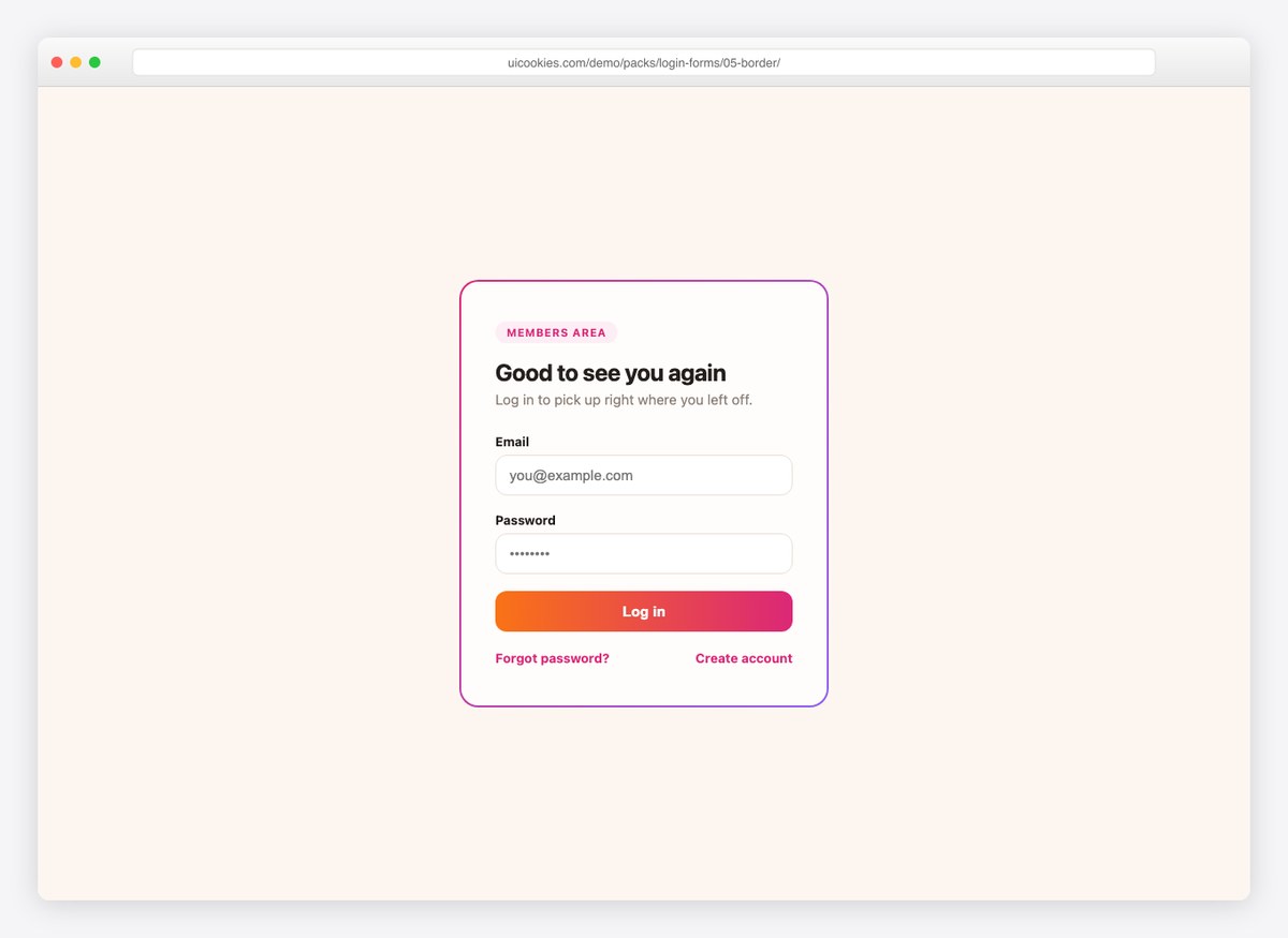
A warm card wrapped in a continuously rotating gradient border, done with an animated background rather than JavaScript. Distinctive without being loud — good for membership sites and communities.
Live Demo CSS, Bootstrap & Tailwind code
6. Passwordless Magic Link
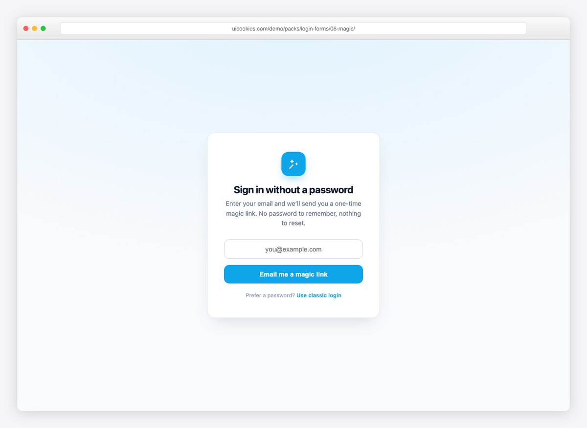
One email field, one button, and a built-in success state that confirms where the link went. If your product signs users in by email link, this ships the entire front-end of that flow.
Live Demo CSS, Bootstrap & Tailwind code
7. Neobrutalist Login
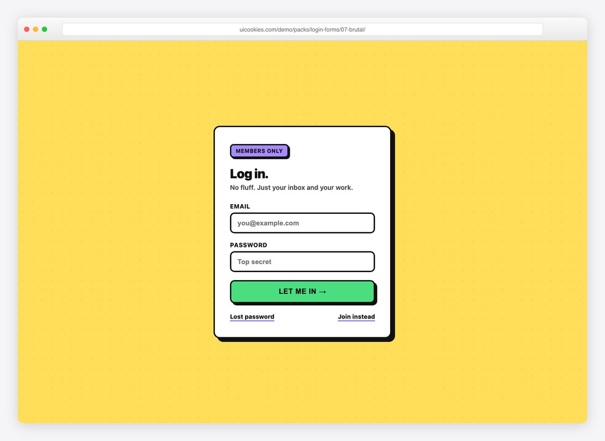
Thick black borders, offset shadows, and a button that physically depresses when clicked. For brands with personality — portfolio sites, indie products, anything that refuses to look corporate.
Live Demo CSS, Bootstrap & Tailwind code
8. SaaS Login with Social Proof
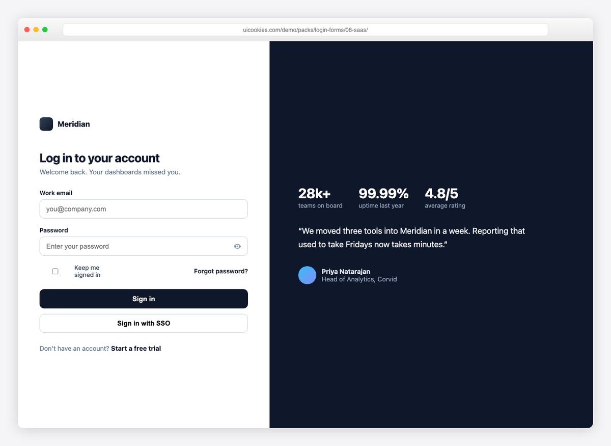
A split login where the dark panel carries stats and a customer quote, plus an SSO button under the main action. Modeled on how enterprise SaaS products actually present their sign-in.
Live Demo CSS, Bootstrap & Tailwind code
9. Login + Registration Tabs
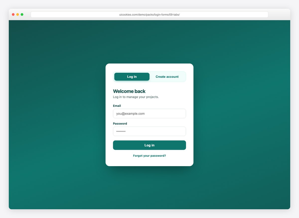
Two forms in one card behind an accessible tab switcher: log in on one tab, create an account on the other. If you need a free registration form template as well as a login, this covers both.
Live Demo CSS, Bootstrap & Tailwind code
10. Terminal Login
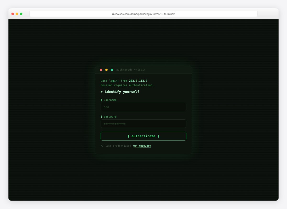
A developer-console take on authentication: monospace type, scanline background, blinking cursor, and prompt-style labels. Perfect for dev tools, APIs, and anything aimed at engineers.
Live Demo CSS, Bootstrap & Tailwind code
The rest of the sign-in flow
These nine are the screens a real product needs and roundups never include. Each one is complete on its own, so you can take just the one you are missing.
11. One-Time Code Screen
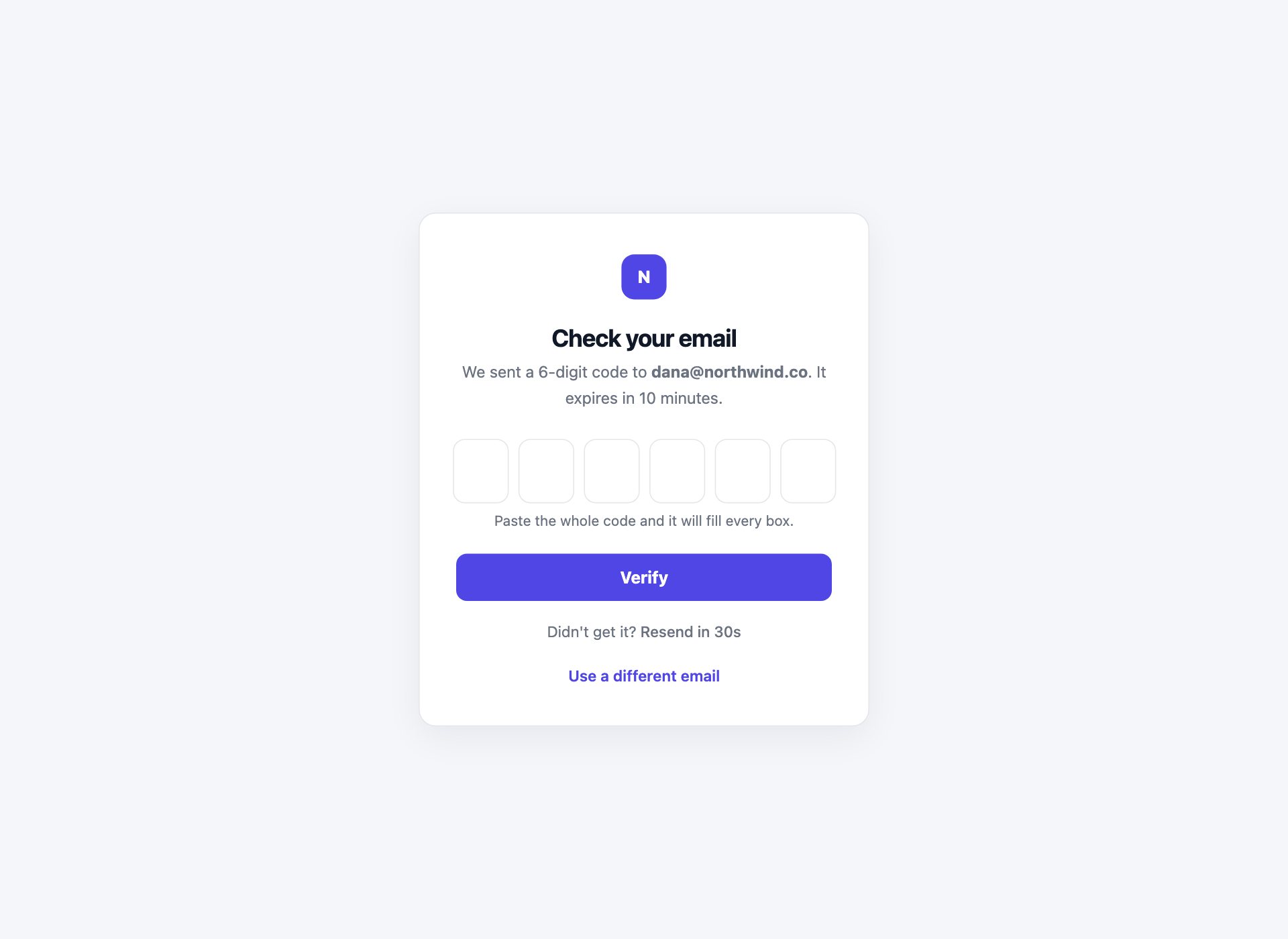
The screen that follows a magic link or an SMS: six boxes, one digit each. The code is typed once and moves the caret on by itself, backspace walks back through the boxes, and pasting the whole code from a message fills all six at once instead of dropping five digits on the floor. A resend button unlocks after thirty seconds so nobody hammers your mail queue.
Live Demo CSS, Bootstrap & Tailwind code
12. Two-Factor Authentication
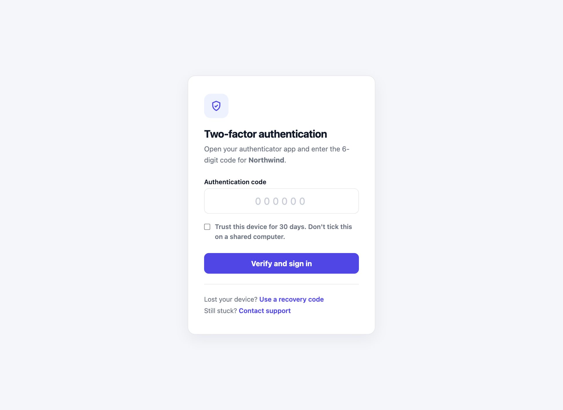
The authenticator-app step, with the parts people forget: a trust-this-device option that says out loud not to tick it on a shared computer, and a visible recovery-code link for the person whose phone is flat. A 2FA screen with no way past it is a support ticket.
Live Demo CSS, Bootstrap & Tailwind code
13. Passkey Sign-In
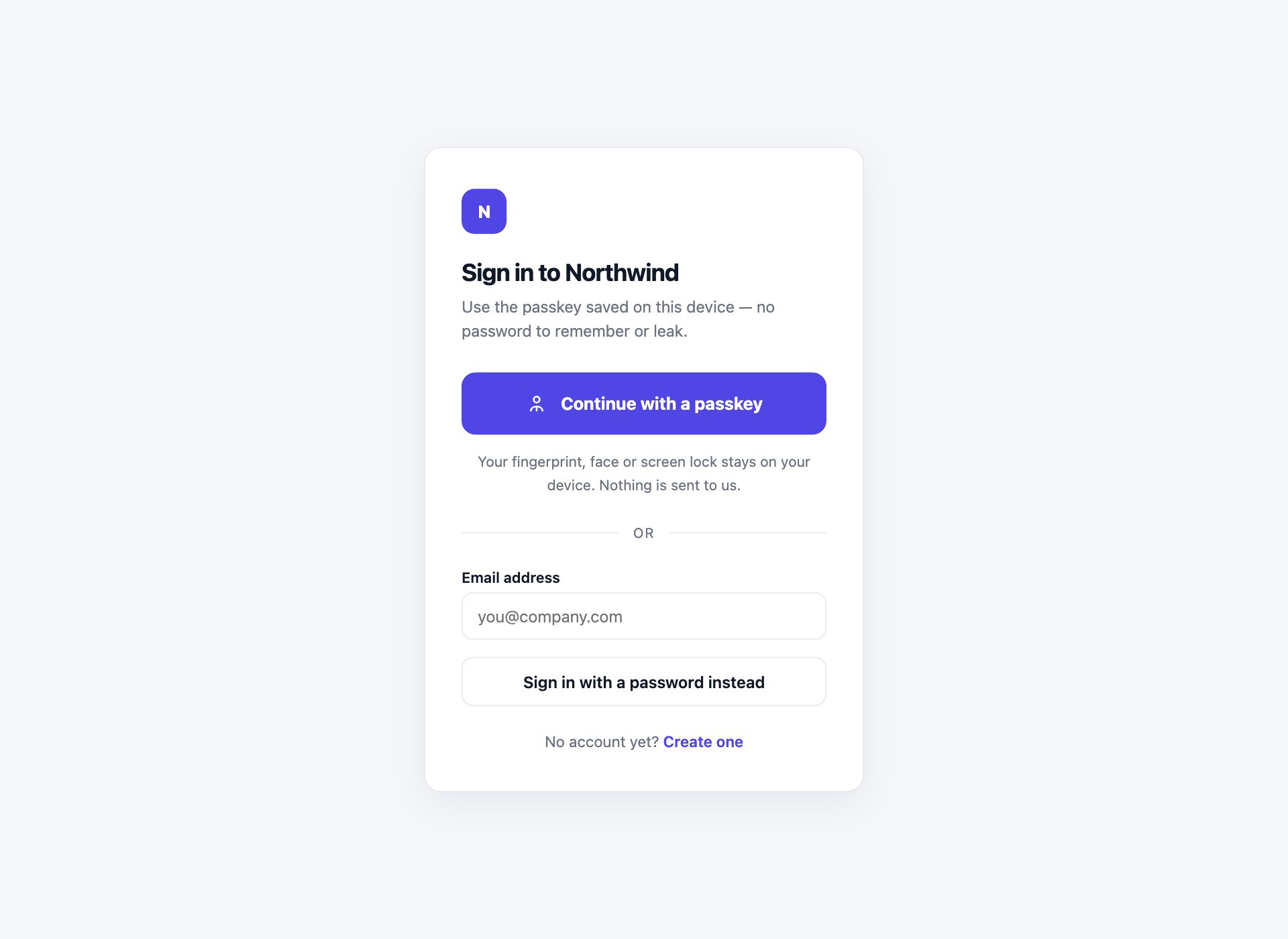
Passkey-first, password second. The biometric button takes the primary weight and the password sits below a divider as a plain fallback rather than hidden behind a link. The email field carries autocomplete="username webauthn", which is what lets the browser offer a saved passkey in the first place.
Live Demo CSS, Bootstrap & Tailwind code
14. Identifier-First Login
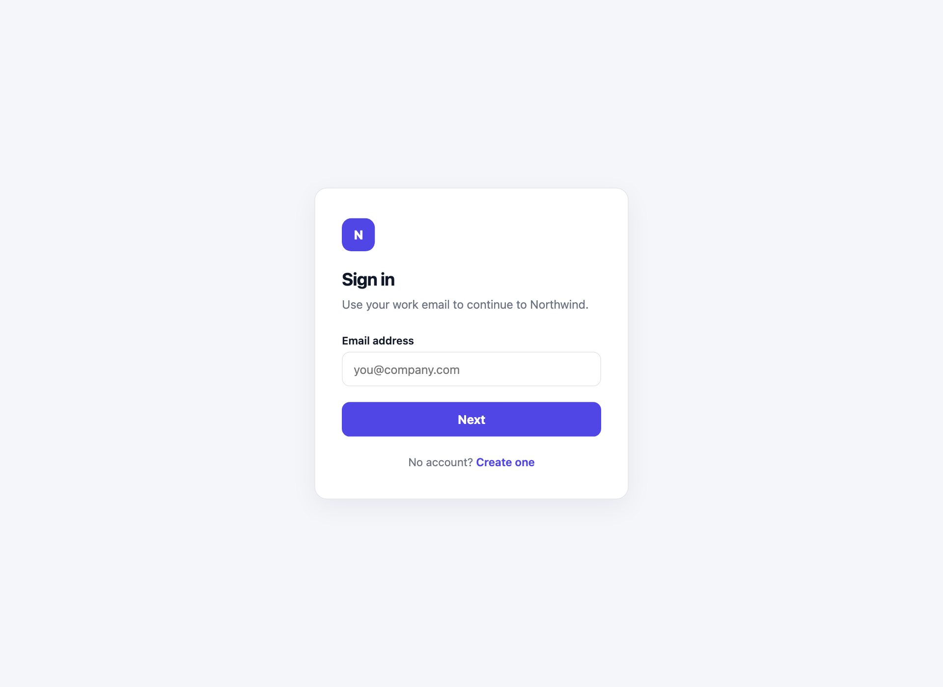
Email on the first panel, password on the second — the pattern Google and most enterprise apps use, because it lets the server decide whether to ask for a password, an SSO redirect or a passkey. The second panel shows the address being signed into with a Change button, so nobody types a password into the wrong account.
Live Demo CSS, Bootstrap & Tailwind code
15. Enterprise SSO Login
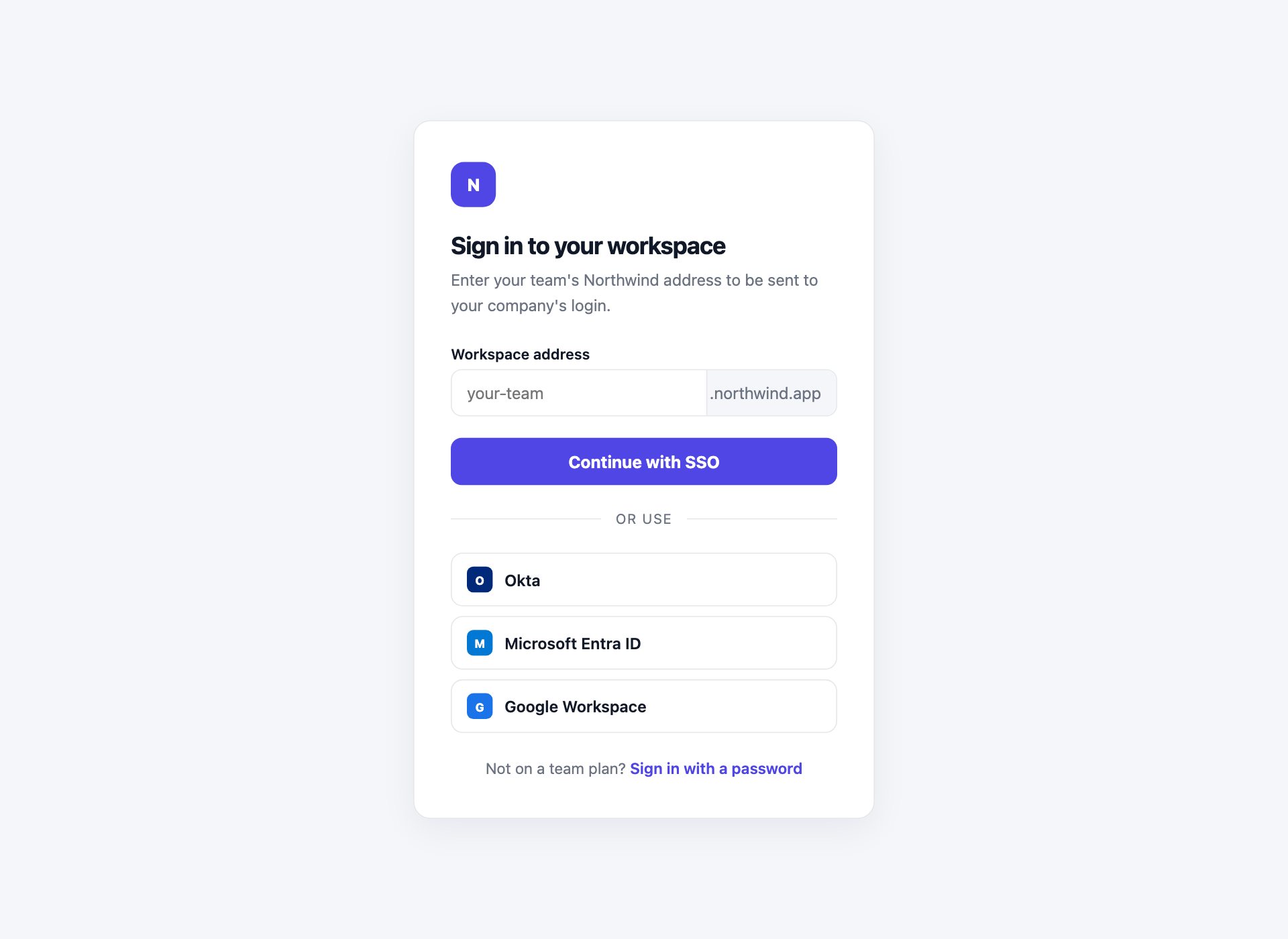
Sign in to a workspace rather than an account: a subdomain field with your domain shown inline so the shape of the answer is obvious, the identity providers named rather than left as anonymous logos, and a way back to an ordinary password for people not on a team plan.
Live Demo CSS, Bootstrap & Tailwind code
16. Phone Number Login
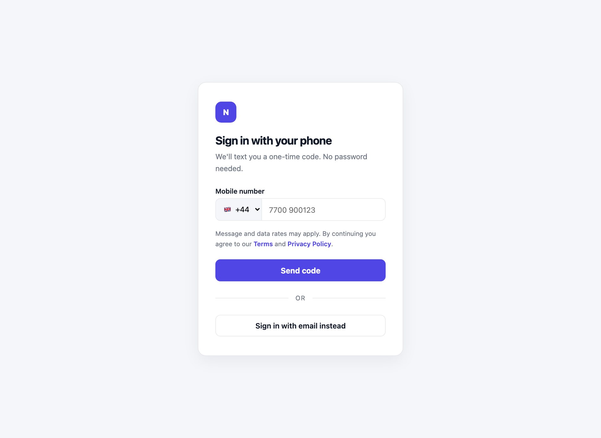
A country calling-code selector fused to the number field so they read as one control. The message-rates notice sits above the button rather than in the small print below it, which is where consent notices belong if you want them to count.
Live Demo CSS, Bootstrap & Tailwind code
17. Session Lock Screen
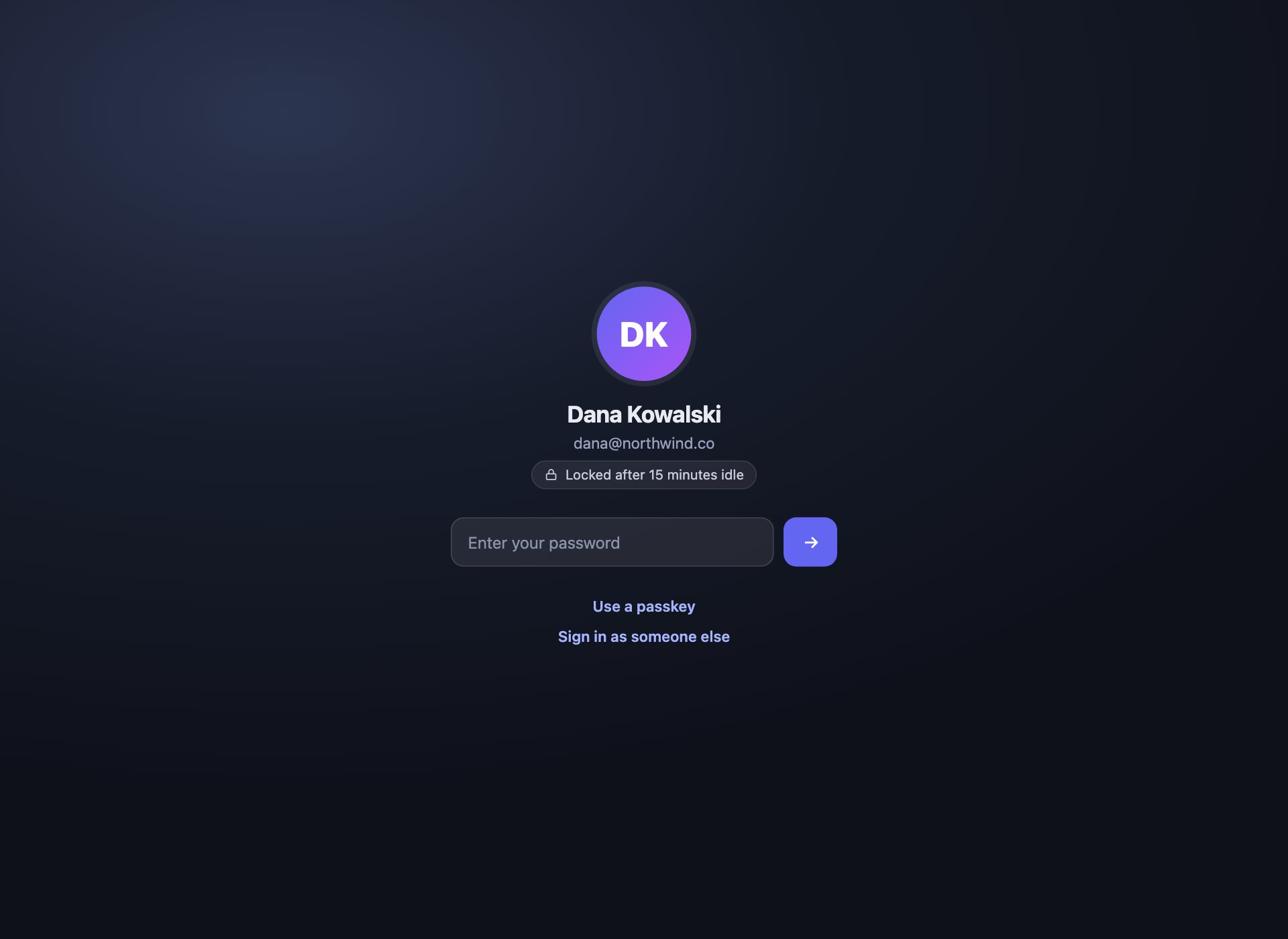
The screen a returning user sees far more often than a real login: the session timed out, the account is already known, and only the password is missing. Avatar, name, one field. Escape hatches to a passkey or a different account sit underneath.
Live Demo CSS, Bootstrap & Tailwind code
18. Password Reset Request
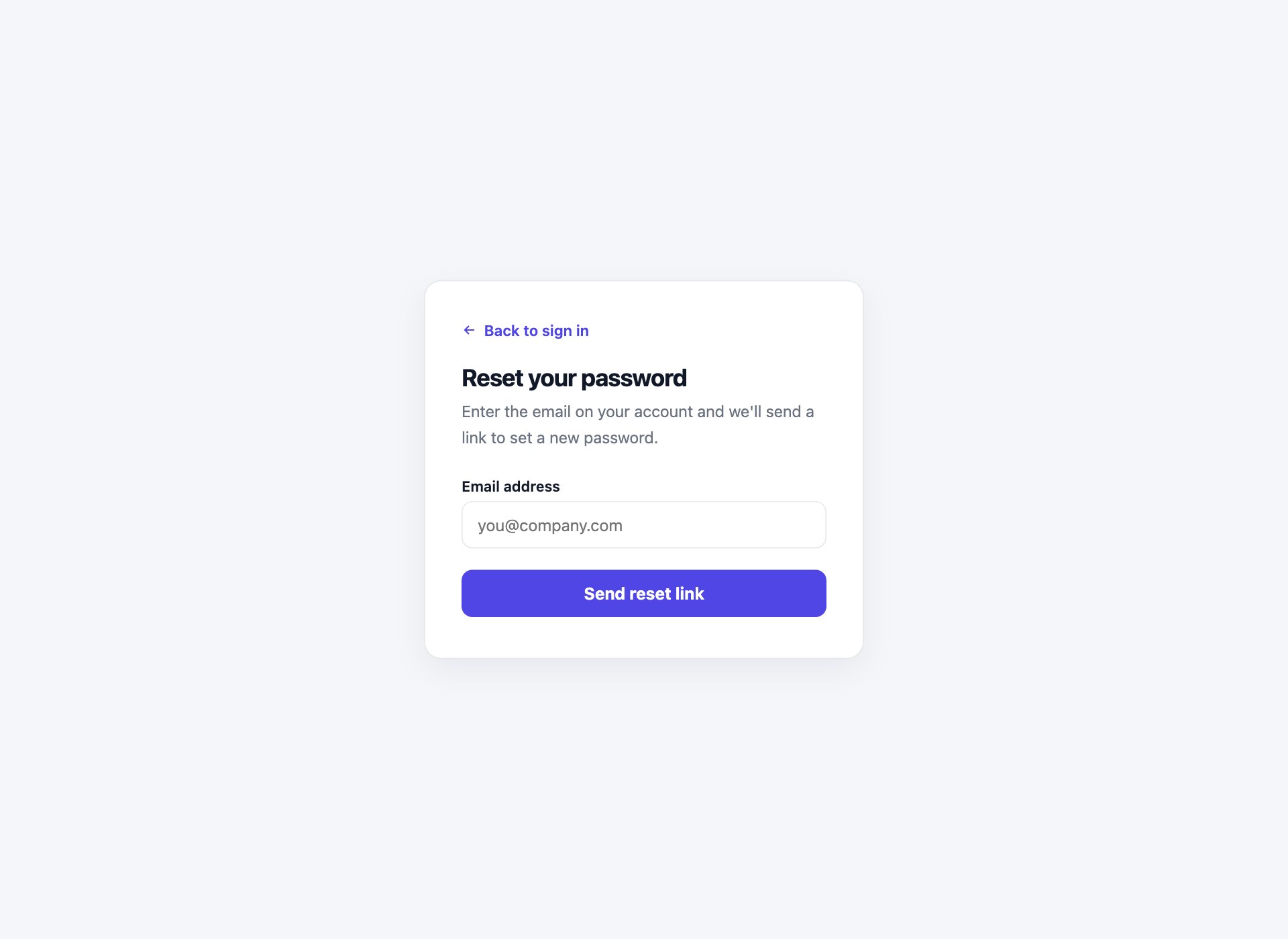
The forgotten-password screen and the confirmation that follows it, wired together so you can see both states. The confirmation deliberately says if an account exists — telling a stranger which addresses are registered turns your reset form into a free account-enumeration tool.
Live Demo CSS, Bootstrap & Tailwind code
19. Login with Error States
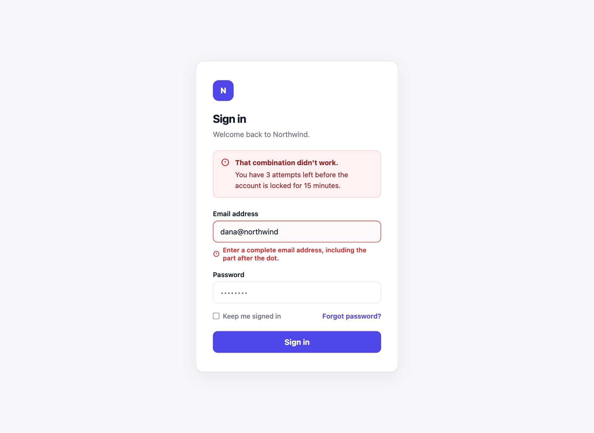
Every failure mode on one screen: a form-level alert with the attempts remaining, a field error tied to its input with aria-describedby, aria-invalid on the field itself, and a Caps Lock warning driven by getModifierState. This is the part of a login that gets designed last and used most.
Live Demo CSS, Bootstrap & Tailwind code
Three ways to present the same form
The last three change the frame rather than the fields — useful when the login has to sit inside an existing product or brand.
20. Full-Bleed Background Login
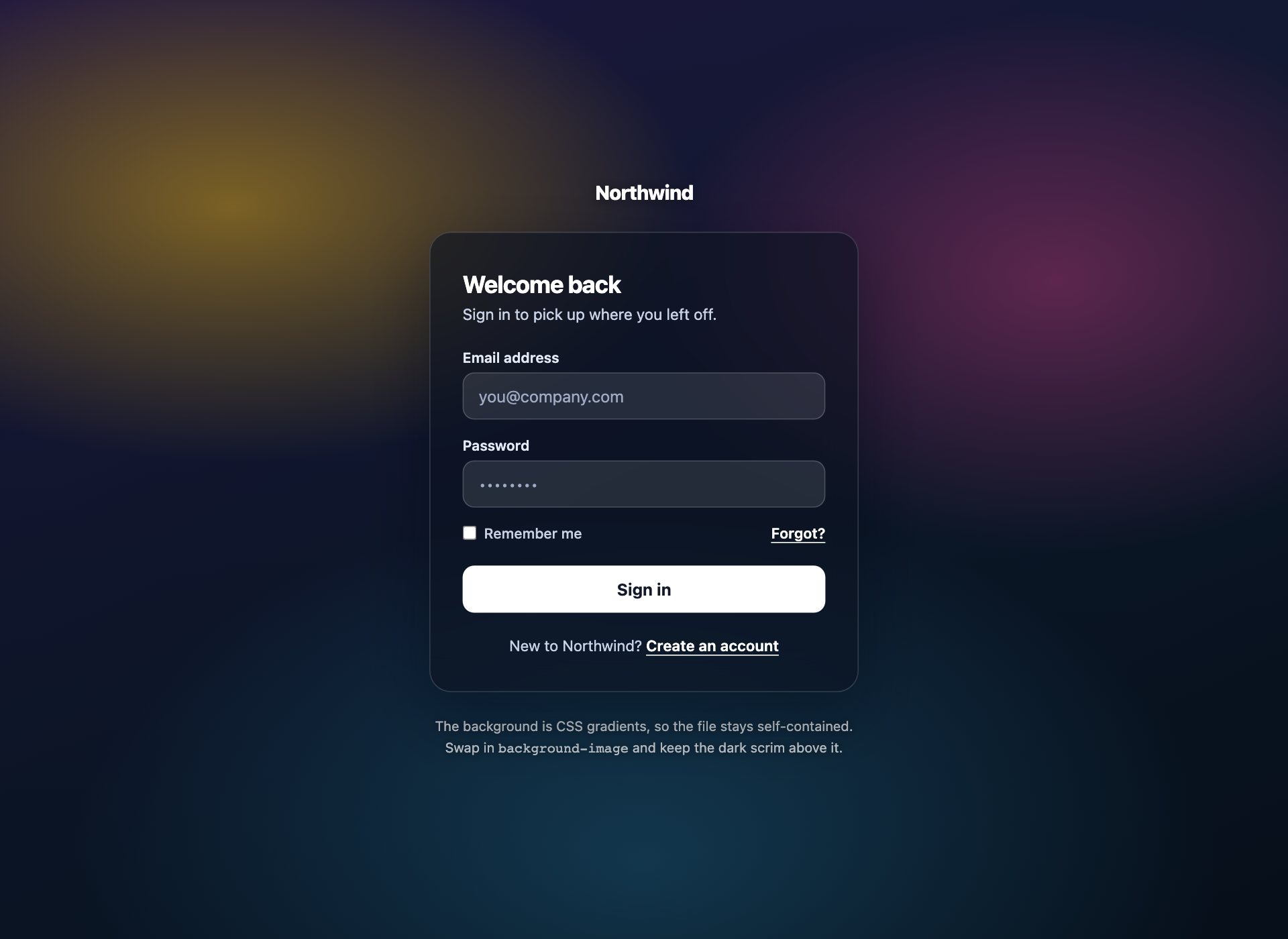
A card floating over a full-bleed background, with the two things that keep it readable whatever image you drop in: a dark scrim between the background and the content, and a text shadow on anything sitting outside the card. The background here is CSS gradients, so the file stays self-contained — swap in a background-image and keep the scrim.
Live Demo CSS, Bootstrap & Tailwind code
21. Modal Login Over the App
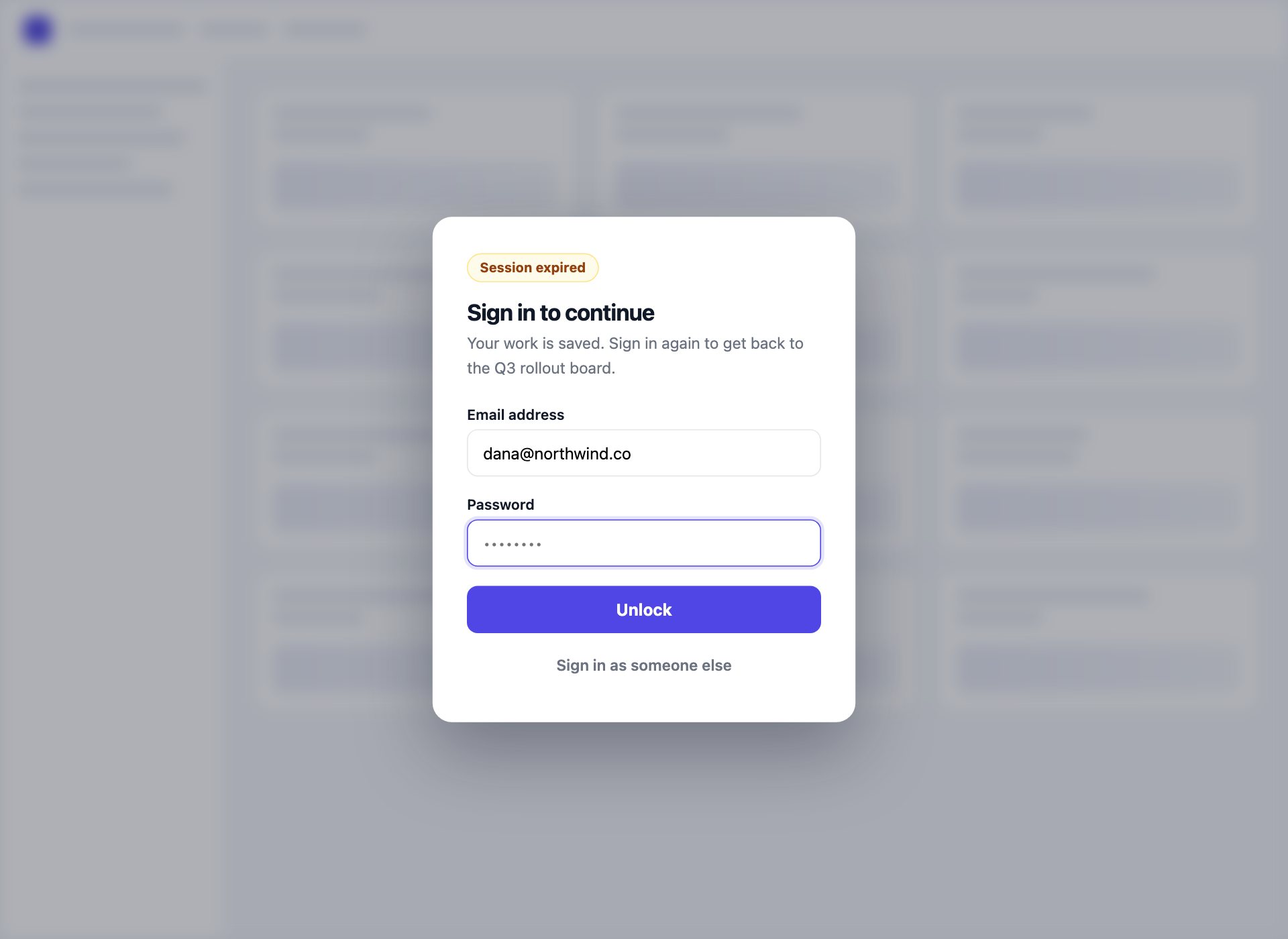
For the session that expires mid-task. The product stays visible but blurred behind the dialog, the copy confirms the work is saved, and the email is pre-filled and read-only so only the password is left to type. The dialog carries role="dialog", aria-modal and a label, which is what makes it a modal rather than a box.
Live Demo CSS, Bootstrap & Tailwind code
22. Theme-Aware Login
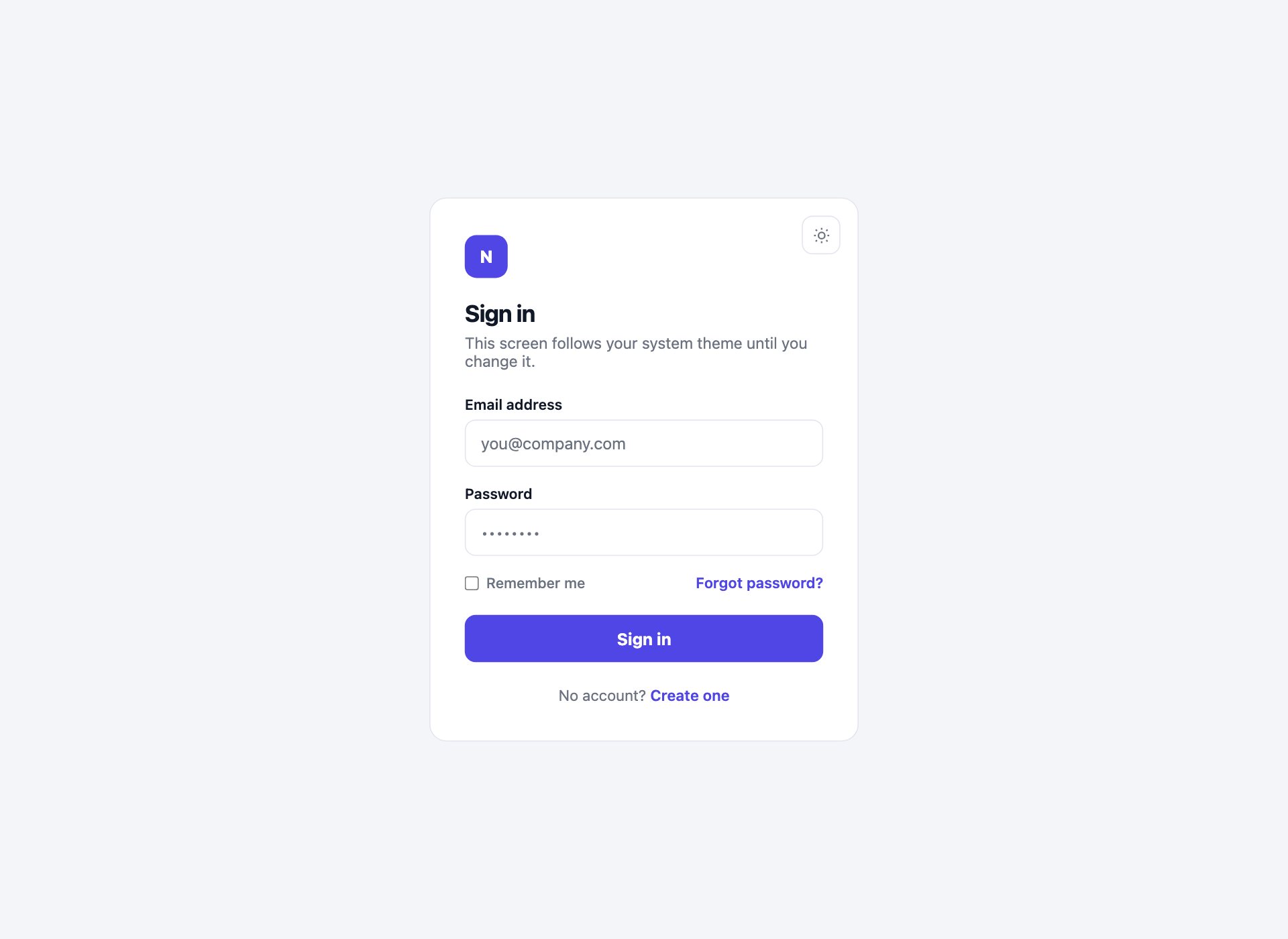
One login that follows the operating system and can still be overridden. Every colour goes through a custom property, the media query is guarded so an explicit light choice beats a dark OS, and the toggle only stamps the root element once someone actually opts out — before that, the system keeps deciding.
Live Demo CSS, Bootstrap & Tailwind code
What belongs on a login screen
A login is the narrowest screen in a product, and almost everything that gets added to it makes the job harder. The short list of what earns its place:
- The identity field and the secret. Email or username, then password, code or passkey. Nothing between them.
- A way out when it fails. Forgot password, resend code, use a recovery code. Visible, not hidden in a footer — the person who needs it is already frustrated.
- A route to sign up. One line at the bottom. People land on the login when they meant to register far more often than the reverse.
- The reason, if the visit is involuntary. “Session expired” or “Sign in to continue to the Q3 board” turns a dead end into a step.
What does not belong: marketing copy competing with the form, a cookie banner over the button, a password-strength meter (that is a registration control), or a CAPTCHA shown before anybody has failed anything.
Passwords, passkeys or one-time codes?
These are not three skins of the same thing — they change what you store and what can be stolen.
Passwords are still the default and the pack covers them properly, error states included. They also mean you are storing something worth stealing, so hashing, rate limiting and a reset flow are not optional extras.
Passkeys move the secret onto the visitor’s device. Nothing phishable crosses the wire and there is nothing in your database worth breaching. The catch is recovery: a person who loses every device needs a route back in, which is why design 13 keeps the password fallback visible instead of hiding it.
One-time codes — magic links and six-digit codes — remove the password without asking anyone to learn a new concept. The cost is a dependency on email or SMS delivery, and a UX that lives or dies on the details in design 11: paste support, auto-advance and a resend that is not instant.
Most products end up offering two of the three. Identifier-first (design 14) is the pattern that lets you do it without a fork in the interface — collect the email, then show whichever second step that account uses.
Accessibility checklist
Every design here passes the list below. It is worth keeping if you build your own:
- Every input has a
<label>with a matchingfor. A placeholder is not a label — it disappears exactly when it is needed. - Focus is visible on every control. If you remove the default outline, put something back.
- Errors use
aria-invalidon the field andaria-describedbypointing at the message, so a screen reader hears the problem with the field rather than in isolation. - Form-level failures live in a
role="alert"region so they are announced when they appear. - Icon-only buttons — the show-password eye, the unlock arrow — carry an
aria-label. - The
autocompletevalues are the real ones:username,current-password,one-time-code,tel-national. - Colour is never the only signal. Error fields get an icon and a message, not just a red border.
- Motion is wrapped in
prefers-reduced-motion.
What a front-end template cannot secure
Worth saying plainly, because login templates get treated as security components when they are not. Everything visible in a browser is advisory. The parts that actually protect an account all live on the server:
- Hashing passwords with a slow algorithm — argon2 or bcrypt, never a plain hash.
- Rate limiting and lockout. The “3 attempts left” message in design 19 is a display of a server-side counter, not the counter itself.
- Neutral responses that do not reveal whether an address is registered, which is why design 18 is worded the way it is.
- Session cookies set
HttpOnly,SecureandSameSite, and rotated on sign-in. - CSRF protection on the POST.
Client-side validation is there to save a round trip and to be kind. Assume it can be switched off, because it can.
Connecting a form to your backend
Each form posts nowhere by default — the onsubmit handler calls preventDefault() so the demo does not navigate. To wire one up, remove that handler and give the form a real method and action:
<form method="post" action="/api/login">For a framework auth package — NextAuth, Devise, Laravel Breeze, Django’s auth views, Supabase — keep the markup and swap the field name attributes for whatever that package expects, then let it own the redirect. For an API, intercept the submit, fetch the endpoint and render the failure into the error markup from design 19, which is already wired for it.
How to use these forms
Download the pack, open the folder for the design you want, and copy the markup and the rules from its <style> block into your project. Each design is self-contained — nothing depends on the other 21 or on a shared stylesheet. Replace the brand mark, point the form at your endpoint, and the screen is done.
Frequently asked questions
Are these login form templates free?
Yes. All 22 are free for personal and commercial projects, including client work, under our standard licence. No attribution is required, though a link is always welcome.
Do the forms work with Bootstrap, Tailwind, React or Vue?
Yes. Each design is plain HTML and CSS on its own class names, so nothing collides with a framework you already load. For React or Vue, copy the markup into a component and move the CSS into your stylesheet or a module — the handful of designs with JavaScript use ordinary DOM events you would replace with state anyway.
Which login form should I use?
Start from the flow, not the skin. If you store passwords, take Split Screen or Minimal Card and add Error States and Password Reset. If you do not, take Magic Link and One-Time Code. If you sell to enterprises, you will need Enterprise SSO and Identifier-First. The table above maps the common cases.
Do these login forms actually authenticate anyone?
No, and no front-end template can. These are the screens only — the markup, styling, states and client-side niceties. Authentication happens on your server or through a provider such as Auth0, Clerk, Supabase or your framework’s own auth package. Point the form’s action at that endpoint and you are connected.
Is a registration form included?
Yes. Design 9 is a tabbed card holding login and registration in one component, with an accessible tab switcher. Design 18 covers the password-reset half of account management.
How do I add a show/hide password toggle?
Design 2 ships one. It is a button that swaps the input’s type between password and text and updates its own aria-pressed — about six lines. Keep it a real <button> so it is reachable by keyboard.
Are the forms accessible?
Every field has a real <label>, focus is visible on every control, icon-only buttons carry an aria-label, errors are tied to their fields with aria-describedby, and each design was checked at 380px for horizontal overflow. Motion respects prefers-reduced-motion.
Can I use these in a template I sell?
You can use them in client work and in products you sell. What you cannot do is repackage the pack itself as a template pack for redistribution.
Download all 22 login forms (free) Browse live demos