
We are all well known of the importance of menu icons on the website. They provide great navigation and a user-friendly website experience for both users and website owners. Viewing the different web pages and sections of the website can also be made very easy with the menu icons. They are mostly situated with a menu header bar. However, most websites also prefer them on either of the sidebars. It all depends on the website’s appearance and needs, as seen by the website owner. Some even use special buttons to hide or toggle the menu bars on their website. For this, the hamburger menus are quite useful.
Hamburger menu button is the button on your website that shows or hides the menu icons on the navigation bar. It can greatly improve the user experience of your website visitors. They also come in handy for your website design. Hiding the menu bar with a hamburger menu button can give your website a neat, clean appearance. Sometimes, the menu bar can be quite a hassle for some users. In these cases, the hamburger menu CSS buttons can be a great assistance.
Now, without any delay, let’s go through some of the best and easiest-to-use hamburger menu CSS.

Morphing Hamburger Menu
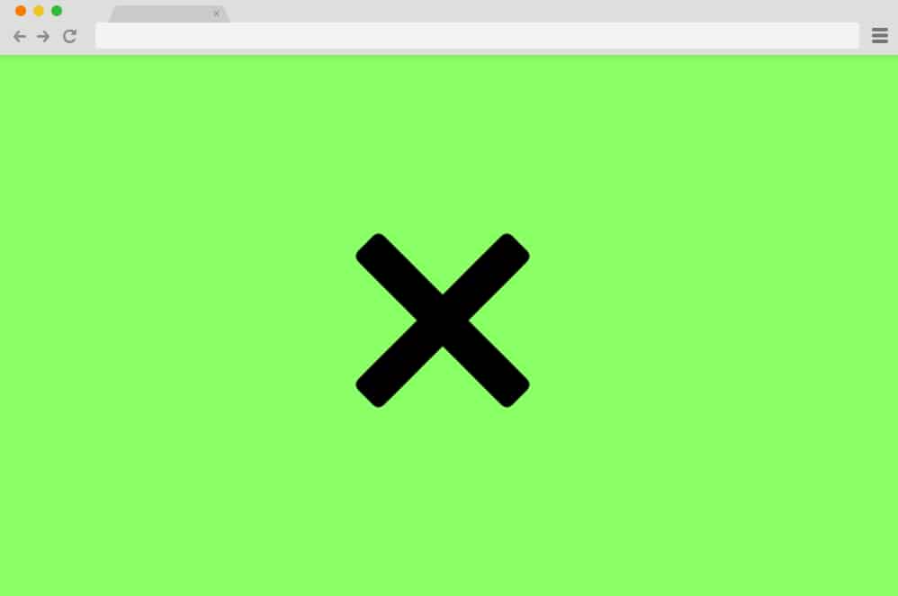
At the top of our list here is a pure CSS and HTML-based hamburger menu that is as simple as it gets. Great for anyone starting one with the codes, this particular sample depicts everything in perfect harmony. The classic three-lined icon for the menu, the use of soft and mellow color schemes, the SVG icons, and the smooth transitions, everything here is carefully drafted. When you click the icon, it changes to a cross icon while revealing the navigation menu inside. The rest of the website smoothly slides down to make way for the menu. Pretty user-friendly, you can view the full text and the code structure using the link below.
Flipping Burgers
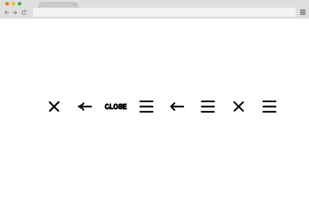
This particular variation is a collection of hamburger menu animations rather than the actual menu reveal like the others we mentioned here. For the hamburger concept, the creator has come up with plenty of creative animation variations you can use to keep things interesting. All of these start out as a simple hamburger icon, which is then animated to transform into different icons. You will find ones that transition to an arrow, a cross, and the text closing. And if clicked again, it then diverts back to the original position using the same movement. All of these are pretty minimal, to say the least, and use only HTML and CSS.
SVG Gooey Hover Menu

Now, this is another simple take on the hamburger menu concept by Michael Leonard. While it looks pretty minimal, the design implies multiple layers of animations and transitions. It starts out as a simple canvas with the navigation hamburger CSS menu on the right-hand side. When hovering over any section, the description alongside the hamburger icon moves immediately to the same level. For an even more interesting addition, when hovered over the hamburger icon, it gives the cursor a melting, gooey effect. And when the cursor is finally placed on the icon, the navigation menu is displayed.
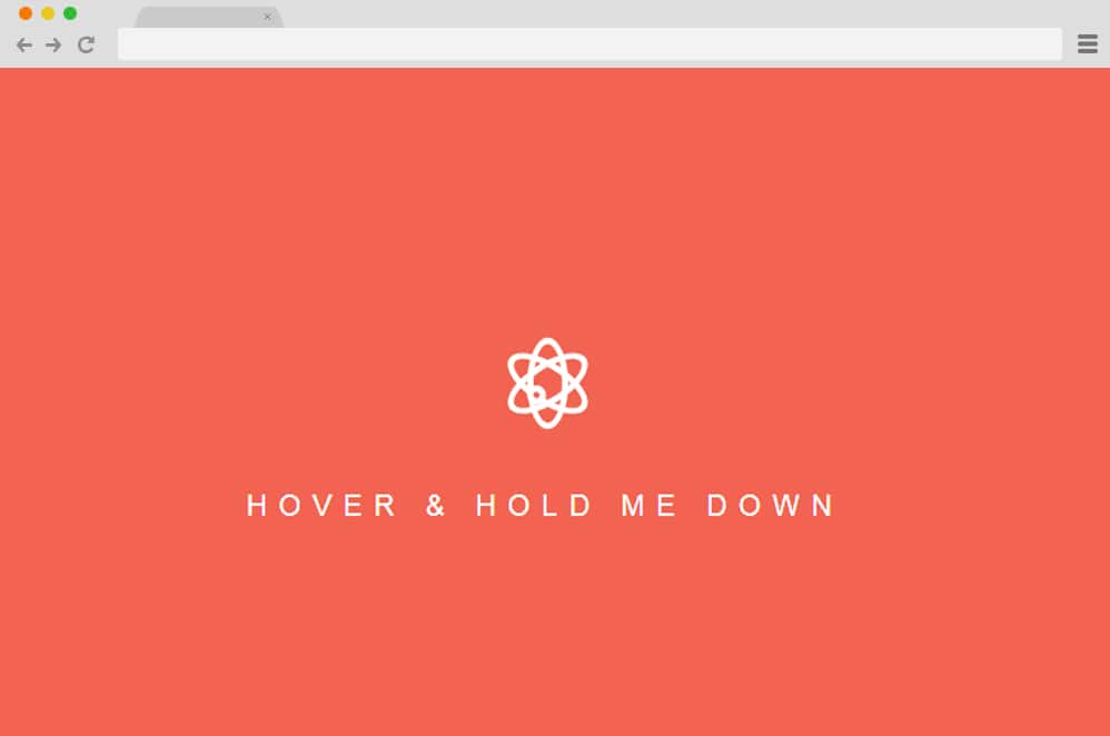
Atomic Hamburger Menu CSS
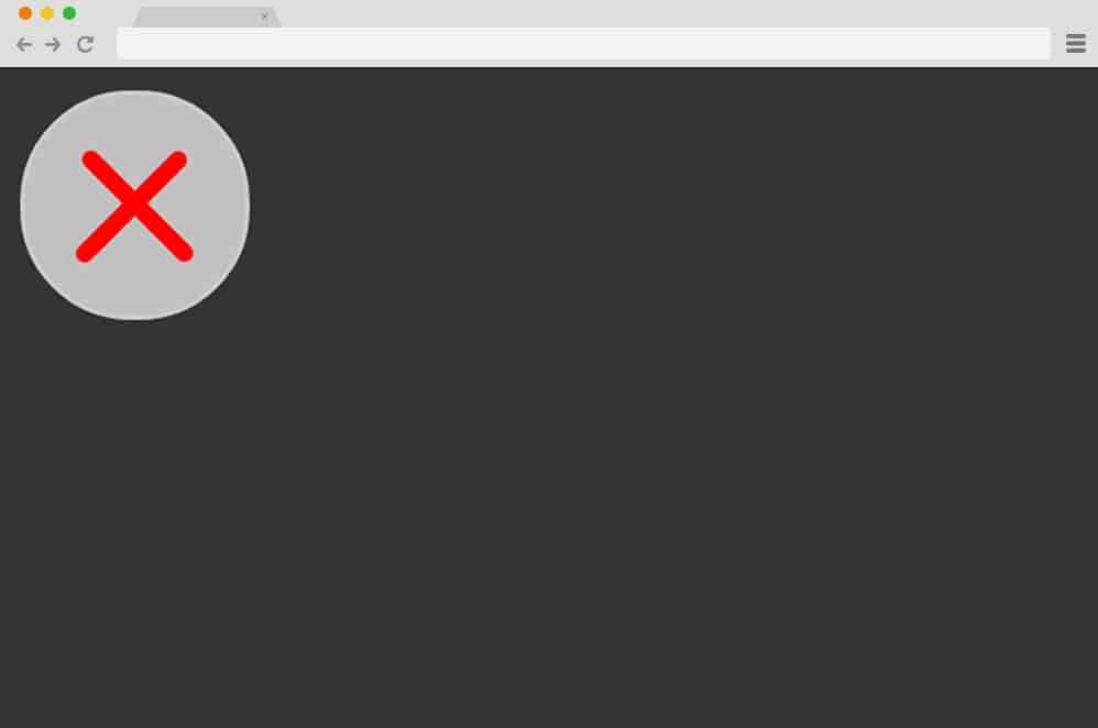
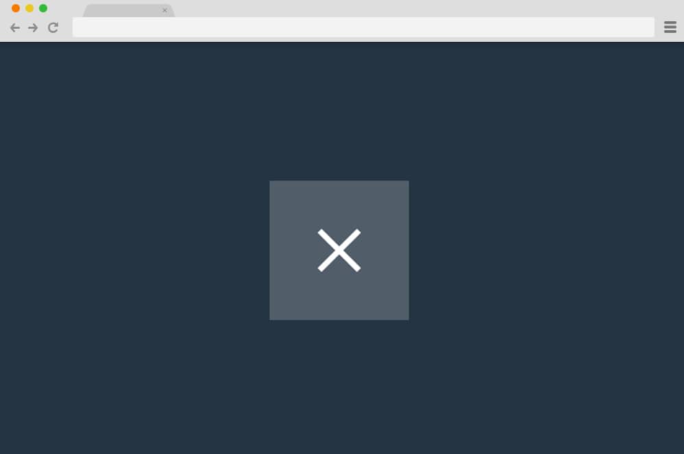
The Atomic hamburger menu CSS uses a very cool animation. It is a hamburger menu CSS that uses an animation for loading and waiting. The animation resembles an atomic particle. Here, various orbits of the particles are situated, and one of the electrons of the particle revolves around the orbit. This can be viewed only when the mouse pointer is hovered over the button. When you hold the button by clicking the mouse, you will see a cross. Using this cross sign, you can hide your website menu bar.
Hamburger Menu Css Animated
This hamburger menu CSS button is quite simple. But nonetheless, it can be quite efficient and useful for your website as well. It has a very smooth and basic animation as well. When you hover the mouse pointer over the hamburger menu CSS animated button, it quickly and smoothly transforms into a cross. Even though this is a very simple animation, the button can still have a great impact on the overall design. It is developed to look good and be fit for any type of website.
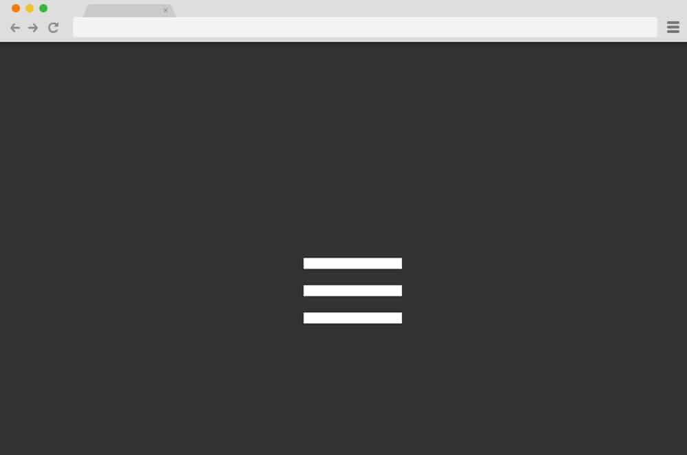
Hamburger Menu CSS Animation
Hamburger Menu CSS Animation is a CSS animation for a hamburger menu that speaks for itself. It has a very smooth, simple animation when you click the button. Initially, the button is just a hamburger menu button. When clicked, it uses an animation to convert the horizontal lines into a cross-shaped button. The color of the horizontal lines is also changed when it transforms into a cross. The background color of the circular button in the hamburger menu is also changed during the transition.
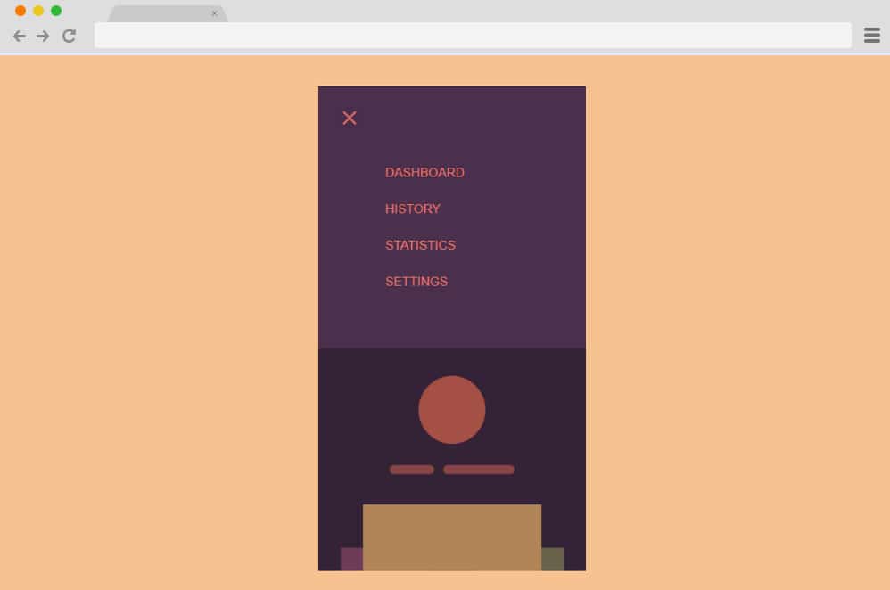
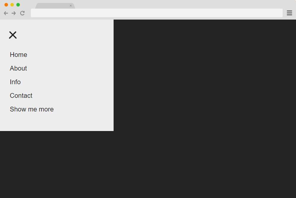
Hamburger Menu – CSS and jQuery
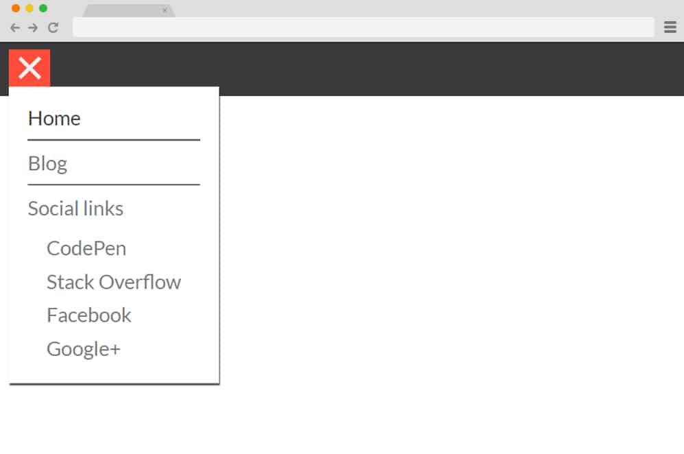
This hamburger menu CSS is developed with CSS and jQuery. It is an extremely functional hamburger menu. Here, a header bar is also attached to the hamburger menu. The hamburger menu button is easily distinguished by the color of the button and the header bar. The action starts once you click on the hamburger menu button. A vertical sub-menu appears when you click on the hamburger menu button. You can add all sorts of menu items, such as home, blog, social links, and more. Furthermore, submenus for menu options can be added here to enhance the functionality of your website.
This hamburger menu CSS can also enhance the appearance of your website’s submenus. It also has a small amount of animation. When you click on the button, the vertical submenu appears with an animation. The hamburger menu button also transforms into a cross when clicked. When you click it again, the submenu collapses or disappears.
Animated Hamburger menu – CSS Only
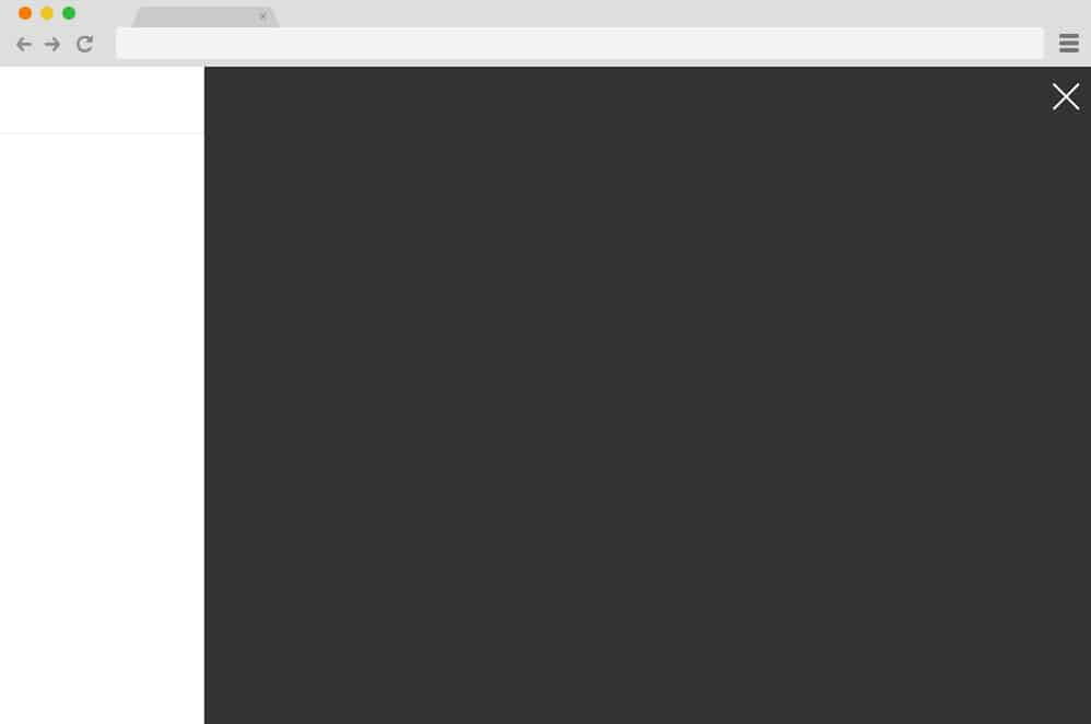
Animated Hamburger menu – CSS only is a Hamburger menu CSS button that can be very suitable for your website. You can easily add it to your website and watch it rapidly increase your website’s impressions. This hamburger menu features a horizontally animated sidebar when you click the hamburger menu button. Once clicked, the menu sidebar slides in from the extreme right to the center of the screen. The animated sidebar’s color is also changed to a darker skin. You can add the submenu content here.
Finally, the hamburger menu button is also changed to the close symbol. When you click it, the menu sidebar collapses, and everything reverts to its initial appearance.
Single Element Animated Hamburger Menu CSS Only
As the name suggests, Single Element Animated Hamburger Menu CSS is a very simple hamburger menu. It uses only one simple animation for your hamburger menu button. But don’t get fooled by its simplicity. This simple button is quite functional if you want to add the hamburger menu CSS button to your website. When you click the hamburger menu button, the three horizontal lines are initially combined into one. This happens during a sliding animation in which the horizontal lines merge toward the center. Then, two lines appear and are rotated to form a cross sign for your hamburger menu. When you click it, the same transition repeats, and you can see the original hamburger menu button.
Another Hamburger Menu CSS
If you want a hamburger menu CSS button with animation, there are plenty of options. Another Hamburger Menu CSS is also one of them. It has a very good animation when you click on the button. The hamburger lines are transformed into a single horizontal line when you click the button. Then, a cross sign is formed from the single horizontal line. You can hide the menu by clicking on this cross button. This button has fewer frames per second than most similar hamburger menu CSS implementations. But it will surely do its job and won’t disappoint you.
Hamburger Menu(CSS only)

This is one of the most fun looking hamburger menu CSS. It has a very visually entertaining animation and color combination for your website. Using the Hamburger Menu (CSS-only) can easily catch the eye of many of your website’s audience. Initially, the hamburger menu button is designed with very bright and attractive colors. The magic starts to happen once you click on it. When you click it, the button extends, allowing you to add different menu options for your website. These menus can be anything like home, contact, blog, and so on.
The elongation of the hamburger menu button to the menu bar is animated as well. When you click on the button, it quickly moves to either slides of the screen with a very quick transition. Then, you can add all the menu items here. After the menu bar is opened by clicking the button, the close button also appears at the right end of the menu bar. You can click this button to close the hamburger menu.
Hamburger Menu CSS transition
If you want a simple hamburger menu CSS for your website, you can easily choose the Hamburger Menu CSS Transition. It has a very simple transition. But this simple attention to detail of an animated button can bring a very big impact to your website. The animation transition is quite basic. When you click on the hamburger menu button, the second horizontal line disappears instantly. Then, the remaining two lines move to form an ‘x’ icon. You can click it to close or hide the hamburger menu. This button can easily upgrade the overall design of your website as well.
Animated Hamburger Menu – CSS
As the name suggests itself, Animated Hamburger Menu is a hamburger menu CSS with very good animation. You can easily add it to your website and enhance the functionality and the design of your website. All animations and transitions start after you click the hamburger menu CSS. This button is located on the right side of the screen. Once you click it, a menu slider appears on the left side of the screen. Simultaneously, the hamburger menu button is transformed into a cross. This button can be used to close the menu options if you want.
Talking about the menu, you can also add the submenu titles to this hamburger menu CSS. The fonts are designed to suit any type of website. They are well-bulleted with proper margin spacing, divided into menu titles and submenu titles.
Hamburger Menu CSS with Animation
Hamburger Menu CSS with animation is one of the simplest and easiest to use hamburger menu CSS. It consists of a hamburger menu button that can be easily set up for your website. When you click it, you can easily see the button change to a closed sign. At first, the middle horizontal line disappears. Then, the top and bottom horizontal lines are joined to form a cross to hide the menu. The hamburger menu button is restored once you click on the close button.
Mrs Hangwoman

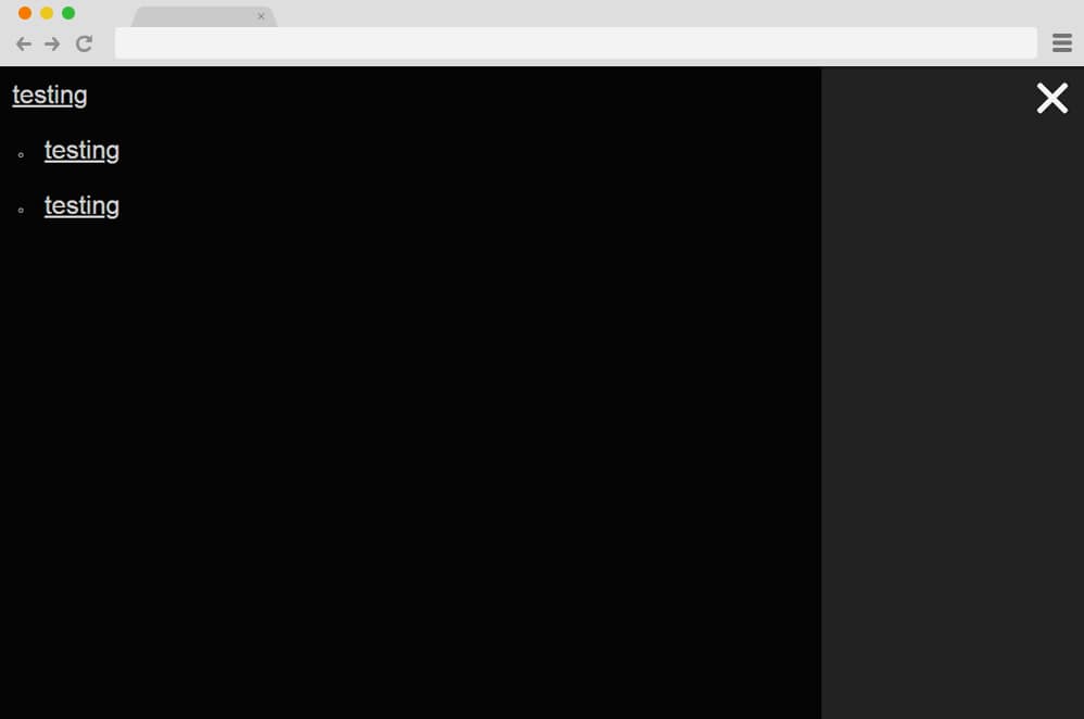
This is one of the most extraordinary hamburger menu CSS you can find. Mrs. Hangwoman has such extraordinary animation features that will surely blow your mind. It has an ordinary hamburger menu button, like any other. But once you click it, you can see all the various, stylish transitions of this hamburger menu. First, a vertical line starts to get pulled from the menu button. The width of the line is the same as the width of the button menu. The animation transition continues with a horizontal movement from the vertical line. This transition covers the surface of the website to form a rectangular shape in the top left corner of the website.
You can add a different menu to this hamburger menu. The menu titles are displayed on the menu tab that opens when the hamburger menu button is clicked. When you hover the mouse pointer in the menu titles, they are also highlighted with a different color. This can really add a new, attractive look to the website’s overall design as well. The demo given provides a very intimidating, unorganized background for the website. You might not like it. However, it can be guaranteed that once you add this hamburger menu to your website, it will look better than the demo, as the background will be more attractive.
Hamburger Menu – CSS only
If you are looking for a very simple yet tacky hamburger menu CSS, the Hamburger Menu – CSS only is a perfect companion. It is just a hamburger menu button. But it has all the features a hamburger menu button needs. An eye-catching design, a button, and animation transitions. There isn’t much drama when you hover the mouse pointer over the button. Things get interesting only after you click the hamburger menu. There are 3 horizontal lines on the button, like any other hamburger button. When you click on it, all three buttons are merged into a single horizontal button. Then two lines appear, forming a button with a cross. You can click on it to collapse or hide the hamburger menu.
Simple Hamburger Menu/ CSS
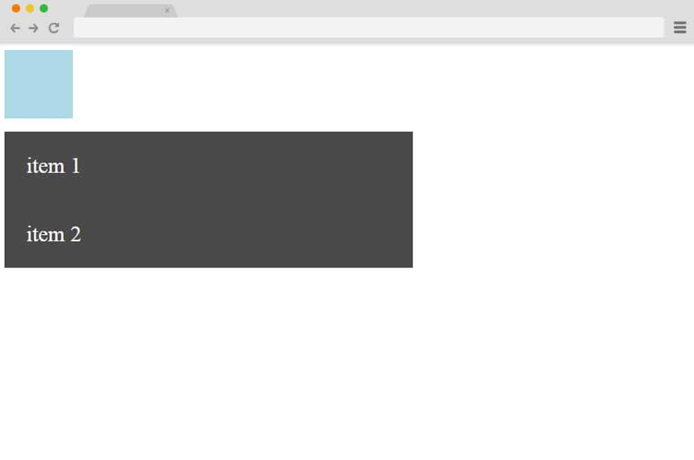
Sometimes you just love it when things are right on the edge. Not too much, not too little. It has all the elements that you’ll ever need for hamburger menu contents. You can easily add content for what you want to your website menu. As the name suggests, Simple Hamburger Menu/CSS has a simple, easy-to-use interface. It doesn’t have any animation whatsoever. However, it will help you get the job done, depending on your website. You can have 4 different menus. Surely, the design will be suitable for any of the website,s and you can add any type of menus for your website.
Hamburger Menu CSS Only by Silvia

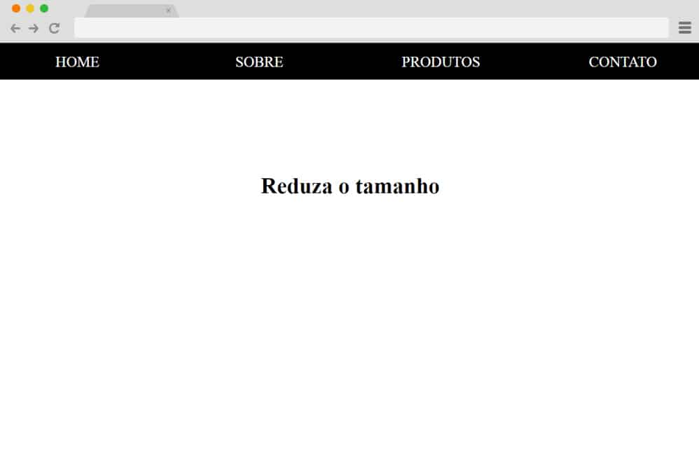
Hamburger Menu CSS Only is one of the simplest hamburger menus you can add to any website. It has a very simple layout, as its name suggests, and can be used for any purpose on your website. If you look at its design, it has a very intuitive appearance with the website title at the top left of the website header. The header continues with four menu header titles for the different sections of your website. Here, you can add menus for pages like About Us, Contact, Blog, and so on. The individual text colors in this menu can also be easily changed to suit your website’s needs.
Hamburger Menu
If you are looking for a hamburger menu CSS for your website, this is perfect for you. It has a very gorgeous animation, on which you can easily add the menu items of your website initially, which is shown as a button for your hamburger menu. Although it doesn’t have a hamburger icon, it can still be used for your hamburger menu. When you click the button, a number of horizontal rows appear with a fading-in animated transition. You can add the menu titles to each row of the button extension. When you hover over the menu titles, the color of the rows is also slightly changed to show which menu title you have highlighted. This can be very useful to enhance the user interface of your website as well.
Hamburger Menu CSS+JQ

A hamburger menu CSS filled with attractive animations and designs to catch the eye of your website viewers, Hamburger Menu CSS+JQ is the best companion for your website. It includes all the animations and visuals you need for your hamburger menu. The button appears on the screen initially. Once you click on it, the two horizontal lines at the top and bottom are rotated and moved. They are connected at the right end of the middle horizontal line at a certain angle to create an arrow. This hamburger CSS button can be used to indicate where to click in the menu to make the hamburger menu disappear or go back. It can really help visitors navigate your website.
Trivia Quiz

Trivia Quiz is a hamburger menu CSS that can be suitable for any type of website. It has very stylish animations that will leave you and your website audience with an amazing impression. If you look at the demo, you can see a lot of quiz samples as well. But when you take a close look at the hamburger menu button, you can easily see a big impact from a small element. When you click the hamburger menu button, the entire button slides to the right. Then you will be able to see all the menu titles of your website to the right of the slides hamburger menu button.
The background color and text color of the menu title buttons can also be changed once you hover over them. In this way, your users can also see which menu items are highlighted by the mouse pointer.
FullScreen Hamburger Menu
This is another great way to implement a CSS hamburger menu on your site, and the creative aspect is sure to take it to the next level. It starts out as a simple, content-filled website with a circular icon at the top and a hamburger menu. This template is pretty responsive across all device screen sizes and ideal for any type of website, whether professional or personal. When clicked, the icon uses CSS animation to expand and reveal the menu options. Even the icon is coded to rotate as it transitions to a cross icon when clicked.
Everything else about this is pretty minimal and clean. The menu maintains its circular shape as it expands, adding that extra detail. It does, however, rely on CSS, HTML, as well as a bit of JS. But you can check out the whole code structure through the link below.
Hamburger Icon with Morphing Menu
Another one with similar animated features, but with a variation in the end result, is this Hamburger Icon with Morphing Menu. And the end result is just as it sounds. Created by Sergio Andrade, it features a simple hamburger icon at the top to represent the menu. When clicked, the icon reveals the menu options, which slide into view. The hamburger icon also transitions into the exit/cross icon, which is exactly the purpose. Using a bit of CSS, HTML, and JS, the creator has achieved a smooth, working end result. The expanding menu container also looks pretty unique, with two translucent spheres laid atop each other for that 2D visual. The whole structure is also fully responsive and easily adjusts to every device screen size. Follow the link below to get access to the whole code snippet and a full page preview.
Fullscreen Navigation

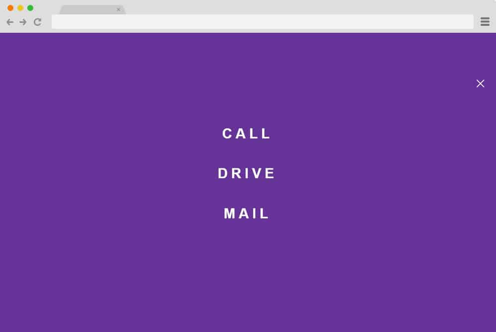
If a pretty, eye-catching, vibrant, and efficient design is what you are looking for, then this hamburger menu CSS design is surely one for you. It starts out as a simple, plain background interface with just the hamburger icon at the top. Using the overlay effect, when the icon is clicked, the entire interface transitions to a colorful gradient menu. The hamburger icon also morphs into an exit button, reverting the interface to its original state. It is also fully responsive and visually impactful. All in all, the creator Marcus Bizal has presented the idea with a unique flair, and we definitely love the end result. Check out the full code structure and view the live demo using the link below.
Creative Hamburger Menu
Now, this is a simpler, minimal design that adds a clean, professional touch to any of your sites. The hamburger icon on the sphere is based on Material Design to give it a realistic feel. A great thing here is that the icon features both hover and click effects. The uneven lines become equal on hover, and the menu expands to reveal the options when clicked on. Another slight addition here is the shape transition from the hamburger icon to a cross while the rest of the background changes completely. Relying mostly on CSS, HTML, and JS is a great way to keep things interesting for your users.
Hamburger Menu By Georgia Valvassori
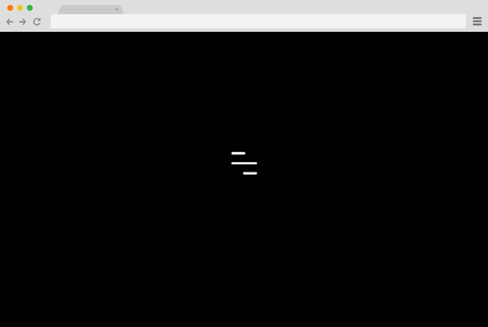
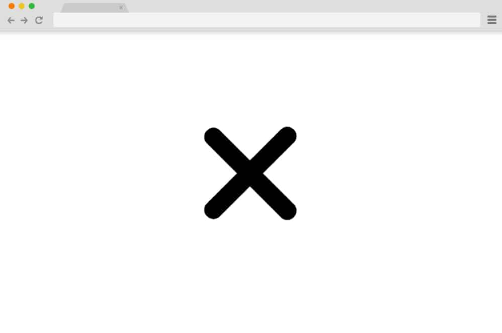
Another example of a more creative yet simple approach to a hamburger menu icon animation is this one. With a solid black background, the icon stands out in a striking way. The icon itself differs from a more traditional route, however, adding just a subtle hint of creative flair. While it doesn’t expand to show a full table or menu, this is a head start on the process. Using simple CSS and HTML, the icon is animated to transform into a cross and revert to its original state when clicked.
Slide Vertical Navigation Bar
A more functional hamburger menu design: a simple, minimal approach. A solid background with the icon on the left-hand side, it starts out with a simple interface. When clicked on the icon reveals the side navigation bar that showcases the menu contents. The subtle use of different animations with the icon, along with the slide-in transition of the menu, is what stands out here. But that’s not all, the creator here has also added a CSS-based hover effect on the menu content. Completely responsive and built entirely with HTML and CSS, it is easy to work with and replicate with a full code snippet. And down below, you get full access to it