

Radio buttons are always used for mutually exclusive options, meaning the user can choose only one option. Professional designers always recommend going for a circular design with a solid circle at the center. Practically speaking, sticking to the circular design is the best idea. But you don’t have to keep the radio buttons with the same old design. You can add animation effects and colors to make your radio buttons unique and attractive. In this list, professional developers have shown some of their creative design ideas that follow the current design trends & guidelines. We have collected radio buttons for forms, applications, control panels, and other use cases where we typically need them. These bootstrap radio button styles will come in handy for all your design needs, so make sure you check each one in this list.

Easy to Implement Bootstrap Radio Button Designs
Whether you want a simple Bootstrap radio button or an animated one, this list has a design for you.
Bootstrap Button Style V02
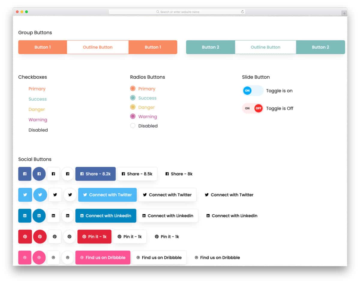
The V02 is a collection of Bootstrap button styles. You get beautiful call-to-action buttons along with colorful radio button styles. All buttons are designed using the latest Bootstrap framework, making it easy to use the code on your website or application. The creator has organized the files neatly and kept the code structure as simple as possible, so developers can easily find the element they want and use it in their projects in no time.
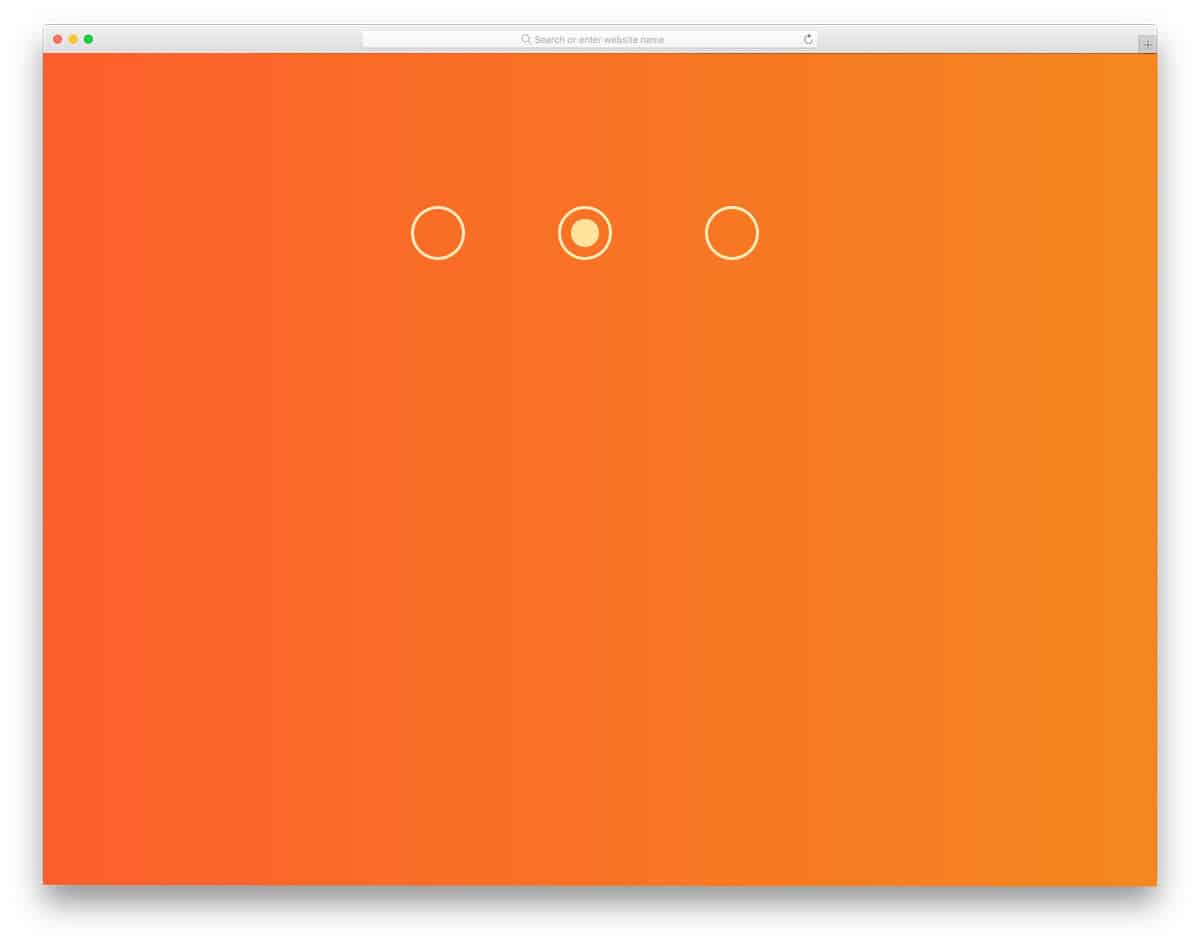
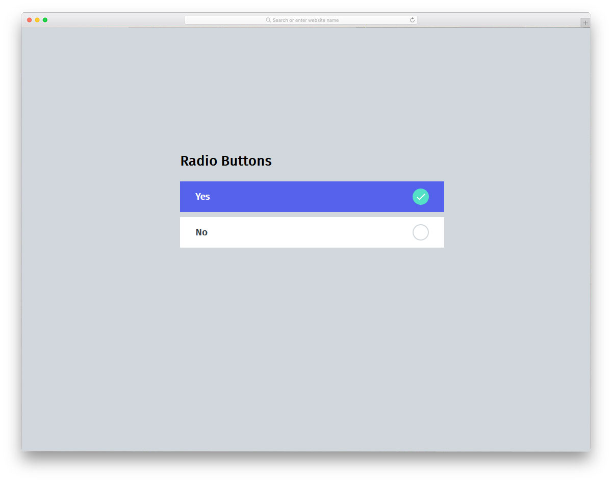
Google Maps Style Radio Buttons

Those who are looking for a simple and elegant bootstrap radio button style will love this concept.
As the name implies, this design is inspired by Google Maps. Icons are used to present information more clearly than traditional labels. Since the icons have evolved significantly over the past few years, you can convey the message clearly with them alone. Plus, you can save plenty of space on your website and on mobile applications. The best part about this radio button style is it is made mostly using the CSS script. Therefore, you can easily use the code in your project.
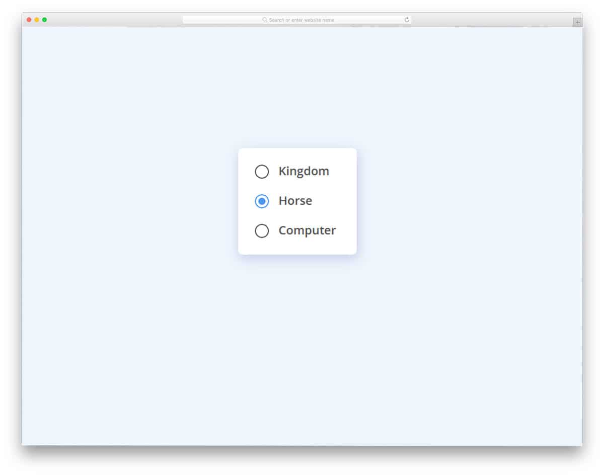
Classic Style Bootstrap Radio Button
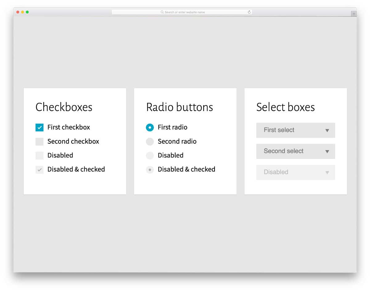
In this example, you get a simple yet functional bootstrap radio button design. Four radio button designs are included in this pack, each serving a different purpose. For example, a radio is disabled, and another radio button is checked & disabled so that the users can’t control those options. If you plan to use the radio button on the settings page, the Bootstrap buttons in this example will be helpful.
Card theme Switcher

The creator has used a credit card category selection concept. Sparkle effects are used smartly to clearly show which card the user has chosen. Plus, the card’s shining effect while selecting them makes the interaction even more engaging to the user. Since the whole concept uses the latest HTML and CSS scripts, you can add any custom elements and effects to it. The default code structure is clean and loads the design faster, so you can use it in your website or application design without any worries.
Radio Hopping
Many hopping effects are used in the radio button designs because they are more meaningful and work well in both webpages and forms. The hopping effect in this example is smooth. Plus, the bulging effects and shrinking effects are timed perfectly so that the overall effect looks complete. The default design itself is an eye-catching design, but you can add a glowing effect to the radio button to spice up the look. Take a look at our CSS glow effects collection for more attractive glowing effect concepts.
Bulgy Radios
For those who want a flashy and eye-catching radio button design, this concept might impress you. The texts move in a wave pattern from left to right when you select an option. Zoom in and wave effects are combined smartly in this concept so that they manage to get the user’s attention easily. Though the animation looks complex, it can fit easily on any part of the website and application. You can change the effects a bit if you want. The creator has kept the code script simple and has given more than enough space to add your own custom effects.
SCSS Styled Radio Buttons
SCSS Styled Radio Buttons is a simple, large radio button you can use on all types of websites and applications. Fade-in and fade-out animation effects are used for the radio button so the user can quickly see the option they chose. The entire gradient background and the smooth radio button transition effects are created entirely with CSS3 and HTML5. Since the developer has used the latest frameworks, you can even improvise the design with your own custom animation effects and color scheme. By making a few optimizations, you can easily use this code in your project.
Underground Radios
If you are looking for animated Bootstrap radio button styles, this example will inspire you. The animation effect is subtle and doesn’t take much screen space. Hence, you can easily use these animated Bootstrap radio button styles on your website and in your forms. The center dot moves smoothly to the radio button you click. With this simple animation, the creator has created a natural-looking radio button that makes it easy for the user to use. Another advantage of this design is that it is built entirely with HTML5 and CSS3. Hence, you can easily use this code in your project.
Pure CSS Radio Button Tiles
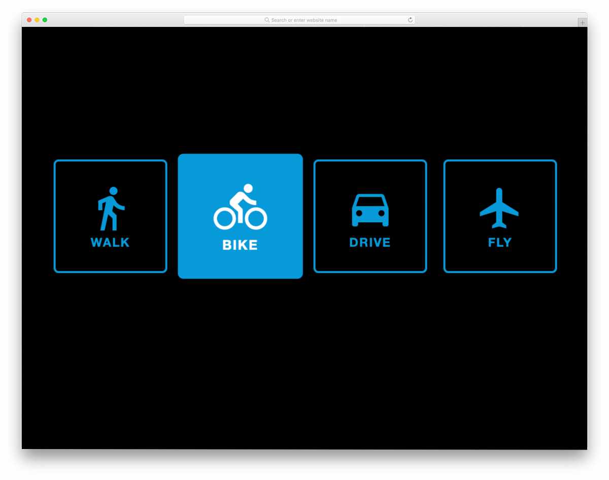
The bootstrap radio button styles in this example are easy to use and can be applied to any website or form. Instead of using labels and conventional round radio buttons, this design uses icon tiles. All you have to do is click the tile you want; simple, that’s it. Because the icons are more direct and can be understood easily by the users, you don’t have to worry about interface difficulty. Just like the design, the creator has kept the code as simple and neat as possible. Hence, you can easily utilize the code on your website or application.
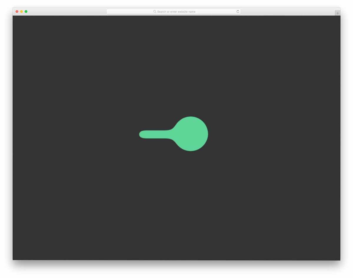
Liquid Radio Button

As the name suggests, the creator has applied a liquid effect to this radio button. Both the select and unselect effects are neat in this example. The best part is that the entire design is built with CSS. Because of its lightweight structure and flexible layout, you can easily edit this design. Plus, you can easily place this radio button anywhere on your website and in forms. There are other types of liquid animation examples in this list; take a look at it if you are not inspired by this one.
Gooey Switch – Radio Button
This one is also almost similar to the liquid drop design. The creator has used liquid animation for the toggle-switch radio buttons. If you have only two options, a toggle switch is a more convenient design than a traditional radio button. To achieve a buttery-smooth effect, the creator has used a few lines of JavaScript alongside the CSS script. The entire code script is shared with you on the CodePen editor. You can edit and visualize the results in the editor before using them on your project.
Animated Checkboxes and Radio Buttons
In this pack, you get different types of checkbox and radio button animations. Each animation is unique and will help you create interactive checkboxes and radio buttons. The entire code script can be downloaded so developers can easily load it into their preferred editor. Since the code script is used smartly, the effects are smooth and give a realistic look. If you want simple yet distinctive radio button designs, the Bootstrap radio button styles in this pack will help you.
Input & Radio-button

This is another practically feasible radio button that can be used anywhere on the website. The animated radio button doesn’t take much screen space, so you needn’t worry about aligning other elements on your webpages and forms. Since the creator has used the latest CSS script, you can also use other types of animations to personalize the design. An input box is also given along with the radio buttons. Take a look at our CSS input box design collection for more interactive options.
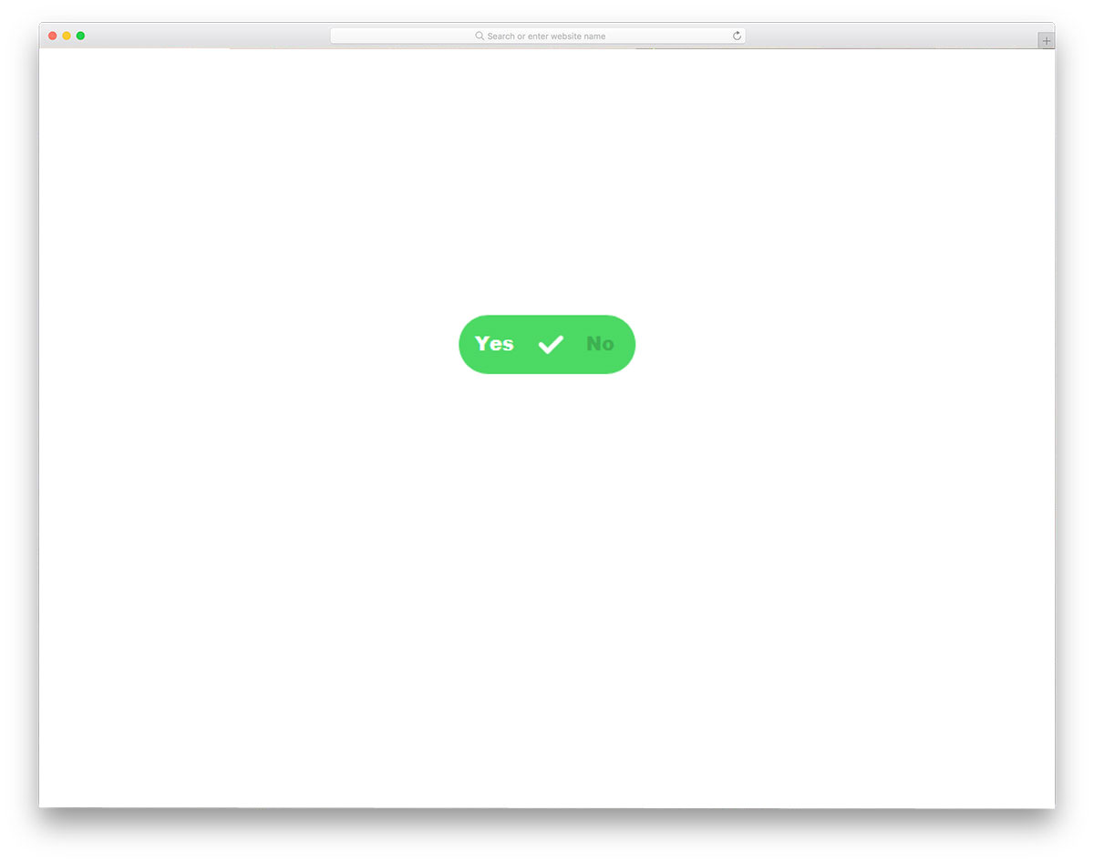
Form with SVG Radio Buttons

Instead of using the conventional bootstrap radio button styles, the creator of this example has used a creative style. Icons are used to directly indicate the purpose of the radio button. In this example, the SVG icons have replaced the gender radio button. Using icons like this is simpler and saves a lot of screen space. Subtle highlighting animation effects are used to indicate the option you have chosen. Function-wise, it is still a boolean, either yes or no. Only the front look of the button has changed, hence you can use Bootstrap radio button styles like these without any worries.
Google Dots Radio Buttons

Google Dots Radio Buttons is a fun concept design inspired by Google loading animation. If you are looking for some cool animated radio buttons, this one might impress you. Each dot on this design has different clicking animation, which is an attractive feature. But if you prefer consistency in your design, you can stick with a single animation effect. Though the concept looks intricate, the code structure is very simple. The developer has used only CSS3 to create this beautiful conceptual design. Because of this simple code structure, you can easily incorporate it into your design. All you have to do is to tune the design as per your requirement and use it on your website or application.
Pure CSS Radio Button Tiles
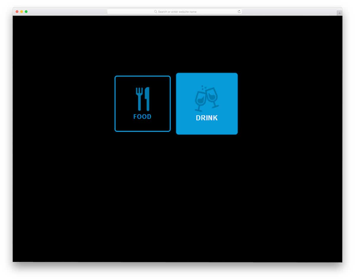
Instead of using simple radio buttons, you can use icons to create a more creative design. In this design, the developer has used a restaurant theme. The user can select whether they want drinks or food. Because of its simple icon design, you can use it in mobile applications as well. Restaurants are among the most competitive industries that effectively use modern technologies to serve their customers. Making the restaurant website mobile-responsive is a must to let users reserve a table on the go. Since this radio button is icon-based, you can easily use it in responsive design as well.
Swappy Radios
Swappy Radios is another crazy conceptual radio button design. Instead of animating each and every button, the developer has moved the selected radio button throughout the form. As the name implies, the selected radio button swaps positions with the unselected one. Since this animation happens around the form, make sure you give adequate spacing between the elements. Though it is a swapping animation, the developer has timed it perfectly so the user won’t feel any lag. You can use radio buttons like this in your survey forms or other forms. Take a look at our free email template collection to improve your email engagement rate.
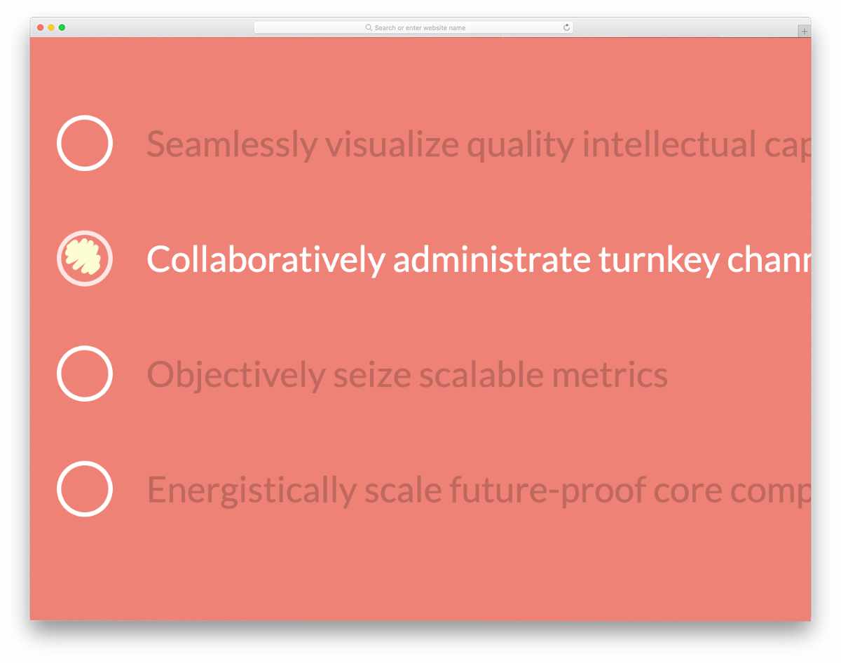
SVG Splat Radio Buttons
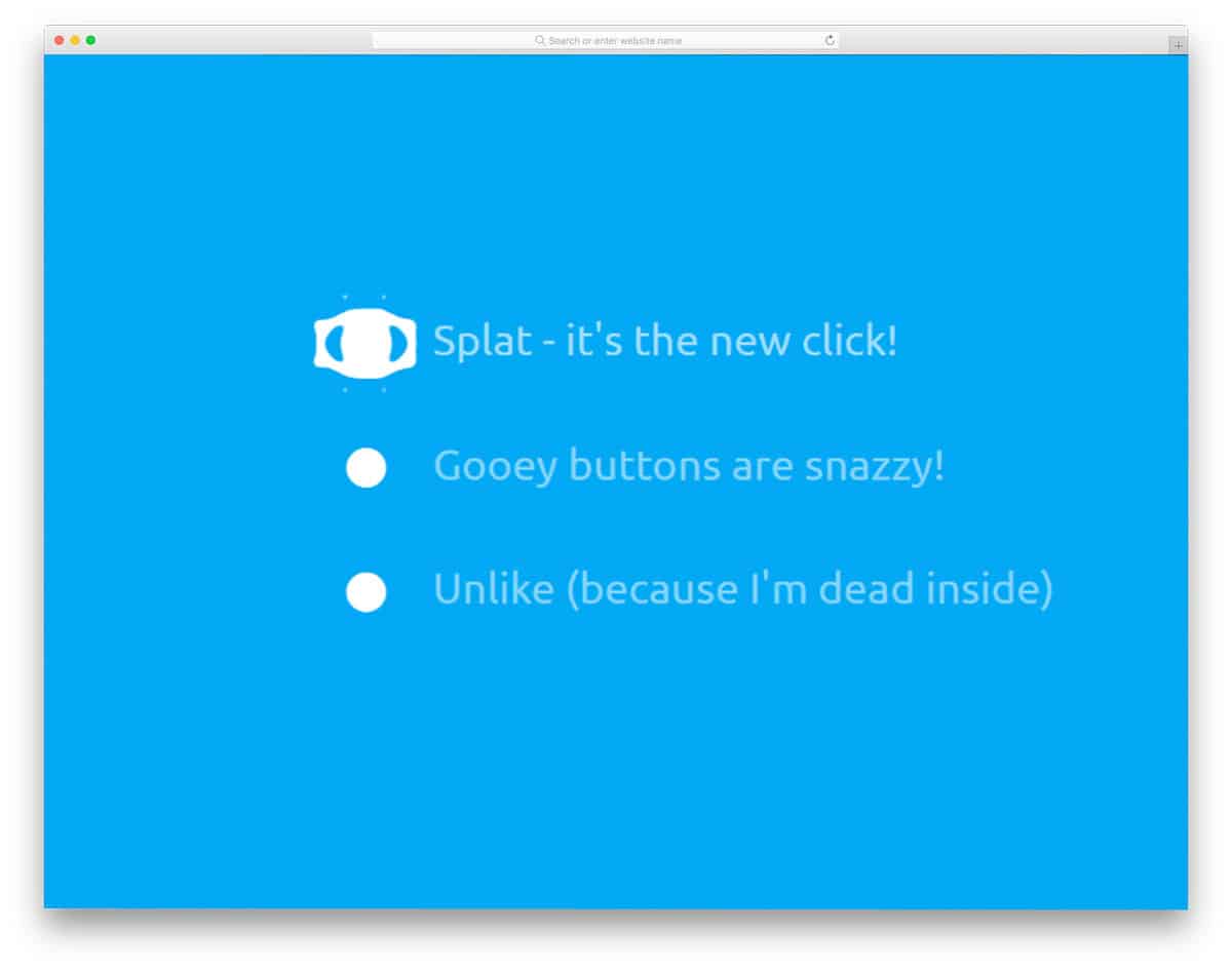
SVG Splat Radio Buttons is similar to the Swappy radios mentioned above. This one also uses a creative animation effect to make the radio buttons interactive. A small, subtle animation indicates which option the user has chosen. The animation effect used in this design is very simple, so you don’t need to worry about the spaces around the elements. To create this beautiful radio button, the developer used HTML5, CSS3, and JavaScript. Since the developer has used the latest frameworks, you can expect smooth animation with this code.
Custom Radio Buttons

Custom Radio Buttons is a simplified version of the above Google Dots radio button. This one doesn’t have any flashy or cool animation effects. A basic functional design is used in this example, and a simple animation indicates the tick mark in the radio button. The design and code structure are kept simple in this example as well. Hence, you can easily use this design on your existing website or application. Though the code is simple, you must make a few optimizations before using it commercially. Click the info link below to have hands-on experience on the code.
Material Radio Button

Material Radio Button is another icon-based radio button design. In this design example, the developer has used a water droplet concept. The white dot squiggles to the next option when you click an option. The animation effect is made very fluid using CSS3 and a JavaScript framework. When you are making a radio button, two options, this design will do. In the default design, the developer has used a Font Awesome icon, which is good and well optimized. However, if you have your own set of icons, then you can use that in this design. Since it uses the latest framework, it supports all trendy color schemes.
Animated SVG Radio Buttons

Animated SVG radio buttons are sensibly animated. The developer has designed the buttons smartly so they won’t take up much screen space and still provide an eye-catching animation effect. The button is made to zoom in at the end of the animation to clearly show the user what option they have chosen. Along with the radio buttons, the developer has also given you a tooltip animation in this set. It is a complete set for control panel design, which will provide a better user experience. Another advantage of this design is that it is built with HTML5 and CSS3.
Ripple Wave Radio Button
In this design, a small ripple wave blast is shown when you click an option. Along with the radio button the developer has also given you checkboxes. We have made a separate list for checkbox designs for applications, websites, and forms, take a look at it for a more impressive design. The developer used only HTML and CSS to create this design. Hence, you can easily work with this design and customization will also be easier on this one.
Liquid Radio Button
Liquid Radio Button is another liquid drop-based animated radio button. This one might impress you if you like to do something out of the ordinary. The developer has provided an animation for both the selected and unchecked radio buttons. Hence, this design will give you a clear idea before using it. To achieve a buttery-smooth liquid drop animation, the developer has used CSS3 and JavaScript. The code structure is well-organized, making it easy for other developers to use. Since it uses the latest frameworks, implementing the latest design trends will be easy.
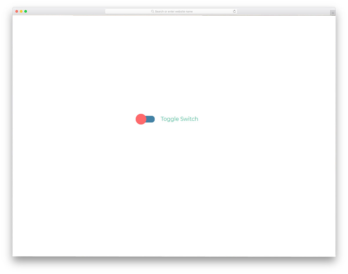
Flight Toggle

For a more natural experience, toggle buttons are used instead of radio buttons in some applications. To make the user experience more interactive and straightforward, slightly improved toggles like these are used. Bootstrap radio button styles like these can also be used for mobile applications, forms, and websites. For example, since this is a flight-themed design, you can use it for travel websites. The entire code script for this design is shared with you directly, so you can easily modify it per your needs.
Custom Toggle Switch Inspiration
It is another toggle switch design that can be used as an alternative to conventional Bootstrap radio button styles. Not only is the design of this toggle switch simple, but the code for this design is simple as well. The toggle switch transition is smooth, so most users will enjoy using this button. If you are making a toggle or radio button that the user will use frequently, simple toggle switches or Bootstrap radio button styles like this are a good choice. Since this design is mostly built with CSS3, you can add your own colors and transition effects if you want.
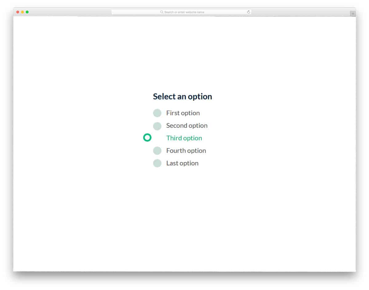
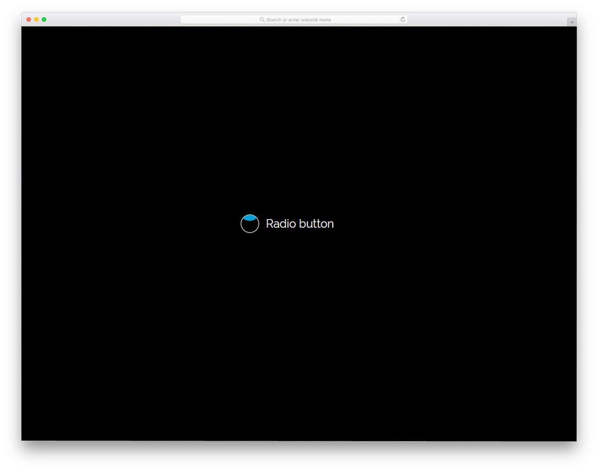
Radio Button
This is another example of smart contemporary bootstrap radio button styles that you can use to replace boring radio buttons. With simple transition effects and colors, the creator clearly shows the user’s chosen option. The transition effects are smooth and swift, so the users don’t notice the shape transitions. Like most other bootstrap radio button styles on this list, this one is made purely with CSS3. Hence, you get a more natural animation effect and can easily use this code on your existing form or website.
Animated Switch For Radio Buttons

Instead of the same old-school design, the developer has used a sliding button for the radio buttons. All the user has to do is slide the button to the desired option. The developer has used colors effectively to indicate the options. By default, you get a tapping/clicking interface in this design, but if you prefer, you can use a sliding gesture. The advantage of this radio button design is that it can be used for both website and mobile application design. To achieve this sensible design, the developer has used HTML5 and CSS3. Because of this simple code structure, developers can easily work on this design.
Three State Radio Button

Three state radio button is another version of the Animated switch design mentioned above. But this one has a funkier, more attractive animation effect. The letters on the switch constantly rotate to indicate that they are clickable options. Just like the previous Animated switch design, this one also uses different colors for different options. Using different colors for the options makes it easy for the user to see which option they are choosing. Though this one has multiple animation effects, the code structure is simple. With the latest CSS3 script, the developer has delivered an attractive design with lightweight code.
Jelly Radio Button
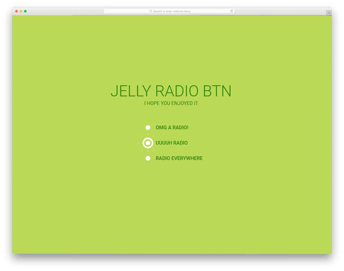
Jelly Radio Button is another version of the Splat Radio Button design above. Since both designs are from different developers, the code structures also vary. In this one, the animation effect is a bit intense than in the Splat Radio button. When you select an option, the zoom-in animation starts right from the screen and ends on the button. For professional use, tone down the effect so the user won’t get annoyed. Since this one is designed only using the CSS3 scrip,t adjusting the code as per your requirement will be an easy job.
Gooey Radio Buttons
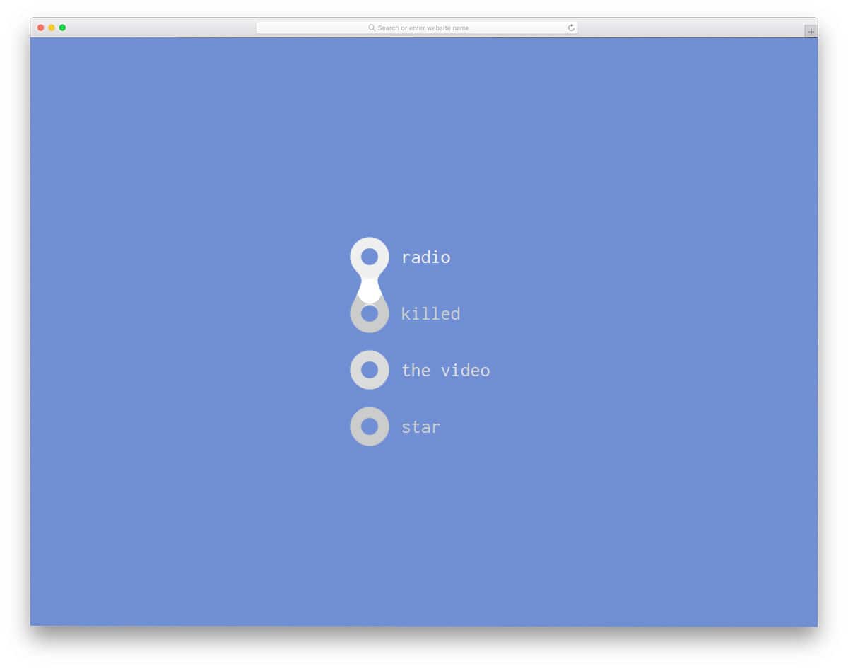
Gooey radio buttons use a liquid drop animation for radio button selection. The developer has made the animation consistent, ensuring a professional finish. For example, if you select the fourth option in the radio button list, the liquid drop moves through the second and third options to reach the fourth. The user will have a better experience with this interactive animation effect. The developer has used CSS3 and JavaScript to create a smooth, clean animation effect. The use of the additional framework feels like a good choice, given the end result.
Radio Button Animation
In this design, the developer has given us an animation concept for the radio button. When you click the radio button, a bouncing ball fills it. The animation effect is gentle and clean, making it a perfect fit for all types of websites and applications. Like most other Bootstrap radio buttons on this list, this one is made with CSS3. Because of this lightweight code script, you can even use this code straight away on your existing website. All you have to do is optimize the code as per your requirement and use it in your design.
Bouncy Radio Buttons

Bouncy Radio Buttons is a very clean, simple, animated radio button design. As all the animation effects occur within the radio button, you don’t have to adjust the elements on your web page. The design and code structure are kept simple. Since the developer has made this design purely with CSS3, you can use any modern color scheme and animation effects. Plus, you can easily utilize the code on your existing website or form.
Transform Toggles Will-change
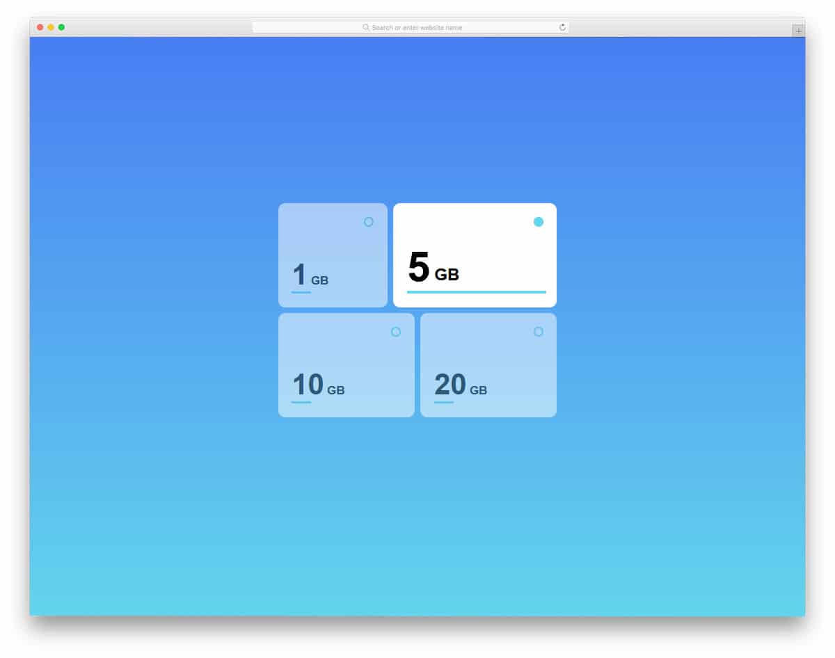
All the previous radio buttons are made for forms and web pages. In modern web design, web elements not only look elegant but also give user-friendly features. The developer here used the radio buttons effectively to select plans. You can use this design as such on your website. When you pick a plan, the card slowly expands to show the plan you chose. Another advantage of this design is that it makes full use of CSS3. The CSS3 script gives you a smooth animation and transition effect. If you wish to use something different from the usual design, this design will impress you.
Slap Toggle

Slap Toggle uses a 3D card-flipping animation. When toggling from one option to another, not only does the option flip, but the entire option swings to give a fluid effect. To give you this free-flowing animation effect, the developer has used CSS3 and JavaScript frameworks. The code structure is handled properly, so you can easily spot an element and edit it quickly. This design also uses colors smartly to give you a realistic experience. Because of this fluid animation, you can even use this as a standalone function on a full page.
Wobble Radio Buttons

Wobble radio buttons give you a set of radio button designs. Each button has a different color. Based on your needs, you can pick one and start editing it. To give you a better idea, the developer has shown his design in both light and dark modes. The colorful radio buttons look more attractive and distinctive in the dark version. To make this set of radio buttons, the developer has used HTML5, CSS3, and JavaScript. The default design is smaller, but you can easily scale it as per your design needs.
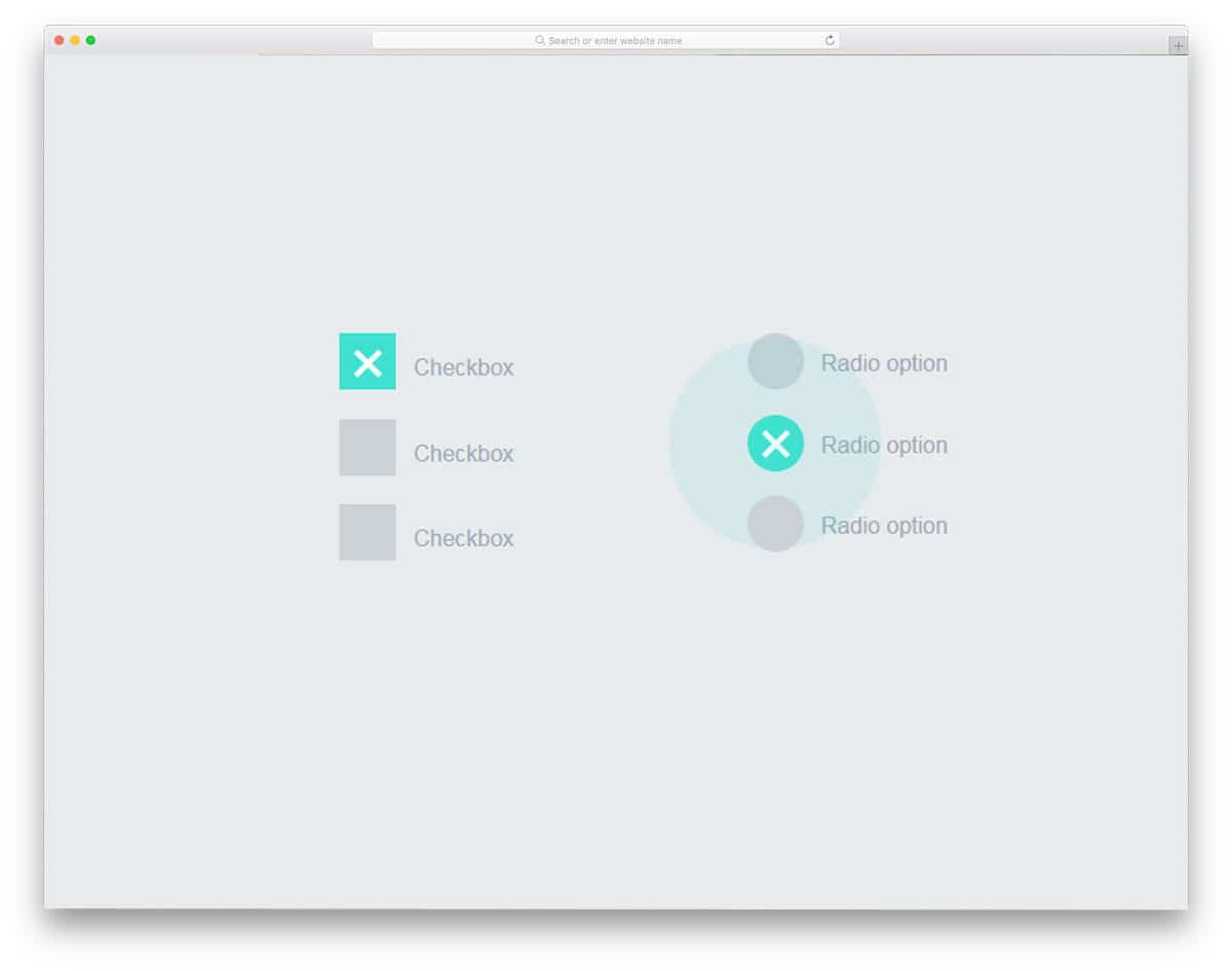
Material Inspired Radio Groups
As the name implies, this one is a material design-based radio button. Along with the radio buttons, the developer has also provided checkbox designs in this set. Both the checkboxes and the radio buttons use the same material design colors. Swift animation effects indicate the field the user has chosen. The developer has given you a base design; from here, you have to manually refine it to fit your design and feature requirements. A simple code structure lets you easily add and edit the features you like.