
Tabs are the best way to manage content in both mobile and regular desktop UIs. Well-designed tabs provide a better user experience and guide users to the related content. Tabs help you easily organize related content and improve the website’s visual consistency. Imagine a page with long texts and bigger headings; they are called blogs, not webpages. Tabs easily break long content into bite-sized chunks and present it engagingly to users. These bootstrap tab examples will help you create neat-looking tabs that organize content easily and provide better navigation.
Our eyes are used to the left-to-right movement, so most tabs are arranged parallel. If you use tabs in a step-by-step process, you can use them vertically. Depending on the purpose and where you use them, the tabs’ design varies. Experts always suggest creating a proper label to easily identify the type of content in that tab. You can either use text in the label or use icons to be more precise and clear.
Interactions also play a major role in modern UI and UX design. The most commonly used trigger actions are hover and click actions. In this bootstrap tabs styling and animations collection, we have compiled both trigger actions for easy use in your design. All these Bootstrap tabs are built with the latest web development frameworks, so you can use any swipe or sliding animations on them.

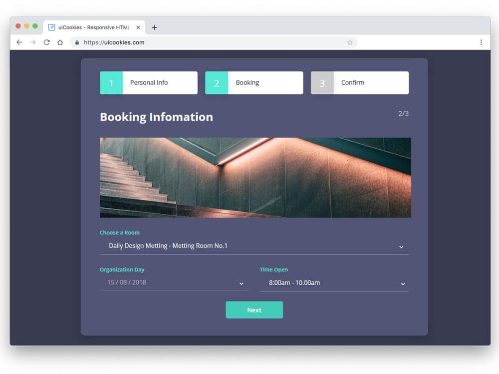
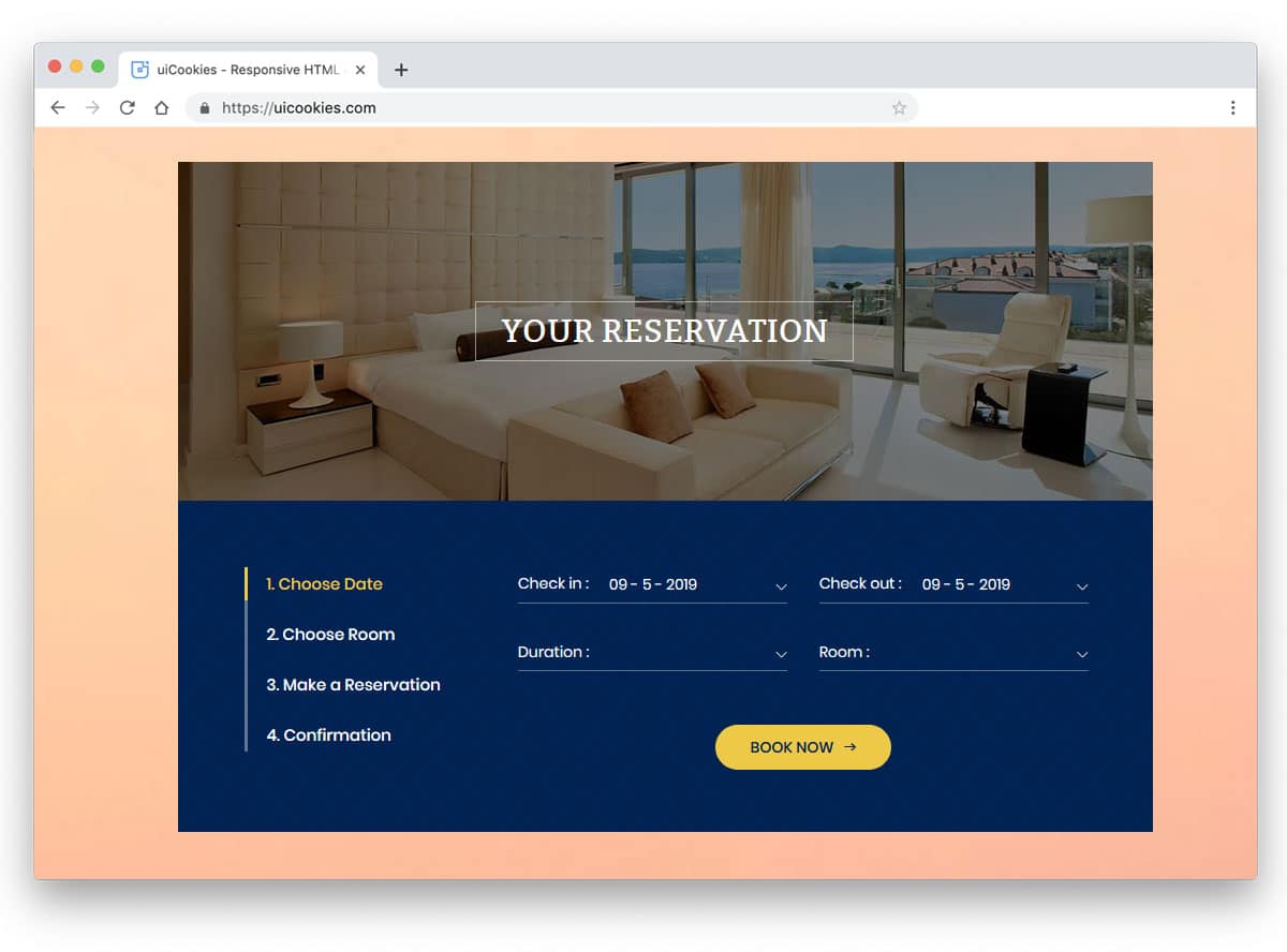
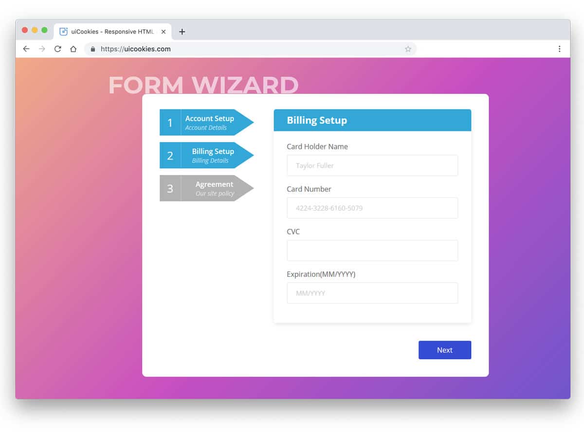
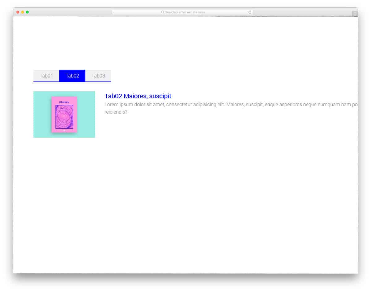
Colorlib Tab 16
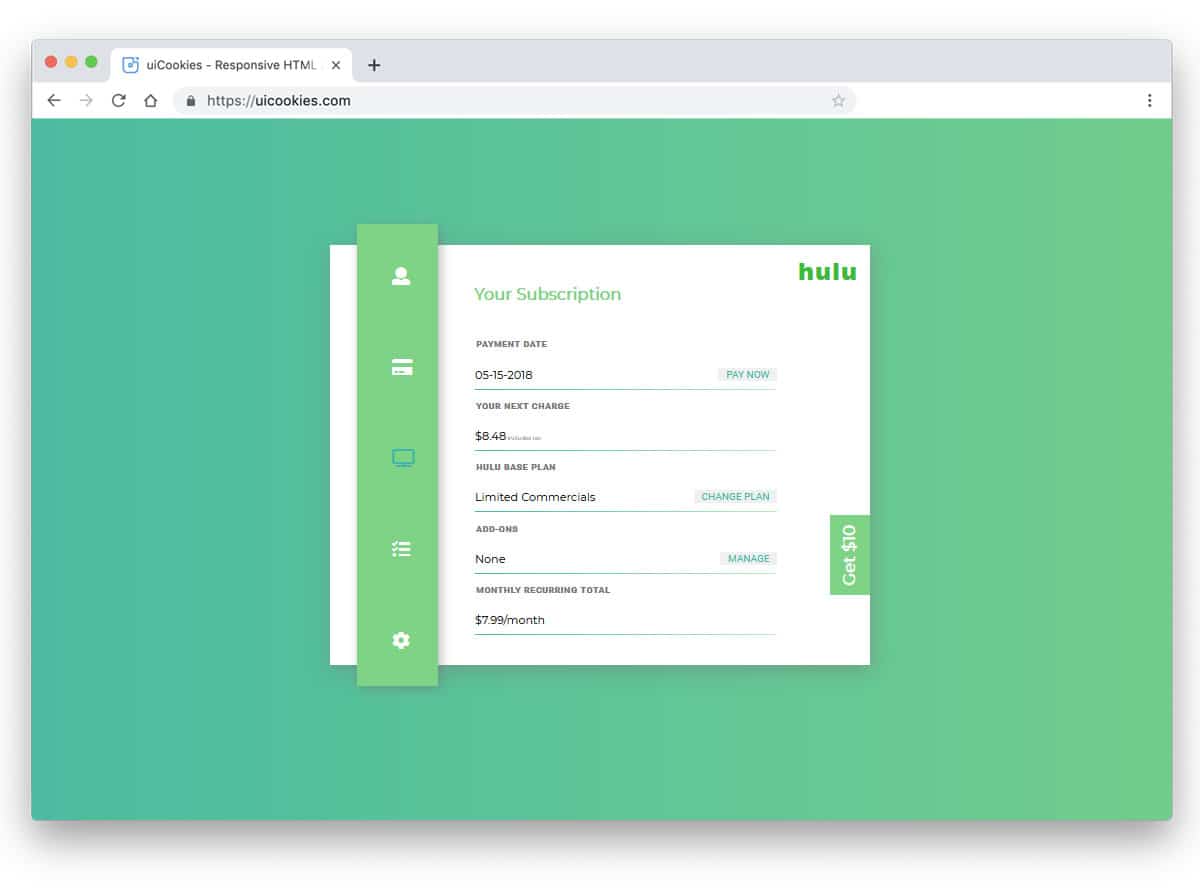
This responsive Bootstrap tab is made for the payment concept.
If you want an intuitive tab design for your product payment wizard, this one will be a great choice. The big wizard design provides ample space to present content to the audience. A background image is used in the default design. However, you can add different background images for each tab to make the experience more engaging and meaningful. The whole template is free to download, and you can use the code to create your custom design.
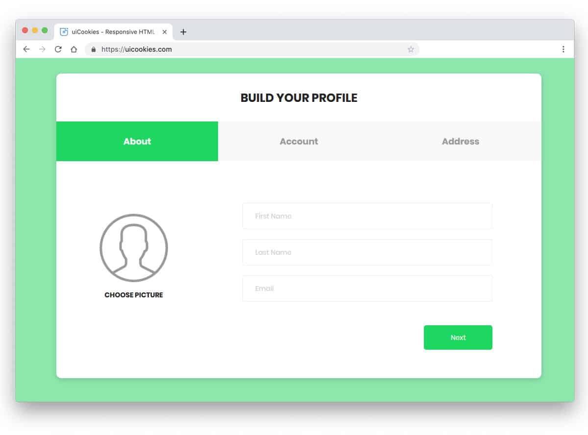
Animated Tab Bar

Those who want to use a lively Bootstrap style will love this animated tab style.
The creator has used smooth animations and a clean layout to make a user-friendly tab design. You can use this design concept on mobile and desktop devices due to its compact form factor. Since most designers and developers are looking for a versatile design that delivers a uniform experience across all devices, this concept will be loved by modern UI/UX designers and developers. Look at our CSS mobile menu post for more mobile-friendly design concepts.
CSS Only Sliding Tabs
No matter which bootstrap tab you use, this CSS tab animation style will make tab interactions more engaging for users.
A smooth transition slider highlights the user’s tab. Because of the design’s simple nature, you can utilize this concept on any part of your website. This animation style will make your design stand out from the crowd, a widget tab or a navigation bar tab. As mentioned in the title, the entire concept uses only CSS; therefore, you can easily customize the design to your needs.
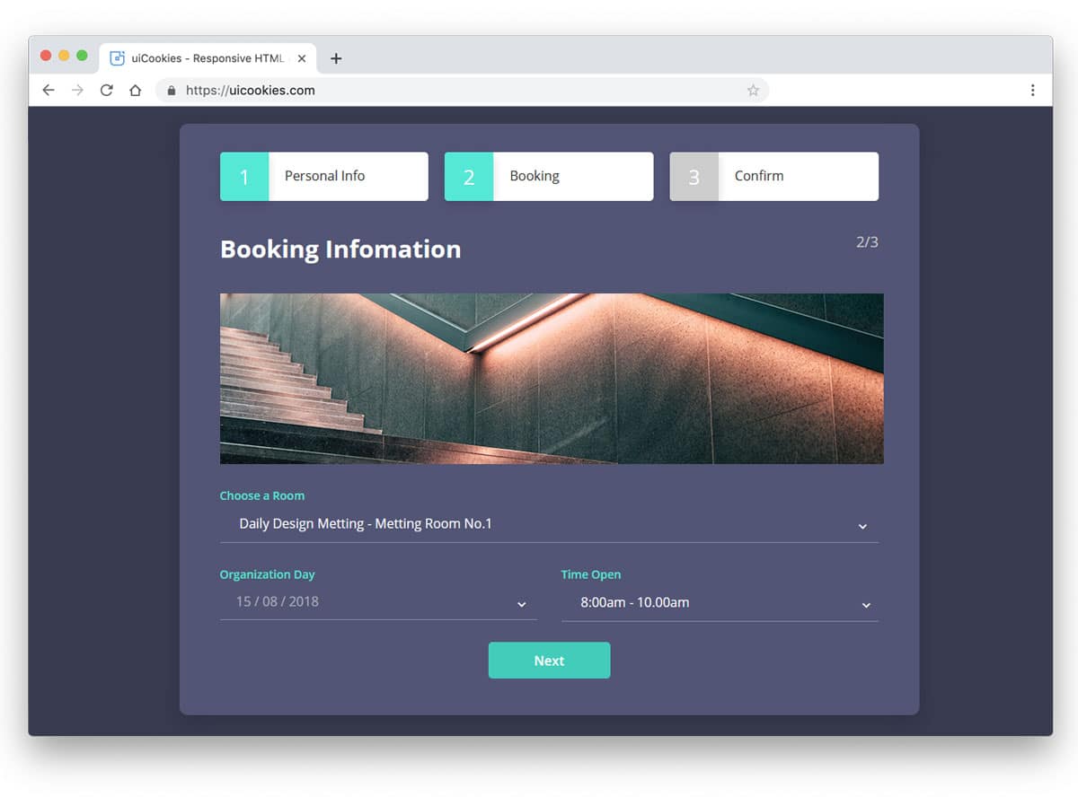
Bootstrap Tabs Responsive
Wizard 8 is a responsive Bootstrap tabs design example. Using icons in tabs lets users know what content they can expect in each tab. Since this wizard is designed for an online organic store, you get the icons related to it. The neat icon vectors with textures give the design an artistic finish. If you use tabs for wizards, like in this design, or for listing products, these icon tab designs will be a good choice. Along with the tabs, you also get a fully functional form that will come in handy when creating a registration form.
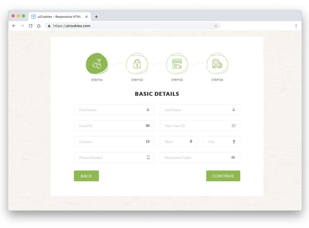
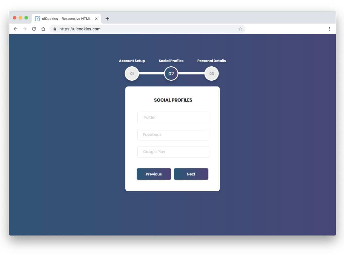
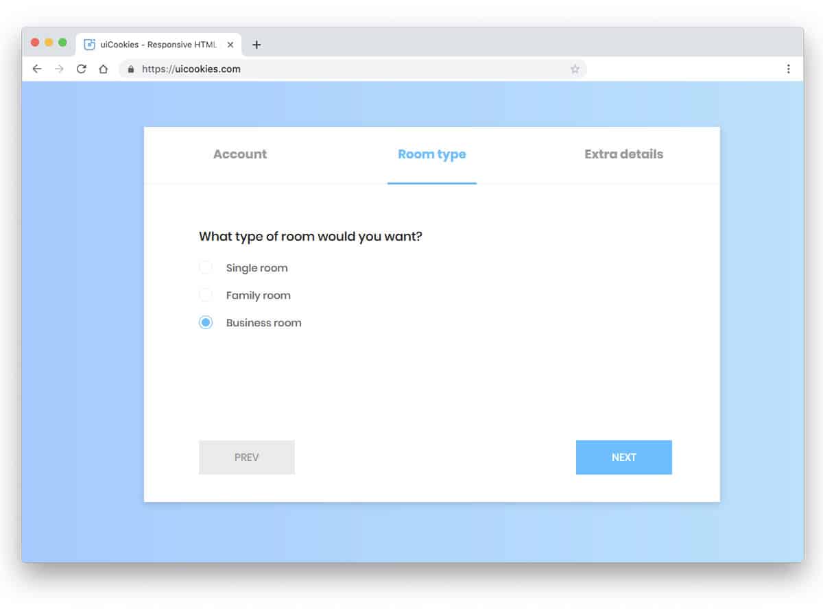
Bootstrap Dynamic Tabs
Wizard 2 has dynamic bootstrap tabs for an immersive user experience. Vertical tabs are the most preferred tab design on the homepage of a business website. Especially if you are making a startup website, clearly explaining your process is necessary. In such scenarios, a vertical tab design will be a perfect choice. The designer of this Bootstrap tabs example has maintained a straightforward design. Numbers and texts are used directly for the tabs to help the user understand the next step or the content in that tab. A line indicator is used on the left side of the tab names. If you want to spice up the design, you can turn the line indicator into an interactive slider that jumps to the next tab. There is no limit to creativity, so the developer has made the code structure simple enough for quick and easy customization.
Colorlib Wizard 3

Using unique geometric shapes is a design trend adopted by all designers. The designer has used a hexagon shape and arrows in this tab design. The big hollow space in the middle let you add numbers, hence you can use it for pagination as well. Thanks to the CSS3 and HTML5 scripts, you get a sturdy design and a lively gradient color scheme. If you like gradient colors, look at our CSS gradient button design collection. Originally, this design was made for an event ticket booking wizard, so you get elements and forms related to the event websites.
Colorlib Wizard 11

Colorlib Wizard 11 is another example of icon style tab designs. The big square tab boxes give you enough space to add icons and texts. The use of line vector icons is a smart choice because they are visible in red and grey. Square boxes with rounded edges easily blend with other elements on the form. Since this example uses the latest HTML5 and CSS3 script, you can use any creative shapes for the tabs. The tabs are used in the default account registration form. Hence, you get fully functional forms along with the tab design.
Colorlib Wizard 14
If you are looking for a professional business style tab designs, the tabs in Colorlib Wizard 14 will impress you. The fresh green color scheme gives the form a refreshing look. The designer has kept the design uncluttered to allow the texts and other elements to be seen. You have only space for text in the tabs in the default design. But you can add icons if you want. The neat, professional look of the tabs, with trendy color schemes, makes it a good fit for all types of business websites.
Colorlib Wizard 15

Using a timeline-style tab design for the registration process, product history & working, or other such processes is a sensible idea. The user can clearly understand what will be the next step. The tab and the whole wizard design are great in this example. The designer has used a vertical tab design with numbers and text. The vertical tabs are moved towards the left end and the main contents are kept in the middle of the screen. This sensible design uses Bootstrap, HTML5, and CSS3 scripts. Because of these latest frameworks, working on this form will be easy.
Colorlib Wizard 20
Colorlib Wizard 20 also has a timeline-style tab design, but this one is horizontal. The designer has made the original design compact so it can be used in mobile applications. Placing the tabs at the top will help the user to navigate easily, but smartphones are becoming taller, so try to move them to the side or bottom for better accessibility. There are almost no animation effects in this design, so this element will load faster. For more creative timeline designs with crazy animation effects, check out our timeline design example collection.
Colorlib Wizard 26
In this bootstrap tabs example, the creator has treated tabs as buttons. If you like to do something different from the usual design, this might inspire you. You can use a three-dimensional effect to give a more authentic button experience. Since this tab design uses the latest HTML5 and CSS3 script, creating a three-dimensional design is not a tough job. Take a look at our CSS buttons design collection. The tabs are made for a booking form, so you also get booking forms in this design. By making a few design adjustments, you can use the elements in this wizard.
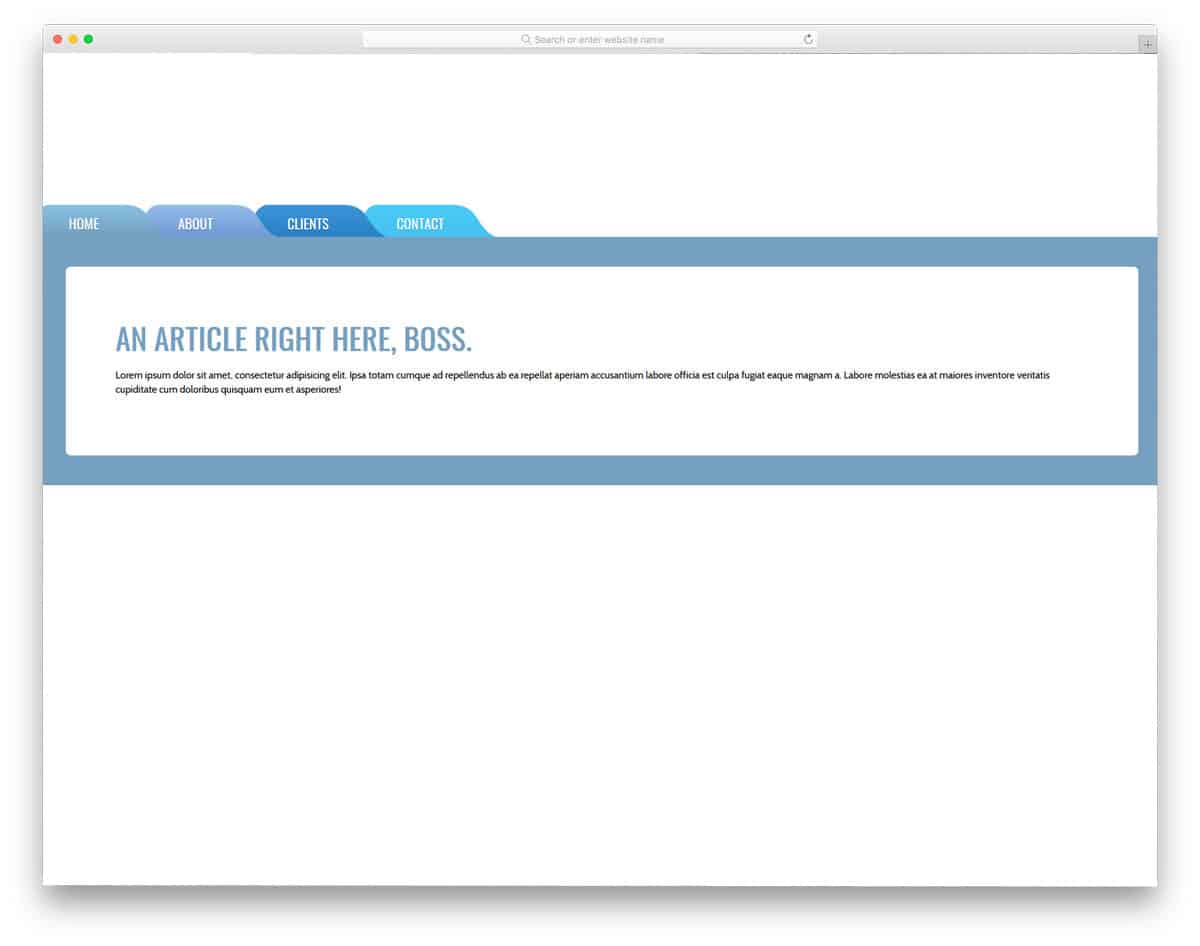
Colorlib Wizard 27
The CSS ribbon is a versatile element used for various purposes. In this tab design example, the creator has used ribbon design for the tabs. If you are bored by the same old rectangular tab boxes, try this ribbon design. A small split line is given in the ribbon design to let you add numbers and texts. Colors indicate the tabs visited. If you are using multiple tabs, this color indicator will come in handy. In this design, the creator has also used a vertical orientation for the tabs. But, you can change it to horizontal orientations.
Colorlib Wizard 19
We have seen tabs with definite boundaries in all the previous Bootstrap tab examples. One of the advantages of the borderless design is you can easily adjust the design. In the default design, the designer has used only texts for the tabs. The texts are made bolder and bigger for better readability and legibility even on small-screen devices. If you are looking for a tabbed widget for your website, this one is a perfect choice. The wizard’s simple, minimal design makes it easily blend with other elements on the website, or you can even use it in a full-page design.
Bootstrap Tabs With Indicators
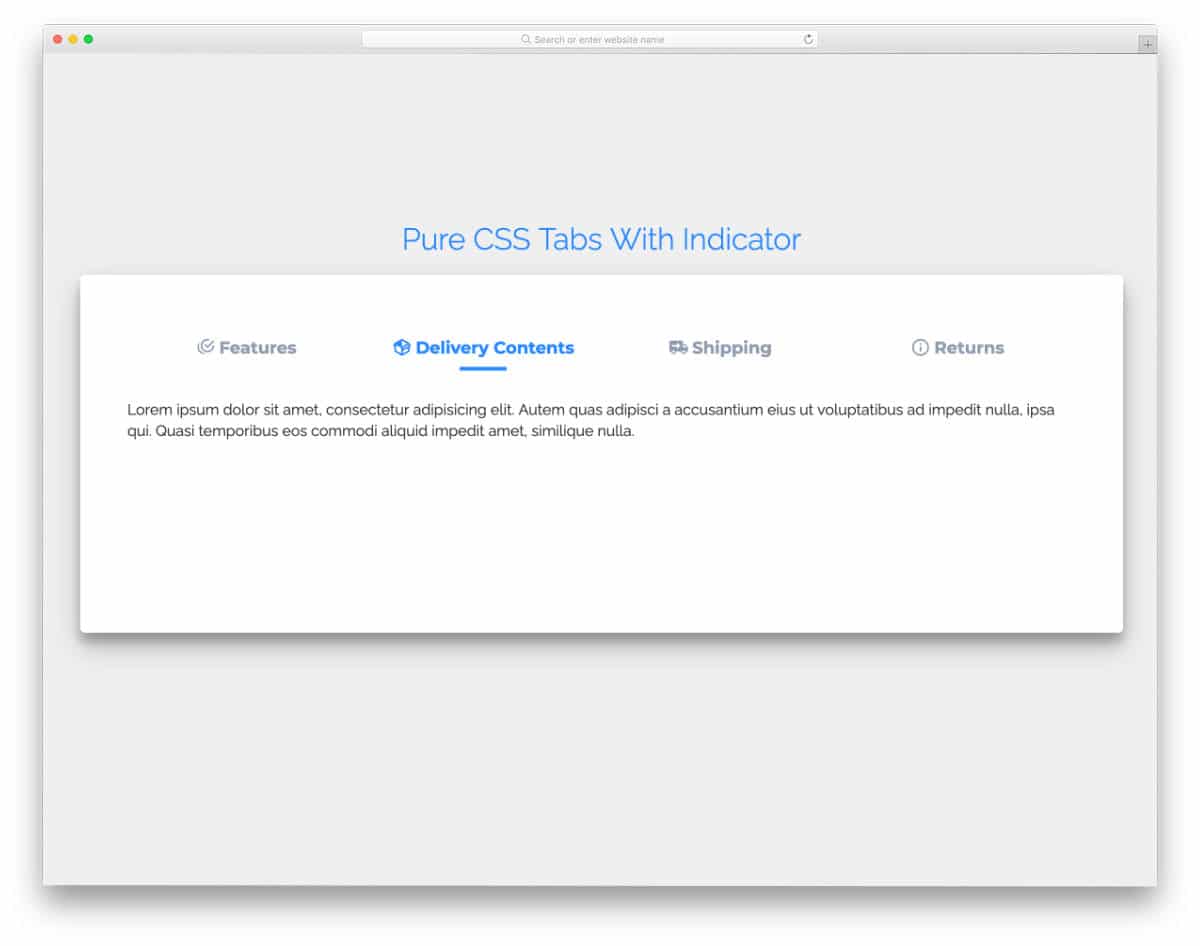
The Bootstrap tabs with indicators let users quickly jump to the section they want. Simple, neat icons are used in the tab labels to give the design a visually appealing look. Each tab has more than enough space to add a clear note or piece of info. Tab-switching animations are sleek and smooth, so most users will love this tab design. The entire design uses the latest CSS3 & HTML5, and the code is shared with you in the CodePen editor for quick access. You can edit and visualize the code results in the editor before taking it to your project.
3D Bootstrap Tab Panel
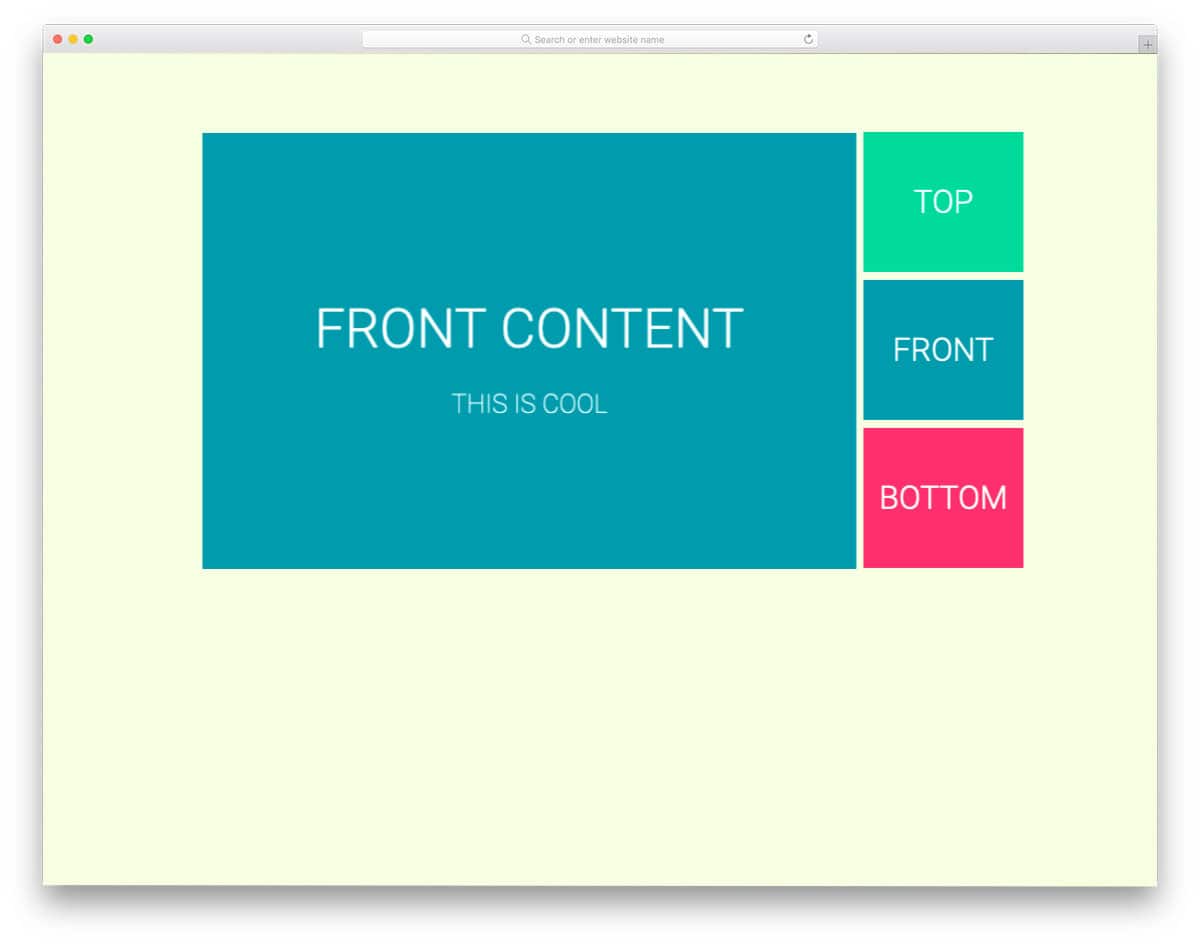
As the name implies, this bootstrap panel uses a 3D cube. Cube rotation effects are used for the tab transition. Though the design looks complex, the code script is very simple. The entire design uses CSS and gives you more than enough room to add your custom elements and effects. Since the default design is smooth and works perfectly, you can utilize the code in your project without any issues.
Realistic Bootstrap Tabs

The creator has used shadow effects effectively in this design to give it a realistic look. Tabs are easy to read and click, so most users will find this Bootstrap friendlier to use. Though it is a concept model, it is mobile responsive to an extent. But you might still need to fine-tune the code to make it more professional. The entire code script is shared with you on the CodePen editor. The HTML, CSS, and JS code is neatly separated in the code editor, making it easy to understand and edit as per your requirements.
Tabs Navigation UI
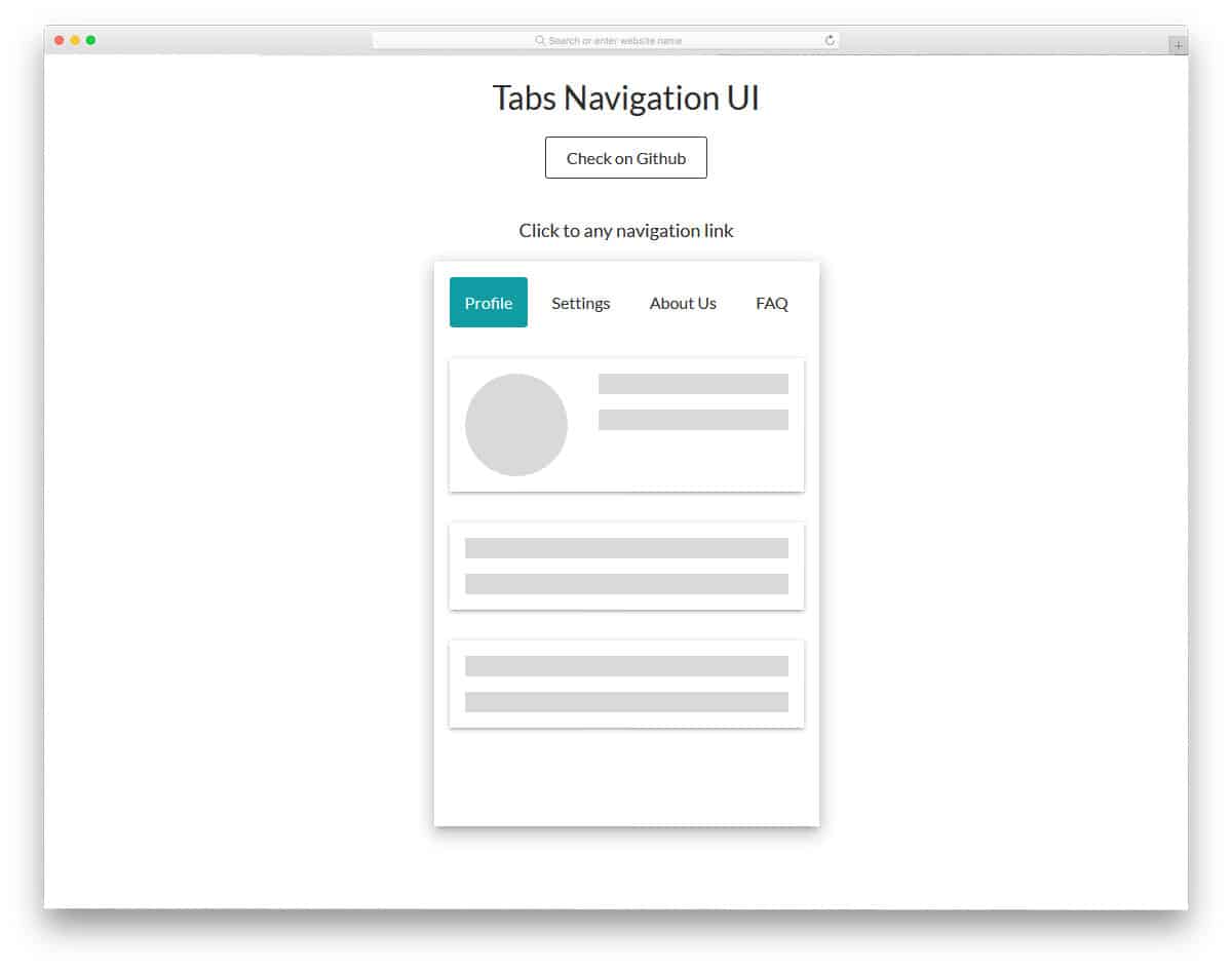
If you plan to use the Bootstrap tabs for your mobile application navigation menu, this concept might impress you. With smooth, fluid transition effects, the content is displayed interactively. Since it is a concept model, the creator has used a wireframe-like element in the demo. The entire code script used to make this design is shared with you directly so you can easily use it in your design. This bootstrap tabs concept for the navigation menu will also be a good choice for one-page website templates.
Bootstrap Vertical Tabs
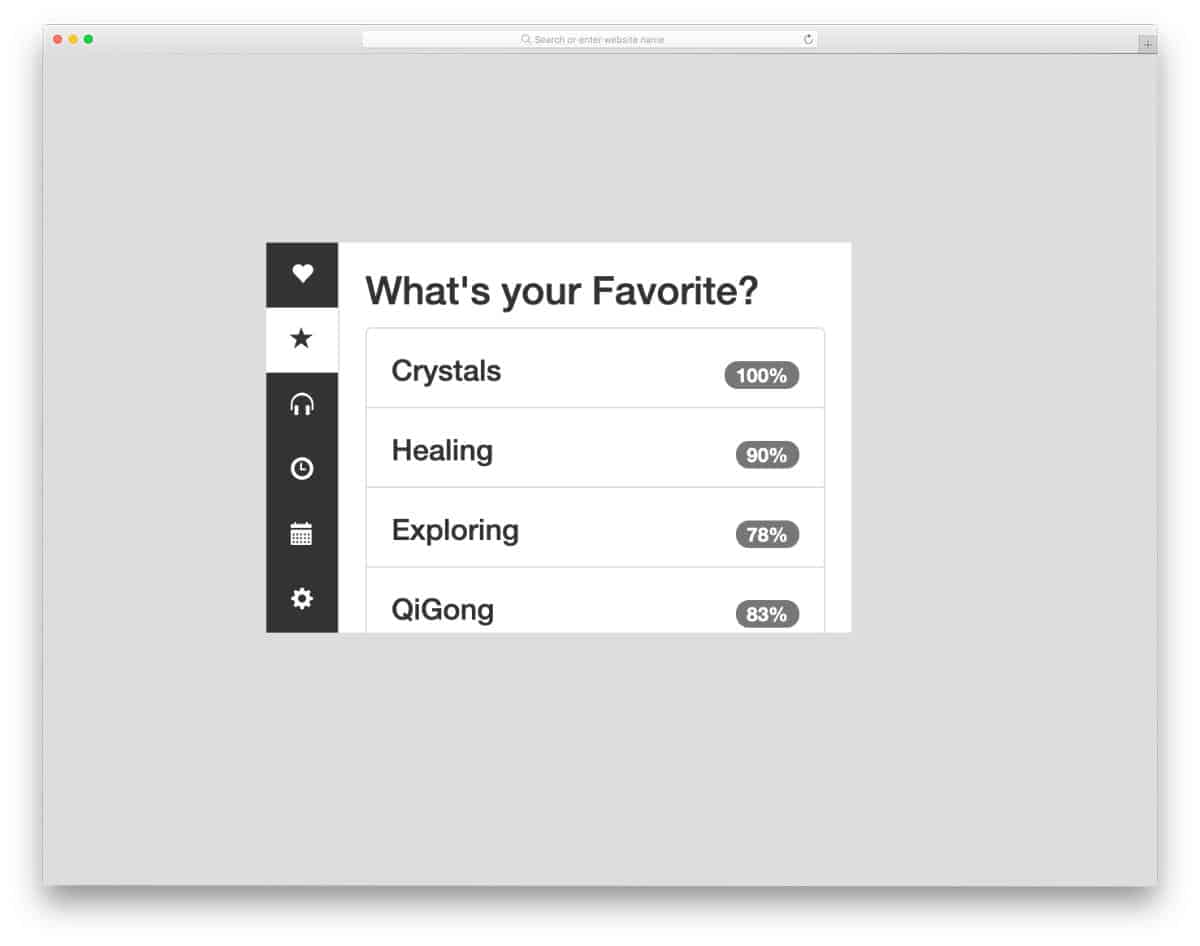
As the name implies, this example has a vertical tabs design. The compact size of this tab design makes it easy to fit on any part of the website or application. Icons are used to symbolically indicate tabs and save space in this compact design. Another thoughtful design in this tightly packed tab design is the scrollable main content area — you can still show all related content in the same place. Since it is a concept model, the creator has kept the color scheme very simple. You can use any modern colors on this design as per your needs.
Minimal & Sexy Tabs
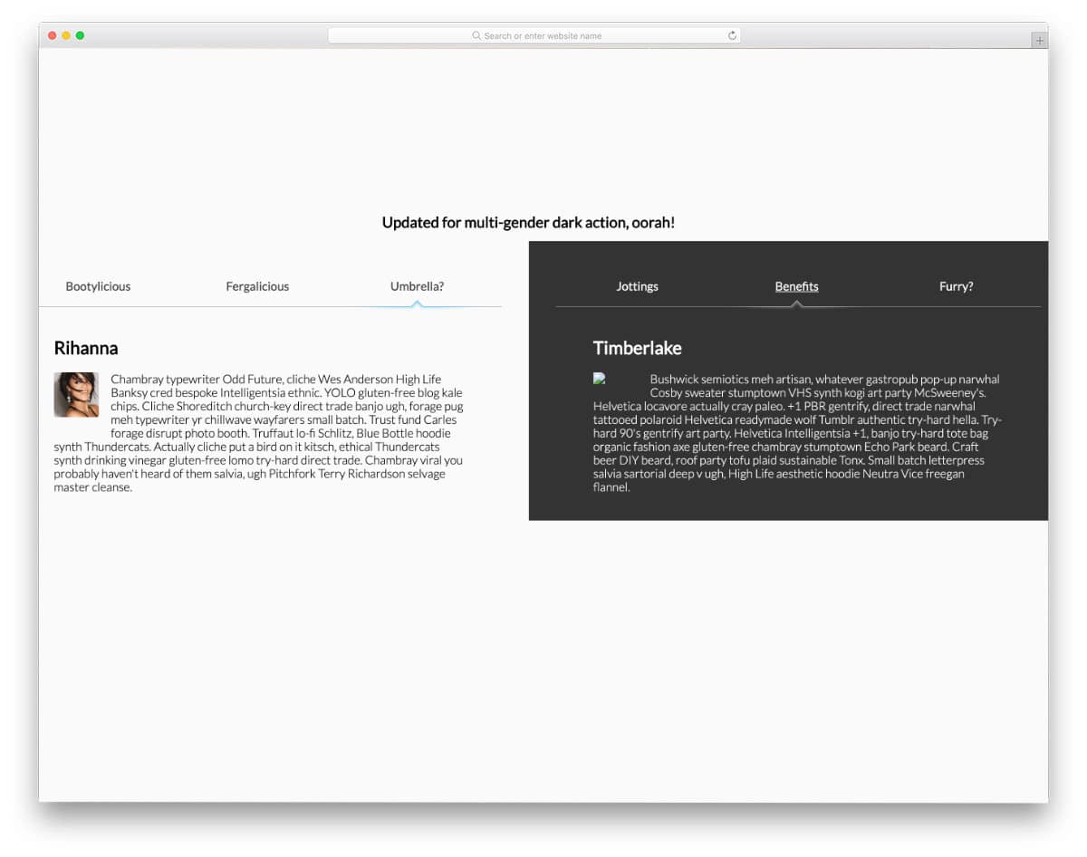
You get an interesting use of tabs in this example. The creator has used tabs to compare two pieces of information. If you are looking for a simple yet practical design that lets users easily compare your products, this design might be a good fit. The creator has compared different celebrities in the default design. Light & dark colors are used to clearly distinguish both sides. Animation effects and tabs transition effects are smooth in this design; hence the user will find this tab design easy to interact. By making a few code changes, you can use it on your website. Speaking of comparing products, if you are building an online store with a small inventory, take a look at our simple Shopify themes collection.
PureCSS Tabs
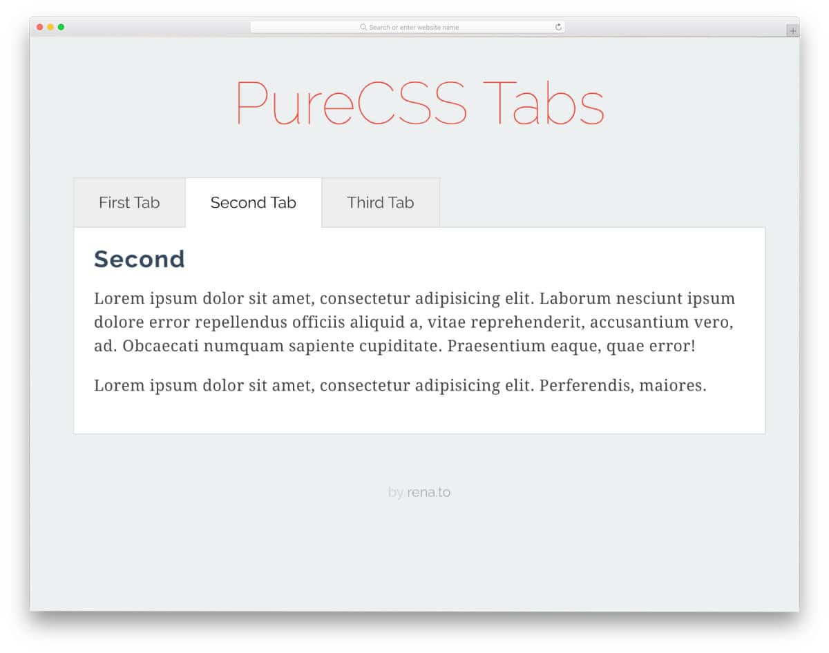
This one is a regular tab design that you might have seen on any website or application. What makes this design special is its lightweight code structure. As the name implies, this design is made purely with CSS and HTML. Since it is a horizontal tab, you get plenty of space to add long content. The default design is kept very simple, with only a few animation effects. You can add transition effects to the tabs to make the design even more interactive.
Fantabulous Tabs
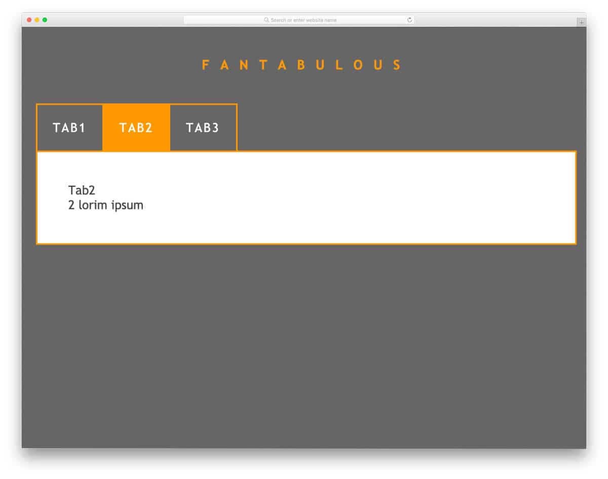
Bix boxy tabs and tab columns are used in this design, which makes the interaction easier. Using bright colors for the tabs lets the user easily identify the selected tab. Both CSS and JavaScript frameworks are used in this design to create buttery-smooth animations. Since this template uses the latest web development frameworks, you can use any modern colors and animation effects in this design. For more fresh animation ideas, take a look at our Bootstrap animation examples collection.
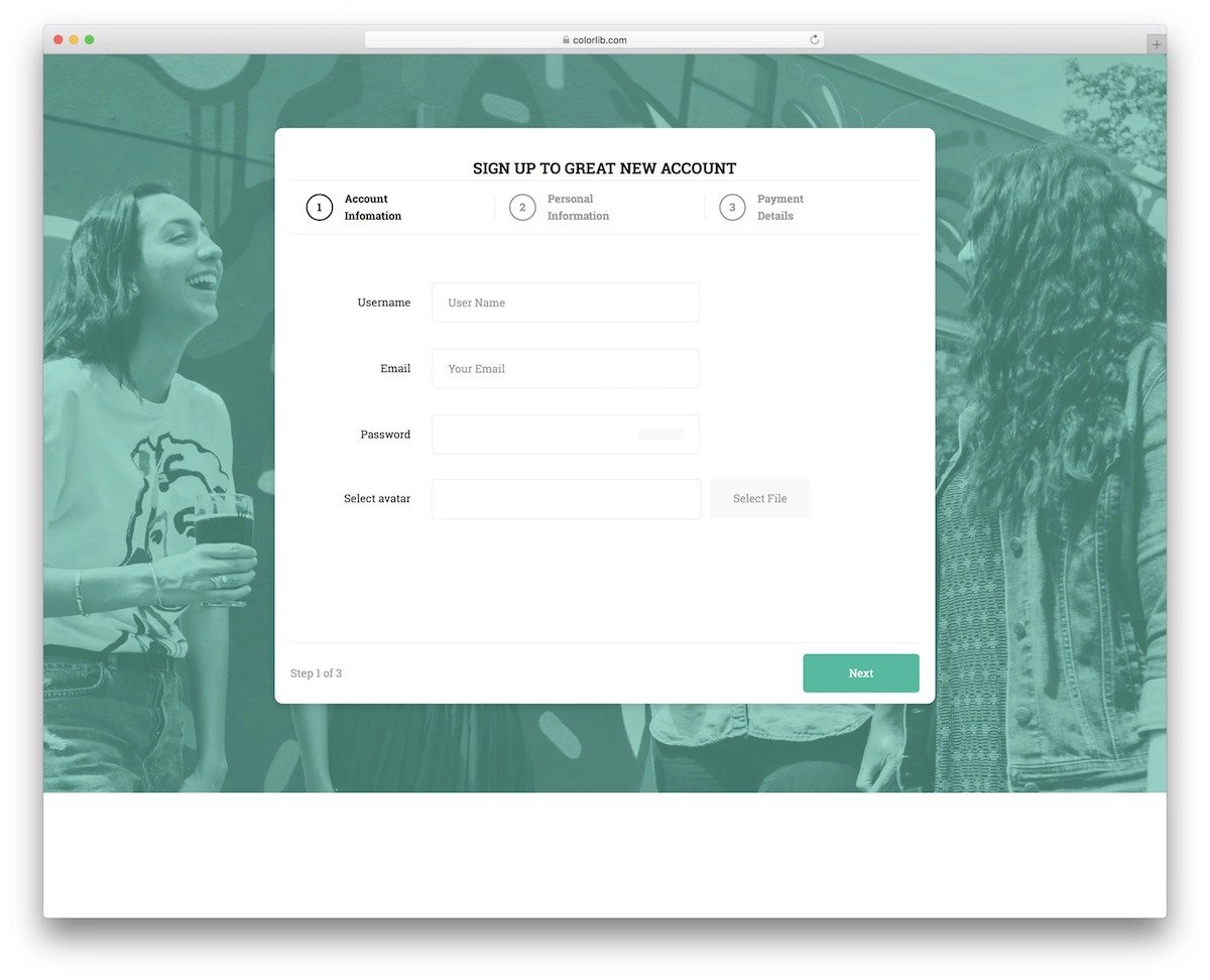
Sign-Up/Login Form

One of the most common places where tabs are used nowadays is the login/signup forms. Different UI designs and UX effects are easily used to access the login and signup forms. But the tabs are more effective and less time-consuming to build than in other UI designs. Both the login and the signup forms are fully functional in this example. The creator has given you a bold and boxy form design. The entire code script is shared with you in the CodePen editor; you can use it easily on your website or application.
Tabs – CSS + JS
As the name implies, this bootstrap tab uses CSS and JavaScript frameworks. Because of these frameworks, the creator has given us a fluid interactive hover effect for the tabs. The animation effect is neat and simple, so you can use this design on any part of your website. Since all the animation effects occur within the tab, you no need to rearrange other elements on the webpage. The creator used only text in the demo tab, but you can add images and videos if you want. If you like to add life to your design, animated bootstrap tabs like this will impress you.
Adaptive Tabs
If you are looking for interactive smart bootstrap tabs that adapt its size automatically to the content length, this code snippet will help you. In addition to the adaptive bootstrap tabs design, the creator has also given you the option to change the background color. If you are interested in using different background patterns in your design, take a look at our CSS background design collection. The animation and transition effects are kept smooth and simple, so you can use this design on any professional or business website without worry. By making a few adjustments to the code you can fit this tab in your design.
SVG Tabs
SVG Tabs is similar to the Adaptive tabs design mentioned above, but it’s a bit cartoonish and lacks the adaptive character. Chunky border and bold color make this design a perfect fit for the kids school websites and other related websites. Though these bootstrap tabs are made using the CSS3 script, the animation effects aren’t that fluid. But you can edit the code and make it smooth to give a realistic look. The entire code snippet is shared with you on the CodePen editor, hence, you can easily edit and see the results before using it on your design.
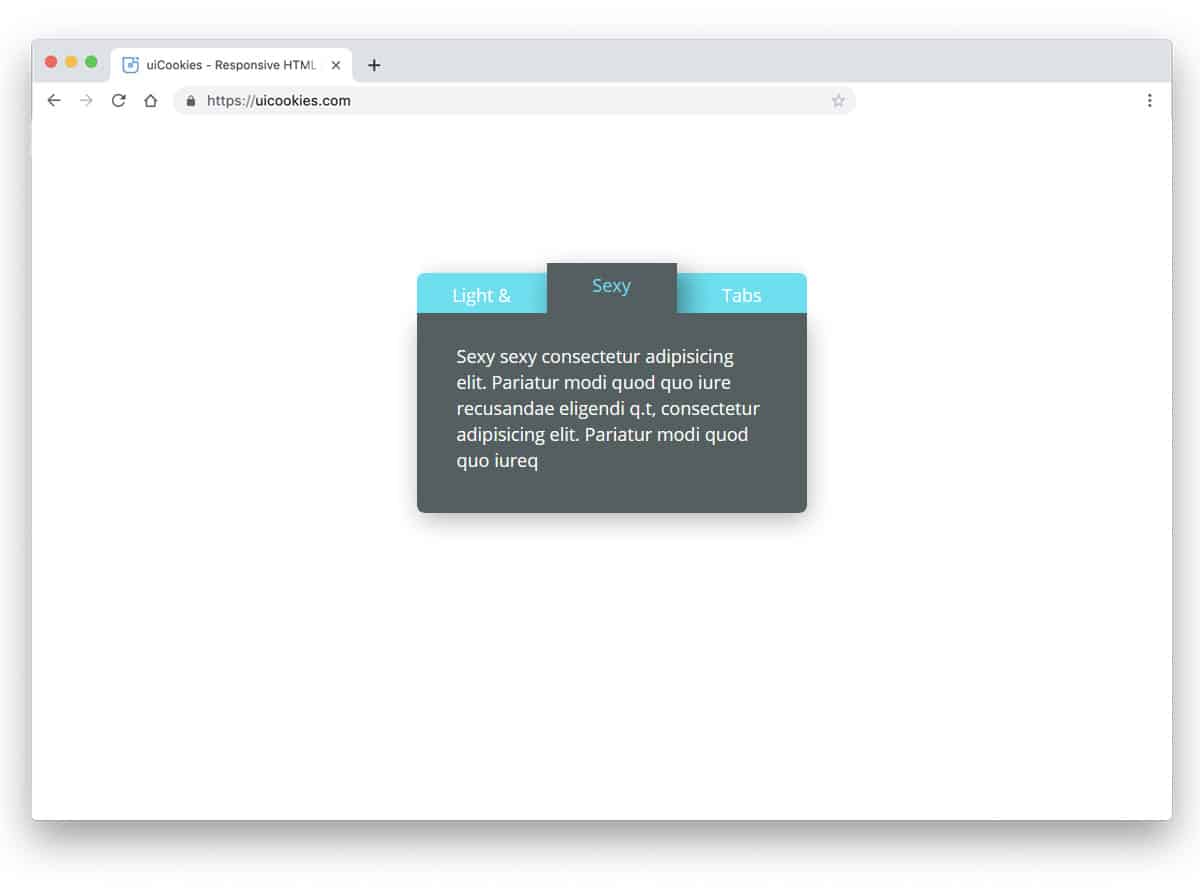
Sexy Tabs
The creator of this design has used a modern and trendy-looking bootstrap tabs design. Bright colors clearly indicate the selected tabs, and you have plenty of content areas to add longer content. The animation effect is used for both the tabs and the content, so this example gives you a complete design. If you’re making an interactive website with a modern design, this Sex Tabs design is a good choice. The code script is structured properly to let the developers easily understand the code and use it on their design. By making a few adjustments to the code, you can design your website or mobile applications.
Breadcrumbs & Tabs
The designer has beautifully combined breadcrumbs and tabs. When you move to the next page, the previous pages are added as a tab on the left side of the screen. Different colors are used to distinguish each page from the others clearly. If you plan to use tabs for the application setup process, this one would be a good choice. The only shortcoming in the default design is that other page breadcrumbs vanish when you move to the previous pages. For example, when I jump from tab five to tab two, tab three, and tab four vanish along with tab five. The user has to click the next button to go to the next tabs. Other than that, this is a cool concept that can perform well.
Elastic Tabs
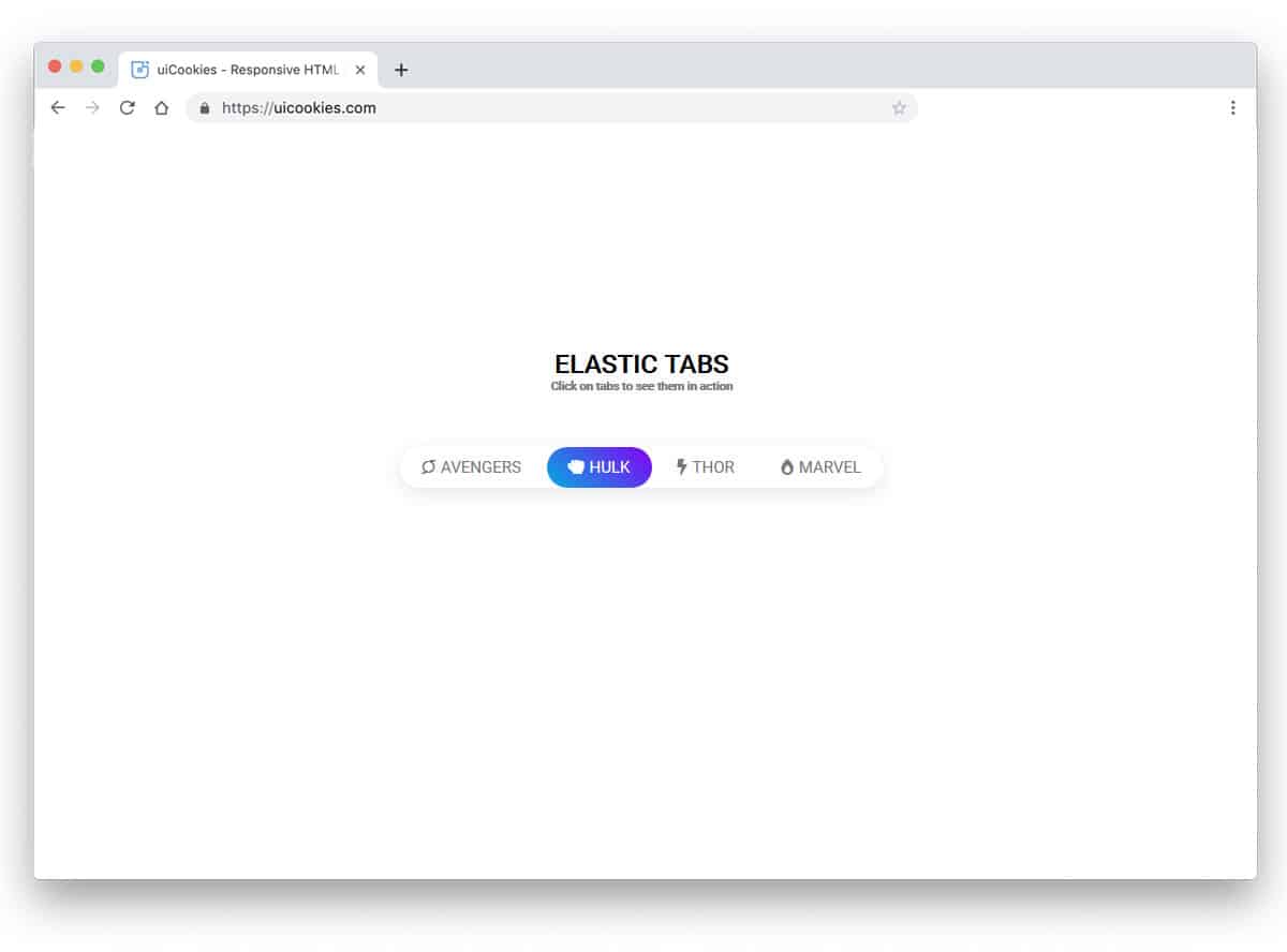
In this tab design example, the creator has given you tab animation. Rather than simply keeping tabs, you can add animation. Especially if you are making a modern website with trendy elements, effects like this will give users an authentic experience. As the name implies, the tab indicator uses elastic movement. The tab indicator smartly shrinks and expands based on the text length. The creator itself does all the basic refinements. Hence, you can easily use this code snippet in your project.
Tab Switch Animation
In the previous Elastic tab animation, we saw animated tab indicators. In this example, the creator has used a switching animation effect for the page. The entire page smoothly moves towards the edges, giving the application a fluid look. As you can see, this concept is designed for mobile applications; hence, moving pages to the edges of the screen gives the interface a natural look. The developer has used the Bootstrap framework, HTML5, and CSS3 scripts to make this flexible design.
Featured Tabs
It is a regular tab design with a little bit of creative touch. The selected tab is protected from the rest of the tabs to help the user easily recognize which tab they have selected. In the tab, you can add large icons and headings. Each tab box is sized to accommodate larger text and icons. You can either adjust the tab size for longer texts or reduce the text size. The developer has given you the entire code structure in the CodePen editor. Hence, you can edit and visualize your customizations before using it on your website.
Settings Tab
The creator has given you a fully functional application concept in this example. The developer has used tab navigation for account settings, as the name implies. You can use this tab design for profile settings in a mobile application. Organizing options under one hood will help users easily search for and find the content they are interested in. Shadow effects are used to differentiate the tabs from the main content area. Plenty of elements are shared with you along with the tab design. You can bookmark this code snippet for future reference if you are a professional developer.
Scroll For Tabs

In this example, we get scrollable tabs. If you have to list lots of tabs in one place, this would be a perfect design. Especially for responsive design, concepts like this will come in handy. The developer has treated the tabs as a navigation bar in the default design. Based on your needs, you can change the design. Colors indicate the selected tab and work perfectly on both desktop and mobile devices. The developer has used HTML, CSS, and JavaScript framework to make this dynamic, interactive design.
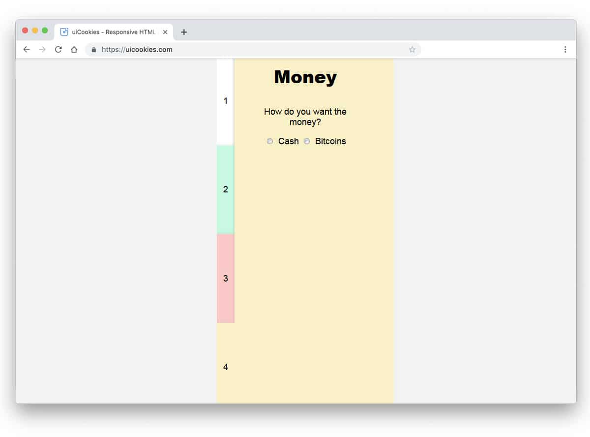
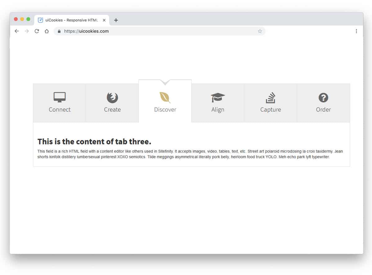
Bootstrap Tab With On Click Step Effect
This is another Bootstrap tabs design for wizards and a step-by-step process. At the top, you get big tabs with icons and labels below them. In the original design, timelines are used alongside tabs to indicate progress towards the next process. The entire code structure used to make this design is shared with you directly. Hence, you can use the elements you want and make your custom design quickly. From the code snippets, you can understand that the code structure is handled properly, so it won’t take much of your time to work on this design.
Light & Sexy Tabs
The creator of this tab has utilized colors and shadow effects to make a realistic 3D card-like design. Subtle hover effects indicate which tab the user will choose. The original tab is treated as a small widget to get only a small space for texts. But you can edit and increase the size of the widget or you can use it as a segment in a web page. The developer has used the latest CSS3 framework, so the color transitions and animation effects are swift. The user won’t even feel the color transitions in this design. You can use your custom effect to make this tab design unique.
CSS Tabs
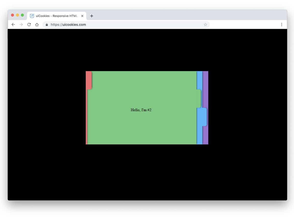
It is an exciting tab concept design. If you love creating unique elements for your website, this concept will impress you. The tabs are treated as indexed files, each with a different color. This simple design lets the user easily pick the file they want. Smooth animation effects add life to the design. Another advantage of this tab design is that the animation effects are implemented entirely with CSS. Hence, you get a lightweight element that can be easily used anywhere on the website.
CSS3 Tabs By Sorax
The developer of this tab design has used card flipping animation effects. The card-flipping distance is reduced to simplify the design and allow the user to see the contents more easily. Like the previous CSS tabs example, this one is also made using the CSS3 script alone. This gives you an infinite customization opportunity to edit the design and add your custom elements. You get space to add texts alone in the default design, but you can adjust the code to use images. Adding images will make the contents easy to understand and give a rich look to the design.