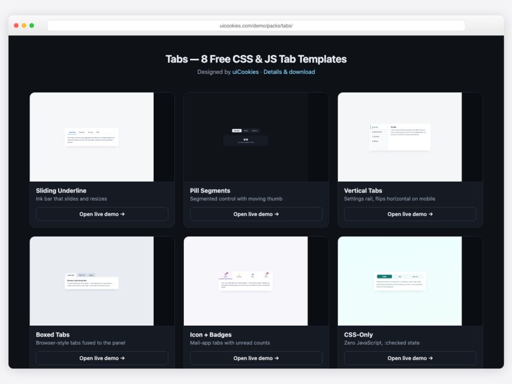
Every tab component here was designed and coded in-house by uiCookies — our own pack, not a CodePen roundup. Each design is a single self-contained HTML file with proper ARIA roles (tablist, tab, tabpanel), inline CSS, and at most twenty lines of vanilla JavaScript. One design needs none at all.
Download all 8 (free) Browse live demos
The designs
1. Sliding Underline Tabs
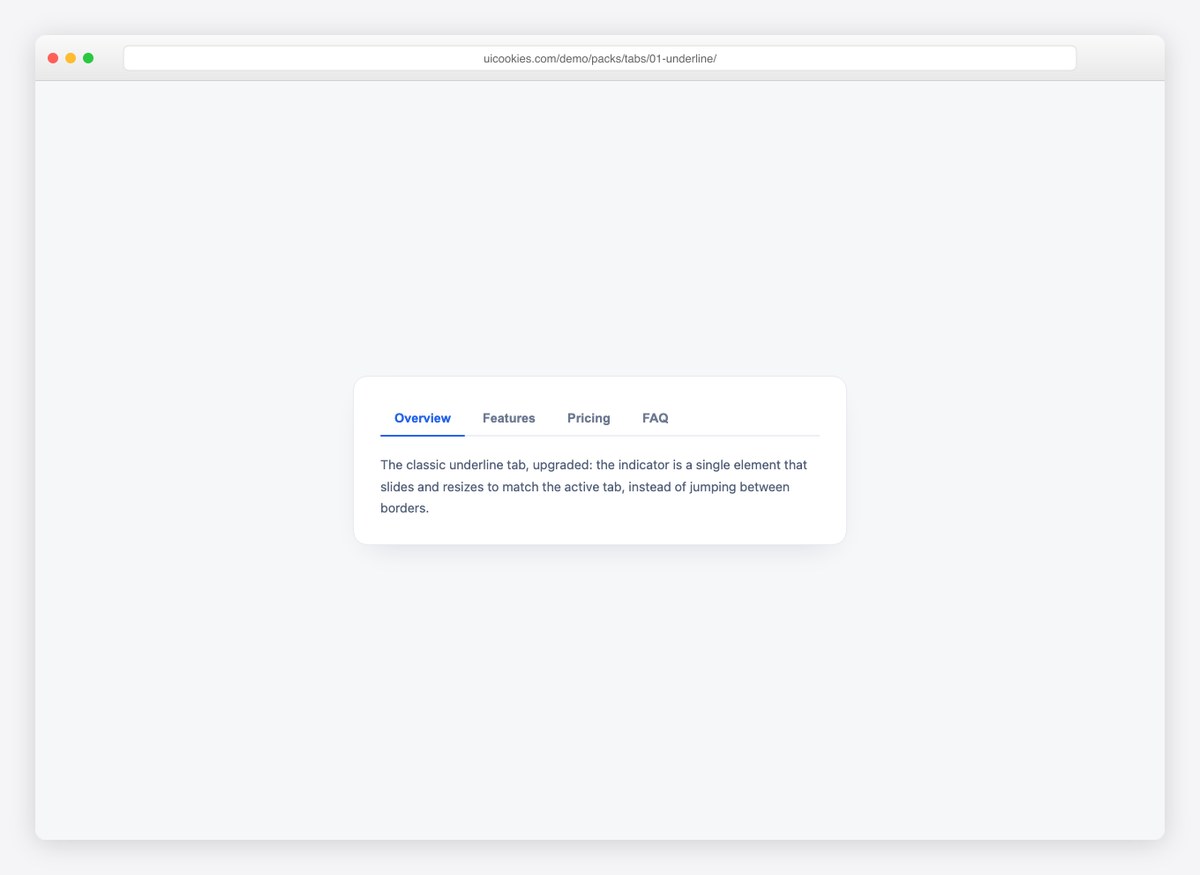
The ink-bar pattern: a single indicator element that slides and resizes to match the active tab, instead of borders jumping between buttons. Twenty lines of JavaScript, fully keyboard-accessible.
2. Pill Segmented Control
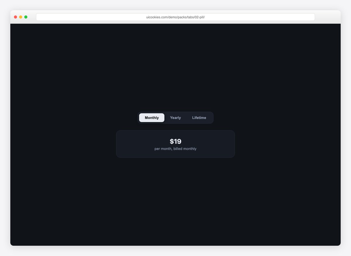
An iOS-style segmented control with a sliding thumb, wired to a live pricing card so you can see tabs driving content. Works for any either/or choice.
3. Vertical Settings Tabs
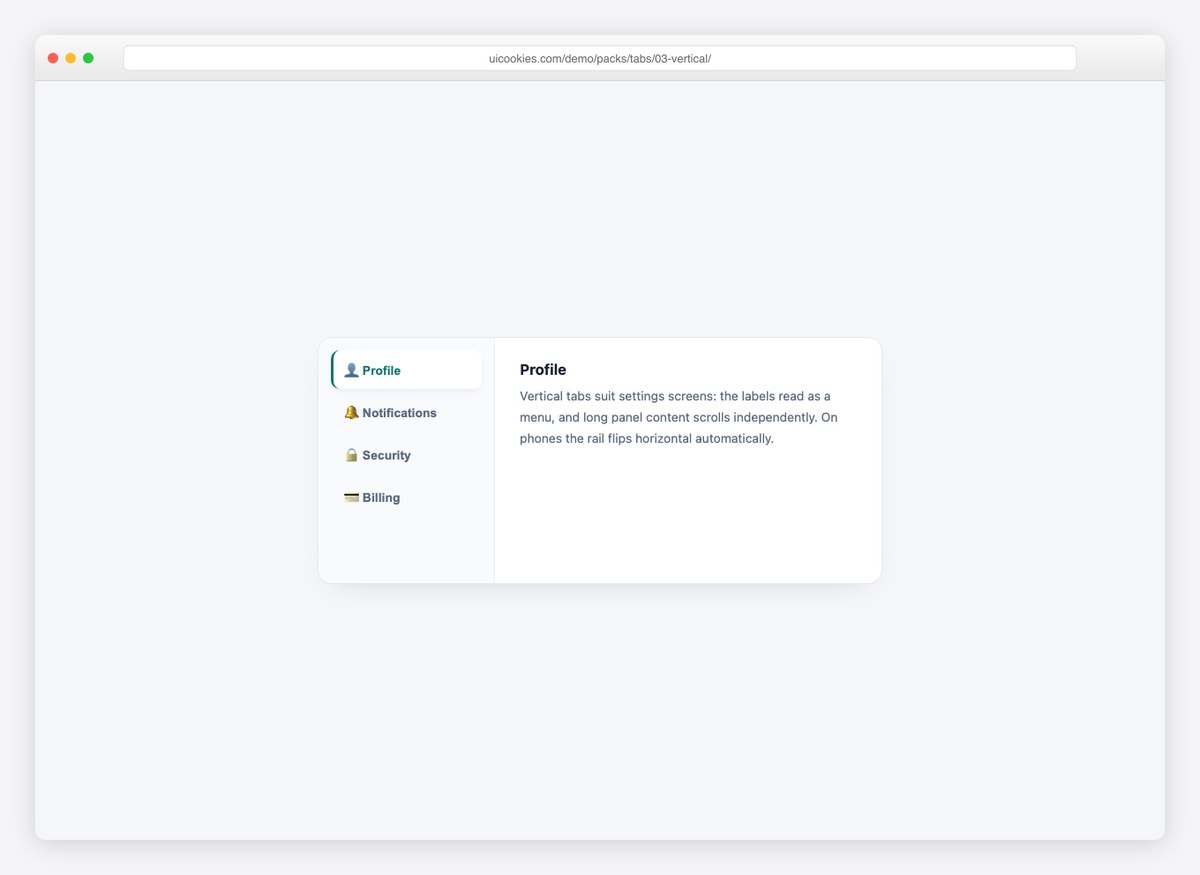
A settings-screen rail with icons and a colored spine on the active item. Below 560px the rail flips horizontal and scrolls — no separate mobile component needed.
4. Boxed Browser Tabs
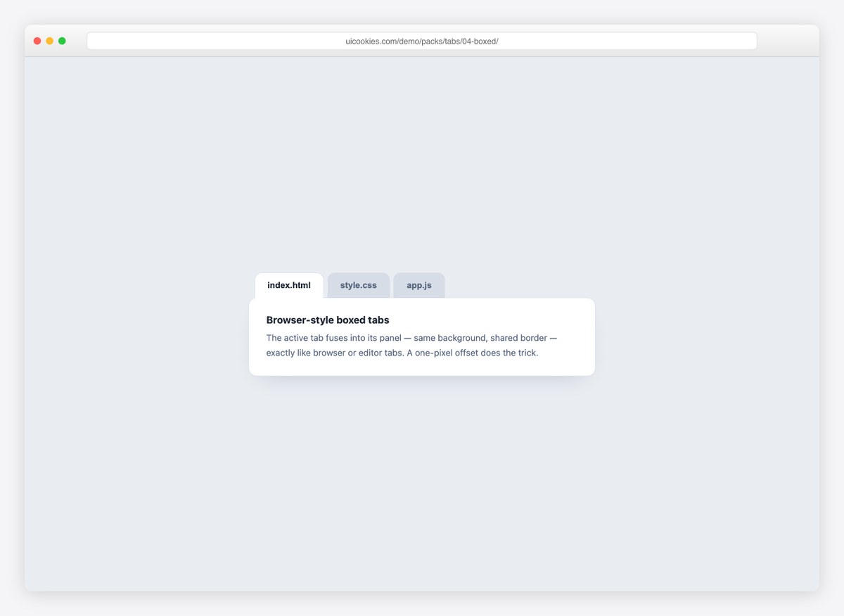
Editor-style tabs where the active tab fuses into its panel — same background, shared border, one-pixel offset. The most literal “tabs” there are.
5. Icon Tabs with Badges
Mail-app tabs: icon over label with unread-count badges that don’t shift the layout. Active state uses color, bar, and background together.
6. Pure CSS Tabs
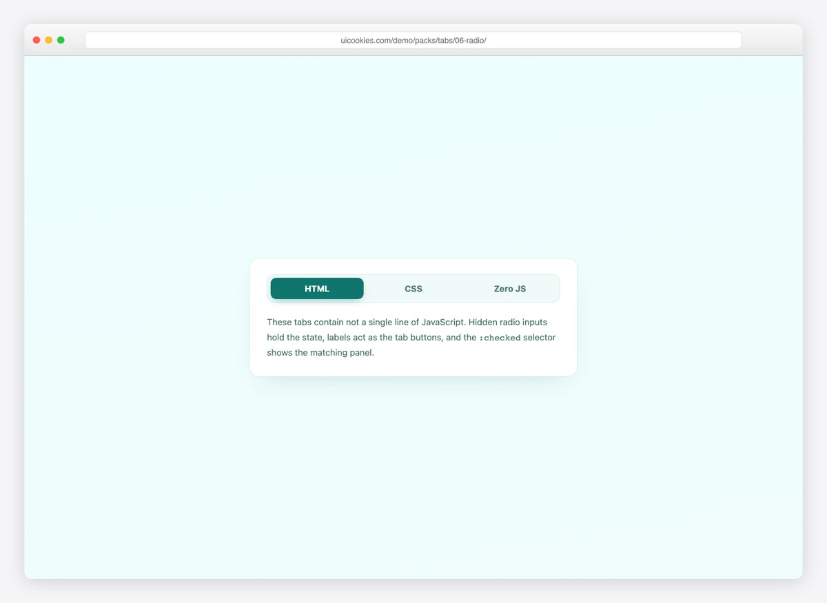
Not a single line of JavaScript — hidden radio inputs hold the state and :checked shows the panel. For docs sites and no-script baselines.
7. Dark App Tabs
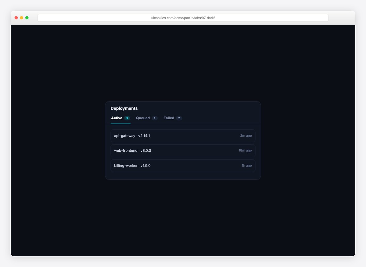
Dashboard tabs with count chips, styled for dark UIs and wired to a deployments list. The chips recolor with the active state.
8. Responsive Tabs-to-Accordion
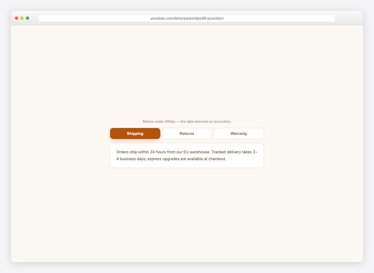
The honest answer to tabs on mobile: below 560px the tab row hides and per-panel accordion headers take over, sharing one state and one script.
Frequently asked questions
Are these tab components free?
Yes. The whole pack downloads free from the uiCookies pack page — no signup. See the uiCookies license page for attribution details.
Can I make tabs with CSS only, without JavaScript?
Yes — design 06 in this pack does exactly that with hidden radio inputs and the :checked selector. The trade-off is that radios can’t be deep-linked or read as easily by assistive tech, which is why the other designs use a small script with proper ARIA.
How should tabs behave on mobile?
Either keep them scrollable in a row (the vertical design does this automatically) or convert them to an accordion — design 08 implements the tabs-to-accordion switch with one shared state.
Do they work with Bootstrap?
Yes — the designs use their own class names and don’t touch Bootstrap’s .nav-tabs, so they can replace or coexist with it.
More building blocks: cards, tables, menus, and the full template catalog.