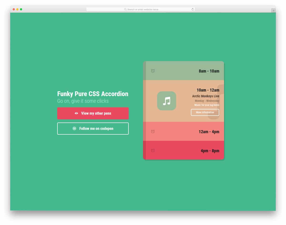
The creator has used the colors to give a visually pleasing look and also a sense of orderliness. Both folding and unfolding are smooth in this template, so the audience can easily interact with your accordion. If you want a compact yet flexible accordion that can handle all types of content, this is the best option.
The V16 bootstrap accordion gives us a traditional accordion design in a modern outfit.
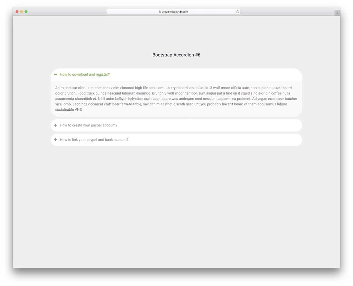
Rounded edges and smooth animations make the accordion feel more natural in modern web design. Adding long content and displaying it clearly to the audience will be easy in this template thanks to its wide form factor. The default accordion design makes it a perfect fit for websites and web applications.
The Bootstrap accordion design for mobile UI is included in this template.
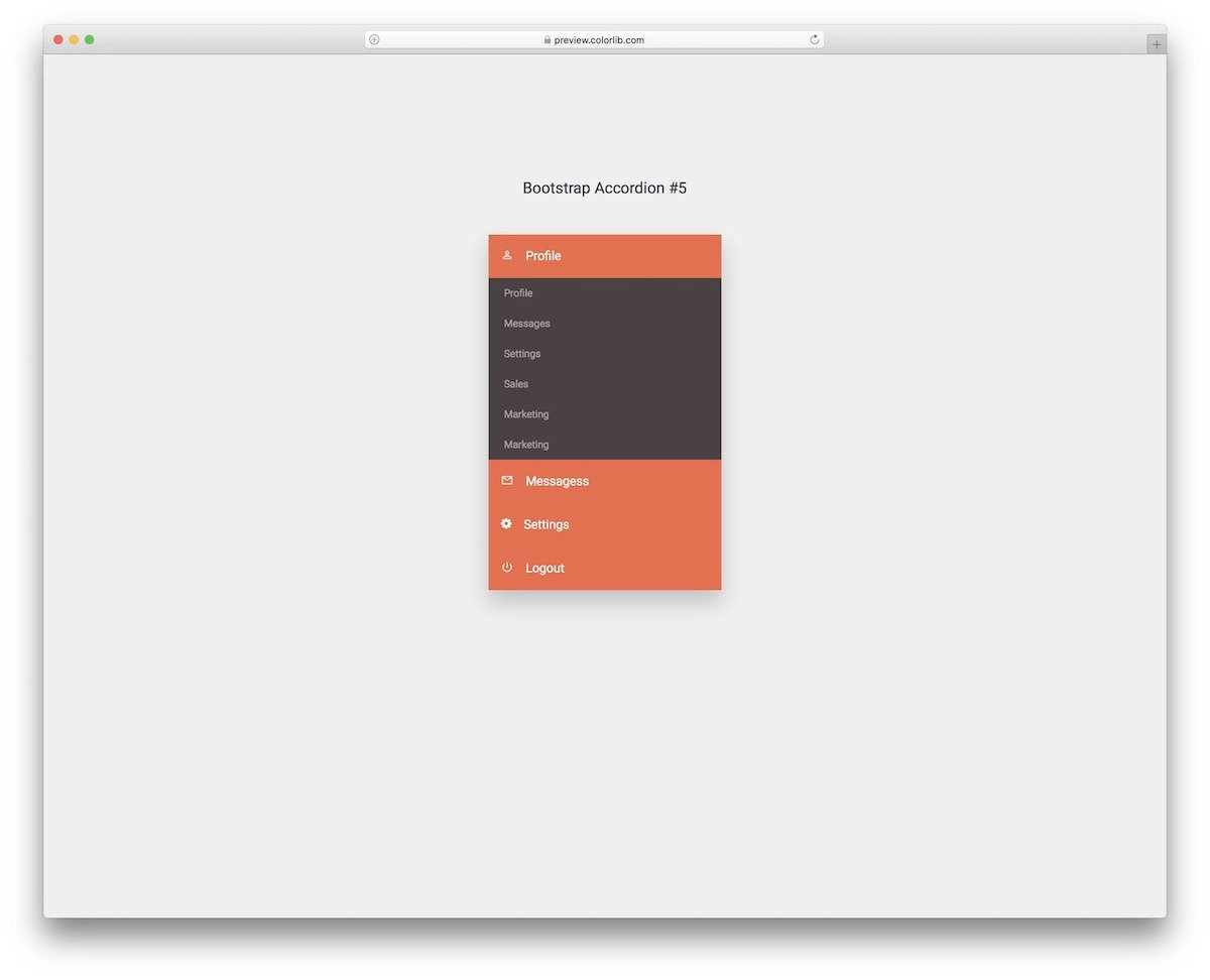
Those looking for a simple accordion design to accommodate menu options will find this one useful. Color shades are used smartly in this template so get a visually pleasing look. Plus, you can use your brand colors easily in this template.
A dark-theme Bootstrap accordion is given in this template.
The creator has shown the potential of this accordion in the demo itself. This accordion can handle all types of content. If needed, you can even add buttons and checkboxes within the accordion to make the experience simpler for users.
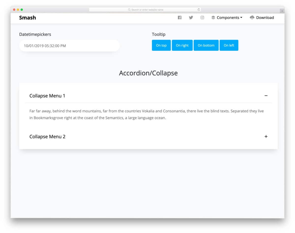
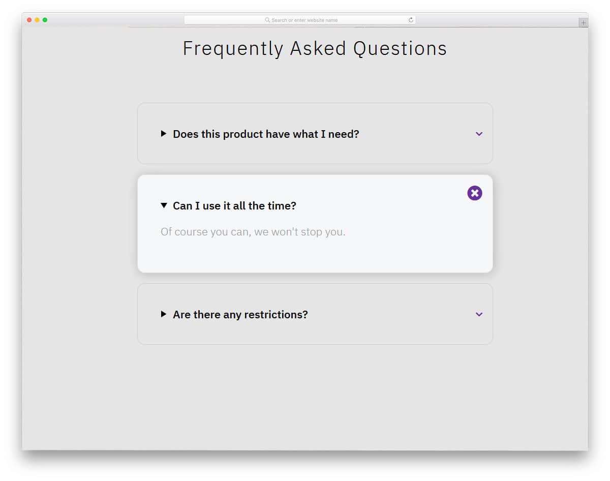
Smash is a free Bootstrap UI kit with a friendly Bootstrap accordion pre-designed for you. All basic web elements are designed along with the accordion. If you are a professional developer, UI kits like this will help you skip mundane tasks and focus on custom features. The default accordion in this kit is a Bootstrap accordion with a plus-minus symbol; i.e., the user can easily unfold and fold the information with just a click. More than ample space is given for each accordion tab, so you can add long texts without any issues.
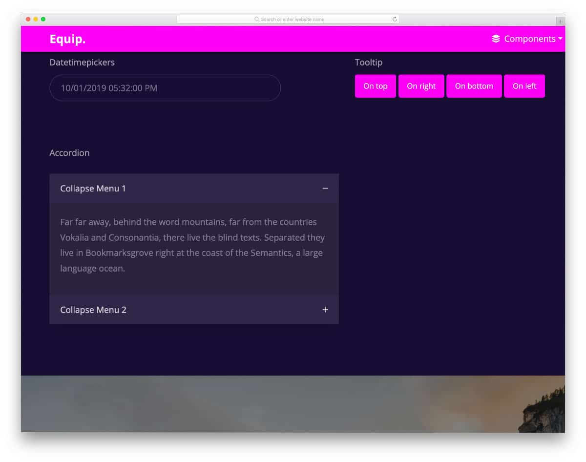
Equip is another UI kit with a Bootstrap accordion. This kit includes a medium-sized accordion that is easy to use and easy to fit on any part of the website. If you are looking for a simple and mobile-responsive Bootstrap accordion, this one will be a good choice. The creator has followed a dark theme in the default design; you can try other color schemes if you want. This template uses the latest CSS3 script, so you can try all modern colors and effects in this template without any issues.
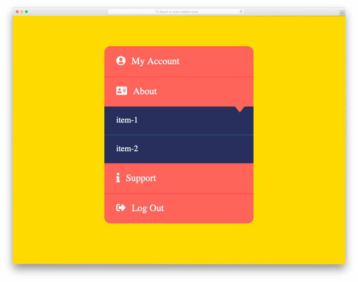
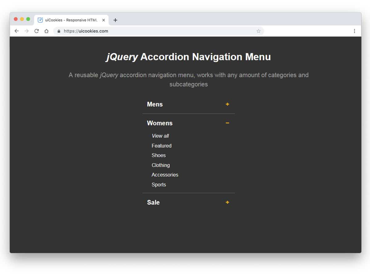
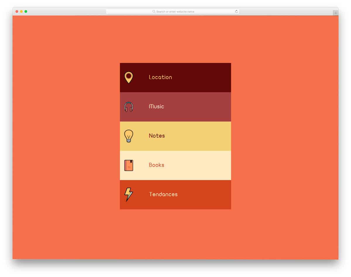
As the name implies, this is an accordion menu concept. The creator has used the accordion concept effectively to group all related menu options under a single main category. Plus, the smart-folding hover effect makes the menu even more engaging. The bootstrap collapse panel with an icon in this example will help the user quickly identify the menu options. Since the whole concept is made using CSS and HTML scripts, you can easily utilize it on your project.
The developer has provided us with a swift, responsive accordion in this example. From the name itself, you can tell the developer used ReactJS. The transformation animations are clean and smooth. Adding a bit of bounce to the elements gives the animation a more realistic touch. More than enough space is given for the text contents, so you can give a clear explanation about the particular tab. The entire code structure is shared with you directl,y hence you can easily work with the code and make your custom accordion in no time.
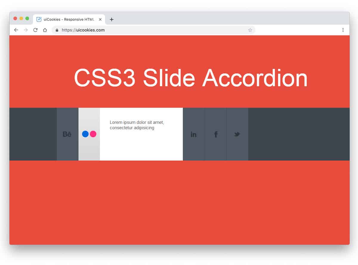
CSS3 Accordion is a sleek, stylish accordion design example. The creator has used the design and the animation effects perfectly to present the content engagingly to the audience. In the default demo, the creator has used the social media icons concept, but you can use this design for other purposes as well. Using cool gradients for social media icons gives the accordion a unique look. By making a few design adjustments, you can use this accordion on your website. For the animation effects, the developer has used only CSS3. Hence, you get a lightweight element that loads faster, along with other simple elements on your website.
You get a colorful, funky-looking accordion design in this example. As the name suggests, the accordion opens on hover. The transitions and the response are quick in this example, so the user doesn’t have to wait for the content to appear. Another advantage of this design is that it is built entirely with HTML5 and CSS3. Hence, you can easily edit and use the code in your existing websites. If you are looking for a colorful accordion to use in kids websites like school websites or other such websites, this design will fit perfectly.
The creator has smartly combined the slider and accordions in this design to deliver an engaging user experience. Sliders change based on the accordion you select, helping the user quickly understand your content. The default design makes it a perfect option for the product feature presentation. Transition effects and unfolding animations are sleek so that you can use it on any part of your webpage. The code used to create this design is available in the CodePen editor. You can edit and visualize the results on the editor before you take it to your project.
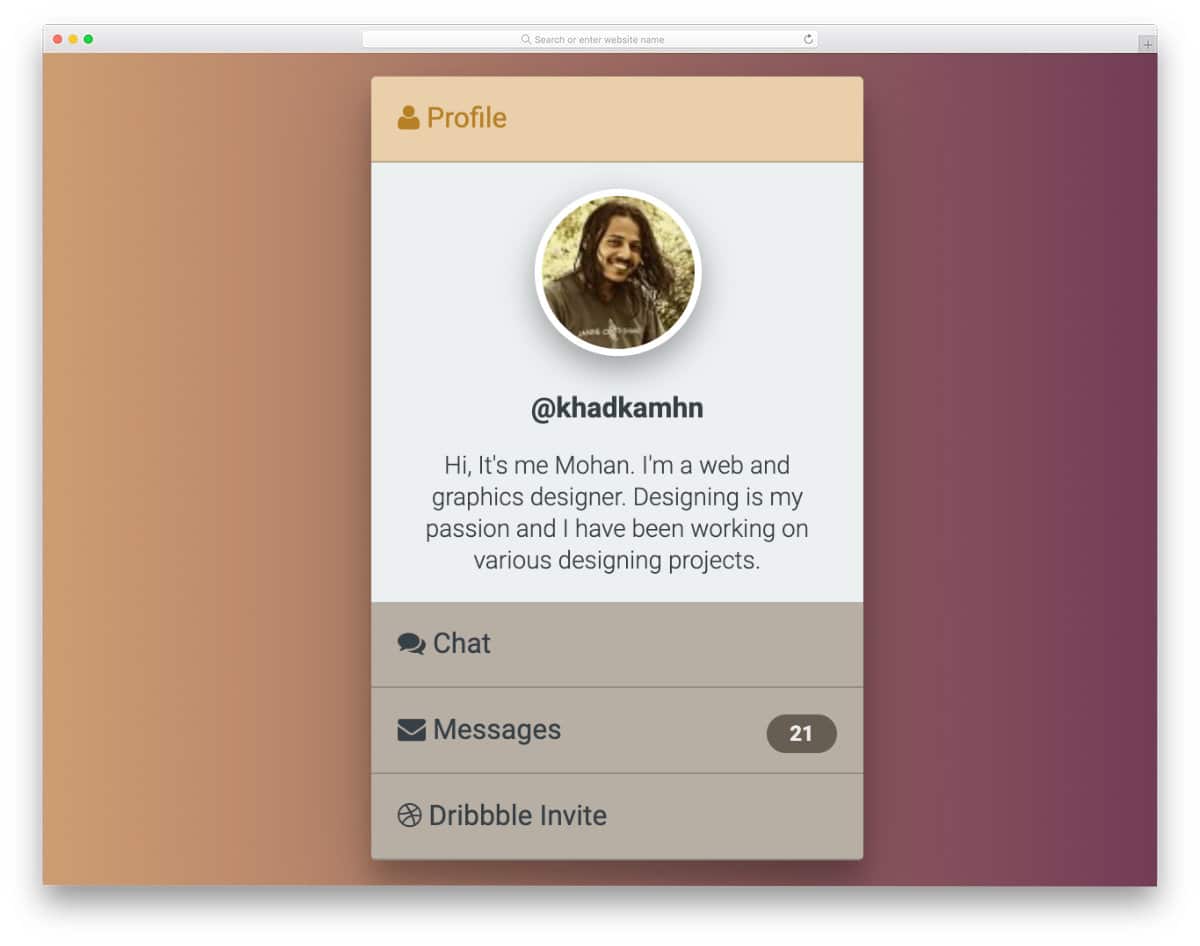
A smart handy profile card design is given in this example. The creator has used the accordions to squeeze all basic profile information into this card. Since it is a concept model, you need to make a few tweaks to perfect it. For example, if you want to make the design even more friendlier, try to keep the profile name and the image section static or keep the avatar visible— other than that, everything works perfectly in this profile card accordion design. For more interactive card designs, take a look at our Bootstrap card example collection.
This example has a widget style accordion design. The creator has used smooth animations and accordions, with more than enough space to accommodate all text content. Texts are bold and bigger so that the audience can easily read the content. One of the biggest advantages of using the bold design is that mobile users can easily interact with your elements. As smartphone use increases, making your design compatible with both desktop and mobile users will help you reach a larger audience.
The creator has used a simple, neat accordion design in this example. Only lines, text, and white space are used in this design, making it easy to interact with. Though this design uses the latest CSS and JavaScript frameworks, the animations are not particularly smooth. You might need to adjust the timing and animations again to make this accordion fit on your website. Aside from the transition effects, all other animations work neatly in this design. Hence, the developer can easily work with this code snippet.
As the name implies, this one is a responsive accordion design. Using a responsive design code snippet will save you some time. The creator has kept the code script simple. Hence, developers can easily work with this code. Plus, you can also add any custom effects and options to this accordion without any issue. Each accordion panel is made big enough to let you easily add long content. Color-changing hover effects are a simple yet effective design that help the user easily recognize the accordion section they are selecting.
In this bootstrap accordion example, we get a 3D folding-type accordion design. The creator has timed the animation effects precisely to achieve a realistic look in this example. Shadow and depth effects are used effectively to create a paper-like folding effect. If you use an accordion to display details about a product or service, this 3D accordion design is a good choice. Since it is a concept model, the creator has kept the accordion box simple and small. But you can easily resize the accordion box to the size you want. To give you an authentic 3D folding effect, the creator has used a few lines of JavaScript alongside HTML5 and CSS3.
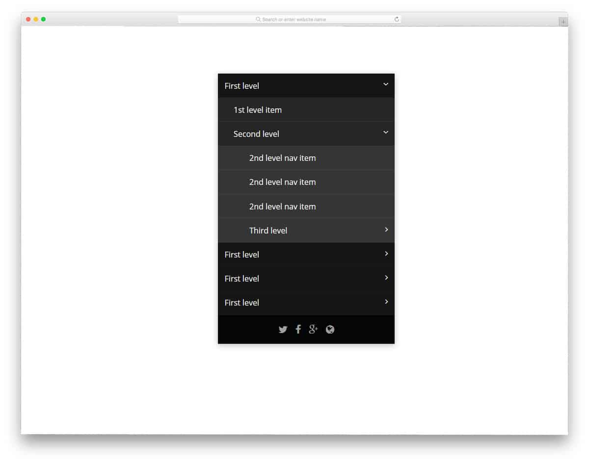
If you are looking for a Bootstrap accordion example to group multiple information, this multi-level accordion design might impress you. The toggle animation is swift and smooth, so users don’t have to wait long for the information to appear. Hover effects are also used to indicate which field the user will select. All these toggle and hover effects are implemented purely with CSS3. Hence, it is a lightweight code snippet that can be easily used on any website or application. By making a few code changes, you can adapt this accordion example to your design.
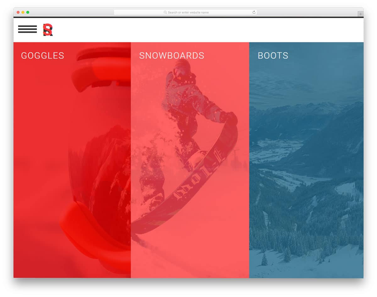
This bootstrap accordion example is made for the images. In modern web design, images are given more importance; they not only make the website enjoyable but also help the user easily understand the content. Elements like this will be a valuable addition to travel and hotel websites, where images are used to explain their offerings. To give a uniform look, all the images are kept in the same size. But, you can customize it as per your design requirements. Hover effects are used to trigger the accordions, if you are adding links to the accordions then you can use clicking interface.
In this smart gadget-rich world, a person uses at least two devices. Making your website responsive is a must. Giving the same user-friendly experience across all devices is difficult. In this design example, the creator has used an accordion for the navigation menu. If you want to list multiple submenus, this accordion design will be a good solution. Since it is used for the navigation menu, the animation effects are kept very simple. This thoughtfully designed navigation menu needs a bit of tuning for public release. The properly handled code script will help you easily find and edit the needed elements.
The developer Eze Rangel has given us a creative accordion slider concept. With swift animation effects and bright colors, this accordion will get the user’s attention easily. Since it is a full-width slider, you have ample space for text and other types of content. To give you a buttery smooth experience, the developer has used CSS3 and JavaScript frameworks. Since it uses the latest web development framework, you can use all trendy colors and animation effects. For more animation inspirations, take a look at our CSS animation example collection.
The GreenSock Accordion is almost the same as the React Accordion mentioned above. But this design has slightly different animation effects. The gradient color scheme easily gets one attention, plus the developer has used color-shifting hover effect to make it more attractive. Animation effects are very fluid and smooth so the user can feel the animation. Color-shifting hover effect is a thoughtful design, but you can change it if you are not a fan. The coding part is tricky, so take your time to clearly understand the code. Thankfully, the code is shared with you in the CodePen editor, hence you edit and visualize the result before using it on your project.
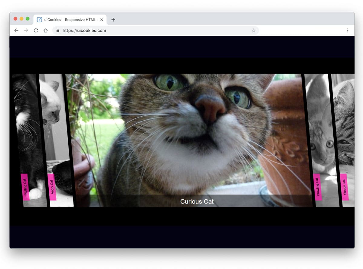
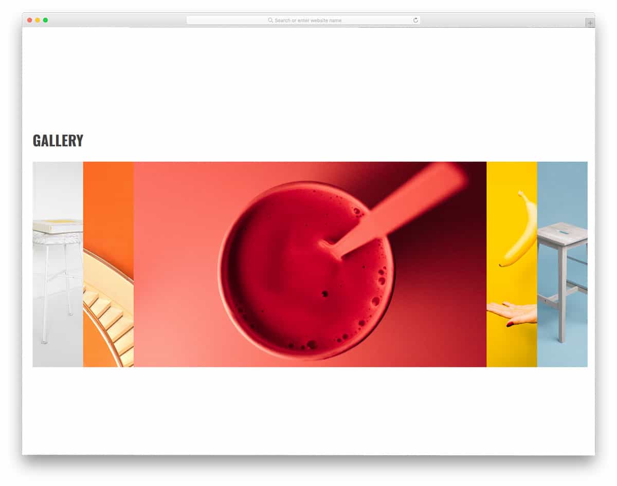
The Accordion gallery uses a horizontal accordion design and works flawlessly. The developer has given three functionalities to this accordion gallery: It has to unfold, zoom in on the image, and gently push other images to the edges. Though this design example involves multiple actions simultaneously, it uses a simple code structure. The developer has used only HTML5 and CSS3 to create this design. Another advantage of this design is that it is responsive; it gently adapts to the screen when you expand its size. Hence, you can use this design in your mobile-responsive website design. The simple nature of this design makes it easy to squeeze in any part of the webpage.
Flat accordion is a colorful and icon-rich accordion design. Since it is a flat style design, it blends well with the background and other elements on the page. To separate the accordion heading from the paragraphs, the developer has used shadow effects. In the flat style design, the shadow effect gives the elements a three-dimensional look. In the demo, you get a small accordion, but you can resize it to fit your design needs. The simple code structure of this accordion design makes it easy to customize in minutes.
Expanding Horizontal Accordion is a modern accordion design with an artistic touch. This design can be used in architecture websites to show the design and share a few words about the project. You can also use this accordion to showcase your products and highlight their key features. No matter what purpose you use this accordion for, this design will beautifully present both images and text. Visual effects are smooth and clean, which most users will love. This accordion design is mostly built with CSS3 and JavaScript. Based on the code script you prefer, you can edit the code and recreate the design.
The developer Jamie Coulter has given us a colorful accordion design for mobile applications. Originally, this design was made for the calendar and task management applications. You can use this concept as a base and can create your own custom accordion design. Smooth transition effects give this design a natural look. As today’s smartphones grow taller, vertical animation effects look pleasing to the eye. All these colors and lively animation effects are created purely with CSS3. Since CSS3 is the latest and greatest framework, you can add any modern colors and animation effects to this design. Click the info link below to have a hands-on experience with the code.
Pure CSS accordion is almost similar to the Accordion gallery mentioned above. But in this design, you get a vertical slab-style accordion that isn’t as responsive as in the Accordion Gallery example. Though it is not responsive, the animation effects are very fluid and neat. The accordions unfold swiftly as you hover over them. In the default design, the creator has used text content for the accordions. But if you need, you can use it for images just like in the Accordion gallery. Since the default accordions are treated as vertical slabs, make sure your photographs are in portrait orientation.
As the name suggests, the creator used Material Design to create this Bootstrap accordion. Fluid animation effects make this accordion a fun element to use. Since the material design is intended to provide a better experience for both mobile and desktop users, it will age well. In the default design, the unfolding action takes some space above and below. Make sure you leave enough space when using this accordion with other elements. Ample space is provided for the texts so you can clearly explain the topic. To make this swift accordion design, the developer has used SCSS and a JavaScript framework.
Horizontal accordions are used widely in modern web design. In this bootstrap accordion example, the creator has given you a simple horizontal accordion outline. There is plenty of room for you to add the content and the feature you want. There are a few horizontal accordions in this list, which let you add images and buttons. If you want a simple design that lets you easily add the elements you want, this design is a good choice. By keeping this code script, you can create your own custom accordion design. The entire code snippet is shared with you on the CodePen editor; hence, you can easily edit and visualize your results before using them on your website or application.
In this example, you use an accordion design to handle large amounts of content. The creator has even allowed you to add an image as the background of the accordion. To make the content even clearer and direct, you can use this image background option to add relevant images. Apart from the infolding animation, the creator has also adding flipping animation for the text. The entire design is built with the latest CSS3, so you can add the animation effect you want. For more animation inspirations, look at our CSS animation examples design collection.
The creator has given two types of bootstrap accordion designs in this example. You can open multiple accordions in one design and only one in the second design. Apart from these accordion opening conditions, the design is simple. If you want unique accordions, you can use this code and customize the design to your needs. The entire code script is shared so you can easily use it in your design.
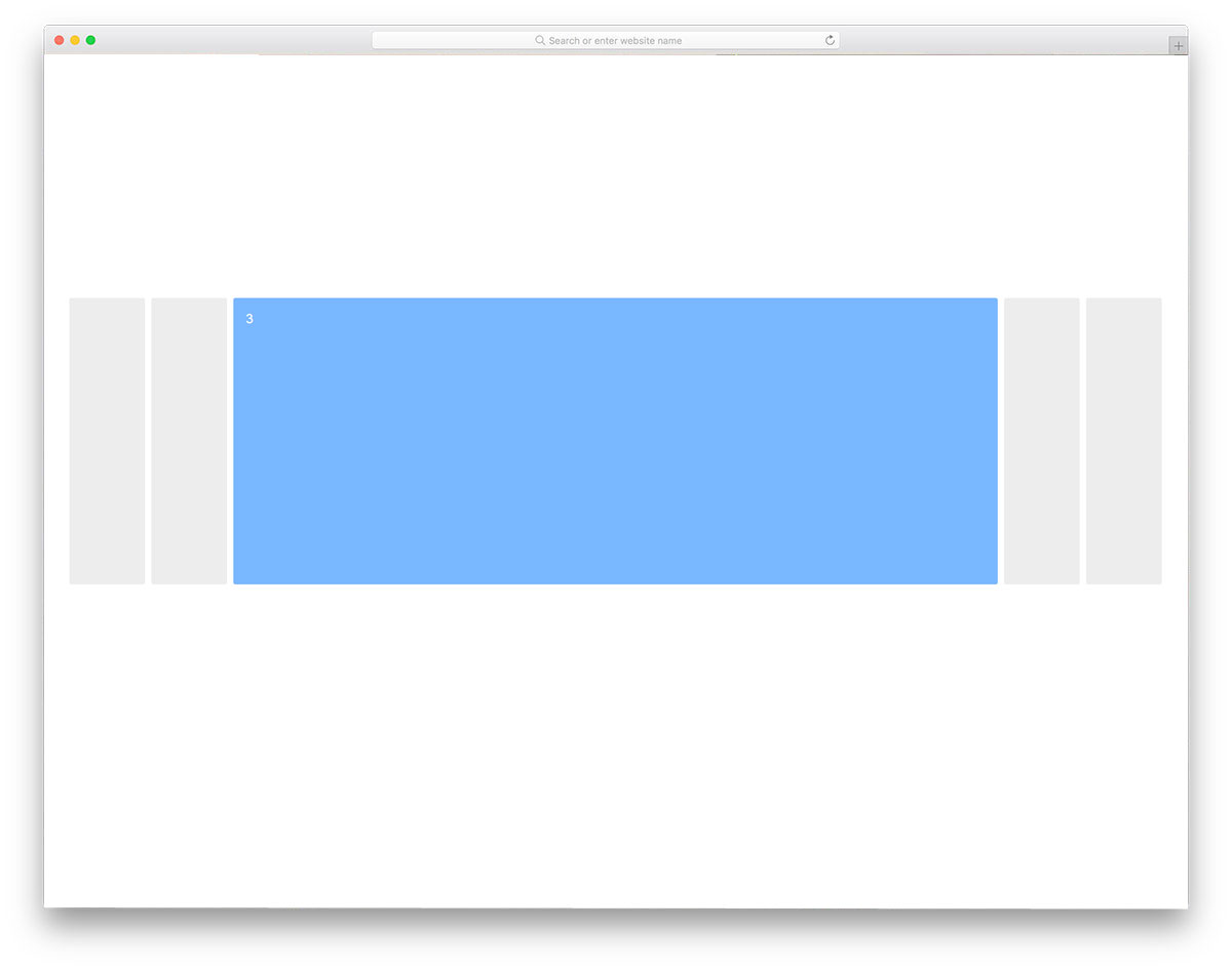
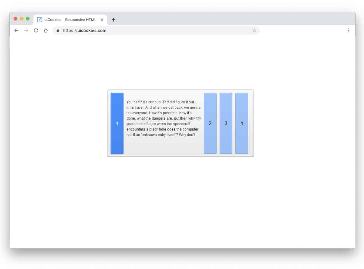
Keeping things simple in design will help you use it anywhere on your website or application. In this bootstrap accordion example, the designer has used a horizontal accordion. The design concept is simple, but it works flawlessly. Hence, you can use this accordion design for all types of websites. By default, this design is made for text content. Hence, you have more than enough space for text content. Another advantage of this design is that it uses CSS3 and HTML5. Because of this simple code structure, you can easily edit and use the code in your project.
When you are making more than one product, giving a brochure will help the user to choose the best product for them. In this design, the creator has used the accordion to list their products. In this horizontal bootstrap accordion design, you have enough space to show your product image. The creator has thoughtfully given you the space to add text content and text links. Accordions are triggered when hovered over, which requires a few extra clicks on the desktop version. On the mobile version, of course, you have to go with the click interface. Since it is built with Bootstrap, you can easily make it responsive.
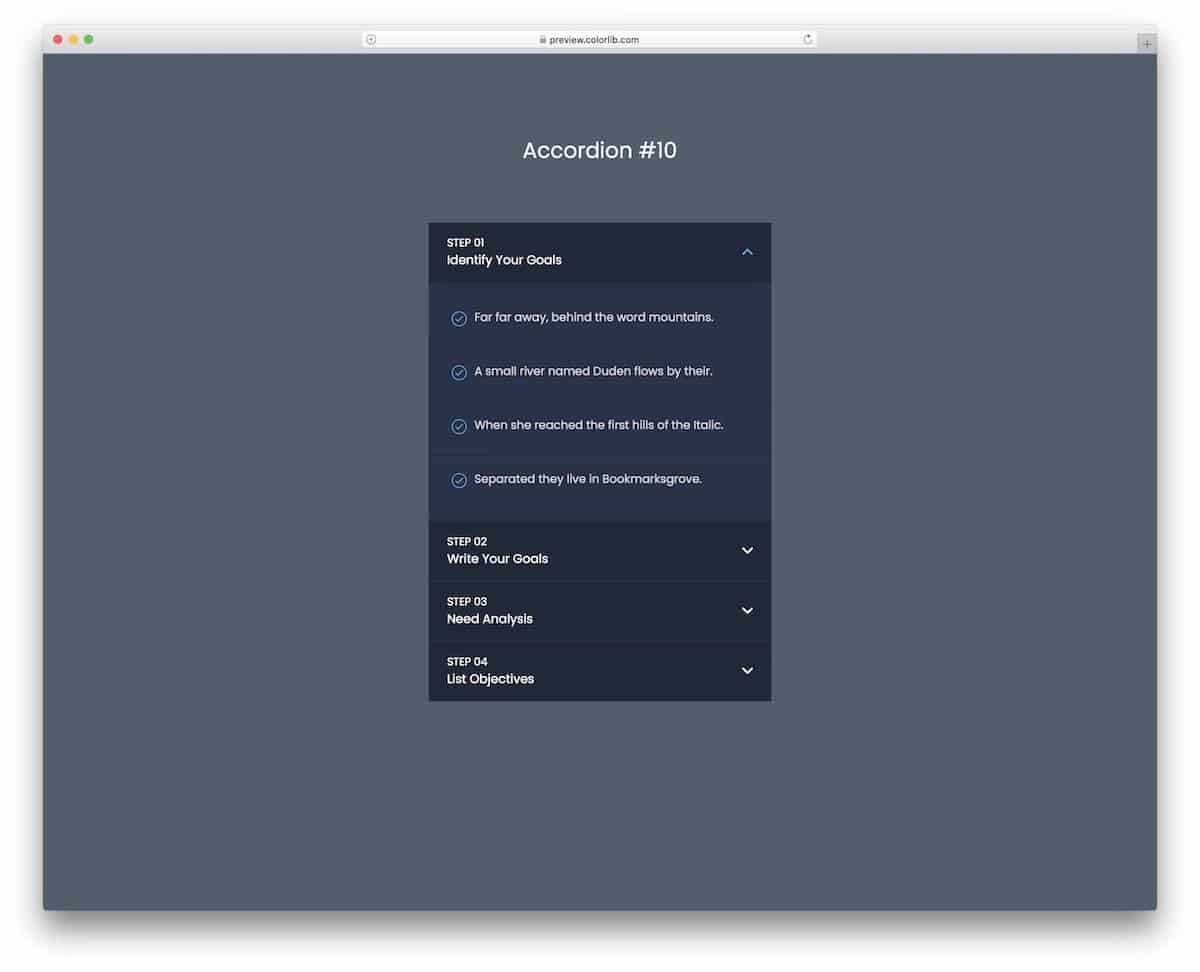
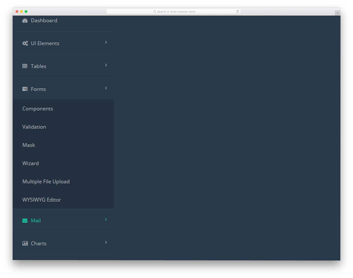
We have seen an accordion design for the mobile and website navigation menu above. In this example, the designer has used Bootstrap accordion for dashboard navigation. Dashboards are the place where people expect usability and easy accessibility. Using accordions in dashboard navigation helps users easily find related menu options. The accordions unfold quickly and swiftly, so the user doesn’t have to wait for the menus to appear. The entire design is built with HTML and CSS3. To give you a buttery smooth experience, the developer has used a few lines of JavaScript.
Accordion Image Gallery is another Bootstrap accordion design for galleries. If you plan to curate the users before entering your main gallery, you can use a widget like this. This one is almost identical to the Accordion Gallery mentioned above; it also expands and zooms in on the images. But, the animation part is slightly different from the Accordion gallery. You don’t have space to add text contents or ribbons to highlight the name. If you need, you can add extra elements. The developer has kept the code script simple so that you can edit the accordions as per your design needs.
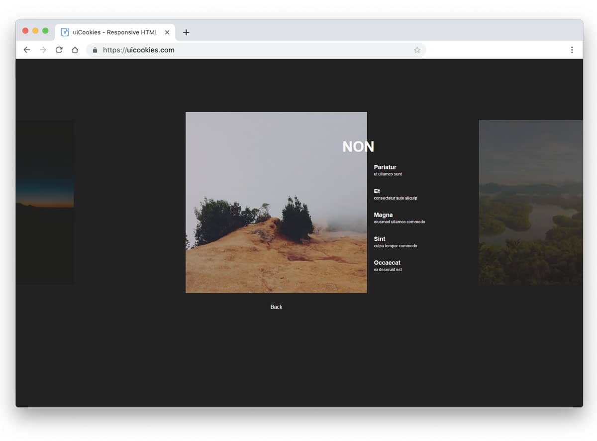
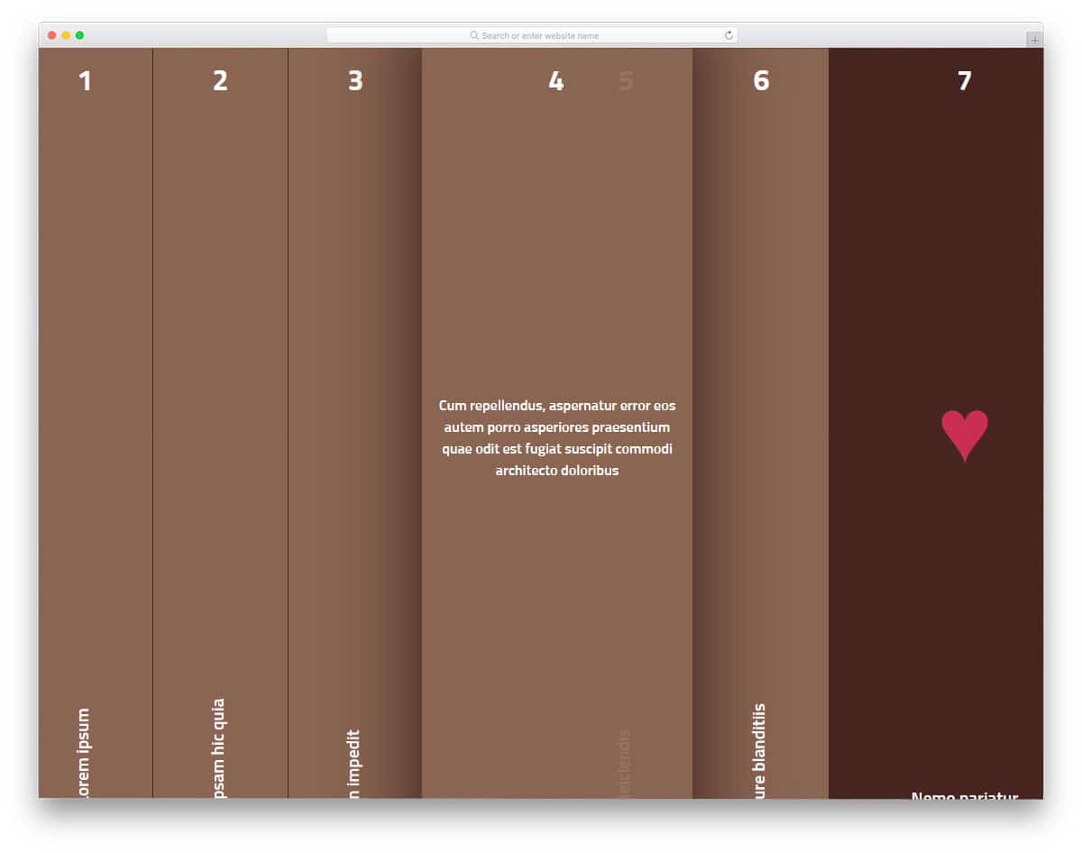
If you wish to use an accordion for a full web page, then this Bootstrap accordion will help you. The designer has treated it as an index. When the accordions are folded, users can see the headings, so that they can pick the one they like. Since it is a full-page horizontal accordion, you have plenty of space to add long content. You can use this design to list your case studies or product features. For example, on a car website, you can use this accordion to showcase the car’s interior, exterior, luxury features, and safety features.
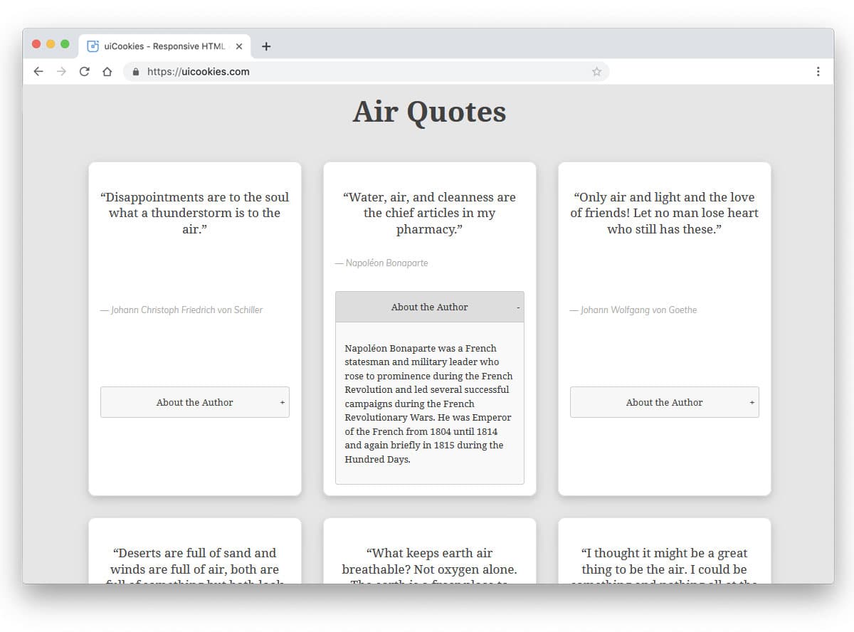
If you are having a special task to include accordion in a directory website, this design will impress you. The default design is for the quotes collection website, where an accordion is used to display the author details. To make the boxes uniform, the developer has set the entire page to expand when the accordion is opened. If you don’t like this effect, you can try other types of animation effects. To make this dynamic and powerful design, the developer has used both CSS3 and the Bootstrap framework effectively. Since it uses the latest framework, you can easily work in this bootstrap accordion concept and make it a good fit for your design.
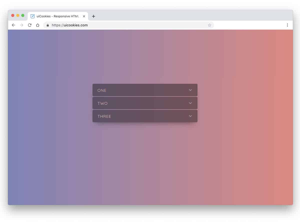
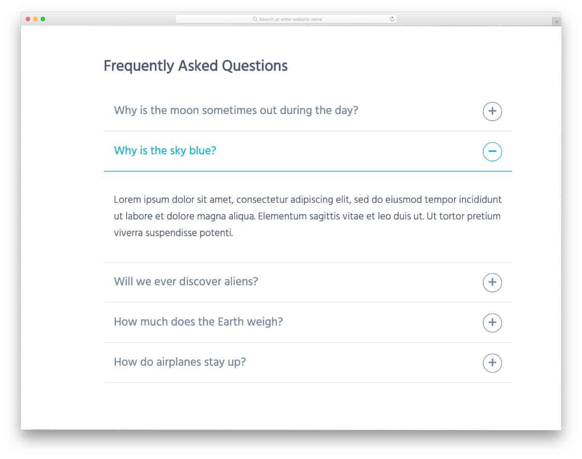
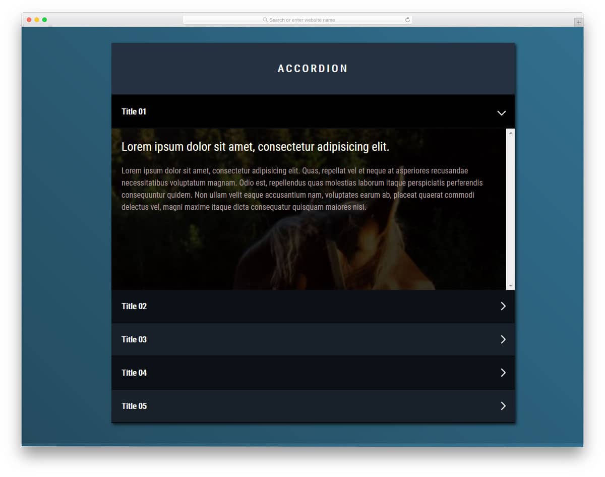
Accordion Details and Summary is a simple accordion design, which you might have seen in many websites. This is a default accordion design in many websites’ FAQ sections. The text area is made bigger so that you can make the text bolder and easier to read.
Aigars Silkalns is a Latvian entrepreneur and web developer who founded Colorlib, a hub for distinctive WordPress themes. Trained in technology and design, he began as a freelancer and launched Colorlib in 2013, earning acclaim for user-friendly, modern, responsive themes. A champion of open source, Silkalns shares insights on web trends and entrepreneurship. His mission is to make web design simple and accessible, empowering people worldwide to build professional sites with ease.


