Date pickers are very common UI elements we use every day. Whether we are booking an appointment or setting up a profile, the datepicker minimizes the effort required for input. There are two main types of date pickers: the usual tap-and-pick-a-date method and the date range selector. Depending on where you use the datepickers, their interfaces change. In this bootstrap datepicker collection, we collected single-tap datepickers and date range selectors.
Unless you are making a scheduling application, a simple date picker will suffice. Because the scheduling application’s datepicker plays a major role. For example, if you have used social media scheduling applications like CoSchedule and Hootsuite, you will know that all the actions are designed around the calendar. But the datepicker in a form or on a website is a simple UI element used to ensure error-free input. Based on the purpose, the navigation of the datepicker calendar totally differs.
If you are using the datepicker in an event registration form, you only need to make the event dates available for users to pick. But on a travel or hotel website, we have to show the entire year and upcoming dates so users can easily pick a convenient date. No matter for what purpose you use a datepicker, there is one example for you in this bootstrap datepicker example. Whether you have to show only the selected dates or only the weekends in the datepicker calendar, there is a design for you here.
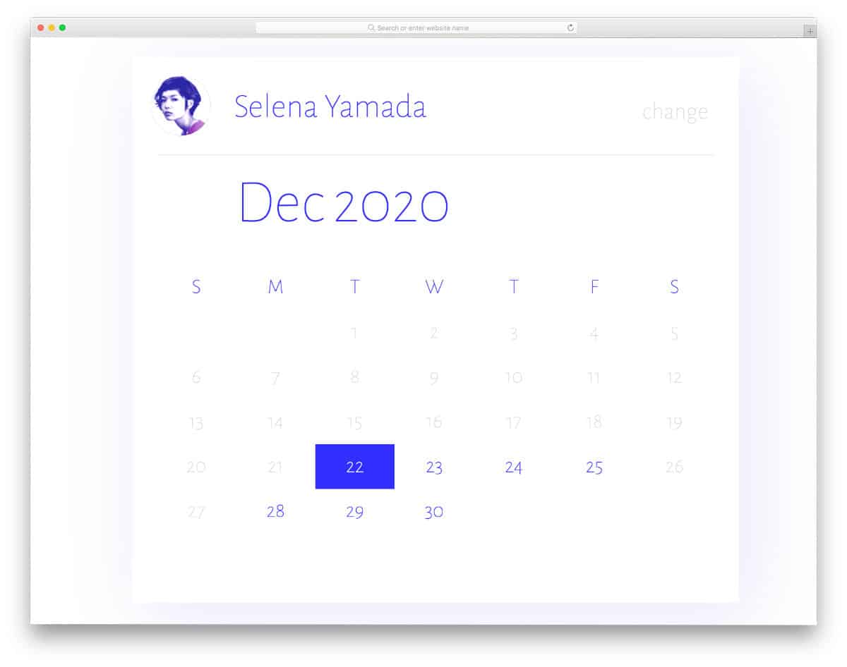
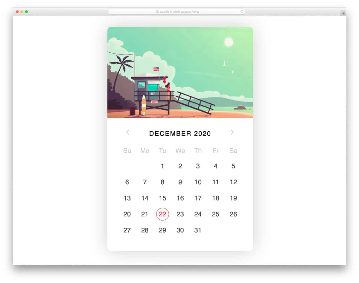
Calendar V11

In the V11 bootstrap calendar template, you get a simple and straightforward datepicker design. The datepicker calendar is large and bold, so the audience can easily select the date they want. You also get useful options like Today, Clear, and Close at the bottom of the calendar, which is a thoughtful addition. This datepicker design is best for selecting a single date. Since the calendar opens as a modal window, you don’t have to worry about fitting this datepicker into your form or web page with limited space.
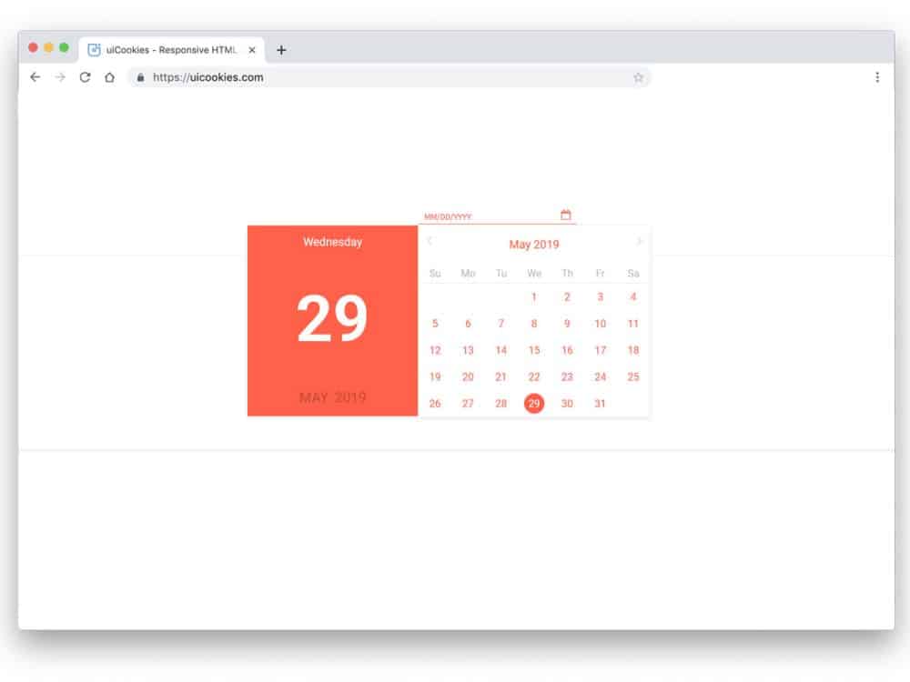
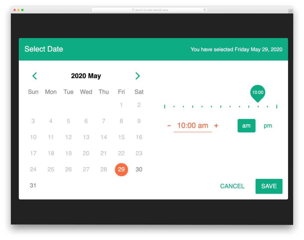
Calendar V09
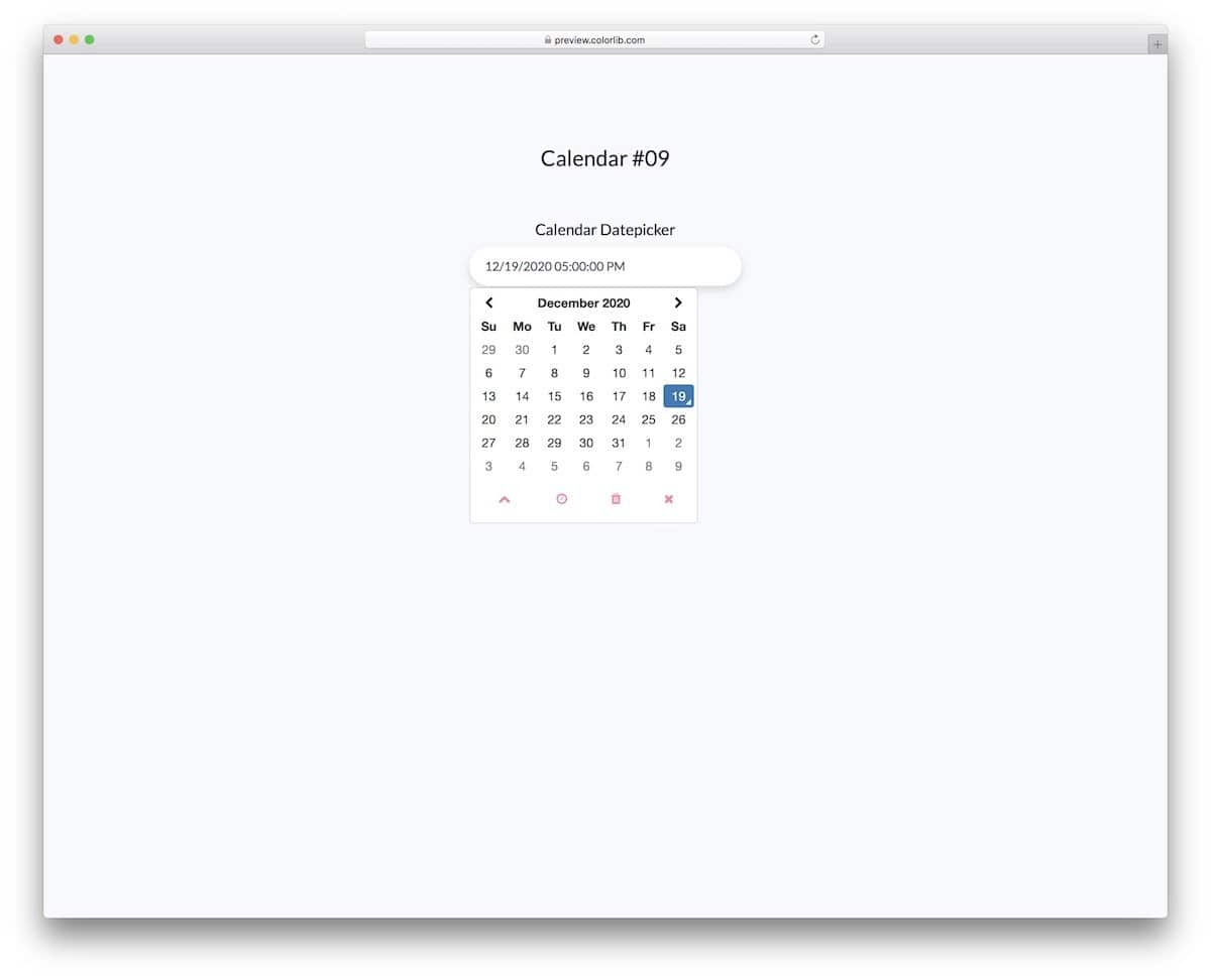
The V09 bootstrap datepicker is also similar to the V11 template mentioned above. But this calendar lets you pick both the date and the time. If you are looking for a Bootstrap datepicker for your reservation form or page, this one is a great choice.
The creator has smartly incorporated a calendar and a working clock into the calendar widget. As a result, you can save space on the webpage, and users can quickly select the time and date. Icons are used to show the options to maintain a cleaner look; you can use tooltips to let the new users easily understand what the icons really mean.
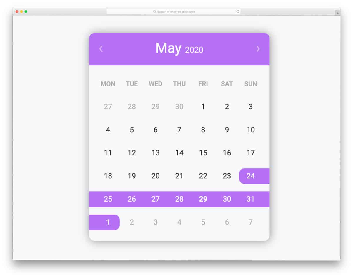
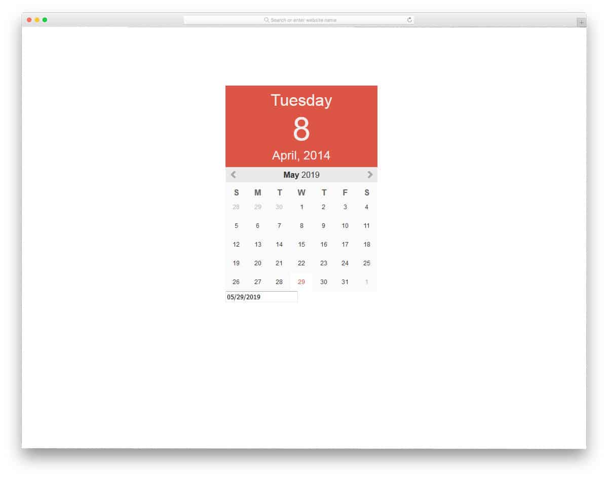
Calendar V03
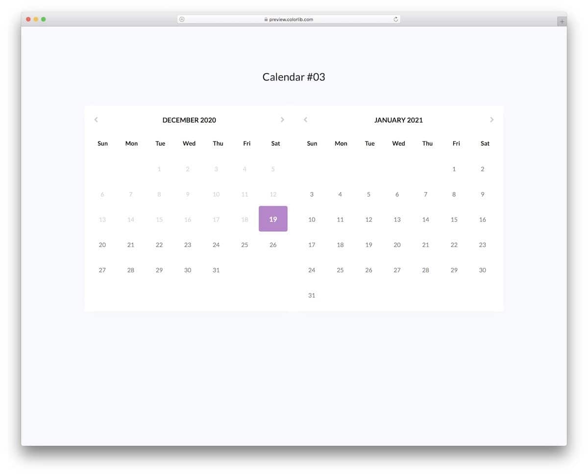
For those who want a Bootstrap datepicker with the ability to select a range, this template is the best option for you. The creator has placed two calendars side by side to let the audience easily select the date range without confusion. If you don’t want two calendars, you can edit the code and bring the range functions to a single calendar. The creator has given you a solid template with a flexible code script. Therefore, you can edit the template and use it to create your custom calendar in no time.
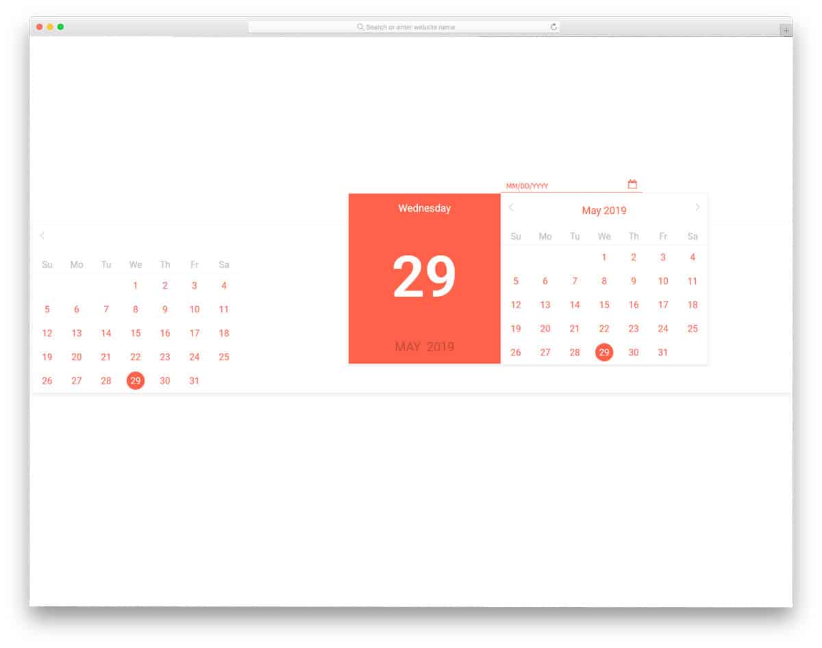
Calendar V18

The V18 bootstrap datepicker lets you set a date range and let the audience pick a date within it. If you are organizing an event or selling tickets for an event, Bootstrap Datepicker will come in handy. Since this one is a concept model, the functions are not clear, but you can get an idea. You can use this template’s idea as a base for your event booking application or the calendar in the website admin dashboard.
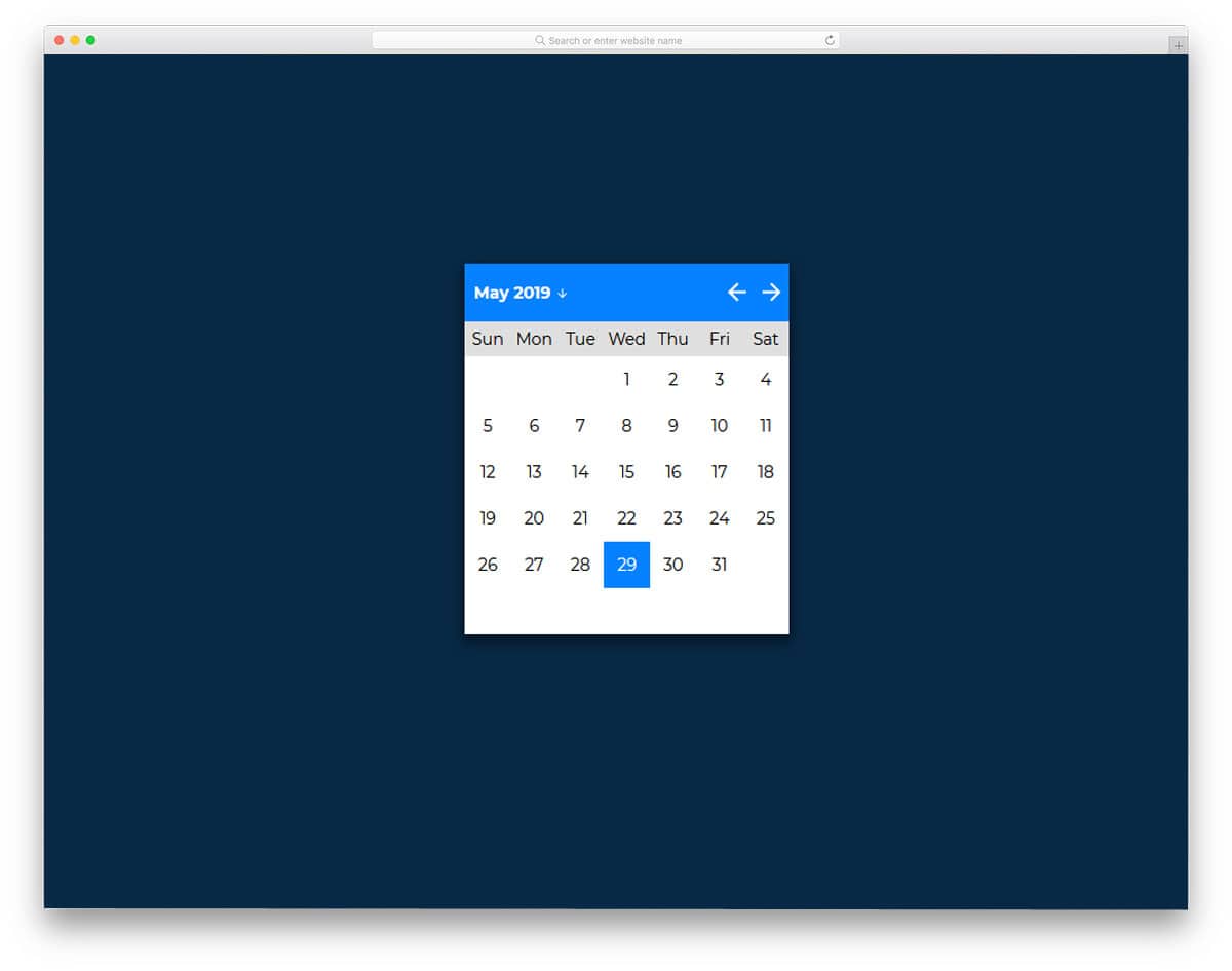
Calendar V14
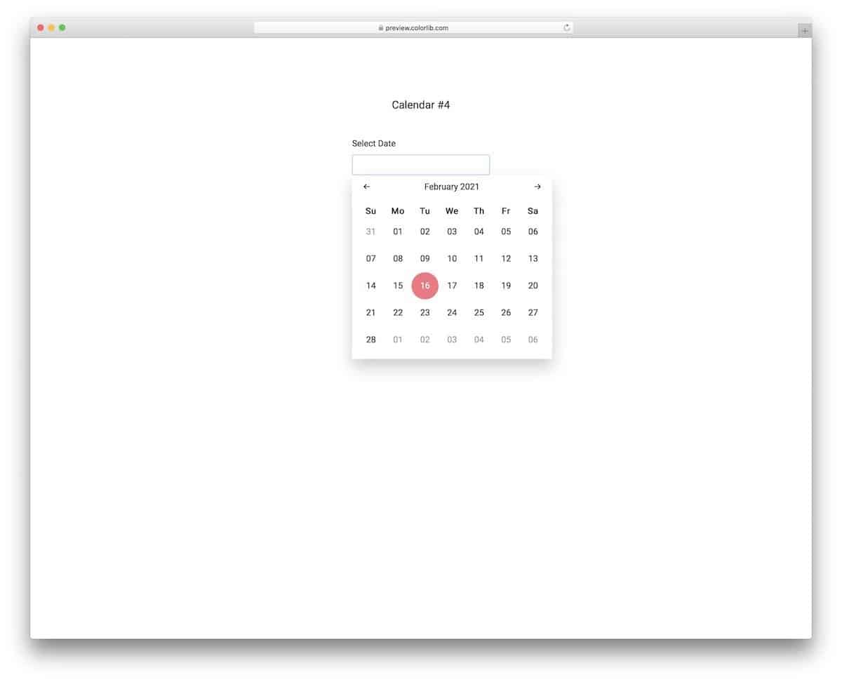
The V14 is a simple bootstrap datepicker with all the necessary options pre-built for you. You get easy-to-use navigation options and a nice, colorful highlighter to indicate the current date. The calendar automatically jumps to the date even when the user types the value directly, which most calendars don’t do. Users can easily jump to the date they want and select it thanks to this template’s friendly layout. The default design itself works smoothly on the frontend. Once you have made the changes you want, you can use them on your website or application.
Bootstrap Datepicker Example v2
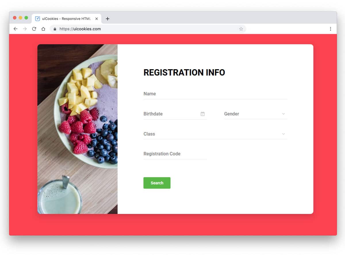
One of the most common areas where date pickers are used is in registration forms. Providing the option to easily pick the date keeps the user within the form and also lets them know the day of that date. In this Bootstrap datepicker registration form, the designer has treated months and years as separate elements. Hence, you can easily pick the month and year you want. The entire registration form is made using the Bootstrap framework. You can easily utilize the code in your design and also customize the form as per your design needs.
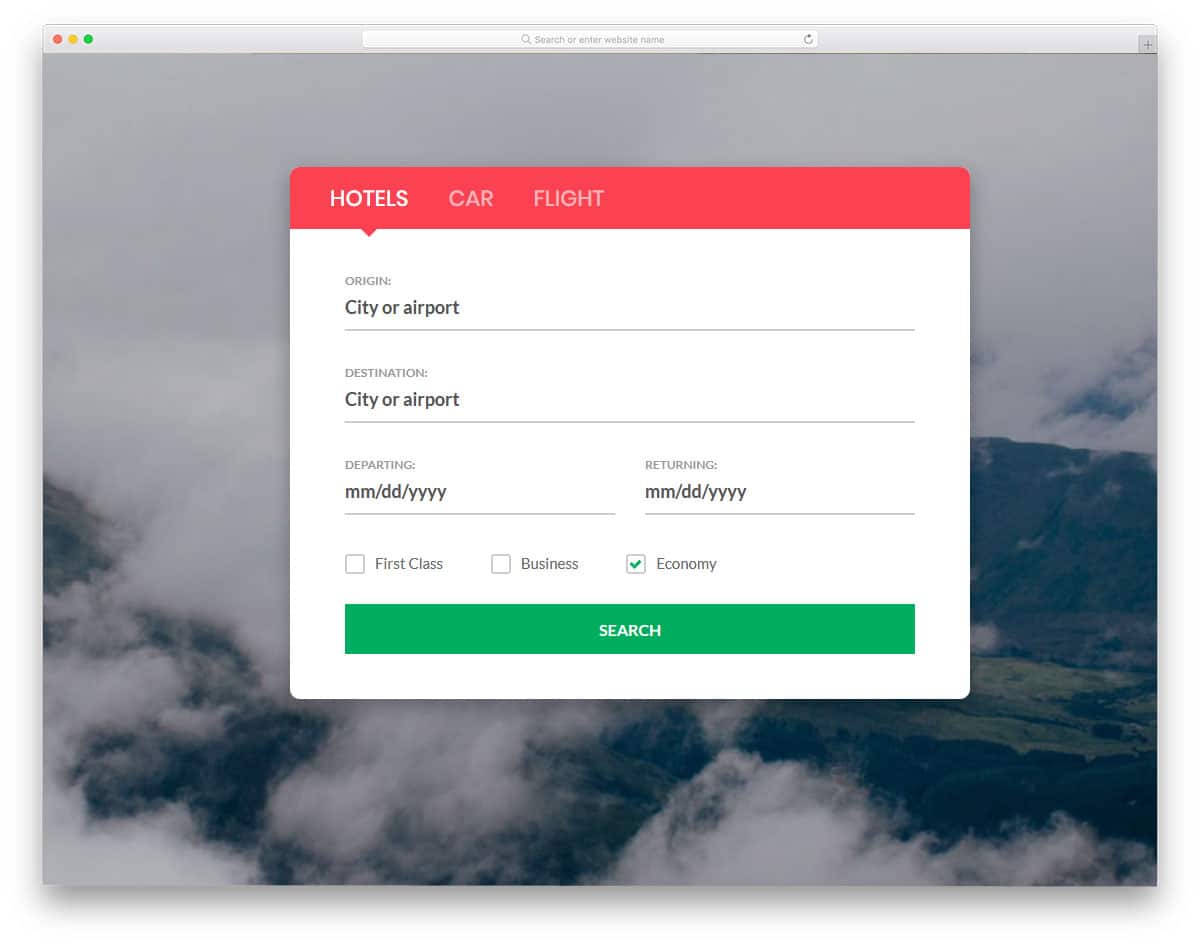
Reg Form v11
Reg Form v11 is also from the same creator as the V2 form mentioned above. In this form, you get two date picker options for the check-in and check-out dates. The calendar design used in this form differs slightly from the one you have seen in the V2 form. This datepicker calendar is classy-looking, with thick borders to differentiate each date. A yellow color highlighter is used in the default design, but you can use any color as per your design. Since this template uses CSS3, it supports all modern colors and animation effects. This bootstrap datepicker code structure is kept simple so you can easily integrate it with your reservation or other systems.
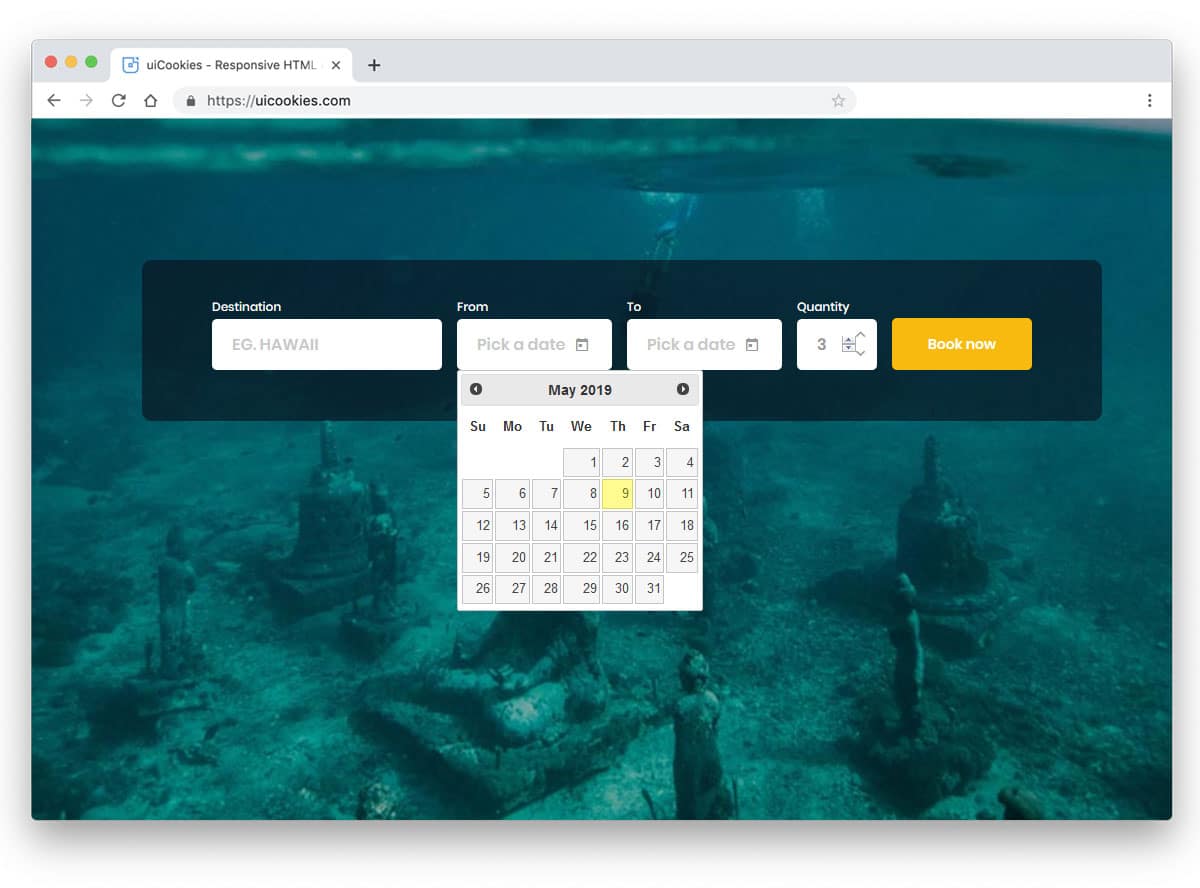
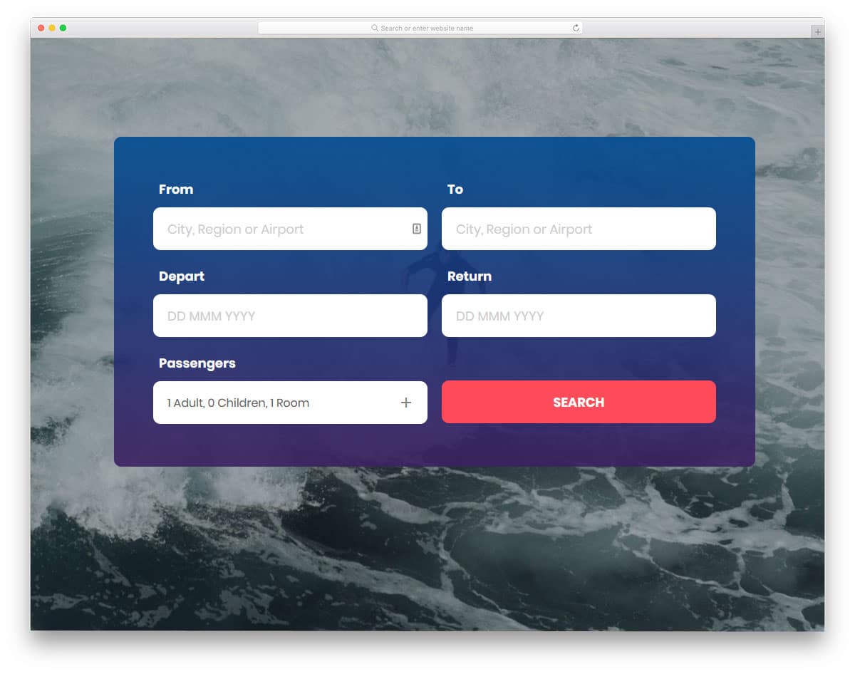
Bootstrap Datepicker Search Form v2
Datepickers are also used in the search form to let the user easily narrow down the search result. If you are making a search form for a travel website or hotel website, this bootstrap datepicker will be a good choice. In this form, you also get two date pickers. If you like the V11 form mentioned above but prefer a modern calendar, this design might impress you. The Bootstrap datepicker calendar is made bigger with trendy fonts so users can easily pick the date they want. You get the entire source file in the download folder, so you can easily work with this template.
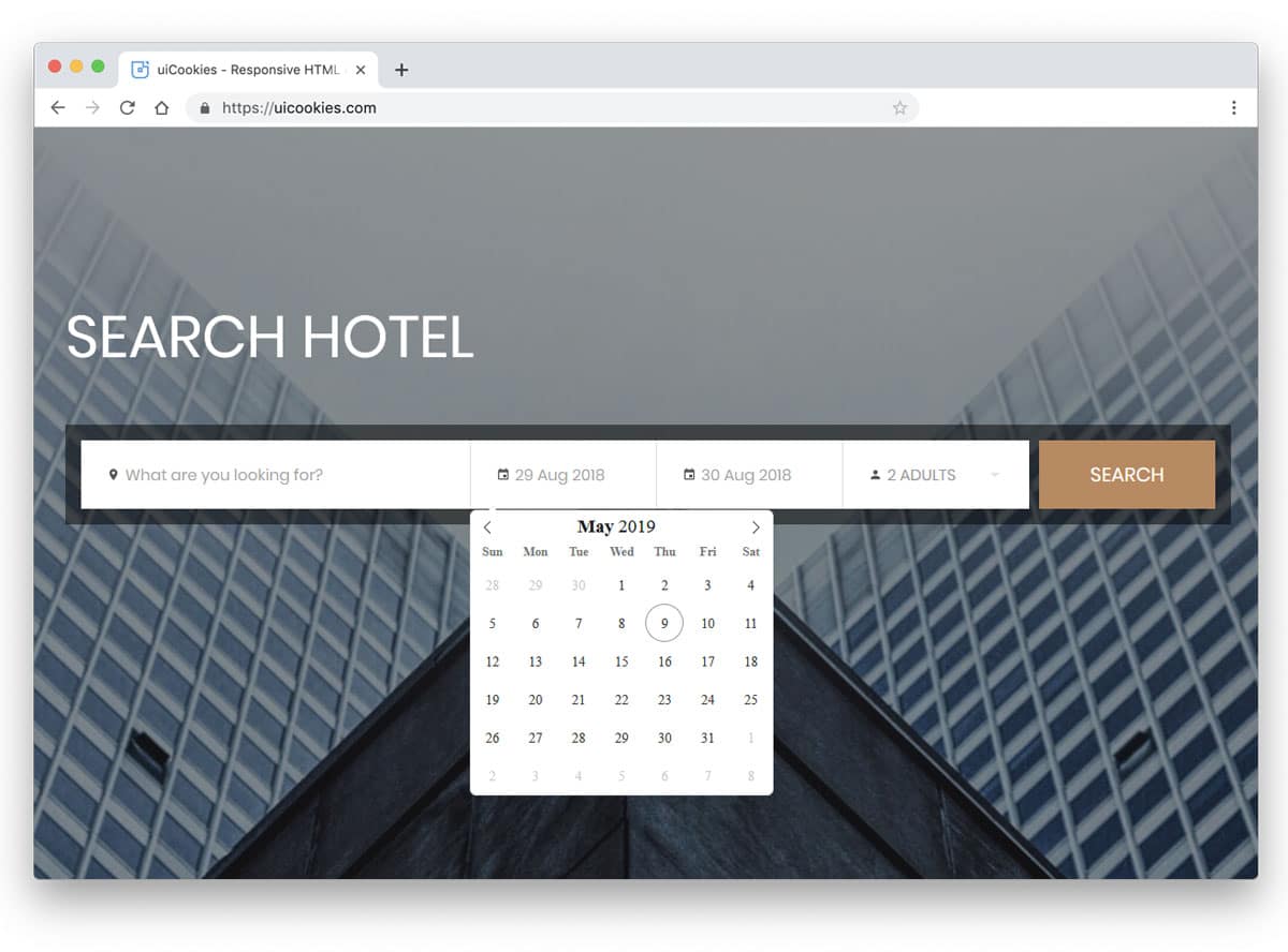
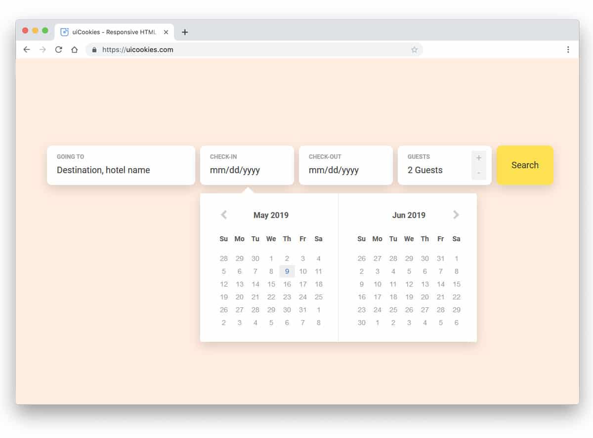
Search Form v20
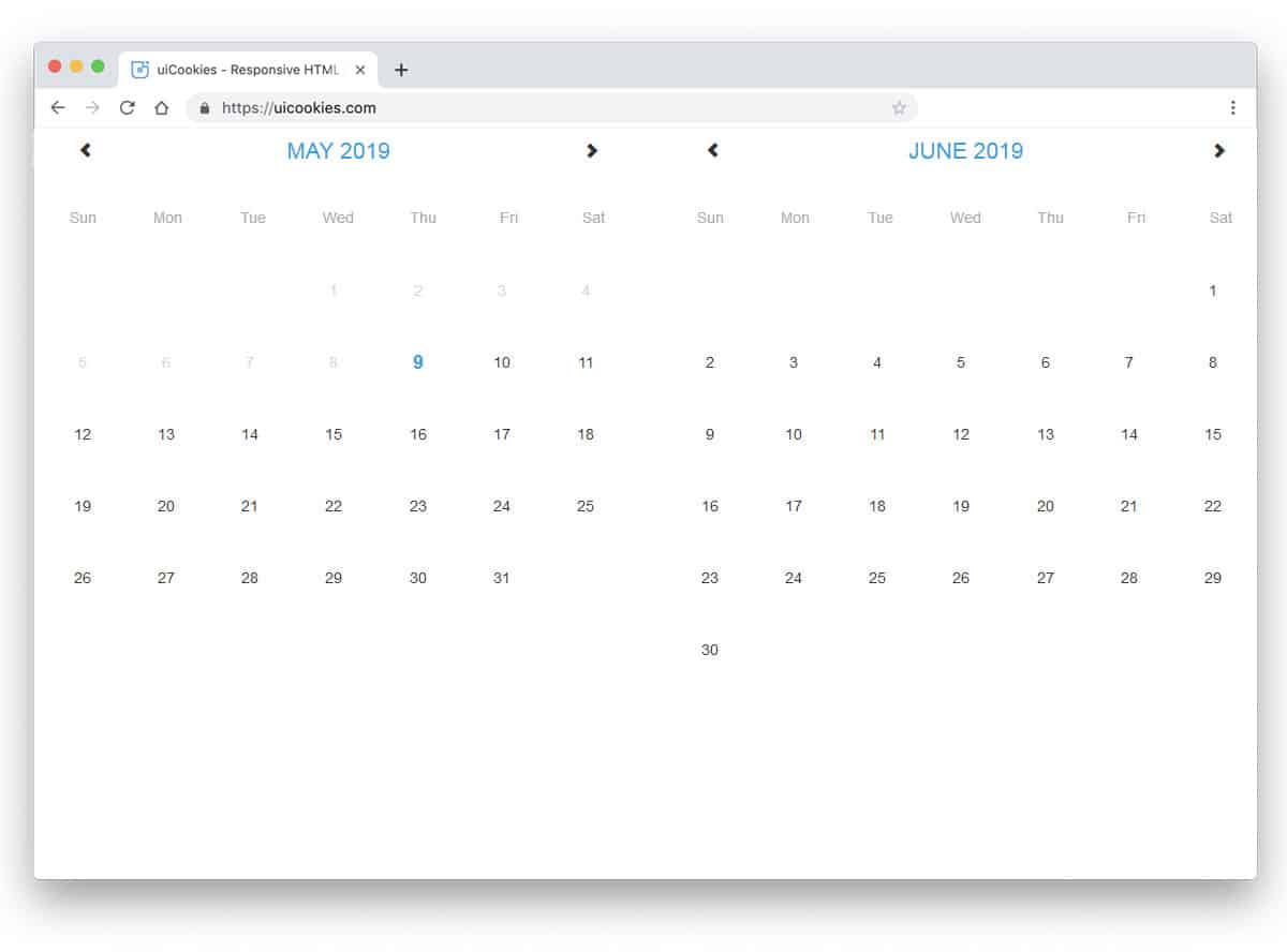
Sometimes date pickers need to select a date range. For example, if you are booking a hotel room, offering the option to select the date range lets the user easily enter the check-in and check-out dates. To make range selection easier, the developer has provided a wide calendar that shows consecutive months side by side. The default calendar is large and uses large fonts, so the user can easily read and interact with it even on small-screen devices. Properly handled shapes and color scheme give the Bootstrap datepicker calendar a unique look, and it is also easy to use.
Search Form v16
Search Form v16 also has the same date range selection as in the V20 form. In this form, you get a slightly different calendar with an orange color scheme. The unique feature in this search form is the tabbed interface. In all the tabs, the datepicker calendar works perfectly. If you are looking for intuitive tab interface design, take a look at our bootstrap tabs design collection. Thanks to the latest HTML5, CSS3, and Bootstrap framework, this form loads faster and looks natural. You can use this template in your website or application by making a few adjustments to the code.
Search Form v14
Search Form v14 is another version of the v20 form mentioned above. There are only a few design tweaks to this datepicker calendar, but they make it more elegant. A small vertical line separates the months, making it easier for the user to interact with the calendar. Throughout the design, the shadow effect is used effectively to give the form a floating appearance. Though the original design of the template is for search widget, you can use it for other purposes as well. The solid code base gives you full freedom to customize the template as per your needs.
Fluid Booking Form Datepicker Example
As the name implies, this datepicker example is designed for a booking system. Though it is a concept model, all features and options work smoothly. The user can first select the professional they want and then pick the desired date & time from the datepicker. Animation effects are kept as simple as possible so that the users can seamlessly jump between processes. If you are building an app that follows the Microsoft Fluent design guidelines, this Bootstrap datepicker example is a good choice.
Bootstrap Datepicker Summer Vibe
As the name implies, this datepicker design uses a summer concept. A pleasant sunny day at the beach is used in the calendar header section. You can take this concept and use different seasonal images for the particular month. Like in all other Bootstrap datepicker examples, this one also uses a nice big calendar with ample space between each date. Therefore, mobile users can also easily interact with this calendar. You don’t have the option to highlight or display the selected date, or to use other functionalities, in this calendar. By keeping this code script as a base, you can create your own custom design in no time.
React Date Range Picker
Instead of simply selecting the from and to dates, you can give a date range selection option to make it even more interactive for the users. For example, on a hotel website, a user can select the date range before booking a room. Basic previous and next navigation options are included in this pack; you may need to provide more sophisticated options to let users easily select the date they want. As the name implies, ReactJS is used to easily handle dynamic interactions. The creator has given you the entire code script of this design; hence, you can easily edit the code as per your requirements.
Bootstrap Datepicker

Those who want a compact yet interactive datepicker design, this one will definitely get your attention. The creator has used quick, bouncy animations to get the user’s attention and a reasonably bigger calendar for easier interaction. Though the default calendar is small, the creator has made navigation easier, making it feel more natural. Hence, the user will find this datepicker design easy to use. Because of the compact nature of this design, you can use it on any form and application without any issue.
Date and Time Picker
This one is slightly bigger than other Bootstrap datepicker examples, but given its ease of use, the size is worth the trade-off. As the name implies, this one lets you select both time and date. For the time, you have a draggable slider and an increment/decrement options for precise selection. If you are developing scheduling software, a datepicker design with useful input options like this will greatly help your users. Since it is a concept model, the creator has given only basic options. You can add the features you want and can make it a complete datepicker widget as per your requirements.
jQuery UI Date Picker
This one is a compact datepicker design, but this one has a different look and animations compared to the Bootstrap Datepicker mentioned above. Because of the unfolding animation, you may need to free up some space below the datepicker. The animations are sleek in this example, making it easy for users to interact with the datepicker. The current date is neatly highlighted in the calendar, and neat navigation arrows are provided at the top to easily navigate to different months. As you can see, this datepicker design has all the basic options. You can work on the custom features and can integrate the datepicker into your website/application without any hitch.
mdPickers

This datepicker design is made using material design. Elements are trendier and options snappier to use, which most mobile and desktop users will love. Since it is a concept model, the creator has provided you with a long list of features and options. Though it is a free template, every element works perfectly, like in a premium design. Hence, developers can easily work with this code snippet and can utilize it on their project without any issue.
MD Datepicker Demo
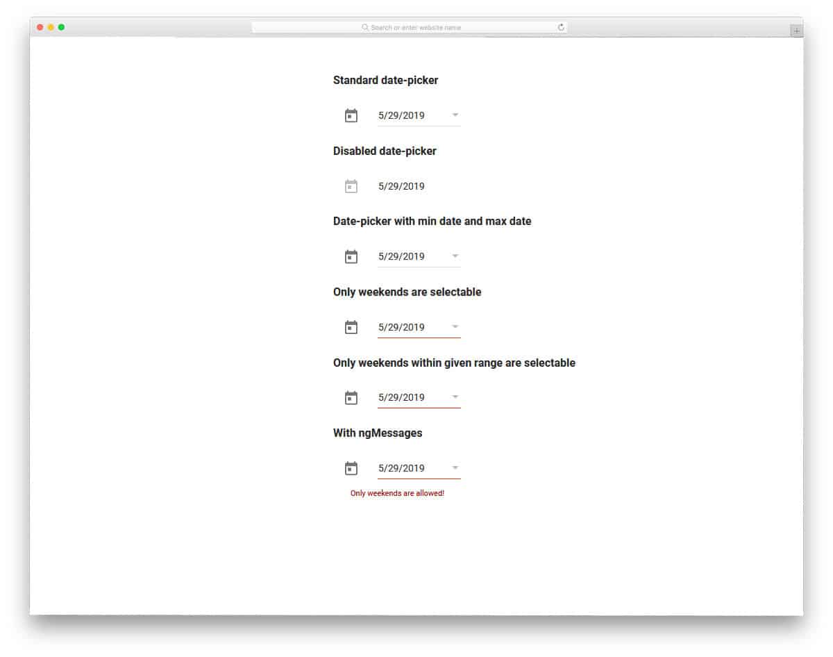
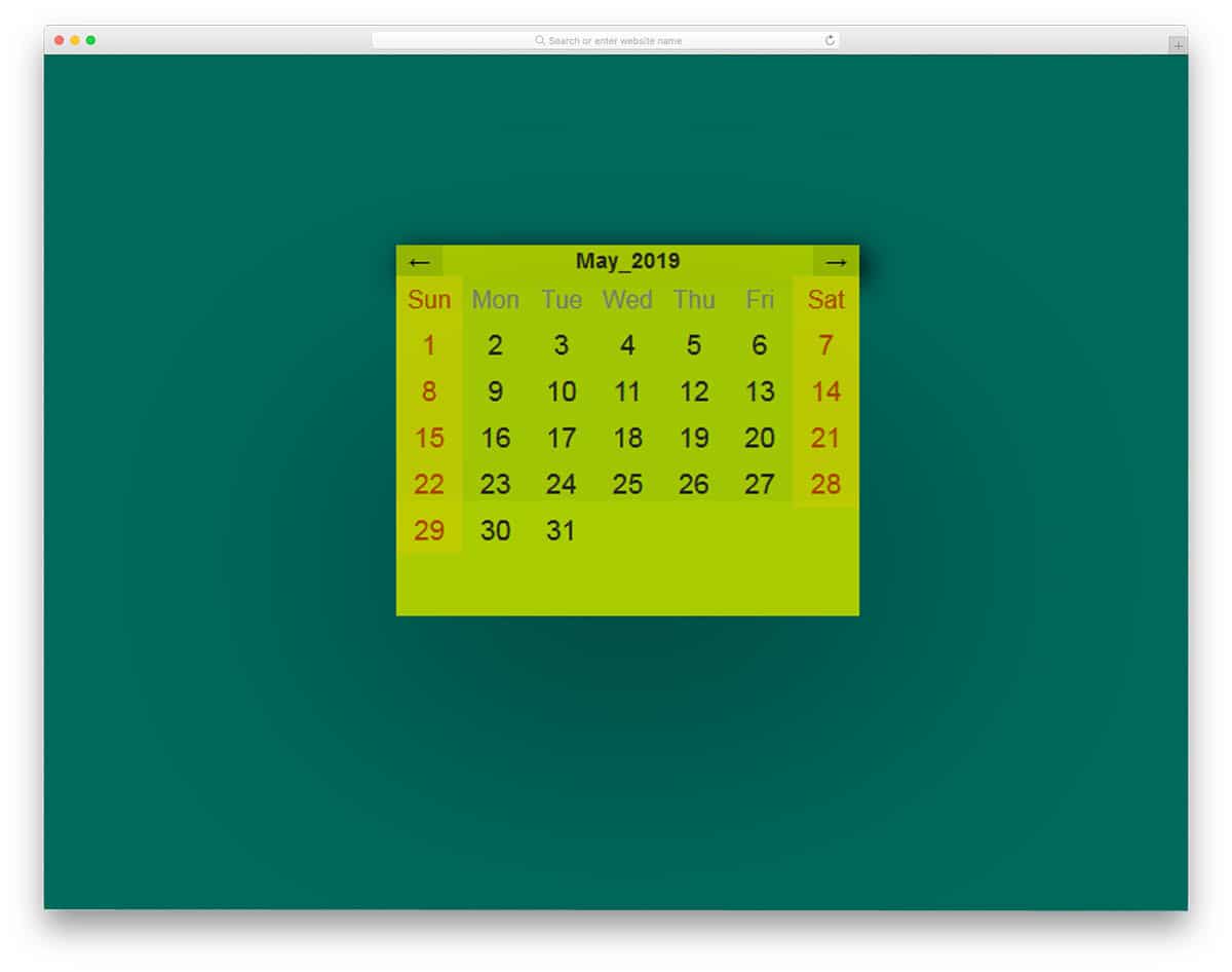
The developer Sean Larkin has given different conditions in this Bootstrap datepicker example. For example, if you are open only on weekends, you can show only weekends on the calendar. So the user can pick the perfect date, and you can reduce the number of wrong entries. The calendar is fluid and scrolls smoothly, so mobile users will enjoy using it. Not only the weekend option, but there are also several other options in this example. Take your time and pick the one you want.
Datepicker y Materialize
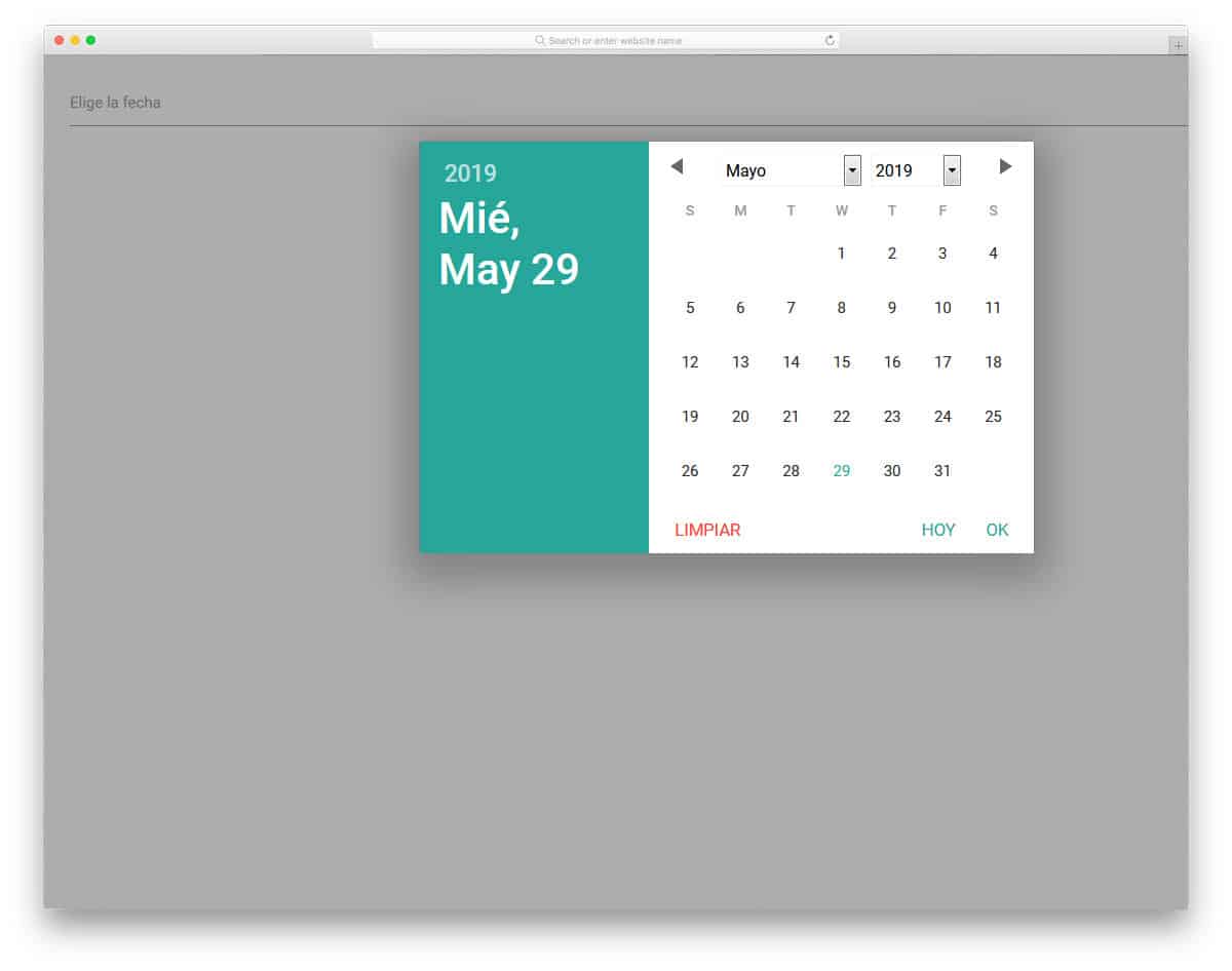
The creator of this design has used a proper calendar to help you easily pick a date. Navigations are made extremely simple so you can jump to any month and year with a single click. A split-screen design is used in this calendar so the user can clearly see the date on the left. The only thing you have to change in this calendar is the language. In the default design, you get Español, but you can easily change it to your preferred language. This bootstrap datepicker adapts to the screen up to a certain limit. To make it fully responsive, you have to manually work on it.
Clean Vue Datepicker
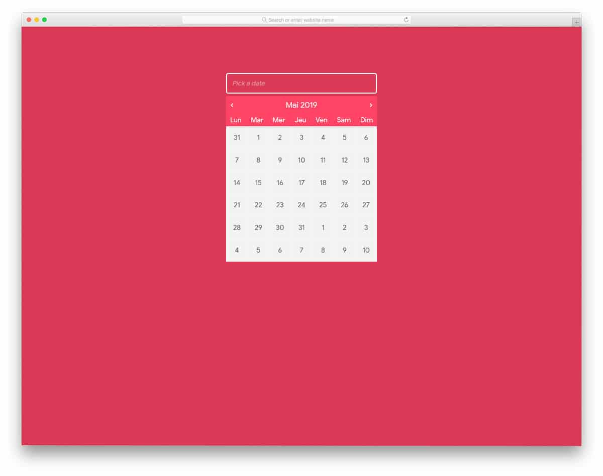
Clean Vue datepicker is a clean-looking material-style datepicker calendar. The developer has used small animation effects to show which date you will select. Hover effects are smooth and don’t take much of your time. In the demo, the same color scheme is used for the background and the calendar, making it tough to differentiate the calendar from the background. The entire code structure used to create this whole design is shared with you in the CodePen editor. Hence, you can easily edit the code and visualize the result before using it on your design.
UI Datepicker Calendar
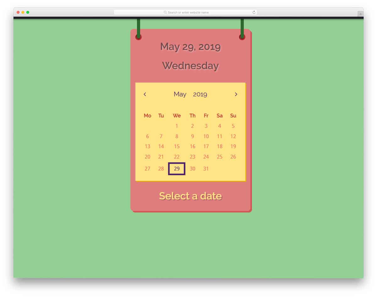
UI Datepicker Calendar has a colorful and cartoonish design. You can see the current date at the top of the calendar, which is a thoughtful addition. Throughout the design, the creator has used a chunky rectangular element. Only colors are used to indicate the date picked by you, which isn’t evident on this bold looking calendar design. You can use a different hover effect or animation effect to indicate the date the user picks. Take a look at our hover effects collection for more inspiration. The default design of this calendar datepicker design makes it a perfect option for both widget design and main element.
Event Calendar
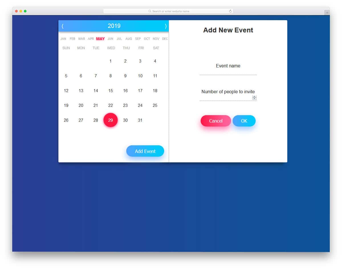
Event Calendar is a well-thought and well-executed calendar design. Though it is originally a calendar app design, you can use it as datepicker element. The navigation design is the best part of this calendar. Months, weeks, and years are treated as separate elements so the user can easily navigate to the date they want. In addition to the calendar design, you also get a functional “add event” option. The creator has used the glow effect effectively to highlight key web elements. Not only the design but the code structure is also handled professionally. Hence, developers can easily use this code in their designs.
Calendar App Concept
From the name alone, you can see that this is also a calendar app design. The fluid animation and natural interface design make it a perfect option for a datepicker calendar. This calendar allows you to choose a date range. Since it is a mobile application, letting the user select both check-in and check-out dates on one screen will be a smart interface design. Since this is a calendar app concept, you can add new tasks. Colors are used smartly to organize the contents. Since this template uses CSS3, you can use any trendy colors in this design.
Wide Responsive Calendar
If you don’t want any concepts and just need the calendar, this Bootstrap datepicker example would be a good choice. This simple, clean calendar can be used in any form and in any application. Another advantage of this plain design is that you have the full freedom to add your creative touch. The calendar is fully functional, and you can’t select past dates, which is a thoughtful design choice. Navigation arrows are given at the top, but in this design, you can skip only one month at a time. Right from the color scheme to animation effects, everything is kept minimal so you can easily adapt this calendar in your design.
Angular Material Datepicker
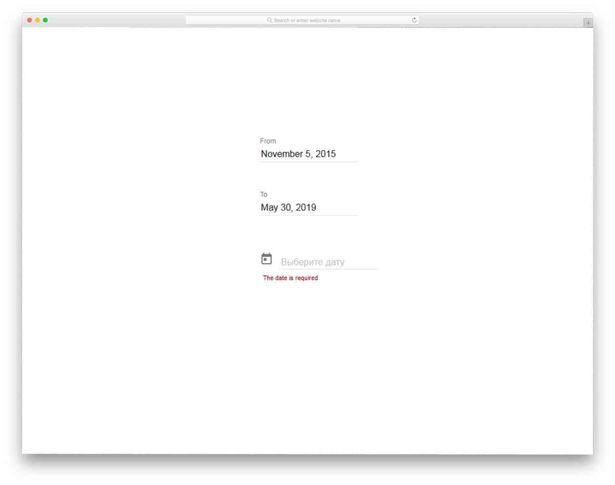
Angular Material Datepicker is a neat design for forms and applications. Two separate fields are given in this datepicker design to select the from and to dates. The calendar is large, with ample space between elements. Colors are used beautifully to show the selected date. At the top of the calendar, you can clearly display the selected date to the user. The calendar is fully functional, the only thing that is not working is the “Today” option. But it isn’t a big issue; you can add the feature by editing the code. The developer has mostly used HTML5 and AngularJS to create this user-friendly datepicker calendar design.
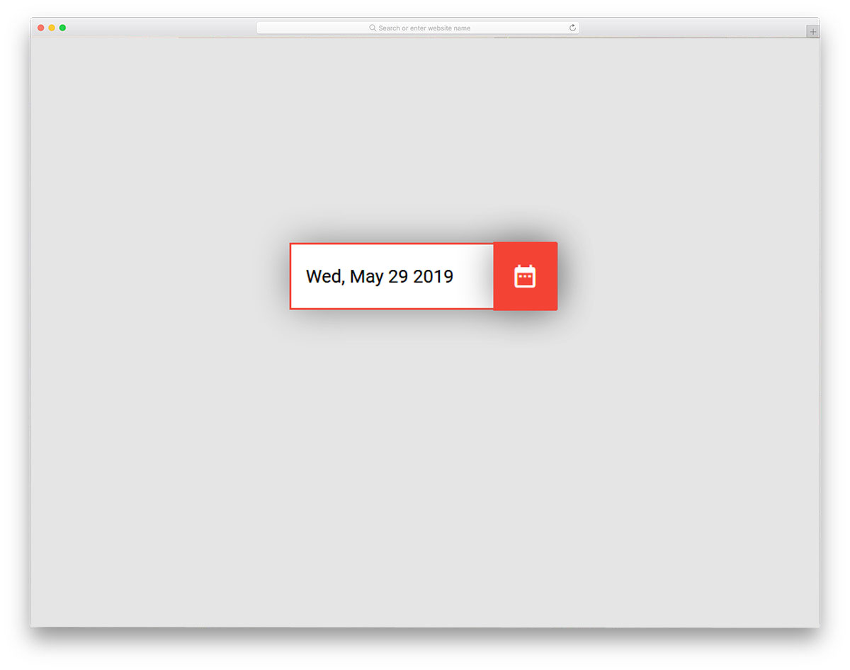
UI Datepicker Modification
The creator of this Bootstrap datepicker example has used a different approach. The calendar is the center of the design, and the selected date is displayed in a text box below it. If you are making a calendar-centric design for your registration or booking page, this design would do. All you have to do is make the text box bigger, since the default is smaller and the content isn’t visible. The developer hasn’t made it responsive because it is a demo concept. But the codebase used in this design can adapt to responsive design. Overall, the UI Datepicker Modification example can be incorporated into your design with a few adjustments.
Bootstrap Datepicker
The creator of this design has used material design in this datepicker calendar design. A split screen style design is followed in the calendar to show the selected clearly to the user. Shadow effects and colors are used smartly to differentiate each element from the others. The default font looks clean and professional, so you can use this design as is in your project. There are a few unfinished elements in this design. For example, a big calendar right below the datepicker box. The entire code structure is shared with you directly in the CodePen editor. So you can easily make your hands dirty and make your own custom datepicker in no time.
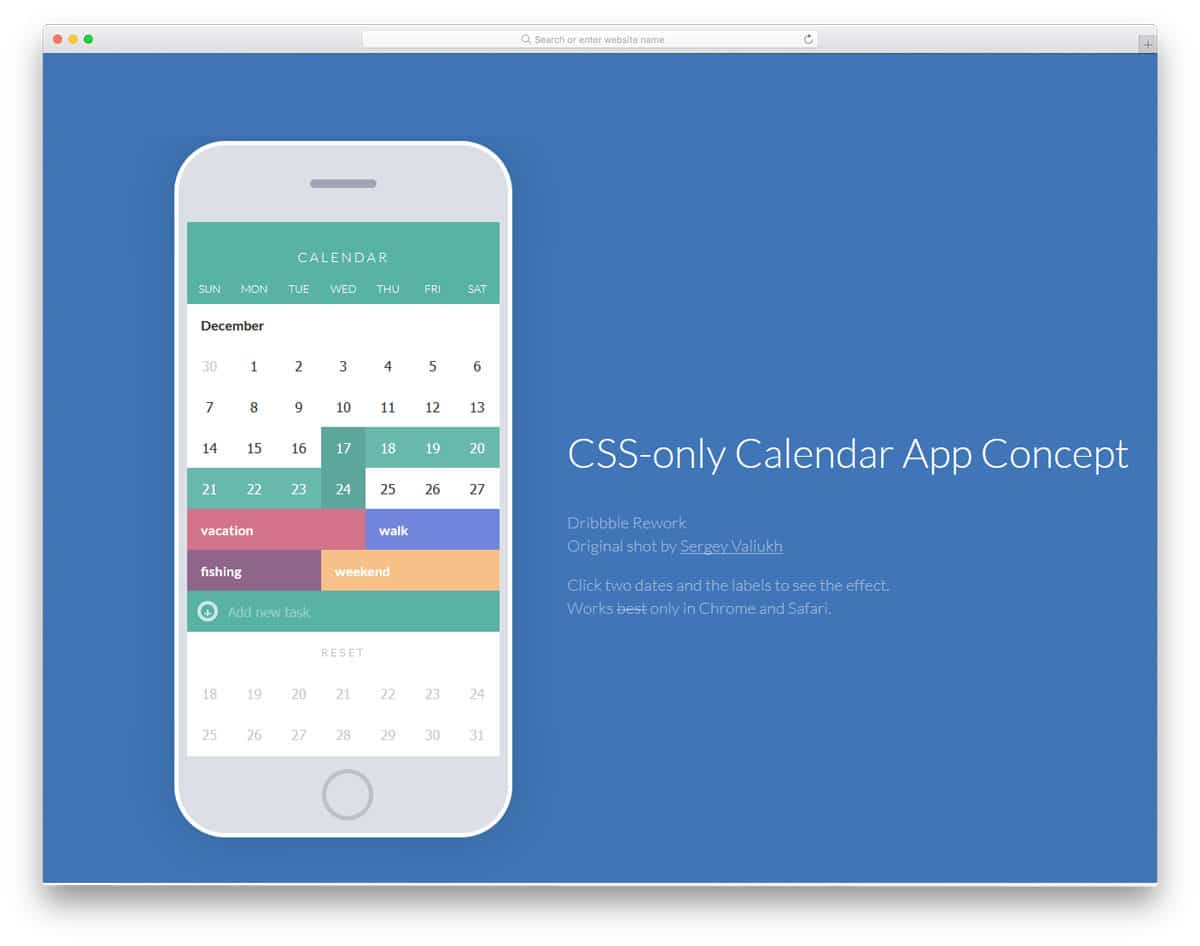
CSS Only Calendar
This Only Calendar doesn’t show the selected date, but it has an ideal navigation design for a calendar. Within the small screen, the designer has given you a proper calendar. A small arrow is given next to the year to let you easily choose the year you want. Since it is a demo, only a few years are given in the option. By keeping this design as a base, you can create your custom datepicker calendar. Plus, this design is made entirely with CSS3; using this code in your design won’t be an issue.
Material Design – Pickers
From the name itself you can understand that this one is also a material-design-based datepicker example. Zoom-in and Zoom-out animation effects are used for the calendar, which is neat. But if you’d like to use other animation effects, check out our CSS3 animation examples. In this calendar design, the creator has used Material Design effectively to give you an elegant-looking datepicker. The default design isn’t mobile-responsive; you might need to work on it manually if you pick this design.
DatePicker
The developer Akash has given us a colorful datepicker calendar. Smooth, clean animation effects make this calendar interactive. Though this design uses the latest CSS3 script, the default color scheme looks a bit dull. But as usual, you can use your own color scheme on this calendar. The developer has mostly used CSS3 and JavaScript to make this design. The entire code structure for this design is available in the CodePen editor. You can edit the code in the editor and can visualize it before using it on your website or application.
Material Datepicker
In this example, the creator has given us a colorful material design datepicker. The calendar is made bigger and neater so the user can see the date they pick. An ample amount of space is given between each element so the interaction will be easier on this datepicker. Bright colors and swift animation effects keep users visually engaged. The entire code script is shared with you on the CodePen editor. You can see that the creator has given a clear description and information for the codes. This template will help you understand the code better if you are a beginner.
jQuery UI Material Design Datepicker
This is another Material Design datepicker design example. But the creator has used fewer colors to give the datepicker a professional look. The calendar is made taller and wider so you can show all the dates in the month and the selected date clearly at the top. In the bottom-left corner, you can easily jump to the current date. All the options and the elements in this Bootstrap datepicker concept are working properly. Since it is a concept model, there is a small inconsistency in the design. But nothing is major, you can fix it easily by editing a few lines of code.
jQuery Datepicker
jQuery Datepicker is a simple and fully functional bootstrap datepicker design. The creator has given all the basic options in this calendar; users can easily navigate through the calendar and pick the date they want. Just like the design, the code script is also kept neat and simple. The developers can easily work with this template and add the features they want. On the calendar, the present day is neatly highlighted, but you don’t have the “today” option to jump to the current date, just like in the Material datepicker design mentioned above. If you are looking for a simple and easy-to-edit Bootstrap datepicker design, this example will impress you.
iOS Datepicker
From the name itself you can understand that the developer has used an iOS-style scrollable calendar. This design might impress you if you are looking for an interactive calendar for your mobile or smartwatch application. Modern-day smartwatches have vibration motors to provide haptic feedback. Using calendar datepicker designs like this will give users a satisfying experience. The entire code script for this design is shared with you directly on the CodePen editor. So you can easily use the code in your design. You can easily edit and visualize the results on the CodePen editor itself.
Bootstrap Datepicker Multi Date
This one is a unique datepicker on this list. The creator has provided you with a code snippet to select multiple dates in a calendar. This bootstrap datepicker example gives you only the functionality; you don’t get fancy designs and colorful elements. You can take this code snippet and add your skin and effects to it. The creator has made the code script flexible enough to easily edit and add the features you want. All the basic functions work in this design, so you can focus on fine-tuning it to your needs.