
Border elements are often used as a surprise element in modern web design. Until the user hovers over the element, they won’t know how the element reacts. If you are looking for creative border effects to engage your users, the CSS border animation effects in this list will help. This list has a border effect for buttons, content blocks, gallery sections, and other small web elements. Most of the effects are built with the latest HTML5 and CSS3, so you can easily customize and use the design to meet your requirements.
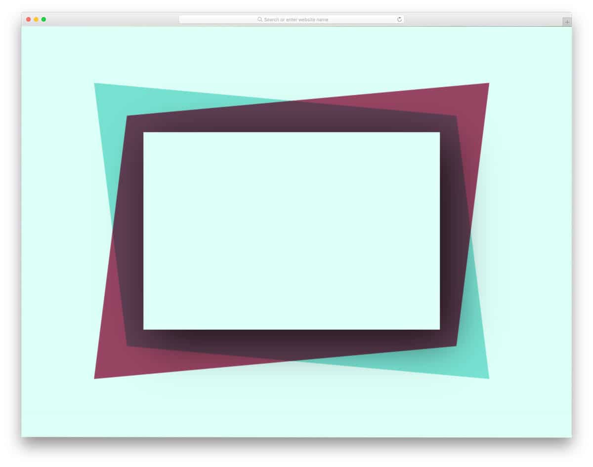
Here are the best CSS border animation effects you can use in 2026

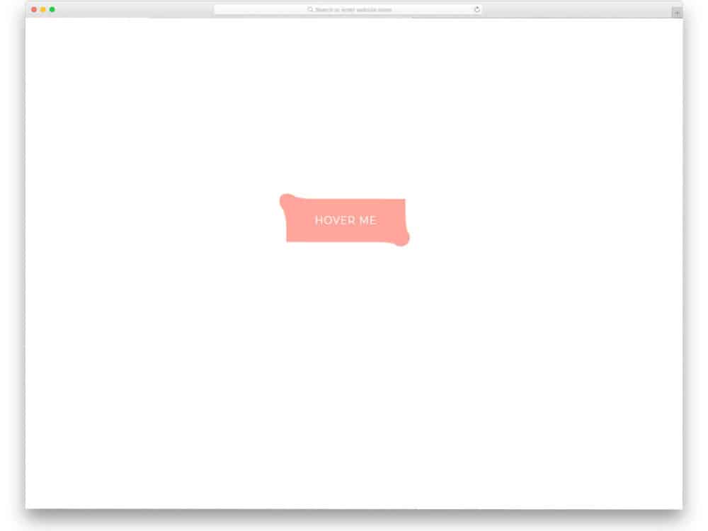
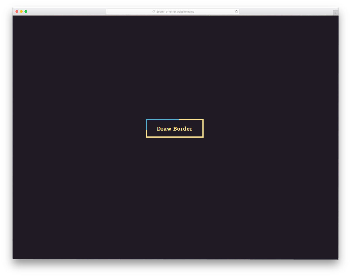
CSS Hover Border Animation

As the name implies, this CSS border animation is triggered by hover. The borderline closes from the edges to the center. Lines at the corners help the user to understand that the button is clickable.
The whole concept is built purely with CSS, so you can add your own custom effects to the design to spice up the interaction. Another advantage of this pure CSS3 design is that you can use any modern elements and effects without any issues.
Inspiration For Menu Border Animation
Navigation and secondary menus are treated as a part of the design in modern web and app interface design. If you are planning to make your menu stand out from other designs, this CSS border animation for menus might come in handy.
This responsive design reveals the menu option when the user clicks the button. Border animation is used to get the user’s attention and let them know they will see a result in the box. The overall design is subtle and simple; you can use it on any part of the website and mobile application.
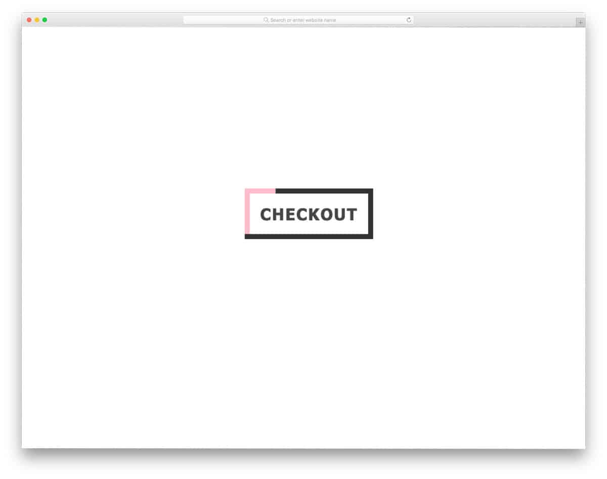
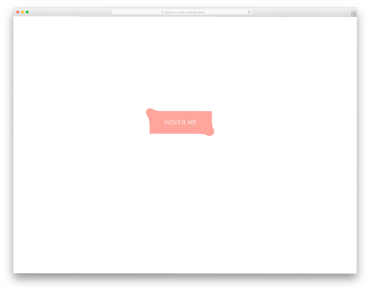
Pure CSS Border Animation For Buttons

This CSS button border animation is a straightforward design. The button is clearly visible even without the border animation, which will help the audience easily identify the button on mobile devices as well. If you are looking for a professional border animation for your buttons or want to make a business website more interactive without compromising its business-like look, designs like this will come in handy.
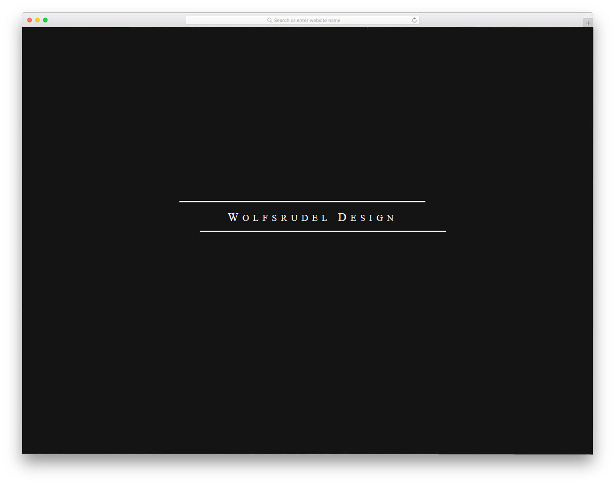
CSS Animate Border Left To Right
Those who are specifically looking for a left-to-right CSS border animation might find this code snippet useful. The use of contrasting colors and a bold border draws user attention to the element. Both entry and exit animations are included in this button border animation, so it might feel even more engaging to users. The text on the button also gradually becomes bolder as the border animation begins. Animation timing is done carefully to give a realistic look.
Pure CSS Border Animation
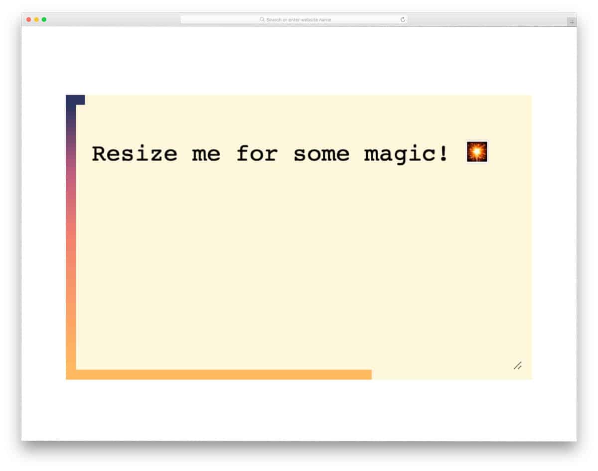
The creator, Louis, has given us a responsive and dynamic CSS border animation concept. The endless CSS border animation loop smoothly expands and contracts as you resize the text area. If you are looking for a dynamic border animation that automatically adapts to the environment, this code snippet will be helpful. The default gradient color and the perfect animation timing show the edges clearly to the audience. Since the whole design is made only using the CSS script, you can easily handle the code and add your own custom effects to fit in your design.
Border Animation Using Clippath
This example features a smoothly animated border that will mesmerize users. The borders will move slowly when you leave them undisturbed, but the borders will move rapidly when you hover over them. If you plan to use this border effect on a landing page or promotional banner, the default design is a good choice. For professional purposes and on regular web pages, keep animations smooth and gentle. The entire code script is kept simple and is shared with you on the CodePen editor. You can easily edit the code in the editor itself before taking it to your website or application.
Animating Border-Radius

Most CSS border animation effects are designed for rectangular and square elements. If you want a border animation concept for a circular element, this code snippet will come in handy for you. The default animation is smooth and fluid, so that the user will feel a fluid effect. Since it is a concept design, the text isn’t fully visible, and the animation timing is a bit slower. Once you fix the size and the animation timing, you can use this effect on any part of your website.
Sass Button Border Hover Effect Mixin
In this example, the creator has used a color mixing effect. The animation is triggered by hover, and the color mixing is smooth, so the user can see it clearly. Since the entire animation takes place on the button, it doesn’t take up extra screen space. Because of this simple nature, you can use this CSS border animation on any part of the website, form, or landing page. The creator used CSS3 to create this design. If you want, you can try other bright or gradient colors to make the color-mixing effect even more attractive.
Button Bubble Effect
If you like to make the border animation for your button or other elements even more engaging, effects like this will impress you. As the name suggests, the creator has used a bubble effect. The elastic nature and bouncy effects are timed perfectly, giving you a realistic look. To achieve this fluid animation effect, the creator has used CSS3 and JavaScript. Apart from the CSS border animation, this button changes color each time you click it. Small details like this make this design example unique in this list. By making a few optimizations, you can use this code snippet in your design.
SVG Border Animation
The creator of this design has used border animation for the clicking action. By default, this animation effect is almost similar to the Double border animation mentioned later in this post. But the lines in this example move in a different pattern. The complete border of the button is not shown even when you click the button, this might be something you have to fix if you are using this CSS border animation for the button. The creator of this template has used HTML5, CSS3, and JavaScript frameworks to make this design. The entire code script is shared with you on the CodePen editor. Hence, you can trim the code as per your needs and visualize the results before using it on your website or landing page.
Search Interaction / Border animation
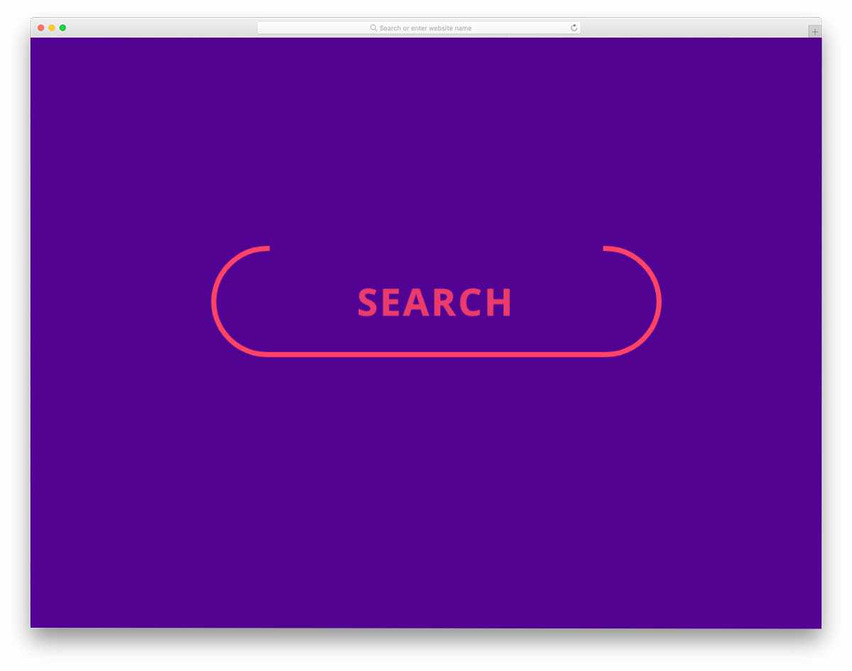
This is a meaningful border animation effect for the search button. When you click on the button, the button border neatly becomes a blinking cursor indicating that the user can straightaway type and start searching. To make this sensible button border animation, the creator has used the latest web development frameworks. As a result, you get a smooth, fluid animation. Because of this example’s simple and elegant border animation, you can easily use this design on any part of your website or application.
Button Border Animation
Button Border Animation is another hover-activated button border animation. The creator has used the bright border colors effectively to draw the user’s attention. Borders move smoothly from the edges and fully cover the button. Just like the design, the code script of this border animation is also simple. The creator has mostly used CSS3 to create this design. Hence, you can easily utilize the code even on your existing website. Because of this design’s lightweight structure, you don’t have to worry about the loading time.
CSS3 Box Border Animation

This border animation activates on click. If you are making a typography-rich website, animations like this will liven up the design. Since this is a concept model, the creator has kept the animation speed slow and smooth. But you can adjust the speed and other attributes easily as per your needs. The code script is shared with you in the Codepen editor. You can quickly edit and visualize your customization works on the editor itself. To keep the border animation buttery smooth, the creator has used a few lines of JavaScript. If you feel the code structure is a little heavy, you can remove the JavaScript and use CSS3 for the whole design.
Denis Border Animation

This is another button-border animation that will definitely get the user’s attention. The zippy animation at the end emphasizes the importance of the button. Whether you are making a dark-theme website or a minimal website with lots of white space, this button border effect blends well with the overall design. The creator has kept the code as simple and direct as possible so developers can easily understand it. Plus, developers can easily add their custom effects and elements to give the button a unique look.
SVG Border Animation

This is a simple, elegant example of a circular border animation. The default animation can be used for both web elements and graphs. To make the animation more evident, the creator has used a dark theme in the default design. But you can use this effect on the light theme websites as well. The default animation doesn’t take much screen space, so you don’t have to realign other elements on the webpage. Plus, you can fit this animation concept on any part of your website without any hitch.
Border Animation Effect
This is one of the most common border animations we have seen on many websites. On hovering over the element, the border rotates to highlight it. Unlike the SVG border animation effect mentioned above, this one shows the entire border before and after the animation. Hence, the user can clearly identify the proper region to interact. Though the animation is simple, the creator has used three code scripts for the design. Based on the code structure you follow, you can trim the code and still achieve the same effect. Or you can use this CSS border animation example as an inspiration and create your own custom animation effect.
Input Field Gradient Border Focus Fun
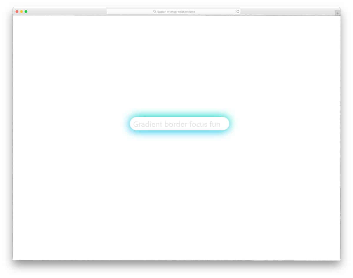
In this example, the creator has used CSS border animation for the input text field. Different simple and elegant effects are used to indicate the selected text fields to clearly indicate users on which field they are adding information. In this example, the creator has used a glow effect on the borders to make the selected text field easier to understand. Along with the glow effect, the creator has also used a depth effect to distinguish the text field from the plain background. If you are looking for more creative text field animations, take a look at our CSS Input Text design collection.
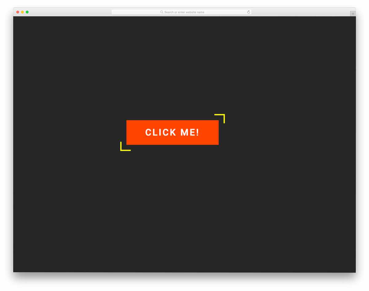
Button Hover Animation

This button hover animation is very minimal yet powerful enough to get the user’s attention. The corners of the buttons are made visible on the button, and the lines gradually expand to mark the boundary of the button. If you are creating a modern Scandinavian-style web design, animated elements like this will add richness. Like the previous button hover effect, this one is also made purely with CSS3. Since it is a CSS3 script, you get a fluid animation effect and natural colors. For more creative hover effects like this take a look at our CSS hover effects collection.
CSS Border Animation
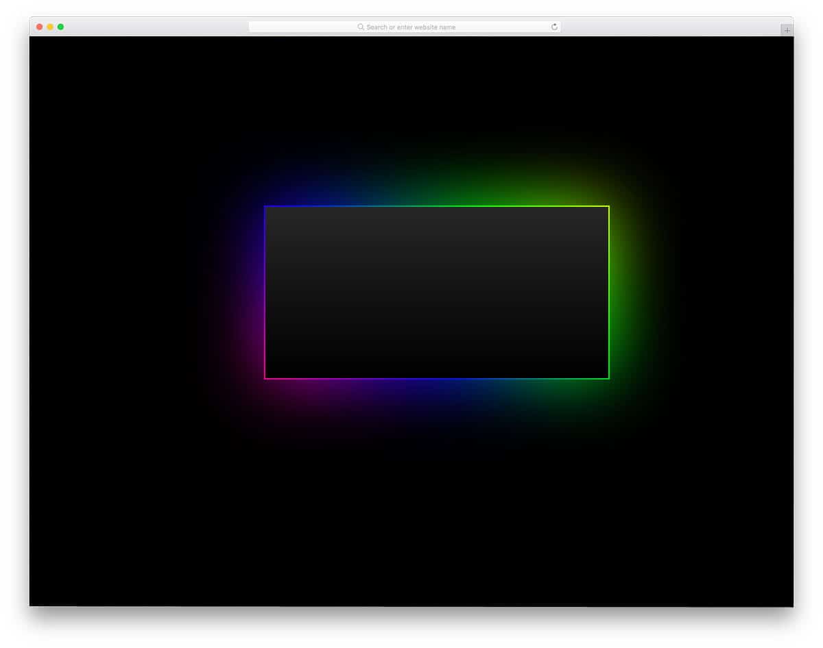
If you are a Razor fan, this RGB illuminating border effect will definitely impress you. In this border effect, you get glowing RGB colors moving from one corner to the other. If you are making a gaming website, elements like this will definitely help you connect with your audience. Most hardcore gaming accessories feature RGB lighting, and gamers obviously love this design. This simple, colorful animation effect is designed using CSS3. Hence, you can use this effect even on your existing website. The simple code script won’t make your web pages heavy, and it also performs well on mobile devices.
CSS Border Animation By Filipe Daniel

If you are using a broken grid and an asymmetrical style web design, animated web elements like this will spice up your design. Using an animated web element not only provides a visually rich appearance but also enhances the user experience. The creator of this border effect has crafted it with the broken grid-style design in mind. The whole effect is smooth and clean, which will make the users raise their eyebrows. This one is also a pure CSS3 design, hence you can use it on any modern website without any hesitation. The developer of this effect has shared the code in the CodePen editor, so you can edit and preview your customization before using it on your website.
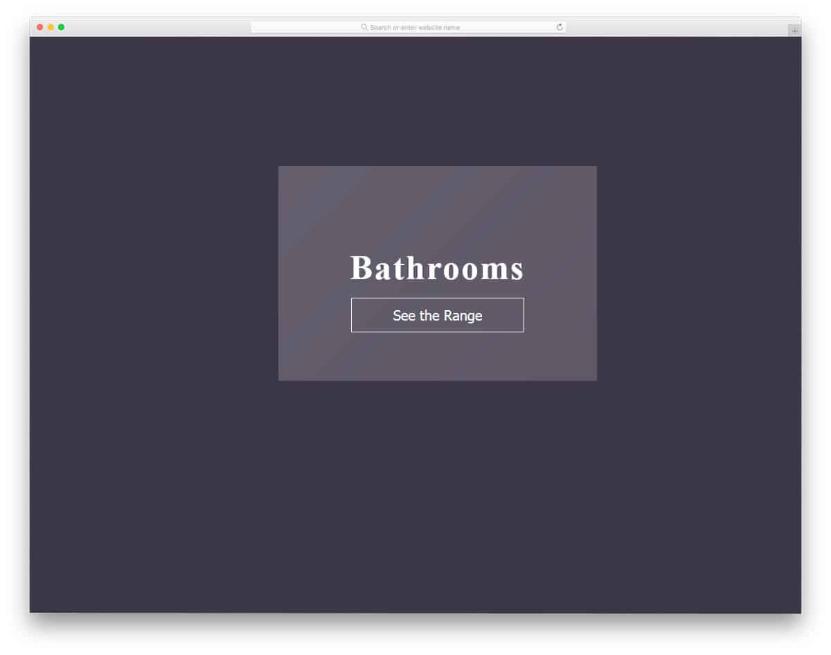
Border Animation Without SVG

If you are looking for an attractive border animation for image-holding content blocks, this design might help. Two lines smoothly move along the edges of the block and create a shadow when the user hovers over it. The default design is just a vague example; you can tune it to fit your purpose. To make your customization job easier, the developer has used the latest HTML5 and CSS3 frameworks. Hence, you can use any modern animation effects and color schemes on this border animation example. In the original design, the animated border revolves around another border on the inner side, so make sure you have given enough space between the elements.
Single Element CSS Border Animation

Single-element CSS border animation is another border animation for call-to-action buttons. The borderline lights up and moves swiftly to ripple the button. Since it is a glowing effect, it looks great on dark-themed website templates. Plus, the effect is smooth and professional-looking, hence you can use it on business websites without any issue. Borders of the button are clearly shown before the animation itself, so the user will know exactly where to click and interact with the button. This one is an SCSS script, so you can easily edit the effects based on your design and where you use it.
Border Animation By Inderpreet
Another border animation effect for blocks and image holders. You can use effects like this in a content-rich area to highlight the important content. For example, on the service page, you can use this animated block to highlight your best services. The effect is smooth and fluid, starting from one edge and finishing on the other end. In the default design, you get a big white line, but you can adjust the line stroke width and colors to fit your design. As most of the animation takes on the surface of the element, you can easily fit this on any part of the website.
Border Animation CSS

This animation effect is almost similar to the border animation in the previous example. But in this one, you get an extra hover effect along with the border effect. When using text boxes on an image background, elements like this improve content visibility. With the HTML5 and CSS3 framework, the creator can give you a perfect glass finish. On hover, a shadow effect is applied to the content block, adding extra beauty to the glass finish. As this design is done purely in HTML and CSS, working with them won’t be an issue for developers.
One Div Hover Animation
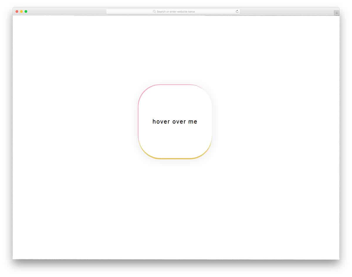
One of the biggest advantages of the modern web design framework is that you can surprise your audience with interactive animation effects. In this effect, you won’t see any border or animation until the user hovers over the text. The border of the button is highlighted with a colorful gradient. A 3D embossed look is applied when the user hovers over the button, making it distinctive against the background. Another advantage of this cool design is that it is made using HTML and CSS alone. Hence, it will load faster and also give better performance on both mobile and desktop versions.
Border Animation Effect With SVG And CSS
The border animation effects need not be used for galleries and buttons alone. In this design, the designer has used border animation for card elements. If you want to highlight and show the best pricing table among the others, animation like this will help you. A simple ribbon tag on the pricing table is enough to highlight the table, but animating it would make it more lively. In the default design, the border animation is treated as a hover effect. You can use the design as such, or you can edit and make a single card alone, animate to differentiate it from the others.
Css Border Animation By Nedim
If you are looking for a NatGeo style border animation, this is the best inspiration for you. In the default design, the creator has just used a line moving in a square format. You can incorporate this design on any part of the website and on any web element. The simple design of this border animation makes it blend in well with all types of web pages and application screens. The code structure is also kept really simple, so you can use it easily in your design. Since it uses CSS3, you can even use other types of animations in this design.
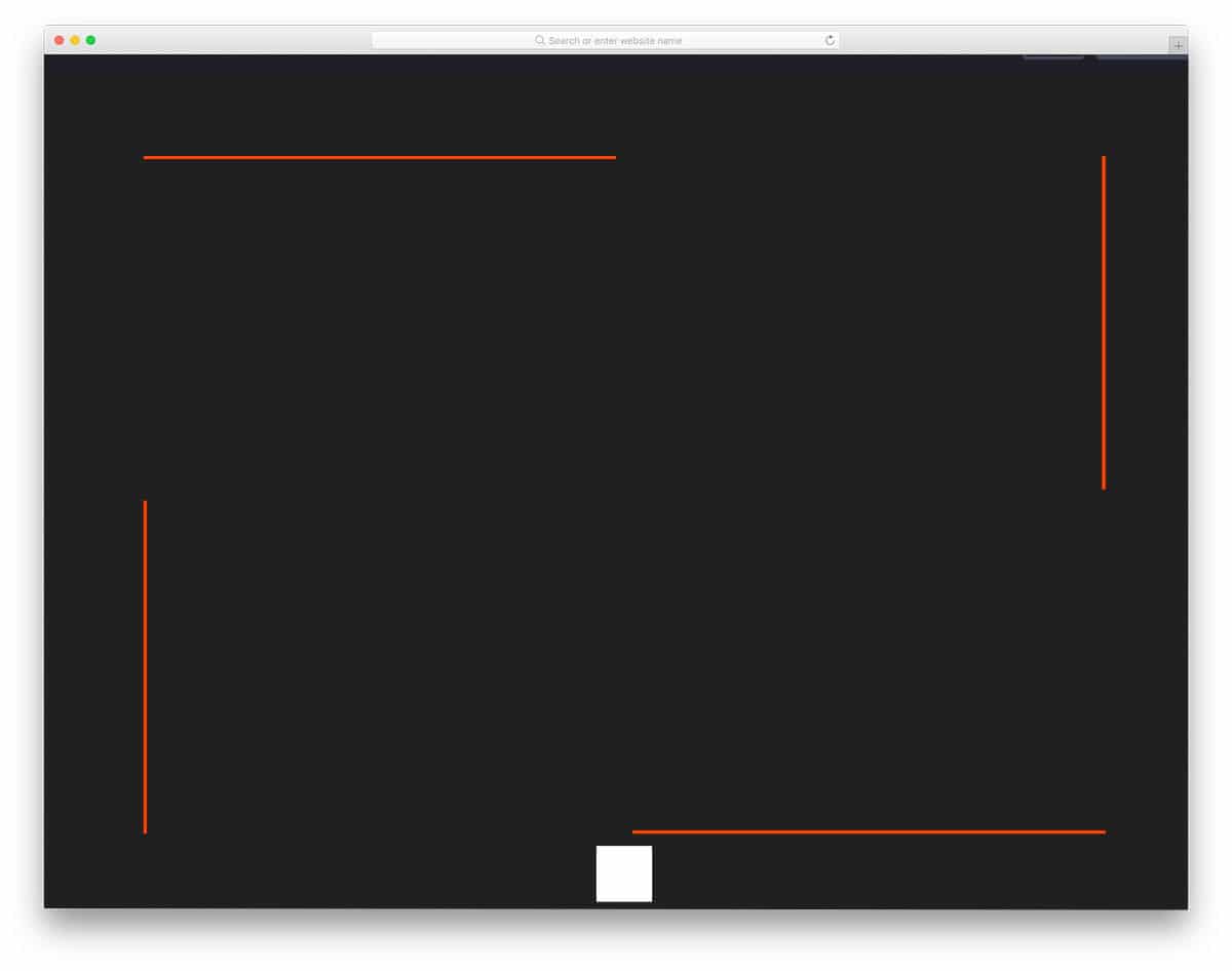
SVG Border Animation 1

In the previous button border animation effect, we saw the entire rectangle or square of the button animated. In this effect, a single line transforms into a button. If you are running a directory website, animations like this will let the user clearly direct to the desired page. You can even use this design on a personal website when the user clicks the button you can take them to your portfolio or about page. Hence, this design is a practically functional design which you can use for any website and landing pages. The animation effect is sleek and fluid hence the user doesn’t need to wait for the animation to complete to access the option.
CSS Border Transitions
Six CSS border animation effects are given in this set. All six effects are sleek and simple, hence you can use them on any professional website without any hesitation. The creator has given you both subtle and aggressive animation effects. Based on your need, pick one and start editing it. All the effects given in this example is designed using HTML5 and CSS3 script. Hence, you can change the button’s shape and add any modern animation effect. By making a few optimizations, you can use any of these effects in your responsive website designs.
Border By Marco Barría

This is another border animation effect for card elements. This effect is almost similar to the Border Animation Effect with SVG and CSS design mentioned above. But this one has a slightly different animation effect. These effects are not only for card elements, but they can also be used for other elements. The effect is simple and takes up only a few screen spaces, so you can easily squeeze it into your existing website. The designer has given you animation effects for both hovering over the element and moving the cursor away from it. As this effect is made entirely with CSS3, it takes only a few minutes to edit and use on your website or project.
SVG Border Animation 2
SVG border animation 2 is the best animation effect for event cards and other digital card designs. Since this design is built with HTML and CSS, you can use these scripts in your email template. But you have to make a few optimizations before using it for the email template design. The developer has used a few lines of JavaScript to achieve a buttery-smooth animation effect. As the default effect is simple, you can make this on the CSS3 script itself. Based on the code structure you follow, you can trim the code. Speaking of invitation cards, if you’re designing invitations, take a look at our invitation mockups to present your designs elegantly to your audience.
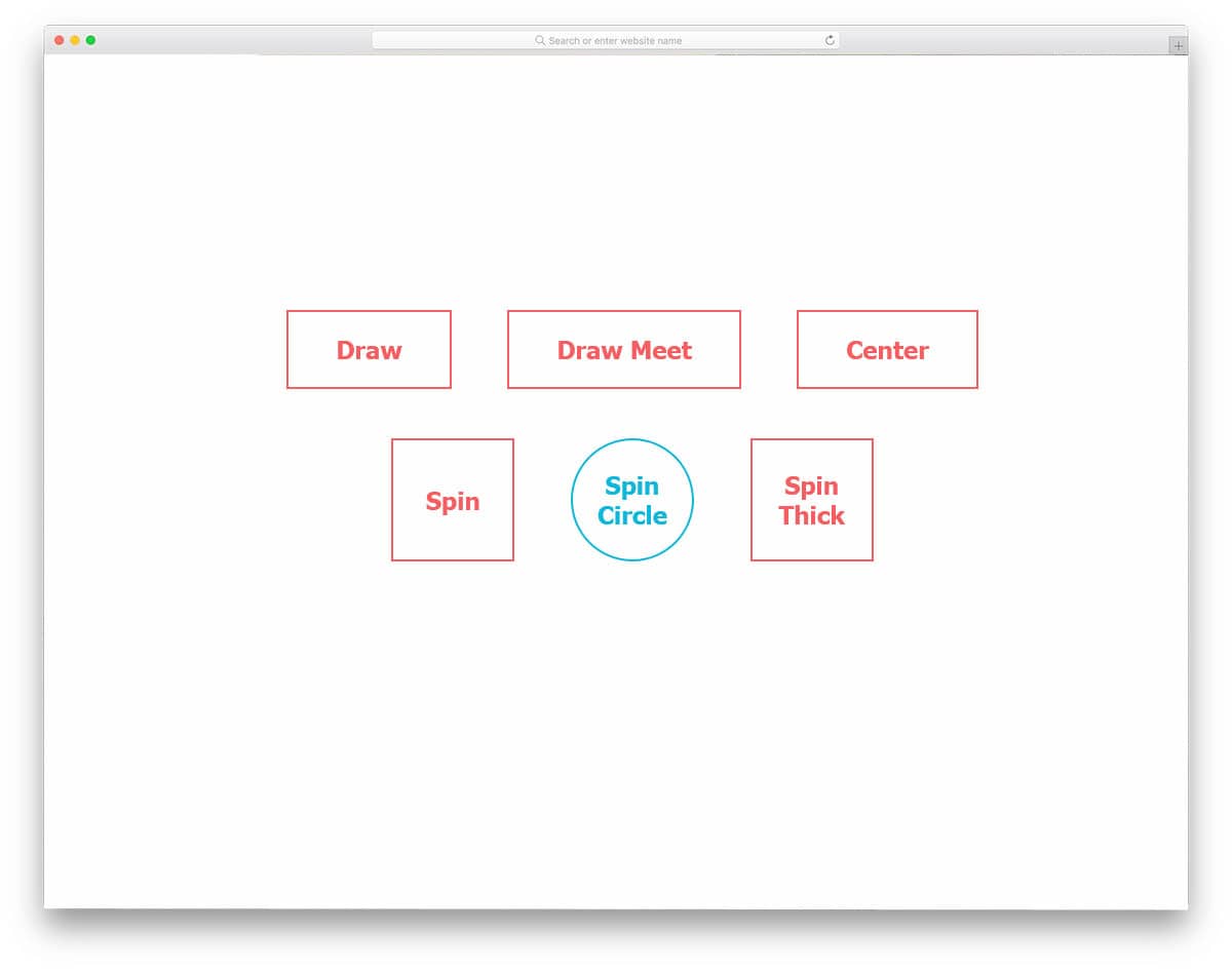
Border-Gradient Mixin
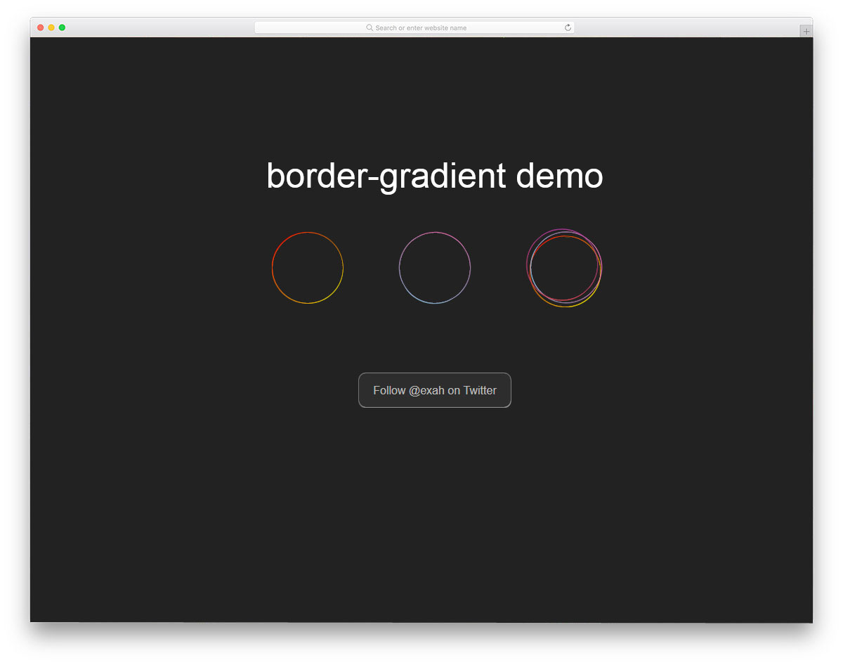
In this set, you get border animation for circular elements. Geometric shapes are widely used in this modern web design. If you are using circular web elements, this border animation will come in handy for you. Three design types are included in this circular border animation, and all of them have a professional look. Both simple and bold animation effect examples are given in this set. Based on your taste, pick one and start working on it. To get hands-on experience with the code script used to create this design, check the info link given below.
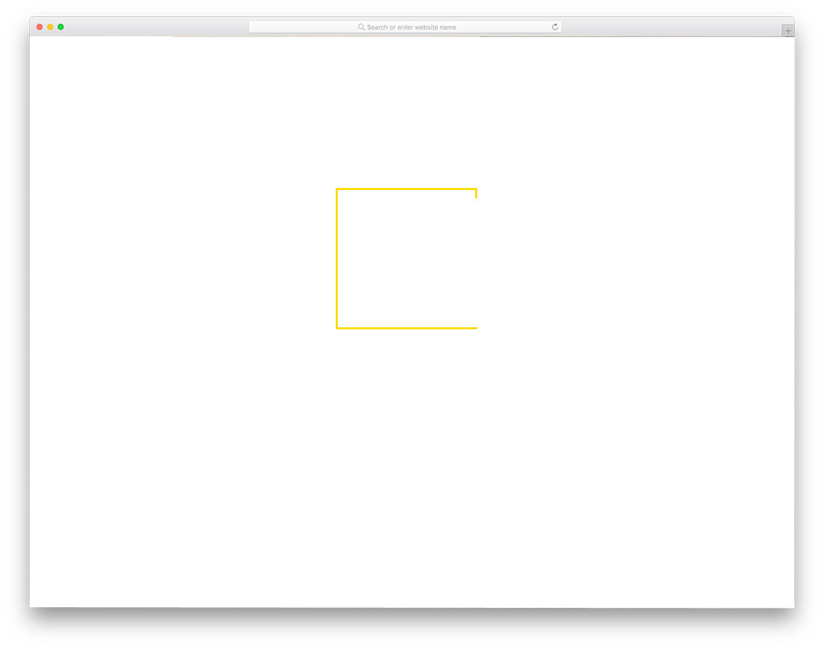
Draw Borders From Center
Border animation like this will be the best option for modern fashion websites and eCommerce store websites. Along with the animation, you can also show an additional feature to the user. Use big, bold letters to display the product title, and on hover, show the purchase button. On the e-commerce website, we need to include all the essential features without taking up too much space. Using elements like this will provide a better user experience without compromising the features. For eCommerce website with a more sensible design like this, take a look at our free eCommerce website templates collection.
SVG Ellipse Border Animation

SVG Ellipse Border Animation is another border animation effect for circular elements. If you are using floating option buttons, animations like this will help make your design more interactive. Just like most of the CSS border animations in this list, this one is also done purely using HTML and CSS script. In the default effect, the transition and color scheme have a professional look. The developer of this design has given you a very basic concept. From here you have to adjust the code to add your feature and make it fit it in your design.
Border-Radius Animation

Border-radius animation gives a liquid-drop effect to a circular element. It is just an automated animation, but if you need, you can make it interactive. Since it is a simple animation effect, the code structure is kept simple as well. This one is designed using HTML and CSS3 script. Since it uses the latest framework, you can combine other modern effects to create your own custom animation. The creator of this design has given you a basic example; from here, you have to work manually to make it a perfect element for your website or application.
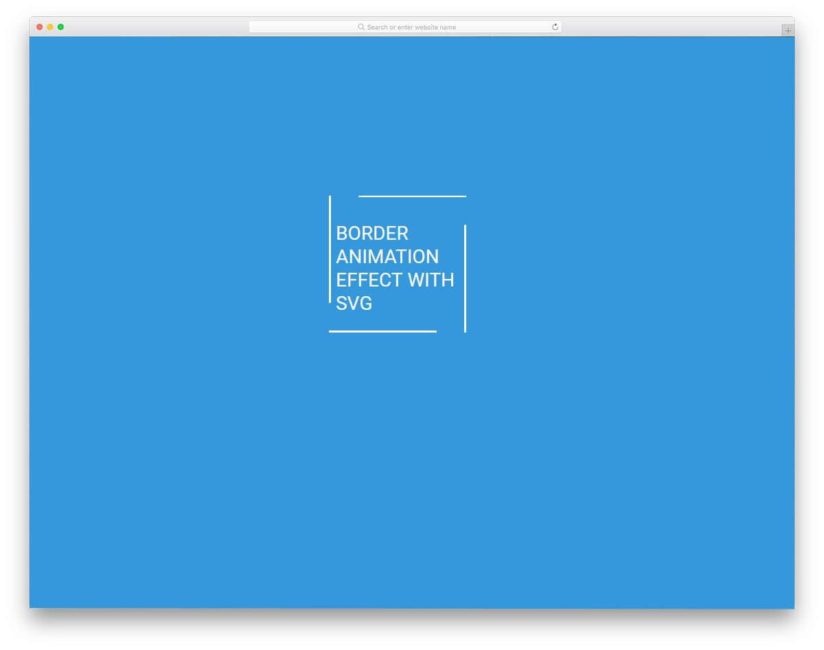
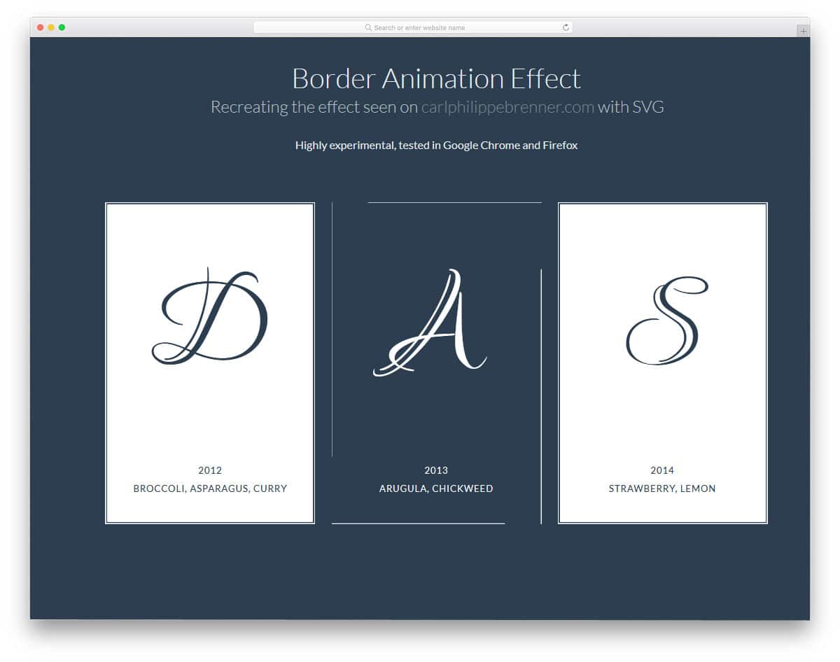
Double Border Animation

Double border animation is a clean, simple animation effect for texts and headings on your website. As typography is also a part of modern website design, using elements like this will make your website even more pleasant. The default animation effect is smooth and clean, but if you need to change the animation speed, you can customize it. The entire code structure used to create this animation is shared in the CodePen editor. Hence, you can customize and see your results before using it on your website or project.