
From Google Assistant search suggestions to online food delivery apps, cards are extensively used in modern interface design. Their simple and versatile nature enables designers to easily utilize them for any purpose. Whether you are looking for a small card design to show bite-sized content or a full-length expanded card to give brief information, there is a design for you in this Bootstrap card examples list.
Bootstrap cards are very fluid and easily adapt to the size of the screen. For example, the cards arrange themselves in a gallery format on a big computer screen, just like on Pinterest. When you see the same content on mobile devices, they arrange themselves in a vertical format for a thumb-friendly design. This flexible nature of the bootstrap cards makes them both a secondary and a core element in a design. We collected some design concepts in this bootstrap cards examples list so that you can adopt a unique design for your project.
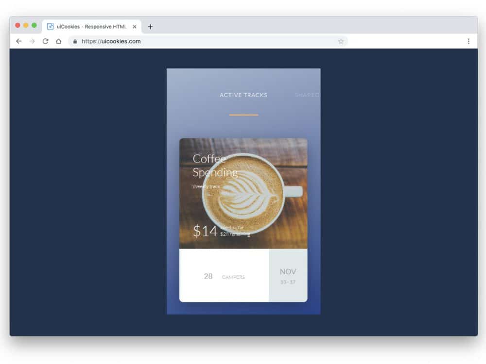
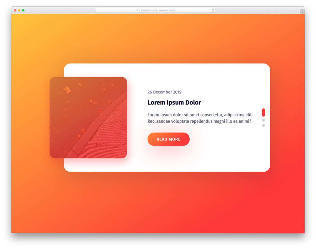
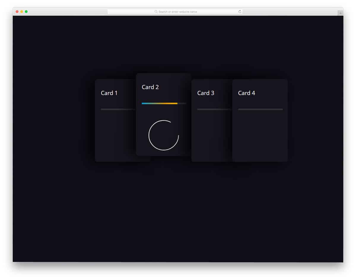
Bootstrap Delivery Card With UX Animations

Delivery cards are one element used extensively in modern eCommerce mobile applications. Each app tries new things, and many use a simple timeline design for more clarity.
The creator of this bootstrap card has used images and timestamps to deliver the message clearly to the audience. Smooth animations take the experience to a whole new level and allow app owners to add more information within a small space. The entire code script is shared with you on the Codepen editor, where you can edit and visualize the customization results before adding the code snippet to your project.
Responsive Material Design Card
This is a responsive bootstrap card example. In this design also UX animations are used effectively to show more information within the given space.
The creator has made these cards as profile cards in the default design. You can use this design as a base and create your custom cards. The entire code script is shared with you, and you can edit it to see how you can use this code on your project.
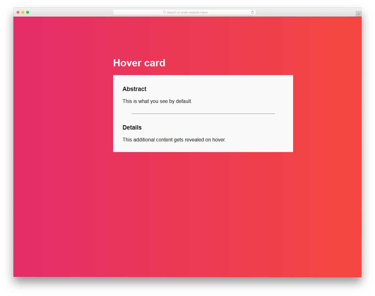
Card Hover Interactions
As the name implies, you get neat card hover interactions in this bootstrap card example.
The creator has used parallax effects and texts to show related information to the users. This one will be a good choice if you plan to make interactive and product cards for your services. Plus, you have a call-to-action button to take the users to the related pages. Since the whole concept is mostly made using the CSS script, you can use it on any website. Another advantage of this design’s simple coding is that you can modify it easily per your requirements.
Pokemon Card Holo Effect
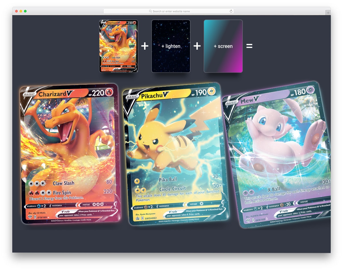
You get an eye-catching and rich bootstrap card effect in this design. This code snippet will be useful to make a fantasy-style effect for your card elements.
Using multiple animations on a single element is always challenging because it might easily ruin the experience. But, this bootstrap card’s creator has balanced the animations smartly to deliver an immersive experience. The creator has used glittery animations, smooth floating effects, and light-shifting effects in this design. You can see the entire code script to understand how this design works clearly.
Bootstrap Product Card
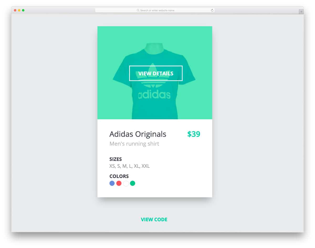
Bootstrap product cards are used extensively in modern online store designs to make the shopping experience easier for users. This dynamic product card lets users select the product color & size and add it to the cart without loading the product page. Smart elements like this will make the purchase experience easier but also helps the user see many products on your website. You can use this bootstrap card example on websites and mobile applications because of its smart, versatile nature. If you are a Shopify developer, look at our simple Shopify themes collection.
Horizontal Bootstrap Card Carousel

As the name implies, the creator has used bootstrap cards for the carousel. All related information is given within the given space. Plus, the big image background makes the card appealing. You can even add hover effects to the card to make it livelier. Since this card uses the latest Bootstrap4 framework and the CSS3 script, it can handle all modern effects without issues. The code file is downloadable so you can easily use it with any code editor you like and use it in your project without any issues.
Parallax Bootstrap Card Template

This is the best option if you are looking for a bootstrap card with interactive hover and parallax effects. Though it is a concept model, the details are done carefully, as seen in a final website or application. Since the design concept is based on the cursor movement, this bootstrap card template fits better on a website than on a mobile application. Shadow movements are also calibrated smartly in this template to give a realistic feel to the design. This design uses multiple effects simultaneously, and the creator blended them beautifully to create an immersive user experience, making it the best option for contemporary UI designers.
Smash- Bootstrap UI Kit

Smash is a multipurpose UI kit for websites and mobile applications. You get all the basic UI elements in this kit to skip the mundane work and concentrate on the creative side. Different card elements are given in this pack to let you present the content neatly to the audience. Since it is a multipurpose UI kit, animation effects are kept as minimal as possible. You can still add the animation effects to the elements if you want. The creator has thoughtfully written the code structure so that you can easily add custom effects and features to the elements.
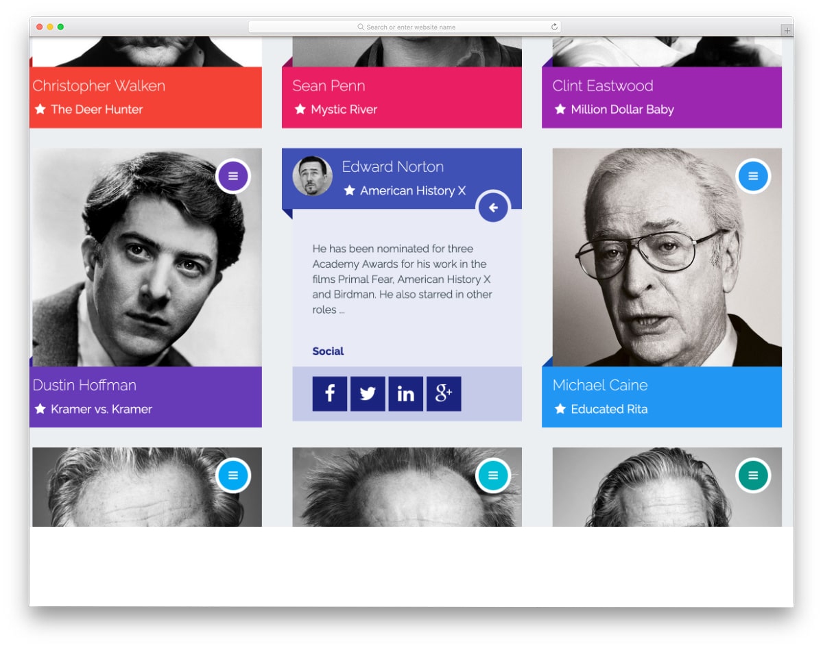
Cards – BTS on Soompi
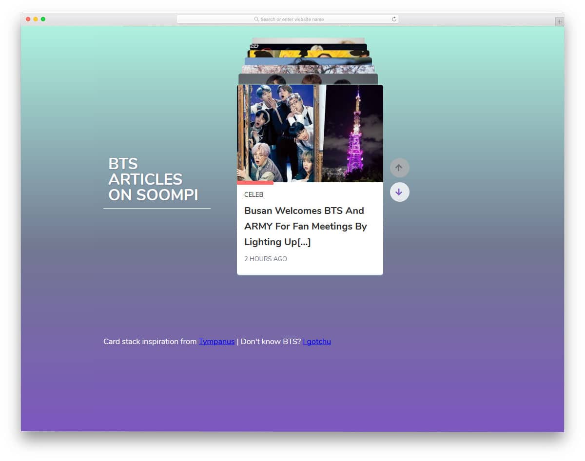
One of the biggest advantages of the cards UI is curating content and engagingly organizing them. The bootstrap cards easily work with both touch and mouse inputs. They are very natural to use. In this bootstrap cards example, you get cards showing content related to one topic. The developer has navigation arrows to let the users easily switch between the cards. Though it is a simple small card, hover effects expand the cards and give a brief overview of the content. Since it is a concept model, it does not support swipe gestures. But you can adjust the code to add swipe gestures.
Animated Cards
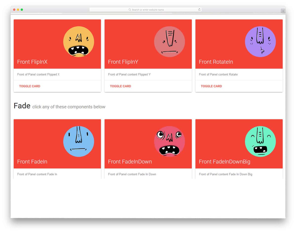
Animation and transition effects give a character to your design. Since modern web development frameworks support many lightweight animation effects, the sky is the limit for your imagination. In this example, the developer has given us 24 types of animation effects for the cards. All the card animations are minimal and don’t take much screen space. Hence, you can use this toggle and animation effects on professional websites without hesitation. The entire code structure used to create these 24 different animated cards is shared with you on the CodePen editor. Just pick the card you like and start editing it.
News Cards – CSS only

News cards are becoming quite popular nowadays. Even the redesigned Google News app aggregates all related news as card elements. If you also like presenting your news as cards, this design might give you some fresh ideas. Images are kept as the center of attraction in this design. Therefore, users can get an idea before reading the full article. Little hover effects are also used to liven the element. Overall, it is a sensibly designed big news card with all basic features done perfectly. Plus, it is a pure CSS script-based design. Hence, you can utilize this design easily on your website/applications.
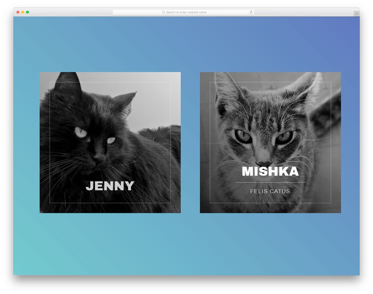
Info Cards

In this content-rich web world, creators are adopting different techniques to make the content easy to consume. One of such effective technique is presenting the content as bite-sized content. The creator has utilized the card design effectively in this design for the bite-sized content strategy. The 3D-ish-like image effect gives this card design an interactive feel. If you use custom images for your content, this card design’s image-focused nature will be useful. The only flaw in this design is the lack of navigation options. You don’t get navigation arrows or scroll input actions to interact with the cards. If you plan to use this design on your project, you might need to fix this navigation option issue.
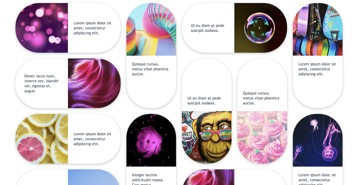
Horizontal Cards with Fade Animation
This horizontal card design will be a good choice if your cards need to handle long excerpts like on a blog homepage. Because of the horizontal design, you get more than enough space to show the blog post excerpt and image. Smooth scroll animations are also given in this template, so you can use this card design for long lists. You can even add small image carousels to these cards to intrigue the users. Look at our bootstrap carousel design collection for more interactive and responsive designs.
Fork it – A Card

The creator has given us beautiful card designs in different sizes in this example. The neatly designed card lets you easily add text, images, and other elements within the given space. Shadow and depth effects are used smartly to give a realistic look to the card. The only issue with this card design is the elements in this card are not functional. You can use the CSS design of these bootstrap cards as an example and can add your custom elements and features. The entire code script is shared with you on the CodePen editor. You can trim and use the code in your design based on your needs.
Clash of Clans Cards
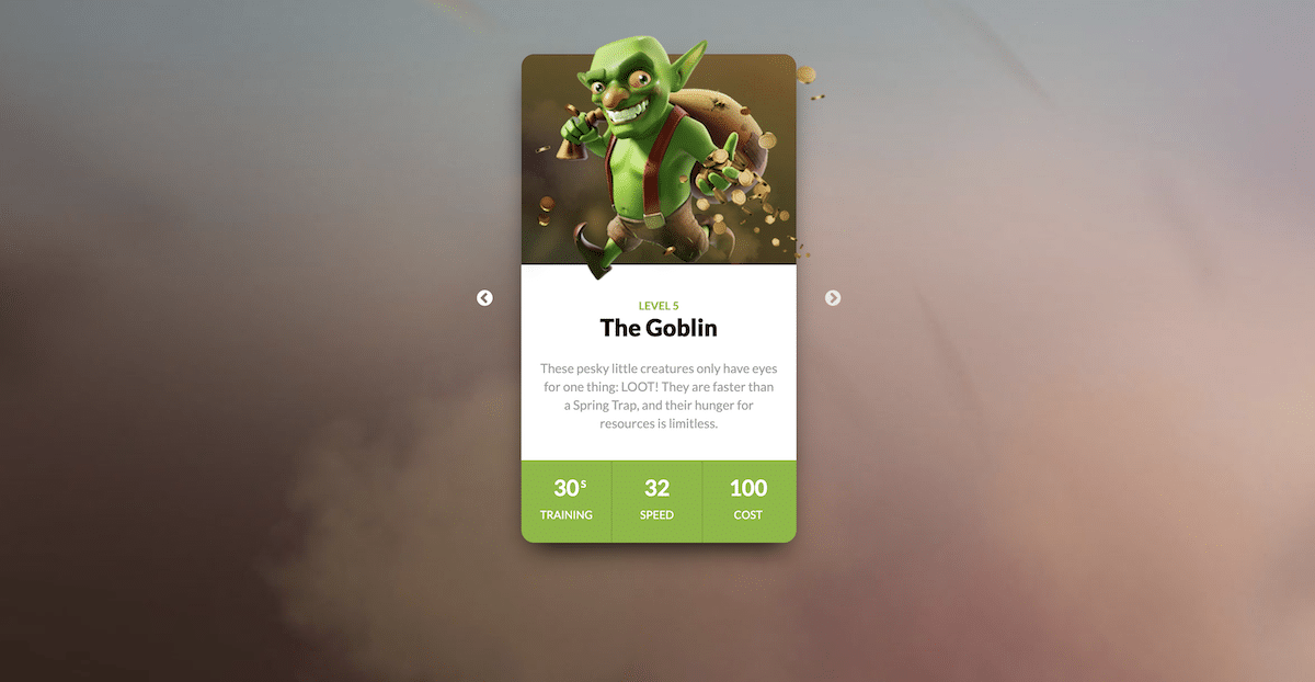
As the name implies, the creator has used the famous Clash of Clans game characters in this card design. This card design will be a good choice if you use the cards for your products or show them to your team members. The long card design gives you more than enough space to show images and texts clearly to the audience. To give a smooth transition and realistic look to the character image, the creator has used a few lines of javascript in this Bootstrap card example. By making a few changes to the code, you can fit this card in your design.
Dr. Mario pill cards
This is another bootstrap card example that is designed based on a game. The creator has used the old arcade game, Dr. Mario Pills, for the card. With the help of modern web development frameworks, the creator has created a beautiful pills-like card design. The split-screen design uses these bootstrap cards to give you space to add images and text within the given space. Like the Fork It card example mentioned above, the creator only gave you the basic design. You don’t get any interactive elements or features in this design. Using this card as a base, you can create custom cards with the features you want.
Simple Animated Media Card

This is a simple and practically applicable card design. Smooth hover effects are used to add life to the media content on the card. Since it is a concept model, the creator has used only images in the demo, but you can also add other types of content. Just like the design, the code script of this design is also simple and clean. The creator of this card mostly uses HTML and CSS3 scripts. Hence, working with this template will be easy and easily implemented on your website without any issues.
CSS Profile Card

If you are making a personal or freelancer website, adding an interactive profile card will help the user easily reach you via the provided social media profile links. The creator has given us a professional-looking, neatly animated profile card design in this example. The animation effect is smooth and quick, so the users can easily interact with this card. Because of this simple design, you can use this car even on the sidebar of your website. For example, you can use this card on the sidebar to show the author’s bio and details on a personal blog website.
Card Flip – Movies
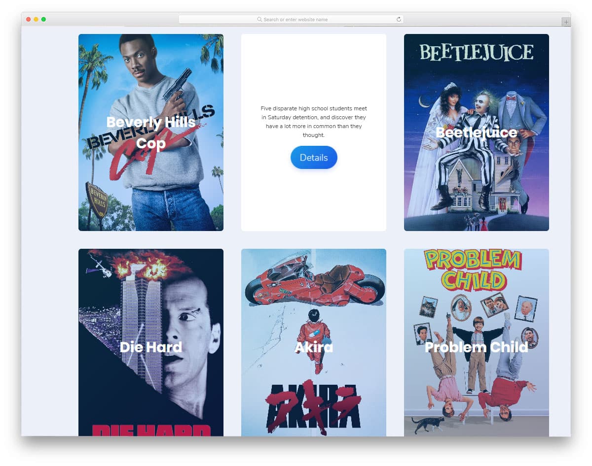
In this example, you get a card-flipping animation to show the image and the related content. The parallax rotating effect is smooth and fluid, which the users will like. If you do not like the parallax rotating effect, look at our CSS card flip animation effects collection. Coming to this design, the developer has optimized this design for desktops. Even the card-flipping animation uses the hover trigger. You have to adjust the code a bit to make it mobile-friendly. Apart from it, this design is great and can be used on any part of the website.
Dribbble Member Card Concept

Another place where cards are used is the profile detail section. Like placing your social media widget on your sidebar, you can use cards to show basic profile information. In this concept, the developer has used Bootstrap cards to show the Dribbble shots of a particular user. Except for the arrows, every other thing works smoothly in this design. The elastic card-pulling transition effect looks great on this small widget. The design and the code structure are also simple in this example. The whole design uses the HTML5 and CSS3 script; hence, you can easily utilize this code.
Card Flip

Natural, realistic designs are becoming popular among creative website owners. The virtual elements are well-blended in the environment and act as a surprise to the user. This card flip animation effect is one such creative concept. Though the original design uses a poker card, you can replace it with your card design. Again, this one is also a hover-activated card flip animation, which works fluently. The developer has given us both entry and exit animation in this example. This simple CSS3-based card design is easy to edit and use on your website.
Swipe The Cards

You can understand from the name that these bootstrap cards follow swipe gestures. Swiping gestures seem to be the most natural way to interact with the smartphone application. Even Apple has introduced swiping gestures on the iPhone X and other models for a better user experience. This design might give you some ideas if you also plan to make cards with swiping gestures. The developer of this card design has used swipe gestures and taps to expand the card details. You have labels at the top of the screen to show the card name. Regarding iPhones, look at our iPhone mockups to present your mobile card interface designs elegantly to the users.
Responsive Blog Card Slider
The creator of this design has fused the slider and cards to help you make an interactive element. In this card design, you have a separate space to highlight and show the image. Shadow effects and gradient colors are used smartly to present the content elegantly to the users. The default card design supports scroll control, so it works perfectly on both mobile and desktop versions of your website. The overall design looks great, but there is room to add creativity. For example, the gradient button is kept as an ideal element. You can use some effects to spice up the design. Take a look at our CSS gradient button collection for more design ideas.
Infographic Card using Flexbox
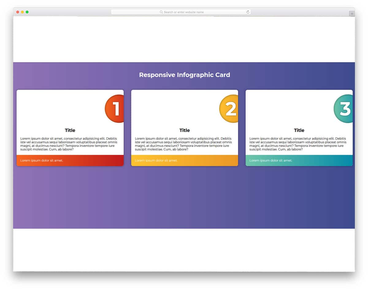
Cards always give a rich look to the contents. Using images will help you get user attention easily. Even though this design doesn’t have images, the designer has used geometrical shapes and typography to present the content engagingly to the user. This type of professional design will be an excellent addition to business websites. Subtle animation effects make the cards even more appealing to the users. Another thing about this bootstrap card is that it is made purely using the CSS3 and HTML5 scripts. Hence, you can easily use the code to create your custom card design.
Card Slider Parallax Effect

This design has all the potential to be a core card element in any mobile application. In the original design, the developer has treated it as a full-page slider. These visually rich cards put the product in the front and all the related information at the top. These types of cards are the best option for eCommerce websites and applications. At the top, you have space to show the product price, and call-to-action buttons are at the bottom. The simple design of these cards allows it to be used as a small carousel widget or as a main element in mobile applications.
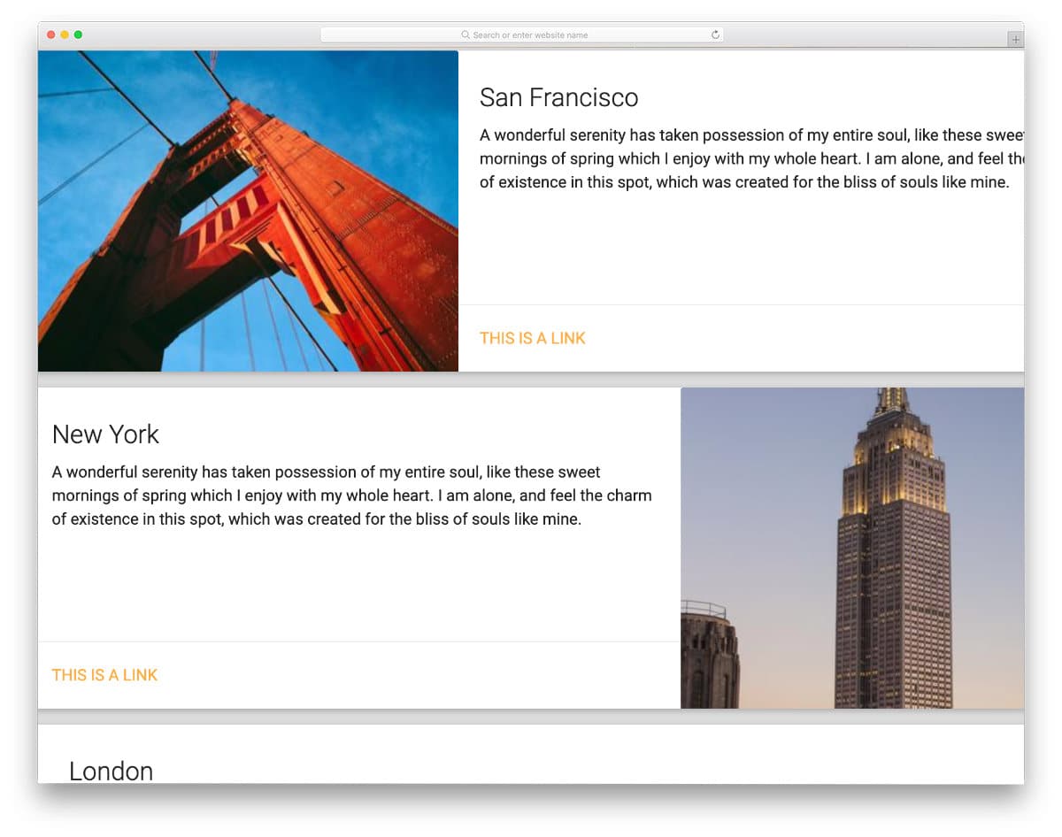
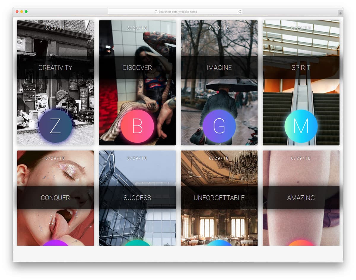
Bootstrap Cards
These are simple and elegant-looking cards that show images and a few lines. This simple card design can be used on a portfolio site or in a blog section of the homepage to show the latest articles. Hover effects reveal the call-to-action button. If you want to maintain the simplicity of the design even with the call-to-action button, you can make it a text link. Look at our CSS link style post for more design inspiration.
Those Cards Make No Sense

Cards effectively present a series of events or information in a bite-sized format. With this clever approach, the user can easily digest the information and tend to remember it for a long time. In this card design, the developer used animated characters to show information related to them. The card transition effects are smooth and quick, so the users can easily jump to the cards they want. In the default design, only keyboard arrow key inputs are supported. You can add scroll and swipe gesture support to make it more intuitive. This bootstrap card example uses a few lines of javascript for a buttery smooth animation effect.
Card Animation
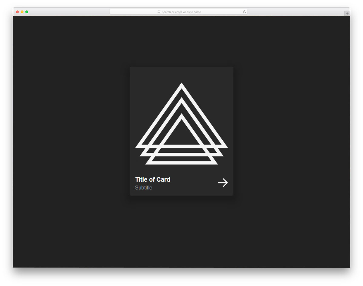
From the name itself, you can infer that this bootstrap card animation is an example. The developer has used a hover-based animation effect in this design. The simple nature of this animation makes it the best option for profile cards and product cards. A space for a text link is given at the bottom right corner, which will be useful for you to direct the user to the corresponding pages. Since the original design uses geometrical shapes, the developer has used the shapes effectively in the hover effect. If you have other elements or images, look at our hover effects collection for more inspiration that you can use in this card design.
Endless Scrolling Cards

If you plan to use cards in your slider or carousels, this code snippet can help you. Because of their flexible size, cards are used in different parts of the website. This one is a simple example of automatically sliding carousels. The cards are made longer and wider, so you can add any type of content in this card. Since it is an example of a scroll effect, the developer has mostly used CSS and Javascript in the code. You can adjust the code based on the type of content you will use.
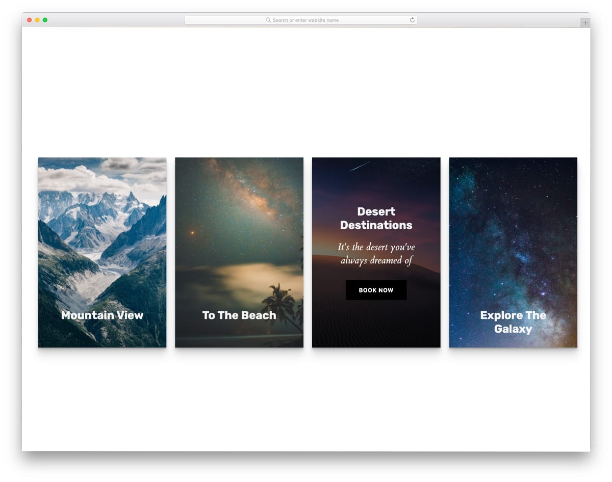
Card Animation
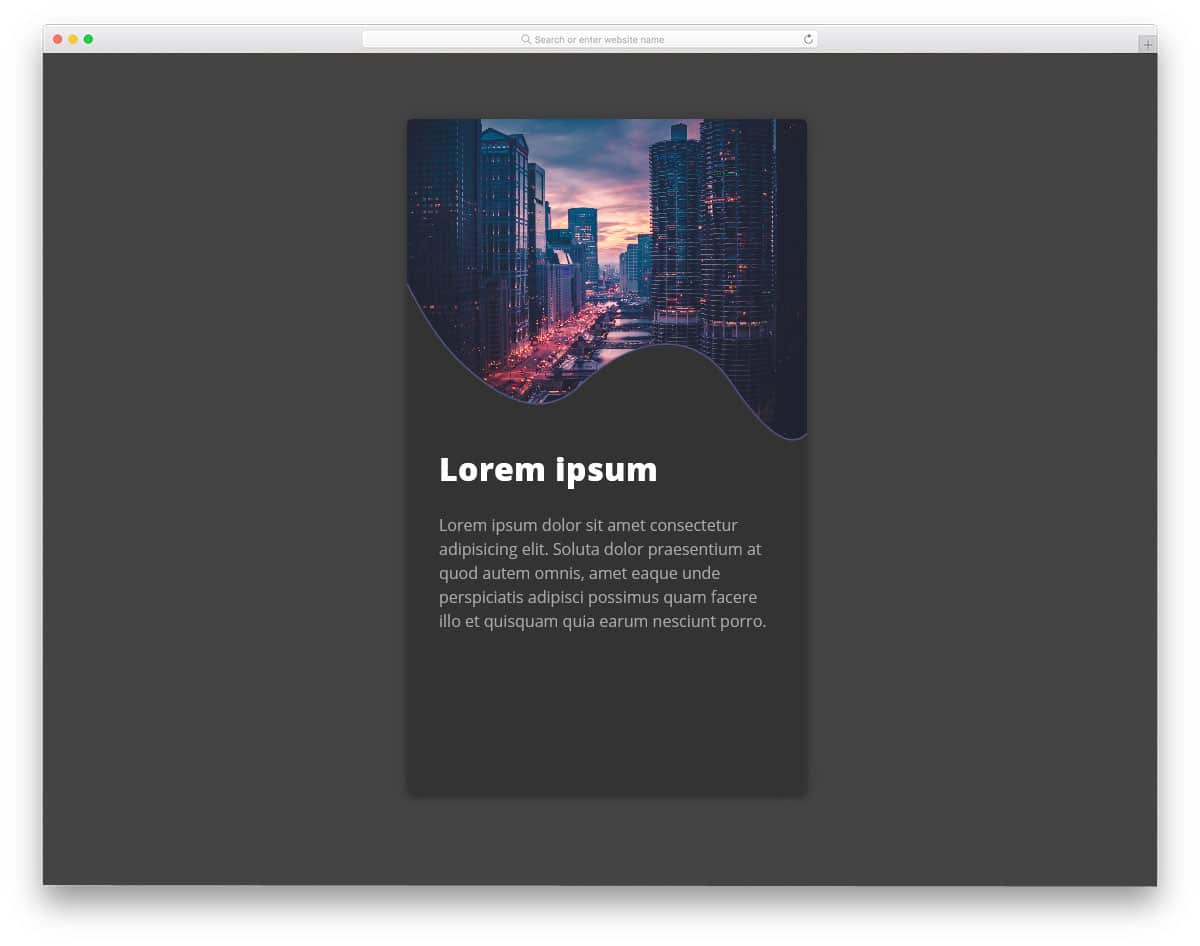
Custom creative shapes are extensively used in modern web design. In this card, the creator has used a sine wave-like organic shape for the image and content separator. This creative image card design will be a perfect addition to modern travel websites. Plenty of space exists for the text contents to explain the corresponding image. Texts are bold and clear so the user can easily read the contents. You can add a text link at the bottom of the card to direct the user to the desired pages. Another advantage of this card animation is it is purely made using the CSS3 script. Hence, you can incorporate this code into your existing design.
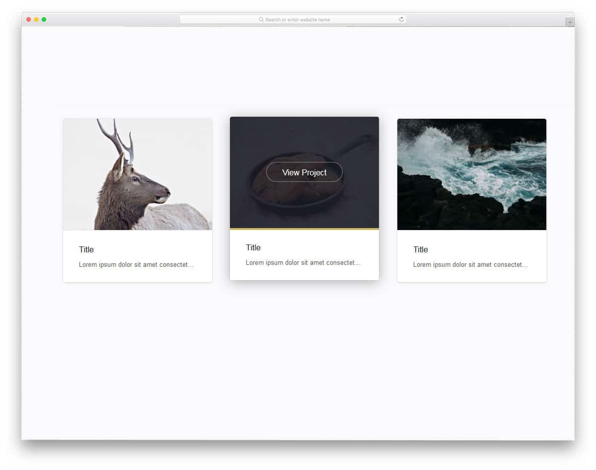
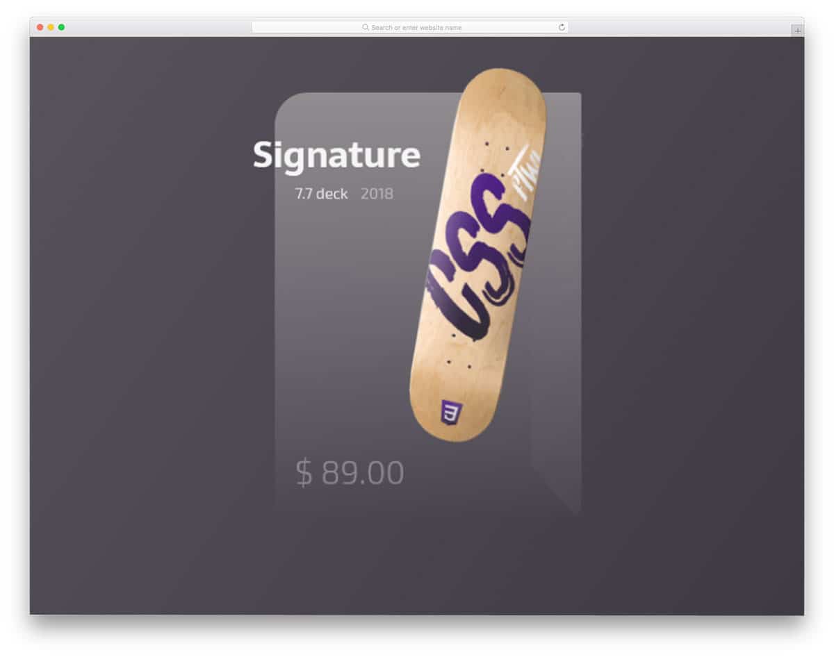
Hover For Product Info
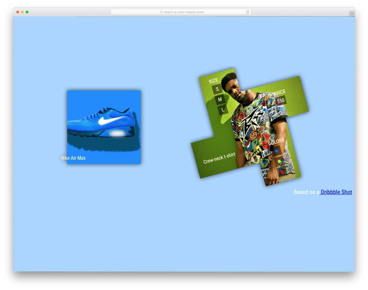
The creator of this design has used cards to show the product image. The developer has used a creative hover effect to make it unique from the rest of the bootstrap cards in this list. Since it is a product image, the designer has used the edges to neatly show related contents. Most designers use secondary menu designs to show the website’s product-related details. But on mobile, we can use creative design elements to give the same features without consuming much screen space. The developer has used HTML and CSS3 script to make this concept model.
Profile Card
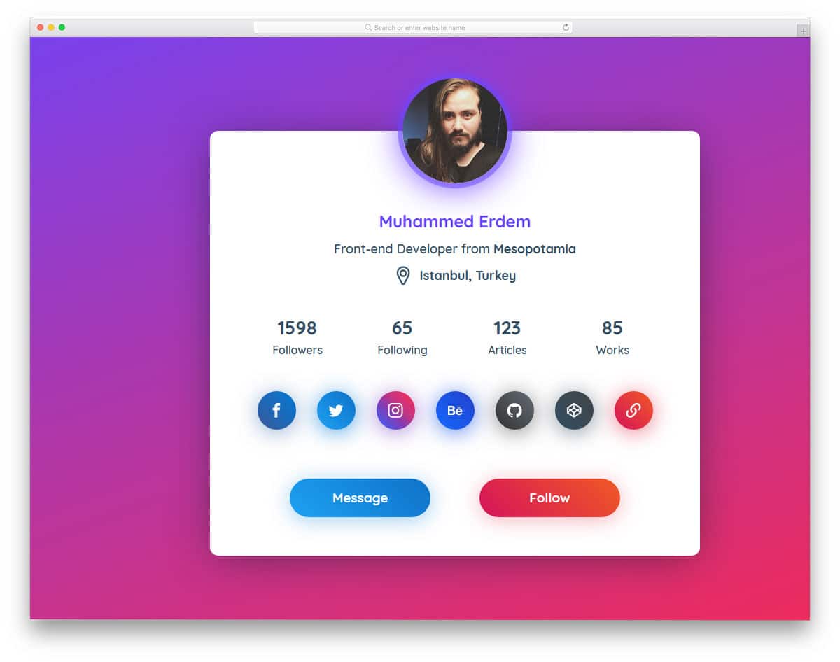
Profile Cards are widely used in both web and mobile UI designing. Seeing all the related content in one place makes cards better for showing profile information. This slightly bigger profile card gives you plenty of space to add profile details and call-to-action buttons. Use of gradients and glow effects make the elements distinct from each other. You can reduce the card size and remove unwanted elements if you want. This profile card design would be a good addition to personal and portfolio websites. For more glow effects, look at our CSS glow effect collection.
CSS-Tricks Card Carousel
In this bootstrap cards example, the developer has given us a pack of cards arranged together. On hovering over the card, you can see the complete details in the card. The creator of this card has used the card to show the circular stats bar. You can use this design as such in a personal website to show your skills. To clarify the value, you can show numerical values on the card. On the clean black background, the colorful elements are visible. Since this design is made purely using the CSS3 script, you can use any modern color scheme in this design.
Player/User Cards
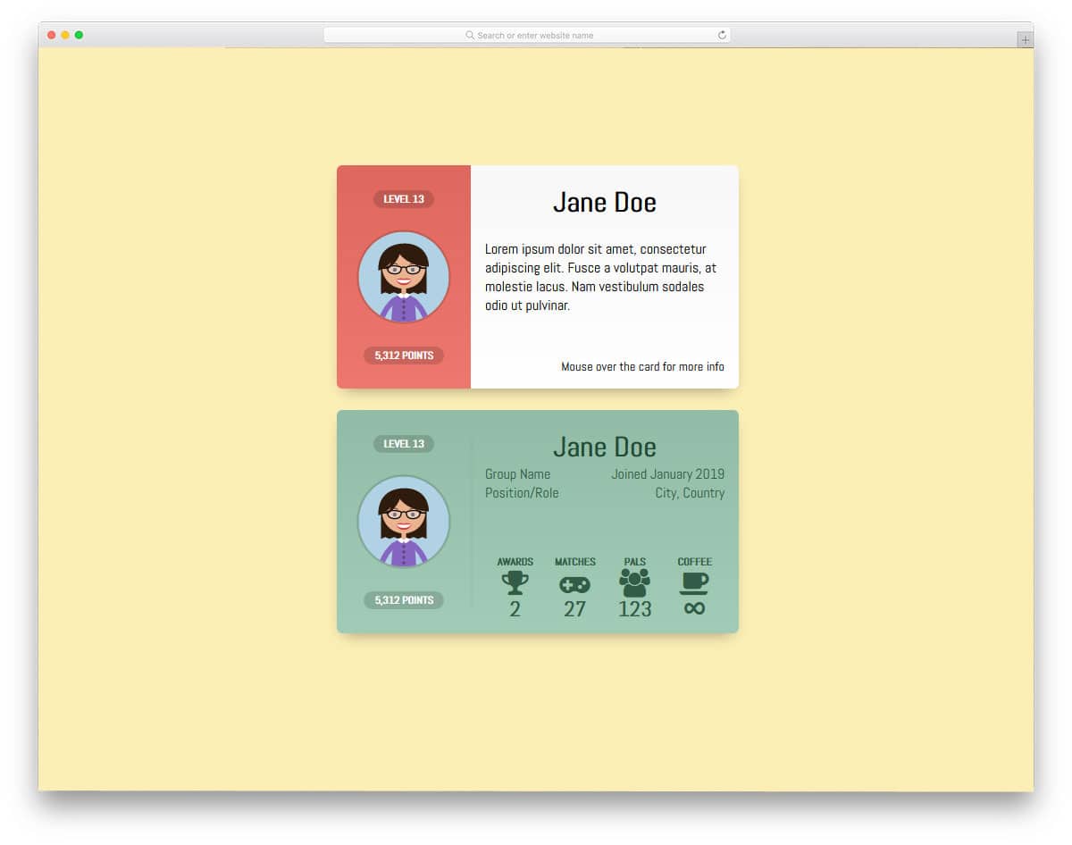
Gamification is one of the engagement strategies experts use to make the user/employees participate in an event or campaign actively. If you are adopting such a gamification strategy, this card could help show your users’ performance. The segmented design helps you organize the content, and hover effects show more content in one place. This bootstrap card example is inspired by Google’s Play Game, where you can see the user’s achievements and other activities. The whole concept is designed using the HTML5 and CSS3 scripts. Properly handled code structures will make your customization work easier.
Bootstrap Card

In this example, the developer has given us three simple card designs. Apart from the regular small and medium-sized cards, the creator gave us a social card in this example. Giving the option to like and share right below the content will increase the chances of content reaching a larger audience base. Since it is just a concept model, the options are not fully functional, and fewer animation effects are used. The entire code structure used to create this design is shared with you in CodePen editor, hence you can edit and visualize the results before using it in your project.
Card Fold Down Effect
This bootstrap card is a good option if you are using nested contents. As the name implies, the card folds down to show the additional information. Since it is a concept design, there are few flaws in the front-end design, but nothing is major. The design and the code structure are kept very simple in this design. Because of this simple structure, you can add any extra elements. You can easily adjust the code and make it a perfect element on your website or application.
Animated Card Flip
This one is also a profile card design, but the creator has used flipping animation in this card. The card makes one full vertical rotation to reveal the profile’s information, which is visually pleasing. Since this card uses the front and backside of the card, you have more than enough space for the image and the text contents. The default design can be used as such in your website’s team section. The animation effects take a few vertical spaces, so you don’t have to realign other web page elements. For a buttery smooth experience, the developer has used a few lines of Javascript along with the CSS3 code.
Pure CSS Card UI

In this design, the creator uses cards as a slider. Bouncy effects are added to the card transitions, giving this broken grid design a natural look. If you are looking for an interesting card design, this card will impress you. The text contents are shown on a full-sized card so you can be clear and detailed to the user. All these funky elements and creative animation effects are made using the CSS3 script. Because of this simple code structure, you can easily utilize this design in your creative website template.
Tricky CSS hover
Tricky CSS hover is another crazy card design for products. The floating product image and a semi-transparent background give the product card design a unique look. A call to action is made to add to the cart, and the product details are shown hovering over the card. The animation effects are smooth and clean, which users love to use on mobile and desktop devices.
Card Flip Animations

This is another Bootstrap card example for card flipping animation. In this design, the developer has used left-to-right flipping animation. Since it is a hover-activated animation effect, the user can see the information at a glance. Shadow and depth effects are used smartly to separate the card from the background. This simple design is made using the HTML5 and CSS3 script. Since it is a demo, the texts are kept small, but you can increase the text size.
Flexbox Cards
Flexbox Card is a perfect example of card-based gallery design. In this design, the creator has used cards in portrait orientation. Ribbons are used to highlight the title of the card, if you are using cards as an album cover, this ribbon element will give an elegant touch to your design. Since the cards are closely packed, the developer has kept the hover effects simple and neat. By making a few adjustments to the code, you can use this card gallery design in your website. This gallery design uses the CSS3 script and is shared with you on the CodePen editor. You can edit and visualize your customizations in the editor itself.