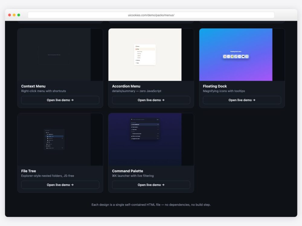
Every menu here was designed and coded in-house by uiCookies — our own pack, not a roundup. Each design is a single self-contained HTML file with inline CSS; two designs (the accordion and the file tree) use native details/summary and need no JavaScript at all, and none of the others need more than a dozen lines.
Download all 8 (free) Browse live demos
The designs
1. Account Dropdown Menu
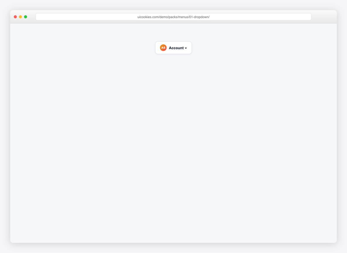
The avatar-triggered dropdown every app needs: grouped actions, keyboard shortcut hints, a separator before the destructive item, and click-outside to close.
2. Admin Sidebar Menu
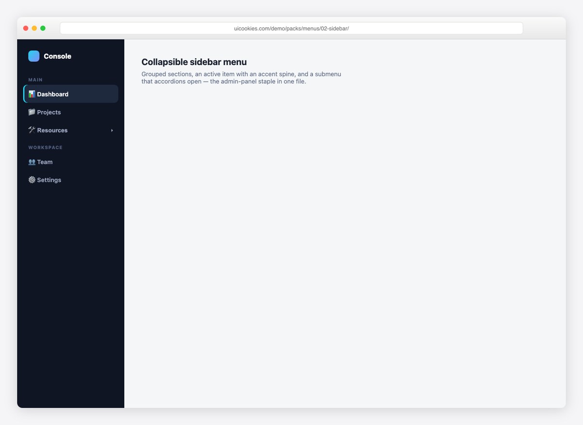
A dark admin sidebar with labelled groups, an active item carrying an accent spine, and a submenu that accordions open. The admin-panel staple in one file.
3. Mobile Bottom Navigation
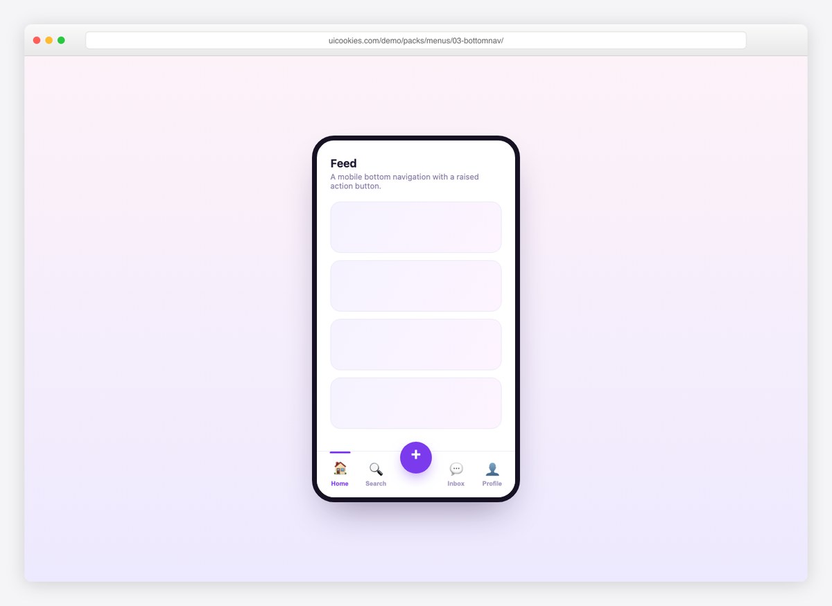
A phone-framed bottom nav with five items and a raised center action button. The active tab lifts its icon and shows a top indicator bar.
4. Right-Click Context Menu
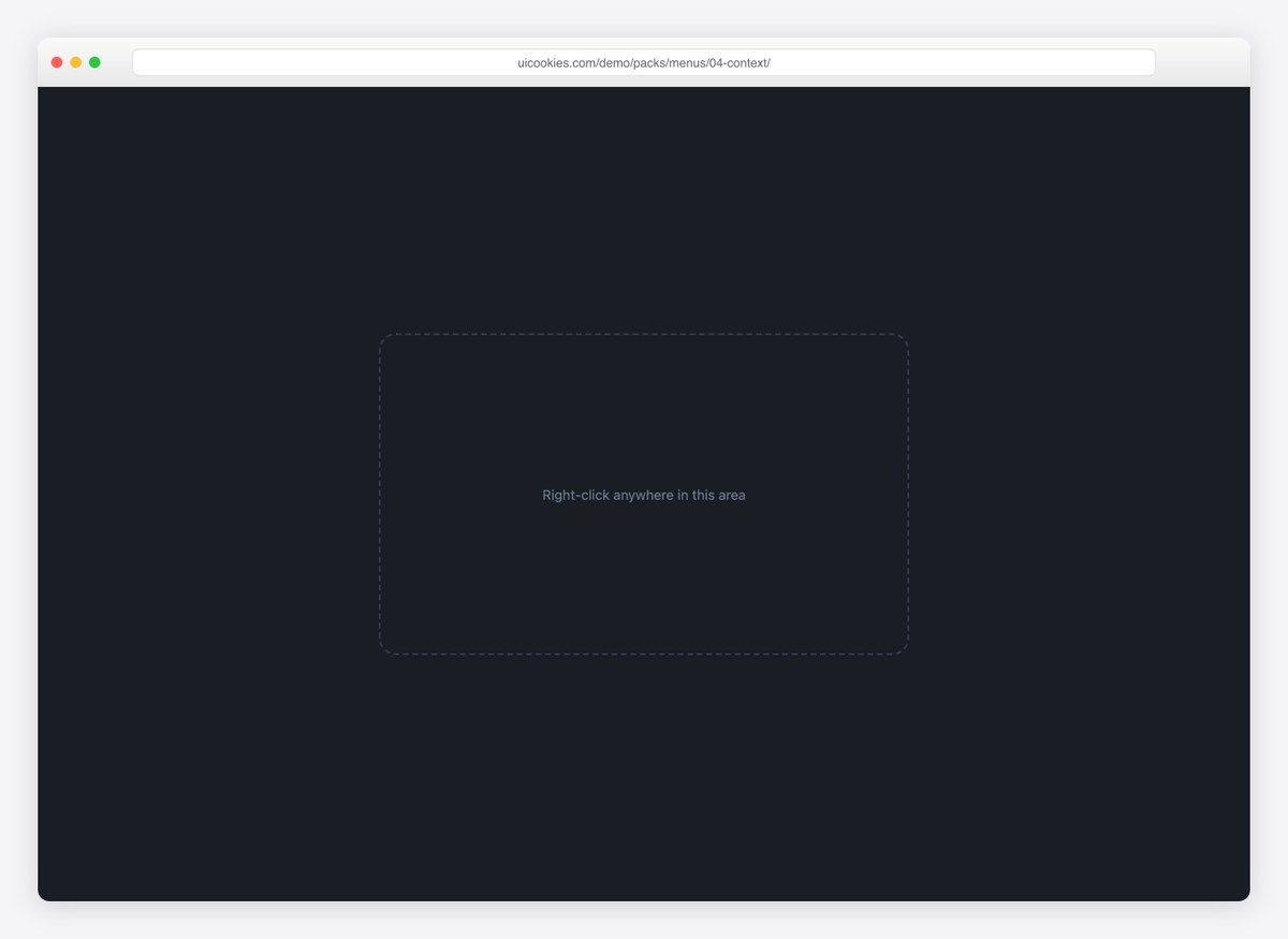
A real context menu: right-click the demo area and it opens at the cursor (clamped to the viewport), with shortcuts and a danger action.
5. Accordion Menu
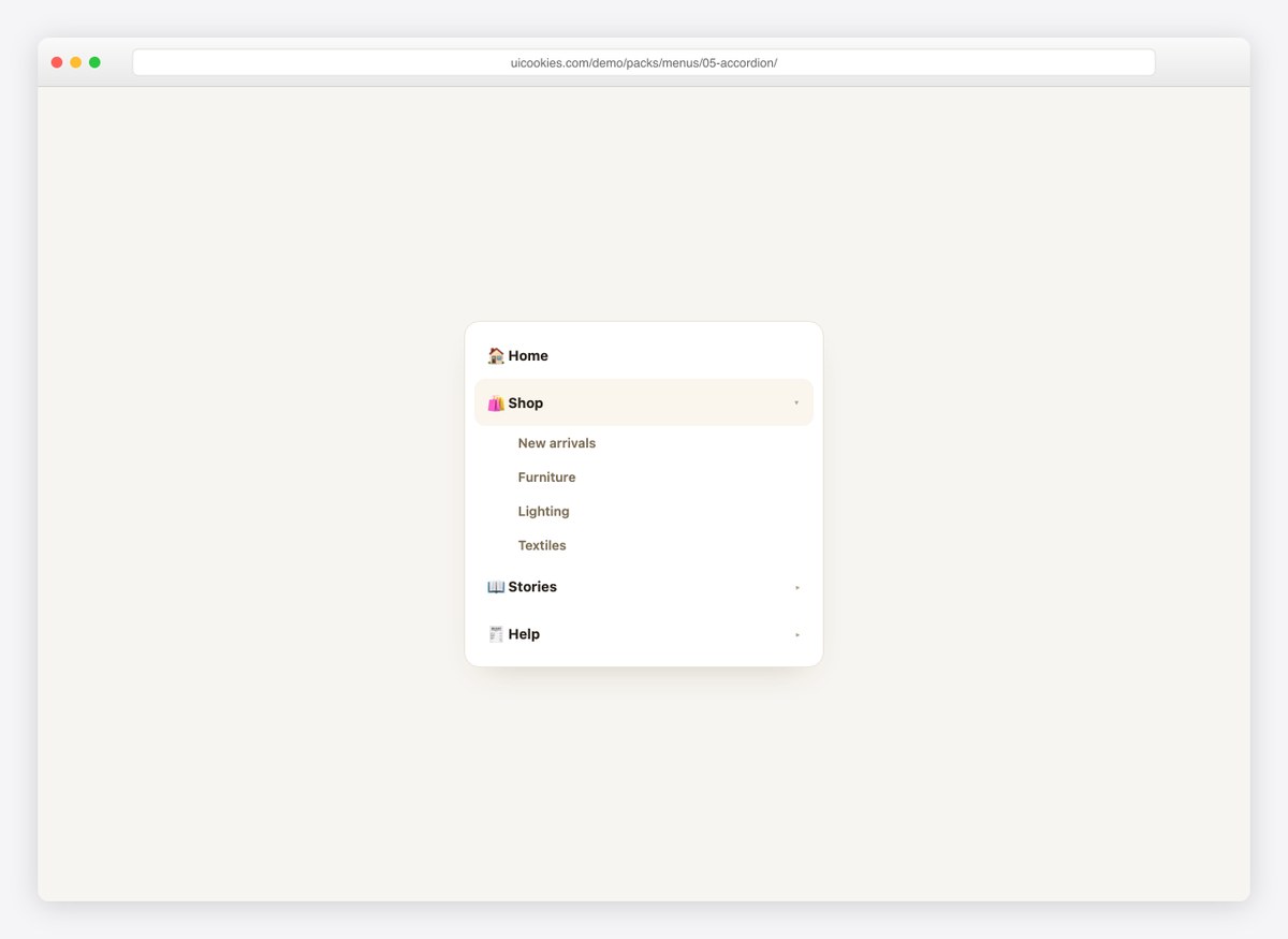
A warm accordion nav built entirely on details/summary — zero JavaScript, native keyboard support, and it works with scripts disabled.
6. Floating Dock Menu
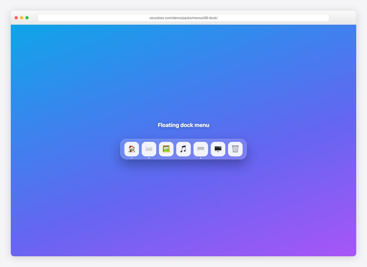
A macOS-style glass dock: icons magnify with a springy transition on hover, tooltips label them, and running apps carry a dot.
7. File Tree Menu
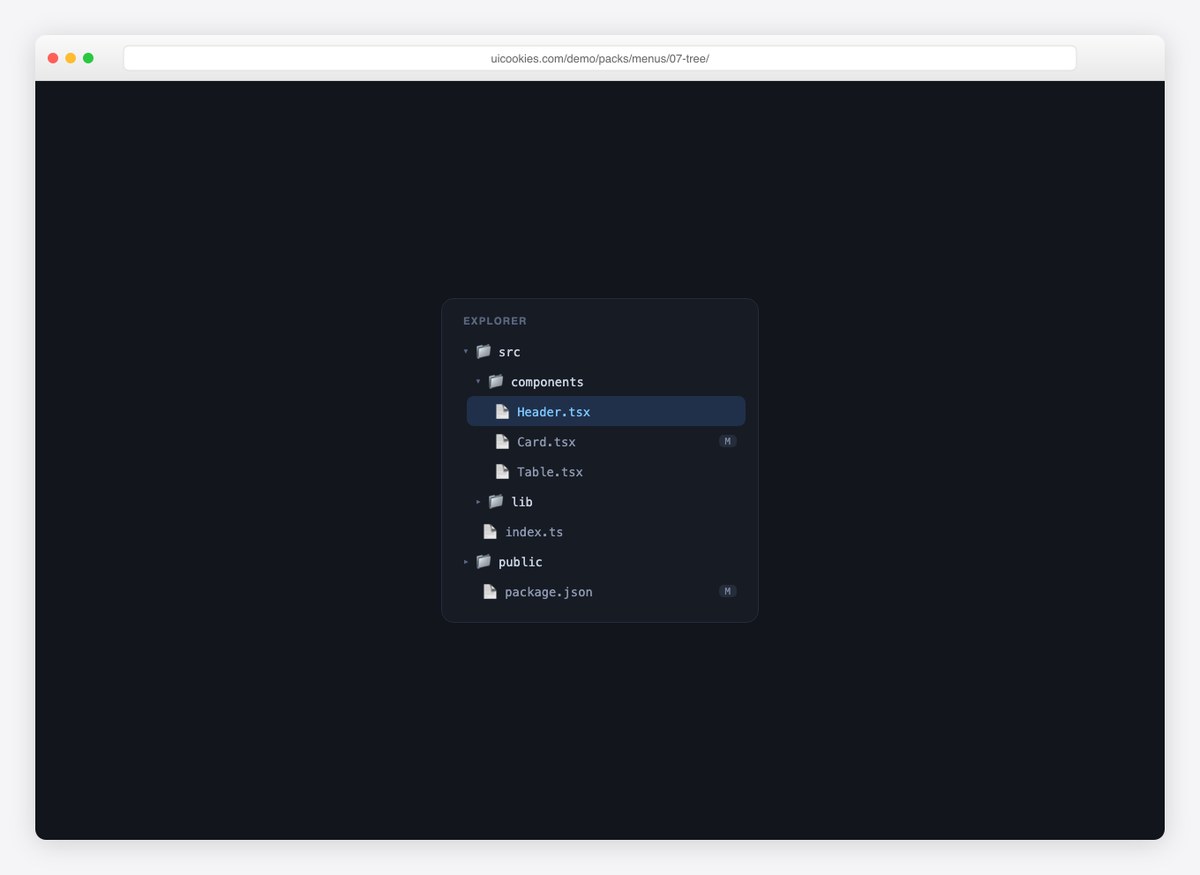
An explorer-style nested tree using details/summary — collapsible folders, modified-file badges, and an active file state. Also JavaScript-free.
8. Command Palette
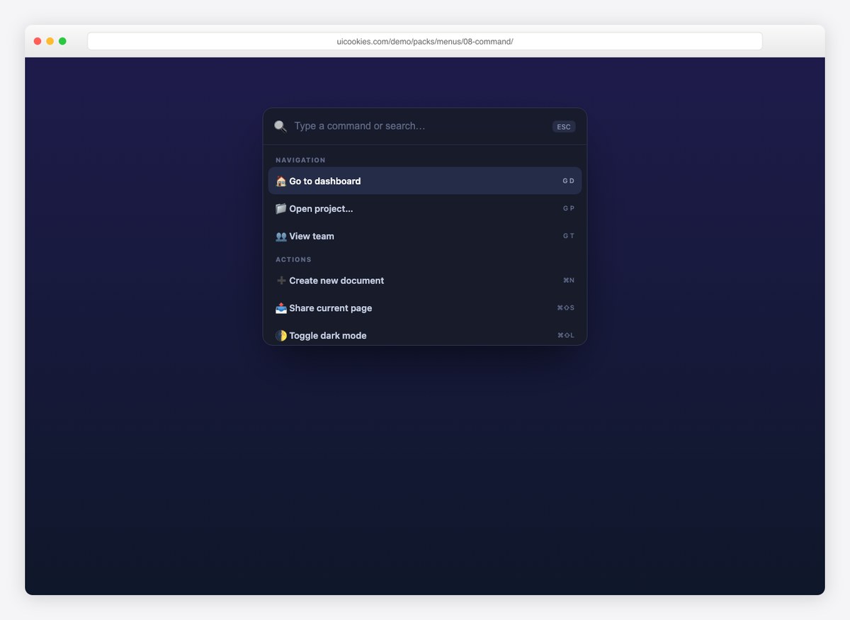
The ⌘K pattern: a glass palette with grouped commands, shortcut hints, and live filtering as you type. The command list is one array.
Frequently asked questions
Are these menu templates free?
Yes. The whole pack downloads free from the uiCookies pack page — no signup. See the uiCookies license page for attribution details.
Can I build a menu without JavaScript?
Yes — two designs in this pack (the accordion menu and the file tree) are pure HTML and CSS using native details/summary elements, which come with keyboard support built in.
How does the right-click context menu work?
A contextmenu event listener prevents the default browser menu, positions the custom one at the cursor (clamped so it never overflows the viewport), and any click elsewhere closes it — about six lines of JavaScript.
Do these replace Bootstrap dropdowns?
They can. The designs use their own class names, so they drop in alongside or instead of Bootstrap components without conflicts.
Related building blocks: headers, tabs, buttons, and the full template catalog.