Sliders are an important element in UI design. And they have evolved a lot in the past few years. The UI elements must adapt as our interaction with devices has changed immensely. For example, we now swipe more than click, and designs are mostly thumb-friendly rather than mouse-friendly. Sliders are one of the few elements that can adapt to both touch and old-school mouse interfaces. If you plan to make a versatile slider that fits mobile and desktop interfaces, these Bootstrap slider examples could help you.
In this bootstrap slider designs collection, you can find inspiration for :
- Carousel card sliders
- Bootstrap testimonial sliders
- slider transition/animation effects
- Bootstrap image slider for gallery
- Bootstrap 5 carousels for multiple items
The sliders in this list have a cool transition effect that looks natural and friendly to the users. If you are particularly searching for range sliders, then look at our CSS range slider design collection.
Bootstrap Slider V08

The V08 Bootstrap slider example provides a lively design. Big slides and elastic-like animation will grab users’ attention for sure. The creator has made this one as an auto-rotating Bootstrap slider, so the chances of showing more products to your visitors are great. You can change the auto-rotating option if you want. The simple code structure will make customization easier and let you easily add custom features to the design. Since the entire code script is a downloadable file, you can use it in the code editor you like.
Bootstrap Slider With Text V06
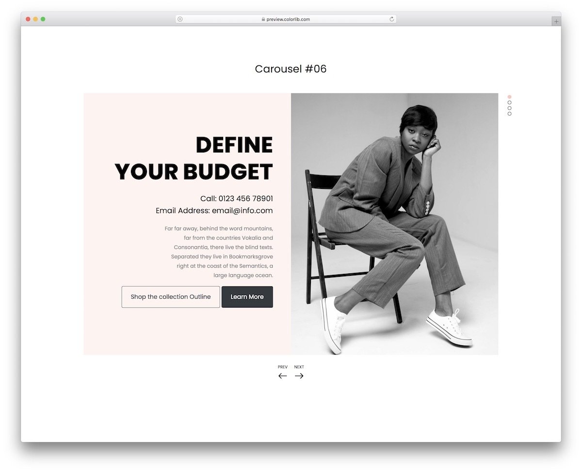
The V06 bootstrap slider features an engaging design that uses images and text effectively to deliver a friendly experience. Coordinated text and image movement let the user quickly understand the content, making this bootstrap slider example the best fit for modern business websites. The creator has added contact details and an email subscription form in the default design. If you are into email campaigns, look at our free email templates collection for high-quality budget-friendly email templates to speed up your campaign.
Bootstrap Carousel V10
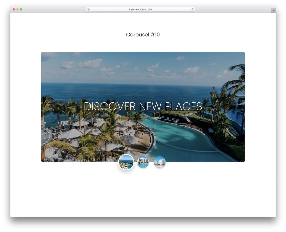
If you are looking for a simple yet elegant-looking Bootstrap slider/carousel, this is the best option for you. The creator has used thumbnails in this Bootstrap slider to make the interactions easier. Plus, the user will know the slider content before picking it. Animations are sleek and simple, ensuring the slider works flawlessly across all types of websites and applications. You can incorporate this design into any of your projects because of its flexible code structure. Overall, the V10 is the best option for image and product sliders.
Swipe The Cards

Cards are used widely in modern UI design. Using cards and swiping gestures is a good idea, as touch interfaces are slowly making their way onto laptops. In this slider, the developer has used cards to provide a brief overview of the product. With a single tap, the user can expand the cards to view product details. Shadow and depth effects are used smartly to differentiate the cards from the background. The transition animations are swift and clean, providing a better user experience. Since the original design is small, you can easily fit it in any part of the website.
Motion Reveal Slideshow

This design will impress you if you want an interactive Bootstrap slider for your portfolio website. As the name implies, the creator has used a motion reveal animation: when you click the next button, the animation moves from right to left, and when you click the previous button, it moves in the opposite direction. The creator has added an arrow at the bottom pointing to the related article or information about the image. Using this bootstrap slider for the portfolio, you can use the arrows to navigate to the single project detail page. The slider is working perfectly on the front end; we just need to edit it to fit our needs.
Diagonal Slideshow
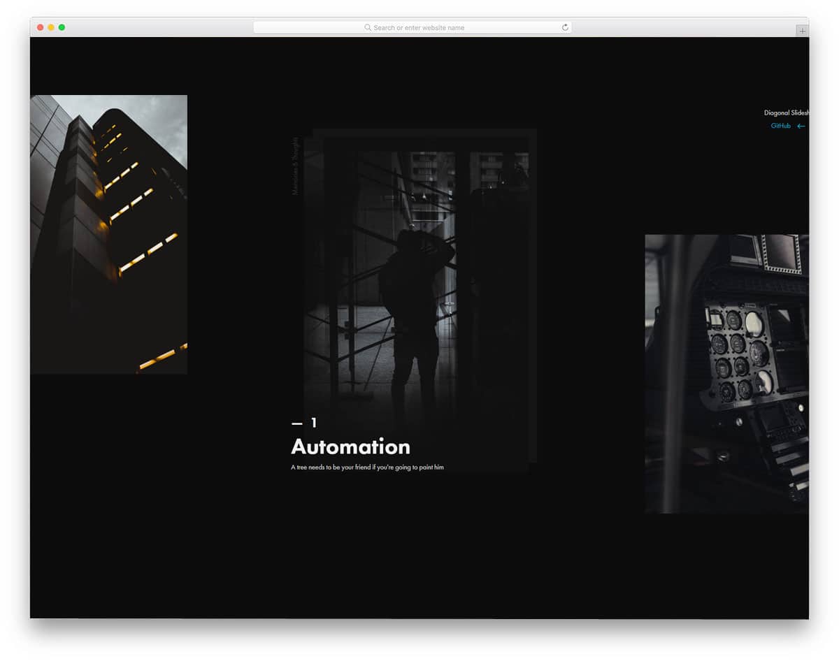
Most bootstrap slider examples in this list are horizontal sliders, and some are vertical sliders. If you are not impressed by both sliders, this diagonal slider might inspire you. The entire slider moves in a diagonal path. Apart from the diagonal path, the creator has also used a few animation effects to spice up the design. For example, the image title is animated, and the template includes an interactive ,dynamic hover effect. Though it is a concept model, the creator has given us a fully functional, complete design. The entire code used to create this design is available for download. Hence, you can easily edit the code and tune the slider per your needs.
Animated Fragment Slideshow
This is an advanced Bootstrap slider concept. As the name implies, the sliders are shown as slices and are animated as fragments. So, you get an interactive design with fluid animation effects. For this smooth, fluid animation, the creator has used CSS3 and JavaScript frameworks. On the info page, the creator clearly explained the code structure, making it easy to understand how they handled it. If you are a beginner, this template will help you understand the capacity of modern web development frameworks. The default design is perfect, so you can use it directly on your website or application.
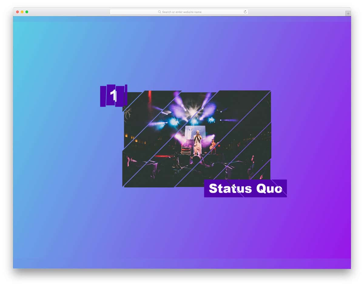
Crossroads Slideshow

Crossroads Slideshow is almost similar to the Diagonal Slideshow concept mentioned above. In this example, the creator has used text on one diagonal and images on the other, creating a crossroads-like design. Along with the slider, you also get an interactive mouse pointer to give the slider a dynamic feel when the user uses it. In this concept, the creator has used a full-page design to let the user fully immerse in it. If you like this entire design, you can use the whole code snippet or pick the elements and effects you want and use it in your design.
Layer Motion Slideshow
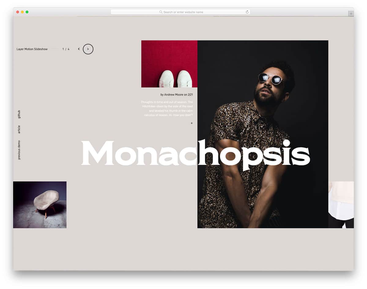
The Layer Motion Slideshow has more complex animation effects and design elements. The creator effectively used the CSS grid concept to create a visually striking design. Like in the Crossroad template mentioned above, this one also has an interactive mouse pointer. Along with the image slider, you also get a single project page to clearly explain the project to the user. The whole concept is interesting, if you have the resource, you can keep this design as an inspiration and create your custom creative website template. The entire code script used to make this design is share as a downloadable file, so you can utilize the code easily in your project.
Slider like Yahoo Weather App

As the name implies, this slider is inspired by Yahoo’s weather app design. Smooth image transitions and text parallax movement give a visually appealing look. Since this design is built from a mobile app perspective, it is very compact and can fit any part of the website. If you would like to add an interactive Bootstrap weather information slider for your magazine website or dashboard, this one would be a perfect option. Speaking of magazines, look at our free magazine website templates collection. As this slider runs on the latest code script, you can use it easily on any website.
Slider Transitions
Since modern web elements need to meet all user needs, they should be versatile enough to work on both desktop and handheld devices. The creator has used swipe and scroll gestures to interact with the sliders. Sliders move in opposite directions on the split-screen design to give a visually pleasing look. There is more than enough text space on the slider to add an excerpt or a link related to the image. Since the entire bootstrap design uses the latest script, you can easily make it responsive and add new elements without any hitch.
Split Slick Slideshow

This one is similar to the Slider Transitions design mentioned above, but the creator used a full-screen slider here. Hence, you get more space for images and text. Plus, each slider shows one image — as you can see, this is a different slider concept that uses the same transition effect as the Slider Transitions mentioned above. The creator has used a few lines of JavaScript to make the transitions buttery smooth and more dynamic in the actions. Since the entire code script is shared with you, you can trim it and use it per your requirements.
React Slider w/ Hover Effect

From the name itself, you can infer that this design uses ReactJS. Hence, you can expect many dynamic and interactive elements in this design. Dynamically changing the cursor and the navigation arrows below the slider will help the user easily interact with the slider. Because of this design’s professional code structure, it is mobile responsive out of the box. If you are making a modern interactive website, sliders like this will deliver an authentic contemporary experience to the users.
3D Slider

3D Slider is an interesting Bootstrap slider design. The creator has used a three-dimensional rotating object to show the image. Along with the three-dimensional design, the developer has also made it interactive, using your cursor movement. If you are looking for an interactive slideshow design to elegantly showcase your photographs, this might impress you. Navigation options are given at the bottom of the screen. The user can easily jump to the next and previous images with a single click. You can use this design even in your homepage header section by making a few code changes. To give you an authentic experience, the developer has used three.js and the HTML5 and CSS3 script. If you are into three.js design, look at our inspiring three.js design collection.
Swiping Image Effect

In this bootstrap slider example, you get a vertical slider. The creator has used vertical scroll gestures to make the slider even more interactive. The images at the center of the triangle alone change as you scroll down. Sliders like this will help you elegantly explain your products to users. If you have a geometrical shape logo, then you can use it in place of the triangle in this slider. By making a few design adjustments, you can create a brand-focused slider. Since the entire code structure used to create this design is shared with you, customizing it won’t take much of your time.
Fancy Slider

Fancy Slider is a creative Bootstrap slider. The developer has used the features of CSS3 and HTML5 fully to create this beautiful slider. Shapes and smooth transition effects are used smartly to make this slider unique. Along with the slider, the developer has also used an off-canvas menu to display menu options and other slider controls. You can use the entire design to create a modern photography website. Properly structured code will help you build your custom design more easily. Since it is a Bootstrap-based design, making it responsive will be easy. The original design itself is fairly responsive; hence, working with this code will be an effortless experience for the developers.
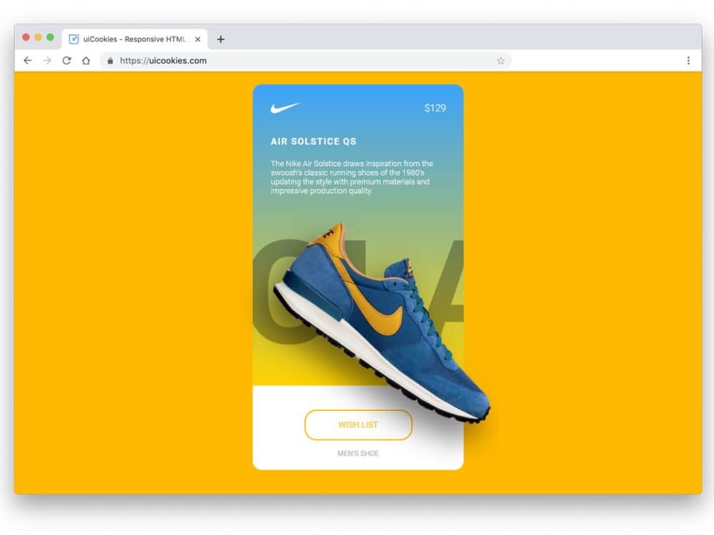
Slider Parallax Effect

The parallax effect adds a new dimension to the design. In this product slider, the developer has added a parallax effect to highlight and show the product. Along with the parallax effect, the developer has used a shadow effect to give the product a natural look. The long card has enough space to show the related contents and the price. Just below the product image, you can add a call-to-action button and a text link. In the default design, you get a full-page slider. However, you can use the cards alone in your design so they fit easily into any part of the website. To make the text link unique, look at our CSS link style collection.
Slider With Ripple Effect

The Ripple Effect slider is simple and elegant. The creator has used colors and ripple effects to create an eye-catching, colorful slider. The main content area is kept clean so you can easily add images or other content. At the bottom-left corner, you have space to add text, which is a smart choice to keep the images centered and undisturbed. The default text appears bolder and larger, making it easier for the user to read. Since it is a CSS3-based design, you can use any new fonts.
Responsive Parallax Drag-slider

This is another slider example with a parallax effect. However, the developer used typography to make this design unique. As typographies are also treated as part of the design, this slider will give your website a rich look. To make navigation easier, this slider supports horizontal scrolling, and you can also use the slide indicator at the bottom to jump to the required slide. The transition effects are smooth and quick, so the user can easily see the contents. In the default design, the typography letters hide a few contents behind it; this might be something you need to adjust before using it on your website.
Pokemon Slider

The creator has used the Pokémon concept in this slider; otherwise, it is a simple slider you can use on all types of websites. The 60:40 split-screen design gives you ample space for both images and text. Texts are used elegantly to present the content engagingly to the users. Another notable feature of this slider is that it is vertical. You must use the slider indicator on the right side to jump to other sliders. Adding a scroll option will make the slider even more interactive for users. The developer has shared the code in the CodePen editor so you can edit and visualize the results easily.
Coverflow Effect Slider

The Coverflow Effect Slider is almost like the sliders you have seen in many music players. This slider design shows the album cover image and the other songs in the queue. The simple, elegant look of the slider has made it a perfect option for both websites and mobile applications. If using this slider in mobile applications, consider using haptic feedback. As most modern smartphones have good vibration motors, giving haptic feedback will help the user feel your application. Speaking of smartphones, if you are an app developer, check out our iPhone mockup collections to elegantly showcase your designs to users.
Pure CSS Featured Image Slider

Pure CSS Featured Image Slider is an interesting image slider concept. The creator of this slider has placed the image slider within a photo frame. If you are a digital artist or painter, this creative image slider will give an apt element for your website. Since it is designed for artist websites, it has a clean and elegant look. The only downside in this design is the navigation option. You can use the bottom slider indicator, but a navigation arrow would be a welcome addition. Take a look at our CSS arrow designs to find the apt navigation arrow to use in this slider.
Actual Rotating Slider

If you are bored with the horizontal and vertical sliders, this rotating slider might offer new inspiration. The creator alternated images and text in the slider. Rotating animations are smooth and clean, giving users a buttery smooth experience. The only flaw in the original design is you can’t manually control the rotating slider. Adding a scroll action or a navigation arrow will help the user to interact with the slider. If you are creating a creative business website template for a startup, elements like this will give the template a unique look.
Pure CSS Slider With Custom Effects

If you feel the slider plugins are an unnecessary burden to your website. This custom-made CSS slider effect will give the same feel without making your website heavy. The entire slider effect is made purely with CSS3, so you can easily use this code on your existing website. Mostly, this slider uses breaking and splitting transition animations. The developer has kept the effects swift and attractive so that the user can enjoy the slider and its contents. Since the original design is simple and neat, you can use it for your homepage header.
Full-Screen Slider

This is another full-screen slider design with appealing transition effects. The zoom-out and zoom-in effects are handled intelligently to create an authentic slide transition. In the original design, the developer used only solid colors for the slider. However, you can use images and texts to present the content engagingly to the users. Another thoughtful feature of this slider is the multiple control options for changing the sliders. You can either use horizontal scrolling with a trackpad or simply use the navigation arrows at the top. To give you a buttery smooth experience, the developer has used a few lines of JavaScript in this Bootstrap slider design.
Clip-Path Revealing Slider

Clip-Path Revealing Slider is similar to the Slider With Ripple Effect example. In this bootstrap slider design, the developer has used images and the ripple effect is blended well. The developer has used a CSS arrow animation to add detail to the design. If you wish to use a different animation effect, take a look at our CSS arrow design collection. Though the slider is not responsive out of the box, it handles smaller screens up to a limit. Hence, making this slider responsive and using it on your website won’t be difficult.
Yarden

Yarden is a cool-looking slider concept. The template’s trendy design makes it a perfect choice for presentations and image sliders. Bog bold texts are legible even on the image background sliders. Slide transitions are quick, and the animation effects are used only at the required elements. Hence, your audience will have a good reading experience with your slider. If you often make presentations, take a look at our free presentation templates and free keynote templates collections. Another advantage with this bootstrap slider is it is made purely using the CSS3 and HTML5 scripts.
Responsive Blog Card Slider
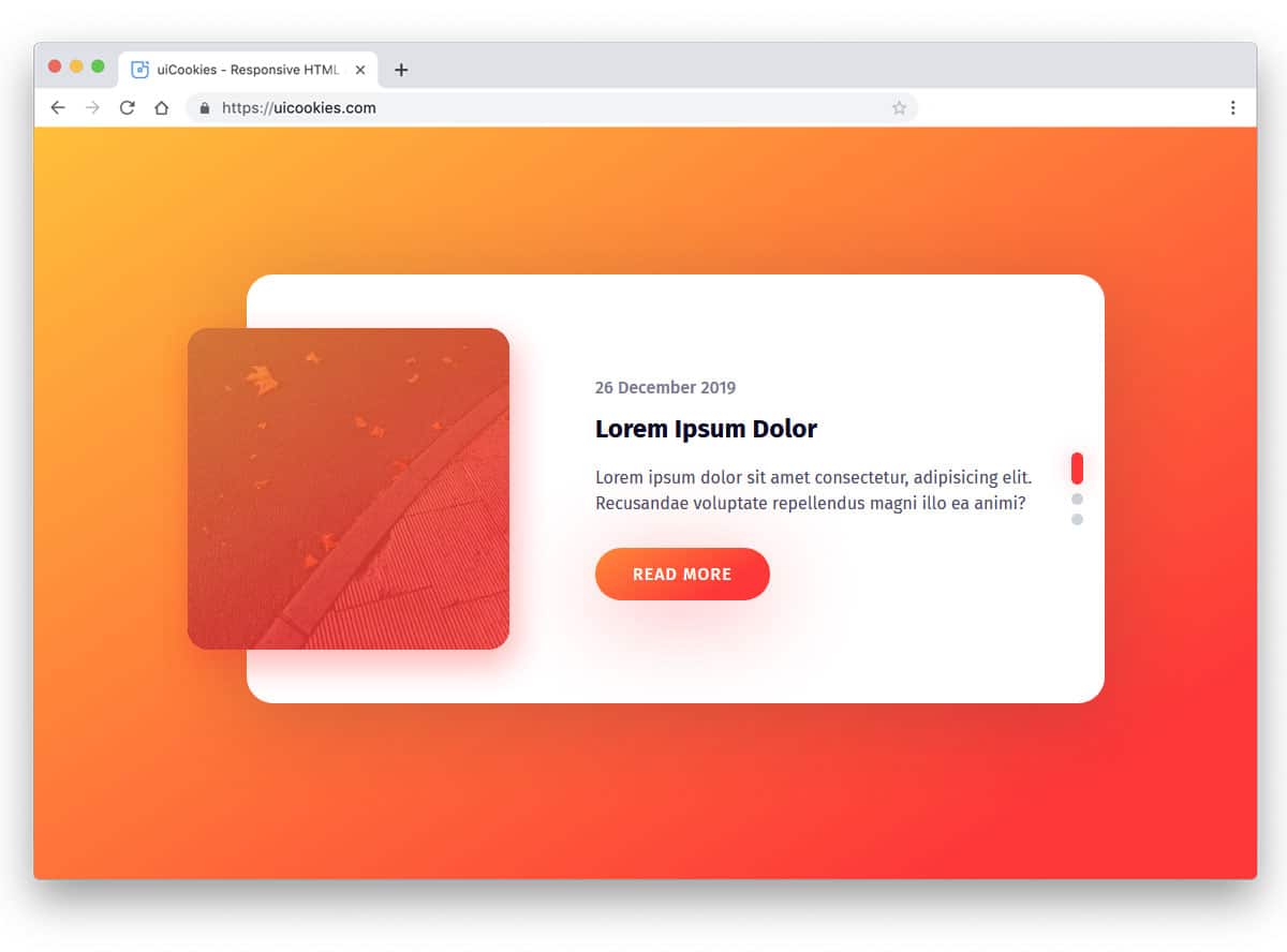
Card sliders are the perfect option to present bite-sized content. Though the original design is made for blogs, you can also use it for other websites. Shadow and depth effects are handled effectively in this design, giving it a floating appearance. The vertical scroll options look natural and work well on computers and mobile devices. You also get a small highlighted area to display images and text. If you use this card slider for blogs, then you can use this image space for the featured images. The default gradient button looks great on this design, but you can spice it up with a few animations. Read our CSS gradient button collection for more design inspirations.
Image Slider Using SVG Patterns

From the name itself, you can understand that this slider uses patterns. The developer has blended the animation with a wedge-type pattern. If you feel the original animation effect is slightly misaligned with the pattern style, you can edit it. Since this example uses the latest CSS3 script, you can easily work with the code to add custom animation effects. The default design is a perfect option for a full-page gallery slideshow. But if you want to use it on a webpage alongside other elements, you’ll need to make a few code adjustments.
Greensock Animated Slider

Greensock animated slider is a versatile Bootstrap slider that you can use as both a full-page slider and as an element on your website. The vertical transition effect is fluid, which most users will love to use. A split-screen style design is used in this slider so that you can make the slides even more attractive to the users. The only downside with this design is that the text is too small to read; it is just nitpicking. You can fix this easily. Other than that, this slider is almost perfect, and you can use it on any website.
Oceanic Overlays

Oceanic Overlays slider example is a perfect option to explain your product and its features. In this vertical split-screen design, you can add images at the top and text at the bottom. You have plenty of space for text, so you can explain your product features clearly to users. The default slider animation is almost similar to most Android smartphone home screens, with a moving image background. The design and code are also kept simple for easier customization. The default slider is responsive, so your customization work will be easy with this design.