

The navigation bar, or the navbar, plays a crucial role in any website and application. A website or an application without a navbar is like leaving your users blindfolded in a dense forest. A poorly designed navbar affects the user experience and hinders your SEO results. It is always better to spend some time seeing and analyzing other navigation design solutions that help others overcome an issue. This could help you make a better conclusion and also save you valuable time. We have posted these Bootstrap navbar examples to help you see more innovative navbar design solutions.
Due to advances in web design frameworks, we use various navigation designs for our websites and applications—for example, the hamburger menu, sidebar menu, and off-canvas menu. No matter what type of navigation you use, we must keep three key elements in mind.
- Branding
- Navigation labels that are easy to understand
- Useful tools like the search bar or call-to-action buttons
We have collected Bootstrap navbar examples with all three elements mentioned above. They also have creative designs and animation effects to meet modern design standards.
Website Menu V17
The V17 bootstrap navbar has a well-rounded navbar design. You can add social media links, a search bar, and menu options.
Since all navigation options are on the dark navbar, you have more than enough space to add the links you want. This navbar can handle more links as your website grows and has more pages. Simple yet eye-catching animations indicate the menu options. All code files are included in the download file. Unless you have any special needs, you can use this template as such and save your time.
Website Menu V15

The V15 is a clean Bootstrap navbar design example. Lots of white spaces are used in this design, which gives a cleaner look and makes interactions easier on both small and big screen devices. This template will be a good option if you use the same navbar design for your mobile version. A call to action is placed at the end of the navbar; you can use it as a button or a cart page link, depending on your needs. The entire design uses the latest CSS3, so you can easily add your brand colors to this template.
Website Menu V18

Site owners who want to add a mega menu in their Bootstrap navbar will love this V18 template. The mega-menu-style drop-down design provides ample space, so you can add as many links as you want and categorize them easily for quick navigation. The default design of this navbar makes it ideal for large websites and sites with many categories. This template uses the Bootstrap framework, allowing developers to easily integrate widgets and images as required. For example, you can edit the code to add your special sales banner to the megamenu.
Website Menu V14

Social proof is now essential for brands, and many maintain active social media profiles. If you also place importance on social media interactions, this Bootstrap navbar with social media icons will impress you. The logo is moved to the left-most side of the navbar, and the navigation menu options & social media icons are moved to the rightmost side. Though the default design looks good, you can use it only for sites with only a few pages. Because, as the number of page links increases, this navbar may look cluttered.
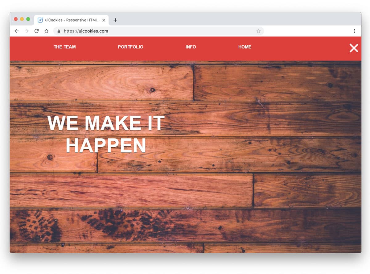
Cohost Bootstrap Navbar Template

Cohost website template uses a modern and elegant looking navigation bar. This bootstrap navbar template follows the traditional layout in a modern outfit. Everything is right in this template: clear branding, ample link spacing, and a call-to-action button at the end. Since the brand logo is placed separately from all other menu elements, it gives your brand name or logo good visibility. Sometimes it is better to stick with the old school technique, which performs well even in today’s tough world. The fonts and color schemes used in this navbar reflect the brand’s creative spirit and complement the template’s overall design.
Bootstrap Navbar Example With Logo
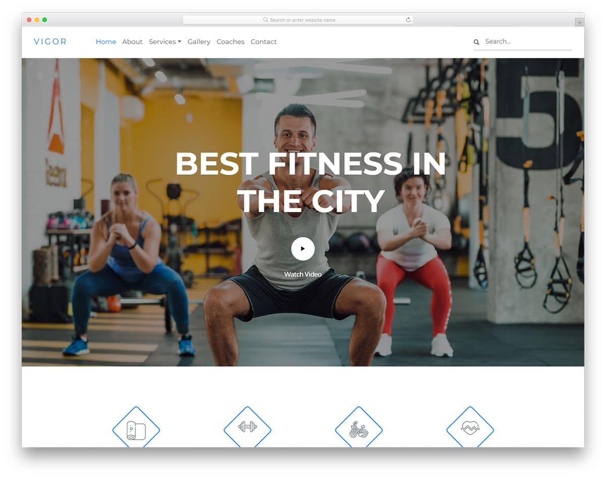
Vigor is a simple clean fitness website template and is a good bootstrap navbar example with a logo. To reflect the theme of getting lean and fit, this template uses sharp, thin fonts throughout. The design consistency in this template is flawless. Even in the navbar, the designer has maintained a simple, elegant design. In this bootstrap navbar, you also get drop-down actions. At the end of the right side, you have space for a search bar. The main purpose of a navbar is to guide the user, but it can’t do so every time. Search bars will help the user to easily find the hidden gems in your website.
Bootstrap Responsive Navigation Menu

Yogafun is almost similar to the Vigor template mentioned above. But, this one is designed for a yoga website. The designer has balanced the navbar element beautifully in this design, which makes it the best bootstrap responsive navigation menu in this list. An equal amount of space is given for the brand logo, menu options, and search bar. Wordings are very important in a navigation bar, they shouldn’t be too long and it must convey the message carefully. In this bootstrap navbar design, the designer has kept the menu labels short and crisp. At a glance, the user can understand where the particular link will take them.
Jobpply
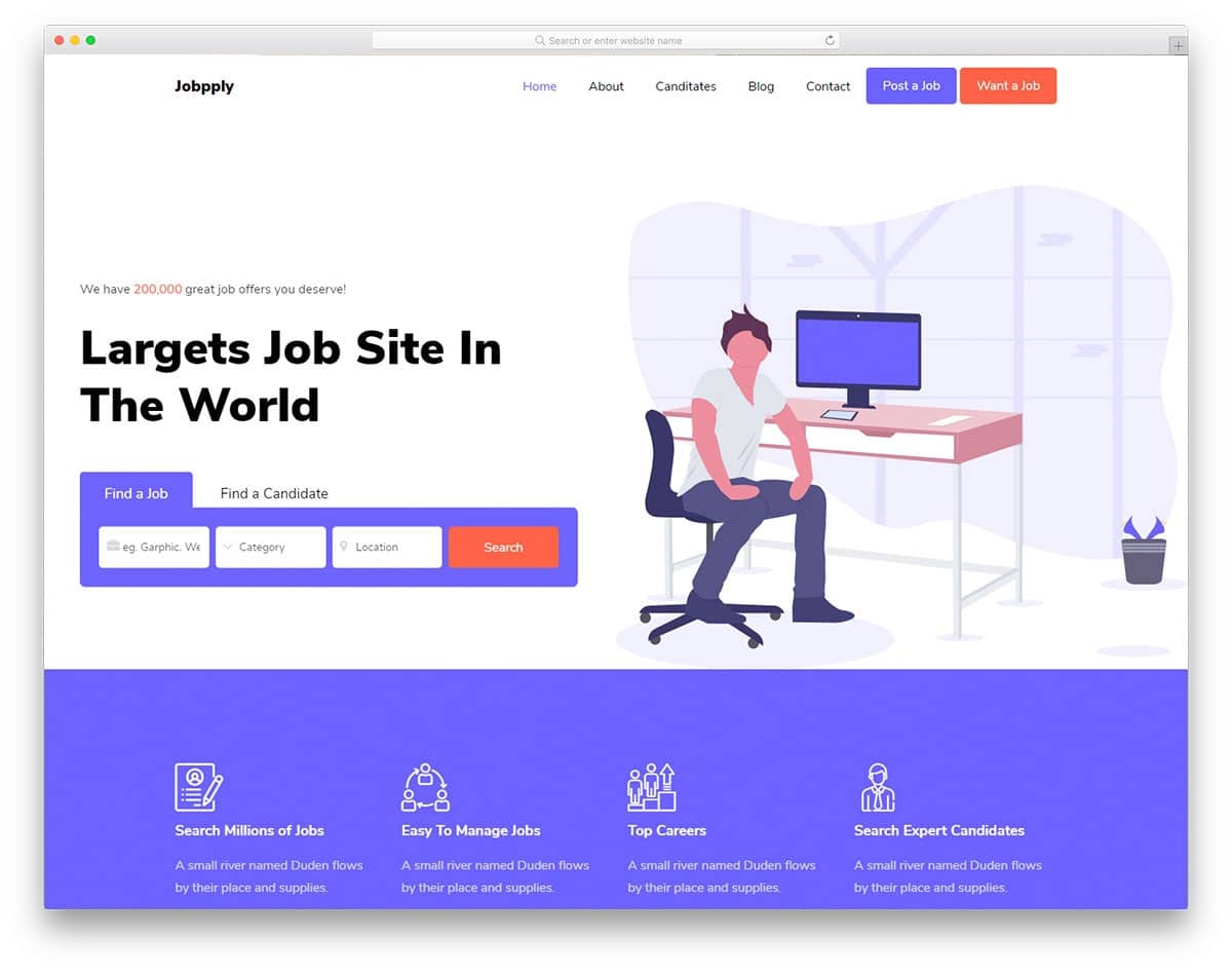
If your website offers two distinct services, you can direct users to the appropriate service from the navbar. In this Bootstrap navbar example, you can see that the developer has used two call-to-action buttons. One button posts a job, and the other searches for a job. Carefully designing your website from the menu bar will help you serve your users better. Apart from the thoughtful features, this example also has a trendy, cool design. Important elements are bold and big so they can be recognized easily.
Basketball
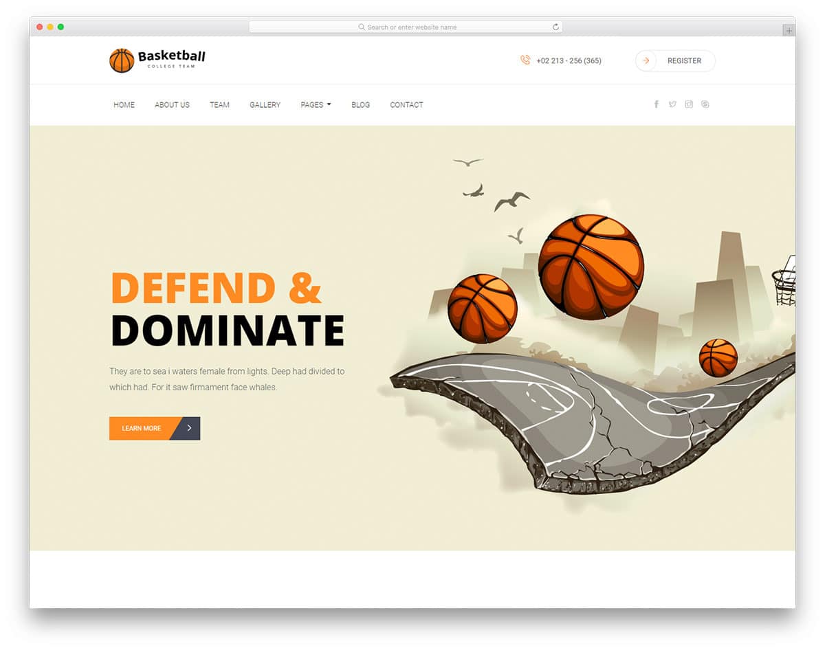
The navigation bar shouldn’t always follow a single-line design. Instead, you can follow a hierarchy design, which means putting branding elements at the top and the most used elements in an easily accessible part. In this bootstrap navbar design, you can see that the designer has used the top part to add a logo and a registration form call to action button. Right below the promotional part, all the necessary navigation menus are listed. Splitting and organizing content like this will give a clean look to the design. In a navbar design, clarity is very important and if you need to add multiple elements, designs like this could help you.
Daren

While designing a navbar with space constraints you can always use icons. Iconography not only helps you save space but also conveys the message. In this navbar design, the designer uses texts and icons to balance the look. All navigation menu options are presented in text; other secondary elements, like search and social media icons, are presented as icons. Since Daren is news and magazine website template, placing social media icons in the navbar is a good design idea. Very smooth and gentle animation effects are used for the drop-down and hover effects. With this bootstrap navbar design, the user can easily search and find the options they want.
Glamour
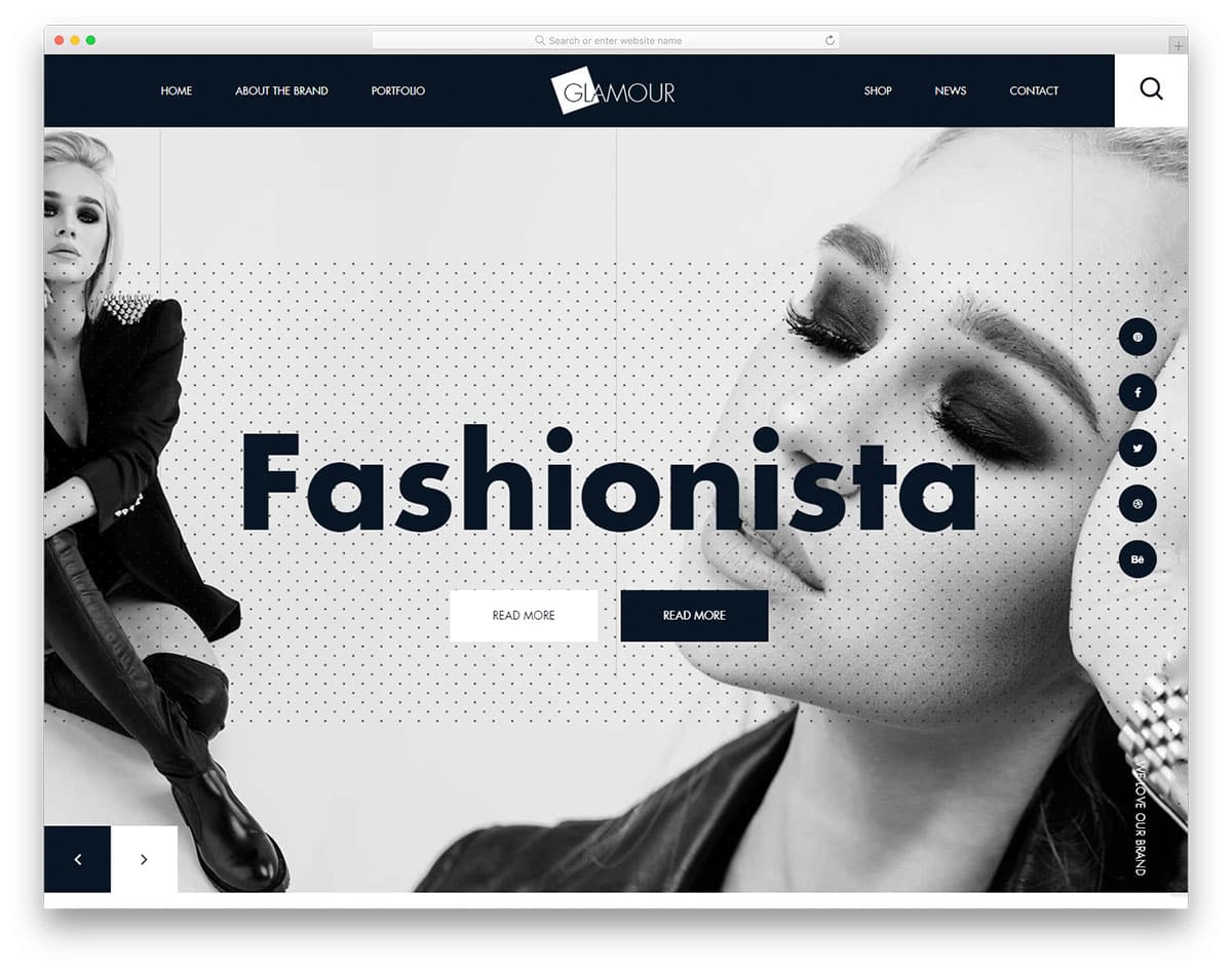
The creator of this template has followed a brutalist web design. With big, bold elements and creative patterns, this template stands out from others. Making a navigation bar for a brutalist website needs perfection. You have to maintain the brutalist design and at the same time you to maintain the user-friendly nature. The designer of this template has done an excellent job balancing both the creative look and user-friendly design. In this navbar, the logo is centered, improving visibility and clear branding for your website. Since the navigation menu labels have taken up enough space, the designer has opted for a full-page search bar.
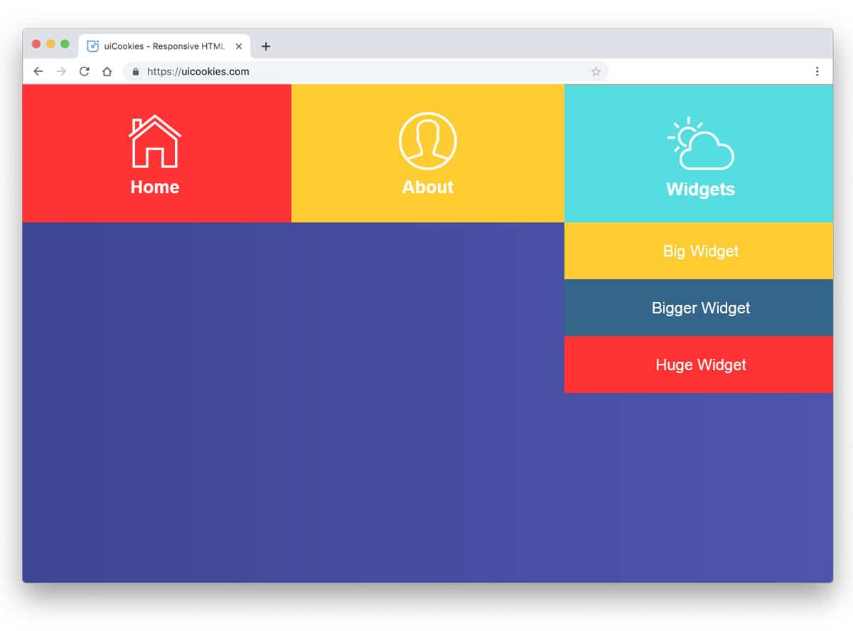
Shopmax
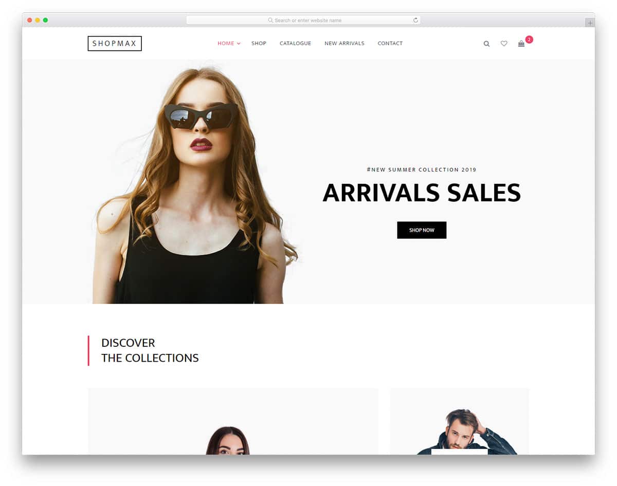
Apart from the branding and clear menu labels you can make the navbar to show useful information. In this bootstrap navbar, the designer has used notification tags to show the number of products in the cart. This design is inspired by the mobile application UI designs, where the user can see the unread messages as a small badge over the app icon in their home screen. Showing information like this will help the user track their purchase. Since the Shopmax is an eCommerce website template, all the interactive elements on the navbar show user-specific details. Another useful feature in this navbar is it supports multiple submenus.
Little Closet
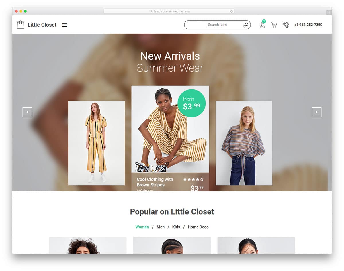
Little Closet is also an eCommerce website template, but this one uses a different navigation system. In the main navbar, you see only useful information like customer care number, profile detail, a logo, and a search bar. All other page links are given in the hamburger sidebar. The creator of this template intended to give users a personalized experience. By designs like this, you have space to show user specific recommendations on the main screen. And all other common options in the sidebar. To maintain the template’s minimalist look, the designer has used only icons in the main navbar. The default icons are clear and easy to understand, so the designer has taken a brave decision of not using text labels.
Karma

The Karma template’s navbar is placed at the top as usual. But the designer has added a little bit of a modern design touch to make it stand out from the other navbars. The navbar, with rectangular boundaries on the full-width, looks distinct from other elements on the page. The designer has added a shadow effect to draw your attention to the menu bar. This shadow effect, combined with the rectangular form factor, gives the navbar a floating appearance. For the menu options, the creator has used text labels and icons for the cart and search options.
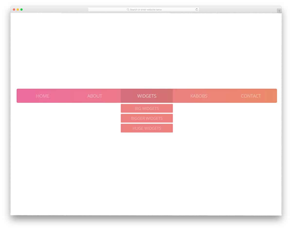
Magnews2
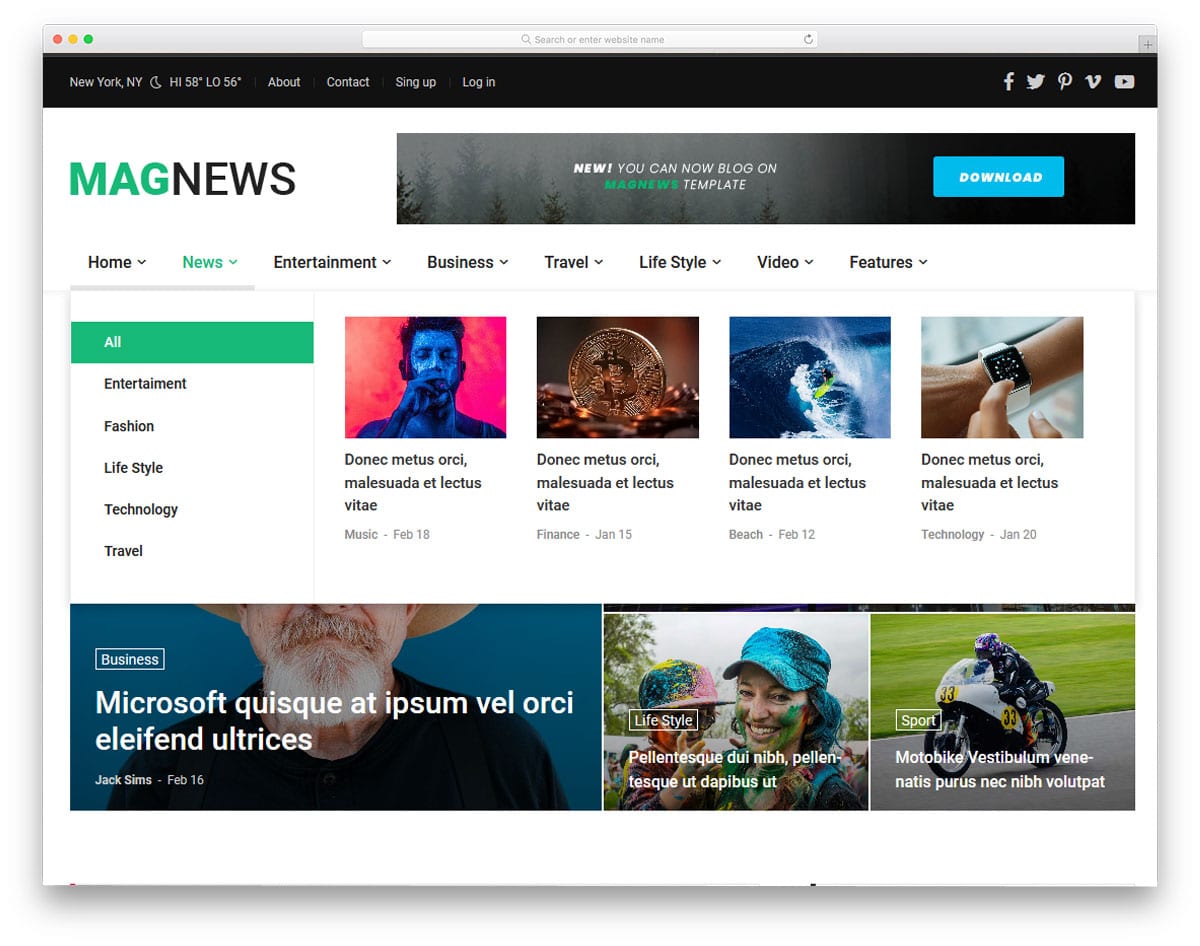
In all the previous navbar we have seen only the single dropdown and multiple submenu options. The creator of this navbar has given us a mega menu design. The mega menu lets you organize multiple options under one menu. Another advantage of the mega menu is adding images and other multimedia content without any issue. You can infer from the template’s name that this one is a magazine and news website template. Giving a mega menu option for such a content-rich website will help users easily find the content they love.
Megazine
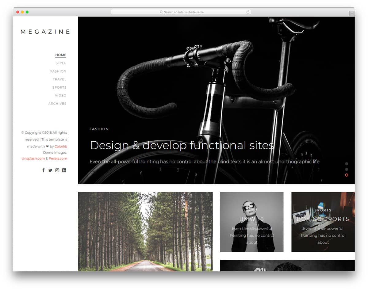
In all the previous navbar menu we have seen that the navigation bars are placed at the top. The creator of this template has used a sidebar menu design. Using a sticky sidebar will let the user to easily access the menu from any part of the website. The vertical form factor gives you more space to add widgets and other links. Line menu design is used in this navigation bar to indicate on which page the user is currently viewing. The template uses HTML5, CSS3, and Bootstrap framework. As it is responsive, you can use this navbar code on your website or application without any issues.
Minimal Bootstrap Navbar
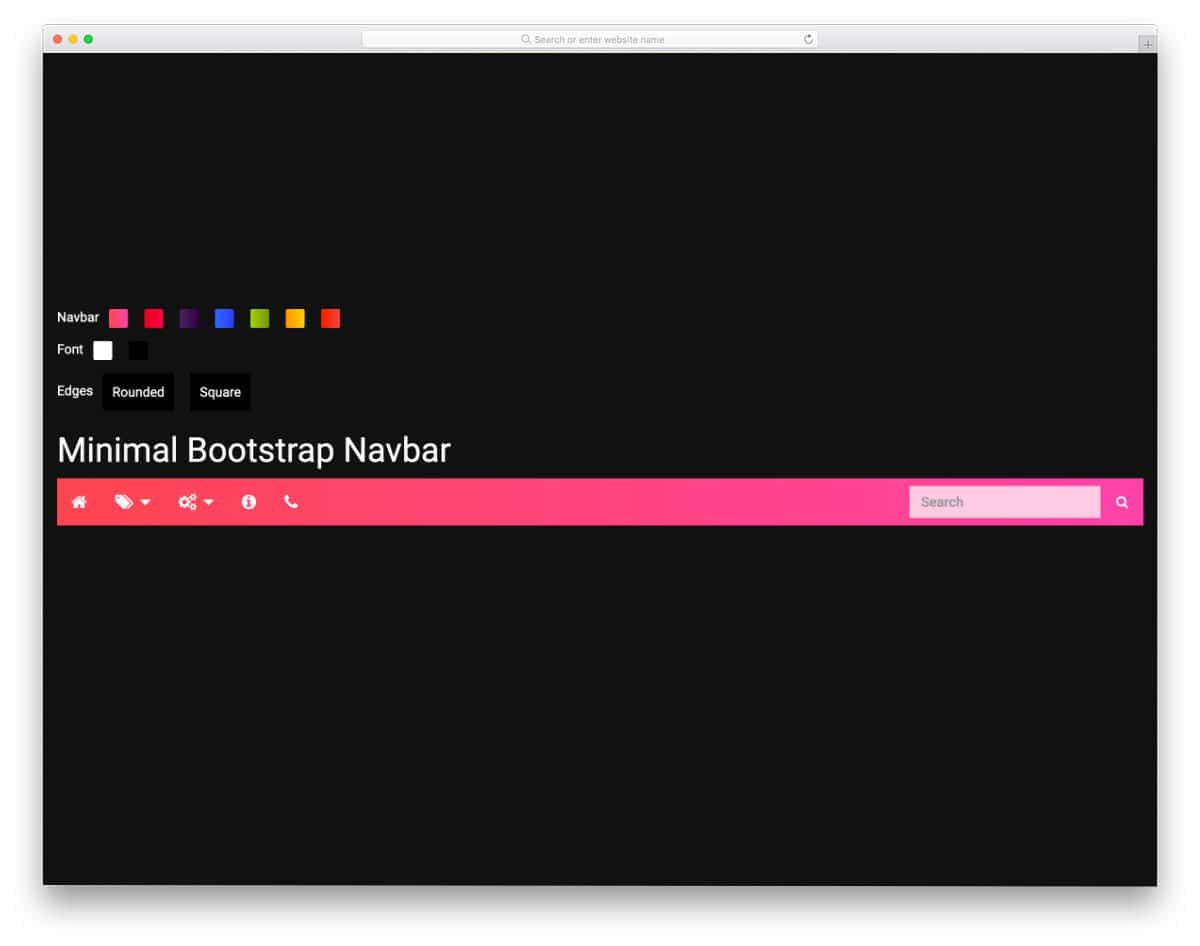
This Minimal Bootstrap Navbar example will help you make a colorful navigation bar. The creator has given you the option to change the navbar’s gradient colors and font colors and the navbar edges into rounded and square. Apart from the quick customization options, this navbar has a clean, easy-to-use design. There is more than ample space between options, and hover effects are used to display the menu labels. If you want a modern navbar design with smart interactions, this Bootstrap navbar example could be handy.
Slide Out Vertical Navbar
You can infer that this bootstrap navbar example has a sliding out navigation bar. The default vertical navbar is responsive and loads quickly; hence, you can use this codebase to create your custom navbar without worries. The creator has followed a simple, elegant design that you see on personal websites and blogs. Color highlighters are used to show the selected options. Since the navbar is sticky, users can access the menu options and scroll down the pages without any issues. Overall, the Sticky Slide Out Vertical navbar is a perfect example of sticky right navbar designs.
Cafe Prague Restaurant Navbar
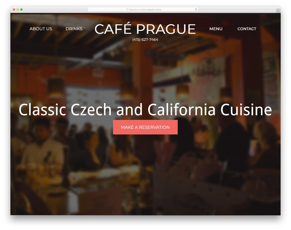
This example is a fully functional one-page restaurant website template. The creator has used a bootstrap navbar with a logo for quick navigation. The navbar smartly switches into a sticky navbar at the top without any logo so that the users can jump to the section they want no matter which part of the website they are in. Since this is a fully functional website template, the code script is a little long. You can take the navbar portion alone and can use it on your website. Speaking of restaurant websites, check out our restaurant website templates collection for more interactive website designs.
Sticky Slider Navigation

This is a practically applicable Bootstrap navbar design. Instead of placing the navbar at the top, the creator has placed it just below the header section. As the user scrolls down the page, the navbar moves to the top and remains as a sticky bar. If you are making an interactive landing page, a Bootstrap navbar like this will help you provide a more immersive experience for users. In the demo, the navbar is treated as a single-page navbar, so you can click the option and jump to the section you want. The creator has made it responsive, so you can use this Bootstrap design easily on your website.
Navigation Animation

The creator has given you a set of animations for the navigation bar. Using simple animated navbars will help you retain the traditional look and make it interactive. The advantage of this animated navbar design is they are made purely using the CSS3 script. Therefore, they are attractive and lightweight, so they load quickly and let the user easily navigate to the page they want. Nearly fifteen animation variations are given in this pack. Take your time, try each animation, and pick the right one.
Sidebar Slide-in-out Effect
This one is also an animated navbar concept. This concept will come in handy if you use a sidebar instead of the top horizontal bar. The creator has designed this sidebar smartly so that it won’t interfere in the main content area. A small protrusion is given at the top to indicate the sidebar access point. The navigation options appear when the user clicks the access point icon. Sliding animations are buttery smooth in this example, which makes it a perfect fit for both computer and mobile UI design. For more smart sidebar designs like this, take a look at our bootstrap sidebar design collection.
okayNav Demo
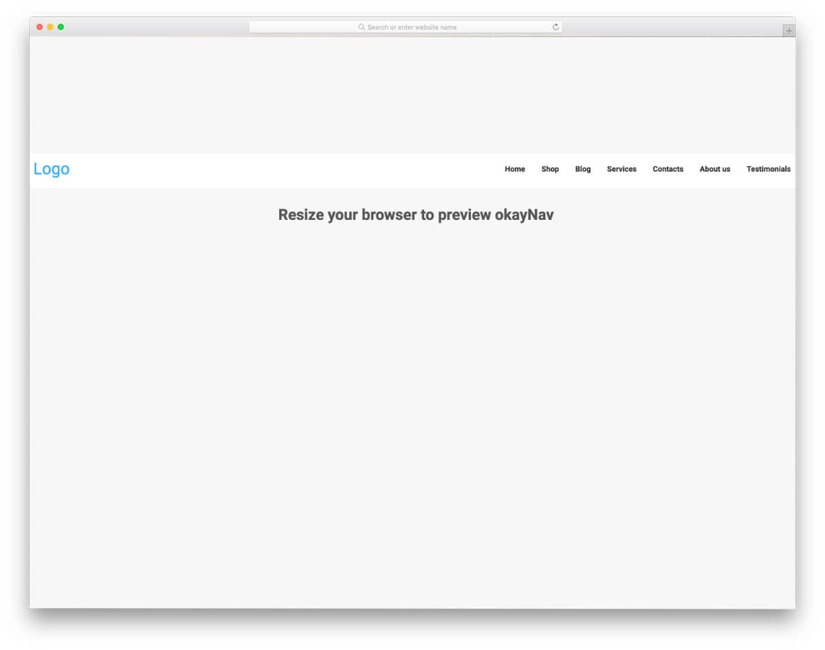
okayNav is a responsive and smart navbar design. When you view it on a computer, it looks like a regular navbar, but when you switch to mobile view, you can see it transform smartly. All navigation options are legible and easy to interact with. If accessibility and user-friendliness are the main goals of your navbar design, this is the best option. The code script is simple and straightforward, just like its design. Hence, you can easily handle the code as per your requirement.
Batman Nav

This navbar has nothing to do with Batman; the name may be given because of its agile, precise movement. The navbar moves up and becomes sticky as you scroll down the pages. If you are designing an interactive landing page or a single-page website, navbar designs like this will improve your overall design. The code used to implement this concept is available in the CodePen editor. Since the creator has created a complete webpage, the code might look a bit long, but you can edit it and use it according to your requirements.
Collapsing Site Navigation

This is a concept for a fancy navbar design. If you like to try a different Bootstrap navbar on your website, this one is worth a look. The creator has used vertical navbars in this example. Related images are shown when you hover over the options. All animations are quick enough to be well-synchronized with your cursor movement. Since it is a conceptual model, it is simple and vague. You can try different concepts and see whether this navbar concept works with your website. The creator has given you the entire code script as a downloadable file. Hence, you can easily utilize the code.
CodePen Challenge By Natalie
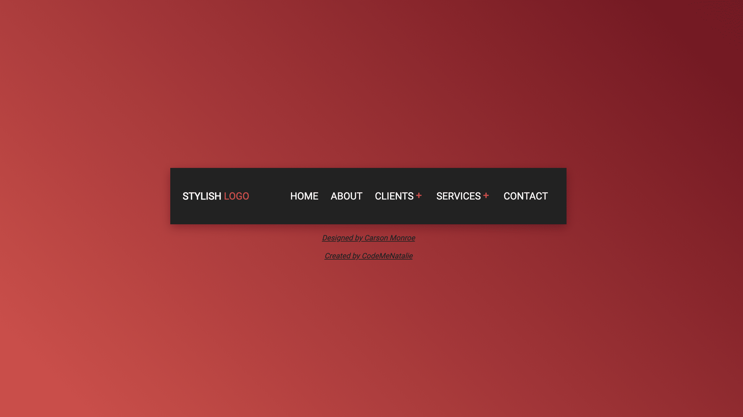
The creator of this design has used a familiar navbar design with a slightly different interface. Instead of showing the submenus as a dropdown, it overlays the existing navbar menu. The creator has used indicators and symbols to clearly show which option they are seeing and how to return to the main menu. If you have space constraints, you can use this Bootstrap navbar design. The entire code snippet used to create this design is available in the CodePen editor. You can edit and visualize the results on the CodePen editor and have an idea before using it on your website.
Expanding Bar Navigation Concept
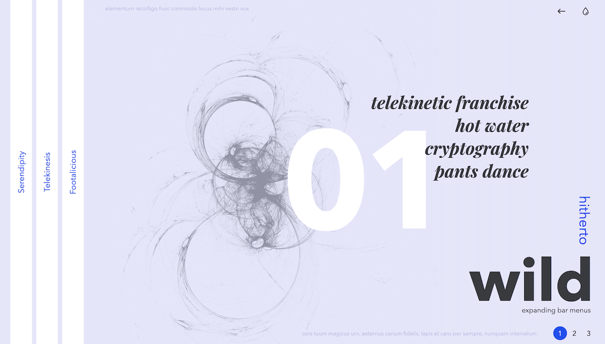
If you are bored of the same old traditional navbar design, this creative bootstrap navbar design might inspire you. The creator has provided three distinct navbar concepts in this design. All three concepts are unique and can make your website stand out from other normal websites. The animation effects are smooth and quick, so the users don’t have to wait for the options to appear. In the default design, except for the third concept, the other two may suffer from ergonomic issues when used on mobile devices. But the given concept will work smoothly on the big-screen devices. This bootstrap navbar design will spice up your design if you make a creative website design.
Underwater-Style Navigation
This is another creative navbar design concept. As the name suggests, the creator used an underwater animation effect for the navbar menu. If you plan to use a full-screen menu on your website, this animated Bootstrap navbar design is a good choice. The menu options are quick and respond quickly, so the user can easily navigate to the page they want. The attention to detail in this concept is impressive; it is almost perfect, like you see in a premium template. If you like the whole concept, then you can simply use the code script as such on your website.
Navigation Bar by Jan Kaděra
In this example, you get an interesting Bootstrap navbar design. The creator has used a 3D-style navbar design. In the default design, the creator has placed the navbar in a flat position to let you fully experience the 3D elevation. But you can place the navbar in vertical and horizontal positions to easily access the options. The 3D concept works impressively in this design, and the code script will help you make such a design without any issue. Another advantage of this bootstrap navbar example is it is made purely using the CSS3 script, hence this code won’t make your website heavy and loads faster.
Expanding Menu
Hamburger style menus are used extensively used in all types of websites. Since the design can be easily adapted to mobile and website interfaces, these designs are preferred a lot by designers. The creator used an expanding animation for the hamburger menu in this design. The menu unfolds smoothly and quickly, so the user can easily access the menu bar whenever they want. If you are looking for a swift transition effect for your navigation menu, this design could be a good fit. The developer has shared the entire code with you, so you can easily use it to create your menu in no time.
Line Menu Styles

This is another example of menu bar animation effects. One of the most commonly used menu animations is the line effect. Since they are minimal and take up only a few screen spaces, both designers and users love them. The creator of this template has given us nearly thirty types of line menu inspirations. From simple straight line effects to creative complex effects, there is an example for you in this set. The developer has given all the code in the source file, which you can download from the link given below. All the animations are swift and built with the latest web development frameworks. Hence, this design loads faster and is light on your website.
MainMenu
The creator of this design has used pictographic icons. The main advantage of pictographic icons is that they are self-explanatory and can be understood easily without any text labels. To help the user easily identify the menu options, the developer used icons and text labels in this design. It is a colorful navbar design with cool animation effects for the drop-down options. Since this template uses CSS3, you can use any modern colors in this design. Big, bold letters are legible and easy to read, even on small-screen devices.
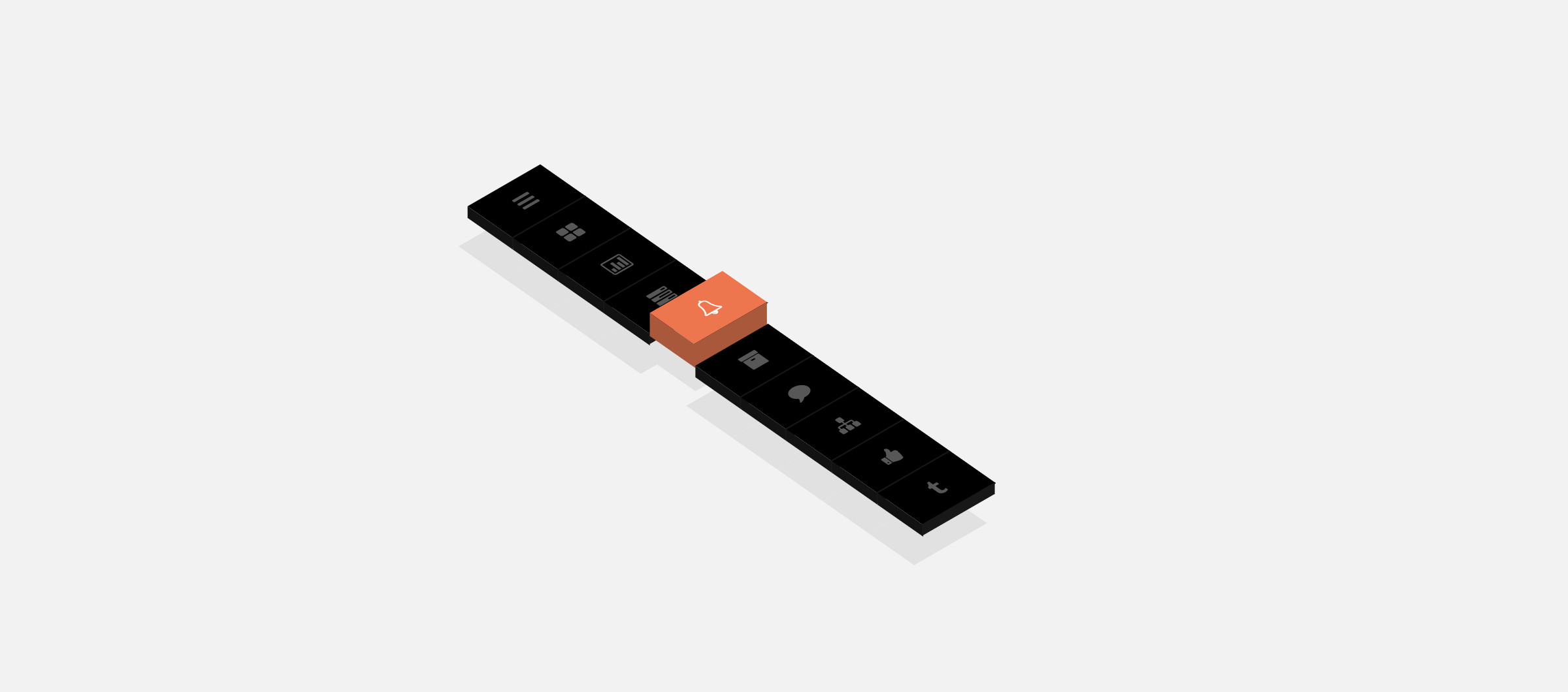
Perspective Page View Navigation
The creator of this template had tried to create a three-dimensional effect for the navigation menu. One important factor we must keep in mind when designing is maintaining a consistent tone throughout the template. If you are making a creative website with a new effect, this navigation bar menu effect will come in handy. The developer of this design has given us six types of menu navigation effect. All six effects are three-dimensional and will take up your whole page in the animation process.
Off-Canvas Menu Effects

As the name suggests, this example includes an off-canvas menu effect. The creator of this design has given you animation effects for both traditional navbars and trendy sidebars. Nearly nine types of menu transition effects are given in this set. You can change the direction of the menu transition effects based on your preference. In all nine menu designs, the designer has followed an icon and text label design for the menu options. Sincethe most common icons are used in this design, the users can easily identify the menu options. Plus, the designer hasn’t used any redundant menu icons, which makes it a perfect option for professional websites.
Another Menu Concept
Originally this is a full-page menu design concept. But, you can use the design for regular navbars as well. The developer used line effects in this menu to indicate the selected menu. The hover effects are precise and well-timed. Since it is a demo concept, it is not fully functional. By keeping this design as a base, you can create your menu design. The code used to create this menu concept is available in the CodePen editor. Hence, you can easily edit and visualize your customizations before using it on your website or application.
Menu CPC-Menus
It is another animation concept for your navigation bar. The animation in this example is fluid and swift. Everything is taken care of —from the hover effect to the click animation —in this menu design. Another advantage of this design is that all these fluid animations are created using CSS3 alone. Because of this simple code structure, you can use this code on any website or application without any issue. An ample amount of space is provided between menu options to let users easily interact with them without false clicks.
Mobile Menu Concept
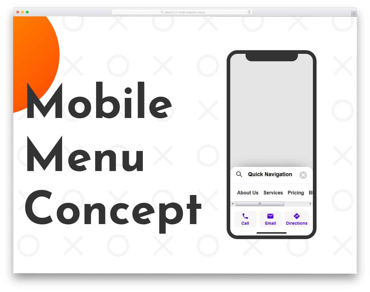
Mobile Menu Concept is truly an interesting menu concept. As today’s smartphones use edge-to-edge screen design, the screen area is becoming taller. The designers are trying several methods to make the options easier to access on these long screens. This quick menu concept not only looks interesting but also feels practically possible. The menu bar is moved to the bottom of the screen, which will make it thumb-friendly. Plus, the scrollable menu lets you add more options in a single area. This creative menu ticks all three menu design principles, like brand, navigation labels, and a useful search tool.